

# Ad summary
This ad for Spiegel Plus promotes a tool that allows users to research their family's history under Hitler's regime, and highlights a search function to help users find out what their ancestors did during that time.
# Brand positioning
Spiegel Plus is presented as a reliable and informative news and research source, specifically focusing on historical events. The brand positions itself as a tool for uncovering the past, providing users with the opportunity to explore their family history in the context of significant historical periods. By focusing on a sensitive topic like family actions during Hitler's regime, the brand aims to establish itself as a source of serious, in-depth historical investigation, appealing to users who value historical accuracy and personal relevance. The brand aims to occupy the space of historical research, aligning with values of truth and knowledge, and pushing against norms of ignoring difficult aspects of history.
# Product
Spiegel Plus offers a tool that allows users to find out what their family did under Hitler. The product includes a search function where users can enter a name (e.g., "Hans Müller") to search for their relatives' involvement during that era. The product is for individuals interested in exploring their family history and understanding their ancestors' actions during a historically significant period. The search box and 'Suchen' (search) button addresses the potential barrier of ease of access to historical records. The ad is telling the viewer that the product is worth trying because it provides a direct way to uncover potentially hidden aspects of their family's past.
# Visual style
The ad uses a visually striking aesthetic with a split-screen of historical images to create a sense of depth and context. The editing style involves static shots with simple transitions. The production quality appears polished, resembling a hybrid between a commercial and documentary style. The use of black and white historical images contrasted with red text and banners creates a strong visual motif, highlighting the historical theme. The pacing is consistent, providing a steady flow of information without rapid cuts. There is a sync between the visual elements and the overlayed text, with key information timed to appear with the visual components.
# Benefits
- [object Object]
- [object Object]
# Features
- [object Object]
- [object Object]
# Call to action
None used.
# Point of view
- [object Object]
# Storyline
- 00:00–00:02 The ad presents a split-screen visual collage of historical images related to the Hitler regime alongside a red banner with text.
- 00:02–00:04 A cursor appears and enters "z.B. Hans Müller" in a search box, then clicks the "Suchen" (search) button, simulating the process of searching for a family name.
- 00:04–00:06 The split-screen collage of historical images is displayed again, reinforcing the historical context and providing a visual backdrop to the search function.
- 00:06–00:08 The split-screen collage of historical images is displayed again.
- 00:08–00:10 The split-screen collage of historical images is displayed again.
- 00:10–00:12 The split-screen collage of historical images is displayed again.
- 00:12–00:14 The split-screen collage of historical images is displayed again. The text changes at the bottom of the screen.

How DER SPIEGEL Advertises on Meta
Refreshed 4 months ago · Weekly refresh cadence
DER SPIEGEL runs 82 active ads on Meta, shipping ~27 new creatives per week. Their library leans on Press41%, Headline20%, and Split Screen12%. Recently, der spiegel is leaning hard into a nazi genealogy tool that lets users search their family's role under Hitler's regime, using historical weight and personal confrontation as the hook across multiple creatives. Beyond that, they're pushing a scattered mix of spiegel plus utility content ranging from weight loss injection pitfalls and private health insurance switches to ai relationship advice and stock selling tips, suggesting they're testing what practical life anxieties convert best. The through line is intimate urgency, whether it's uncovering your ancestors' complicity or fixing your body, money, or love life with expert guidance only they can provide.
Indexed by Motion's Inspo Library.
The 20 Most Recent DER SPIEGEL Ads on Meta

# Ad summary
This image ad uses a close-up of Aleks Petrović, a controversial figure, with a quote from Spiegel questioning if he is needed because of his divisive persona. The ad leverages controversy and curiosity to draw attention.
# Brand positioning
This ad presents Spiegel as a bold and unafraid news source that tackles controversial figures and topics. By questioning the need for a divisive personality like Aleks Petrović, Spiegel positions itself as a media outlet willing to challenge popular opinion and delve into complex social issues. The brand aims to occupy a space of intellectual curiosity and critical analysis, inviting the audience to question and engage with the news beyond surface-level narratives. It aligns with values of journalistic integrity and incisive commentary, pushing against the norm of avoiding controversial subjects and instead embraces them as essential for informed public discourse. This positioning is functional, providing in-depth analysis, and emotional, provoking thought and discussion.
# Product
The ad promotes Spiegel, a news source, by featuring a provocative question about a controversial personality. The product is designed for individuals who seek in-depth analysis and critical perspectives on current events. The ad doesn't highlight any specific features or ingredients of the news source but implies a USP of bold, unafraid journalism that is willing to question popular figures. The moment of use is suggested as engaging with news and analysis that challenges conventional thinking. By addressing the barrier of potentially alienating or divisive content, the ad suggests that Spiegel provides essential insights, even if they are controversial, which is worth trying or buying into.
# Visual style
The ad uses a high-contrast, close-up shot of a man in a style reminiscent of a magazine cover. The image is highly polished, with a focus on a direct gaze and slight smirk from the subject. The typography is integrated with bold text placed over the subject's face. The ad mimics a disruptive, high-design editorial style, potentially increasing stop power in the feed by diverging from typical social media aesthetics.
# Hooks
Headline: Ganz Fernsehdeutschland hasst diesen Mann.
# Benefits
- [object Object]
# Features
- [object Object]
# Call to action
None used.
# Point of view
- [object Object]
# Storyline
- The top caption introduces the premise that all of German television hates this man, setting a controversial tone. The brand, Spiegel, intends to draw viewers in by presenting a controversial topic and stirring curiosity.
- The central question asks if Aleks Petrović is needed precisely because of his controversial nature. The brand is provoking the viewer to think critically about why divisive figures may be relevant in media.
- The Spiegel logo is included, indicating that the publication is posing the question. This is a clear brand statement that they are the source unafraid to ask difficult questions.

# Ad summary
A starkly lit image ad for an article about the Nazi party.
# Brand positioning
The brand featured in the ad is Spiegel, a news and media publication. It's positioning implies a commitment to uncovering the truth and providing in-depth investigative journalism.
# Product
The product in this ad is a Spiegel Plus article, likely an investigation or deep dive into the history and membership of the Nazi party. The article, titled "Das Ende der Lügen" (The End of Lies), promises to expose the truth about NSDAP (Nazi party) membership. The ad targets people who are interested in history, politics, and investigative journalism.
# Visual style
The ad employs a stark, high-contrast visual style that evokes a sense of historical gravitas and journalistic intensity. The production quality appears carefully curated, with attention to lighting and composition. The image treatment includes a color filter that mutes tones and emphasizes shadows, creating a mood that aligns with the serious subject matter. The font is integrated in a way that is bold, clear, and serious, mirroring the tone of the ad.
# Hooks
Headline: Das Ende der Lügen
# Call to action
None used.
# Point of view
- [object Object]
# Storyline
- The ad opens with a dramatic, high-contrast image, setting a serious and investigative tone. The message is to imply the sensitive nature of the topic being discussed. This is presented from an external source.
- The focal point is a block of text containing the headline and a secondary description of the article's topic. The intent here is to make the article's title clear, along with its central topic. This is presented from the brand's perspective.
- The Spiegel + logo appears on an orange bar, serving as a subtle brand reminder. This is presented from the brand's perspective.
# Ad summary
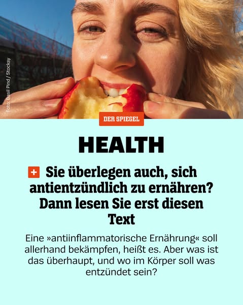
This ad from Der Spiegel promotes a health article about anti-inflammatory diets. It uses a close-up of a person eating an apple along with text overlay.
# Brand positioning
Der Spiegel is presented as a reliable source for health information. Its brand positioning is rooted in providing in-depth articles on health and wellness, suggesting a focus on informing and educating the audience rather than promoting quick fixes. The brand aligns with a tone of journalistic integrity and a commitment to exploring the science behind health trends.
# Product
The ad promotes a health article about anti-inflammatory diets. It frames the topic as something that addresses various health concerns, as it states that the diet should combat all sorts of things. The ad is designed to address the viewer's potential confusion about what an anti-inflammatory diet is and what inflammation in the body means, thus encouraging them to read the article for clarity.
# Visual style
The ad has a clean, editorial style with a focus on clear messaging. The production quality is high, featuring a well-lit photo of a person eating an apple. The image treatment includes background removal and layering of text elements for emphasis. The typography is large and bold, designed to grab attention quickly. The visual style feels native to a digital news platform, aiming for scannability and stop power in feed.
# Hooks
Headline: HEALTH
# Benefits
- [object Object]
# Features
- [object Object]
# Call to action
None used.
# Point of view
- [object Object]
- [object Object]
# Storyline
- The ad opens with an image of a person eating an apple and a headline that states "HEALTH," which indicates that this is about health-related topics. The ad intends to grab the viewer's attention and signal the subject matter.
- The ad poses a question asking whether the viewer is also considering an anti-inflammatory diet, piquing the viewer's curiosity. This is from the brand's POV and is used to directly engage the audience and introduce the topic of the promoted article.
- The ad instructs the viewer to read the article first, signaling from the brand's POV that it will provide important information. This builds anticipation and positions the article as a must-read before making dietary changes.
- The ad dives into the question of what an anti-inflammatory diet is and what inflammation means, highlighting the article's informative nature. This is to assure the viewer that the article will address their potential knowledge gaps.
# Ad summary
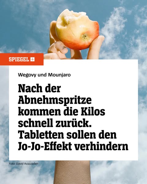
This ad from Spiegel discusses the regaining of weight after using weight loss injections, and implies that pills can prevent the 'yo-yo effect'.
# Brand positioning
This ad promotes Spiegel, a news publication focused on delivering information and insights. The brand presents itself as a source of information on the drawbacks and risks associated with weight loss injections, indicating its commitment to responsible journalism and providing a comprehensive understanding of health-related topics. Spiegel's positioning underscores its role as a trusted source of news that readers should rely on to stay informed about public and consumer issues.
# Product
The ad is for a news story about weight loss injections and a possible solution. The ad references weight loss injections, specifically Wegovy and Mounjaro, and it presents information about the tendency to regain weight after using these injections. The ad also references tablets that are claimed to prevent the 'yo-yo effect' of weight regain.
# Visual style
The ad uses a combination of a natural, bright outdoor scene with a stark white text block. The image has a journalistic feel, contrasting the bright, airy sky and apple with the serious topic of weight loss and potential health concerns. The layout is simple, with a focus on text and a single, symbolic image.
# Hooks
Headline: Nach der Abnehmspritze kommen die Kilos schnell zurück. Tabletten sollen den Jo-Jo-Effekt verhindern
# Benefits
- [object Object]
# Features
- [object Object]
- [object Object]
# Call to action
None used.
# Point of view
- [object Object]
- [object Object]
# Storyline
- The ad opens by showing a partially eaten apple against a cloudy sky. The brand, Spiegel, is presented in the top left. This image suggests health and the desire for weight loss, potentially setting the stage for the topic of the ad from the customer's perspective.
- The text block, positioned in the center of the ad, references Wegovy and Mounjaro and communicates the message that weight lost through injections often returns quickly, from the brand's perspective. This creates a sense of urgency and potential frustration for those seeking quick weight loss solutions.
- The text block continues, stating that tablets are intended to prevent the 'yo-yo effect'. This offers a potential solution or alternative to weight loss injections from the brand's perspective. It suggests that the news story provides a more comprehensive understanding of weight management options.
# Ad summary
This ad for Spiegel discusses how people who use weight loss injections tend to regain weight quickly. The ad suggests that tablets can help people avoid this "yo-yo" effect of losing and gaining weight.
# Brand positioning
The brand featured in the ad is Spiegel, a German weekly news magazine. The ad's presentation, featuring a headline related to health and weight loss, positions the magazine as a source of reliable, scientific information relevant to health and wellness, especially concerning medical advancements and their effects on weight management. The positioning of the Spiegel brand appears to be functional, offering information and solutions to health-related concerns.
# Product
The ad discusses weight loss injections such as Wegovy and Mounjaro and suggests that people who use these drugs tend to regain weight quickly. The ad proposes that tablets can help avoid the "yo-yo effect" of losing weight and gaining it back.
# Visual style
The visual style of the ad combines editorial design with lifestyle imagery. The production quality appears professional, with a clear, well-lit photo of an apple held against a sky background. The typography is clean and legible, typical of news publications. The overall aesthetic suggests a blend of health and scientific reporting.
# Hooks
Headline: Nach der Abnehmspritze kommen die Kilos schnell zurück. Tabletten sollen den Jo-Jo-Effekt verhindern
# Benefits
- [object Object]
# Call to action
None used.
# Point of view
- [object Object]
# Storyline
- The ad opens with a headline that discusses the return of weight after using weight loss injections, highlighting a common concern among individuals seeking weight loss solutions. This sets the stage for a discussion about the challenges of maintaining weight loss and the need for effective strategies. This information is coming from the brand/publication to grab the reader's attention.
- The ad concludes by suggesting tablets as a potential solution to prevent the "yo-yo effect", offering hope and a course of action for individuals struggling with weight management. This part of the story is told by the advertiser to suggest a possible solution to the problem.
# Ad summary
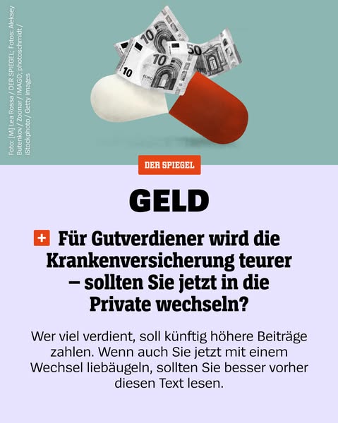
This ad from DER SPIEGEL highlights how health insurance is getting more expensive for high earners and suggests switching to private insurance, and to read the text if considering switching.
# Brand positioning
DER SPIEGEL is presented as a reputable and informative news source that covers financial topics. The ad uses a straightforward tone, addressing high earners and informing them about potential changes in health insurance costs. It positions DER SPIEGEL as a source of information for those who are financially savvy and want to stay informed about important changes that affect their income and expenses.
# Product
The product being advertised is not a physical item but rather DER SPIEGEL's financial news coverage. The ad is targeting 'Gutverdiener' (high earners) who may be affected by rising health insurance costs. The main point is that health insurance is becoming more expensive for this demographic, and the ad prompts them to consider switching to private insurance. The ad suggests reading the article to make an informed decision about switching, addressing the purchase barrier of uncertainty by providing information.
# Visual style
The ad utilizes a clean and minimalistic visual style with a focus on clarity and directness. The use of simple shapes, solid colors, and straightforward typography contributes to an easily digestible message. The overall aesthetic is professional and informative, aligning with the brand's identity as a news source.
# Hooks
Headline: GELD
# Call to action
None used.
# Point of view
- [object Object]
# Storyline
- The ad opens with a visual of a capsule filled with Euro banknotes, immediately grabbing the viewer's attention with an intriguing juxtaposition that symbolizes money and healthcare. The brand is using a visual metaphor to represent the financial aspect of health insurance.
- The next part of the story introduces the core message: 'Für Gutverdiener wird die Krankenversicherung teurer – sollten Sie jetzt in die Private wechseln?' (For high earners, health insurance is getting more expensive - should you now switch to private?). The brand is informing the viewer about a potential financial issue they may be facing, drawing attention and highlighting the relevance of the news to the target demographic of high earners.
- The storyline concludes with a call to action: 'Wer viel verdient, soll künftig höhere Beiträge zahlen. Wenn auch Sie jetzt mit einem Wechsel liebäugeln, sollten Sie besser vorher diesen Text lesen.' (Those who earn a lot will have to pay higher contributions in the future. If you are now considering switching, you should read this text beforehand.). From the brand's perspective, this reinforces the need to read the article, thus positioning DER SPIEGEL as a valuable resource for making informed decisions about healthcare finances.

# Ad summary
This ad promotes an article from Spiegel, focusing on the end of lies related to the NSDAP membership and Nazi party, utilizing a somber and historical visual style.
# Brand positioning
The brand presented in the ad is Spiegel, a news and media organization. The ad aims to occupy a space of investigative journalism and historical analysis. The brand aligns with values of truth-seeking, in-depth reporting, and holding historical figures and organizations accountable. The ad follows category norms of serious news outlets by presenting a somber and thought-provoking image. The brand positioning is functional, focusing on delivering information and uncovering historical truths.
# Product
The product being advertised is an article from Spiegel titled "Das Ende der Lügen" (The End of Lies), which explores the complexities of NSDAP membership and the Nazi party. The product is intended for individuals interested in historical analysis and investigative journalism. The ad addresses potential purchase barriers by suggesting that it will expose uncomfortable truths and challenge previously held beliefs. The article appears to dive into topics and events regarding the past that require further investigation.
# Visual style
The ad's visual aesthetic is somber and historical, with a focus on creating a serious and investigative tone. The production quality appears polished, and the image uses visual motifs of layering and texture to convey a sense of depth and history. The image treatment includes color grading that emphasizes oranges and dark shadows, enhancing the gravity of the subject matter. The typography is integrated cleanly, with a clear and legible font used for the central message. The overall style contrasts with typical social media content, aiming to capture attention through its serious and stark presentation.
# Hooks
Headline: Das Ende der Lügen
# Benefits
- [object Object]
# Features
- [object Object]
# Call to action
None used.
# Point of view
- [object Object]
# Storyline
- The ad opens with a stark and intense image of a face overlaid with faded historical documents to visually convey the seriousness and historical nature of the article. This is being conveyed from the brand's perspective in order to attract an audience interested in history and investigative journalism.
- The central message, displayed in a white block, declares the 'End of Lies' and specifies the focus on NSDAP membership and the Nazi party to clarify the article's subject matter. The intention is to highlight the article's core theme and draw in readers interested in this historical period. This is shown from the brand's perspective.
- The Spiegel logo is presented to reinforce the brand's credibility and provide a clear source for the advertised content. The intent is to associate the article with a reputable news source, encouraging readers to trust the information presented. This comes from the brand.
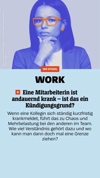
# Ad summary
This ad presents a news article from Der Spiegel about employee sick leave and termination policies. It uses a stock photo of a woman in glasses looking concerned, alongside the question "Is constantly being sick grounds for termination?"
# Brand positioning
Der Spiegel is positioned as a reputable news source, offering in-depth coverage of relevant and complex social issues. By presenting a serious topic like employee sick leave, the brand aims to be seen as a provider of thoughtful analysis and practical advice in the realm of work-related matters. The brand aims to occupy a space of journalistic integrity and relevance to contemporary concerns, targeting readers who seek informed perspectives on employment law and workplace challenges.
# Product
The product being advertised is an article from Der Spiegel that addresses the complex issue of whether an employee's frequent sick leave can be grounds for termination. The ad highlights the challenges and chaos that can arise when a colleague is consistently absent, placing an additional burden on the remaining team members. The article appears to offer insights into the boundaries of employer-employee understanding, raising questions about how far employers must accommodate sick leave and where they can draw the line. The product is targeted towards employers and employees who are dealing with the challenges related to employee sick leave and workplace policies.
# Visual style
The ad has a clean and corporate visual style, using muted colors and a formal tone. The image of the woman is stylized with a blue filter and contrasts with the bright orange glasses, drawing attention to her expression. The layout is simple and organized, resembling a traditional newspaper or magazine format. The typography is bold and clear, ensuring readability. The ad conveys seriousness and reliability, aligning with the brand's image as a reputable news source. Its simplicity makes it scannable in a busy feed.
# Hooks
Headline: + Eine Mitarbeiterin ist andauernd krank – ist das ein Kündigungsgrund?
# Benefits
- [object Object]
- [object Object]
# Features
- [object Object]
- [object Object]
- [object Object]
# Call to action
None used.
# Point of view
- [object Object]
# Storyline
- The ad starts with a photo of a woman in glasses, looking concerned. This image sets a tone of seriousness and professional anxiety related to work-related topics from the perspective of someone in a work environment.
- The ad then features the Der Spiegel logo, signaling the source of the article, with the title "WORK" in bold text, telling the audience that the content is related to employment or labor matters.
- The article headline is presented: "Eine Mitarbeiterin ist andauernd krank – ist das ein Kündigungsgrund?", which translates to "An employee is constantly sick - is that a reason for termination?" The intention here is to present the central issue of the article.
- Finally, the ad includes a brief synopsis of the situation, discussing the chaos and added burden on other team members when a colleague frequently calls in sick, telling the audience why this topic should matter to them.
# Ad summary
This ad by Spiegel Plus poses the question of what role your family played during the time of Hitler.
# Brand positioning
Spiegel Plus is presented as an investigative service that aims to uncover historical truths related to individuals' family histories during the Hitler regime. The brand occupies a space that values transparency, historical accuracy, and personal accountability, as well as providing information on the past and educating consumers on historical issues. The brand positions itself as a source for those seeking to understand their family's involvement in a sensitive and significant period of history. The brand aims to deliver a potentially uncomfortable reality, and uses historical context to bring those situations to light. The brand's position is functional and aims to educate.
# Product
The product is a service by Spiegel Plus that helps individuals discover what their family members did during Hitler's reign. It is for anyone interested in uncovering their family's past during this historical period. The service can be accessed through the Spiegel Plus website by using the search function to find information, addressing the barrier of how to access this kind of information. This provides the consumer with insights into their heritage and promotes transparency about the past.
# Visual style
The ad's aesthetic combines historical imagery with a modern, digital interface. The editing style includes static shots that create a sense of seriousness and directness. The use of blurred imagery alongside clear on-screen text creates a visual contrast, with a mid-range CPM. The audio-visual sync is achieved through the sound effect of the cursor clicking, which emphasizes the interactive element of the ad.
# Benefits
- [object Object]
# Features
- [object Object]
# Call to action
None used.
# Point of view
- [object Object]
# Storyline
- 00:00–00:07 00:00–00:07 The ad opens with old blurred images and flashes a red rectangle box that says, 'Finden Sie hier heraus, was Ihre Familie unter Hitler getan hat,' and translates to 'Find out here what your family did under Hitler'. A cursor appears and clicks in a search bar, types in 'z.B. Hans Muller,' then clicks a red button that says 'Suchen', translating to 'Search.' The message is to encourage the viewer to search for information on their family and understand their historical background during this time.
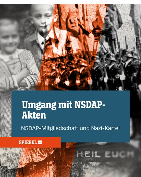
# Ad summary
This ad is for the German news publication Der Spiegel and appears to focus on a feature regarding NSDAP files. The image appears to be an old photograph with two children in the foreground and an army marching in the background.
# Brand positioning
This ad, presented by SPIEGEL+, directs viewers to a news article about the NSDAP. It positions the SPIEGEL+ brand as an investigative journalistic source for historical topics.
# Product
This ad is for a SPIEGEL+ article focusing on how the NSDAP-Files are handled. It highlights the brand's coverage of historical subjects.
# Visual style
The ad has a vintage and serious visual style, using a combination of black-and-white and desaturated orange tones to evoke a sense of history and gravity. The use of a photograph overlaid with text gives it a documentary feel, while the stark imagery of the soldier aims to create a sense of intrigue. The design is clean and direct, intended to catch the eye and communicate the topic effectively.
# Hooks
Headline: Umgang mit NSDAP-Akten
# Benefits
- [object Object]
# Features
- [object Object]
# Call to action
None used.
# Point of view
- [object Object]
# Storyline
- The image shows a black and white photo of two children, superimposed with an orange-tinted photo of soldiers marching. The children are placed in the foreground, while the soldiers fill the background. This juxtaposition aims to highlight the impact of the NSDAP on the younger generation.
- A blue-grey rectangle contains the title "Umgang mit NSDAP-Akten" and subtitle "NSDAP-Mitgliedschaft und Nazi-Kartei". This central block positions the news story as the focal point of the ad, clearly stating the article's subject to draw in viewers.
- The orange SPIEGEL+ logo is displayed at the bottom of the rectangle. This is designed to act as a visual marker to signal where the news story can be found.
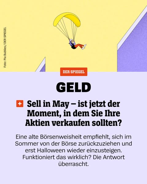
# Ad summary
This ad presents a recommendation of when to sell stocks and makes the claim that the answer will surprise you.
# Brand positioning
This ad is for DER SPIEGEL. The brand presents itself as a provider of financial advice. The brand exists to provide relevant information to investors so they can make smart decisions about their money. This brand is not pushing against or following any category norms or competitor behavior.
# Product
This ad is for financial advice on when to sell stocks. The ad specifically says to sell in May. The ad speaks to a well known saying that suggests to withdraw from the stock market during the summer and not re-enter until Halloween. The ad makes the claim that the answer will surprise you.
# Visual style
The ad has an editorial and polished visual style. The visual motifs include the illustration of a person parachuting. The image treatment includes background removal. The typography integration is large and bold. The ad contrasts the platform native style.
# Hooks
Headline: GELD
# Call to action
None used.
# Point of view
- [object Object]
# Storyline
- The ad presents an illustration of someone parachuting. The ad uses the illustration to grab attention, as well as present the idea of jumping out of the stock market.
- The ad presents the recommendation to sell stocks in May. The ad does this to grab attention, as well as tee up the question about whether it works to withdraw from the stock market in the summer and re-enter in October.
- The ad presents the idea of an old saying, which recommends withdrawing from the stock market during the summer and re-entering in October. The ad does this to provide context for the question about whether it works.
- The ad asks whether it works to withdraw from the stock market during the summer and re-enter in October. The ad does this to present a question to the reader, which implies that the answer will surprise you.
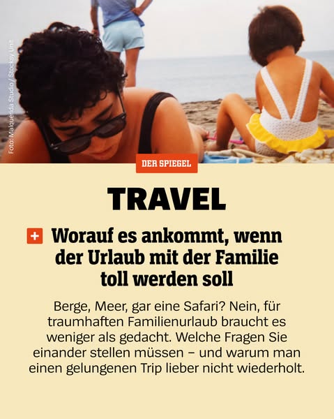
# Ad summary
This ad from Der Spiegel promotes family travel by suggesting that you don't need mountains, oceans, or safaris to have a great trip, and offering advice on what questions families should ask to have a successful vacation.
# Brand positioning
The brand presented is Der Spiegel, a German news magazine. It positions itself as a source of insightful travel advice and guidance for families. The brand aligns with values of practicality and thoughtful planning, offering expertise rather than just promoting destinations. It pushes against the norm of exotic or extravagant travel, instead focusing on the quality of the experience. The brand's positioning is functional, emphasizing useful information and advice.
# Product
The product is travel-related content, specifically family vacation advice from Der Spiegel. It suggests that a dream family vacation requires less than people think, focusing on asking the right questions. The product is intended for families planning a vacation. The copy emphasizes that a successful family trip doesn't necessarily require grand destinations like mountains, the sea, or safaris. It addresses the potential barrier of thinking family vacations need to be elaborate or expensive, presenting a more accessible and manageable approach.
# Visual style
The ad has a magazine-style visual aesthetic with a combination of a candid photograph and text overlay. The production quality looks like a professionally shot stock image. The image treatment includes warm color grading. The typography is large and bold. The overall style is simple, aiming for readability and scannability in-feed.
# Hooks
Headline: Worauf es ankommt, wenn der Urlaub mit der Familie toll werden soll
# Benefits
- [object Object]
- [object Object]
# Call to action
None used.
# Point of view
- [object Object]
- [object Object]
# Storyline
- The ad shows an image of people on the beach, conveying a sense of relaxation and vacation. This visual aims to capture the viewer's attention and set the tone for the content.
- The Der Spiegel logo and the word "TRAVEL" are prominently displayed, introducing the brand and topic. This aims to inform the viewer who is providing the travel advice and what the article is about.
- The text states that you don't need mountains, oceans, or safaris for a great family vacation. This sets up the premise that simple, well-planned vacations can be just as enjoyable, appealing to families looking for accessible vacation ideas.
- The ad mentions the questions families should ask and why a successful trip shouldn't be repeated. This further teases the value of the travel advice being offered.
# Ad summary
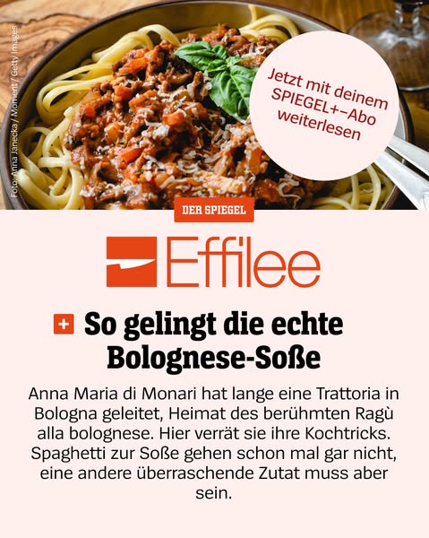
This ad promotes Effilee magazine with an article on Bolognese sauce.
# Brand positioning
Effilee is presented as a culinary magazine that shares cooking tips and articles. The brand aims to occupy a space in the consumer's mind as a source of cooking knowledge and inspiration for those interested in Bolognese sauce.
# Product
The product is an article in Effilee magazine focused on Bolognese sauce. The article, written by Anna Maria di Monari, who led a Trattoria in Bologna, shares cooking tricks for making ragù alla bolognese. It highlights that spaghetti is not typically used with the sauce and mentions another surprising ingredient.
# Visual style
The ad has a clean, editorial visual style. The high-quality image of the pasta and sauce gives it a gourmet feel. The use of a beige background and simple typography lends a classic and readable aesthetic. The image treatment is natural, with warm lighting and no obvious filters.
# Hooks
Headline: Jetzt mit deinem SPIEGEL+-Abo weiterlesen
# Benefits
- [object Object]
# Features
- [object Object]
- [object Object]
# Call to action
None used.
# Point of view
- [object Object]
- [object Object]
# Storyline
- The ad shows a bowl of Bolognese sauce on pasta, implying the magazine offers recipes and food-related content. This is from the brand's perspective.
- A text bubble promotes a SPIEGEL+ subscription to read the article, indicating the magazine is associated with SPIEGEL. This comes from the brand.
- The text below the brand logo introduces the topic of the article, highlighting it provides tips on how to make authentic Bolognese sauce, which is from the magazine’s perspective.
- The text describes the author's experience and teases the reader by mentioning the surprise ingredient and the no-spaghetti rule. This is from the author’s/magazine's perspective, drawing the reader to want to know more.
# Ad summary
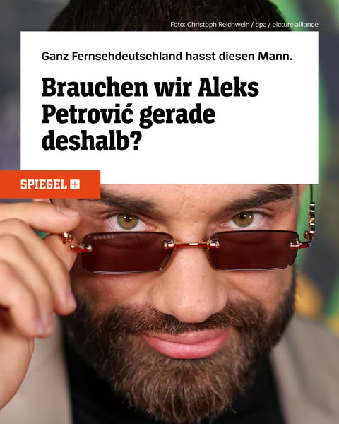
The ad uses a provocative headline about a public figure to pique curiosity and drive clicks. The ad is designed to generate interest by presenting a controversial statement about Aleks Petrović, aiming to draw viewers into clicking the link to understand why "all of German television hates this man."
# Brand positioning
The brand in this ad is Spiegel, a German news publication. The brand positions itself as a source of in-depth reporting and analysis on current events and public figures. By using a provocative headline, Spiegel aims to capture attention and demonstrate its ability to deliver intriguing and controversial stories. This approach suggests the brand isn't afraid to tackle contentious subjects, aligning with a value proposition of delivering unfiltered and engaging news.
# Product
The product being advertised is a news article or feature piece about Aleks Petrović, available through Spiegel's online platform. The ad highlights a story angle that suggests Petrović is a polarizing figure, prompting the audience to seek more information. The ad doesn't detail specific features or ingredients but instead focuses on the intrigue and potential controversy associated with the subject matter. The key value proposition is the promise of an engaging and possibly controversial story, framed to overcome the barrier of generic news fatigue.
# Visual style
The ad features a mix of journalistic and celebrity aesthetic. The photo of the man is high-quality and close up, which conveys intimacy and immediacy, while the text overlay mimics a news headline, lending credibility. The overall style is designed to grab attention and provoke curiosity.
# Hooks
Headline: Ganz Fernsehdeutschland hasst diesen Mann.
# Benefits
- [object Object]
# Features
- [object Object]
# Call to action
None used.
# Point of view
- [object Object]
# Storyline
- The ad opens with the provocative statement "Ganz Fernsehdeutschland hasst diesen Mann" (All of German television hates this man), aiming to immediately grab attention and create intrigue. This is the brand speaking, setting up the central question. The intention is to pique the viewer's curiosity and make them want to know who the man is and why he is so disliked.
- The copy follows with a question, "Brauchen wir Aleks Petrović gerade deshalb?" (Do we need Aleks Petrović precisely because of that?), posing a thought-provoking counterpoint to the initial statement. This is the brand speaking, continuing to build suspense and inviting the audience to question their own perception. The intention is to drive further engagement and position the story as something deeper than just a simple condemnation.
- The image shows Aleks Petrović looking directly at the viewer, with a slight smirk and raised glasses, which is placed below the copy. This image of Aleks Petrović contributes to the narrative by directly confronting the audience with the subject of the controversy. The intention is to humanize Petrović and further intrigue the viewer, encouraging them to click and learn more.
# Ad summary
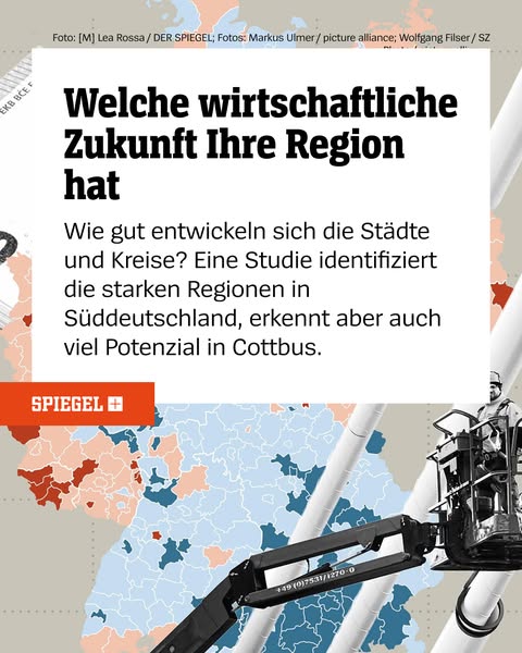
This ad is for a German publication called "SPIEGEL" that provides economic information related to Germany's future. The ad is promoting the publication's study that identifies strong regions in Southern Germany, while recognizing the potential in Cottbus.
# Brand positioning
SPIEGEL is being promoted as a credible German publication that provides its readers with the most current, need-to-know information. Their study identifies strong regions in Southern Germany, while recognizing the potential in Cottbus. Their publication aims to occupy a space in the consumer's mind as a highly reputable, trustworthy source of information to help them stay up to date and educated on current events.
# Product
The product being advertised is a Spiegel publication about a study that identifies strong regions in Southern Germany. The study focuses on the economic future of the region. It identifies the strong regions in Southern Germany, while also recognizing a lot of potential in Cottbus.
# Visual style
The ad uses a map of Germany as a visual motif, overlayed with an image of a cherry picker to suggest infrastructure or construction. The design uses a bold, sans-serif typeface for the headline to capture attention, while the body copy is in a more readable serif. The layout is relatively clean and minimal to make the content scannable.
# Hooks
Headline: Welche wirtschaftliche Zukunft Ihre Region hat
# Call to action
None used.
# Point of view
- [object Object]
# Storyline
- The ad begins with a question about the economic future of the viewer's region. This message is intended to grab the viewer's attention by making them consider the stability and economic state of their own community from the brand's perspective.
- The ad continues by explaining that the publication has information about how cities and districts are developing. This is meant to draw the viewer in by describing how the publication provides a solution to the initial question posed in the beginning of the ad, from the brand's perspective.
- The ad closes by stating that the publication's study identifies the strong regions in Southern Germany, while also recognizing the potential in Cottbus. This is meant to leave the viewer with a small taste of the information the brand provides, to get them to act and read their publication for more details, from the brand's perspective.
# Ad summary
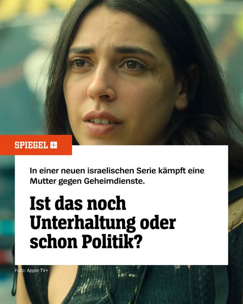
This ad highlights a German news outlet's coverage of a new Israeli series on Apple TV+.
# Brand positioning
Spiegel+ is presented as a news and media outlet that covers international shows. The brand aims to occupy the space of providing insightful coverage on global entertainment.
# Product
The ad highlights a new Israeli TV series available on Apple TV+. It is a series about a mother who is fighting against secret services. The ad's main focus is to raise a question about the nature of the show as entertainment or politics.
# Visual style
The ad has a journalistic and editorial feel. The image is a still from a TV show, and it is framed by editorial text blocks. The production quality is high. The typography is integrated in a clean and legible manner. The ad emulates a news story or review, which may add to its credibility and attention-grabbing power.
# Hooks
Headline: Ist das noch Unterhaltung oder schon Politik?
# Benefits
- [object Object]
# Features
- [object Object]
- [object Object]
# Call to action
None used.
# Point of view
- [object Object]
# Storyline
- The ad introduces a new Israeli series where a mother fights against secret services. This is presented from the brand's perspective as an introduction to their coverage of the series.
- The ad then poses the question: Is this still entertainment or already politics? This is from the brand's perspective, inviting the audience to consider the show's themes and relevance.
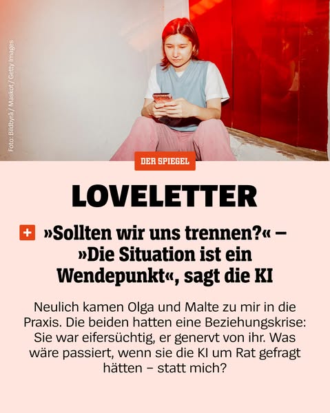
# Ad summary
The ad features a photograph of a young woman on her phone above two quotes from an article titled "Loveletter." The first quote asks, "Should we break up?" and the second is from AI and states, "The situation is a turning point."
# Brand positioning
The ad comes from Der Spiegel, a German weekly news magazine. The brand is presented as being on the cutting edge of current issues. The focus is on AI, which suggests that the brand embraces technology and innovation.
# Product
The ad promotes an article from Der Spiegel titled "Loveletter" that explores the impact of AI on relationships. The article appears to address relationship issues and how AI might provide solutions. The product aims to provide readers with cutting edge perspectives on technology and its potential effects on relationships.
# Visual style
The ad uses a clean and modern visual style. The lighting is soft, and the color palette is muted. The photo has a real-life vibe, which creates a sense of authenticity and relatability. The addition of the logo and quotes gives it a professional and informative look. The integration of text and image is seamless, making it easy to scan.
# Hooks
Headline: LOVELETTER
# Call to action
None used.
# Point of view
- [object Object]
- [object Object]
- [object Object]
# Storyline
- The image shows a young woman looking at her phone, which is meant to capture attention and create a sense of relatability with the audience. This presents a real life scene to draw viewers in. The perspective is from an observer's point of view.
- The article's title, "Loveletter," combined with a provocative question about breaking up, piques the audience's curiosity. The article teases a story about relationships. The perspective is from the brand to intrigue the viewer.
- The quote from AI positions the article as providing modern, tech-driven insights into personal problems. This offers a potential solution or alternative perspective. The perspective is from AI.
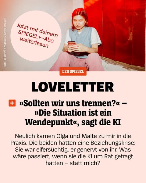
# Ad summary
An ad for Der Spiegel features an image of a person on their phone above a conversation about seeking AI's advice on a relationship instead of a therapist.
# Brand positioning
Der Spiegel presents itself as a provider of thoughtful analysis on a wide range of topics, as implicitly suggested by the content of this ad. The brand's focus on current events and cultural issues positions it as a source of in-depth knowledge and understanding. By exploring complex topics like relationship advice from AI, Der Spiegel appeals to intellectually curious consumers seeking to stay informed and engaged with the world around them.
# Product
The product advertised is Der Spiegel's digital subscription service, Spiegel+. The ad presents Spiegel+ as a source of advice, using the example of a couple seeking relationship help. The service is positioned as an alternative to traditional methods like therapy, suggesting Spiegel+ offers modern solutions and perspectives on personal issues. It addresses the purchase barrier of needing expert advice by presenting the service as a readily available resource for insightful analysis.
# Visual style
The ad has a modern, editorial aesthetic with a focus on clean design and minimal clutter. The production quality appears to be professional. The image treatment includes color grading that enhances the pink and red tones, creating a cohesive look. Typography is integrated in a bold, caption-style to grab attention. The style of the ad mimics native platform content while maintaining a high-design feel, enhancing scannability in the feed.
# Hooks
Headline: LOVELETTER
# Call to action
None used.
# Point of view
- [object Object]
- [object Object]
# Storyline
- The image shows a person sitting and looking at their phone, implying they are actively engaged with digital content. This sets the stage by visually connecting the viewer to the digital nature of the advertised service from a customer point of view.
- The headline introduces the provocative question of whether a couple should seek advice from AI instead of a therapist. From the brand's point of view, this is intended to pique the viewer's interest by presenting a relevant and timely issue.
- The body copy then provides context by describing a couple, Olga and Malte, who are experiencing relationship problems and were considering asking an AI for advice, illustrating the product's application to real-life issues from the brand's point of view.
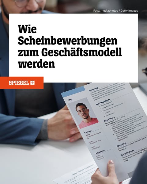
# Ad summary
This ad is for a news article about fake job applications that are used as a business model.
# Brand positioning
SPIEGEL+ is a news media outlet offering investigative and insightful journalism. It appears to be a subscription-based service, offering readers in-depth coverage and analysis of current events and trending topics. The brand aims to occupy a space in the consumer's mind as a reliable source of quality journalism. It promotes values of integrity and in-depth reporting. It ignores the behaviors of superficial or sensationalist reporting often seen in mass media.
# Product
This ad promotes an article on SPIEGEL+ titled "Wie Scheinbewerbungen zum Geschäftsmodell werden". The article investigates the phenomenon of fake job applications being used as a business model. The topic is relevant for job seekers, HR professionals, and anyone interested in understanding modern business practices. The ad suggests SPIEGEL+ offers in-depth and investigative journalism on contemporary business topics.
# Visual style
The ad features a combination of studio-shot imagery and text overlays to convey its message. The overall visual aesthetic is clean and professional, with a focus on clarity and readability. The image treatment includes background blurring and color grading to enhance the visual appeal. The typography integration is large and bold. The style contrasts with platform-native content.
# Hooks
Headline: Wie Scheinbewerbungen zum Geschäftsmodell werden
# Benefits
- [object Object]
# Features
- [object Object]
# Call to action
None used.
# Point of view
- [object Object]
- [object Object]
# Storyline
- The ad presents a headline about fake job applications becoming a business model. The intention is to grab the viewer's attention and introduce the topic of the SPIEGEL+ article. The audience is experiencing it from the brand's perspective.
- The ad features an image of a CV being reviewed by a potential employer. The intention is to provide a visual context to the article and make the topic more relatable to the audience. The audience is experiencing it from an external source perspective.
- The ad features the SPIEGEL+ logo. The intention is to promote the brand as the source of the article. The audience is experiencing it from the brand's perspective.
How Other Entertainment Brands Advertise on Meta
Peer brands in Motion's library — click any brand to see their creative strategy, live ads, and AI breakdowns.