

# Ad summary
This ad uses trending meme footage to promote the dating app QuackQuack.
# Brand positioning
The ad does not go into detail on how the app works, but QuackQuack is implied as the app to use to find a girlfriend.
# Product
QuackQuack is a dating app that connects people together. No other feature or detail is provided.
# Visual style
The video is a combination of regular footage and meme footage. The regular footage takes place in a brightly lit environment, and the camera angle is set at eye-level to the individuals.
# Benefits
- [object Object]
# Features
- [object Object]
# Call to action
None used.
# Point of view
- [object Object]
# Storyline
- 00:00–00:02 00:00–00:02 A woman approaches a man standing next to an SUV and asks if she can ask him a question.
- 00:02–00:05 00:02–00:05 The woman asks the man whether he is single or has a girlfriend. The man replies that he has a girlfriend.
- 00:06–00:07 00:06–00:07 A popular meme of a man laughing with the text overlay "He Boy" implying his excitement.
- 00:07–00:10 00:07–00:10 The woman asks the man where he met his girlfriend, to which he replies that he met her on the app, QuackQuack.
- 00:11–00:13 00:11–00:13 The woman asks the man approximately how many dates he has gone on using QuackQuack. The man replies "maybe 3".
- 00:15–00:18 00:15–00:18 Another popular meme is displayed of a man looking up and exclaiming "Oh My God! Wow!"
- 00:18–00:24 00:18–00:24 The woman asks the man whether he has deleted the app or whether he still uses it. The man says that he still uses it, implying he talks to other girls.
- 00:24–00:27 00:24–00:27 The video ends with the "suspicious dog" meme.

How QuackQuack Advertises on Meta
Refreshed 4 months ago · Weekly refresh cadence
QuackQuack runs 69 active ads on Meta, shipping ~5 new creatives per week. Their library leans on Spokesperson22%, Testimonial16%, and Text Message10%. Recently, QuackQuack is pushing their core dating app with an almost aggressive focus on trust signals and ease of use, hammering home "photo-verified singles," "no fake profiles," and "genuine users" to overcome skepticism about online dating in India. The creative strategy leans heavily on relatable social scenarios (friends ditching you for dates, asking siblings for setups, late night loneliness) delivered through street interviews, skits, and direct-to-camera testimonials that feel informal and peer-driven rather than polished. There's a consistent throughline around lowering the barrier to entry: dating from home is possible, talking to strangers doesn't have to be tense, and finding someone is as simple as "like, chat, date."
Indexed by Motion's Inspo Library.
The 20 Most Recent QuackQuack Ads on Meta
# Ad summary
This ad for the QuackQuack dating app features a woman standing on a street. She speaks directly to the camera, asking the viewer if they are looking for a perfect partner, then urging them to try QuackQuack. She states it is as easy as liking, chatting, and dating.
# Brand positioning
QuackQuack is presented as an easy-to-use dating app for those looking for a relationship. The brand emphasizes simplicity, stating that finding a partner is as easy as liking profiles, chatting, and going on dates. The app seems to be designed for younger generations looking to make connections online.
# Product
QuackQuack is presented as a dating app designed to facilitate friendships, chats, and matches. It encourages users to 'like, chat, and date,' highlighting the app's straightforward process for connecting with others. The app is available on both Android and Apple devices, making it accessible to a wide range of users. The ad positions QuackQuack as a simple and convenient way to find a partner.
# Visual style
The ad has a simple, straightforward visual style with natural lighting. The editing is minimal, with static shots and direct address. The production quality appears to be mid-range, suitable for social media platforms.
# Benefits
- [object Object]
- [object Object]
# Features
- [object Object]
- [object Object]
- [object Object]
# Call to action
Aaj hi download karo.
# Point of view
- [object Object]
# Storyline
- 00:00–00:01 The ad opens with a woman standing outdoors, speaking directly to the viewer.
- 00:00–00:01 She asks if the viewer is looking for a perfect partner, immediately engaging the audience with a relatable desire.
- 00:02–00:03 The woman suggests trying QuackQuack, positioning the app as a solution for finding a partner.
- 00:04–00:07 She explains the app's process: like, chat, and date, emphasizing its simplicity and ease of use. The tone is friendly and encouraging.
- 00:07–00:09 She ends by saying that it is easy and urges the viewer to download the app today.
- 00:10–00:12 The ad concludes with the QuackQuack logo, tagline ('Friendship. Chat. Match.'), and icons indicating availability on Android and Apple, reinforcing the brand and providing clear next steps.
# Ad summary
This ad for QuackQuack features a street interview where a woman asks a man if he is single or has a girlfriend. After he tells her he has a girlfriend, she asks where he met her. He admits he met her on the QuackQuack dating app and that he still uses the app to talk to other girls.
# Brand positioning
This ad presents QuackQuack as the dating app where the featured male in the ad met his girlfriend. The app seems to position itself as a way for anyone to meet someone, even someone who is already in a relationship. The ad seems to follow in the footsteps of other similar dating apps.
# Product
This ad for QuackQuack seems to present the app as a service that people in relationships can use to talk to others, or as a place to find a relationship. According to the man in the ad, he met his girlfriend through QuackQuack, but still uses it to talk to other girls. The features of the app are not mentioned but the value of the app is presented as a place where you can meet new people.
# Visual style
The ad has an amateur or UGC feel to it. The ad consists of simple interview shots, reaction memes, and text overlays. The ad feels somewhat quick paced due to the interspersion of reaction memes.
# Benefits
- [object Object]
# Features
- [object Object]
# Call to action
None used.
# Point of view
- [object Object]
- [object Object]
# Storyline
- 00:00–00:03 The ad begins with a woman approaching a man in the street.
- 00:03–00:05 She asks him if he is single or has a girlfriend.
- 00:05–00:05 The man replies that he has a girlfriend.
- 00:05–00:07 This cuts to a reaction meme from a man who smiles widely.
- 00:08–00:09 The interviewer asks the man where he met his girlfriend.
- 00:09–00:10 The man admits that he met her on QuackQuack.
- 00:11–00:13 The interviewer asks how many dates he has been on from the app.
- 00:13–00:14 He replies "maybe three."
- 00:14–00:18 This cuts to another reaction meme of a man who says "Oh my god."
- 00:18–00:21 The interviewer replies, "Wow," and asks if he deleted the app or still uses it.
- 00:21–00:24 The man states that he still uses the app because he still talks to other girls on it.
- 00:24–00:27 The ad ends with a third reaction meme of a dog who gives a disapproving look.
# Ad summary
This ad promotes the QuackQuack app, which helps users make new friends, chat, and match from the comfort of their homes. The ad presents the app as a solution for people who want to date but feel tension when talking to new people. It emphasizes the app's genuine users and encourages viewers to download and try it.
# Brand positioning
QuackQuack is presented as a modern dating app designed to ease the anxiety of meeting new people. The brand focuses on comfort, safety, and genuine connections, contrasting with the often superficial and stressful experiences of other dating apps. It promotes a user-friendly approach where individuals can chat and match from their home, implying a relaxed and low-pressure environment. The brand aligns with values of authenticity and ease, positioning itself as a solution for those seeking genuine relationships without the traditional dating hurdles.
# Product
QuackQuack is a dating app designed to help people make new friends, chat, and find potential matches from the comfort of their own homes. The app addresses the tension some people feel when talking to new people, providing a platform where users can first chat and then match if they feel a connection. It emphasizes the presence of genuine users and assures a safe, worry-free environment. The app is available for download on both Google Play and the App Store, making it accessible to a broad audience. QuackQuack simplifies the dating process by allowing users to connect in a relaxed and convenient setting, ensuring that interactions are authentic and stress-free.
# Visual style
The ad has a casual, UGC-style aesthetic with natural lighting and simple editing. The cuts are quick but not overly fast-paced, giving a sense of authenticity. The production quality is relatively low-fi, enhancing the relatable feel of the ad. Visual motifs include text overlays and app interface shots to highlight the app's features and benefits. The pacing is consistent throughout, with cuts timed to match the speaker’s rhythm.
# Benefits
- [object Object]
- [object Object]
# Features
- [object Object]
- [object Object]
# Call to action
Download kar lo.
# Point of view
- [object Object]
# Storyline
- 00:00–00:05 A young woman stands in a park and says she wants to date, but feels nervous about talking to new people.
- 00:05–00:10 The woman recommends downloading the QuackQuack app, followed by a scene of her at home.
- 00:08–00:14 She states users can meet new people from the comfort of their home using the app, followed by a scene of her using the app in a park.
- 00:11–00:14 She explains users can chat first, and match if they like each other.
- 00:14–00:19 She assures viewers that all users on the app are genuine, so they don't need to worry.
- 00:19–00:21 She concludes by telling viewers to download the app.
# Ad summary
This ad is designed to feel like a relatable skit, where the 'girlfriend' is actually promoting the dating app Quack Quack in a comedic twist.
# Brand positioning
Quack Quack is presented as a modern dating app for young adults who are frustrated with their current dating prospects. The brand embraces a playful tone and humor, suggesting it offers a fun and easy way to find romantic connections. The ad implies Quack Quack challenges the norm of relying on friends for matchmaking by positioning itself as a more reliable and direct alternative. The brand aims to be seen as a solution for those seeking a more extensive and diverse dating pool.
# Product
Quack Quack is introduced as a dating app that provides a platform for young adults to find romantic partners. The ad implies the app is easy to use and offers a wide selection of potential matches, positioning it as a solution for those dissatisfied with their current dating options. The app's main selling point is its ability to connect users with a large pool of women. The ad addresses the common frustration of relying on friends for setting up dates, suggesting Quack Quack offers a more direct and efficient way to find a girlfriend.
# Visual style
The ad has a casual, UGC-like aesthetic. The video appears to be shot at night with available light. The editing includes quick cuts to maintain a brisk pace. The change to black-and-white at the end creates a comedic twist. The production quality is basic, which aligns with the intended tone of a relatable and informal endorsement. The pacing is quick, with roughly 5 cuts in 21 seconds.
# Benefits
- [object Object]
- [object Object]
- [object Object]
# Features
- [object Object]
# Call to action
Download Quack Quack.
# Point of view
- [object Object]
# Storyline
- 00:00–00:06 00:00–00:06 A man confronts a woman on a balcony at night, accusing her friend Neha of setting him up with someone unpleasant. The message is that the man is clearly annoyed and blames the woman for a bad setup.
- 00:06–00:14 00:06–00:14 The woman tells the man to "Get lost" and promotes Quack Quack as an alternative way to find a girlfriend, boasting that "there are so many women" on the app and that he's sure to find someone better than her friend. The message is that Quack Quack is a reliable solution for finding a better romantic connection, directly responding to the man's complaint.
- 00:15–00:17 00:15–00:17 The man is surprised and asks the woman how she knows about Quack Quack, building intrigue and implying she uses the app herself. The man is confused about how the woman would know the name of this app, conveying that it is not as widely known and that he is curious to know how she is aware of it.
- 00:17–00:21 00:17–00:21 The woman smirks slyly and a black-and-white filter appears with jaunty music, hinting at the twist that she uses the app too. The message is that the woman is secretly a user of Quack Quack, adding humor and a final call to action.
# Ad summary
A woman speaks directly to the camera, encouraging viewers to use the QuackQuack dating app. She emphasizes that the app has photo-verified singles and doesn't have fake profiles.
# Brand positioning
QuackQuack is presented as a dating app focused on safety and authenticity. The ad highlights the photo-verified singles and the lack of fake profiles, suggesting the brand aims to provide a trustworthy and reliable platform for finding genuine connections. This positioning pushes against the perception of many dating apps being filled with fake or misleading profiles. QuackQuack targets users who value safety and transparency in their online dating experience and is positioned as easy to use.
# Product
QuackQuack is a dating app that helps users meet singles in their city. A key feature highlighted is the photo verification process, which ensures that the app only contains profiles of real people and eliminates fake profiles. The app is presented as easy to use and provides a safe and trustworthy environment for users seeking genuine connections. The ad addresses the pain point of encountering fake profiles on dating apps, positioning QuackQuack as a solution with its verification system.
# Visual style
The ad has a simple, natural aesthetic with an emphasis on the presenter. The editing style involves direct cuts between shots of the woman speaking, with text overlays to reinforce her message. The production quality appears to be mid-tier, resembling UGC or social media content. The pacing is relatively quick, keeping the viewer engaged with short, concise statements.
# Benefits
- [object Object]
- [object Object]
# Features
- [object Object]
- [object Object]
# Call to action
Install karo
# Point of view
- [object Object]
# Storyline
- 00:00–00:02 A woman looks directly at the camera and asks why the viewer, if single, is not on a dating app.
- 00:03–00:06 She then encourages the viewer to install QuackQuack and meet singles in their city. This is a direct call to action.
- 00:07–00:08 The woman highlights that QuackQuack features photo-verified singles, which leads to the next point.
- 00:09–00:11 She emphasizes that because of the photo verification, there are no fake profiles on QuackQuack, addressing a common concern among dating app users.
- 00:11–00:14 She emphasizes it is very easy to use and encourages viewers to try it.
# Ad summary
This ad promotes the QuackQuack dating app, stating that although the user installed the app because their friends did, their friends are now busy chatting with girls at home instead of going out on weekends.
# Brand positioning
The QuackQuack dating app is presented as a modern solution for meeting people, contrasting with traditional social gatherings. The brand positions itself as the enabler of connection. It seems to appeal to individuals seeking companionship online, providing an alternative to physical outings. The brand is taking on the status quo by implying that online interactions can be more convenient than meeting in person, suggesting a preference for digital social experiences.
# Product
QuackQuack is presented as a dating app that facilitates connections between people. The ad emphasizes the app's role in enabling users to chat with girls from the comfort of their homes, contrasting with traditional social activities like meeting up on weekends. The ad uses a humorous, slightly cynical tone to suggest that the app is so effective that it keeps users engaged online rather than participating in real-world social events. The key selling point is convenience and accessibility, particularly the ability to connect with others from home.
# Visual style
The ad uses a lo-fi aesthetic, shooting in a vertical format in low light. The editing style is static, with a single long take and no transitions, creating a simple, observational feel. The video appears to be taken from a mobile phone, adding to the UGC feel. The pacing is slow, reflecting the continuous flow of traffic and people, with no audio-visual synchronization.
# Benefits
- [object Object]
- [object Object]
# Features
- [object Object]
# Call to action
None used.
# Point of view
- [object Object]
# Storyline
- 00:00–00:14 The video opens with a wide shot of a busy street at night. Cars, motorcycles, and buses drive by, and people are seen walking along a sidewalk with various vendors.
# Ad summary
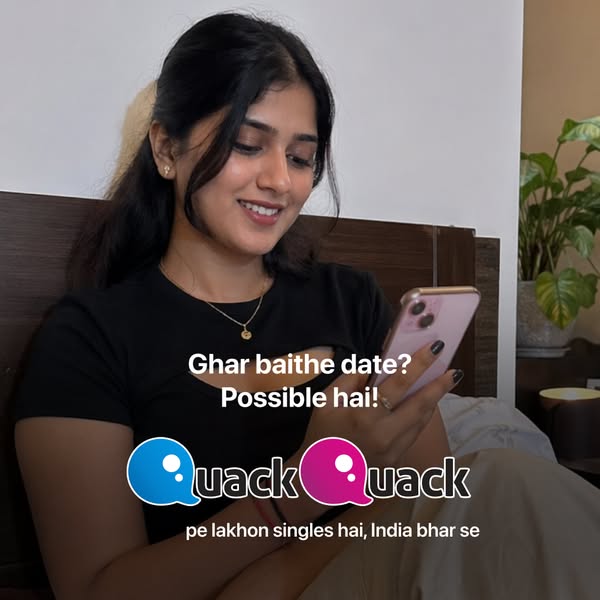
This image ad for Quack Quack targets users looking for connections with other singles. The creative features a happy-looking woman looking at her phone, with ad copy that reads, 'Ghar baithe date? Possible hai! pe lakhon singles hai, India bhar se'.
# Brand positioning
Quack Quack is presented as a modern dating app that enables users to connect with singles from across India, all from the comfort of their homes. The overall impression is one of accessibility and ease, suggesting that finding a date is easily achievable through the platform. The brand does not obviously push against category norms.
# Product
Quack Quack is an online dating app that connects singles in India, from their own homes. The primary appeal of the app, as highlighted in the ad, is its convenience, implying that users can easily find dates without the need to go out or change their routine. The ad copy states, 'pe lakhon singles hai, India bhar se', suggesting a large user base from across India. This hints at the app's popularity and reach, overcoming potential purchase barriers by assuring users of a vibrant community and diverse options.
# Visual style
The ad has a casual and approachable aesthetic, resembling user-generated content with its informal setting and natural lighting. The focus is on a real person in a realistic environment, giving it a relatable and authentic feel.
# Hooks
Headline: Ghar baithe date? Possible hai!
# Benefits
- [object Object]
# Call to action
None used.
# Point of view
- [object Object]
# Storyline
- The ad presents a young woman smiling at her phone, while the text reads 'Ghar baithe date? Possible hai!' This captures the viewer's attention with the concept of dating from home, showing the user's perspective.
- The Quack Quack logo appears, with the text 'pe lakhon singles hai, India bhar se'. The brand is telling the audience that the app has many singles across India.
# Ad summary
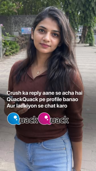
The ad shows a young woman standing outside. Text at the top says that instead of waiting for a reply from a crush, one should create a profile on QuackQuack and chat with girls.
# Brand positioning
QuackQuack is presented as a modern dating app, designed for users seeking connection and conversation without the pressure of traditional dating norms. The brand appears to push against the common frustration of unrequited interest and lack of communication, positioning itself as a proactive solution for finding companionship and engaging in meaningful interactions. By suggesting users "chat with girls" (translated from Hindi), the brand promotes a fun and accessible approach to dating, inviting users to take control of their romantic lives with confidence and ease.
# Product
The ad promotes QuackQuack, which is presented as a dating app that is used to create a profile and chat with girls. The ad presents itself as an alternative to the frustration of waiting for a reply from a crush.
# Visual style
The ad features a natural, unfiltered, UGC-style visual, which creates a sense of authenticity. The focus is on the subject, with a simple outdoor background. There are no filters, retouching, or staged compositions. The ad aims for a casual, relatable style.
# Hooks
Headline: Crush ka reply aane se acha hai
# Call to action
None used.
# Point of view
- [object Object]
- [object Object]
# Storyline
- From the brand's POV, a woman stands outside and the text above says that instead of waiting for a crush to reply, you should create a profile on QuackQuack and chat with girls. This is to grab the viewer's attention.
- The brand's logo is at the bottom and is meant to reinforce brand recognition.
# Ad summary
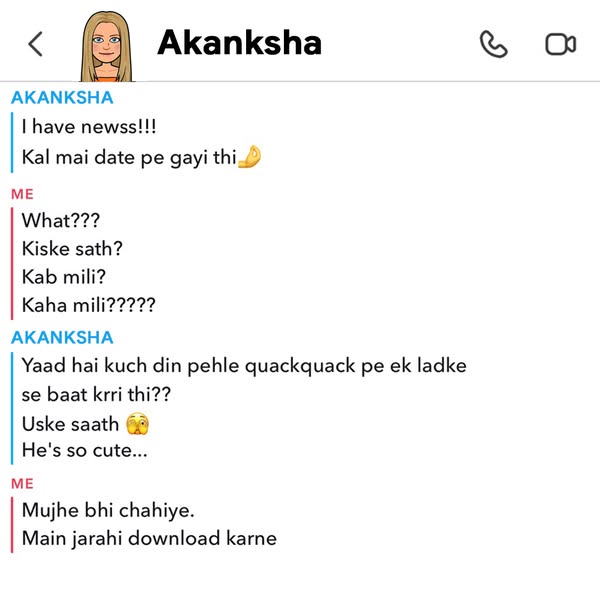
This ad is a screenshot of a conversation where one person tells the other that they went on a date with someone from the dating app 'QuackQuack' and the other responds that they also want to download the app.
# Brand positioning
This ad promotes QuackQuack, a dating app that appears to cater to a young audience seeking connections. The app is presented as a platform where users can meet people and go on dates, as showcased through a user's experience. The brand aims to position itself as a modern and accessible avenue for finding romance, with a lighthearted tone and focus on user-friendly experiences.
# Product
This ad showcases QuackQuack, a dating app designed to connect people for dating purposes. The ad highlights the app's function of enabling users to meet potential partners, as evidenced by the conversation where one person shares their experience of going on a date with someone they met on the app. The app is presented as easy to use and effective in facilitating real-world connections, with the intention of enticing viewers to download it.
# Visual style
The ad uses a platform-native style by mimicking a phone's text conversation user interface. The screenshot is clean and simple, with text organized in a chronological order. This contributes to the scannability of the ad, since most people are familiar with the format of text messages and know how to read the conversation.
# Hooks
Headline: I have newss!!!
# Benefits
- [object Object]
- [object Object]
# Features
- [object Object]
# Call to action
None used.
# Point of view
- [object Object]
# Storyline
- Akanksha initiates the conversation by excitedly informing the other person that she has 'newss!!!' and that she went on a date yesterday. This serves to pique the viewer's curiosity, from Akanksha's perspective.
- The other person responds with a series of questions expressing surprise and interest, asking who she went with, when they met, and where. This expresses the listener's curiosity and builds anticipation for further details about the date, from the listener's perspective.
- Akanksha reveals that she went on a date with someone she had been talking to on QuackQuack and describes him as 'so cute.' This emphasizes that the app can lead to successful dates with attractive people, from Akanksha's perspective.
- The other person responds by saying they also want the app and that they're going to download it. This serves as a testimonial of how the product solves the problem of finding a date by being successful in meeting new people, from the listener's perspective.
# Ad summary
This ad utilizes a comedic skit to highlight the QuackQuack dating app. A woman promotes the app to her brother as a solution for him to find a partner instead of asking her to set him up with her friends.
# Brand positioning
The brand, QuackQuack, is positioned as a modern solution to finding a partner, especially for young adults. It is presented as an alternative to traditional methods such as asking friends for set-ups, promoting a more direct and independent approach to dating. The brand aligns with the values of convenience and choice, offering a wide range of potential matches through its app. It pushes against the norm of relying on personal connections and suggests a more efficient, tech-enabled solution. The brand positioning is functional, emphasizing the practicality and accessibility of finding a partner through their platform.
# Product
The featured product is the QuackQuack dating app, presented as a platform for individuals seeking to find a partner. It is implied to be user-friendly and filled with numerous potential matches, positioned as being better than relying on friends for setups. The app addresses the purchase barrier of inconvenience and limited options by offering a vast selection of people to connect with directly. The ad showcases the app as a modern solution for meeting new people and finding relationships independently. The ad subtly suggests the app is a better, more efficient way to find a partner compared to traditional methods.
# Visual style
The ad has a UGC feel, resembling content shot on a phone with natural lighting. The editing is minimal with static shots and basic cuts. The production quality is low-end, aligning with a casual tone suitable for social media. The pacing is consistent, and cuts are timed to coincide with spoken lines, enhancing the comedic effect.
# Benefits
- [object Object]
# Features
- [object Object]
# Call to action
None used.
# Point of view
- [object Object]
# Storyline
- 00:00–00:02 A man asks his sister to set him up with her friend, Neha.
- 00:02–00:09 00:02–00:09: The sister, annoyed by her brother's request, tells him to download the QuackQuack app and find someone there. She claims there are many girls on the app who are better than her friends, conveying the benefit of the app. The dialogue is from the sister's perspective as she is expressing her annoyance.
- 00:09–00:11 00:09–00:11: The brother questions how she knows about QuackQuack. He is suspicious, implying she uses it herself. The tone is inquisitive and slightly judgmental.
- 00:11–00:13 00:11–00:13: The video turns black and white and cartoon sound effects play, conveying the brother is suspicious of the sister using QuackQuack.
# Ad summary
This ad promotes QuackQuack, a dating app. The ad features a brother and sister sitting together. The brother asks his sister to set him up with her friend, and she suggests he download the QuackQuack app to find someone himself.
# Brand positioning
QuackQuack is presented as a modern, user-friendly dating app for young adults. The ad positions the app as a solution for singles looking for relationships, suggesting it offers a wide selection of potential matches—even better than the sister's friends. The brand messaging is functional, focusing on the app's practical benefits for meeting new people rather than emotional appeals or lifestyle associations.
# Product
QuackQuack is a dating app designed to help users find relationships. The ad highlights the app's ability to connect users with many potential matches, implying a diverse and active user base. It suggests that users can find better matches on the app than through traditional social circles, addressing the pain point of limited options. The ad encourages users to download the app and independently find partners, presenting it as an efficient and empowering solution for singles.
# Visual style
The ad has a low-budget, UGC feel with static shots. The editing is minimal, and the production quality is basic, giving it a relatable and authentic vibe.
# Benefits
- [object Object]
- [object Object]
# Features
- [object Object]
# Call to action
None used.
# Point of view
- [object Object]
# Storyline
- 00:00–00:02 A man asks his sister to set him up with her friend.
- 00:02–00:06 00:02–00:06 The sister tells her brother to download the QuackQuack app and find someone himself.
- 00:06–00:09 00:06–00:09 The sister says there are many girls on QuackQuack who are better than her friends.
- 00:09–00:11 00:09–00:11 The brother asks how she knows about QuackQuack.
- 00:11–00:13 00:11–00:13 The video switches to black and white with the QuackQuack logo.
# Ad summary
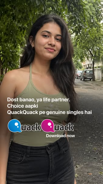
This ad for QuackQuack features a young woman and invites viewers to download the app to find either friends or a life partner.
# Brand positioning
QuackQuack is presented as a modern dating app for young adults looking for genuine connections. The ad emphasizes the app's ability to help users find either friends or a life partner, suggesting a flexible approach to dating and relationship-building. The brand aims to occupy a space in the consumer's mind as a platform for authentic relationships and choice in dating. It presents itself as a fun, accessible option for individuals seeking companionship and connections that are not based on hook-up culture or antiquated traditional relationship paradigms.
# Product
QuackQuack is a dating app designed to help users find friends or life partners. The ad emphasizes that the app features 'genuine singles'. The primary USP lies in the app's promise of authenticity and choice, as highlighted by the tagline 'Choice aapki' (Your Choice). The ad encourages users to download the app now to explore these opportunities.
# Visual style
The ad features a natural, candid aesthetic that aims to appeal to a younger demographic. The image is shot outdoors with soft lighting, giving it an authentic feel. The typography is clean and modern, and the ad utilizes simple graphics to highlight key messages and brand elements.
# Hooks
Headline: Dost banao, ya life partner. Choice aapki
# Benefits
- [object Object]
# Features
- [object Object]
# Call to action
Download now
# Point of view
- [object Object]
# Storyline
- The ad opens with a young woman posing in front of an outdoor backdrop. This establishes the visual theme and setting for the ad, inviting the viewer to step into her world and consider her perspective.
- The text then appears, stating, 'Dost banao, ya life partner. Choice aapki (Make friends, or life partner. Your choice)'. This phrase clarifies the app's purpose and highlights the user's freedom to choose the type of relationship they seek on the platform.
- The ad features the QuackQuack logo to reinforce brand recognition. It also features the text 'QuackQuack pe genuine singles hai (On QuackQuack, there are genuine singles)' to emphasize the app's value proposition and attract potential users.
- The ad concludes with the call to action, 'Download now,' encouraging the viewer to take the next step and engage with the app. The brand is conveying that the viewer has agency and can download the app now.
# Ad summary
This ad for the QuackQuack dating app features a woman in a casual outdoor setting, explaining the app's features. She emphasizes the ability to meet local singles, the app's photo verification process, and the ease of use. The ad encourages viewers to try the app now.
# Brand positioning
QuackQuack is presented as a modern, accessible dating app focused on connecting local singles. The brand emphasizes safety and authenticity by highlighting photo verification and the elimination of fake profiles, positioning itself as a trustworthy platform for genuine connections. The brand appears fun and easy to use, presenting a friendly approach to online dating. It seems to ignore the high pressure of dating apps by offering a more relaxed approach. It focuses on functional benefits like verified profiles, suggesting a commitment to a secure and enjoyable user experience.
# Product
The QuackQuack dating app is presented as a platform to connect with singles in the user's city, emphasizing the feature of photo-verified singles to eliminate fake profiles. The ad highlights ease of use and genuine connections with local people. The product is for anyone who is single and is looking to find relationships in their own city, particularly targeting those who are wary of fake profiles and want a safer, more authentic dating experience. The ad addresses the barrier of distrust in online dating by promoting the verification process and user-friendly design. It shows the product is worth trying because it offers verified profiles and local connections, making it easier to meet real people nearby.
# Visual style
The ad has a simple, UGC-style aesthetic, with natural lighting and minimal editing. The production quality appears casual, suggesting a grassroots or authentic feel. The editing is straightforward, with static shots and simple transitions. The pacing is relaxed, matching the conversational tone. The cuts sync with the changes in topic or the appearance of on-screen text, enhancing the clarity of the message.
# Benefits
- [object Object]
- [object Object]
# Features
- [object Object]
# Call to action
Install
# Point of view
- [object Object]
# Storyline
- 00:00–00:04 The ad starts with a woman directly addressing the viewer.
- 00:00–00:04 She asks if the viewer is single and not on a dating app, expressing surprise. The purpose of this is to challenge the viewer and pique their interest, making them question why they aren't using a dating app. The audience experiences the ad from the woman's perspective, conveyed through her direct address and curious tone.
- 00:00–00:04 This serves as a hook to draw them in and establish a need.
- 00:05–00:06 Next, the ad transitions to displaying the QuackQuack logo and an 'Install' button. The app logo is highlighted, followed by an encouragement to install. This is a call to action, immediately presenting a solution to the initial question.
- 00:05–00:06 The perspective shifts to the brand, showcasing the app and its availability.
- 00:07–00:08 Following this, the woman reappears, encouraging the viewer to install QuackQuack and meet singles in their city. She promotes the app's core function, highlighting the possibility of connecting with local singles. This reinforces the previous call to action.
- 00:07–00:08 The focus remains on the benefits of using the app, delivered from the woman's friendly perspective.
- 00:09–00:13 The woman continues, explaining the app's photo-verified singles feature, addressing the issue of fake profiles. She emphasizes the absence of fake profiles, building trust in the app's authenticity. This directly responds to potential user concerns about the safety of online dating.
- 00:09–00:13 She speaks from a user's perspective, addressing potential concerns. The tone is reassuring and informative.
- 00:14–00:18 Lastly, she affirms the app's ease of use and encourages viewers to try QuackQuack. The ad concludes with a positive affirmation and final call to action, solidifying the brand's message.
- 00:14–00:18 This reinforces the message that the app is easy and user-friendly. The tone is friendly and inviting.
# Ad summary
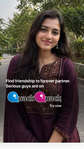
This ad for QuackQuack is focused on attracting serious men. The image focuses on a woman's face and body, with text layered over it.
# Brand positioning
QuackQuack is presented as a dating app that caters to individuals seeking meaningful relationships, ranging from friendships to long-term partnerships. The brand explicitly targets those who are looking for serious connections, as emphasized by the tagline 'Serious guys are on.' This positions QuackQuack as a platform that aims to differentiate itself from casual dating apps by focusing on users with genuine intentions and a desire for commitment.
# Product
QuackQuack is an online dating application designed to connect individuals looking for relationships, ranging from friendships to potential long-term partnerships. The platform is explicitly marketed towards individuals seeking serious connections. The ad directly targets men who are seeking genuine relationships.
# Visual style
The visual style is naturalistic with soft focus. The photograph appears to be shot in natural light, giving it an authentic and approachable feel. The aesthetic emphasizes the person rather than flashy graphics.
# Hooks
Headline: Find friendship to forever partner.
# Benefits
- [object Object]
# Features
- [object Object]
# Call to action
Try now
# Point of view
- [object Object]
# Storyline
- From the brand's perspective, the ad starts by inviting people to "Find friendship to forever partner." This is to convey the breadth of relationship types available through the app.
- From the brand's perspective, the ad states "Serious guys are on" to explicitly call out that the dating app has the type of user the target audience is looking for.
- The ad ends with a "Try now" call to action for the viewer to start using the product.
# Ad summary
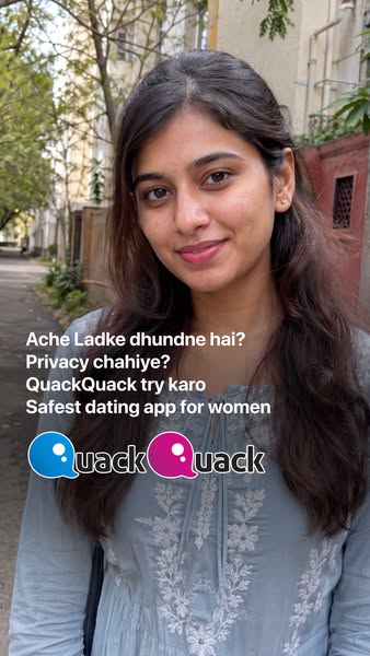
This ad for QuackQuack, a dating app for women, features a testimonial from a woman who asks if the viewer is looking for a good man and privacy, and then tells them to try the app.
# Brand positioning
QuackQuack is presented as a dating app that is safe for women, implying that it prioritizes their safety and privacy. The brand seeks to occupy the space of a reliable and secure platform for women seeking meaningful connections. Its emphasis on safety suggests that it aims to push against the category norm of potential risks and lack of security found on other dating apps. The positioning is functional, focusing on providing a secure and private environment.
# Product
QuackQuack is a dating app that prioritizes privacy and caters specifically to women. It aims to provide a safe and secure platform for women seeking connections. The USPs of the app are its focus on safety and privacy, addressing potential purchase barriers related to concerns about online security and user protection. The ad encourages viewers to try the app, implying it can help them find 'Ache Ladke' (good men) and ensure their privacy while dating online.
# Visual style
The ad has a UGC (user-generated content) aesthetic, with a casual, unfiltered look and feel. The image is shot in natural lighting and has a slightly grainy texture. The background is blurred to keep the focus on the woman. The overall visual style is simple and approachable, designed to mimic an organic in-feed post. The typography is plain and straightforward, with the brand logo integrated at the bottom.
# Hooks
Headline: Ache Ladke dhundne hai?
# Benefits
- [object Object]
# Call to action
None used.
# Point of view
- [object Object]
# Storyline
- The ad begins with a woman asking if the viewer is looking for 'Ache Ladke' (good men). This is intended to grab the viewer's attention by directly addressing their desire for a relationship. This is from the perspective of a customer sharing their own experience.
- The woman then asks if the viewer needs privacy. The intention is to highlight the importance of privacy in online dating, suggesting that the app prioritizes user security. This is from the perspective of a customer.
- Next, the woman directly recommends the QuackQuack app to the viewer. The intention is to encourage the viewer to try the app as a solution to their dating needs, emphasizing its safety and suitability for women. This is from the perspective of a satisfied customer endorsing a product.
- Finally, the ad includes the brand name and tagline, 'Safest dating app for women', reinforcing the app's unique selling proposition. The intention is to leave a lasting impression of the app's safety and suitability for women seeking a secure dating platform. This is from the brand’s perspective, asserting its market position.
# Ad summary
An ad for the QuackQuack dating app, where a girl is standing outdoors and is asking the viewer if they are bored of the single life, and if so, suggests the viewer try the QuackQuack app.
# Brand positioning
The dating app QuackQuack positions itself as a resource for eligible singles to connect, chat, match, and potentially find love or friendship. It is conveyed as a convenient, free platform where users can easily find partners in their local city. The app focuses on accessibility and convenience, implying that it is an easy and risk-free way to meet new people from the comfort of one's home.
# Product
The QuackQuack app is a mobile dating application designed to help individuals find friends, chat, match, and connect with other eligible singles. It is for anyone who is bored with being single and is looking to find friendship or love. It offers a platform to chat with and meet eligible singles from every city in India. It addresses the challenge of meeting new people by providing an easy and accessible way to connect with potential partners from the comfort of their own homes. It’s easy to install, allows free chatting, and provides a convenient way to find love.
# Visual style
The ad features a casual, low-budget aesthetic, which is typical of UGC style content, and likely meant to look authentic and relatable. The editing is minimal with static shots. The pacing is slow and conversational, matching the tone of the speaker.
# Benefits
- [object Object]
- [object Object]
# Features
- [object Object]
- [object Object]
# Call to action
QuackQuack try karo na. (Try QuackQuack)
# Point of view
- [object Object]
# Storyline
- 00:00–00:03 The woman is talking to the camera. She is asking the viewer if they are bored of the single life. The message is to acknowledge the feeling of loneliness that some individuals experience. She addresses the viewer directly to feel as though she’s having a one-on-one conversation with the viewer. The tone is casual and conversational.
- 00:03–00:04 The woman says to try the QuackQuack app. This is meant to introduce the solution to the pain point from the previous moment. She makes the tone light and friendly.
- 00:04–00:08 The woman explains that the app can help find eligible singles from every city in India. This is meant to highlight the app's wide reach. The tone is casual and reassuring.
- 00:08–00:11 The woman explains that you can install the app, chat, and find love at home. This is meant to highlight the ease and convenience of the app. The tone is friendly and persuasive.
# Ad summary
This ad promotes the QuackQuack dating app. It features a woman who acknowledges that it can be hard to talk to strangers on dating apps, and promotes QuackQuack as a place to connect with genuine people.
# Brand positioning
QuackQuack is presented as a dating app designed to ease the tension of meeting new people. The brand's tone is conversational, relatable and casual. The app is positioned as a safe and comfortable space to meet genuine users with the assurance that everyone on the platform is authentic. QuackQuack opposes the issues of fake accounts and catfishing.
# Product
QuackQuack is a dating application for meeting new people in a comfortable and safe environment. The app aims to connect individuals with genuine users, ensuring that interactions are authentic and trustworthy. Users can chat, and if they like the person, they can match with them. The app is presented as a platform where all users are genuine.
# Visual style
The ad has a UGC aesthetic. The editing style consists of static shots and jump cuts. The production quality has a low-budget feel, resembling user-generated content. The pacing is moderate, with a few cuts in a short amount of time.
# Benefits
- [object Object]
- [object Object]
# Features
- [object Object]
- [object Object]
- [object Object]
# Call to action
Ab QuackQuack download karo
# Point of view
- [object Object]
# Storyline
- 00:01–00:05 The ad opens with a woman who says that while it can be fun to date, it can be stressful to talk to new people.
- 00:06–00:12 She then introduces QuackQuack as a way to meet compatible people. She says that users can chat, and if they enjoy the conversation, they can match.
- 00:12–00:15 The ad concludes with her stating that all users on the app are genuine, and encourages viewers to download the app today.
# Ad summary
A woman describes feeling like she wants to share her thoughts at the end of the day. She introduces QuackQuack dating app so people can chat late at night.
# Brand positioning
QuackQuack is presented as a dating app that provides a platform for users to connect and chat, particularly late at night. It aims to occupy the space of a reliable and accessible dating app that caters to users looking for meaningful conversations. The brand is aligned with the values of connection, companionship, and open communication. It positions itself as a user-friendly platform where individuals can easily find someone to share their thoughts and feelings with. It targets individuals who are looking for connections but may be hesitant to engage in traditional dating scenarios.
# Product
QuackQuack is a dating application. It provides a platform for users to connect and chat with each other, especially late at night. The app emphasizes the ease of finding someone who suits your preferences from its large user base. It offers a space for individuals to share their thoughts and feelings, particularly at the end of the day when they feel the need to communicate. QuackQuack addresses the barrier of loneliness and the desire for companionship by providing a convenient and accessible means of connecting with like-minded individuals.
# Visual style
The ad has a simple and casual aesthetic, resembling user-generated content. It is shot in natural light and has minimal editing, which contributes to the authentic and relatable feel. The pacing is consistent, with static shots and simple transitions, creating a straightforward and easy-to-follow narrative. The overall production quality suggests a UGC feel, aiming to resonate with the target audience by presenting the ad in a familiar and accessible format.
# Benefits
- [object Object]
# Features
- [object Object]
- [object Object]
- [object Object]
# Call to action
None used.
# Point of view
- [object Object]
# Storyline
- 00:00–00:05 00:00–00:05 A woman expresses that after a long day, everyone wants to share their thoughts at night.
- 00:05–00:07 00:05–00:07 The woman asks who to share with and introduces QuackQuack.
- 00:07–00:14 00:07–00:14 She shares that QuackQuack has millions of users.
- 00:14–00:17 00:14–00:17 She asks viewers to try the dating app.
# Ad summary
This ad for the QuackQuack dating app uses humor and a direct-to-camera format to address the pain point of being single while friends are in relationships. The ad encourages viewers to download the app and find genuine connections, promising an end to loneliness.
# Brand positioning
QuackQuack is positioned as a dating app focused on helping individuals find genuine connections and combat loneliness. The brand aims to be seen as a solution for those who are single while their peers are in relationships. It promotes the idea of finding a partner from the comfort of home, suggesting convenience and ease of use. The brand pushes against the norm of prolonged singledom and offers a functional solution to the emotional need for companionship.
# Product
QuackQuack is a dating app designed to help users find genuine connections and friendships. It is targeted towards individuals who are single and looking for a serious relationship. The app aims to solve the problem of loneliness by providing a platform where users can find partners from the comfort of their homes. It emphasizes the possibility of finding genuine matches and waving goodbye to loneliness forever. It's available on both Android and Apple devices.
# Visual style
The ad has a simple, straightforward aesthetic with static shots and minimal camera movement. The production quality is clean and polished, resembling a standard commercial. The editing style consists of basic cuts to highlight the presenter and the product visuals. The pacing is moderate, with cuts timed to key messaging points.
# Benefits
- [object Object]
- [object Object]
# Features
- [object Object]
- [object Object]
- [object Object]
# Call to action
Jaldi QuackQuack download karo.
# Point of view
- [object Object]
# Storyline
- 00:01–00:06 The presenter addresses the viewer directly, highlighting the contrast between their single status and their peers' relationship status.
- 00:03–00:05 An image of a broken heart appears overhead as the woman states that other younger people are getting in relationships, whereas you are single.
- 00:06–00:11 She promotes the app as a solution to this problem, urging them to download QuackQuack to find a genuine match at home.
- 00:12–00:14 She encourages the audience to say goodbye to loneliness forever.
- 00:14–00:16 The presenter directly tells the audience to hurry and download the app to try it out.
How Other Technology Brands Advertise on Meta
Peer brands in Motion's library — click any brand to see their creative strategy, live ads, and AI breakdowns.