# Ad summary
This ad demonstrates how to create a website using Framer. It shows how to go to Framer, pick a free template, and customize it to fit your branding.
# Brand positioning
Framer is presented as a user-friendly website building platform that allows anyone to easily create their own website. It's positioned as a tool that provides an advantage in any industry by simplifying the website creation process. The brand aligns with values of simplicity and accessibility, pushing against the notion that website creation is difficult or requires specialized skills. The brand positioning is functional, emphasizing the ease and speed with which users can create a website.
# Product
Framer is a website building platform that enables users to create and customize websites using pre-designed templates. The product is for anyone looking to build a website, particularly those without coding experience. The ad emphasizes the ease of use with free templates that can be customized to match individual branding. USPs include its simplicity, speed, and cost-effectiveness, addressing the purchase barriers of complexity and cost. The ad shows moments of use, such as selecting templates, customizing images and fonts, and publishing the website, highlighting how quickly a user can go from start to finish.
# Visual style
The ad features a blend of polished and UGC-style visuals. The aesthetic is bright and clean, with the product demo segments using screen recordings. The editing rhythm is quick, with cuts timed to transitions. The pacing is moderate, with a mix of static shots and screen recordings. The screen recordings support the intended tone of ease and accessibility. There is a vintage filter on the final product.
# Benefits
- [object Object]
- [object Object]
# Features
- [object Object]
# Call to action
comment “framer” for a free template link
# Point of view
- [object Object]
# Storyline
- 00:00–00:04 00:00–00:04 The ad opens with a laptop displaying a website portfolio, indicating the importance of knowing how to build your own website in any industry. This aims to capture the viewer's attention by suggesting that website building is a valuable and easily attainable skill. The perspective is from a general observer, with a casual and accessible tone.
- 00:04–00:12 00:04–00:12 A female clicks the Framer app icon on the computer dock and opens the app. The user selects the template tab and the cursor hovers over different template options. This communicates how to get started with Framer. The perspective is from a user demonstrating the first few steps to creating a website.
- 00:12–00:24 00:12–00:24 A woman selects the 'use for free' button and then continues to customize the template, including the photo, font, and colors. Then she clicks the 'publish' button. This conveys the user-friendly design of Framer and how easy it is to customize a template, matching it to your own branding. The perspective is from a user who is showing how to easily customize the template.
- 00:24–00:31 00:24–00:31 The ad shows the finished website portfolio. This conveys that the website creation process is simple with Framer. The perspective is from an observer.

How Framer Advertises on Meta
Refreshed 6 weeks ago · Weekly refresh cadence
Framer runs 110 active ads on Meta, shipping ~18 new creatives per week. Their library leans on Screen Recording34%, Headline12%, and How To7%. Recently, framer is doubling down on speed and creative possibility as its core value props, selling the platform as both a rapid deployment tool (minutes not weeks, free templates, instant customization) and a playground for whimsical, high-end design work through effects like easing, glass, and scroll-driven video. They're leaning hard into social proof from big names like SpaceX, Perplexity, and Miro while flooding the zone with creator-led tutorials that show off specific features and weird, delightful use cases like sourdough trackers and interactive Valentine's cards. The through-line is democratized sophistication: framer wants to be seen as the tool that lets anyone ship something fast and polished without sacrificing creative control or personality.
Indexed by Motion's Inspo Library.
The 20 Most Recent Framer Ads on Meta
# Ad summary
This ad demonstrates free fonts used in Framer sites.
# Brand positioning
This ad features the Framer platform, which is not directly mentioned in the ad. The brand is presented as a tool for designers looking to create visually appealing and functional websites. Framer is positioned as a resource for accessing free fonts that can enhance the design of their sites. The brand aligns with a modern, design-conscious lifestyle. The brand positioning is both functional and emotional, appealing to users who want to create high-performing and visually pleasing websites.
# Product
The ad showcases a selection of free fonts suitable for Framer websites. These fonts include Space Grotesk, Libre Baskerville, Inter Display, Undefined, and Fira Sans. Each font is displayed on a website mockup, demonstrating its use in a real-world context. The product aims to address the need for designers to find high-quality, free fonts that are compatible with the Framer platform. The ad conveys that these fonts are worth trying or buying because they enhance the aesthetic and functionality of Framer websites.
# Visual style
The ad has a polished, professional aesthetic with a focus on showcasing the fonts in a clear and visually appealing manner. The editing style involves quick cuts between different website designs, allowing the viewer to see a variety of fonts in a short amount of time. The production quality is high, giving the ad a commercial feel. The pacing is fast, with cuts timed to the music beats, enhancing the overall viewing experience.
# Benefits
- [object Object]
- [object Object]
- [object Object]
# Features
- [object Object]
- [object Object]
- [object Object]
- [object Object]
- [object Object]
- [object Object]
# Call to action
None used.
# Point of view
- [object Object]
# Storyline
- 00:00–00:02 The ad begins with a shot of a person sitting at a desk, working on a computer. The text overlay indicates that the video will showcase free fonts used widely in Framer sites.
- 00:02–00:15 The screen displays a series of websites, each using a different font. The name of the font is shown on screen, highlighting the design element being featured.
# Ad summary
This ad showcases a creator sharing their monthly digest using the design software Framer. The creator walks through how they designed it and displays the different elements included in their digital journal.
# Brand positioning
The ad does not explicitly show or mention a brand. However, based on the product being showcased, it could be inferred that the brand aims to occupy the space of a design or creative tool. The values align with promoting creativity, personal expression, and digital organization. The brand may push against the norms of traditional design software by offering a more intuitive and user-friendly experience. The brand positioning is functional, focusing on the simplicity and performance of the software.
# Product
The featured product is the design software Framer, presented as a tool for creating personalized digital journals or digests. It enables users to visually organize and present their monthly discoveries, learnings, and obsessions in a structured, visually appealing format. The software allows users to design their own layouts, customize cursors, and create interactive elements. Framer addresses the pain point of disorganized digital content by offering a platform to curate and showcase personal interests and experiences. The ad emphasizes the ease of use and flexibility of the software, making it suitable for individuals seeking a creative outlet to document their lives.
# Visual style
The ad has a polished, modern aesthetic with a focus on clean design and user-generated content. The editing style incorporates quick cuts and zooms to highlight specific features of the software. The production quality is high, with clear visuals and professional-looking graphics, creating a commercial feel. The pacing is consistent, maintaining a steady flow of information. The cuts and text are timed to the music beats, enhancing the overall audio-visual sync.
# Benefits
- [object Object]
- [object Object]
- [object Object]
- [object Object]
# Features
- [object Object]
- [object Object]
- [object Object]
- [object Object]
# Call to action
None used.
# Point of view
- [object Object]
# Storyline
- 00:00–00:01 The ad begins by introducing the concept of a January wrap-up and month in review.
- 00:01–00:04 The screen shows a digital journal titled "the january digest" and the different sections it contains, conveying the intention to showcase a method of digital organization.
- 00:04–00:07 The narrator's face is shown in front of the digital journal, from their perspective.
- 00:07–00:10 The screen shows the creator selecting design transitions, highlighting the functionality of the program.
- 00:10–00:13 The creator creates a new cursor in the design program.
- 00:13–00:16 The digital journal screen is displayed again, highlighting an interactive button, and displaying how the cursor changes when hovered.
- 00:16–00:18 The screen shows the creator in front of the journal, and reinforces the concept of a method of digital organization.
# Ad summary
This ad demonstrates how to improve the look and feel of interface design by using easing effects, creating a slight delay for the sub-headline, setting the effect to per word, and adding a 10-pixel blur.
# Brand positioning
The brand is presented as a design resource for founders, offering solutions to make interfaces look and feel better. It positions itself as a provider of key design and animation principles that can elevate the quality of design work. The brand aligns with a functional approach, focusing on improving the performance and aesthetics of interface design through specific techniques.
# Product
The product is a set of design and animation principles that can be applied to interface design to improve its look and feel. It is for founders and designers who want to create more visually appealing and user-friendly interfaces. The ad highlights the use of easing effects, creating a slight delay for the sub-headline, setting the effect to per word, and adding a 10-pixel blur as key techniques. The USP is that by following these principles, designers can transform a "horrible" design into something "good" and even "premium enough that Bruce Wayne himself would buy it."
# Visual style
The ad has a polished yet casual aesthetic, combining direct address from a man in a dimly lit room with screen recordings of design interfaces. The editing style includes quick cuts between the man speaking and the design interface. The production quality is a hybrid of UGC and commercial, supporting an informative and engaging tone. The pacing is consistent, with cuts timed to the voiceover lines.
# Benefits
- [object Object]
- [object Object]
- [object Object]
# Features
- [object Object]
- [object Object]
- [object Object]
- [object Object]
# Call to action
None used.
# Point of view
- [object Object]
# Storyline
- 00:00–00:04 00:00–00:04 The ad begins with a man asking how to go from one design to another and why one looks and feels better. The message is to pique curiosity about design improvement. The perspective is from the brand, presented by a man speaking directly to the camera in a casual, inquisitive tone.
- 00:04–00:07 00:04–00:07 The man states that the first version is "complete ass" because it doesn't follow key design principles. The message is to highlight the importance of design principles. The perspective is from the brand, presented by a man speaking directly to the camera in a casual, critical tone.
- 00:07–00:11 00:07–00:11 The man explains that key design and animation principles can make a design feel way better. The message is to introduce the solution. The perspective is from the brand, presented by a man speaking directly to the camera in a casual, informative tone.
- 00:11–00:17 00:11–00:17 The man explains that the first version is not using any sort of easing effect, which makes animations feel smooth and buttery. The message is to highlight the importance of easing effects. The perspective is from the brand, presented by a man speaking directly to the camera in a casual, informative tone.
- 00:17–00:24 00:17–00:24 The man explains that simply changing from linear to Framer's built-in spring-easing effect takes us from horrible to good. The message is to demonstrate the impact of a specific design principle. The perspective is from the brand, presented by a man speaking directly to the camera in a casual, informative tone.
- 00:24–00:25 00:24–00:25 The man states that we can do better. The message is to encourage further improvement. The perspective is from the brand, presented by a man speaking directly to the camera in a casual, encouraging tone.
- 00:25–00:38 00:25–00:38 The man explains that we'll create a slight delay for the sub-headline and set the effect to per word to follow the visual hierarchy on the page, and to bring this home even further, we'll add a 10-pixel blur to make this feel premium. The message is to demonstrate additional design principles. The perspective is from the brand, presented by a man speaking directly to the camera in a casual, informative tone.
- 00:38–00:41 00:38–00:41 The man states that the design will feel premium enough that Bruce Wayne himself would buy it. The message is to emphasize the high quality of the improved design. The perspective is from the brand, presented by a man speaking directly to the camera in a casual, confident tone.
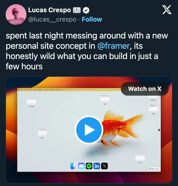
# Ad summary
This ad is a screenshot of a social media post from Lucas Crespo, showcasing a personal site concept built using Framer. The post highlights the ease and speed with which one can build using Framer.
# Brand positioning
Framer is presented as a user-friendly and efficient tool for building personal websites. The brand is positioned as innovative and empowering, allowing users to quickly create impressive sites. It emphasizes simplicity and speed, contrasting with the complexity often associated with web development. The brand aligns with a modern, tech-savvy lifestyle, promoting the idea that anyone can create a website with minimal effort.
# Product
The product being advertised is Framer, a platform for building websites. The ad showcases a personal site concept created using Framer, emphasizing how quickly and easily it can be built. The product is for individuals looking to create websites without extensive coding knowledge. The ad highlights the speed and simplicity of Framer, suggesting that users can build impressive sites in just a few hours. The ad addresses the barrier of complexity often associated with web development, positioning Framer as an accessible alternative.
# Visual style
The ad has a platform-native style, mimicking a social media post. The production quality is clean and polished, resembling a typical screenshot. The visual motifs include a grid layout of icons and a gradient background. The image treatment involves background removal and layering of elements. The typography is integrated in a caption-style, similar to social media posts. The style aims to blend in with the platform's native behaviors, enhancing scannability and stop power in the feed.
# Hooks
Headline: spent last night messing around with a new personal site concept in @framer, its honestly wild what you can build in just a few hours
# Benefits
- [object Object]
- [object Object]
# Features
- [object Object]
- [object Object]
# Call to action
None used.
# Point of view
- [object Object]
- [object Object]
# Storyline
- The ad begins with a social media post from Lucas Crespo, who is sharing his experience of using Framer to create a personal site concept. This is intended to capture attention and establish credibility through a user's perspective.
- Lucas Crespo mentions that he spent the previous night 'messing around' with Framer, highlighting the ease of use and the speed with which he was able to create something. This is from the perspective of a user, emphasizing the product's accessibility and efficiency.
- The post emphasizes that it's 'honestly wild' what you can build in just a few hours using Framer. This is from the user's perspective, building excitement and curiosity about the product's capabilities.
- The ad includes a visual of the personal site concept, showcasing the potential of Framer. This is from the brand's perspective, demonstrating the product's capabilities and inspiring users to try it out.
- A 'Watch on X' button is included, prompting viewers to learn more about Framer. This is from the brand's perspective, driving engagement and encouraging users to explore the product further.
# Ad summary
This ad promotes Framer's domain services. It highlights that you can get a free domain with any paid plan and that Framer can help you come up with domain name ideas by telling them about your business. It concludes with a CTA to find your free domain at framer.com/domains.
# Brand positioning
Framer is presented as a tech-forward brand providing domain registration services with a focus on ease and accessibility. They position themselves as a modern, cutting-edge option for obtaining a domain name, integrating domain services with paid website builder plans. The ad emphasizes simplicity and value by highlighting free domain offerings and idea generation tools, suggesting a user-friendly approach to web presence.
# Product
Framer offers domain registration services, which allow users to secure a unique web address for their online presence. The ad highlights that a domain can be obtained for free with any paid Framer plan, addressing the purchase barrier of cost. Framer also provides a domain name generator feature, aiding users in brainstorming domain ideas by simply describing their business or activity. This tool suggests domain options, simplifying the domain selection process. The ad presents Framer as an accessible solution for anyone looking to establish their digital identity, combining domain registration with the tools to easily build a website.
# Visual style
The ad has a polished, tech-forward aesthetic with clean lines and a modern UI design. It features quick cuts and seamless transitions that sync with the audio, maintaining a consistent pace. The use of bright blues against a dark background creates a visually striking contrast, emphasizing key elements. The overall production quality suggests a professionally produced commercial.
# Benefits
- [object Object]
- [object Object]
# Features
- [object Object]
- [object Object]
# Call to action
Find your free domain
# Point of view
- [object Object]
# Storyline
- 00:00–00:02 The ad begins with a search bar, showing a domain name being typed out and searched for.
- 00:00–00:02 This introduces the core concept of finding and registering domain names using Framer's services.
- 00:02–00:05 The next beat shows a list of suggested domain names, highlighting the free availability of domains with a paid plan.
- 00:02–00:05 This beat emphasizes the affordability and value proposition of Framer's service.
- 00:05–00:06 The ad transitions to a robot character.
- 00:06–00:09 The screen then shifts to display domain ideas.
- 00:06–00:09 This beat introduces Framer's domain idea generation feature, suggesting ease of use.
- 00:09–00:10 The ad shows a cursor clicking a button, resulting in a confirmation checkmark.
- 00:09–00:10 The process is shown as quick and effective.
- 00:10–00:15 The ad concludes with a call to action, encouraging viewers to find their free domain.
- 00:10–00:15 This final beat directs viewers to the Framer website to take the next step.
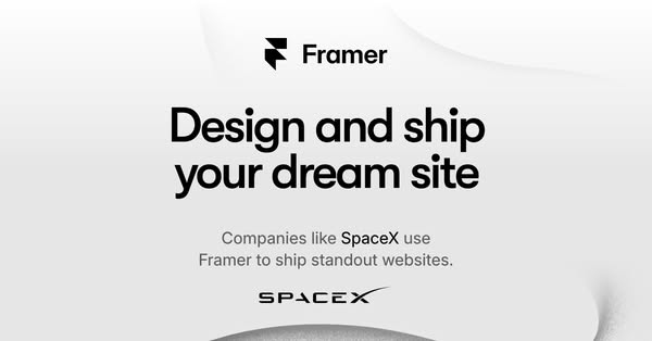
# Ad summary
This ad for Framer highlights the ability to design and ship your dream website, and uses SpaceX as an example of a company that uses Framer to ship standout websites.
# Brand positioning
Framer is presented as a platform that empowers users to design and ship standout websites. The brand aligns with values of innovation and excellence, as evidenced by its association with SpaceX. Framer positions itself as a tool for creating exceptional online experiences, suggesting it pushes against the norms of basic or uninspired website design. The brand positioning is both functional, offering tools for website creation, and emotional, promising the realization of a 'dream site'.
# Product
Framer is a platform that enables users to design and ship websites. It is for individuals and companies looking to create standout online experiences. The ad highlights the platform's ability to help users realize their 'dream site'. A key selling point is that companies like SpaceX use Framer to ship standout websites, suggesting the platform is capable of producing high-quality results. The ad addresses the purchase barrier of complexity by implying that Framer is user-friendly enough for even advanced companies like SpaceX to use effectively.
# Visual style
The ad has a clean and modern visual aesthetic with a minimalist design. The production quality is highly polished, with a focus on typography and simple shapes. The image treatment includes subtle color grading and background gradients. The typography is large and bold, making it easily scannable. The style is high-design, aiming to capture attention in the feed.
# Hooks
Headline: Design and ship your dream site
# Benefits
- [object Object]
- [object Object]
# Features
- [object Object]
# Call to action
None used.
# Point of view
- [object Object]
# Storyline
- The ad opens by presenting Framer's logo, immediately establishing the brand identity and setting the stage for what's to come. The brand is telling the audience who they are.
- The ad then highlights the core value proposition: 'Design and ship your dream site'. This message is from the brand, and it aims to capture the audience's attention by promising the ability to create an ideal website.
- The ad builds credibility by stating, 'Companies like SpaceX use Framer to ship standout websites.' This is the brand telling the audience that their product is used by a well-known company.
- The ad reinforces the association with SpaceX by displaying the SpaceX logo, further emphasizing the platform's reliability and effectiveness. This is the brand reinforcing their message.
# Ad summary
This ad promotes Framer, a tool that helps people build websites using pre-made sections and allowing for customization that matches their branding.
# Brand positioning
Framer aims to occupy the space in the consumer's mind as an accessible tool for building and designing websites, even for those without strong design skills. Framer aligns with values of creativity and individual branding, pushing against the norm of limited customization in similar website builders. The brand positioning is functional, offering a simplified approach to web design without sacrificing the ability to customize and add personal touches.
# Product
Framer is presented as a website-building tool that helps users create sites even if they don't know the design best practices. It offers pre-made sections that can be dragged and dropped to create a base website, then allows users to customize these sections to match their own branding and design skills. Framer distinguishes itself by not limiting users' editing capabilities, allowing them to go as deep into the design process as they want and add cool animations. The product's USP is that it is built using proven website design practices, and it helps build something that actually converts and brings sales. It also has free templates.
# Visual style
The ad features a hybrid aesthetic, blending polished commercial elements with a UGC feel through selfie-style shots and informal language. The editing style includes quick cuts and zooms, maintaining a consistent pace of around 24 cuts per minute. Audio-visual sync is present, with text and actions timed to the voiceover.
# Benefits
- [object Object]
- [object Object]
- [object Object]
# Features
- [object Object]
- [object Object]
- [object Object]
- [object Object]
# Call to action
Comment "website"
# Point of view
- [object Object]
- [object Object]
# Storyline
- 00:00–00:03 The ad opens with a shot of a computer screen displaying a website in progress, followed by text overlay that reads, "Let's Build a Website" This is intended to grab the attention of viewers interested in website creation.
- 00:03–00:05 A creator introduces a "cheat code" for website building, addressing viewers who want to build a website but may lack design expertise. This is to frame the ad from the customer's perspective.
- 00:05–00:08 The ad showcases Framer, advising viewers to use its pre-made sections for website building. This is from the brand's perspective, showing how easy the Framer is.
- 00:08–00:13 The ad continues to highlight Framer’s customization options, stating users can tailor the pre-made sections to match their branding. This is the brand building on the customer's initial pain point from the top.
- 00:13–00:21 The creator explains that unlike other tools, Framer doesn’t limit users' editing capabilities and allows them to add animations. This is intended to show that Framer allows for deep design customization.
- 00:21–00:27 A final shot of the website building in progress follows with the creator saying it helps build something that converts and brings sales. This is intended to encourage viewers to comment "website" to get a link to Framer’s free templates, completing the ad with a CTA.
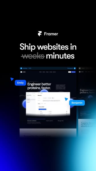
# Ad summary
This ad for Framer shows a UI and highlights the software's speed and ease of use. The main promise is that Framer allows users to ship websites in minutes instead of weeks. UI elements that include names highlight collaboration features and ease of use.
# Brand positioning
Framer is presented as a user-friendly and efficient web design platform. The brand aims to occupy a space in the consumer's mind as a modern solution that simplifies website creation, challenging the traditional norm of lengthy development cycles. The ad emphasizes a functional brand positioning, focusing on performance and speed, which is designed to appeal to users who value efficiency and streamlined workflows.
# Product
Framer is a web design platform designed to enable users to create and deploy websites quickly. The product is positioned for individuals and teams looking to streamline their web development process. The ad highlights Framer's USP of reducing website shipping time from weeks to minutes, addressing the common purchase barrier of lengthy development cycles. The visuals and language suggest that Framer is designed for modern teams that need a collaborative, efficient, and user-friendly platform.
# Visual style
The ad employs a modern and sleek visual style with a focus on minimalist design and a clean interface. The production quality appears to be highly polished, resembling a studio shot with attention to detail. The visual motifs include a dark color scheme with blue accents, which create a sense of sophistication and modernity. The image treatment includes subtle gradients, lighting effects, and background blur. The typography is integrated with a large and bold headline that emphasizes the ad's key message. The overall style is disruptive, designed to contrast with typical norms and grab attention in the feed.
# Hooks
Headline: Ship websites in ~~weeks~~ minutes
# Benefits
- [object Object]
# Features
- [object Object]
# Call to action
None used.
# Point of view
- [object Object]
# Storyline
- The ad opens by presenting the brand name and logo, followed by the main promise: websites ship in minutes instead of weeks. The brand wants to establish itself as a time-saving solution.
- The ad visual includes the Framer UI with floating annotations pointing to various elements. The brand is highlighting how the software works and key features that enable collaboration.
- The ad ends with a callout to the trustworthiness of the platform. The brand is building credibility.
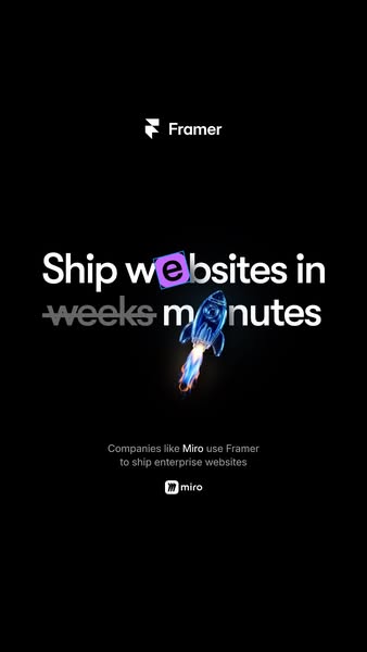
# Ad summary
This ad for Framer highlights how their platform reduces website development time from weeks to minutes. It uses a rocket graphic to emphasize the speed improvement and mentions that companies like Miro use Framer.
# Brand positioning
Framer is presented as a cutting-edge solution for website development, positioning itself as a tool that drastically reduces the time and effort required to ship websites. By highlighting efficiency and speed, Framer caters to businesses and professionals seeking to streamline their web development processes. The brand aligns with a modern, tech-forward ethos, pushing against the traditional norms of lengthy development cycles and positioning itself as a faster, more agile alternative. Its functional positioning appeals to those who prioritize performance and simplicity in their workflow.
# Product
Framer is a platform designed to expedite website development, allowing users to ship websites in minutes instead of weeks. The product is geared towards companies needing enterprise websites and aims to eliminate the typical time-consuming barriers associated with web development. The ad emphasizes the speed and efficiency of Framer, suggesting that it can significantly reduce the time required to launch a website. The mention of established companies like Miro using Framer implies reliability and effectiveness, encouraging potential customers to see the value in adopting the platform.
# Visual style
The ad utilizes a modern and minimalist visual style with a dark background and bright, contrasting text and graphics. The production quality appears highly polished with a clean, studio-shot aesthetic. A visual motif of speed and efficiency is established through the use of a rocket illustration, while the text treatment emphasizes key value propositions with bolding and cross-outs. Typography is integrated in a large, bold, and caption-style manner, enhancing scannability. The ad contrasts platform norms by avoiding overly busy or cluttered designs, creating a disruptive yet professional feel that could significantly enhance stop power in a feed.
# Hooks
Headline: Ship websites in weeks minutes
# Benefits
- [object Object]
# Call to action
None used.
# Point of view
- [object Object]
- [object Object]
# Storyline
- The ad opens by stating the core value proposition: "Ship websites in weeks minutes." This message is intended to immediately capture the viewer's attention by highlighting the dramatic difference in website delivery time, told from the brand's perspective. It sets the stage for how Framer accelerates the development process, appealing to those who seek faster results.
- Next, the ad reinforces credibility by mentioning, "Companies like Miro use Framer to ship enterprise websites." This leverages social proof by associating Framer with a well-known company, Miro, to assure potential users that the platform is reliable and effective for enterprise-level projects, told from an external source's perspective. It aims to instill confidence in Framer's capabilities by showing it's trusted by other successful businesses.
# Ad summary
This ad promotes Framer, highlighting its user-friendly, AI-powered feature for renaming layers. A creator explains how this free tool helps designers save time by automating the layer-naming process based on layer function, making website design easier and more efficient.
# Brand positioning
Framer positions itself as a user-centric design tool company that listens to its community, incorporating their feedback to enhance their offerings. The brand emphasizes efficiency and innovation by introducing AI features that directly address designer pain points. This helps Framer push against category norms by providing an AI-driven solution to simplify design tasks, promoting a functional and empowering experience for designers who seek to optimize their workflow.
# Product
Framer is presented as a design and website building tool that now includes an AI-powered feature designed to help designers streamline their workflow. The ad targets users who face the common issue of manually naming layers and stacks during the website design process. The new AI feature allows users to rename layers and stacks automatically based on their functions. Designers can activate this by pressing Option or Alt+R, after which the AI renames all layers according to what they are and do. This feature aims to solve the time-consuming manual process of layer naming, saving designers hours of work, and is offered as a free tool, which minimizes barriers to entry for potential users.
# Visual style
The ad has a UGC feel with a mix of direct-to-camera shots and screen recordings. The editing features quick cuts between the speaker and the software interface. The production quality is solid, which aligns with the brand's emphasis on professional design tools. The pacing is fairly consistent, supporting the creator's engaging delivery.
# Benefits
- [object Object]
- [object Object]
# Features
- [object Object]
# Call to action
Go and try it out for yourself, it's free to use. Go and build your website in Framer.
# Point of view
- [object Object]
# Storyline
- 00:00–00:02 The creator introduces Framer's new update.
- 00:03–00:08 He explains the traditional way of checking fonts and how inefficient it is.
- 00:09–00:11 He tells us about Framer's new feature.
- 00:11–00:17 He explains how it works using a live preview.
- 00:18–00:23 He explains how Framer keeps releasing amazing updates.
- 00:23–00:33 He references his own website design process, including the pain of naming all layers and stacks.
- 00:33–00:36 He explains that Framer has added an AI feature.
- 00:36–00:50 He explains how instead of renaming layers yourself, you just press Option/Alt+R.
- 00:51–00:55 He highlights how much time the program will save designers.
- 00:55–01:01 He encourages the viewer to try out Framer for themselves.
# Ad summary
This ad showcases Framer as a website builder that allows users to create whimsical websites with unique designs. The ad highlights different websites created with Framer, including a portfolio that resembles a desk, a sourdough tracker, and an interactive Valentine's card. It emphasizes the platform's versatility in building various types of websites with a creative and playful approach.
# Brand positioning
Framer is presented as a user-friendly platform that empowers creators to build whimsical and unique websites without needing extensive coding knowledge. The brand promotes a sense of creativity and fun, contrasting with the often serious and technical nature of web development. It positions itself as a tool for those who want to express their personality and individuality through their online presence, rather than adhering to conventional web design norms. Framer seems to focus on enabling self-expression and creativity over pure performance, and its tone is friendly and approachable.
# Product
Framer is a website builder that enables users to create a variety of whimsical websites. It allows for unique designs such as portfolios that mimic a physical desk, sourdough trackers, and interactive Valentine's cards. The ad emphasizes the ease of use and creative potential of Framer, highlighting its ability to bring unusual and fun ideas to life. The key selling point is the platform's versatility and its capacity to allow users to build anything they can imagine, catering to individuals who value creativity and personalization in their online presence. It addresses potential barriers such as technical complexity by implying simplicity and ease of use.
# Visual style
The ad has a bright, clean, and modern aesthetic with a focus on showcasing the creative potential of the Framer platform. The editing style includes quick cuts to highlight different website designs and interactive elements. The production quality appears to be a hybrid of UGC and polished commercial, lending a sense of authenticity while maintaining visual appeal. The pacing is upbeat, with cuts timed to the music, enhancing the ad's energetic feel.
# Benefits
- [object Object]
- [object Object]
- [object Object]
- [object Object]
# Features
- [object Object]
- [object Object]
- [object Object]
- [object Object]
# Call to action
None used.
# Point of view
- [object Object]
# Storyline
- 00:00–00:02 The ad begins by showing examples of whimsical websites built in Framer.
- 00:02–00:11 The ad transitions to showcasing a portfolio website designed to look like a desk.
- 00:11–00:27 The ad highlights a sourdough tracker and other interactive elements.
- 00:28–00:32 The ad concludes by showing a user working on Framer, emphasizing the ability to build anything with the platform.
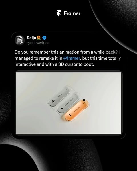
# Ad summary
This ad showcases an interactive animation made using Framer, highlighting its capabilities in creating 3D cursor interactions.
# Brand positioning
Framer is presented as a cutting-edge design tool that empowers creators to build fully interactive and visually appealing interfaces. The brand aims to occupy the space of innovation and user engagement, promoting values of creativity, interactivity, and seamless user experiences. By enabling users to remake animations with 3D cursor integration, Framer positions itself as a tool that pushes against the norms of static design, offering a dynamic and engaging alternative that enhances user interaction and overall design appeal. The brand positioning appears to be both functional and emotional, offering practical design capabilities while also appealing to the emotional desire for innovation and creativity.
# Product
The product being advertised is Framer, a design tool used to create interactive animations. Framer allows users to remake existing animations with added interactivity and a 3D cursor, enhancing user engagement. The ad showcases the tool's capabilities in designing interfaces that are not only visually appealing but also highly interactive. The product is designed for creators and designers who want to build dynamic, engaging user experiences. The unique selling point is the ability to create totally interactive designs with a 3D cursor, making designs more immersive and user-friendly. The ad addresses the barrier of static, non-interactive designs by offering a solution that brings animations to life.
# Visual style
The visual style of the ad is clean and modern, mimicking a social media post to enhance its relatability. The use of a digital tablet display adds a layer of sophistication, while the animation showcases the product's interactive capabilities. The color scheme is minimalistic with a focus on black, white, and orange, creating a sleek and professional look. The overall aesthetic is designed to feel native to a social media feed, encouraging easy scannability and stop power.
# Hooks
Headline: Do you remember this animation from a while back? I managed to remake it in @framer, but this time totally interactive and with a 3D cursor to boot.
# Benefits
- [object Object]
- [object Object]
# Features
- [object Object]
- [object Object]
# Call to action
None used.
# Point of view
- [object Object]
# Storyline
- The ad opens with a question: "Do you remember this animation from a while back?" This is intended to pique the viewer's curiosity and draw them into the content. The story is being told from the perspective of a creator who is sharing their experience.
- The creator then shares that they "managed to remake it in @framer, but this time totally interactive and with a 3D cursor to boot." This shows Framer's capability in enhancing existing designs with interactive elements. This is from the perspective of the creator who is showcasing the tool's features.
# Ad summary
This ad uses a voiceover and text overlays to highlight three features in Framer that help make websites look more high-end: Glass effect, Transform, and Motion. The ad also includes b-roll footage of how to use the features in Framer.
# Brand positioning
This ad features Framer, a no-code website builder that is focused on simplicity and polish. By highlighting the platform's hidden features, the ad positions Framer as a website builder that allows designers to easily elevate the look and feel of their websites without needing to spend a lot of effort. Framer aims to empower designers by providing them with the tools to make their websites look more finished and put together, even if they don't have extensive coding knowledge.
# Product
This ad features Framer, a no-code website builder that enables users to design and build websites with ease. Framer is focused on simplicity and polish by providing users the tools to easily elevate the look and feel of their websites without needing to spend a lot of effort. The ad highlights three hidden features in Framer: Glass effect, Transform, and Motion. The Glass effect adds depth instantly and feels more finished by switching reduced opacity to background blur. The Transform feature makes any card feel more polished and premium by adding depth. The Motion feature helps even a footer feel iconic by using animation timing. Slow feels calm and fast feels expressive.
# Visual style
The ad has a UGC feel that is authentic and relatable. It features quick cuts and a consistent pace to keep the audience engaged. The text and product actions are timed to the music beats, which adds to the ad's overall appeal.
# Benefits
- [object Object]
- [object Object]
- [object Object]
# Features
- [object Object]
- [object Object]
- [object Object]
# Call to action
Save this reel for when you're looking for ways to make your website look premium, and follow for more.
# Point of view
- [object Object]
# Storyline
- 00:00–00:04 The ad begins with the creator introducing herself as a slightly annoying designer who can't let go of a website that works but feels off.
- 00:04–00:10 The creator states that she thought a website design took a lot of effort, but it turns out it only takes a few hidden features in Framer for a more finished look.
- 00:10–00:18 The ad presents the first hidden feature: Glass Effect. The creator explains that if she sees reduced opacity, she immediately switches it to background blur, as it adds depth instantly and feels more finished.
- 00:18–00:27 The ad presents the second hidden feature: Transform. The creator notes that flat cards work, but using Framer's transform to add a bit of depth makes them feel premium.
- 00:27–00:36 The ad presents the third hidden feature: Motion. The creator explains that motion should be used wisely, because even a footer can feel iconic with animation timing. She notes that slow feels calm and fast feels expressive.
- 00:36–00:40 The creator emphasizes that none of this is complicated, yet it makes a website look more finished and put together.
- 00:40–00:45 The creator instructs viewers to save the reel for when they're looking for ways to make their website look premium, and to follow her for more.
# Ad summary
This ad showcases the development and construction of the Tunebird logo. A musical note appears to have a bird embedded inside it. The logo goes through editing and is finalized.
# Brand positioning
Tunebird is a brand that seems to occupy the space of music and birds. Their logo is the combination of both objects into one. It would be presumed that they focus on relaxing nature sounds from birds or music for birds.
# Product
The Tunebird logo is a combination of a musical note and a bird. The product is not shown in use but is instead shown in its development. It begins with a musical note that has a crude pencil sketch and is converted into a black and white logo. It eventually is shown as a purple and white logo, as well.
# Visual style
The ad has a simple aesthetic. It showcases the development of the logo, and has many quick cuts to show the editing process. The production quality has a polished feel due to the use of a program. The cuts are not timed to the music but the editing is quick at around 60 BPM.
# Call to action
None used.
# Point of view
- [object Object]
# Storyline
- 00:00–00:03 The ad begins with an unfinished logo with the shapes sketched out by a pencil.
- 00:03–00:15 The sketch gets replaced with bold lines to complete a musical note shape.
- 00:15–00:22 The shapes are then adjusted using the tools in the program to perfect the logo.
- 00:22–00:28 The name, Tunebird, then gets added to the bottom of the logo.
- 00:28–00:33 The logo and name get shifted around before the logo is showcased as a purple logo with white background.
# Ad summary
This ad responds to another user who is advocating for stealing other people's website designs. The ad promotes Framer, arguing that becoming a creative professional involves learning tools and growing your skill set.
# Brand positioning
Framer is positioned as a tool that enables users to build websites that stand out, are unique, and flex their skills as creative professionals. The brand pushes against the norm of using readily available templates that result in websites that look like copies from 2005. Framer aims to occupy the space of a professional tool that fosters creativity and uniqueness in website design, promoting the value of exploration, hard work, and skill development. The brand positioning is functional by offering tools that promote differentiation and design value.
# Product
Framer is a website-building tool that enables creative professionals to design unique and customized websites. It is positioned as an alternative to using readily available templates that lead to websites that look dated. The USP of Framer is its ability to allow users to grow their skill sets and do the exploration to build websites that stand out. It addresses the purchase barrier of relying on copy-and-paste methods by advocating for learning the tool and doing the work to create something unique.
# Visual style
The ad has a polished commercial feel with clean cuts and a consistent color grade, which supports the intended tone of a knowledgeable, credible expert giving advice. The editing rhythm is moderate, with cuts timed to key messaging moments. The audio-visual sync is well-coordinated to emphasize key points and maintain viewer engagement.
# Benefits
- [object Object]
- [object Object]
- [object Object]
# Features
- [object Object]
# Call to action
None used.
# Point of view
- [object Object]
- [object Object]
- [object Object]
- [object Object]
# Storyline
- 00:00–00:11 A stitch from another user who makes the statement, 'Gross, dude! Your website looks like AI sloth, bro. How to start stealing other people's designs. I'm not even kidding bro. Find somebody's website you think is sick.' The stitcher states that instead of prompting users to start from scratch they should go to a GitHub repository.
- 00:11–00:21 A man wearing a white shirt and a baseball cap stands in a room with a black background. He responds with, 'Why would you ever want to be creative? There's so many designers that are fearful right now, whether or not they're going to have a job in five years. And that video is a perfect example of why you will have a job.'
- 00:21–00:57 Speaking directly to the camera, the man argues that creatives are going to stand out. He advocates that instead of looking for the fastest, cheapest diet pill way to create a website, that users should start learning tools like Framer to build a site that stands out, is unique and flexes your skills as a creative professional. He closes with the statement, 'You're never going to be a creative professional if you just copy and paste somebody else's work, but you will be if you do the exploration, do the work, grow your skill set, and leverage the correct tools like Framer that allow you to do anything you want.'
# Ad summary
This ad demonstrates how to create a scroll-driven video component in Framer, a website builder, in less than a minute. The ad features a woman speaking directly to the camera, providing step-by-step instructions on how to use Framer's plugins and settings to achieve this effect.
# Brand positioning
Framer is presented as a user-friendly website builder that empowers users to create visually stunning and interactive websites with ease. The brand is positioned as a tool that simplifies complex design processes, allowing users to achieve professional-level results in a short amount of time. Framer aims to occupy the space of accessible innovation, promoting a functional approach to web design by providing the tools and features needed to create engaging user experiences. The brand pushes against the norm of complex coding and design processes, offering a simpler, more intuitive solution for creating dynamic websites.
# Product
Framer is a website builder that allows users to create scroll-driven video components. The product works by using Framer's plugins and settings to sync a video with the user's scroll position, creating a frame-by-frame playback effect as the user scrolls down the page. The product is for anyone looking to create visually engaging and interactive websites without complex coding. Key features include the ability to create a scroll-driven video component in less than a minute, the option to add a cover image, and the ability to adjust the height of the page. The ad addresses the purchase barrier of complex coding by offering a simpler, more intuitive solution. The ad tells the viewer that Framer is worth trying because it allows them to create visually stunning and interactive websites quickly and easily.
# Visual style
The ad has a polished, commercial aesthetic with a hybrid feel, combining a professional demonstration of the Framer interface with a UGC-style presentation by the woman in the bottom half of the screen. The editing style includes quick cuts and smooth transitions, maintaining a consistent pace throughout the ad. The audio-visual sync is well-coordinated, with text overlays and product actions timed to the voiceover lines.
# Benefits
- [object Object]
- [object Object]
# Features
- [object Object]
- [object Object]
- [object Object]
- [object Object]
# Call to action
None used.
# Point of view
- [object Object]
# Storyline
- 00:00–00:03 The ad begins with a woman introducing a website that is going viral for its mind-blowing scrolling effects.
- 00:03–00:06 She then transitions to showing how to build the same effect in Framer in less than a minute, creating anticipation and setting the stage for a quick tutorial.
- 00:06–00:31 The ad proceeds with a step-by-step demonstration of how to create a scroll-driven video component in Framer, guiding the viewer through the process.
- 00:31–00:33 The ad concludes with a preview of the final result, showcasing the scroll-driven video effect in action and reinforcing the ease and effectiveness of using Framer.
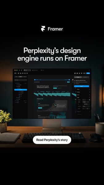
# Ad summary
This ad emphasizes how Perplexity uses Framer as its design engine.
# Brand positioning
Framer positions itself as the go-to platform for designing and building websites. The brand showcases its ability to empower other companies, as exemplified by Perplexity, to develop design engines. By highlighting the use of its platform by another design company, Framer positions itself as a sophisticated solution for creating websites.
# Product
The ad showcases Framer as the platform on which Perplexity's design engine runs. The design is viewed on a computer screen, demonstrating the user interface and the capability to build interfaces. The ad promotes Framer as a tool for design and development, emphasizing its use by Perplexity, another player in the tech and design space.
# Visual style
The ad features a professional and clean visual style. The color palette is dark, with a black background, and dark UI elements, which is contrasted with white text and the silver computer monitor, which creates a modern and sophisticated feel. The image is well-lit and the composition is balanced, with the computer monitor as the focal point. The ad has a high-quality, studio-shot feel.
# Hooks
Headline: Perplexity's design engine runs on Framer
# Benefits
- [object Object]
# Features
- [object Object]
# Call to action
Read Perplexity's story
# Point of view
- [object Object]
# Storyline
- The ad opens with the Framer logo, immediately establishing the brand. The brand is communicating their identity from the beginning of the ad.
- The text "Perplexity's design engine runs on Framer" is displayed on the screen. This emphasizes that Framer is the platform used by Perplexity. The brand is highlighting one of their partnerships to build trust in their design capabilities.
- The ad presents a computer monitor displaying a design created in Framer. The purpose is to highlight Framer's design capabilities by showcasing a digital design, which helps to establish the platform's functionality and usability.
- The ad concludes with a CTA, urging viewers to "Read Perplexity's story", inviting the viewer to learn more about the partnership between the two companies. This directs the viewer towards engagement with the brand.
# Ad summary
This ad demonstrates how to use Framer to create a brand guide for a bubble tea cafe, showing the addition of logos, icons, color palettes, patterns, and shaders to bring energy to the design.
# Brand positioning
Milkbar Bubble Tea Cafe is presented as a playful and feel-good destination that combines nostalgic charm with modern flavor. The brand aligns with the comfort of classic milk bars and the creativity of today's cafe culture. It serves up handcrafted bubble teas, specialty drinks, and sweet treats, aiming to make everyday moments more fun and positions itself as a unique blend of traditional and contemporary.
# Product
The ad features a demonstration of creating a brand guide using Framer, a design and prototyping tool. The process includes adding logos and icons representing various milk bar items, incorporating a color palette, and applying patterns and shaders to enhance the design's visual appeal. The product is for designers and brand managers who want to create consistent and visually engaging brand guidelines. The USP is the ease of creating animations and dynamic elements within the brand guide using Framer's features, making it worth trying for those looking to create comprehensive brand assets.
# Visual style
The ad has a polished, screen-recorded aesthetic, with a focus on demonstrating software functionality. The editing style includes quick cuts to highlight different design steps. The production quality is high, with clear visuals and professional screen recordings. The pacing is fast, with cuts timed to showcase each feature efficiently. The audio-visual sync is aligned with the steps taken in the software.
# Benefits
- [object Object]
- [object Object]
- [object Object]
# Features
- [object Object]
- [object Object]
- [object Object]
- [object Object]
- [object Object]
- [object Object]
# Call to action
None used.
# Point of view
- [object Object]
- [object Object]
- [object Object]
- [object Object]
# Storyline
- 00:00–00:02 The ad opens by displaying the Milkbar Bubble Tea Cafe brand guide on a computer screen, showcasing its logo, color palette, and brand description.
- 00:02–00:04 Transitioning to Framer, a design interface is shown where the creator begins building the brand guide.
- 00:04–00:12 The creator adds logos and icons from the Milkbar brand to the design, demonstrating how to incorporate visual assets.
- 00:12–00:25 Next, the creator animates a donut icon using Framer's component features, highlighting the tool's ease of use for adding interactive elements.
- 00:25–00:30 The creator adds color palettes and patterns to the brand guide, enhancing the visual appeal and brand identity.
- 00:30–00:39 The creator incorporates shaders to bring energy and visual interest to the design, showcasing Framer's capabilities for dynamic visual effects.
- 00:39–00:45 The ad concludes by adding final touches to the logo and showing the completed brand guide again, emphasizing the polished final result.
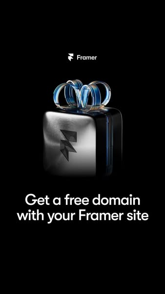
# Ad summary
This ad promotes Framer by offering a free domain with a Framer site.
# Brand positioning
Framer is presented as a cutting-edge platform that specializes in web design and development. The brand emphasizes accessibility, offering users tools to build and host websites. The presentation, combined with a sleek, minimalist design, indicates that Framer caters to individuals and businesses seeking a professional and visually appealing online presence. The brand is functional, focusing on performance and simplicity.
# Product
The product being advertised is Framer, a platform for building and hosting websites. The advertisement promotes a special offer of a free domain with a Framer site. This offer is intended to reduce the barrier to entry for new users by removing the cost of purchasing a domain name. The ad emphasizes the ease of getting started with Framer by providing a free domain, making it more attractive to potential customers. The product is worth trying or buying because the domain is free, as the ad states.
# Visual style
The ad has a highly polished and modern visual style. The image treatment includes gradient effects on the ribbon. The typography is clean and legible. The dark background enhances the visual elements and keeps the focus on the key elements.
# Hooks
Headline: Get a free domain with your Framer site
# Benefits
- [object Object]
# Features
- [object Object]
# Call to action
None used.
# Point of view
- [object Object]
# Storyline
- The ad opens by featuring the Framer logo above a stylized, three-dimensional gift box. This immediately sets the tone by associating Framer with a special offer, establishing a sense of excitement for the audience.
- The offer, "Get a free domain with your Framer site", is presented beneath the gift box to immediately convey the ad's core value proposition and incentivize users to explore Framer's offerings. This reinforces the brand message that Framer offers added value for its customers.
How Other Technology Brands Advertise on Meta
Peer brands in Motion's library — click any brand to see their creative strategy, live ads, and AI breakdowns.