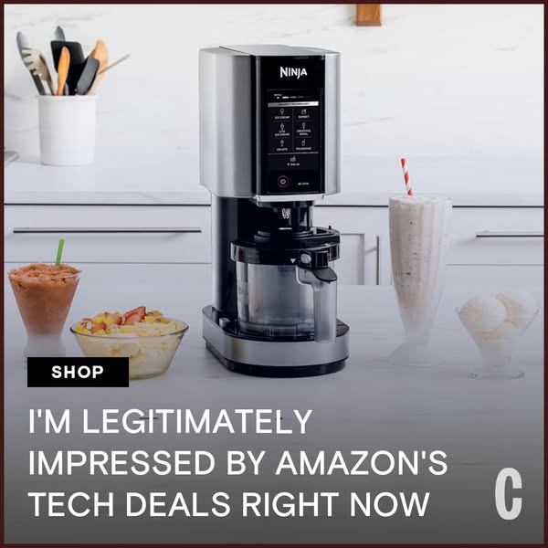
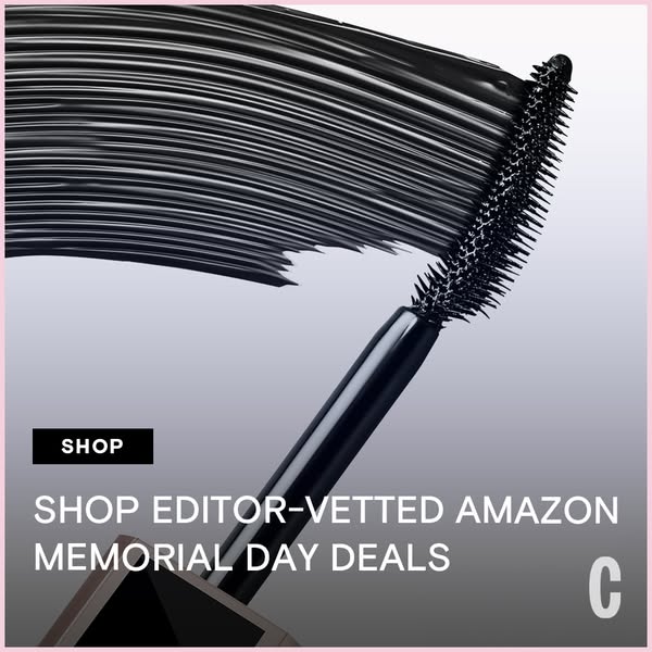
Cosmopolitan runs 236 active ads on Meta, shipping ~58 new creatives per week. Their library leans on Headline45%, Collage11%, and Celebrity8%. Recently, cosmopolitan is going hard on affiliate commerce, flooding the zone with Amazon Memorial Day tech and home deals positioned as editor-vetted and budget-friendly, alongside celebrity-endorsed beauty products under $50 (heavy on Ciara Miller and accessible brands like Maybelline and Soap & Glory). The through-line is accessible aspiration: everything is framed as either expertly curated or celebrity-approved but still shoppable for the everyday reader, with product-forward flatlay aesthetics dominating the creative. They're essentially positioning themselves as the trusted filter between mainstream retail and their audience's wallet, with a few sex and beauty awards spots sprinkled in to maintain editorial credibility.
# Ad summary
This ad uses an image of a person in athletic gear with a testimonial about Amazon's tech deals. The ad is designed to quickly grab the attention of the viewer and entice them to shop Amazon's tech deals.
# Brand positioning
This ad promotes Amazon and its tech deals. Amazon is presented as a broad marketplace that offers tech products at attractive prices. The ad's tone suggests that Amazon's deals are legitimately impressive and worth checking out.
# Product
This ad focuses on promoting deals from Amazon. It is implied that Amazon offers a variety of tech products to a wide audience. The ad uses a quote from someone who is 'legitimately impressed' to try to create a feeling that the deals are worth checking out.
# Visual style
The ad features a lifestyle image with a testimonial overlay. The shot is taken from above, giving it a dynamic perspective. The visual design is clean and simple, with a focus on the person's movement and the smartwatch on their wrist.
# Hooks
Headline: I'M LEGITIMATELY IMPRESSED BY AMAZON'S TECH DEALS RIGHT NOW
# Benefits
- [object Object]
# Features
- [object Object]
# Call to action
SHOP
# Point of view
- [object Object]
# Storyline
- The ad opens with a birds-eye-view image of a runner wearing a smartwatch. The visual is intended to capture the viewer's attention with the suggestion of a tech-savvy and active lifestyle.
- The text then conveys an endorsement from someone who is 'legitimately impressed' by 'Amazon's tech deals right now'. The endorsement seeks to establish credibility and excitement around shopping for tech on Amazon.
- A 'Shop' call to action (CTA) encourages viewers to visit Amazon and explore the available deals. The CTA serves as a clear direction for those interested in learning more or making a purchase.
# Ad summary
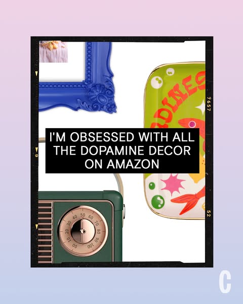
This ad features a collection of dopamine decor items available on Amazon, presented in a visually engaging layout.
# Brand positioning
The brand being promoted is Amazon, presenting itself as a one-stop shop for all things 'dopamine decor.' By curating and offering a variety of visually stimulating and joyful home decor items, Amazon positions itself as a source for uplifting and mood-boosting products. The brand leans into emotional design, suggesting that customers can easily enhance their living spaces with items that spark joy and positive feelings.
# Product
The ad features a curated selection of home decor items available on Amazon, all categorized under the umbrella of 'dopamine decor'. The items shown are: a vintage-style green radio with a gold analog dial, a green and white sardine motif serving tray with a gold trim, and a vintage-style blue picture frame. Each product is intended to inject color, personality, and a sense of playfulness into living spaces. The ad addresses the barrier of sourcing unique and joyful decor by offering a collection of hand-picked items in one convenient location.
# Visual style
The ad has a playful and curated visual style. It resembles a lo-fi collage, using a filmstrip frame and a soft gradient background to create a layered effect. The production quality is polished, giving the image a clean and modern feel despite the vintage-inspired decor items. Typography is integrated through a bold, sans-serif font in a simple black block, ensuring scannability and stop power in the feed.
# Hooks
Headline: I'M OBSESSED WITH ALL THE DOPAMINE DECOR ON AMAZON
# Benefits
- [object Object]
# Features
- [object Object]
# Call to action
None used.
# Point of view
- [object Object]
- [object Object]
# Storyline
- The ad opens with a collection of curated, colorful decor items including a green radio, a blue picture frame, and a green sardine motif serving tray. This is intended to showcase the variety of dopamine-inducing decor that's available on Amazon, told from the brand's perspective as a curator of these items.
- The narrative progresses to a testimonial declaring "I'M OBSESSED WITH ALL THE DOPAMINE DECOR ON AMAZON". This is shown from the perspective of a happy customer who is excited about the array of products available.
# Ad summary
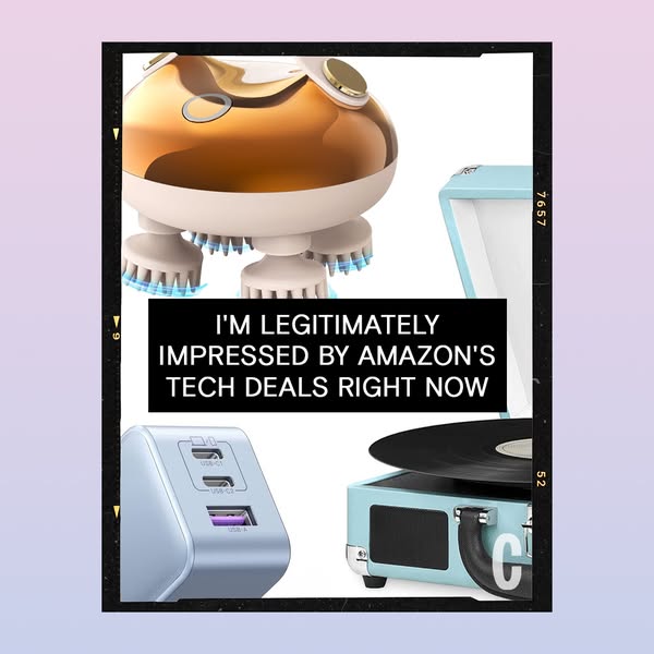
This ad showcases Amazon's tech deals with a visually engaging image of different tech items and a testimonial quote in the center of the image.
# Brand positioning
This ad promotes Amazon's tech deals and suggests that the consumer will be impressed by the products sold on Amazon. The brand aims to occupy a space in the consumer's mind as a retailer that sells high-quality tech products at a low price point, and should care because of the various tech deals available.
# Product
This ad features an assortment of tech products likely found on Amazon. In the top left is a gold and white scalp massager. It has a large rounded gold head and multiple white prongs with light blue ends. In the bottom left is a wall outlet power adapter in light blue. The power adapter has three visible charging ports: 2 USB-C ports and 1 USB-A port. On the right of the image is a small vintage-style record player in light blue. The record player features a black record and black speaker.
# Visual style
The ad features a collage style with a collection of different tech items placed together. The image has a film strip style border and a testimonial text overlay. The image looks to be studio-shot and highly polished. There is color grading that gives the image a clean, modern aesthetic. The large and bold typography used allows the ad to be easily scannable.
# Hooks
Headline: I'M LEGITIMATELY IMPRESSED BY AMAZON'S TECH DEALS RIGHT NOW
# Benefits
- [object Object]
# Features
- [object Object]
- [object Object]
- [object Object]
- [object Object]
# Call to action
None used.
# Point of view
- [object Object]
- [object Object]
# Storyline
- The ad opens with an assortment of tech products, intending to showcase that Amazon has an impressive and diverse assortment of tech items. The audience experiences this moment from a customer's perspective, since they are being exposed to the product assortment to instill excitement about the tech deals that Amazon offers.
- Next, the ad has a quote in the center of the image to imply that Amazon's tech deals are legitimately impressive. The audience experiences this from a customer's perspective, since this testimonial is to provide social proof and trust in Amazon's product deals.
# Ad summary
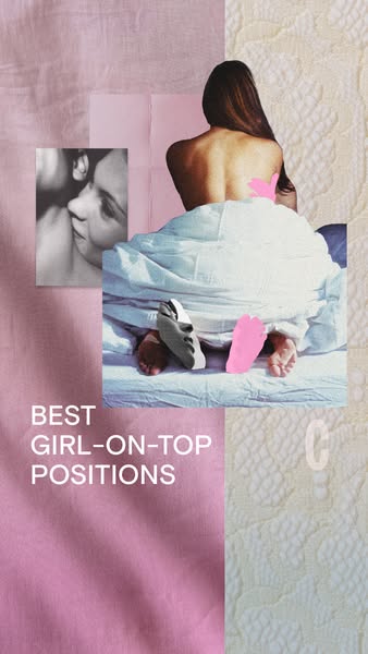
An image ad promoting the best 'girl-on-top' sex positions. The ad features a collage of a woman in bed, a photo of two people kissing, and patterns of pink and white fabrics.
# Brand positioning
There is no brand explicitly promoted in this ad. The content focuses on a specific sexual activity, and does not align with the tone, values, or marketing approach of any easily identifiable brand.
# Product
This ad does not directly feature or promote a tangible product for sale. Instead, it suggests a list of sex positions or a guide to 'girl-on-top' positions. It doesn't offer specific features or benefits of a physical product but implies an improved or more satisfying sexual experience, for people interested in heterosexual sex.
# Visual style
The ad uses a collage-style layout with overlaid images and color blocks. The color palette is soft, with muted pinks and whites. The black-and-white photo contrasts with the color elements, and the overall effect is somewhat fragmented and intimate.
# Hooks
Headline: BEST GIRL-ON-TOP POSITIONS
# Benefits
- [object Object]
# Features
- [object Object]
# Call to action
None used.
# Point of view
- [object Object]
- [object Object]
# Storyline
- The ad opens with a partially nude woman in bed, covered by a sheet, to grab attention and set the scene. This moment is from the brand's perspective, as it aims to draw viewers into the topic.
- A black-and-white photo of two people kissing is included to add a romantic or sensual element. This section appears to be from an external source, as it adds context to the suggested activity.
- The text 'BEST GIRL-ON-TOP POSITIONS' is displayed to clarify the ad's focus, explicitly telling viewers the specific activity being addressed. This text comes from the brand, directly stating the offer or information presented.
# Ad summary
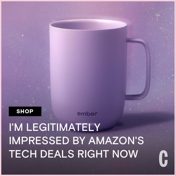
This ad features a testimonial praising Amazon's tech deals, showcased against a backdrop featuring an Ember mug.
# Brand positioning
Ember is presented as a brand that merges technology with everyday lifestyle products, enhancing the user experience with smart design. The mug's presence suggests a focus on innovation and sophistication, positioning the brand as a provider of premium, tech-integrated home goods. Its sleek appearance and the ad's clean aesthetic suggests the brand aligns with values of modern, elevated living.
# Product
The featured product is an Ember mug, a temperature-controlled smart mug designed to keep beverages at the user's preferred warmth. The mug is sleek and modern, made of a smooth, solid material with a handle. The Ember logo is subtly displayed near the base of the mug. This smart mug targets tech-savvy individuals who value a premium beverage experience, offering a solution to the common issue of drinks cooling too quickly. By integrating seamlessly into daily routines, it addresses the need for convenience and quality in consumer goods.
# Visual style
The ad has a clean, modern aesthetic with a minimalist composition. The pastel color palette creates a soft and inviting mood, while the product-focused presentation is highly scannable. The image treatment enhances the product's visual appeal, while the typography is integrated to support the overall message.
# Hooks
Headline: I'M LEGITIMATELY IMPRESSED BY AMAZON'S TECH DEALS RIGHT NOW
# Call to action
None used.
# Point of view
- [object Object]
- [object Object]
# Storyline
- The ad begins with a product shot showcasing the Ember mug, establishing the product as a visually appealing and technologically advanced object. The brand's perspective is highlighting the elegance and modernity of the product to capture attention and signal its unique value.
- A positive quote about Amazon's tech deals is displayed, with the brand's perspective connecting the endorsement to tech products available on Amazon. This association subtly leverages Amazon's reputation as a source for quality tech goods to promote the Ember mug, which may be available through these deals. The messaging intends to capitalize on consumer interest in discounted tech to drive traffic and sales.
# Ad summary
This ad features the Ninja CREAMi ice cream maker, with a photo of the appliance accompanied by ready-to-eat frozen desserts. A line of text below endorses Amazon's tech deals.
# Brand positioning
Ninja is presented as a brand of innovative kitchen appliances. The Ninja CREAMi is part of their line of products designed to make it easier for consumers to create professional-quality food and beverages at home. The brand positioning is focused on convenience, performance, and empowering users to make their own frozen treats.
# Product
The Ninja CREAMi is an ice cream and frozen dessert maker. It allows users to create homemade ice cream, sorbet, milkshakes, and other treats. The machine appears to have a digital control panel with multiple pre-set functions for different types of desserts. It features a sleek, modern design with a silver and black finish. The product is marketed as a way to make custom, healthier, or dietary-specific desserts at home.
# Visual style
The ad has a clean, well-lit studio shot. The color palette is neutral with pops of color from the desserts and straws. The lighting is bright and even, highlighting the details of the product and the desserts. The image treatment is polished and professional, designed to appeal to users browsing social media.
# Hooks
Headline: I'M LEGITIMATELY IMPRESSED BY AMAZON'S TECH DEALS RIGHT NOW
# Call to action
None used.
# Point of view
- [object Object]
- [object Object]
# Storyline
- The ad features a lifestyle shot of the Ninja CREAMi in a kitchen setting, surrounded by the desserts it can create. The intent is to showcase the product in a real-world context, emphasizing its ease of use and the appealing end results from the brand's perspective.
- The ad then includes an endorsement of Amazon's tech deals. The intent is to leverage the positive association with Amazon to drive interest and sales in the featured Ninja CREAMi product, from the brand's perspective.
# Ad summary
This ad features a close-up of a mascara wand and advertises editor-vetted Amazon Memorial Day deals.
# Brand positioning
This ad promotes a beauty brand, positioning itself as a curator of editor-vetted deals, particularly for Amazon's Memorial Day sales. This suggests a brand that values expert opinion and aims to provide customers with reliable recommendations on quality products during specific promotional periods. The brand aligns with a consumer lifestyle focused on informed purchasing and capitalizing on seasonal discounts. It stands out by offering curated selections as opposed to generic promotions.
# Product
The product featured in the ad is a mascara, presented via its application wand. The ad focuses on the visual impact of the mascara, showcasing the dense, black pigment coating the brush bristles. The design of the brush, visible in close-up, is implied to contribute to the mascara's performance. The intended audience is likely individuals interested in beauty products. The ad does not explicitly mention features or ingredients but conveys value through an association with "editor-vetted" status, suggesting quality and effectiveness worth purchasing during the Memorial Day deals.
# Visual style
The ad has a product-focused and simple aesthetic. It utilizes a macro shot to highlight the mascara product. The visual style aims for scannability, with a clear product focus.
# Hooks
Headline: SHOP EDITOR-VETTED AMAZON MEMORIAL DAY DEALS
# Benefits
- [object Object]
# Features
- [object Object]
# Call to action
SHOP
# Point of view
- [object Object]
# Storyline
- The ad opens with a macro shot of a mascara wand, coated in black mascara. This captures the viewer's attention and highlights the product's visual impact, from the product's perspective.
- The ad includes text promoting "SHOP EDITOR-VETTED AMAZON MEMORIAL DAY DEALS," inviting the viewer to take advantage of curated discounts. This is the brand telling the viewer about an offer.
# Ad summary
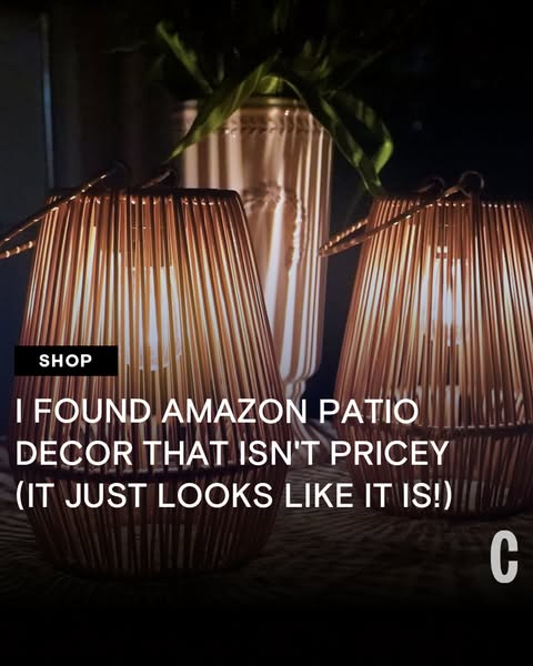
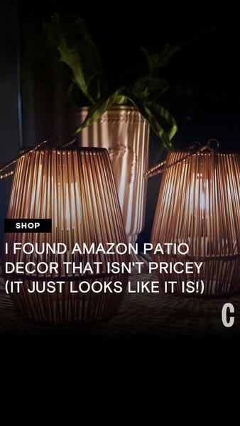
This image ad showcases affordable Amazon patio decor, highlighting the stylish appearance without the high price tag. The ad aims to draw in viewers seeking budget-friendly options for enhancing their outdoor spaces.
# Brand positioning
The ad emphasizes value by showcasing that the brand offers budget-friendly items. The brand positions itself in the market by offering products that look expensive without actually being expensive. The brand aligns with a consumer who wants to decorate their patio without breaking the bank.
# Product
The ad showcases patio decor lanterns that are available on Amazon. The products are not explicitly described but appear to be wire framed and illuminated from within. The product’s key selling point is its stylish appearance, suggesting a high-end look, despite being available on Amazon, implying that the customer does not need to spend a lot of money to attain an elevated aesthetic.
# Visual style
The ad has a cozy, home-like aesthetic, likely shot indoors with soft lighting. The image is not highly polished, giving it a more relatable, user-generated content feel. The typography is simple and functional. The overall style mimics the look of a casual, in-feed post, aiming for a natural and unforced impression.
# Hooks
Headline: I FOUND AMAZON PATIO DECOR THAT ISN'T PRICEY (IT JUST LOOKS LIKE IT IS!)
# Benefits
- [object Object]
- [object Object]
# Features
- [object Object]
# Call to action
None used.
# Point of view
- [object Object]
# Storyline
- The creator is highlighting a find on Amazon for patio decor. This aims to catch the attention of viewers looking for affordable options.
- The creator emphasizes that the decor looks expensive without being expensive. This reinforces the product's value proposition.
# Ad summary
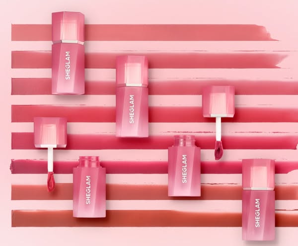
This image ad features SheGlam lip products in multiple shades with a flatlay product shot on a multi-toned background that resembles a color swatch pattern.
# Brand positioning
SheGlam aims to occupy a space in the beauty market that aligns with affordability and accessibility, offering trend-inspired products. The brand ethos centers around enabling customers to explore and express their individuality through makeup without breaking the bank. SheGlam's branding emphasizes a fun, playful, and experimental approach to beauty. The brand ignores the norms of high-end or exclusive beauty brands and embraces a more inclusive and approachable image.
# Product
The product being advertised is a lip product by SheGlam. It is packaged in a clear, geometric bottle with a pink gradient finish. The top is a polygonal shape and solid pink. The applicator is a white wand with a teardrop-shaped sponge tip saturated with the lip product. The ad showcases multiple bottles, each containing a different shade of the product, presumably to highlight the wide range of colors available. The lip product is intended for makeup enthusiasts looking for a variety of color options.
# Visual style
The ad features a clean, studio-shot aesthetic with a flatlay arrangement, which lends a polished feel. The visual motifs, such as the use of a grid layout and the matching color palette, enhance the ad's scannability in-feed. The strategic design contrasts with platform-native content, as the highly polished image stands out against more casual or user-generated content, designed to capture attention quickly.
# Hooks
Headline: None used
# Benefits
- [object Object]
- [object Object]
# Features
- [object Object]
- [object Object]
# Call to action
None used.
# Point of view
- [object Object]
# Storyline
- The ad starts by presenting a flatlay of SheGlam lip products in various shades, arranged on a background of color swatches. This is the brand showing off its product range and the variety of colors available, giving the viewer a sense of the breadth and depth of the offerings.
- The product is showcased in its packaging and applicator, with visual cues of product texture. The brand is conveying the quality of the product and the wide range of shades to the viewer, appealing to the viewer's aesthetic sense and highlighting the variety.
- The color swatches in the background echo the product shades, which lets the brand visually tie the product to real-world application and color payoff. This helps the viewer imagine the look and feel of the product on their lips, encouraging consideration.
# Ad summary
A flatlay-style image ad featuring a yellow background and multiple swimsuits in shades of brown and leopard print. The swimsuits are arranged in a repeating pattern across the background.
# Brand positioning
The brand appears to be positioned as a provider of stylish and fashion-forward swimwear. The use of neutral tones and animal prints suggests a brand that is both sophisticated and playful, appealing to individuals who want to make a statement with their beachwear. The brand's aesthetic leans towards a balance of elegance and trendiness, aiming to capture the attention of consumers who seek high-quality, fashionable swimwear that stands out from the crowd.
# Product
The ad features an assortment of swimwear, including bikini sets and one-piece suits. The bikinis come in various designs, such as classic triangle tops and bandeau styles, paired with matching bottoms. One swimsuit features a leopard print, with string ties on the bottoms. The one-piece suits are in solid brown tones. These swimsuits appear to be designed for women. The variety of styles and colors suggests that the brand aims to cater to different preferences and body types, offering options for those who want both coverage and style. The overall impression is that these swimsuits are fashionable, well-designed, and intended to make the wearer feel confident and stylish while at the beach or poolside.
# Visual style
The ad features a clean and minimalist aesthetic with a flatlay arrangement of the swimsuits. The background is a solid, light yellow color, which provides a bright and cheerful backdrop that makes the swimsuits stand out. The lighting is soft and even, with no harsh shadows, creating a professional and polished look. The arrangement of the swimsuits is somewhat random, yet balanced, giving the impression of effortless style.
# Hooks
Headline: None used
# Benefits
- [object Object]
- [object Object]
- [object Object]
# Features
- [object Object]
- [object Object]
# Call to action
None used.
# Point of view
- [object Object]
# Storyline
- The image shows multiple swimsuits in a flat lay arrangement. The message is to showcase the variety and style options offered by the brand. The POV is from the brand, presenting its product range in an appealing manner.
# Ad summary
This ad promotes Amazon's editor-vetted Memorial Day deals, showcasing a tablet. The ad uses a simple, direct approach with a clear CTA to shop.
# Brand positioning
This ad is for Amazon deals. The brand is presented as a source for editor-vetted products with a focus on promotional events. This approach positions Amazon as a trusted curator of deals, particularly relevant during shopping holidays like Memorial Day, appealing to consumers seeking quality and value.
# Product
The product shown is a tablet, presumably available on Amazon. The tablet is displayed with its screen showing a blue graphic. The overall appearance suggests a modern, sleek design. The ad highlights the availability of the tablet as part of Amazon's editor-vetted Memorial Day deals, implying a limited-time opportunity to purchase the tablet at a discounted price. The ad aims to overcome potential purchase hesitation by associating the product with a curated selection and a well-known sales event.
# Visual style
The ad has a clean, modern aesthetic with a focus on showcasing the product against a gradient background. The lighting is even, highlighting the product's features without harsh shadows. The overall visual style is simple and direct, aiming to draw attention to the promotional event and the featured product.
# Hooks
Headline: SHOP EDITOR-VETTED AMAZON MEMORIAL DAY DEALS
# Benefits
- [object Object]
# Features
- [object Object]
# Call to action
SHOP (in button)
# Point of view
- [object Object]
# Storyline
- The ad presents the tablet with a sleek and modern design, showcased against a gradient background, suggesting high quality and aesthetic appeal from a brand perspective. The intention is to immediately capture the viewer's attention with an appealing visual representation of the product.
- The ad presents the text "SHOP EDITOR-VETTED AMAZON MEMORIAL DAY DEALS" in large, clear text, telling the consumer about an opportunity to purchase products at potentially discounted prices during a specific promotional period. This is from the brand perspective and is intended to create urgency and incentivize immediate action.
- A call to action, a black rectangular button with the text "SHOP" in white text, invites the viewer to explore the editor-vetted deals from the brand's perspective. It serves to directly convert interest into sales by providing a clear next step for the consumer.
# Ad summary
This image ad advertises editor-vetted Amazon Memorial Day deals. The ad features a full-length arched mirror with a gold frame.
# Brand positioning
The brand is implied to be a curator or aggregator of products that are available on Amazon, specifically those that are 'editor-vetted'. The ad promotes a sense of curated expertise, suggesting that the brand's recommendations can be trusted. The brand aims to be seen as a knowledgeable resource for consumers looking for high-quality deals, especially during major sales events like Memorial Day. By highlighting editor-vetted status, the brand positions itself against the vast and sometimes overwhelming selection available on Amazon, offering a more refined and trustworthy shopping experience.
# Product
The advertised products are editor-vetted deals available on Amazon for Memorial Day. The ad features a full-length arched mirror with a gold frame, which is the primary product shown visually. The product is for individuals who are looking for home decor items during the Memorial Day sales event on Amazon. The ad focuses on the benefit of shopping through a curated list of products that have been vetted by editors, addressing the potential purchase barrier of having to sort through numerous products on Amazon to find quality deals.
# Visual style
The ad has a clean, modern aesthetic with a focus on interior design and lifestyle. The production quality appears high, with professional lighting and staging. The image features a neutral color palette with gold accents, creating a sophisticated and inviting atmosphere. The typography is simple and legible, enhancing scannability in-feed.
# Hooks
Headline: SHOP EDITOR-VETTED AMAZON MEMORIAL DAY DEALS
# Benefits
- [object Object]
# Call to action
SHOP (in black rectangular block, in the lower-left corner)
# Point of view
- [object Object]
# Storyline
- The ad presents a stylishly decorated interior setting, which includes a full-length arched mirror. This creates an aspirational and visually appealing environment. The setting is designed to draw the viewer's attention and set the stage for the promotion of editor-vetted Amazon Memorial Day deals from the brand's perspective.
- The ad highlights the 'SHOP EDITOR-VETTED AMAZON MEMORIAL DAY DEALS' message to inform viewers about the opportunity to shop curated deals on Amazon during Memorial Day. This message is delivered from the brand's perspective and aims to attract customers looking for quality deals from a trusted source.
- The inclusion of a 'SHOP' button prompts the viewer to take immediate action and explore the deals being offered. This is a direct call to action from the brand, encouraging viewers to make a purchase.
# Ad summary
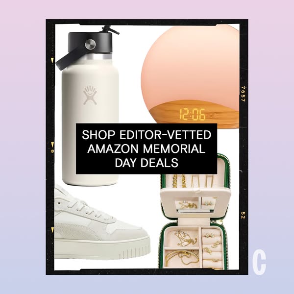
This ad promotes editor-vetted Amazon Memorial Day deals. It features a collage of products against a gradient background, framed by a faux film border to give a vintage look.
# Brand positioning
This ad does not focus on one specific brand; instead, it highlights a selection of 'editor-vetted' items available on Amazon. The items range from home goods to fashion accessories, which is implied to offer a variety of curated products. The brand aims to be seen as a trusted source for identifying quality products on Amazon, providing a shortcut for consumers looking for reliable deals, and focuses on functional positioning through trusted endorsements rather than projecting a specific lifestyle or aesthetic.
# Product
The ad showcases a curated selection of products available on Amazon. These include: a white water bottle with a black lid and handle, featuring a visible brand logo on the bottle; a sunrise alarm clock with a light peach colored dome and a bamboo base, displaying a digital clock; white platform sneakers with a lace-up closure and a white sole; a green jewelry case that is unzipped to reveal an assortment of gold jewelry. The ad promotes these items as part of editor-vetted Memorial Day deals, suggesting a value proposition of quality and savings. The presentation doesn't specify use cases but rather highlights their availability and endorsement.
# Visual style
The ad has a curated and polished aesthetic with a focus on product visibility. The production quality is high, featuring studio-style product shots. The visual motif includes a collage-style layout with a vintage-inspired faux film border. The image treatment appears clean with neutral color grading and background removal for the products. Typography is integrated with a bold, sans-serif font for the main message. The ad blends platform mimicry (faux film border) with a clean product-focused presentation, designed to be scannable and eye-catching in feed.
# Hooks
Headline: SHOP EDITOR-VETTED AMAZON MEMORIAL DAY DEALS
# Benefits
- [object Object]
# Features
- [object Object]
# Call to action
None used.
# Point of view
- [object Object]
# Storyline
- The ad opens with a collage of four distinct product categories (hydration, wellness, fashion, and accessories), each shown as standalone items, which is intended to capture attention and signal a diverse range of options available through a promotion. The perspective is from the brand (Amazon), showcasing the range of products available.
- A central text overlay highlights 'SHOP EDITOR-VETTED AMAZON MEMORIAL DAY DEALS', with the purpose of conveying a sense of trust and endorsement by a third party, which reinforces the value proposition of quality and selection, viewed from the brand's perspective.
- The items are shown in a collage, framed by a faux film border to present the products in an aesthetically-pleasing and curated manner. This aims to visually tie together the products, suggesting a cohesive selection of goods, presented from the brand's perspective.
# Ad summary
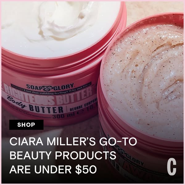
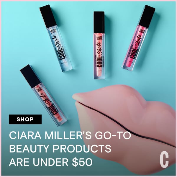
This image ad showcases Soap & Glory products and leverages celebrity endorsement to appeal to value-driven beauty consumers.
# Brand positioning
Soap & Glory is presented as a brand offering high-quality beauty and skincare products, particularly body butters and scrubs, that provide a luxurious experience without the premium price tag. The ad emphasizes a playful, accessible, and results-oriented approach to beauty, suggesting the brand's products are designed to make customers feel pampered and confident in their skin. By highlighting the products' availability under $50, Soap & Glory positions itself as an affordable indulgence, democratizing the self-care experience. It suggests that one does not need to break the bank to enjoy effective and delightful beauty products.
# Product
The ad showcases Soap & Glory's body butters and scrubs. The body butters are presented as rich moisturizers designed to leave skin feeling smooth and hydrated, addressing the pain point of "rubbing feeling" from dry skin. The scrubs are shown as exfoliating treatments to remove dead skin cells. Both products come in pink circular tubs, reinforcing the brand's fun, accessible image. The ad emphasizes the products being part of Ciara Miller's go-to beauty routine, suggesting reliability and effectiveness endorsed by an expert. By featuring both types of products, the ad appeals to a wide range of skincare needs.
# Visual style
The ad has a clean, product-focused visual style with a slightly desaturated color palette that makes the pink pop. The high-angle, close-up shot is typical of product-focused social media content. The overall tone is straightforward, leveraging a recognizable layout (product display plus testimonial) for quick comprehension and scannability.
# Hooks
Headline: CIARA MILLER'S GO-TO BEAUTY PRODUCTS ARE UNDER $50
# Benefits
- [object Object]
# Features
- [object Object]
- [object Object]
- [object Object]
- [object Object]
# Call to action
SHOP
# Point of view
- [object Object]
- [object Object]
# Storyline
- The ad opens with a close-up view of the Soap & Glory body butter and scrub containers, immediately showcasing the products' textures and packaging. This aims to draw the viewer's attention by highlighting the products themselves, creating visual appeal and establishing what the ad is about, all from a brand perspective.
- Next, the ad states that Ciara Miller's go-to beauty products are under $50, which serves to connect the brand with the authority and credibility of a beauty expert while highlighting the products' accessibility and affordability. This attempts to reassure potential customers of the products' quality and value, experienced from the perspective of the brand.
- Lastly, a shop CTA in the bottom left helps direct the viewer toward conversion by encouraging viewers to purchase the products being advertised. This aims to convert interest and consideration into sales by providing an immediate action option. The perspective shifts to the customer who is invited to take advantage of the products and pricing mentioned.
# Ad summary
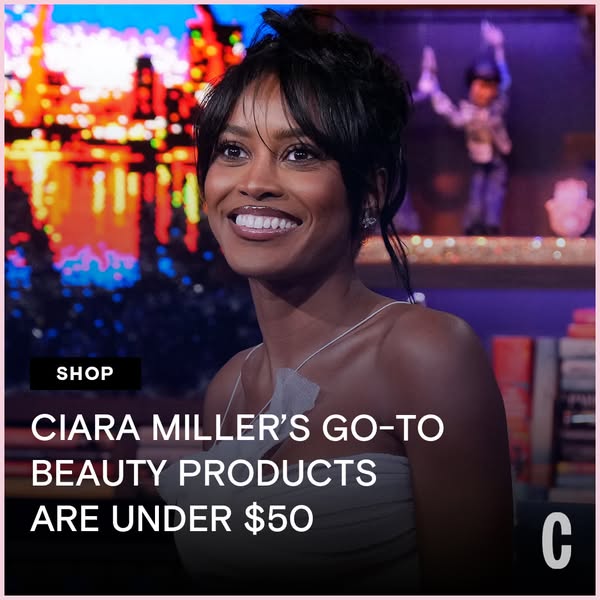
This image ad features Ciara Miller. A caption highlights that her go-to beauty products are under $50. The background is the set of a talk show.
# Brand positioning
This ad does not explicitly showcase a brand. Instead, it focuses on beauty products generally. By featuring Ciara Miller and her favorite beauty products, it aims to occupy a space in the consumer's mind as a brand that is interested in what celebrities use and recommend. It also appears to be going for a more accessible positioning due to the promotion of products under $50.
# Product
The ad does not focus on any specific product. Instead, the ad highlights the fact that Ciara Miller's favorite beauty products are under $50. The overall impression is that these are accessible, affordable products that are useful for achieving a celebrity-approved look.
# Visual style
The ad has a clean, polished look. It appears to be a studio shot. The use of a celebrity gives it a high-end feel, but the focus on affordability makes it more accessible. The typography is large and bold, which helps it stand out. The visual style and the aesthetic, in general, mimic what you may see on a late-night talk show.
# Hooks
Headline: CIARA MILLER'S GO-TO BEAUTY PRODUCTS ARE UNDER $50
# Benefits
- [object Object]
# Features
- [object Object]
# Call to action
None used.
# Point of view
- [object Object]
# Storyline
- The ad begins by featuring an image of Ciara Miller, which is intended to grab the viewer's attention. The ad is implying the viewer will want to learn about the featured person's recommended products.
- The ad then states that Ciara Miller's go-to beauty products are under $50. The ad is implying the user will be interested to learn about the products since they are endorsed by a public figure and are affordable.
# Ad summary
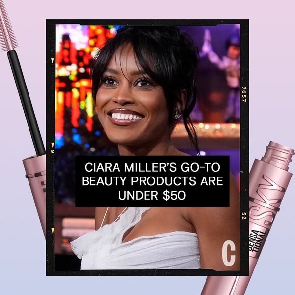
This image ad promotes beauty products that are celebrity Ciara Miller's go-to products and are under $50. The ad utilizes a film strip-style frame around a photo of Ciara Miller, accompanied by the Maybelline Sky High mascara product.
# Brand positioning
This ad focuses on positioning the promoted brand as an accessible and celebrity-approved option. The brand is showcased as the choice of Ciara Miller, implying that the products are high-quality and effective enough for a celebrity's use. By highlighting that her go-to beauty products are under $50, the brand is also subtly challenging the notion that effective beauty products need to be expensive, thus appealing to a wider audience seeking affordability without compromising on quality.
# Product
The ad features Maybelline's Sky High mascara. While not explicitly stated, this product is a mascara designed to lengthen and volumize lashes. The focus on Ciara Miller's endorsement and the under $50 price point aim to lower purchase barriers by associating the product with a trusted figure and making it financially accessible. The product is presented as a way to achieve a celebrity-approved look without breaking the bank, suggesting it is worth trying for those seeking an affordable yet high-impact beauty solution.
# Visual style
The ad adopts a modern and accessible aesthetic. The film strip frame creates a nostalgic and slightly informal feel, suggesting authenticity. The color palette is soft and inviting, with the gradient background adding a contemporary touch. The overall design is clean and simple, focusing attention on the celebrity endorsement and product display. This style feels both current and approachable, indicating a desire to appear both trendy and relatable in the beauty market.
# Hooks
Headline: CIARA MILLER'S GO-TO BEAUTY PRODUCTS ARE UNDER $50
# Benefits
- [object Object]
# Features
- [object Object]
# Call to action
None used.
# Point of view
- [object Object]
# Storyline
- The ad opens by immediately leveraging Ciara Miller's endorsement to draw viewers in. The message is that Ciara Miller trusts these beauty products enough to make them her go-to items. This intends to attract viewers who admire or aspire to emulate Ciara Miller's style.
- Next, the ad emphasizes the affordability of the featured products by stating they are under $50. This aims to address a potential cost barrier and broaden the appeal to a wider audience. The message is communicated from the brand's perspective.
- The inclusion of the Maybelline mascara in the ad reinforces the message. The product is featured as an example of an affordable go-to beauty product used by the celebrity, and it suggests that achieving a celebrity look is within reach for the average consumer. This part of the story is told by the brand, highlighting a specific product within the endorsement narrative.
# Ad summary
This image ad promotes Soap & Glory's COOL Shots lip gloss, featuring Ciara Miller's endorsement. The ad highlights that her favorite beauty products are available for under $50. The ad showcases multiple lip gloss products in different shades and encourages viewers to shop.
# Brand positioning
Soap & Glory presents itself as a brand that offers trendy and accessible beauty products. The brand seems to focus on making beauty accessible through a product endorsed by a creator and an emphasis on affordability with the “under $50” price point. The use of the bold 'Soap & Glory' branding and the placement of the products suggests the brand is confident and mainstream, but the use of celebrity endorsement implies a desire to maintain relevance.
# Product
The featured product is Soap & Glory's COOL Shots lip gloss, available in multiple shades. The product comes in a clear tube with a black cap and a vertical 'COOL Shots' label. The product is presented as a go-to beauty product by Ciara Miller. The lip gloss is highlighted as part of a collection of beauty products available for under $50, making it accessible to a wide range of customers.
# Visual style
The ad features a clean, modern aesthetic with a focus on product presentation and celebrity endorsement. The lighting is bright and even, highlighting the products' colors and textures. The use of a simple background and minimalistic design elements keeps the focus on the products and messaging. The ad imitates a native in-feed style, designed to blend seamlessly with social media content.
# Hooks
Headline: CIARA MILLER'S GO-TO BEAUTY PRODUCTS ARE UNDER $50
# Benefits
- [object Object]
# Features
- [object Object]
# Call to action
SHOP
# Point of view
- [object Object]
- [object Object]
# Storyline
- The ad opens by showcasing multiple tubes of the 'COOL Shots' lip gloss product in various shades, which is intended to grab the viewer's attention and introduce the product range. This is told from the brand's perspective to present the product and demonstrate its availability in different colors.
- The ad then features the headline 'Ciara Miller's go-to beauty products are under $50'. This communicates that a recognized individual vouches for the products, making it a trustworthy and accessible choice. This is told from an external source of credibility and authority.
- The inclusion of a 'Shop' button prompts the viewer to take immediate action and purchase the featured products, suggesting the brand's intention to drive sales directly from the ad. This is told from the brand's perspective.
# Ad summary
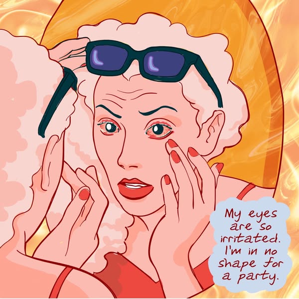
The ad features an animated illustration of a woman with irritated red eyes, framed in a mirror. The text expresses her discomfort and disappointment at being unable to participate in social activities due to her eye irritation. The ad highlights the emotional impact of eye irritation and suggests the need for a solution.
# Brand positioning
This ad does not explicitly mention a brand name or product. However, the ad conveys a focus on health and wellness, specifically related to eye care. The brand is positioned as empathetic to the consumer's discomfort and frustration when dealing with eye irritation, particularly when it interferes with social activities. The brand aims to occupy a space in the consumer's mind as a provider of solutions for such inconveniences. The brand promotes a lifestyle that prioritizes feeling and looking one's best, even in the face of common health issues.
# Product
This ad does not explicitly feature a specific product. It focuses on the problem of irritated eyes and the resulting inability to fully participate in social events. The product implied is intended for those experiencing eye irritation. The ad subtly addresses the purchase barrier related to managing discomfort and the desire to maintain an active social life. The ad suggests a solution for irritated eyes that allows the viewer to feel better and more confident in social situations.
# Visual style
The ad has a hand-drawn illustration style with bold outlines and flat colors. The color palette is dominated by shades of orange and red, which could be associated with the eye irritation. The image treatment appears to be clean and simple. The overall aesthetic is more illustrative than photographic, giving it a unique, less polished feel.
# Hooks
Headline: My eyes are so irritated. I'm in no shape for a party.
# Benefits
- [object Object]
# Features
- [object Object]
# Call to action
None used.
# Point of view
- [object Object]
# Storyline
- The ad begins with a close-up of a woman looking in a mirror with an expression of concern. This aims to immediately establish a relatable scenario for viewers who have experienced similar discomfort. The narrative is told from the customer's perspective, highlighting their frustration and disappointment.
- The woman expresses her discomfort verbally. This reinforces the emotional impact of the situation, underlining the ad's intention to connect with the viewer's personal feelings. This is conveyed from the customer's POV.
- The statement that she is "in no shape for a party" indicates that the irritation is preventing her from engaging in social activities. This shows a deeper connection to the problem. This message is coming directly from the customer's perspective.
# Ad summary
This ad showcases affordable patio decor found on Amazon, emphasizing its stylish appearance despite its low price.
# Brand positioning
The brand highlighted in this ad positions itself as a curator of affordable yet stylish home decor, specifically focusing on Amazon finds. It aims to occupy the space of a budget-friendly tastemaker, proving that good design doesn't have to break the bank. The brand aligns with values of accessibility and smart shopping, seemingly pushing against the notion that quality decor is only available at high price points. The brand positioning appears functional, focusing on affordability and the ease of finding stylish items.
# Product
The featured product is Amazon patio decor, described as affordable yet visually appealing. Specifically, the ad showcases outdoor lanterns constructed from thin vertical bronze-colored rods, with a handle for hanging or carrying. The lanterns are shown illuminated, implying they provide ambient lighting for outdoor spaces. The ad language directly addresses the purchase barrier of high prices, highlighting that these decor items are not pricey, despite their high-end look. The lanterns give an ambiance for special occasions such as a wedding or a cookout with friends and family. The product is worth buying because it offers the aesthetic of expensive decor without the hefty price tag.
# Visual style
The ad has a warm and inviting visual aesthetic, with a focus on creating a cozy and stylish ambiance. It's a UGC-style ad with a warm color grade that emphasizes the warm tones of the lanterns. The typography is large and bold, enhancing scannability. The visual style aims to mimic the type of content you would see on a social platform like Instagram, blending into the feed to catch the viewer's attention without feeling overly commercial.
# Hooks
Headline: I FOUND AMAZON PATIO DECOR THAT ISN'T PRICEY (IT JUST LOOKS LIKE IT IS!)
# Benefits
- [object Object]
- [object Object]
# Features
- [object Object]
- [object Object]
# Call to action
None used.
# Point of view
- [object Object]
# Storyline
- The ad opens with a shot of the patio decor, immediately showcasing the stylish lanterns. The intention is to capture attention with visually appealing products. The audience experiences this from the perspective of a shopper discovering a great find.
- The creator shares that they found Amazon patio decor that isn't pricey but "looks like it is." The intention is to directly address cost concerns while highlighting aesthetic value. This is told from the point of view of a trusted friend who found an amazing deal.
- The ad emphasizes affordability and style, reinforcing the message that attractive decor can be accessible to everyone. The audience experiences this from the perspective of someone sharing the value of an amazing find.
# Ad summary
An image ad for the Cosmopolitan Readers' Choice Beauty Awards features a young woman wearing yellow sunglasses and a striped tank top. Text overlaid on the image urges viewers to vote.
# Brand positioning
The ad highlights the Cosmopolitan Readers' Choice Beauty Awards, positioning Cosmopolitan as a trusted authority in the beauty industry. By showcasing the awards, the brand emphasizes its role in curating and recognizing top beauty products and brands. The ad encourages consumers to participate in the voting process, implying that their opinions are valued and influential in shaping the beauty landscape. This approach aims to create a sense of community and engagement around the Cosmopolitan brand.
# Product
The advertisement promotes voting for the Cosmopolitan Readers' Choice Beauty Awards, encouraging consumers to participate in selecting the top beauty products. There are no beauty products featured.
# Visual style
The ad has a clean and modern visual style, with a focus on the model and a simple background. The image appears to be studio-shot, with polished lighting and a soft color palette. The overall aesthetic is contemporary, aligning with current beauty and fashion trends.
# Hooks
Headline: None used
# Benefits
- [object Object]
# Features
- [object Object]
# Call to action
None used.
# Point of view
- [object Object]
# Storyline
- The ad opens with an image of a model, inviting viewers to pause and take notice. The model is wearing yellow sunglasses and a pastel-colored striped tank top. The intent is to capture the viewer's attention with an aesthetically pleasing and modern visual. This is shown from the brand's perspective.
- An official-looking badge appears in the upper-left corner of the ad, highlighting the Cosmopolitan Readers' Choice Beauty Awards and prompting viewers to vote now. This reinforces Cosmopolitan's authority and credibility. This is communicated from the brand's point of view.
How Other Retail Brands Advertise on Meta
Peer brands in Motion's library — click any brand to see their creative strategy, live ads, and AI breakdowns.