WebMD runs 4K active ads on Meta, shipping ~123 new creatives per week. Their library leans on Pattern Interrupt17%, Infographic16%, and Before and After9%. Recently, WebMD is pushing hard on newsletter subscriptions across specific condition verticals (chronic pain, depression, diabetes, weight management, heart health) while simultaneously running educational content around cardiac conditions like cardiomyopathy and specific diseases like tardive dyskinesia and restless leg syndrome. The strategy leans heavily on condition awareness and patient education, positioning WebMD as the go-to resource for managing ongoing health issues with a mix of treatment intel and lifestyle guidance. There's also a secondary play for WebMD Surveys as a community engagement and monetization tool, dangling gift cards to build their panel.
# Ad summary
This image ad shows a hand holding a puzzle piece that says "CLINICAL TRIAL" on it, suggesting that the clinical trial is the missing piece to solving a medical problem.
# Brand positioning
The ad does not explicitly feature a brand. It is implied that the brand provides or runs clinical trials. The brand aims to occupy a space in the consumer's mind as a provider of solutions to medical problems. The brand attempts to convey a sense of hope and completeness through its service. The brand appears to follow category norms by presenting itself as a part of a solution.
# Product
The product being advertised is a clinical trial. Clinical trials are medical research studies. The puzzle piece is presented as an important missing piece to a solution.
# Visual style
The visual style is clean and minimal, with a focus on the puzzle piece and the hand holding it. The lighting is dramatic, with blue glows emanating from the puzzle pieces, creating a sense of hope and discovery. The image is professionally shot, with a shallow depth of field that keeps the main subject in focus and the background slightly blurred.
# Hooks
Headline: None used
# Call to action
None used.
# Point of view
- [object Object]
# Storyline
- The ad starts with a hand holding a puzzle piece that has the words "CLINICAL TRIAL" on it. The hand represents an individual or organization looking for answers, and it suggests that they are about to find the missing piece to the puzzle. This is from the POV of the brand, presenting the clinical trial as a solution to the viewer's medical challenges.
- The image shows other puzzle pieces in the background, only partially connected, which conveys that there are gaps in knowledge or solutions. The clinical trial is presented as the critical component to complete the puzzle, bringing clarity and resolution. This is from the POV of the brand, showcasing the value and impact of their clinical trial in completing the bigger picture of medical advancement.
# Ad summary
This image shows a model of a human heart being examined up close with a magnifying glass. The ad is geared towards the medical or healthcare industry.
# Brand positioning
There is no brand explicitly featured or promoted in this ad. The focus is purely on an educational or informational depiction of a human heart model. Without any visible branding or messaging, the ad avoids aligning with any particular brand positioning or values. The ad does not push against or follow any category norms, and its nature is more functional than emotional.
# Product
The product is a realistic model of a human heart, designed for educational or demonstrative purposes. The model showcases the anatomical details of the heart, including its chambers, valves, and major blood vessels (arteries and veins). The heart is made of plastic and is painted with different shades of red and brown to depict the muscular tissue, with blue and red lines representing the veins and arteries. The model is set on a stand, allowing it to be viewed from different angles. The ad focuses on the importance of understanding the human heart. The level of detail suggests the model is for someone in the medical field or in a healthcare profession.
# Visual style
The ad has a clean, clinical aesthetic with a clear focus on detail. The image is well-lit, with a shallow depth of field that blurs the background and emphasizes the heart model. The solid blue background creates a stark contrast, making the subject stand out. The overall effect is highly polished and professional, suggesting a studio shot.
# Hooks
Headline: None used
# Benefits
- [object Object]
# Features
- [object Object]
# Call to action
None used.
# Point of view
- [object Object]
# Storyline
- The ad features a detailed model of a human heart. This is included to allow the viewer to see the features of the model heart.
- A magnifying glass is being used to highlight and focus on the intricate details of the heart model, as if inspecting it closely. This conveys the message that the product allows one to see the inner workings of the model heart.
# Ad summary
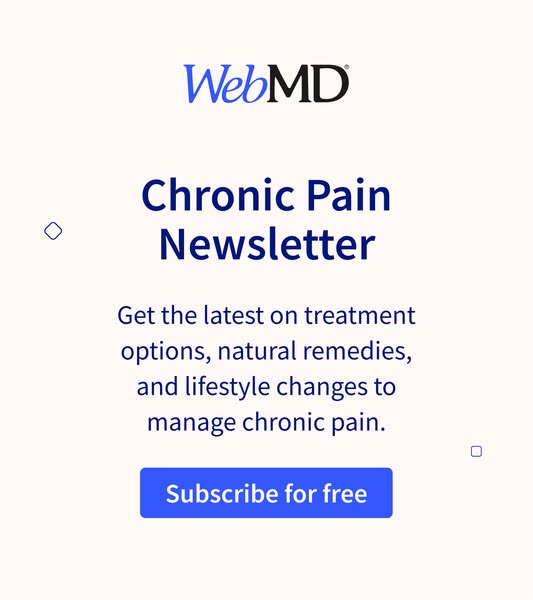
This ad is promoting the WebMD Chronic Pain Newsletter. It entices the user to subscribe for free to get the latest treatment options, natural remedies, and lifestyle changes to manage chronic pain.
# Brand positioning
WebMD is presented as a trustworthy source of health information. The association with health content positions it as an informational resource rather than a medical service provider. It offers the Chronic Pain Newsletter, providing value through accessible and reliable information.
# Product
The product being advertised is the WebMD Chronic Pain Newsletter. It's presented as a free resource offering the latest information on treatment options, natural remedies, and lifestyle changes. The newsletter aims to help individuals manage chronic pain by providing accessible and relevant health information.
# Visual style
The ad has a clean and professional visual style. The layout is simple and uncluttered, with a focus on readability and clear messaging. The use of a limited color palette (primarily blue and white) and basic geometric shapes contributes to a straightforward and trustworthy aesthetic. This style aims to present WebMD as a reliable source of health information in a scannable, in-feed format.
# Hooks
Headline: Chronic Pain Newsletter
# Benefits
- [object Object]
- [object Object]
# Features
- [object Object]
- [object Object]
- [object Object]
# Call to action
Subscribe for free
# Point of view
- [object Object]
# Storyline
- The WebMD logo is displayed at the top, signaling that the ad is from a recognizable health information provider. This builds trust and establishes the brand's credibility as the source of information.
- The ad displays the title “Chronic Pain Newsletter” in a large font, immediately communicating the topic and focus of the ad. This quickly informs the viewer of the newsletter’s specific subject matter.
- The ad describes the value offered by the newsletter: "Get the latest on treatment options, natural remedies, and lifestyle changes to manage chronic pain." This details the benefits of subscribing by listing the key topics covered in the newsletter.
- The ad uses a call to action, "Subscribe for free," in a blue button at the bottom, prompting the viewer to take immediate action. This drives user engagement and encourages newsletter sign-ups.
# Ad summary
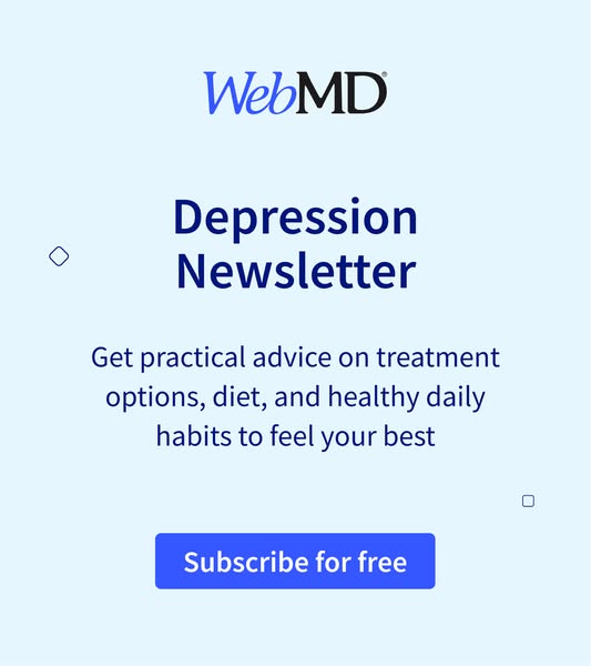
The ad promotes the WebMD Depression Newsletter, offering practical advice on treatment options, diet, and healthy daily habits.
# Brand positioning
WebMD is presented as a trusted source of health information, specifically related to mental health. The brand aims to occupy the space of a reliable guide, providing practical advice and treatment options. Its tone is informative and supportive, aligning with a lifestyle of healthy habits and well-being. By offering a newsletter on depression, WebMD positions itself as a resource that acknowledges and addresses mental health concerns, distinguishing itself from brands that may focus solely on physical health.
# Product
The product is a free newsletter from WebMD focused on depression. It offers practical advice on treatment options, diet, and healthy daily habits. The newsletter is for anyone seeking information and support related to managing depression. The ad addresses the purchase barrier by explicitly stating that the subscription is free, making it accessible to anyone interested in the topic. The ad conveys the idea that the newsletter is a valuable resource for those looking to improve their well-being through informed choices and lifestyle adjustments.
# Visual style
The ad has a clean, straightforward visual style with a focus on clarity and legibility. It uses a simple color palette of blue and white, creating a sense of trustworthiness. The typography is clear and easy to read, emphasizing the message. The design is minimal, avoiding distractions and focusing on the key information about the newsletter.
# Hooks
Headline: Depression Newsletter
# Benefits
- [object Object]
- [object Object]
# Features
- [object Object]
- [object Object]
- [object Object]
# Call to action
Subscribe for free
# Point of view
- [object Object]
# Storyline
- WebMD introduces itself as the source of information by displaying its logo at the top of the image. The purpose is to establish the brand's credibility and signal that the information comes from a trusted health resource. This is from the brand's POV.
- The ad announces the "Depression Newsletter" to inform viewers about the specific topic of the newsletter. This highlights the focus on mental health and aims to attract those interested in this area. This is from the brand's POV.
- The ad describes the content of the newsletter as providing "practical advice on treatment options, diet, and healthy daily habits to feel your best". The purpose is to entice viewers by promising valuable and actionable information that can improve their well-being. This is from the brand's POV.
- The ad provides a clear call to action with the button that says, "Subscribe for free". The purpose is to prompt the viewer to take the next step and sign up for the newsletter. This is from the brand's POV.
# Ad summary
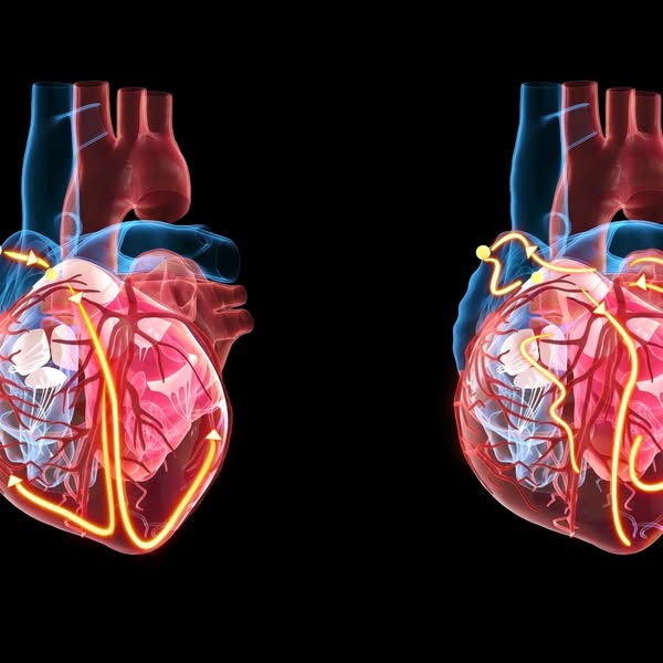
This ad features a split-screen visualization of a heart, with arrows indicating electrical pathways. It aims to educate viewers about heart health.
# Brand positioning
There is no brand presented in the visual ad. The ad is purely informative.
# Product
This ad showcases a visualization of a human heart. Red and blue shading highlight the organ's structure, while yellow arrows trace the electrical pathways.
# Visual style
The ad features a scientific and informative visual style. It uses a digitally rendered anatomical visualization with clear, contrasting colors to highlight key features. The black background keeps the focus on the heart and its pathways. The overall production quality appears highly polished, suggesting a professional medical or educational source.
# Hooks
Headline: None used
# Benefits
- [object Object]
# Features
- [object Object]
# Call to action
None used.
# Point of view
- [object Object]
# Storyline
- The ad starts with a detailed visual representation of a human heart, focusing on its anatomical structure and electrical pathways. This is included to grab attention and set the stage for discussing heart health from an educational point of view.
- The visualization then highlights the electrical pathways of the heart with yellow arrows. This is intended to educate the viewer about how the heart functions from an educational point of view.
# Ad summary
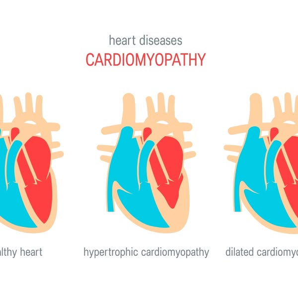
This is an informational ad that shows three different types of heart disease, cardiomyopathy. The ad presents healthy heart, hypertrophic cardiomyopathy, and dilated cardiomyopathy.
# Brand positioning
There is no brand being promoted in the ad. The ad seems to be for educational purposes.
# Product
The products being advertised are the concepts of 3 different types of hearts. The first one is a healthy heart, the second one is a heart with hypertrophic cardiomyopathy, and the third heart is dilated cardiomyopathy. The hearts are shown as cartoon images that highlight which part of the heart has the disease. The point of the image is to distinguish between the types of heart diseases.
# Visual style
The ad uses a simple, cartoon style to depict three different types of hearts to educate the viewer.
# Hooks
Headline: CARDIOMYOPATHY
# Benefits
- [object Object]
# Features
- [object Object]
- [object Object]
- [object Object]
# Call to action
None used.
# Point of view
- [object Object]
# Storyline
- The ad shows the viewer an image of three hearts. The first heart is labeled as a healthy heart and it is the correct shape, the second heart shows hypertrophic cardiomyopathy and the third shows dilated cardiomyopathy. This image intends to educate the viewer on the different forms of cardiomyopathy.
# Ad summary
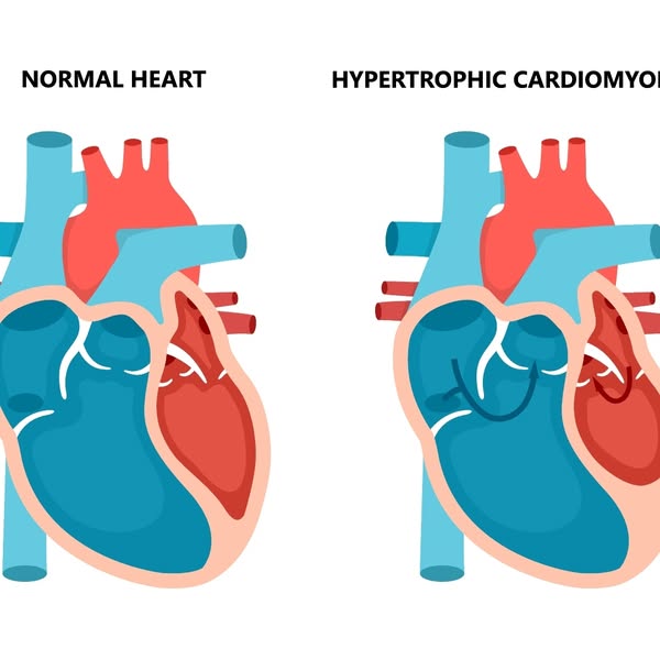
This is a comparison ad that displays two images of a normal heart and a heart with hypertrophic cardiomyopathy.
# Brand positioning
There is no brand shown or referenced in this image.
# Product
There is no product being advertised. The ad features a side-by-side comparison of a normal human heart and a heart with hypertrophic cardiomyopathy. The cross-section illustrations depict the organ's exterior shape and interior structure, with different areas distinguished by shades of red, blue, and white.
# Visual style
The ad employs a straightforward, clinical, and educational visual style. It utilizes simple, vector-style illustrations with clear, contrasting colors for easy understanding. The production quality is clean and polished, resembling textbook or infographic design.
# Hooks
Headline: None used
# Benefits
- [object Object]
# Features
- [object Object]
# Call to action
None used.
# Point of view
- [object Object]
# Storyline
- The image presents the audience with a diagram of a healthy human heart, intending to educate on the baseline anatomy. The perspective is from an external observer, aiming to establish a point of reference for comparison.
- The image presents a diagram of a heart with hypertrophic cardiomyopathy, highlighting the differences between the normal and diseased heart. The perspective is from an external observer, intending to show the effects of the condition on the heart's structure.
# Ad summary
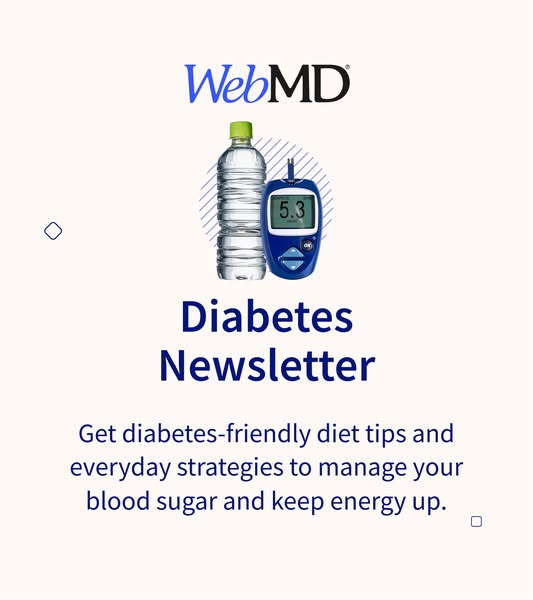
This WebMD ad promotes a newsletter that contains diabetes-friendly diet tips and everyday strategies to manage blood sugar and keep energy levels up.
# Brand positioning
WebMD is presented as a trusted source of medical information, providing diabetes-friendly diet tips and strategies. The brand aims to occupy the space of a reliable health resource, promoting a sense of well-being through everyday strategies. The brand aligns with values of health and management, and it ignores trends to focus on providing concrete solutions for diabetes management. The brand positioning is functional, providing accessible and clear information, rather than trying to be aspirational.
# Product
The ad features a diabetes newsletter, offering diabetes-friendly diet tips and everyday strategies to manage blood sugar and keep energy up. The newsletter is for individuals with diabetes who seek practical advice and information to better manage their condition. The ad addresses the need for accessible information and strategies to manage diabetes effectively. The value is in the utility of information.
# Visual style
The ad has a clean and simple aesthetic with a focus on providing clear information. The production quality is polished, with well-lit product shots against a simple background. The image treatment includes background removal. The typography is large and bold.
# Hooks
Headline: Diabetes Newsletter
# Benefits
- [object Object]
- [object Object]
# Features
- [object Object]
- [object Object]
# Call to action
None used.
# Point of view
- [object Object]
# Storyline
- The ad introduces the WebMD brand at the top, establishing the credibility of the information source. The brand is presenting itself as an authoritative source for health information, setting the stage for the diabetes-related content that follows.
- The ad visually associates a water bottle and blood glucose meter with the headline "Diabetes Newsletter," setting the context for the content. This is from the brand's perspective.
- The ad promises "diabetes-friendly diet tips and everyday strategies to manage your blood sugar and keep energy up," conveying the value proposition of the newsletter. The brand aims to provide solutions to the viewers.
# Ad summary
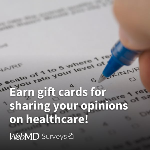
This ad encourages people to share their opinions on healthcare in exchange for gift cards by joining WebMD Surveys.
# Brand positioning
WebMD Surveys is presented as a platform where individuals can contribute their opinions on healthcare-related topics. The brand positions itself as a facilitator of valuable insights by incentivizing participation with gift cards, suggesting a mutually beneficial relationship between WebMD and its survey participants. This positions WebMD as a reliable source of information within the healthcare sector, emphasizing the importance of individual perspectives in shaping healthcare discussions and policies.
# Product
WebMD Surveys is a program designed to collect opinions and insights on healthcare topics from individuals, offering gift cards as a reward for participation. The program is open to anyone interested in sharing their views, making it accessible to a broad audience. The ad highlights the opportunity to earn gift cards, presenting a direct incentive for users to engage with the surveys. The ad suggests that by participating, individuals can contribute to healthcare discussions while receiving compensation for their time and insights.
# Visual style
The ad uses a close-up, high-angle shot of a survey form being filled out, giving the image an authentic feel. The lighting is soft and diffused, reducing harsh shadows and creating an inviting tone. The shallow depth of field blurs the background, drawing attention to the survey and the pen. The brand logo is cleanly integrated at the bottom, maintaining a professional yet approachable aesthetic. The image suggests a blend of professionalism and ease, aiming to make the viewer feel comfortable and intrigued.
# Hooks
Headline: Earn gift cards for sharing your opinions on healthcare!
# Benefits
- [object Object]
# Call to action
None used.
# Point of view
- [object Object]
# Storyline
- The ad captures an image of a hand completing a healthcare survey and aims to highlight that participating in healthcare surveys is a straightforward way to earn gift cards. The story begins with an image that is meant to be a depiction of a real-life survey completion.
# Ad summary
The ad features an image of a person working at a laptop and shows an ad for health insurance, which includes a click button for the viewer.
# Brand positioning
This ad promotes a health insurance provider that offers a way to save your health by providing access to accident, incident, and protection coverage. The brand aims to occupy a space in the consumer's mind as a comprehensive solution for health-related coverage. By emphasizing the importance of saving one's health, the brand aligns with values of security, well-being, and proactive health management. The brand pushes against the norm of reactive healthcare by providing access to a comprehensive platform for health-related risks.
# Product
The product featured in the ad is health insurance coverage. It is positioned as a solution for anyone seeking to protect their health and well-being. The ad highlights coverage for accidents, incidents, and general protection. It works by providing a safety net to cover costs associated with health risks. The ad targets individuals who want to save their health with health insurance and seeks to remove the purchase barrier by offering peace of mind and financial security in case of unexpected health events.
# Visual style
The ad has a clean and professional visual style, with a focus on the product (health insurance) being presented in a clear and accessible manner. The image is well-lit, with soft lighting that creates a welcoming and approachable atmosphere. The composition is balanced, with the laptop as the central element and supporting props (pens, plant, coffee) that add context and a sense of everyday life. The use of a real person interacting with the laptop adds a personal touch.
# Hooks
Headline: Health Insurance
# Benefits
- [object Object]
# Features
- [object Object]
- [object Object]
- [object Object]
# Call to action
Click (button on laptop screen)
# Point of view
- [object Object]
- [object Object]
# Storyline
- The ad shows a laptop screen displaying a health insurance advertisement with the headline "Health Insurance Save Your Health" and a button labeled "Click". The intention is to immediately introduce the product and its primary value proposition, emphasizing the ease of accessing information and coverage through a simple click. This is presented from the brand's POV to capture attention and prompt engagement.
- The ad shows a person using a laptop while making notes on a notepad. The intention here is to present the health insurance ad in a lifestyle setting, implying that getting insurance is easy and can be done while going about your normal life. This is shown from the customer's perspective, to showcase how the product fits into their daily routine.
# Ad summary
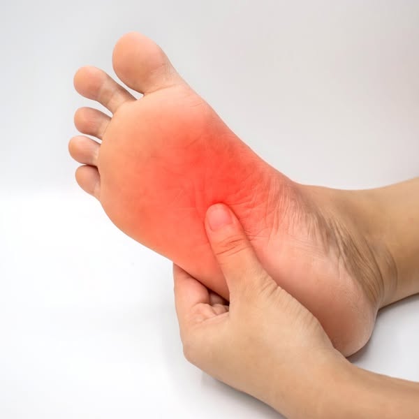
This image ad focuses on the pain point of foot pain, and intends to highlight a product that addresses this issue.
# Brand positioning
There is no brand explicitly shown in this ad. The focus is on the universal experience of foot pain, setting the stage for a solution-oriented product to be introduced. The brand would likely position itself as an empathetic provider of relief, aligning with a functional approach to wellness and self-care by directly addressing the discomfort experienced by the target customer.
# Product
There is no product explicitly shown in this ad. The focus is on the problem of foot pain, specifically in the arch area. The redness indicates inflammation or soreness. The hand applying pressure implies the person is seeking relief, suggesting the advertised product may reduce this pain or discomfort. The implied target audience is someone experiencing foot pain or discomfort.
# Visual style
The visual style is clinical and straightforward, focusing on the depiction of physical discomfort. The shot is close-up and well-lit, with a neutral background that ensures the viewer's attention is directed to the foot and the highlighted area of pain. The overall aesthetic is simple and direct, with no distractions, aiming to connect with viewers experiencing similar foot issues.
# Hooks
Headline: None used
# Benefits
- [object Object]
# Features
- [object Object]
# Call to action
None used
# Point of view
- [object Object]
# Storyline
- The ad begins by showing a foot with an area highlighted in red. The message conveyed is about the presence of pain or discomfort in the foot, specifically focusing on the arch. This visual serves to immediately grab the viewer's attention by presenting a relatable physical issue. The audience is experiencing it from the customer's perspective.
- A hand is shown pressing on the painful area of the foot. The message conveyed is of someone attempting to alleviate the discomfort, signaling a search for relief. This adds to the narrative by implying the need for a solution. The audience experiences it from the customer's perspective.
# Ad summary
This image ad for WebMD Surveys promotes the opportunity to earn gift cards for sharing opinions on healthcare. It uses a simple design with text overlaying a clipboard and pencil graphic.
# Brand positioning
WebMD Surveys is presented as a survey platform that values and rewards user opinions on healthcare topics. The brand aims to occupy a space in the consumer's mind as a reputable source for healthcare information, and a platform that compensates individuals for their healthcare insights. The positioning is functional, offering a straightforward exchange: opinions for gift cards, implying simplicity and direct benefit for participation.
# Product
The featured product is the WebMD Surveys platform, which allows individuals to share their opinions on healthcare topics in exchange for gift cards. The platform targets individuals interested in healthcare and willing to share their opinions. The unique selling proposition (USP) is the opportunity to earn rewards (gift cards) for a relatively simple task (sharing opinions). The ad addresses the potential purchase barrier of time investment by implying the survey process is quick and easy, given the simplicity of the clipboard and checklist graphic.
# Visual style
The ad has a clean, minimalist visual style with a flat design. The production quality appears polished and professional, using simple shapes and a limited color palette of blues and white. The typography is clean and legible, contributing to the ad's scannability. The overall style is platform-native, fitting seamlessly into a standard social media feed with its bright and simple design.
# Hooks
Headline: Earn gift cards for sharing your opinions on healthcare!
# Benefits
- [object Object]
# Call to action
None used.
# Point of view
- [object Object]
# Storyline
- The ad begins by highlighting the opportunity to earn gift cards. This message aims to immediately grab the viewer's attention by promising a tangible benefit and it is from the brand's perspective.
- The ad specifies that the gift cards are in exchange for sharing opinions on healthcare. This part of the story clarifies the activity required to earn the gift cards, setting expectations that the survey platform is related to healthcare insights. It is also from the brand's perspective.
- The visual of a clipboard with a checklist symbolizes surveys and data collection. This reinforces the idea of sharing opinions in a structured format. It is from an external source.
# Ad summary
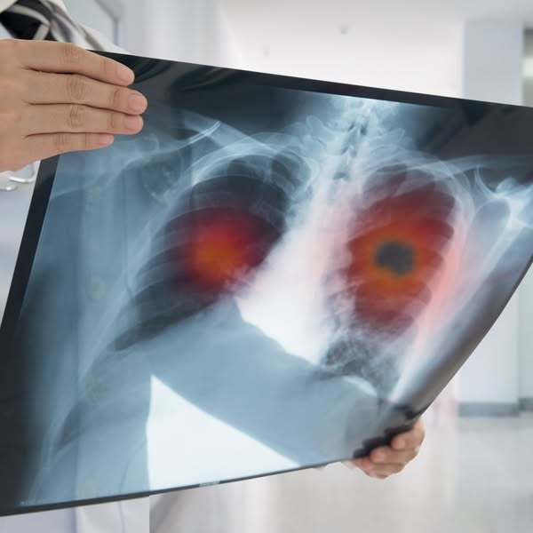
This ad shows an X-ray of a person's chest. There are red areas around the lungs, implying lung disease. The ad is likely about a medication or other intervention for improving lung health.
# Brand positioning
There is no brand present in this image. Therefore, no inferences can be made about the brand or its market positioning.
# Product
No product is shown in this ad, so there is no product description. The image focuses on an X-ray of a pair of lungs, and red areas appear in the lungs. The image implies the need for a health-related product to treat diseased or infected lungs.
# Visual style
The ad uses a stark, clinical visual style. The X-ray image is intended to convey a sense of medical accuracy and concern, while the clinical background reinforces the health context. The use of red highlights on the X-ray image draws the viewer's eye and emphasizes potential health issues.
# Hooks
Headline: None used
# Benefits
- [object Object]
# Features
- [object Object]
# Call to action
None used
# Point of view
- [object Object]
# Storyline
- The audience sees an x-ray of a chest cavity with lungs. The intention is to show the viewer a visual representation of a potential lung issue. This is shown from an external source, such as a medical professional, to grab the audience's attention and highlight a health concern.
# Ad summary
Ad for WebMD Surveys offering gift cards for sharing opinions on healthcare. The image features a laptop with a graphic of a checklist overlaid, emphasizing the survey format. The focus is on earning rewards for providing feedback.
# Brand positioning
WebMD Surveys is presented as a platform that values and rewards individuals for sharing their opinions on healthcare. The brand positions itself as a bridge between healthcare providers and consumers, offering a structured way for users to contribute to the improvement of healthcare services. By providing gift cards, WebMD Surveys incentivizes participation and establishes a mutually beneficial relationship with its users, thus creating an active and engaged health-conscious community. The brand's focus is functional, emphasizing accessibility and rewards for participation, which may appeal to those interested in contributing to healthcare discussions and improvements.
# Product
The advertised product is WebMD Surveys, a platform designed for individuals to share their opinions on healthcare topics. Participants are rewarded with gift cards for their contributions. The ad emphasizes the ease of participating in surveys from a laptop, suggesting convenience and accessibility. The core function is to gather feedback and insights on healthcare, incentivizing participation through monetary rewards. It targets individuals interested in healthcare discussions, who want to make their voices heard and are motivated by the chance to earn gift cards. The ad aims to reduce barriers to participation by highlighting the simple, rewarding nature of the platform.
# Visual style
The ad employs a clean, professional visual style. It uses a slightly blurred background to keep the focus on the laptop and the overlaid checklist graphic. The color palette is muted, with a combination of dark gray, white, and soft warm lighting. The composition is balanced, featuring the laptop prominently in the foreground with the checklist graphic serving as the primary visual element. The style is intended to be functional and straightforward, aiming to quickly convey the ad's message and call to action.
# Hooks
Headline: Earn gift cards for
sharing your opinions
on healthcare!
# Benefits
- [object Object]
# Features
- [object Object]
# Call to action
None used.
# Point of view
- [object Object]
# Storyline
- The ad begins by presenting an opportunity to “Earn gift cards for sharing your opinions on healthcare!” This is intended to quickly grab the viewer's attention by showcasing the incentive (gift cards) and the action required (sharing opinions), presented from the brand's POV to attract potential participants.
- The visual element of a laptop with a checklist overlaid shows a survey being completed. This reinforces the idea of easy participation and the structured way to provide feedback, seen from the brand's perspective as it illustrates how users can engage with their platform.
- The ad concludes with the WebMD Surveys logo, clearly identifying the brand behind the offer, coming directly from the brand's POV to reinforce its identity and credibility.
# Ad summary
This image ad promotes a weight management newsletter from WebMD, highlighting top food choices, daily habits, and expert-backed tips for weight loss. The layout features a balanced plate of food, a scale, and a clear call to subscribe, aiming to attract individuals interested in health and wellness information.
# Brand positioning
WebMD is presented as a trusted source of health information, providing expert-backed tips and guidance for individuals seeking to manage their weight. The brand positions itself as a reliable resource for making informed decisions about food choices and daily habits, aligning with a health-conscious lifestyle. WebMD follows the category norm of providing factual, informative content, distinguishing itself through its established reputation and expert endorsements. The brand positioning is functional, focusing on providing practical advice and support for weight loss.
# Product
The advertised product is a "Weight Management Newsletter" offered by WebMD. This newsletter provides readers with the latest information on top food choices, daily habits, and expert-backed tips aimed at supporting weight loss. It targets individuals interested in improving their health through informed dietary and lifestyle choices. The newsletter addresses the purchase barrier of information overload by curating expert-backed tips into an easily digestible format, promoting itself as a resource that simplifies the path to weight loss.
# Visual style
The ad has a clean and minimalist aesthetic with a light color palette. The production quality appears polished, resembling a typical ad seen in-feed. A grid layout helps organize the information, and the typography is bold and legible. The overall design mimics platform-native styles, enhancing scannability and stop power in the feed.
# Hooks
Headline: Weight Management Newsletter
# Benefits
- [object Object]
# Features
- [object Object]
- [object Object]
- [object Object]
# Call to action
None used.
# Point of view
- [object Object]
- [object Object]
# Storyline
- The ad opens by presenting the WebMD logo and brand, immediately establishing credibility and trust in the health and wellness space. The brand tells this part of the story, immediately setting the stage for reliable health information.
- Next, the ad features a balanced plate of food and a scale. This is designed to visually represent the core theme of weight management through diet and exercise. The brand is using imagery to convey a sense of healthy choices and balanced living as part of the program.
- The ad highlights the promise of expert-backed information. It indicates how the newsletter will provide 'top food choices, daily habits, and expert-backed tips to support weight loss.' This is intended to show the value and benefit of subscribing to the newsletter. The brand is promoting its reliability and expertise as a valuable source for achieving weight loss goals.
# Ad summary
This ad is aimed to promote the importance of staying hydrated. The ad shows a woman holding a glass of water.
# Brand positioning
There is no mention of the brand in the ad.
# Product
The product in the ad is a clear glass filled with water. The ad aims to promote the importance of hydration by visually displaying a woman holding the product.
# Visual style
The image is a studio shot with soft, natural lighting. The focus is primarily on the product, with a shallow depth of field that blurs the background. The composition is simple and clean, emphasizing the product and the person interacting with it. The overall effect is polished and professional, typical of lifestyle product advertising.
# Hooks
Headline: None used
# Benefits
- [object Object]
# Features
- [object Object]
# Call to action
None used.
# Point of view
- [object Object]
# Storyline
- The ad features a woman holding a glass of water, which conveys the message of staying hydrated.
# Ad summary
This ad shows a woman in bed and uses that visual to connect the idea of restless leg syndrome with a solution for the pain.
# Brand positioning
This ad does not explicitly showcase a specific brand, instead focusing on addressing a widespread issue that many people experience. The brand aims to occupy a space in the consumer's mind as the solution for restless leg syndrome. It implies that the product is a reliable solution for this condition. The brand positioning is primarily functional, focusing on providing relief and comfort.
# Product
This ad focuses on a solution for restless leg syndrome. It directly confronts the discomfort and nightly disturbances caused by this condition, presenting itself as the go-to solution for individuals experiencing these symptoms. The product is not explicitly shown, but the ad serves to build awareness of a solution for those who may be unaware that a solution exists for their RLS.
# Visual style
The ad features a realistic and intimate visual style, resembling a photo taken in a bedroom setting. The production quality appears polished, but the focus on realism and relatability creates a sense of authenticity. The image treatment includes soft lighting and blurring to emphasize the discomfort and movement associated with restless legs syndrome. The visual style is likely designed to be scannable and relatable, grabbing attention in the feed through its realistic depiction of a common issue.
# Hooks
Headline: None used
# Benefits
- [object Object]
# Features
- [object Object]
# Call to action
None used.
# Point of view
- [object Object]
# Storyline
- The ad opens with a visual depiction of restless legs. The image sets the stage by showing legs in bed that are experiencing discomfort and movement. This helps viewers empathize by illustrating the common sleep issue.
# Ad summary
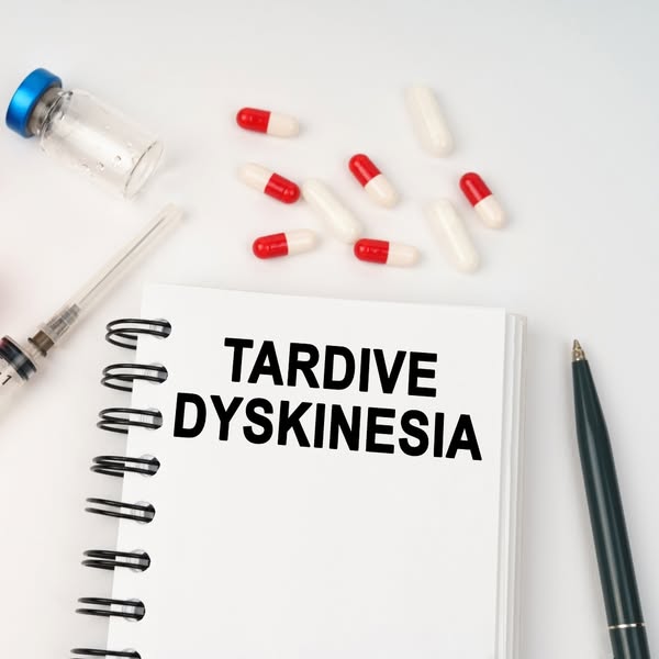
The ad shows an image with medical objects on a white background with a notebook in the center labeled "Tardive Dyskinesia."
# Brand positioning
None used.
# Product
None used.
# Visual style
The ad features a clean, clinical aesthetic with a flat lay arrangement on a white background. The production quality appears to be a studio shot, with even lighting and a focus on clarity and detail. The typography is large and bold for emphasis, with a minimalist style that is common in informational materials.
# Hooks
Headline: TARDIVE DYSKINESIA
# Benefits
- [object Object]
# Features
- [object Object]
# Call to action
None used.
# Point of view
- [object Object]
# Storyline
- The ad shows medical objects with a notebook in the center, suggesting the topic is related to medical information. The intent is for informational or awareness purposes from a medical or educational perspective.
# Ad summary
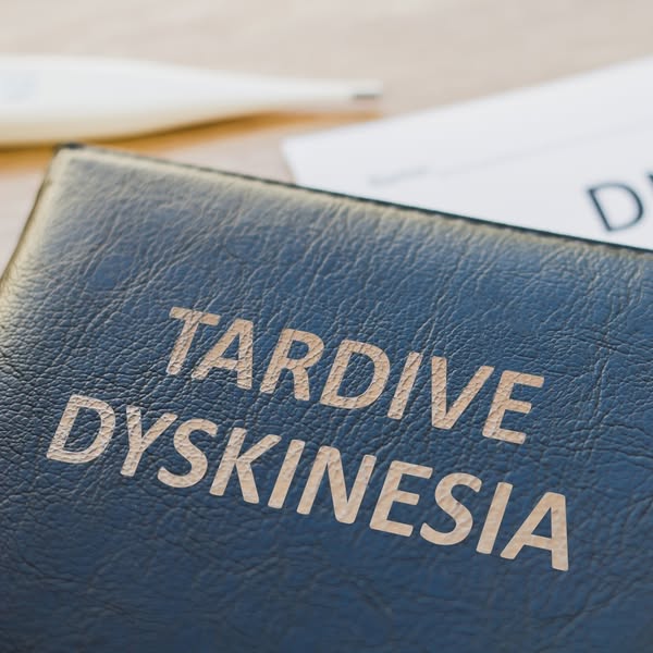
This image ad features a close-up of a medical reference book with the words 'Tardive Dyskinesia' on the cover, which is designed to inform viewers about this medical condition.
# Brand positioning
This ad does not explicitly present a specific brand. However, the focus on 'Tardive Dyskinesia' suggests a brand associated with medical education, pharmaceutical research, or healthcare solutions related to neurological conditions. The brand aligns with values of medical accuracy and healthcare improvement. It positions itself as an educational resource within the healthcare industry.
# Product
This ad features a medical reference book labeled 'Tardive Dyskinesia.' The book is a resource intended for healthcare professionals, medical students, or individuals seeking information about this neurological condition. The ad highlights the availability of detailed information about Tardive Dyskinesia, implicitly addressing the knowledge gap and purchase barriers related to understanding complex medical conditions.
# Visual style
The visual style is clean and informative. The image is professionally shot, emphasizing clarity and legibility. The color palette is subdued, with the dark blue book contrasting against the lighter wooden surface. The visual aesthetic is designed to convey medical accuracy and educational value.
# Hooks
Headline: TARDIVE DYSKINESIA
# Benefits
- [object Object]
# Features
- [object Object]
# Call to action
None used
# Point of view
- [object Object]
# Storyline
- The image presents a close-up view of a medical reference book, conveying a message about accessing and learning about the condition Tardive Dyskinesia from the brand's point of view. This draws attention to the topic and encourages viewers to engage with the subject matter.
# Ad summary
This ad promotes WebMD's Heart Health Newsletter, offering the latest information on heart-healthy diets and expert-backed ways to protect heart health daily. It uses a simple design with a clear call to action to subscribe for free.
# Brand positioning
WebMD is presented as a trusted and authoritative source of health information, particularly concerning heart health. The brand is positioned as providing 'expert-backed ways' and 'the latest' information, implying a commitment to accuracy and up-to-date knowledge. The focus on heart health places WebMD in the niche of preventative and informative health content, aligning with a user's desire to proactively manage their well-being. The brand aims to occupy the space of a reliable health resource that empowers consumers to make informed decisions about their health, specifically in the area of cardiovascular wellness.
# Product
The product being advertised is the WebMD Heart Health Newsletter, which is described as providing 'the latest on heart-healthy diets and expert-backed ways to protect your heart daily.' It offers information on maintaining a healthy heart through diet and expert advice. The newsletter is positioned as a resource that users can access daily, suggesting regular and ongoing value. The primary benefit is access to reliable information that can help users make informed choices to protect their heart health. A potential purchase barrier is addressed by offering the subscription 'for free,' making it accessible to a broad audience.
# Visual style
The ad uses a clean, simple design with a white background and blue text. It has a professional, informative feel, consistent with WebMD's brand. The layout is straightforward and easy to read, with a clear call to action.
# Hooks
Headline: Heart Health Newsletter
# Benefits
- [object Object]
- [object Object]
# Features
- [object Object]
- [object Object]
# Call to action
Subscribe for free
# Point of view
- [object Object]
# Storyline
- The ad begins with the WebMD logo, establishing the brand as a credible source of health information. This logo is a recognizable brand that viewers likely already know and trust.
- The ad then directly announces its focus with the 'Heart Health Newsletter' headline. This headline clearly states the ad's topic, drawing in those specifically interested in heart health and immediately conveying what the ad is promoting.
- The ad continues by promising 'the latest on heart-healthy diets and expert-backed ways to protect your heart daily.' This description elaborates on the newsletter's contents and offers the potential benefit of expert advice and up-to-date information for maintaining heart health, which is presented from the brand's perspective.
- The ad concludes with a prominent 'Subscribe for free' button, prompting immediate action. This CTA reduces any potential barriers to entry and encourages users to engage with the brand, shown from the brand's perspective.
How Other Health & Wellness Brands Advertise on Meta
Peer brands in Motion's library — click any brand to see their creative strategy, live ads, and AI breakdowns.