# Ad summary
This Rifle Paper Co. ad showcases its Americana Summer Collection. A woman on a beach showcases different items from the collection.
# Brand positioning
Rifle Paper Co. is presented as a brand with a strong focus on design and aesthetics. The brand is launching an Americana Summer Collection that captures the essence of American style with a blend of traditional and artistic elements. The brand appears to ignore any category norms or competitor behaviors by creating a unique niche through its intricate designs. The tone of the brand is emotional, evoking feelings of nostalgia and a connection to Americana.
# Product
The ad features items from Rifle Paper Co.'s Americana Summer Collection. The main product featured is a blanket with an American flag pattern using flowers for the stars and stripes. The model is wearing a cap with the brand's logo on the front. The setting, which appears to be a beach, suggests these products are suitable for outdoor summer activities. The products aim to capture the spirit of summer with a blend of Americana and floral design.
# Visual style
The ad has a soft, nostalgic aesthetic, with a polished, commercial feel. The editing style is simple, with static shots and smooth transitions. The pacing is slow and consistent, with a calm and relaxed tone. The visuals are timed to match the gentle music.
# Benefits
- [object Object]
# Features
- [object Object]
# Call to action
None used.
# Point of view
- [object Object]
# Storyline
- 00:00–00:04 00:00–00:04 A woman is standing on a beach, wrapping herself in a blanket. The message conveyed is one of freedom and relaxation, positioning the product as a companion for leisure. The perspective is from an observer. The tone is serene.
- 00:04–00:08 00:04–00:08 The shot transitions to a lighthouse. The message conveyed is to show the Americana theme of the product. The perspective is from an observer. The tone is nostalgic.
How Rifle Paper Co. Advertises on Meta
Refreshed 6 weeks ago · Weekly refresh cadence
Rifle Paper Co. runs 263 active ads on Meta, shipping ~29 new creatives per week. Their library leans on Headline56%, Collage10%, and Product Image6%. Recently, rifle paper co. is pushing hard into home goods and collaborations, particularly bedding with The Company Store (Strawberry Fields collection) and drinkware with Corkcicle, while their Americana Summer Collection anchors the seasonal moment with picnic and beach lifestyle imagery. The through-line is pattern as product, positioning their signature florals and designs as licensing opportunities across categories from furniture (Cloth & Company chairs) to tech accessories (Kindle cases) rather than just paper goods. It's a volume play on brand expansion, treating every surface as canvas and leaning into aspirational domesticity and warm-weather entertaining.
Indexed by Motion's Inspo Library.
The 20 Most Recent Rifle Paper Co. Ads on Meta
# Ad summary
This ad showcases the Rifle Paper Co. brand and the patterns they offer on different textiles.
# Brand positioning
Rifle Paper Co. is presented as a brand that offers home goods, stationery, and gifts. The patterns are intricate, colorful, and vintage-inspired, suggesting the brand values beauty, attention to detail, and timeless design. The brand seems to ignore the minimalist trend by embracing maximalism, encouraging customers to express themselves through ornate design. The brand appears to focus on emotional appeal through its focus on visual design.
# Product
The ad showcases various textiles from Rifle Paper Co. The products are patterned with floral designs and vintage prints. The ad is designed to highlight the intricate details and the different color palettes available. The textiles vary in their weave and texture, each appearing to be designed to enhance the pattern's visual impact. The product aims to capture the attention of customers who are looking to add a touch of color and character to their homes or personal accessories. The textiles are designed to be both visually appealing and potentially functional for a range of uses.
# Visual style
The ad has a close-up and detailed view of the products. The video has an aesthetic that feels polished, high-end, and the editing is smooth. The pacing is slow and consistent.
# Call to action
None used.
# Point of view
- [object Object]
# Storyline
- 00:00–00:13 The camera is focused on different Rifle Paper Co. textiles.
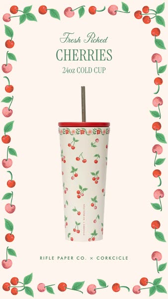
# Ad summary
This ad features a 24oz cold cup designed with a cherry pattern. The cup is a collaboration between Rifle Paper Co. and Corkcicle. The ad aims to showcase the product in a visually appealing way, highlighting its design and functionality.
# Brand positioning
Rifle Paper Co. is presented as a design-forward brand that values aesthetic appeal and collaborations with other like-minded companies, as evidenced by the partnership with Corkcicle. The brand aligns with a lifestyle that appreciates visually appealing, high-quality products. Rifle Paper Co. appears to push against the norm of purely functional product design, instead focusing on incorporating detailed and artistic designs into everyday objects. This brand aims to occupy the space in the consumer's mind as a creator of beautifully designed lifestyle products, appealing to those who value aesthetics and artistic expression in their everyday items. This is an emotional positioning, prioritizing visual delight and brand affinity over purely functional benefits.
# Product
The advertised product is a 24oz cold cup designed in collaboration between Rifle Paper Co. and Corkcicle. It features a cherry pattern consisting of red cherries with green leaves scattered across the exterior. The cup has a tapered cylindrical shape, with a red lid and a reusable metal straw. The design incorporates Rifle Paper Co.'s signature floral and whimsical style, appealing to those who appreciate detailed and artistic patterns. This cup is designed for cold beverages and aims to address the need for a reusable, stylish, and functional container. The collaboration highlights the cup's appeal as both a practical item from Corkcicle and a design piece from Rifle Paper Co., making it a desirable product for those seeking both utility and aesthetic value.
# Visual style
The ad has a clean, bright, and polished aesthetic, resembling a studio shot with high production quality. The visual motifs include a repeating cherry pattern, a border, and a flatlay-style presentation of the product. The image treatment involves soft lighting, even color grading, and careful attention to detail. The typography is integrated seamlessly, with a mix of script and sans-serif fonts that complement the overall design. The visual style breaks from typical norms by incorporating a hand-drawn, illustrated pattern, which gives the ad a unique and eye-catching appeal. The style enhances scannability by drawing attention to the cup's design, making it more likely to stop the viewer in their feed.
# Hooks
Headline: Fresh Picked CHERRIES
# Benefits
- [object Object]
# Features
- [object Object]
# Call to action
None used.
# Point of view
- [object Object]
# Storyline
- The ad opens by showcasing the full product with a cherry-themed graphic surrounding the cup. This grabs the viewer's attention with the cup's detailed design and sets the tone for a visually appealing product, told from a brand perspective to present the product in an attractive and cohesive manner.
- The ad highlights the collaboration between Rifle Paper Co. and Corkcicle at the bottom of the frame. This elevates the perceived value of the cup, emphasizing both design and functionality and speaking from a brand perspective to reinforce product quality and aesthetic value.
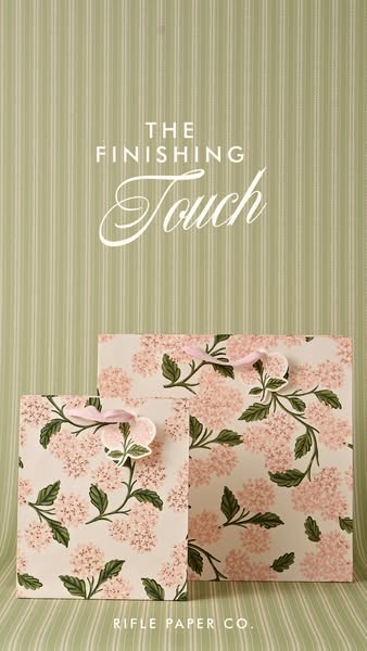
# Ad summary
This ad features two floral Rifle Paper Co. gift bags against a sage green striped background. The image promotes the brand's sophisticated, design-driven aesthetic, positioning its gift bags as a refined final flourish for the discerning customer.
# Brand positioning
Rifle Paper Co. positions itself as a purveyor of beautifully designed stationery, gifts, and home decor. The brand ethos centers on creating products that are visually appealing and thoughtfully crafted, elevating everyday items into objects of art. The overall positioning is one of refined taste and attention to detail, appealing to customers who appreciate quality and design in every aspect of their lives. In a market often dominated by generic or mass-produced goods, Rifle Paper Co. stands out by offering unique, hand-painted designs that add a touch of elegance and personality to any occasion, while maintaining a timeless and sophisticated look.
# Product
The featured product is a paper gift bag from Rifle Paper Co., available in two sizes. These bags are distinguished by their floral pattern, featuring pink hydrangea blossoms and green foliage set against a cream-colored background. Each bag is constructed from heavyweight paper stock to ensure durability and a premium feel, while the handles are crafted from a pink grosgrain ribbon and attached with flower-shaped card stock. The design provides an elevated gifting experience, turning a simple gift into a thoughtful gesture. These bags aim to resolve the challenge of finding aesthetically pleasing and high-quality gift packaging, offering customers a stylish and convenient solution for presenting gifts.
# Visual style
The ad has a polished, studio-shot production quality. The visual motif is a coordinated color scheme and floral design, which is consistent with the brand's aesthetic. The image treatment involves soft, diffused lighting and color grading that enhances the pastel tones of the product and background. The typography is integrated in a simple and elegant manner, with a handwritten script for the word "Touch". The overall style is classic and sophisticated, designed to be visually appealing and stop-worthy in-feed.
# Hooks
Headline: THE FINISHING Touch
# Benefits
- [object Object]
- [object Object]
# Features
- [object Object]
- [object Object]
- [object Object]
# Call to action
None used.
# Point of view
- [object Object]
# Storyline
- The ad opens with a full shot of two gift bags, one smaller and one larger, placed side-by-side. This visual immediately establishes the product and highlights its design. The brand is inviting the audience to recognize the beauty and quality of the bags as the focal point of the image.
- The visual draws attention to the bag's floral design and the ribbon handles, emphasizing the aesthetic appeal and tactile quality of the product. The brand is showing the audience all the details that go into their product.
- The background, a striped sage green wallpaper or fabric, complements the floral design of the bags and reinforces the brand's sophisticated aesthetic. The brand is using this as a way to promote their own style.
- The ad concludes with a view of the Rifle Paper Co. logo, anchoring the brand identity and inviting customers to explore their broader product range. The brand is reinforcing its brand identity and signaling that this product is the finishing touch on any gift.
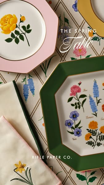
# Ad summary
This image ad showcases various tableware pieces from Rifle Paper Co.'s Spring Table collection. The ad has an elegant, spring-themed aesthetic with a close-up shot of plates, napkins, and a tablecloth with a floral pattern. The headline promotes the 'Spring Table'.
# Brand positioning
Rifle Paper Co. is presented as a brand that specializes in bringing the beauty of florals and distinctive designs into everyday life. The brand is known for its whimsical, colorful patterns and high-quality paper goods and lifestyle products. Rifle Paper Co. aims to occupy a space in the consumer's mind as a purveyor of joyful, design-forward items that add a touch of elegance and personality to the home and personal style. The brand aligns with values of creativity, beauty, and a love for nature-inspired aesthetics. Positioning is more emotional, focusing on creating a sense of joy and refinement.
# Product
The ad features several items from Rifle Paper Co.'s Spring Table collection, including octagonal dinner plates with floral designs and colorful rims. The plates come in multiple colors, including green, yellow, and pink. One plate features an arrangement of various botanical illustrations with the names of each flower printed. Embroidered napkins with floral motifs in shades of green and pink are also featured. The products are designed for those who appreciate fine details and want to bring a touch of spring's beauty to their dining experience. The visual presentation and design details suggest that these items are for creating an elegant and refined table setting, perfect for special occasions or everyday use.
# Visual style
The ad has a polished, studio-shot quality with soft, diffused lighting that enhances the colors and textures of the tableware. The overall aesthetic is clean, bright, and inviting, with a focus on the floral designs. The composition creates a sense of curated elegance, designed to capture attention in a feed and communicate the brand's refined taste.
# Hooks
Headline: THE SPRING Table
# Benefits
- [object Object]
- [object Object]
- [object Object]
# Features
- [object Object]
- [object Object]
- [object Object]
- [object Object]
# Call to action
None used.
# Point of view
- [object Object]
# Storyline
- The image opens with a close-up view of several plates and napkins, giving the audience an immersive look at the Spring Table collection. The intention is to draw the viewer in with the aesthetic appeal of the products and create a desire for the items, from the brand's perspective.
- The focus then shifts to highlighting the brand name, reinforcing recognition and associating the visual appeal with the Rifle Paper Co. brand. This is from the brand's point of view.
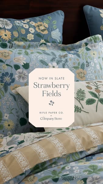
# Ad summary
This ad showcases bedding and home goods from Rifle Paper Co. x The Company Store's new 'Strawberry Fields' collection. The ad focuses on visual appeal, highlighting the product's design and aesthetic.
# Brand positioning
Rifle Paper Co. x The Company Store is presented as a purveyor of high-end, designer home goods. The brand collaboration suggests a blend of Rifle Paper Co.'s signature whimsical designs with The Company Store's reputation for quality bedding. The brand's aesthetic is sophisticated and nature-inspired, appealing to consumers who value both style and comfort in their home decor.
# Product
The featured product is the 'Strawberry Fields' bedding collection, characterized by its floral and strawberry themed design. The ad showcases the bedding set, including pillowcases and duvet covers. The design features a light blue background with detailed floral and strawberry illustrations in various colors. The focus is on the aesthetic appeal of the bedding, emphasizing its ability to enhance the style of a bedroom. The ad showcases a coordinated bedding set, which includes multiple pieces, suggesting a complete and styled look for the customer's bedroom. The collection is called 'Strawberry Fields'.
# Visual style
The visual style is soft and inviting, with a focus on showcasing the product's design. The lighting is diffused, highlighting the floral and strawberry pattern on the bedding. The shot is tightly framed, emphasizing the product's details and creating a sense of intimacy. The overall aesthetic is elegant and refined.
# Hooks
Headline: Strawberry Fields
# Benefits
- [object Object]
# Features
- [object Object]
# Call to action
None used.
# Point of view
- [object Object]
# Storyline
- The ad opens with a close-up shot of the Strawberry Fields bedding set, immediately immersing the viewer in the product's aesthetic. This is intended to capture attention and showcase the unique design, experienced from the brand's perspective.
- A text overlay highlights the name of the collection, 'Strawberry Fields,' and the collaboration between Rifle Paper Co. and The Company Store, solidifying brand recognition and product identity. This is from the brand's perspective, providing key information about the product.
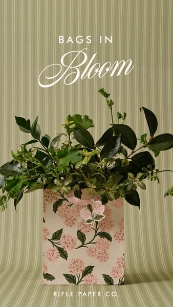
# Ad summary
A product ad for Rifle Paper Co. showcases a floral paper bag filled with greenery against a striped backdrop. The overall composition aims for an organic and upscale aesthetic.
# Brand positioning
Rifle Paper Co. is presented as a brand that brings the beauty of nature into everyday objects, positioning itself as a lifestyle brand with a focus on design and quality. The brand aligns with values of artistry, elegance, and personalization, with a tone that is both sophisticated and approachable. By focusing on the aesthetic appeal and design of its products, Rifle Paper Co. sets itself apart from more generic stationery brands, ignoring category norms by emphasizing artistry and visual delight.
# Product
The featured product is a paper bag from Rifle Paper Co., adorned with a pastel pink hydrangea floral pattern set against a cream background. The bag is filled with an assortment of green leafy stems, giving the impression of a floral arrangement. It has a pair of light pink ribbon handles. The bag's design and the visual styling suggest it is intended for customers who appreciate aesthetically pleasing, high-quality paper goods. The ad emphasizes the bag’s beauty and artistic design as purchase drivers.
# Visual style
The ad has a polished, studio-shot production quality with a focus on clean lines and soft lighting. The visual motif is a blend of natural elements (greenery) with designed paper goods (floral bag), creating an elegant and organic aesthetic. The image treatment includes soft color grading and background removal to highlight the product against the striped backdrop. The overall visual style is native, fitting the aesthetic often seen on platforms like Instagram and Pinterest.
# Hooks
Headline: BAGS IN Bloom
# Benefits
- [object Object]
# Features
- [object Object]
- [object Object]
# Call to action
None used.
# Point of view
- [object Object]
# Storyline
- The ad opens with a shot of the Rifle Paper Co. paper bag filled with lush greenery. This sets the stage, immediately drawing the viewer in with the brand's aesthetic. The brand is speaking to the consumer here.
- The camera zooms in to highlight the bag's floral pattern, reinforcing the product's design. The focus is on the bag itself. The brand is speaking to the consumer here.
- The camera zooms out to show the entire scene, grounding the product in a natural setting. The bag is presented as an elevated and artful piece. The brand is speaking to the consumer here.
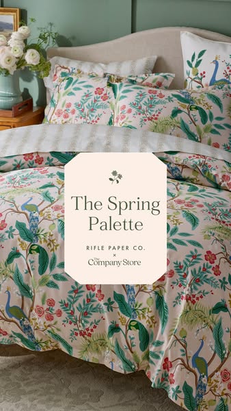
# Ad summary
This image ad features a styled bed displaying Rifle Paper Co. x The Company Store bedding. The headline highlights "The Spring Palette" in a central graphic.
# Brand positioning
Rifle Paper Co. partners with The Company Store, positioning itself as a brand that creates aesthetically pleasing and visually interesting home goods. The collaboration suggests a blend of Rifle Paper Co.’s signature design style with The Company Store’s expertise in home textiles. The overall effect leans towards a lifestyle that values design and comfort, suggesting that customers should care because their home can be both stylish and inviting.
# Product
The featured product is a bedding set from the collaboration between Rifle Paper Co. and The Company Store, highlighted as part of "The Spring Palette". The set includes a duvet cover, pillow shams, and potentially a fitted sheet, all featuring a botanical print with peacocks, flowers, and foliage in shades of green, pink, and blue against a light background. A striped blanket or sheet is visible underneath the duvet. The bedding suggests a fresh and seasonally inspired design, aiming to transform the bedroom into a stylish, comfortable space. The purchase barriers addressed are the desire for aesthetic appeal, quality home goods, and seasonal updates to decor.
# Visual style
The visual style is clean and bright, with a focus on showcasing the product in a natural, inviting setting. The production quality appears high, suggesting a professional photoshoot. The image employs a lifestyle approach, integrating the product into an aspirational yet relatable home environment. The typography is integrated within a geometric shape, creating a focal point that doesn’t clash with the overall aesthetic. The style feels native to platforms like Instagram and Pinterest, designed for easy scanning and stopping power in-feed due to its appealing color palette and detailed visuals.
# Hooks
Headline: The Spring Palette
# Benefits
- [object Object]
# Features
- [object Object]
# Call to action
None used.
# Point of view
- [object Object]
# Storyline
- The ad presents a styled bedroom scene, showcasing the Rifle Paper Co. x The Company Store bedding set. This is intended to draw viewers in by creating an aspirational image of a well-decorated space, from the brand's POV.
- A graphic highlights the branding "Rifle Paper Co. x The Company Store" and the name of the featured collection, "The Spring Palette". This serves to inform the viewer of the product name and the collaborating brands, from the brand's POV.
# Ad summary
This ad showcases Rifle Paper Co.’s Summer Collection Americana, featuring plates, picnic baskets and picnic cloths.
# Brand positioning
Rifle Paper Co. is presented as a lifestyle brand specializing in design and stationery. The brand aims to occupy the space of bringing beauty to the everyday through its unique aesthetic. The brand values art, and evokes a colorful and hand-crafted aesthetic. They focus on functional design with an emphasis on beauty, color, and pattern. The overall brand positioning leans toward an emotional connection by appealing to a love for artful design in everyday objects.
# Product
The Rifle Paper Co. Summer Collection Americana includes items for picnics such as melamine plates, picnic baskets, and picnic cloths. The plates are colorful with patterns and scalloped edges, lending a touch of whimsy to outdoor dining. The picnic basket is a traditional woven style, complete with a striped lining and floral details, offering a functional and stylish way to carry and display food. The picnic cloths are made from cotton and are colorful and patterned. The collection is designed to provide consumers with an opportunity to elevate their outdoor picnic experience with beautiful, design-focused items.
# Visual style
The ad has a polished, commercial aesthetic with a focus on bright colors and detailed product shots. The editing is smooth and the pacing is consistent. The cuts are timed to the music.
# Benefits
- [object Object]
- [object Object]
- [object Object]
# Features
- [object Object]
- [object Object]
- [object Object]
# Call to action
None used.
# Point of view
- [object Object]
# Storyline
- 00:00–00:02 00:00–00:02 The ad opens with a close-up shot of a picnic scene, with a woven basket, plates, and a bowl of fruit set on a colorful floral blanket. This establishes a cozy, outdoor, and summery atmosphere, showcasing the picnic setting.
- 00:02–00:04 00:02–00:04 The camera zooms in on plates with an American flag design. This puts the Americana summer collection in focus.
- 00:04–00:07 00:04–00:07 The shot transitions to a hand placing items into the picnic basket. This reinforces the theme and functionality of the picnic collection.
- 00:07–00:07 00:07–00:07 The camera zooms out to show the full basket, plates and blanket. This completes the ad.
# Ad summary
The ad showcases the Rifle Paper Co. brand through a variety of shots of beach and nautical scenes.
# Brand positioning
Rifle Paper Co. is presented as a brand that evokes a coastal, nautical lifestyle with a touch of Americana. The brand appears playful, relaxed, and connected to nature, specifically the sea. It aligns with values of leisure, exploration, and casual elegance. It does not appear to push against any category norms or competitor behaviors, but rather focuses on creating a cohesive brand image through consistent imagery and design. The brand positioning is primarily emotional, aiming to create a sense of connection to a lifestyle more than highlighting functional attributes.
# Product
The ad primarily features Rifle Paper Co. tote bags. These are canvas totes with various designs including an American flag pattern, and floral patterns. They appear durable and suitable for everyday use. The brand name and logo are visible on the bags. These bags are for people who enjoy a casual, coastal lifestyle and appreciate well-designed, aesthetically pleasing accessories. The primary focus is on the bag's aesthetic and how it fits into a lifestyle.
# Visual style
The ad has a polished aesthetic with bright, natural lighting and smooth transitions. The production quality feels like a hybrid of a polished commercial and lifestyle content. The pacing is moderate, with consistent cuts that match the easy-going tone of the music. The visual motif is a coastal, nautical theme, reinforced by the use of buoys, boats, and beach settings.
# Benefits
- [object Object]
- [object Object]
# Features
- [object Object]
- [object Object]
# Call to action
None used.
# Point of view
- [object Object]
# Storyline
- 00:00–00:01 The ad opens with a close-up shot of painted buoys, immediately establishing a nautical theme.
- 00:01–00:03 00:01–00:03 A woman is shown standing next to a wall covered in buoys. The focus is on setting a scene that connects the product (implied to be a bag she carries) to the aesthetic of the brand.
- 00:03–00:05 00:03–00:05 The ad cuts to a shot of two boats on a trailer, further emphasizing the coastal setting. The movement of the boats out of the frame suggests a sense of motion and adventure.
- 00:05–00:08 00:05–00:08 The scene shifts to a beach where a tote bag is placed on the sand. The change of scenery highlights the versatility of the bag, indicating it can be used in various casual settings.
- 00:07–00:09 00:07–00:09 The ad concludes with a shot of a woman walking on the beach, carrying a floral tote bag as the sun sets. This reinforces the idea of enjoying nature and a relaxed pace of life, associating these feelings with the brand and its products.
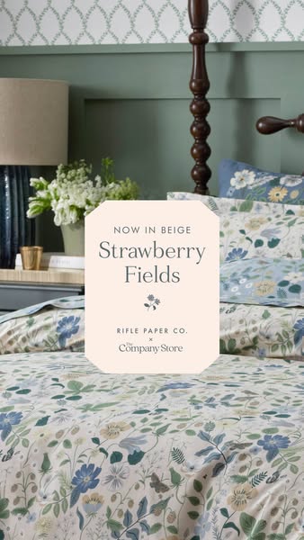
# Ad summary
This ad showcases the "Strawberry Fields" bedding set from Rifle Paper Co. x The Company Store, now available in a beige color. The ad features a detailed shot of the bedding set on a bed, emphasizing its floral pattern and inviting viewers to purchase it.
# Brand positioning
Rifle Paper Co. is presented as a brand known for its distinctive floral patterns. The collaboration with The Company Store suggests a move into home goods, specifically bedding. The brand aligns with a lifestyle that appreciates design, quality, and a touch of whimsy in everyday items. By focusing on a specific design, the ad implies that Rifle Paper Co. products are not just functional but also decorative and capable of transforming a space with their aesthetic.
# Product
The featured product is the "Strawberry Fields" bedding set, which is being offered in beige. The bedding is made in collaboration between Rifle Paper Co. and The Company Store. The main feature of the bedding is its floral pattern that includes flowers, leaves and butterflies. The ad draws attention to the new color option, suggesting that the product is already established and well-received but now available in a new style.
# Visual style
The ad features a highly polished, studio-shot image. The visual motifs include a focus on detailed patterns and a lifestyle-oriented setting to enhance its scannability in feed. The typography is clean and simple, ensuring the message is easily readable. The overall style is native and aims to blend into a home decor-focused feed.
# Hooks
Headline: NOW IN BEIGE Strawberry Fields
# Benefits
- [object Object]
# Features
- [object Object]
# Call to action
None used.
# Point of view
- [object Object]
# Storyline
- The ad opens with a detailed shot of the "Strawberry Fields" bedding set. This is designed to immediately showcase the product's aesthetic. The viewer is seeing the bedding from a wide angle to fully appreciate the bed set.
- The central octagon highlights the "NOW IN BEIGE" color announcement to draw attention to the product's new offering. The viewer is seeing this from the brand's perspective.
- The ad concludes by identifying the collaboration between Rifle Paper Co. and The Company Store. This is intended to add credibility by associating the design-focused brand with a reliable home goods provider. The viewer is seeing this from the brand's perspective.
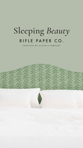
# Ad summary
This ad showcases a bed with a headboard made from Rifle Paper Co. fabric, emphasizing the brand's collaboration with Cloth & Company.
# Brand positioning
Rifle Paper Co. is presented as a brand known for its distinctive and decorative designs, particularly in the realm of paper goods and lifestyle products. The brand aligns with values of beauty, artistry, and a touch of whimsy, offering consumers a way to incorporate unique and visually appealing patterns into their living spaces. By collaborating with Cloth & Company, Rifle Paper Co. extends its reach into home furnishings, suggesting a move towards creating more immersive and tangible experiences for its customers. This collaboration allows the brand to push against the norms of generic or mass-produced home decor, offering a more curated and design-focused alternative. The brand positioning is both functional, in terms of providing well-designed products, and emotional, in terms of evoking feelings of joy and aesthetic pleasure.
# Product
The featured product is a bed with a headboard upholstered in Rifle Paper Co. fabric, specifically from their collaboration with Cloth & Company. The headboard is the focal point, showcasing a green floral pattern that adds a decorative touch to the bedroom. The bed itself is made up with white bedding, including pillows and a duvet, creating a clean and inviting look. The product is likely targeted towards individuals who appreciate unique and artistic home decor, and who are looking to add a touch of personality to their bedroom. The ad addresses the purchase barrier of finding distinctive and high-quality home furnishings by highlighting the collaboration between two well-known brands, suggesting a combination of design expertise and craftsmanship.
# Visual style
The ad features a clean and polished studio shot with a focus on showcasing the product's design. The visual motif is centered around the patterned headboard, which serves as the focal point of the image. The image treatment includes soft lighting and color grading to create a calming and inviting atmosphere. The typography is integrated in a simple and legible manner, with a mix of serif and sans-serif fonts. The overall style is high-design and aims to create a visually appealing and aspirational image.
# Hooks
Headline: Sleeping Beauty
# Benefits
- [object Object]
- [object Object]
# Features
- [object Object]
- [object Object]
# Call to action
None used.
# Point of view
- [object Object]
# Storyline
- The ad opens by showcasing a bed with a headboard upholstered in Rifle Paper Co. fabric, immediately drawing the viewer's attention to the product's design and aesthetic appeal. This is from the brand's perspective, aiming to highlight the unique and decorative nature of their collaboration with Cloth & Company.
- The focus then shifts to the overall presentation of the bed, with clean white bedding complementing the patterned headboard. This is from the brand's perspective, emphasizing the product's ability to create a stylish and inviting bedroom setting.
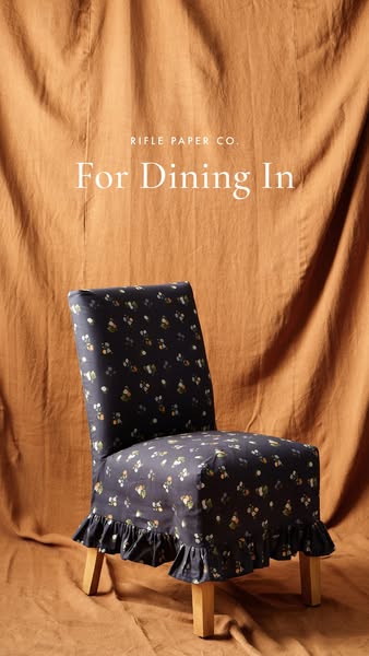
# Ad summary
This ad showcases a Rifle Paper Co. chair cover, emphasizing its design and suitability for dining in.
# Brand positioning
Rifle Paper Co. is presented as a brand that focuses on bringing beauty and style into everyday living through its unique and decorative designs. The brand aims to occupy a space in the consumer's mind as a provider of aesthetically pleasing and high-quality home decor items. The brand aligns with values of elegance, creativity, and a love for detailed, artistic patterns. It likely pushes against minimalist or purely functional home decor trends, instead embracing a more decorative and expressive style. The brand positioning is emotional, appealing to consumers who seek to enhance their living spaces with visually appealing and distinctive items.
# Product
The featured product is a chair cover designed to fit over a dining chair. It is made from a fabric with a dark blue background and a pattern of small, colorful floral designs. The cover is tailored to fit snugly over the chair, with a ruffled edge at the bottom that adds a decorative touch. The chair cover is designed for use in a dining setting, as suggested by the ad's headline, and is intended to protect the chair while also enhancing its appearance. The ad implies that the chair cover is easy to install and remove, making it a convenient way to update the look of dining chairs. The product is presented as a stylish and practical solution for those who want to add a touch of elegance and personality to their dining space.
# Visual style
The ad has a soft, inviting visual style with a focus on showcasing the product in a lifestyle setting. The production quality appears to be high, with attention to detail in the lighting and composition. The visual motifs include the use of a draped fabric background to create a sense of warmth and texture, as well as the floral pattern on the chair cover to add a touch of elegance and sophistication. The image treatment includes soft lighting and color grading to create a cohesive and visually appealing aesthetic. The typography is clean and legible, with a focus on readability. The overall style is designed to be visually appealing and inviting, encouraging viewers to imagine the product in their own homes.
# Hooks
Headline: For Dining In
# Benefits
- [object Object]
- [object Object]
- [object Object]
# Features
- [object Object]
- [object Object]
- [object Object]
# Call to action
None used.
# Point of view
- [object Object]
- [object Object]
- [object Object]
# Storyline
- The ad opens with the brand name, Rifle Paper Co., setting the stage for what's to come. The brand is telling the audience that this ad is about their product.
- The ad then presents the phrase "For Dining In", which is intended to convey the product's purpose and create a sense of comfort and domesticity. The brand is telling the audience that this product is designed to enhance their dining experience at home.
- The ad concludes with a visual of the chair cover itself, showcasing its design and how it fits on a chair. The brand is showing the audience the product in its intended use, allowing them to visualize it in their own homes.
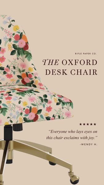
# Ad summary
This image ad showcases the Rifle Paper Co. Oxford Desk Chair, emphasizing its aesthetic appeal and comfort through a customer testimonial.
# Brand positioning
Rifle Paper Co. is presented as a brand that values design and aesthetic appeal, particularly through its use of floral patterns. The brand aims to occupy a space in the consumer's mind as a provider of stylish and visually pleasing home furnishings. The brand aligns with a lifestyle that appreciates beauty and attention to detail, and it likely pushes against the norm of purely functional or minimalist office furniture. The brand positioning is emotional, focusing on the joy and aesthetic pleasure that their products bring.
# Product
The product being advertised is the Oxford Desk Chair by Rifle Paper Co. It is a desk chair featuring a floral pattern fabric on the seat and backrest. The chair has a gold-colored metal base with black wheels. The chair is designed for use in an office or home setting, providing a comfortable and stylish seating option. The ad highlights the chair's aesthetic appeal, suggesting it brings 'joy' to those who see it. The ad addresses the potential purchase barrier of comfort and style by showcasing a visually appealing design and implying a positive emotional response from users.
# Visual style
The ad has a highly polished, studio-shot production quality. The visual motif is clean and simple, focusing on the product and a customer testimonial. The image treatment includes soft, diffused lighting and a neutral color palette. The typography is integrated in a classic and legible style. The style is native to social media feeds, designed to be easily scannable and visually appealing.
# Hooks
Headline: THE OXFORD DESK CHAIR
# Benefits
- [object Object]
- [object Object]
# Features
- [object Object]
- [object Object]
- [object Object]
# Call to action
None used.
# Point of view
- [object Object]
- [object Object]
# Storyline
- The ad begins by showcasing the Rifle Paper Co. Oxford Desk Chair, immediately establishing the product being advertised. This is from the brand's perspective, aiming to capture the viewer's attention with the chair's design and visual appeal.
- The ad then includes a customer testimonial, 'Everyone who lays eyes on this chair exclaims with joy.' This is from the customer's perspective, sharing their positive experience and emotional reaction to the chair. This progresses the narrative by adding a layer of social proof and validation to the product's appeal.
- The ad concludes with the attribution of the testimonial to 'Wendy H.,' further enhancing the credibility of the customer's perspective. This progresses the narrative by providing a personal touch and reinforcing the idea that real people are delighted by the chair.
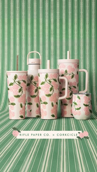
# Ad summary
This ad features a variety of Corkcicle drinkware that has a Rifle Paper Co. design collaboration.
# Brand positioning
Rifle Paper Co. is presented as a brand that values elevated design, particularly through its signature floral patterns. The collaboration with Corkcicle suggests that Rifle Paper Co. aims to extend its aesthetic into everyday lifestyle products, offering consumers a way to incorporate their unique style into their daily routines. Corkcicle is positioned as a high-end, reusable drinkware company.
# Product
The ad features a variety of Corkcicle drinkware products adorned with a Rifle Paper Co. floral design. The products include: a tall tumbler with a straw, a canteen water bottle with a handle, a tumbler with a lid and straw, a large tumbler with a handle and lid, and a small cup. All products are decorated with a consistent floral pattern featuring pink hydrangeas and green foliage on a light background. The drinkware is designed for both hot and cold beverages, catering to a range of use occasions from daily hydration to on-the-go coffee consumption. The collaboration with Rifle Paper Co. elevates the drinkware's aesthetic appeal, making it a stylish accessory rather than just a functional item.
# Visual style
The visual style of the ad is clean and coordinated, with a focus on showcasing the Rifle Paper Co. floral design across the Corkcicle product range. The production quality appears to be studio-shot, with soft, diffused lighting that highlights the products' colors and patterns. The visual motifs include a coordinated color scheme and a grid-like arrangement of the products, which helps to maintain a sense of balance and visual appeal. The image treatment is minimal, with subtle color grading to enhance the floral design and overall aesthetic. The typography integration is clean and legible, complementing the design without overpowering it.
# Hooks
Headline: None used
# Benefits
- [object Object]
# Features
- [object Object]
# Call to action
None used.
# Point of view
- [object Object]
# Storyline
- The image showcases several Corkcicle drinkware products with Rifle Paper Co. designs, presenting the collaboration's visual appeal. This collaboration aims to highlight the aesthetic and design elements of the products.
- The tagline "Rifle Paper Co. x Corkcicle" appears beneath the products, emphasizing the partnership between the two brands. This partnership aims to broaden reach and merge target audiences.
- The products are arranged in a visually appealing manner against a striped backdrop, emphasizing the stylish and design-conscious aspect of the collaboration. The intention is to resonate with potential customers who are drawn to visually pleasing and coordinated aesthetics.
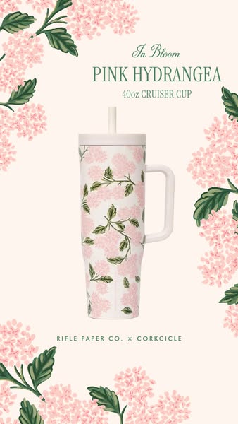
# Ad summary
This ad promotes a 40oz travel mug with a floral design in collaboration between Rifle Paper Co. and Corkcicle.
# Brand positioning
Rifle Paper Co. is presented as a brand known for its distinctive floral and colorful designs, often applied to stationery, home decor, and lifestyle products. The collaboration with Corkcicle, a brand specializing in insulated drinkware, suggests a partnership that combines aesthetic appeal with functional quality. The brand's positioning aims to appeal to consumers who appreciate beautifully designed everyday items that add a touch of elegance and personality to their lives. This collaboration implies a focus on accessible luxury and the infusion of art into practical products, catering to those who value both form and function.
# Product
The advertised product is a 40oz travel mug designed in collaboration between Rifle Paper Co. and Corkcicle. It is made of a hard material and features a white base with a delicate pink hydrangea floral pattern. The mug includes a matching white lid and a white straw, along with a built-in handle for easy carrying. Its 40oz capacity suggests it is intended for those who need to carry a large amount of liquid, making it suitable for travel, commuting, or long days out. The design addresses the desire for stylish and functional drinkware, offering an alternative to plain or generic options. The collaboration leverages Rifle Paper Co.’s reputation for aesthetically pleasing designs to enhance Corkcicle’s insulated drinkware.
# Visual style
The visual style is clean and elegant, with a focus on showcasing the product's design. The use of soft colors and floral elements creates a feminine and sophisticated aesthetic. The image is well-lit and professionally shot, emphasizing the product's quality and design details.
# Hooks
Headline: In Bloom
# Benefits
- [object Object]
# Features
- [object Object]
# Call to action
None used.
# Point of view
- [object Object]
- [object Object]
# Storyline
- The ad begins by showcasing the product, a Rifle Paper Co. x Corkcicle 40oz Cruiser Cup, in a visually appealing setting with floral elements, aiming to immediately capture attention and establish the product's aesthetic appeal. This sets the stage for potential customers to see the product as both functional and stylish, viewed from the brand's perspective.
- The ad includes product-specific details such as 'Pink Hydrangea' and '40oz Cruiser Cup', providing key information for the customer so they know the product's design and size, coming directly from the brand. This helps potential customers understand the precise offering.
- The ad strategically integrates the brand names 'Rifle Paper Co. x Corkcicle', visually reinforcing the collaboration and credibility of both brands in the customer's mind. This helps the customer understand the product is a blend of design and function.
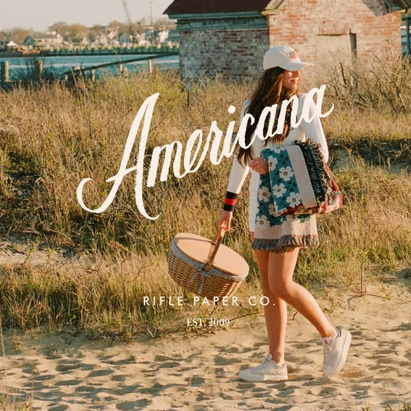
# Ad summary
This ad for Rifle Paper Co. features a young woman walking on a beach with a picnic basket and a tote bag. The image has a bright, summery aesthetic and is designed to appeal to customers who appreciate quality craftsmanship and a sense of Americana.
# Brand positioning
Rifle Paper Co. presents itself as a brand that embraces a blend of quality craftsmanship with a touch of Americana. The brand aims to occupy a space in the consumer's mind as a lifestyle brand that adds beauty to everyday items through unique patterns and styles. It promotes values aligned with artistic expression, classic design, and casual elegance, avoiding overtly modern or minimalist aesthetics. The brand leans towards an emotional positioning, focusing on the joy and beauty their products bring to their customers' lives.
# Product
The ad features a woven picnic basket with a rounded lid and a handle, suitable for carrying food and drinks on outings. The basket is light brown, with a blue and tan accent around the lid. Also featured is a tote bag, made from a fabric with a floral design. The tote bag features a fringe detail at the bottom and red and blue stripes on the strap. These products work together to support an outdoor picnic occasion. The ad implies that these items add style and beauty to everyday outdoor experiences.
# Visual style
The ad utilizes a lifestyle aesthetic with a bright, summery feel, creating a highly polished, studio-shot image. The visual motif is simple and emphasizes the natural setting with a focus on Americana. The image treatment appears to be lightly filtered with soft lighting effects to enhance the serene atmosphere. The integration of typography is simple and unobtrusive, allowing the visual to dominate. The ad contrasts with the fast-paced, chaotic feel of some social media content, providing a calming presence.
# Hooks
Headline: Americana
# Call to action
None used.
# Point of view
- [object Object]
# Storyline
- The scene is set with a young woman walking along a sandy beach with tall grass, carrying a picnic basket and a floral patterned tote bag. This is included to create a visual of leisure, aligning the brand with a relaxing outdoor lifestyle. The audience experiences this from an observer's perspective, creating a sense of aspirational viewing.
- The woman is dressed in light, summery attire and walks with a relaxed posture. This conveys an image of effortless style and carefree enjoyment, suggesting the brand's products are suited for a relaxed lifestyle. The audience experiences this from an observer's perspective, invited to imagine themselves in her place.
- The Rifle Paper Co. logo is positioned prominently in the lower portion of the image, associating the brand with the picturesque scene and highlighting its establishment date. This is intended to emphasize the brand's heritage and quality. The audience experiences this from the brand's perspective, aiming to establish trust and recognition.
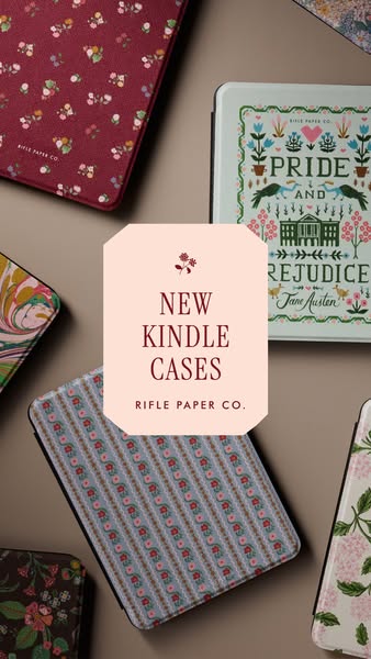
# Ad summary
This ad showcases new Kindle cases from Rifle Paper Co. The ad features an assortment of Kindle cases with various Rifle Paper Co. floral designs.
# Brand positioning
Rifle Paper Co. is presented as a purveyor of beautifully designed products, particularly known for their distinctive floral patterns. The brand aims to occupy a space in the consumer's mind as a go-to for adding a touch of elegance and personality to everyday items. The brand aligns with a lifestyle that appreciates detailed artistry and charming aesthetics. Rifle Paper Co. stands apart by focusing on ornate patterns that evoke a sense of sophistication and joy, making their products stand out.
# Product
The product being advertised is a collection of Kindle cases designed by Rifle Paper Co. Each case features a different signature Rifle Paper Co. floral or patterned design, adding a stylish and protective layer to the Kindle device. The cases appear to be designed for Kindle e-readers and are showcased in various patterns to appeal to diverse aesthetic preferences. These cases offer a way to personalize and protect the Kindle, turning a functional device into a decorative accessory. They present an opportunity to showcase individual style while enjoying e-reading.
# Visual style
The ad has a clean and inviting visual style, employing a flat lay arrangement to showcase multiple product variations. The production quality appears to be high, with evenly distributed lighting and sharp focus on the products. The color palette is soft and warm, aligning with the brand's aesthetic. The layout is balanced, providing a clear view of each Kindle case without appearing cluttered. The central text block is framed by the product placement, creating a focal point.
# Hooks
Headline: NEW KINDLE CASES
# Benefits
- [object Object]
- [object Object]
# Features
- [object Object]
- [object Object]
# Call to action
None used.
# Point of view
- [object Object]
# Storyline
- The ad opens with a flat lay arrangement of various Kindle cases in different Rifle Paper Co. designs. The intention is to showcase the variety and aesthetic appeal of the new Kindle case collection from a brand perspective.
- A central frame highlights the product category, "NEW KINDLE CASES" and the brand name “RIFLE PAPER CO.", framed by a flower graphic. This section introduces the brand and product line to the viewer from the brand's perspective.
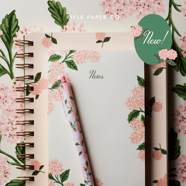
# Ad summary
This ad showcases Rifle Paper Co. stationery products including a spiral notebook, a paper notepad, and a matching pen in a repeating floral pattern. The ad highlights the 'new' product with a badge.
# Brand positioning
Rifle Paper Co. is presented as a lifestyle brand, specializing in stationery and paper goods. The brand is distinguished by its signature floral patterns and sophisticated design, suggesting a focus on artistic expression and elevated aesthetics. Rifle Paper Co. aligns with consumers who value beauty in everyday objects and seek to add a touch of elegance and personalization to their personal and professional correspondence and organization.
# Product
The ad features a selection of stationery items from Rifle Paper Co., including a spiral-bound notebook, a paper notepad, and a matching pen. The notebook features a light pink and green floral pattern, with a spiral binding on the left side. The notepad mirrors the floral design, with the word "Notes" printed in cursive at the top. A matching pen with the same floral pattern is placed diagonally across the notepad. The matching floral design of the products is a key feature. Each item is clearly part of a coordinated set, appealing to customers looking for a cohesive and stylish stationery collection.
# Visual style
The ad has a clean, polished aesthetic with a focus on showcasing the floral pattern. The lighting is soft and even, which creates a warm and inviting feel. The flatlay composition and attention to detail suggest a high production quality, and the image treatment appears to be minimal, allowing the product's design to stand out. The overall style is consistent with the brand’s identity, reinforcing its reputation for elegant and well-crafted paper goods.
# Hooks
Headline: New!
# Benefits
- [object Object]
# Features
- [object Object]
- [object Object]
- [object Object]
- [object Object]
# Call to action
None used.
# Point of view
- [object Object]
# Storyline
- The ad opens with a full view of the Rifle Paper Co. stationery set, immediately establishing the brand and product line. The intention is to capture the viewer's attention and showcase the aesthetic of the products from the brand’s perspective.
- A 'New!' badge is displayed on the top right corner of the notebook. The message is intended to highlight the product's novelty, suggesting that customers can acquire the latest addition to the Rifle Paper Co. collection, coming directly from the brand.
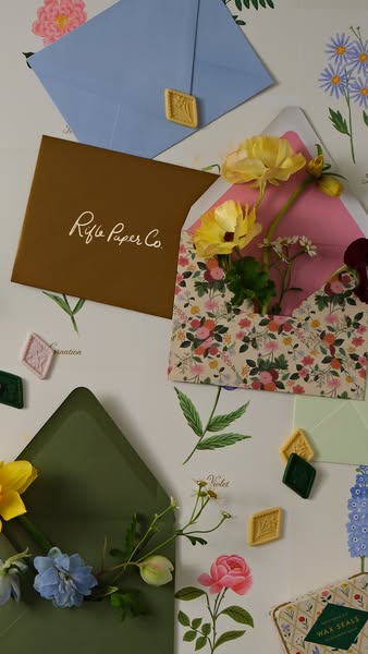
# Ad summary
An image showcasing the Rifle Paper Co. brand of stationery. The image includes envelopes, floral embellishments, and wax seals.
# Brand positioning
Rifle Paper Co. is a brand presented as specializing in stationery and paper goods that emphasize a blend of sophistication and whimsy. The brand's products evoke feelings of warmth, nostalgia, and handcrafted charm, making it stand out from more generic or mass-produced stationery options. The brand aims to occupy a space in the consumer's mind as purveyors of high-quality, artistic paper goods for those who appreciate unique and beautifully designed stationery. They do so by aligning with a lifestyle that values creativity, thoughtfulness, and personalized expression. This brand does not push against category norms but rather embraces them by using traditional stationery and elevating it with its signature floral patterns, hand-painted illustrations, and thoughtful color palettes. The brand's positioning is both functional and emotional, as the products serve a practical purpose while also appealing to the customer's desire for beauty and self-expression.
# Product
The ad features Rifle Paper Co.’s stationery products. The brand's envelopes are presented in various colors such as blue, brown, and green, each distinguished by its solid color and high-quality paper material. These envelopes are designed to hold letters, cards, or invitations and come in a standard rectangular shape with a pointed flap. Some envelopes are sealed with wax seals in shades like gold and green, adding a touch of elegance. One envelope features a distinct floral pattern on its interior lining. The primary purpose of these products is to provide a stylish and sophisticated way to send and receive correspondence, aimed at individuals who appreciate fine stationery and the art of letter writing. The USPs include the use of unique, artistic designs, high-quality materials, and attention to detail, such as the inclusion of decorative linings and wax seals. These products are suitable for various occasions, from personal letters to formal invitations, and address the barrier of generic or uninspired stationery by offering visually appealing and thoughtfully designed options.
# Visual style
The ad features a high-quality, studio-shot flat lay. The visual motifs include floral arrangements and a grid-like layout of stationery products. The image treatment involves soft, diffused lighting, creating a warm and inviting atmosphere. The visual style mimics a platform-native look, specifically an Instagram-style flat lay, enhancing its scannability and stop power in a social media feed.
# Hooks
Headline: None used
# Benefits
- [object Object]
- [object Object]
# Features
- [object Object]
- [object Object]
# Call to action
None used.
# Point of view
- [object Object]
# Storyline
- The image showcases an array of Rifle Paper Co. stationery products arranged in an aesthetically pleasing flat lay, highlighting the variety of colors and designs available from the brand. This presentation is intended to capture the viewer's attention and showcase the brand's artistic and design-focused approach from the brand's perspective.
- Several envelopes are featured, each adorned with different accents such as wax seals and floral embellishments, emphasizing the brand’s attention to detail and the personal touch these elements add from the brand's perspective. The presentation encourages the viewer to consider how these details can enhance their own correspondence.
- Fresh flowers are incorporated among the stationery, which softens the overall presentation. This addition reinforces the brand's connection to nature-inspired designs. It also enhances the perceived value and beauty of the products from the brand's perspective.
How Other Lifestyle Brands Advertise on Meta
Peer brands in Motion's library — click any brand to see their creative strategy, live ads, and AI breakdowns.