


# Ad summary
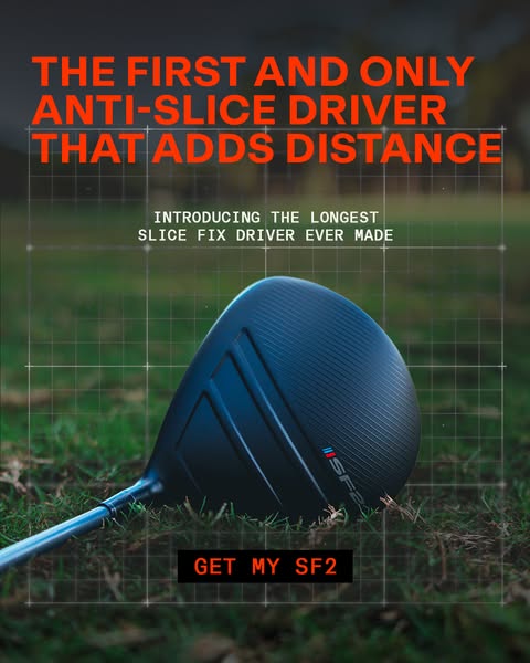
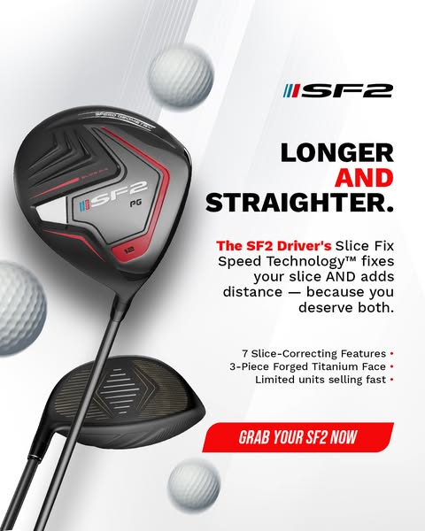
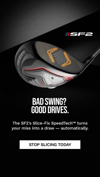
The image ad for SF2 golf drivers targets golfers who struggle with slicing the ball and feel they are overpaying for equipment that doesn't fix the problem. The ad promises that SF2 drivers can fix the common "draw-bias" issue and includes a limited-time offer of $100 off.
# Brand positioning
The SF2 brand is presented as a solution for golfers who struggle with a slice. The brand suggests that other drivers on the market are overpriced and ineffective for this common problem. By offering a driver that is designed to fix the draw-bias, SF2 aims to position itself as a performance-driven brand that provides tangible improvements to golfers' games at a more accessible price point. The brand's positioning appears to be functional, focusing on improving the user's golf game by fixing a persistent problem.
# Product
The featured product is the SF2 golf driver, explicitly designed to address and fix the "draw-bias" issue, which causes a slice. The driver is marketed towards golfers who are currently paying upwards of $400 for drivers that do not correct their slice. The ad highlights that this SF2 driver provides a solution to the common problem of slicing the ball. It doesn't mention specific features or materials but focuses on the functional benefit of fixing a slice and the cost savings compared to other drivers on the market. The product is presented as a way to improve a golfer's game by counteracting the tendency to slice the ball, which is a common issue for many players.
# Visual style
The ad has a clean, modern aesthetic with a focus on product presentation. The product is set against a minimalist background, and the lighting is bright and even. The image has a polished, studio-shot appearance. The typography is large, bold, and clear. The overall visual style aims to convey a sense of performance and innovation, aligning with the brand's focus on fixing a common problem in golf.
# Hooks
Headline: STOP PAYING $400 FOR DRIVERS THAT DON'T FIX YOUR SLICE
# Benefits
- [object Object]
# Features
- [object Object]
# Call to action
CLAIM MY $100 OFF
# Point of view
- [object Object]
# Storyline
- The image opens by showcasing the SF2 golf driver. It presents the product visually and implies that it is the focal point of the ad, highlighting its design and technology.
- The brand immediately calls out the high cost of traditional drivers, framing them as ineffective for fixing a common problem, the slice. This intends to set up the SF2 driver as a better, more affordable alternative, appealing to value-conscious golfers.
- The ad directly addresses the problem of "draw-bias", and states that SF2 drivers are designed to fix this issue. This assures the audience that the SF2 driver is a targeted solution for a widespread problem among golfers.
- The brand creates urgency and entices viewers to act by offering $100 off. This encourages viewers to take immediate action and make a purchase.