Focus on the Family runs 219 active ads on Meta, shipping ~10 new creatives per week. Their library leans on Headline41%, Split Screen11%, and Letter4%. Recently, Focus on the Family is pushing a three-pronged approach: their Clubhouse magazines as a screen-free alternative for faith formation, ultrasound program donations positioned around mothers "choosing life," and RVL Discipleship curriculum for deeper spiritual growth. The through-line is practical tools that protect and nurture Christian families, whether that's shielding kids from screens, supporting crisis pregnancies, or equipping parents and believers with biblical resources. They're framing themselves as the comprehensive solution provider across parenting stages, marriage support, foster care advocacy, and pro-life activism.
# Ad summary
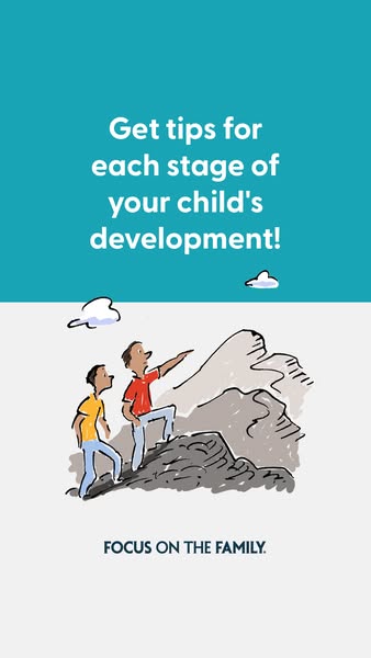
The ad, set in a teal and light gray color palette, is designed to capture the attention of parents. It uses a simple illustration of a father and son climbing a mountain. The aim is to encourage parents to visit the "Focus on the Family" website for tips on child development.
# Brand positioning
The brand, Focus on the Family, is presented as a reliable source of information and guidance for parents navigating the various stages of their children's development. By offering tips and resources, the brand aims to position itself as a supportive partner in the parenting journey. The brand aims to be functional by providing informational resources for child development.
# Product
The product is a resource of tips for parents at each stage of their child’s development. The ad invites viewers to seek guidance and information to help them navigate the challenges of raising children, suggesting that the site offers stage-specific advice.
# Visual style
The ad features a clean and simple visual style with a limited color palette of teal, white, and light gray. The use of a hand-drawn illustration gives the ad a friendly, approachable, and family-oriented feel. The overall design is minimalistic, focusing on clear messaging and a single, symbolic image to convey its message. The typography is straightforward and easy to read, contributing to the ad's scannability. The style is likely intended to be native-feeling to social media platforms, using simple graphics and clear text to quickly communicate its message.
# Hooks
Headline: Get tips for each stage of your child's development!
# Benefits
- [object Object]
# Call to action
None used.
# Point of view
- [object Object]
# Storyline
- The ad begins by posing a question about child development, suggesting to the viewer that the brand can help parents get the information that they need. The intention is to draw in parents seeking advice, from the brand's perspective.
- An illustration of a father and son climbing a mountain is used to visually symbolize the journey of raising a child. It is intended to visually reinforce the idea of navigating the challenges of parenting. The audience experiences it from an observer's perspective.
- The ad concludes by presenting the brand, Focus on the Family, as a resource for parents. The intention is to establish the brand as a source of support. This is presented from the brand’s perspective.
# Ad summary
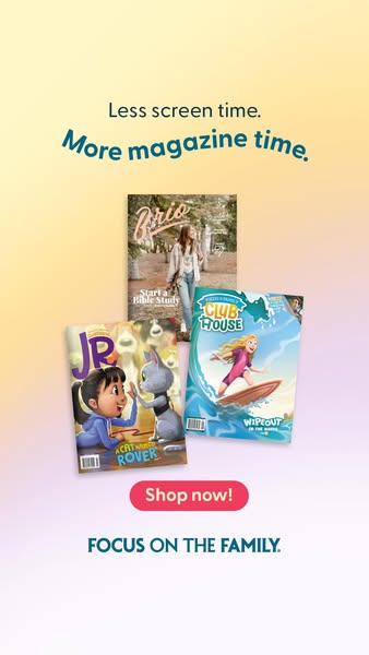
This image ad for magazines is for families who want their children to spend less time looking at screens. It features 3 different magazines and includes a call to action to shop now.
# Brand positioning
The brand being promoted seeks to offer parents an alternative to the digital world that is more family-oriented. This is conveyed through the product offering, which is magazines designed for kids and young adults, and the phrase, "FOCUS ON THE FAMILY," which conveys that it is a brand that aligns with traditional family values. The brand attempts to fill the space of safe, family-friendly content to help parents feel better about what their kids are consuming.
# Product
The product being advertised is magazines for children and young adults. Three different magazines are shown in the ad. Brio is a magazine titled, “Start a Bible Study.” The magazine JR, the cover shows a cartoon cat and a cartoon girl doing a high five. The magazine CLUBHOUSE shows a cartoon girl surfing. These magazines are designed to appeal to kids and parents who want an alternative to screen time.
# Visual style
The ad has a clean, modern style with a focus on bright colors and clear messaging. The design appears simple, with a color gradient in the background. The text is legible and the overall aesthetic is family-friendly.
# Hooks
Headline: Less screen time. More magazine time.
# Benefits
- [object Object]
- [object Object]
# Call to action
Shop now!
# Point of view
- [object Object]
# Storyline
- The ad opens with a statement about reducing screen time and increasing magazine time, attempting to immediately resonate with parents seeking healthier habits for their kids. The brand is sharing its vision and positioning itself as the solution to this problem.
- The covers of three different magazines are displayed, showing the variety of content available and the types of children they might appeal to. The brand is visually showcasing its product offering to build interest and appeal.
- A "Shop now!" button encourages immediate action, aiming to convert viewers into customers directly from the ad. The brand is directly prompting a purchase.
- The ad concludes with the phrase "FOCUS ON THE FAMILY," solidifying the brand's core values and positioning, aimed at parents who prioritize family-centered activities. The brand is reinforcing its commitment to family values.
# Ad summary
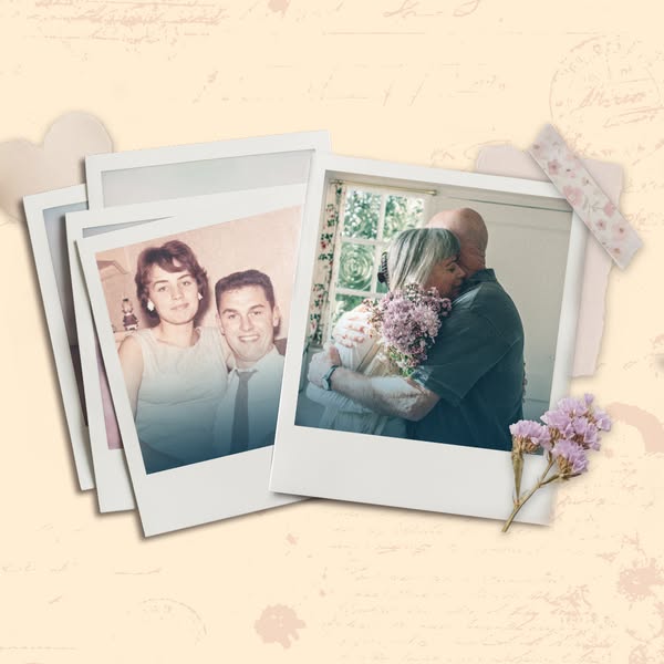
The ad features a collage of vintage photos and graphics to promote the brand.
# Brand positioning
Based on the image alone, the brand's positioning is not explicitly stated. However, the ad appears to promote a sense of timeless love and lasting relationships. The design evokes nostalgia, tradition, and a focus on sentimentality, aligning with values like family, connection, and shared history. The brand doesn't seem to push against any category norms but rather leans into classic, heartwarming imagery.
# Product
The product in the ad is not explicitly shown or described. The visuals center around vintage photographs of couples at different stages of life, suggesting the brand or product is somehow connected to memories, relationships, or sentimental value. Without additional context, it's challenging to determine the product or its specific features. It appears to address a universal desire for connection and lasting love, perhaps through helping users preserve or celebrate these elements.
# Visual style
The ad uses a nostalgic and sentimental visual style, reminiscent of a vintage scrapbook or photo album. The production quality appears polished, with careful attention to detail in the arrangement of photos and decorative elements. The visual motif is a collage of polaroid-style images, evoking personal memories and timeless love stories. Image treatment includes soft lighting and a slightly desaturated color palette, enhancing the vintage aesthetic. This style is designed to feel warm and inviting, contrasting with more modern or edgy approaches.
# Hooks
Headline: None used
# Benefits
- [object Object]
# Features
- [object Object]
# Call to action
None used.
# Point of view
- [object Object]
- [object Object]
# Storyline
- The ad opens with a collage-style arrangement of polaroid photos, giving the impression of a personal collection of love stories. This is from the perspective of someone looking back at a life filled with love and connection, intended to evoke feelings of nostalgia and warmth.
- The photos transition from black and white to color, suggesting time passing and different stages of life. This storytelling element aims to show love's enduring presence through the ages, from an external perspective.
- The ad concludes with a floral element, conveying themes of romance and lasting relationships. This visual metaphor helps reinforce the ad's core message, seen from the brand’s perspective.
# Ad summary
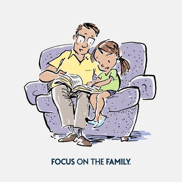
This ad is for Focus on the Family, using a cartoon image of a father reading to his daughter.
# Brand positioning
Focus on the Family is presented as a resource that emphasizes the importance of family relationships and shared activities. The brand aims to occupy a space in the consumer's mind as a trusted and supportive entity that promotes traditional family values and quality time spent together. The brand's tone is warm and inviting, aligning with a lifestyle centered around family unity and nurturing relationships, reinforcing the idea that strong family bonds are essential for a fulfilling life. Positioning is emotional and aims to resonate with individuals who prioritize family and togetherness.
# Product
The image features a scene of a father and daughter sharing a moment while reading a book together. The product, in this context, is the concept of family time and the importance of engaging in activities that strengthen family bonds. The ad promotes spending quality time together, particularly through reading, as a way to connect and create lasting memories. The book acts as a facilitator for interaction, suggesting it as a valuable tool for family engagement. The ad subtly addresses the potential barrier of busy schedules by highlighting the simplicity and joy of reading together, emphasizing the emotional rewards of prioritizing family time.
# Visual style
The ad features a hand-drawn illustration with a simple, clean aesthetic. The image has a slightly textured, painterly feel, created by the visible brushstrokes and color variation within the fills. The color palette is soft and muted, using light pastel shades to create a warm and inviting atmosphere. The overall effect is gentle and nostalgic.
# Hooks
Headline: FOCUS ON THE FAMILY.
# Call to action
None used.
# Point of view
- [object Object]
# Storyline
- The image showcases a father and daughter sitting closely together in an armchair, sharing a book. This is included to illustrate a moment of connection and shared activity within a family, emphasizing the importance of spending quality time together from an observer point of view.
- The positioning of the father and daughter suggests a warm, loving relationship, intended to evoke feelings of nostalgia and the desire for similar experiences in the viewer. The presentation is from an observer perspective.
- The overall scene conveys a message about the value of family time and the simple pleasures of reading together, encouraging viewers to prioritize and engage in similar activities to foster strong family relationships from an observer perspective.
# Ad summary
This image ad by SeeLife, a part of Focus on the Family, asks the question, “What does the Bible say about abortion?” with a call to action of a “Free Download”.
# Brand positioning
Focus on the Family is a brand that aligns with conservative values, particularly concerning family and social issues. The brand presents itself as a resource for guidance rooted in Christian principles. Positioning itself as a source of moral clarity and support, it pushes against secular perspectives on family matters, advocating for traditional family structures and values. It provides functional resources such as articles, counseling, and community support, appealing to those seeking faith-based advice and perspectives on various life and family topics. SeeLife operates under Focus on the Family.
# Product
The product is a free downloadable resource that provides information on what the Bible says about abortion. It is designed for individuals seeking religious perspectives on the topic of abortion, offering insights and guidance rooted in biblical teachings. The resource aims to address the potential barriers of uncertainty or lack of knowledge regarding the Bible's stance on abortion by providing accessible information. It is intended for those who want to align their views with religious teachings, offering a faith-based perspective on the issue.
# Visual style
The ad utilizes a clean, straightforward visual style. The gradient background and soft lighting give it a modern feel, while the open Bible anchors it to the religious context. The typography is simple and legible, ensuring that the message is easily scannable. The overall effect is professional and trustworthy, likely aimed at creating a sense of reassurance and clarity.
# Hooks
Headline: What does the Bible say about abortion?
# Call to action
None used.
# Point of view
- [object Object]
# Storyline
- The ad opens by posing a direct question about the Bible's stance on abortion. This is intended to immediately grab the attention of viewers who are curious about this topic. The brand is conveying this message to the audience.
- Next, the ad presents a clear call to action: a "Free Download" to access information on the topic. This intends to provide an accessible solution, inviting viewers to learn more. The brand is conveying this message to the audience.
- Lastly, the ad visually features an open Bible, reinforcing the religious context. This visual intends to reassure viewers that the information is rooted in biblical teachings. The brand is conveying this message to the audience.
# Ad summary
This ad is designed to encourage parents to reduce their children's screen time and instead subscribe to Focus on the Family magazines.
# Brand positioning
Focus on the Family is presented as a resource for parents looking for wholesome, family-friendly content. The ad promotes print magazines as an alternative to screen time, positioning the brand as a provider of educational and entertaining material that aligns with family values. The brand's identity is rooted in traditional family ideals, suggesting that the brand aims to occupy a space in the consumer's mind as a trusted source of content that parents can feel good about sharing with their children.
# Product
The ad promotes a selection of Focus on the Family magazines. These magazines offer an alternative to screen time, providing engaging content for children and teens. The magazines shown are: Focus on the Family Clubhouse (a magazine with stories, activities, and faith-based content for elementary-age kids), Focus on the Family Clubhouse Jr. (a magazine with stories, activities, and faith-based content for younger elementary-age kids), and Brio (a magazine targeted toward teen girls). The magazines come in a traditional print format, with a cover design intended to attract the target audience. The ad is designed to overcome the purchase barrier of finding safe and educational entertainment options for children and teens.
# Visual style
The ad has a clean and simple visual style, using bright colors and clear typography. The production quality is high with polished magazine covers and a soft gradient background. The layout is balanced, with the text and product images arranged to draw the eye. The overall aesthetic feels friendly and family-oriented, aligning with the brand's values.
# Hooks
Headline: Less screen time. More magazine time.
# Benefits
- [object Object]
- [object Object]
# Call to action
Shop now!
# Point of view
- [object Object]
# Storyline
- The ad presents the message “Less screen time. More magazine time.”, which is told from the brand's perspective. This is included to position magazines as a beneficial alternative to digital media.
- The ad shows three different Focus on the Family magazines: Clubhouse Jr., Brio, and Clubhouse. The brand is presenting their magazine options to showcase the variety of age ranges and target demographics they offer.
- The ad has a red call-to-action button that says “Shop now!” The brand is inviting the viewer to purchase the magazines.
- The ad concludes with the brand name, "FOCUS ON THE FAMILY." The brand is reinforcing brand recognition.
# Ad summary
The ad shows an opened bible with the question, 'Does the Bible mention abortion?' A button reads 'Free download.' The ad seems to be targeted towards religious people.
# Brand positioning
SeeLife, a brand under Focus on the Family, is positioned as a source of information relating to religious perspectives on life's pressing issues. The ad implicitly presents the brand as authoritative and faith-based, addressing complex topics through a lens of religious guidance and family values. By offering a free download, SeeLife aims to engage its audience with accessible content, inviting them to explore their beliefs and find answers within a religious framework.
# Product
The ad promotes a free downloadable resource from SeeLife that addresses the question of whether the Bible mentions abortion. The product aims to provide answers and insights from a religious perspective on this sensitive topic. It is intended for individuals seeking guidance or information rooted in faith. The ad attempts to lower any barriers by offering the download for free, signaling that the resource is readily accessible and potentially comprehensive.
# Visual style
The ad has a clean, direct visual style. It uses a gradient background and a clear image of a Bible to convey a sense of peace. The design is simple and informative.
# Hooks
Headline: Does the Bible mention abortion?
# Call to action
None used.
# Point of view
- [object Object]
# Storyline
- The ad starts by posing the question, 'Does the Bible mention abortion?' which is meant to grab the viewer's attention. This is presented from the brand's point of view to introduce a topic of interest and concern to the target audience.
- Next, the ad offers a 'FREE DOWNLOAD,' which is aimed to encourage the viewer to learn more. This is presented from the brand's point of view as a simple way to learn the answer to the posed question.
# Ad summary
This ad is promoting a course on discipleship. A man, presumably a teacher, lays out how the course is set up and the goal of each unit.
# Brand positioning
The brand presented in the ad is academic and faith-based. The brand's approach to discipleship is functional, offering tools for a deeper understanding of the biblical text. The ad promotes the brand as a resource for students seeking a structured approach to their spiritual education.
# Product
This ad promotes a course on discipleship presented in four units. Unit 1 focuses on preparing the student by developing tools to better understand the text in its original setting. Unit 2 looks at the background of discipleship in the Hebrew bible. Unit 3 focuses on the idea of discipleship in first century Galilee and how Jesus used the practices of synagogue for his teaching and to call his disciples to follow him. Unit 4 centers around how the disciples were prepared and how they were chosen.
# Visual style
The ad's visual style is academic and informational, with a mix of real-life lectures and stylized visuals of historical and theological concepts. The editing style is smooth and slow, transitioning between different visuals to support the voiceover. The visuals are timed to the audio, with title cards introducing each unit and relevant imagery illustrating the content.
# Benefits
- [object Object]
# Features
- [object Object]
- [object Object]
- [object Object]
- [object Object]
# Call to action
None used.
# Point of view
- [object Object]
# Storyline
- 00:00–00:02 The opening title card prompts viewers to think about key aspects of discipleship.
- 00:02–00:07 00:02–00:07: A man directly refutes common notions of discipleship. He emphasizes that it is not part-time, nor simply attending bible class, chapel, church, or bible study.
- 00:07–00:12 00:07–00:12: He clarifies that discipleship is an all-encompassing commitment—everything you do.
- 00:12–00:14 00:12–00:14: A title card asks about the student journey in this course.
- 00:15–00:20 00:15–00:20: The man explains that Unit 1 prepares students for the study by developing tools that help them better understand the text in its original setting.
- 00:20–00:25 00:20–00:25: The man introduces context as a key element, including language, literature, geography, history, culture, and the grand narrative.
- 00:25–00:28 00:25–00:28: The man explains that Unit 2 looks at background of discipleship in the Hebrew bible.
- 00:36–00:41 00:36–00:41: The man states that Unit 3 will consider the idea of discipleship in first-century Galilee.
- 00:41–00:49 00:41–00:49: The man shares that Unit 3 will focus on how Jesus used the practices of synagogue for his teaching, and to call his disciples to follow him.
- 00:50–01:01 00:50–01:01: The man shares that Unit 4 will cover how the disciples were prepared, if there was an education system, and how they were chosen.
# Ad summary
This ad promotes RVL Discipleship, a curriculum designed to help people grow closer to Jesus. The ad features the founder of RVL Discipleship, as well as former students who have taken the course. The founder explains what discipleship is, while former students share how they still incorporate aspects of the course into their daily life.
# Brand positioning
RVL Discipleship is a curriculum designed to help people grow closer to Jesus by following in his footsteps, similar to how one follows a rabbi. The brand promotes a lifestyle of faith, encouraging people to live their lives in the direction of scripture. RVL Discipleship goes against the norm of people being too busy to focus on their relationship with God, instead empowering people to build and maintain that relationship.
# Product
RVL Discipleship is a curriculum that helps people grow closer to Jesus. The curriculum encourages people to follow the teachings of Jesus, and align their lives with the direction of scripture. The program is designed to give people a glimpse into what Jesus is like.
# Visual style
The ad has a polished aesthetic with smooth transitions between shots. The video combines talking head testimonials with visuals of class. The overall tone of the ad is serious and thoughtful.
# Call to action
None used.
# Point of view
- [object Object]
- [object Object]
# Storyline
- 00:00–00:03 The ad opens with a question, prompting the viewer to think about what they hope to gain from the course.
- 00:03–00:22 00:03–00:22: The founder of RVL Discipleship sits on an ornately decorated couch and explains that discipleship is to imitate the rabbi, and that a rabbi is Jesus. He explains that he is supposed to show the world a glimpse of what Jesus is like.
- 00:22–00:44 00:22–00:44: A former student, Breanna Brink, sits inside of a glass-walled building and explains that the phrase that she learned in discipleship class that she still thinks about often is, "Stay dusty." She says that this means to walk so closely in the footsteps of Jesus that the dust of the rabbi is kicked up onto your boots. Breanna then says that she often asks herself if she is staying dusty.
- 00:44–00:48 00:44–00:48: The RVL Discipleship logo appears on screen.
# Ad summary
This ad promotes Focus on the Family Clubhouse Magazine, emphasizing how it can protect children with activities and devotions that nurture their faith in Jesus.
# Brand positioning
Focus on the Family's Clubhouse Magazine is presented as a resource to protect and nurture children's faith. The brand aims to instill traditional Christian values in children through fun, engaging content that helps them become committed followers of Jesus. The brand promotes a family-oriented lifestyle by providing activities and devotions that can be shared between parents and children.
# Product
Clubhouse Magazine is a children's magazine by Focus on the Family that features activities and devotions designed to help children understand what it means to be committed followers of Jesus. The magazine is targeted toward families who want to actively nurture their children's faith and teach them Christian values. The magazine includes activities, games, stories, and devotionals to engage children in learning about their faith. The main USP is igniting a child's faith.
# Visual style
The ad has a polished commercial aesthetic with bright, natural lighting and smooth transitions. It blends shots of everyday family moments with close-ups of the product to highlight its features. The editing rhythm is moderate, with cuts timed to coincide with spoken lines to keep a consistent pace. The overall production quality is high-end, aiming to convey a sense of reliability and trust.
# Benefits
- [object Object]
# Features
- [object Object]
# Call to action
None used.
# Point of view
- [object Object]
# Storyline
- 00:00–00:02 The ad begins by posing a question to the viewer, asking if they want to make sure their kids are protected, setting a concerned tone.
- 00:02–00:05 00:02–00:05: The ad introduces Clubhouse Magazine as the solution, presenting it as a way to protect children by providing activities and stories.
- 00:05–00:12 00:05–00:12: The ad continues by describing Clubhouse Magazine as containing activities and devotions designed to help children understand what it means to be a committed follower of Jesus, emphasizing faith-based learning.
- 00:12–00:15 The ad concludes by encouraging viewers to ignite their child's faith today with Clubhouse, providing a call to action to engage with the product and further instill their child’s faith.
# Ad summary
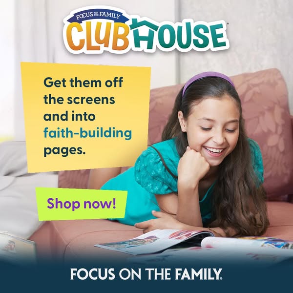
This ad for Focus on the Family's Clubhouse magazine features a young girl reading the magazine. The ad suggests this magazine is a faith-building alternative to the screens children typically spend time on.
# Brand positioning
Focus on the Family is presented as a family-oriented brand that prioritizes faith-building activities over screen time. This positions the brand as a provider of resources that support a traditional family lifestyle centered on Christian values. The brand is presented as an alternative to contemporary screen-based entertainment, appealing to parents who want their children to engage in more enriching and faith-based activities.
# Product
The product featured is Clubhouse magazine by Focus on the Family. The magazine is promoted as a faith-building alternative to digital screens, intended for children. Though the details of the magazine's content are not explicitly stated, the implication is that it contains stories, activities, and lessons that are rooted in Christian values and principles. The ad suggests that the magazine can address a common parental concern of children spending too much time on screens and introduces this magazine as a solution to that problem by providing faith-based content in an engaging format.
# Visual style
The ad uses a clean and bright visual style, with soft colors and lighting to create a friendly and inviting atmosphere. The layout is simple and direct, with text elements placed on solid color blocks for emphasis. The overall aesthetic is polished and family-friendly, aiming to appeal to parents looking for wholesome content for their children. The ad imitates a casual, in-feed format, using a sticky note style to help it blend naturally on platforms like Instagram.
# Hooks
Headline: Get them off the screens and into faith-building pages.
# Benefits
- [object Object]
# Features
- [object Object]
# Call to action
Shop now!
# Point of view
- [object Object]
# Storyline
- The ad starts by highlighting a common parental concern of children spending too much time on screens and not enough time on faith-based activities. This is being conveyed by the brand in order to introduce their product as a solution to this problem.
- The ad transitions to showing a young girl enjoying the Clubhouse magazine. This is meant to illustrate that the magazine is an engaging alternative to screen time. This section comes from the brand's point of view.
- The ad closes with a call to action to 'Shop now!', encouraging viewers to purchase the magazine. This is directly from the brand to promote a purchase.
# Ad summary
This image ad is promoting a free video series to help couples cherish each other and build a marriage that will last a lifetime. The image shows wedding rings on a book.
# Brand positioning
This ad focuses on promoting advice for maintaining a long, emotionally close, and loving marriage. The brand positions itself as a helpful resource that provides guidance on building a strong, lasting relationship. The brand's tone is optimistic and reassuring, and it underscores the value of emotional intimacy and commitment in marriage. It caters to couples who are looking to strengthen their relationship and ensure its longevity. The positioning is emotional, focusing on the love and commitment that marriage entails.
# Product
The featured product is a free video series designed to help couples build a marriage that will last a lifetime. The series is designed to provide insights and strategies for cherishing one's spouse and staying emotionally close. The product is aimed at couples who want to improve their relationship and ensure long-term happiness and connection. The ad emphasizes the value of building a lasting marriage, offering a resource that addresses the desire for long-term commitment and emotional fulfillment in a relationship.
# Visual style
The ad uses a warm, inviting visual style with soft lighting and a shallow depth of field. The gold rings convey commitment and love, while the open book suggests wisdom and guidance. The overall aesthetic is romantic and hopeful, appealing to emotions associated with marriage and long-term relationships. The soft color grading and focus blur create a sense of intimacy and tenderness, drawing viewers into the message.
# Hooks
Headline: Cherish your spouse and stay emotionally close
# Benefits
- [object Object]
# Features
- [object Object]
# Call to action
None used.
# Point of view
- [object Object]
# Storyline
- The ad opens by posing the question of how to cherish your spouse and stay emotionally close. This draws the viewer in by addressing a common desire among married couples. This is told from the brand’s perspective.
- The ad encourages viewers to get a free video series that offers advice on building a marriage that will last a lifetime. This proposes a solution to the issue raised in the first beat by providing a specific resource to help couples achieve a lasting, loving relationship. This is told from the brand’s perspective.
# Ad summary
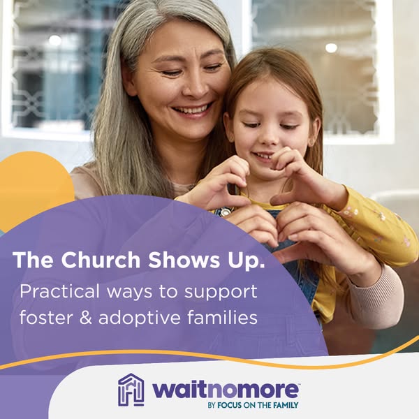
This image ad seeks to support foster and adoptive families and highlight the role churches can play in providing practical support. It features a warm image of a woman and a child making a heart shape with their hands.
# Brand positioning
Wait No More, by Focus on the Family, aims to support foster and adoptive families by connecting them with churches. The brand positions itself as a resource for practical support, filling a need within the community and promoting family values and community involvement. It provides a bridge between faith-based organizations and families in need of support, offering tangible assistance.
# Product
The ad promotes practical ways to support foster and adoptive families, though no specific product is being advertised. The focus is on encouraging churches and individuals to get involved in supporting these families, providing resources, and creating a supportive community. The ad is designed to lower the barrier to entry by highlighting the practicality of the support.
# Visual style
The ad has a warm and inviting visual style, with a soft focus and natural lighting to create a genuine and heartfelt atmosphere. The use of rounded shapes and a comforting color palette further enhances the ad's friendly and approachable feel. The design is clean and uncluttered, drawing attention to the emotional connection between the individuals in the image and the brand's message.
# Hooks
Headline: The Church Shows Up.
# Benefits
- [object Object]
# Call to action
None used.
# Point of view
- [object Object]
# Storyline
- The ad begins with an image of a woman and child making a heart with their hands, which visually conveys love, care, and connection, setting a positive tone for the ad. This is shown from the perspective of the viewer, who is meant to feel empathy and warmth towards the subject matter.
- Next, the ad presents the phrase 'The Church Shows Up,' which introduces the central theme of the ad, emphasizing the active role churches can play in supporting foster and adoptive families. This is shown from the perspective of the brand, highlighting the positive impact churches can have.
- The ad continues by stating 'Practical ways to support foster & adoptive families,' which specifies the type of support being offered, assuring potential volunteers or supporters that the actions needed are feasible. This message is conveyed from the perspective of Wait No More, clarifying the organization's mission and how others can contribute.
- The ad concludes with the brand's logo, reinforcing the identity of the organization behind the initiative and providing a clear visual anchor for recall and further exploration. This is shown from the brand's perspective, solidifying its presence and mission in the viewer's mind.
# Ad summary
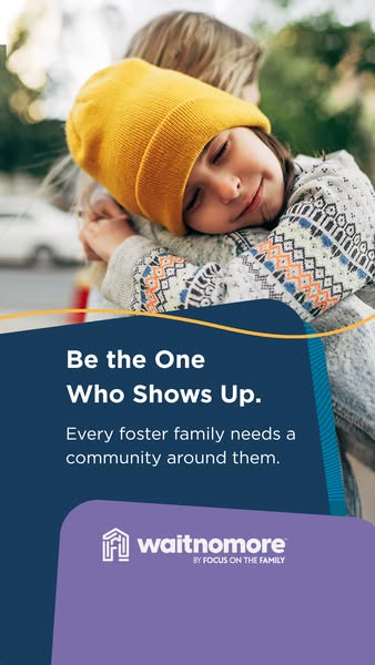
This ad for Wait No More by Focus on the Family encourages viewers to be the one who shows up to foster families. The image shows a young girl leaning on an adult, and the brand messaging is included on a blue and purple block at the bottom of the image.
# Brand positioning
Wait No More by Focus on the Family is presented as an organization dedicated to supporting foster families and children in need. The brand operates in the foster care and adoption sector, aiming to connect potential foster parents with resources and support. The brand promotes values of community, support, and being present for foster families. The brand focuses on the emotional and community-oriented aspects of foster care, emphasizing the need for support networks around foster families.
# Product
The ad promotes Wait No More, a program by Focus on the Family that supports foster families by building a community around them. The program aims to address the need for community support for foster families. The ad's message encourages viewers to "Be the One Who Shows Up," highlighting the importance of community involvement in foster care. The ad addresses the potential barrier of feeling unsure how to help foster families by emphasizing the need for community around them.
# Visual style
The ad has a heartwarming and supportive visual aesthetic, combining a genuine, real-life image with clear, branded messaging. The production quality appears to be high, with professional photography and clean graphic elements. The image has soft lighting and natural colors, creating a sense of warmth and authenticity. The ad uses a combination of a photograph and a flat design style for the text and branding elements. The typography is clean and legible, placed on solid color blocks for easy readability.
# Hooks
Headline: Be the One Who Shows Up.
# Benefits
- [object Object]
# Features
- [object Object]
# Call to action
None used.
# Point of view
- [object Object]
- [object Object]
# Storyline
- The ad starts by displaying a heartwarming image of a young girl embraced by an adult, setting a positive and emotional tone. The brand is showing how they support the foster care system and bring together a community for these families. The ad seeks to emotionally engage the viewer and highlight the importance of community support.
- Next, the ad presents a core message: “Be the One Who Shows Up.” The brand is directly addressing the audience, urging them to take action and be present for foster families, framing foster families' needs from the organization's perspective.
- The ad emphasizes that "Every foster family needs a community around them", reinforcing the brand's mission and the critical role of community support. This is the brand explaining their ethos.
- Finally, the ad displays the Wait No More logo, reinforcing brand recognition and association with foster family support. The brand is ending by reinforcing its name and what it stands for in the viewer's mind.
# Ad summary
This ad aims to raise awareness and funds for the Focus on the Family Option Ultrasound program. The ad emphasizes the idea that a small donation can give a mother the courage to choose life, positioning the program as a means of saving babies' lives.
# Brand positioning
Focus on the Family is presented as a charitable organization focused on supporting families and promoting the value of life, particularly through the Option Ultrasound program. The brand seeks to occupy a space in the consumer's mind as a pro-life and family-oriented organization. The brand aligns with values of compassion, courage, and the belief in the sanctity of life, pushing against the norm of abortion and advocating for alternatives. The brand positioning is emotional, appealing to the viewers' sense of empathy and responsibility to save lives.
# Product
The Option Ultrasound program is a charitable initiative that provides funding for ultrasounds to pregnant mothers, giving them the opportunity to see their unborn child and potentially choose life. The program aims to empower mothers with the courage to make a life-affirming decision. The ad addresses potential purchase barriers by highlighting that just $60 can make a significant difference. The program is portrayed as a tangible way to support mothers and save babies' lives by choosing life.
# Visual style
The ad has a highly polished, studio-shot quality, creating a professional and trustworthy feel. The visual motifs include soft lighting and a gentle color palette to evoke a sense of peace and innocence. The image treatment uses a subtle color grading to enhance the warmth and softness. The typography is integrated in a clear and legible manner. The style is designed to be eye-catching in-feed while conveying a serious message.
# Hooks
Headline: Save a baby's life!
# Benefits
- [object Object]
# Features
- [object Object]
- [object Object]
# Call to action
GIVE NOW
# Point of view
- [object Object]
# Storyline
- The ad opens with a direct appeal: "Save a baby's life!" to immediately capture attention and create a sense of urgency, told from the brand's perspective.
- A button prompts the user to "GIVE NOW", signaling the next step and desire for immediate action, told from the brand's perspective.
- The ad states "Just $60 gives a mom the courage to choose life through the Option Ultrasound program" to provide a tangible benefit and emotional reasoning, told from the brand's perspective.
- The brand is clearly identified through their logo at the bottom left corner. This is to build brand awareness and credibility, told from the brand's perspective.
# Ad summary
An ad for a non-profit organization encouraging people to support children in foster care, featuring an image of a happy child holding stuffed animals.
# Brand positioning
This non-profit organization aims to support and bring comfort to children in foster care. The brand establishes a caring, compassionate, and supportive identity to encourage potential donors and volunteers to contribute to the well-being of vulnerable children.
# Product
The focus of the ad is to promote support for children in foster care. This involves providing them with comfort items, care, and resources to improve their lives. The ad conveys a message of hope and the opportunity to make a difference in a child's life through donations or volunteer work.
# Visual style
The ad has a warm and inviting visual style. The image is well-lit, with soft lighting that highlights the child's face. The background is simple and clean, with a light, textured pattern that adds visual interest without distracting from the main subject. The overall effect is calming and approachable, designed to evoke positive emotions and encourage engagement.
# Hooks
Headline: Comfort a child in foster care
# Benefits
- [object Object]
# Features
- [object Object]
# Call to action
None used.
# Point of view
- [object Object]
# Storyline
- The ad shows a smiling child holding stuffed animals. The brand is aiming to invoke feelings of warmth and compassion to encourage people to support children in foster care.
# Ad summary
The ad shows a woman who discovers she is pregnant. She appears sad and overwhelmed, but a friend encourages her with the phrase, “you don’t have to.” The ad then cuts to the Focus on the Family organization, encouraging viewers to donate $60 to help mothers choose life.
# Brand positioning
The brand, Focus on the Family, is presented as a resource for women who are facing an unplanned or unwanted pregnancy. The ad is intended to evoke compassion for mothers in difficult situations and encourage monetary donations to support them. The brand takes a clear pro-life stance, and their positioning appears to be emotionally driven through a desire to save babies and help mothers in crisis. They do not mention competitors.
# Product
The ad does not feature a physical product for sale; instead, it promotes a donation opportunity with Focus on the Family. The ad attempts to alleviate a mother’s anxieties surrounding an unplanned pregnancy through the phrase, “you don’t have to.” The brand aims to provide support for women who may be feeling overwhelmed, and the ad invites donations of $60 to help mothers “choose life.”
# Visual style
The ad has a polished but realistic visual style, using a mix of handheld and stationary shots. The editing is fast-paced, with quick cuts between scenes to convey a sense of urgency. The production quality is relatively high, with clear visuals and professional-looking shots. There are no consistent visual motifs, but the ad relies on relatable scenarios to create an emotional connection. The pacing is consistent throughout.
# Benefits
- [object Object]
# Features
- [object Object]
# Call to action
Donate $60 at FocusOnTheFamily.com/babies.
# Point of view
- [object Object]
- [object Object]
# Storyline
- 00:00–00:02 00:00–00:02: A woman stands in her bathroom holding a pregnancy test with a plus sign on the digital display. The overall intention is to convey a moment of realization.
- 00:02–00:04 00:02–00:04: A man sits at a kitchen counter, puts his head in his hands, and says, “I can’t handle a baby right now.” This is from the man’s perspective, and the ad conveys worry and stress.
- 00:04–00:05 00:04–00:05: A woman sits in a car and sighs. This is a continuation of the previous moment. It conveys stress and exasperation from the woman’s perspective.
- 00:05–00:07 00:05–00:07: A woman sitting at a table outside says to the first woman, “You don’t have to.” This moment is intended to convey reassurance and support.
- 00:07–00:09 00:07–00:09: The first woman washes her hands in a bathroom. The intention is to show a moment of contemplation and internal conflict.
- 00:09–00:13 00:09–00:13: A medical professional stands in what appears to be an office, smiling, followed by an ultrasound on a screen. This is the beginning of the brand messaging. The intention is to evoke trust and credibility.
- 00:13–00:14 00:13–00:14: The Focus on the Family logo is displayed with the text, “$60 helps moms choose life. FocusOnTheFamily.com/babies.” The intention is to encourage viewers to donate.
# Ad summary
This ad presents statistics about the positive impact of ultrasounds on women's decisions to continue their pregnancies. It asks for monthly donations to help save babies.
# Brand positioning
This ad positions the brand as a proactive advocate for saving unborn babies through education and support. The brand appeals to viewers' sense of compassion and social responsibility, presenting itself as a vital resource for women considering abortion. The brand aligns with values of life preservation and community support. The brand appears to follow the norms of nonprofit organizations by soliciting donations for its cause.
# Product
The ad promotes monthly donations to support the organization's efforts in saving babies. It highlights that a $15 monthly contribution can help save three babies every year. The ad emphasizes the impact of ultrasound technology on women's decisions, suggesting that access to ultrasounds is a key factor in choosing to continue a pregnancy. It suggests that financial donations will help provide and promote access to such ultrasounds.
# Visual style
The ad has a clean and straightforward aesthetic, focusing on clear messaging and a personal connection. The production quality is polished, with a blurred background and crisp text overlays.
# Benefits
- [object Object]
- [object Object]
# Features
- [object Object]
# Call to action
Give $15 monthly
# Point of view
- [object Object]
# Storyline
- 00:00–00:01 The ad opens with a close-up shot of a pregnant woman holding an ultrasound image. The focus is on the image and her hands, creating a personal and intimate feel.
- 00:01–00:04 Text overlay appears stating, "Because of ultrasounds, nearly 60% of women choose life on the spot." This highlights the impact of ultrasound technology on women's decisions regarding their pregnancies.
- 00:04–00:06 The ad transitions to an appeal for donations, with text overlay reading, "Give $15 monthly and help save 3 babies every year." This emphasizes the direct impact of financial contributions on saving lives.
# Ad summary
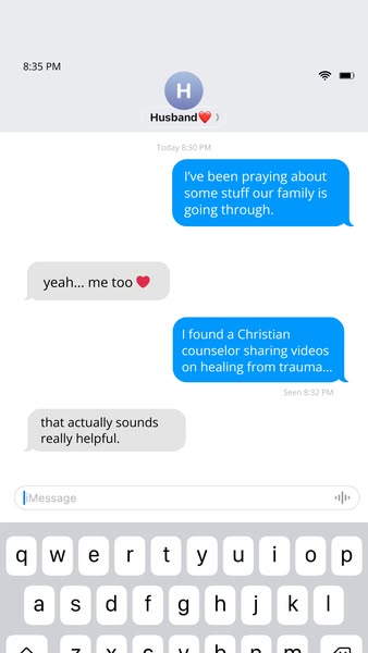
This ad features a screenshot of a text message exchange between a husband and wife who are seeking support for family issues. The husband shares that he has been praying, and the wife responds empathetically. The husband then mentions finding a Christian counselor who shares videos on healing from trauma, and the wife expresses that it sounds helpful.
# Brand positioning
This ad promotes a Christian counselor who offers videos focused on healing from trauma. The brand positions itself as a resource for individuals and families seeking faith-based guidance and support through challenging times. By highlighting Christian values and addressing trauma, the brand aims to occupy a space in the consumer's mind as a compassionate and understanding source of help. The brand's tone is caring and supportive, aligning with a lifestyle of faith and healing.
# Product
The ad promotes a Christian counselor who shares videos on healing from trauma. The product is intended for individuals and families who are seeking guidance and support in overcoming emotional challenges through faith-based practices. The ad highlights the counselor's expertise in addressing trauma and offering a Christian perspective. The videos are positioned as a helpful resource for those who may be experiencing difficulties. The ad addresses potential barriers to seeking help by presenting the counselor's videos as accessible and supportive, encouraging viewers to explore this resource.
# Visual style
The ad features a simple, minimalist visual style with a focus on presenting a realistic text message conversation. The production quality is clean and clear, resembling a standard screenshot from a smartphone. The color palette is limited to shades of gray, light blue, and white, contributing to a clean and modern aesthetic. There are no apparent visual motifs, image treatments, or platform-native styles used. The typography is simple and legible, ensuring that the text is easily readable. The overall visual style aims to create a sense of authenticity and relatability.
# Hooks
Headline: None used
# Benefits
- [object Object]
- [object Object]
# Features
- [object Object]
- [object Object]
# Call to action
None used.
# Point of view
- [object Object]
- [object Object]
# Storyline
- The story begins with a husband sharing that he has been praying about some family issues. This sets the tone and indicates that the family is seeking divine intervention or guidance. The message conveys the intention of finding strength and support through prayer. This is from the husband's perspective and establishes the emotional context of the situation.
- The wife responds with empathy, stating that she has been praying too. This reinforces the shared concern and establishes that both partners are actively seeking a resolution. The message conveys the intention of mutual support and emotional connection. This is from the wife's perspective and adds to the emotional weight of the situation.
- The husband shares that he found a Christian counselor who is sharing videos on healing from trauma. This introduces a potential solution to the family's struggles, indicating that they are actively seeking professional help. The message conveys the intention of finding a resource that aligns with their values and beliefs. This is from the husband's perspective and demonstrates proactive problem-solving.
- The wife responds positively, stating that the counselor's videos sound really helpful. This expresses optimism and implies that they are willing to explore the suggested resource. The message conveys the intention of embracing a potential solution and finding hope in the counselor's expertise. This is from the wife's perspective and adds to the overall sense of hope and potential healing.
# Ad summary
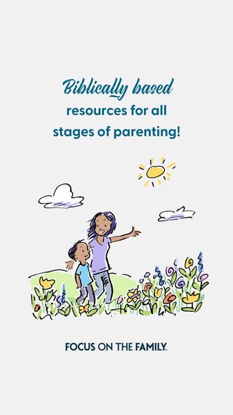
An ad for Focus on the Family, promoting their biblically-based resources for all stages of parenting.
# Brand positioning
Focus on the Family is presented as a resource hub offering biblically-based guidance for parents at every stage of their children's lives. The ad uses a hand-drawn illustration style to convey a sense of warmth, approachability, and authenticity. The brand aims to occupy a trusted position in the Christian parenting space, providing support and encouragement rooted in religious values. They focus on nurturing families through faith-based principles, positioning themselves as a reliable source amidst the challenges of raising children.
# Product
The ad promotes Focus on the Family's resources, offering biblically-based support for parents through all stages of raising children. The ad highlights the comprehensive nature of these resources, catering to families at any point in their parenting journey. The visual of a mother and child in a vibrant, hand-drawn setting suggests that the resources aim to foster a nurturing and positive family environment, presenting the brand as a solution to the difficulties of parenting by providing faith-based guidance.
# Visual style
The ad uses a hand-drawn, whimsical visual style. The production quality is simple and not highly polished, resembling a casual illustration. The color palette is soft and muted. The visual motifs include sketchy lines and a childlike aesthetic. The typography is integrated in a straightforward manner, with a handwritten-style font for the headline. This style contrasts with typical high-design ads, potentially disrupting the feed and increasing scannability.
# Hooks
Headline: Biblically based resources for all stages of parenting!
# Benefits
- [object Object]
# Features
- [object Object]
# Call to action
None used.
# Point of view
- [object Object]
# Storyline
- The ad opens by declaring it provides 'Biblically based resources for all stages of parenting!' This headline is the initial hook, immediately conveying the ad's core message. The ad intends to capture the viewer's attention by positioning itself as a provider of faith-based parenting resources, speaking directly to parents seeking guidance rooted in biblical principles. It sets the stage by quickly establishing the ad's focus and value proposition from the brand’s point of view.
- The ad presents a hand-drawn illustration of a mother and child walking through a field of flowers under a sunny sky. This visual component works to connect the written message with a relatable scene, suggesting the positive, nurturing environment that the resources aim to cultivate. The warm, inviting illustration style is designed to enhance the viewer's perception of the brand as accessible and friendly, drawing them into the story and offering a glimpse into the kind of family life they could achieve with the help of these resources, from the brand’s point of view.
- The ad concludes by showing the 'FOCUS ON THE FAMILY' logo. It serves as a clear identifier of the ad’s sponsor, reinforcing brand recognition. By placing the logo at the bottom, it solidifies the message by reminding the viewer of the resource provider and encouraging them to explore further, from the brand’s point of view.
How Other Parenting Brands Advertise on Meta
Peer brands in Motion's library — click any brand to see their creative strategy, live ads, and AI breakdowns.