# Ad summary
This ad calls out the problems created by big companies when they suggest customers need to “purge a little longer” when it comes to their skin. It is implied that this is a bad narrative that Norse Organics products will help to solve.
# Brand positioning
Norse Organics positions itself as a brand that is against the grain, standing up to big companies in the beauty industry. The brand's values clearly aim to empower consumers to reject marketing strategies that may not be in their best interest.
# Product
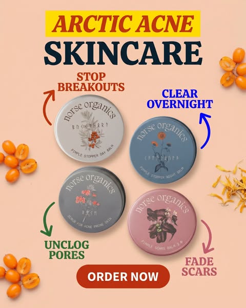
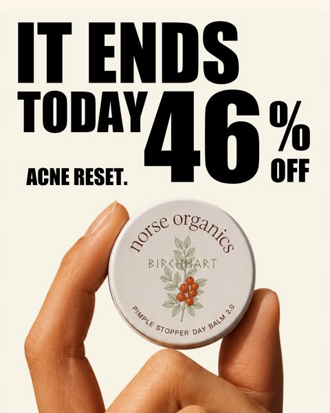
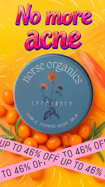
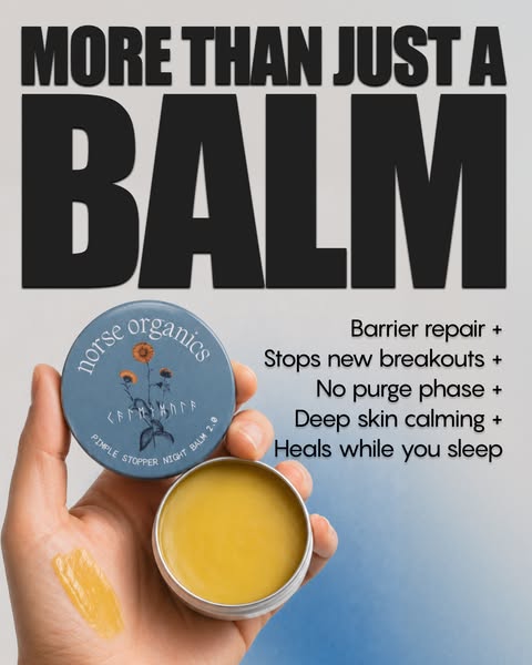
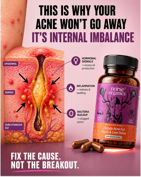
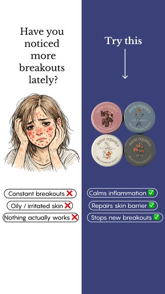
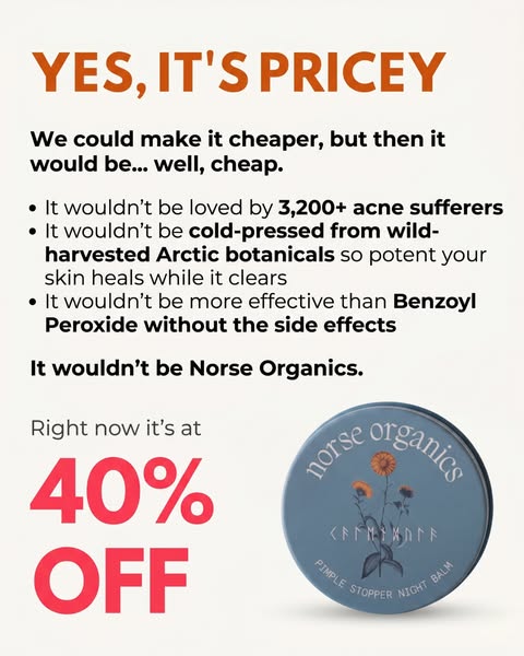
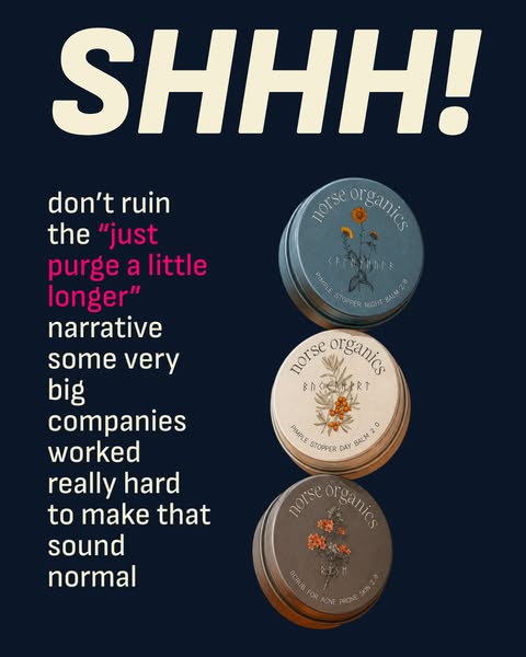
The ad features three Norse Organics products, each packaged in a small tin container. The top product is for nighttime use, as the (on-package label text) "PIMPLE STOPPER NIGHT BALM 2.8" suggests. The middle product is for daytime use as the (on-package label text) "PIMPLE STOPPER DAY BALM 2.0" suggests. The last product is the (on-package label text) "SCRUB FOR ACNE PRONE SKIN 2.8". The ad implies that the products are for consumers who have been struggling with their skin and are looking for a solution that doesn’t involve harsh chemicals or long-term purging.
# Visual style
The ad has a simple, clean visual style. It utilizes a dark blue background with cream-colored text, with product images.
# Hooks
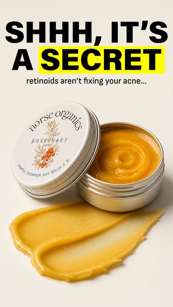
Headline: SHHH!
# Benefits
- [object Object]
# Features
- [object Object]
- [object Object]
- [object Object]
# Call to action
None used.
# Point of view
- [object Object]
# Storyline
- The ad opens by using a large, bold text saying “SHHH!” This is meant to grab the viewer’s attention and suggests that the ad is about to share a secret. The perspective is from the brand.
- The ad then uses a conversational tone, asking the viewer not to ruin the "just purge a little longer" narrative. This suggests that some big companies are pushing this narrative and the brand believes it is harmful. The perspective is from the brand.
- The ad states that "some very big companies worked really hard to make that sound normal", suggesting that it is not normal or healthy to "purge a little longer". The perspective is from the brand.
- Three Norse Organics products are featured, suggesting they offer a solution to the problem that the big companies have created. The perspective is from the brand.