Uber runs 2K active ads on Meta, shipping ~78 new creatives per week. Their library leans on Screen Recording10%, Demo7%, and Listicle7%. Recently, uber is hammering home friction removal across the entire journey, pushing core rideshare with heavy emphasis on upfront pricing, speed versus walking, and ease of booking to combat hesitation at the top of funnel. They're leaning into Reserve for planned trips (especially airport) and multi-stop functionality to own more complex use cases, while the creative execution skews heavily toward simulated UI, text threads, and relatable scenarios that make ordering feel brain-dead simple and socially normalized. There's a clear global play here too with localized hooks like budget tiers and market-specific products (Uber Bike in India), all unified by the message that uber is faster, cheaper, and more convenient than any alternative you're considering.
# Ad summary
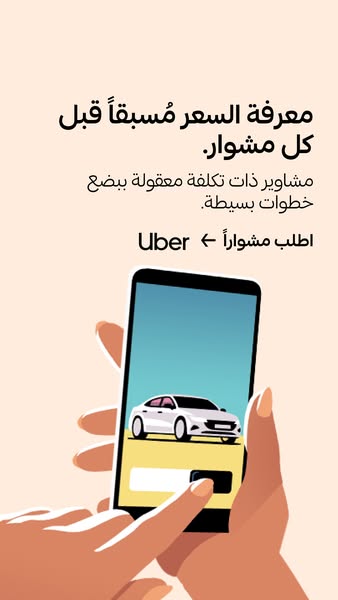
This ad promotes Uber by highlighting the ability to know the price in advance and the ease of ordering a ride in a few simple steps.
# Brand positioning
Uber is presented as a convenient and reliable transportation solution. The ad emphasizes transparency by highlighting the ability to know the price in advance, suggesting that Uber values honesty and clarity in its services. The brand is positioned as a user-friendly option, making transportation accessible and straightforward for everyone.
# Product
The ad promotes the Uber app, a mobile application that allows users to book rides. It highlights the feature of knowing the price in advance, ensuring transparency and avoiding surprises. The app is presented as a simple and affordable solution for transportation needs, with the promise of easy booking in just a few steps. The ad emphasizes the convenience and cost-effectiveness of using Uber for everyday travel.
# Visual style
The ad features a clean and minimalist design with a focus on simplicity and clarity. The color palette is soft and muted, with a light peach background and a bright blue screen on the phone. The illustration style is flat and modern, with bold lines and minimal shading. The overall aesthetic is user-friendly and approachable, designed to appeal to a wide audience.
# Hooks
Headline: معرفة السعر مسبقاً قبل كل مشوار.
# Benefits
- [object Object]
- [object Object]
- [object Object]
# Features
- [object Object]
- [object Object]
- [object Object]
# Call to action
None used.
# Point of view
- [object Object]
# Storyline
- The ad starts by highlighting the benefit of knowing the price in advance, which aims to address the common concern of unexpected costs when using ride-sharing services. This is told from the brand's perspective, emphasizing transparency and customer satisfaction.
- Next, the ad mentions that rides are affordable and can be booked in a few simple steps, reinforcing the ease and cost-effectiveness of using Uber. This is also from the brand's perspective, showcasing the convenience and value of the service.
- Finally, the ad includes a call to action to order a ride via Uber, prompting the viewer to take immediate action. This is from the brand's perspective, encouraging users to engage with the app and book a ride.
Active·image · 8 variants
Us Vs Them
# Ad summary
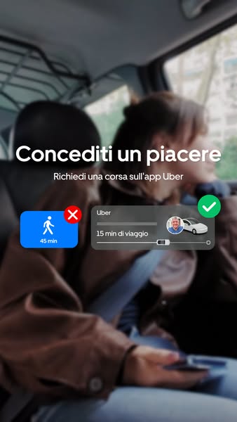
An Uber ad demonstrates how much faster it is to order a ride than to walk the same distance.
# Brand positioning
Uber is presented as a convenient and readily available transportation solution. The ad explicitly positions the brand as a way to add a little luxury to one's life. The service is framed as an alternative to walking, suggesting a focus on convenience, speed, and comfort over more conventional modes of transportation.
# Product
The Uber app is showcased as a transportation service that allows users to quickly and easily book rides. The ad shows a UI element with Uber as the brand, 15 min di viaggio (15 minutes of travel) as the estimated travel time for a ride and another option that shows a pedestrian icon, 45 min, and a red X icon. The ad highlights the speed and efficiency of using the Uber app to book a ride compared to walking, emphasizing its role as a convenient transportation solution.
# Visual style
The ad uses a soft and modern aesthetic with a blend of real-life visuals and platform-native UI elements. The blurred background adds depth and focuses attention on the central message conveyed through the UI panel. The overall design mimics a native app interface, which is clean and easy to scan.
# Hooks
Headline: Concediti un piacere
# Benefits
- [object Object]
# Features
- [object Object]
# Call to action
None used.
# Point of view
- [object Object]
# Storyline
- The ad starts with a lifestyle message to 'treat yourself', positioning Uber as a little luxury you can choose. The intent is to prime the viewer to think of Uber as something desirable, from the brand's POV.
- The ad then shows a visual comparison of two transit options. A pedestrian icon is displayed that shows it would take 45 minutes, and a car icon with a user profile photo shows a time of 15 minutes. The intent is to use the UI element to highlight the speed and efficiency of choosing an Uber over walking, from the brand's POV.
Active·image · 7 variants
Us Vs Them
# Ad summary
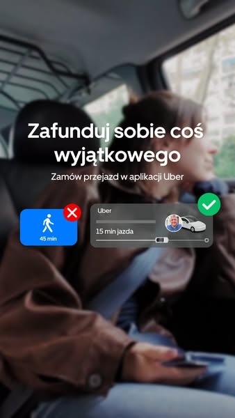
This ad features an overlay that simulates a user choosing between Uber and walking. It is made to look as though the decision is taking place within the Uber app, presenting taking an Uber as the obvious choice.
# Brand positioning
This ad presents Uber as a go-to transportation option. Its positioning is centered around ease and convenience, highlighting the benefits of choosing Uber over other methods like walking. The brand promotes a lifestyle where time is valued, and Uber provides a simple solution to save it. By presenting a direct comparison, Uber implicitly pushes against the norms of slower alternatives, positioning itself as the obvious choice for those who prioritize speed and convenience. The brand is functionally positioned, emphasizing simplicity and time savings.
# Product
This ad is for the Uber ride-sharing app. It provides a quick and efficient transportation solution. The ad is aimed at individuals who value their time and prefer a faster mode of transportation compared to walking. It highlights the app's ability to quickly estimate travel times and suggests that using Uber can significantly reduce travel time. The ad emphasizes the convenience and time-saving benefits of using Uber, making it an appealing choice for those looking to avoid longer walks.
# Visual style
The ad has a modern, clean aesthetic with a focus on simplicity and clarity. The production quality appears polished, with the simulated UI elements seamlessly integrated into the real-life setting. The image treatment includes a blurred background to draw attention to the UI elements, and the color grading is subtle, maintaining a natural look. The typography is clean and legible, contributing to the ad's scannability in a fast-paced feed. The visual style mimics a platform-native interface, enhancing its authenticity and engagement potential.
# Hooks
Headline: Zafunduj sobie coś wyjątkowego
# Benefits
- [object Object]
- [object Object]
# Features
- [object Object]
- [object Object]
- [object Object]
# Call to action
None used.
# Point of view
- [object Object]
- [object Object]
# Storyline
- The ad opens with a person presumably sitting in the back of an Uber, setting the scene and establishing the context of the story. The intention is to immediately immerse the audience in the Uber experience, subtly promoting the ease and comfort of using the service, told from the customer's perspective.
- The focus shifts to a simulated choice within the Uber app, where the user is presented with two options: walking (45 minutes) or taking an Uber (15 minutes). This part of the story aims to highlight the time-saving benefit of Uber, making it an appealing choice for those who value efficiency, told from the brand's perspective through a UI mockup.
- The final beat reinforces the convenience of Uber by visually confirming the ride selection with a checkmark on the app interface. The intention is to provide a sense of validation and satisfaction, assuring the audience that choosing Uber is the right decision, seen from the customer's perspective via the simulated Uber app.
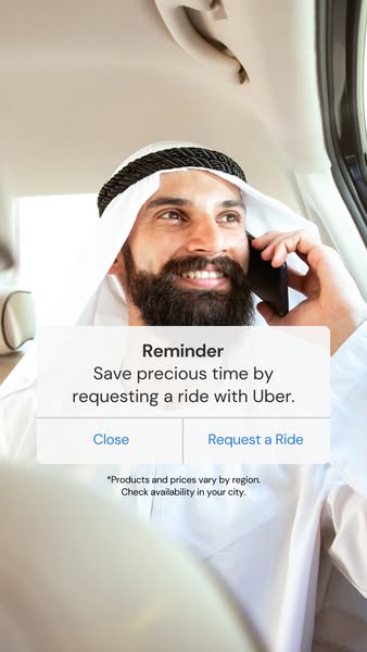
# Ad summary
This ad for Uber features a man in traditional Middle Eastern clothing inside of a car, presumably an Uber. A pop-up notification appears over the image, reminding the user to save time by requesting a ride with Uber.
# Brand positioning
Uber is presented as a convenient and time-saving transportation solution. The brand aims to occupy the space of reliable and accessible ridesharing, positioning itself as a modern alternative to traditional transportation methods. The ad promotes a lifestyle of efficiency and ease, aligning with values of convenience and practicality. Uber addresses the common pain point of wasted time by offering a quick and readily available transportation option. The brand positioning is functional, emphasizing the performance and simplicity of the service.
# Product
Uber is presented as a ridesharing service that allows users to request transportation. The service is for anyone looking to save time and find convenient transportation. The ad highlights the core benefit of saving precious time by requesting a ride with Uber. The ad addresses the potential purchase barrier of time consumption by positioning Uber as a time-saving solution.
# Visual style
The ad has a clean and straightforward visual style. The production quality appears to be high, with a well-lit and professional-looking image. The ad mimics a platform-native notification, creating a sense of familiarity and immediacy. The typography is simple and legible, ensuring the message is easily scannable. The overall style is designed to be non-disruptive and blend seamlessly into a user's feed.
# Hooks
Headline: Reminder Save precious time by requesting a ride with Uber.
# Benefits
- [object Object]
# Features
- [object Object]
# Call to action
Request a Ride
# Point of view
- [object Object]
# Storyline
- The ad opens with a man inside a car, on a phone call. This establishes a relatable scenario where the user might need a ride, setting the stage for the product's value proposition. The perspective is from the brand, showcasing a potential customer in a moment of need.
- A notification pop-up appears, reminding the user to "Save precious time by requesting a ride with Uber." This highlights the core benefit of the service and directly addresses the user's potential need for transportation. The perspective is from the brand, directly communicating the value proposition to the user.
- The notification includes two options: "Close" and "Request a Ride." This provides a clear call to action, prompting the user to either dismiss the reminder or take immediate action. The perspective is from the brand, guiding the user towards conversion.
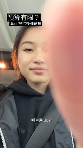
# Ad summary
This ad for Uber features a woman who is riding in an Uber and explaining that Uber has a variety of choices to fit any budget.
# Brand positioning
Uber aims to be an affordable transportation service that is accessible to consumers regardless of their budget. Uber aims to offer a variety of ride options, and customers should care about this if they have budgetary restraints.
# Product
This ad is for the Uber rideshare app, in which customers can book a ride from one location to another. Uber features multiple ride options for every budget.
# Visual style
This ad is shot with a hand-held camera and features everyday clothing. The ad looks like UGC content.
# Hooks
Headline: 預算有限?
# Benefits
- [object Object]
# Call to action
None used.
# Point of view
- [object Object]
# Storyline
- The ad begins with the presenter asking if the viewer has a limited budget and then telling viewers that Uber provides many choices. This is from the brand's POV and is designed to hook the viewer by solving the problem of being on a budget.
- The presenter then says to call for an Uber. This is the brand's POV and is intended to tell the user how to solve the problem.
# Ad summary
This ad promotes Uber by showing how easy it is to get a ride and arrive on time to a dinner party, even when the weather isn't ideal for walking.
# Brand positioning
This ad presents Uber as a convenient and reliable transportation solution that prioritizes punctuality and ease of use. The brand occupies a space in the consumer's mind as the go-to app for ride-sharing needs. Uber allows people to quickly get around, which supports a fast-paced lifestyle and helps its customers to arrive at their destinations in a stress-free manner. It follows category norms by emphasizing its app-based service and user-friendly interface. The brand's positioning blends functional convenience with the emotional assurance of arriving on time, ensuring that it is a practical and emotionally reassuring choice.
# Product
The Uber App is a mobile application that allows users to request and book rides from drivers in their area. As depicted in the ad, it works by facilitating a convenient and quick way to arrange transportation, ensuring users can arrive at their destinations on time, regardless of external factors such as bad weather. The product is for anyone who values punctuality and ease of transportation, especially when faced with adverse conditions. The ad emphasizes the app's usability by showing how users can easily book a car and get dropped off directly at their destination. It also addresses the purchase barrier of inconvenient weather by offering a practical solution for avoiding long walks, thus highlighting its convenience and reliability.
# Visual style
The ad features a platform-native style, mimicking the look and feel of a standard mobile messaging interface to blend seamlessly with the user's experience. It has a UGC, iPhone-shot aesthetic. The visual motif centers around a chat log, providing a familiar and relatable visual context. This approach enhances scannability by presenting information in an easily digestible format that users are accustomed to seeing.
# Hooks
Headline: None used
# Benefits
- [object Object]
# Features
- [object Object]
# Call to action
None used.
# Point of view
- [object Object]
# Storyline
- The image shows a conversation between two people, with one person noting that they don't want to walk in the current weather. The message conveys the inconvenience of traveling in bad weather from the perspective of someone who values comfort and convenience.
- The other person responds that they are wearing new clothes, suggesting they don't want to risk ruining them by walking. This highlights the additional concern of protecting personal appearance from the speaker's point of view.
- The first person asks how they will make it to their dinner party, which starts at 6:30 PM. This questions the difficulty of making it to a dinner party on time from the first person's point of view.
- The second person suggests using the Uber app to call for a ride. This offers a quick and reliable transportation solution for the situation from the speaker's point of view.
- The second person mentions that they can get dropped off directly at the door using Uber. This offers the benefit of direct access and convenience from the customer's point of view.
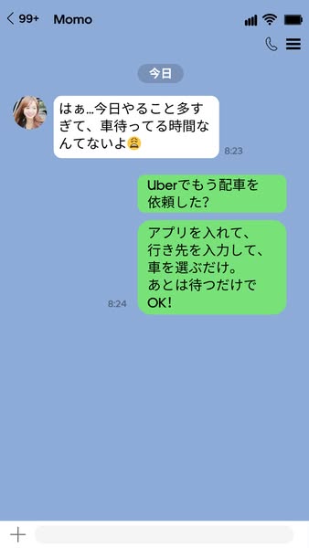
# Ad summary
Ad displays a screenshot of a messaging conversation where one user expresses how they don't have time to wait for a car. The other user suggests using Uber since it is easy to request an Uber with the app and just wait for it to arrive.
# Brand positioning
Uber is positioned as a convenient and reliable transportation solution. The brand aims to occupy the space of a go-to app for hassle-free rides. By focusing on simplicity and ease of use, Uber promotes a functional approach to transportation. The brand is presented as a practical solution to save time, emphasizing efficiency.
# Product
Uber is presented as a ride-hailing service accessed through a mobile application. The product is designed for individuals who need transportation and value convenience and time-saving solutions. The ad highlights the ease of use, stating that users simply need to download the app, enter their destination, and select a car. A key selling point is its simplicity, reducing the barrier to entry for new users by emphasizing that all you have to do is wait for the car after the request is made. The product is ideal for occasions when time is limited and a quick, reliable transportation option is needed.
# Visual style
The ad has a platform-native style, mimicking a messaging app interface to enhance authenticity and familiarity. This approach is designed to blend seamlessly into a user's feed, appearing as a genuine conversation. The straightforward layout prioritizes scannability, ensuring that viewers quickly grasp the key messages. The limited visual elements place emphasis on the text.
# Hooks
Headline: はぁ... 今日やること多すぎて、車待ってる時間なんてないよ
# Benefits
- [object Object]
- [object Object]
# Features
- [object Object]
- [object Object]
- [object Object]
# Call to action
None used.
# Point of view
- [object Object]
# Storyline
- A woman named Momo messages that she doesn't have time to wait for a car, highlighting the problem. This message is designed to create a relatable moment of frustration.
- An Uber user asks if Momo has requested a car yet. Then, they describe how to use the app. This message showcases the product's features and simplicity from a user's perspective.
- The user ends their instructions by saying "OK!" implying that using Uber is simple and satisfactory. This suggests a positive experience and eases the user's worries.
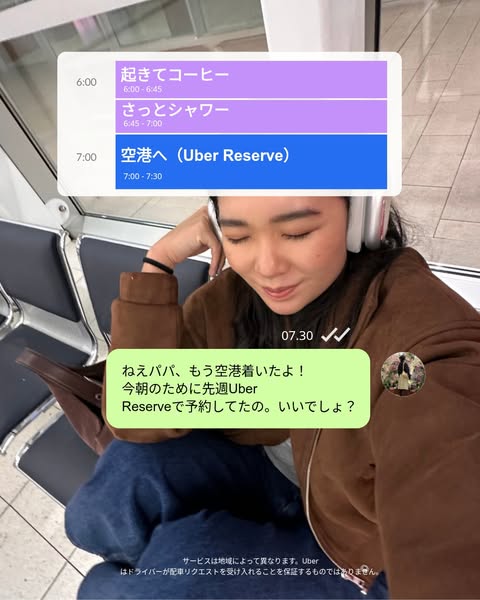
# Ad summary
This ad showcases the convenience of Uber Reserve for airport travel through a combination of a native calendar/schedule UI and a realistic text message conversation, all presented through the lens of a mobile POV.
# Brand positioning
This ad positions Uber as a convenient and reliable transportation solution, specifically highlighting its 'Reserve' feature for scheduled rides. Uber aims to occupy a space in the consumer's mind as a stress-free travel partner, particularly for important journeys like airport trips. The brand aligns with a lifestyle that values planning and efficiency. By showcasing the ability to schedule rides in advance, Uber pushes against the norm of on-demand services and instead promotes a more proactive approach to transportation. The brand positioning is both functional (convenience and reliability) and emotional (peace of mind).
# Product
The ad focuses on Uber Reserve, a feature that allows users to schedule rides in advance, specifically for airport trips. It works by enabling users to plan their transportation ahead of time, ensuring a ride is available when needed. The ad highlights that the featured user scheduled her ride a week in advance, indicating that Uber Reserve offers long-term planning capabilities. The primary USP is the convenience and peace of mind of having a guaranteed ride to the airport, eliminating last-minute stress. The ad shows a use case where a person is already at the airport, implying that Uber Reserve helped them arrive on time for their flight. By showcasing the ease of pre-booking, the ad addresses the purchase barrier of uncertainty or potential delays associated with on-demand transportation services.
# Visual style
The ad employs a blend of platform-native UI elements and a realistic lifestyle visual, creating a sense of authenticity and relatability. The production quality appears moderately polished, combining a mockup graphic and a casual snapshot. The color palette is soft and muted, lending a modern and approachable feel. The integration of a text message interface mimics a common platform behavior, while the typography is clean and legible. This style aims to be both scannable and engaging, capturing attention with familiar digital cues.
# Hooks
Headline: None used
# Benefits
- [object Object]
- [object Object]
- [object Object]
- [object Object]
# Features
- [object Object]
# Call to action
None used.
# Point of view
- [object Object]
# Storyline
- The ad opens with a visual of a calendar/schedule UI on a mobile device, showcasing pre-planned travel activities: 'Wake up and coffee,' 'Quick shower,' and 'To the airport (Uber Reserve)'. This highlights the ad's intention to emphasize the convenience and planning aspects of Uber Reserve. The viewer experiences this from the brand's perspective, demonstrating how Uber Reserve fits seamlessly into a well-organized schedule.
- The scene shifts to a first-person perspective of someone at the airport, who is sending a text message saying, 'Hey Papa, I've already arrived at the airport! I reserved an Uber Reserve last week for this morning. Sound good?' The intention of this beat is to showcase the ease and forethought involved in using Uber Reserve, conveying that the user planned ahead and experienced a smooth journey. The audience is experiencing this from the customer’s perspective.
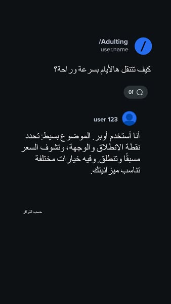
# Ad summary
This ad is designed to look like a message thread about how to get around. The ad highlights Uber as an easy and affordable way to commute.
# Brand positioning
This ad presents Uber as a straightforward, convenient, and affordable solution for everyday transportation needs. The brand is positioned as a modern and accessible alternative to traditional transportation options, emphasizing ease of use, transparent pricing, and budget-friendly choices. Uber aims to occupy a space in the consumer's mind as a reliable and adaptable service that caters to various budgets and preferences, simplifying daily commutes and travel.
# Product
This ad highlights Uber as a transportation service that simplifies commuting. The user narrative emphasizes the ease of planning, transparent pricing, and cost-effectiveness. Uber allows users to specify their pickup and destination points, view the price upfront, and choose from different options to suit their budget. By addressing concerns about convenience, cost transparency, and affordability, the ad aims to make Uber an appealing choice for daily transportation.
# Visual style
The ad mimics a native mobile app interface, specifically a chat or messaging application. It uses simple text bubbles and user profile icons on a dark background to create a familiar look. The aesthetic is clean and straightforward, prioritizing readability and ease of understanding. This design approach aims to blend seamlessly into a user's social media feed, leveraging the visual language of everyday communication to increase engagement.
# Hooks
Headline: كيف تتنقل هالأيام بسرعة وراحة؟
# Benefits
- [object Object]
- [object Object]
# Features
- [object Object]
- [object Object]
- [object Object]
# Call to action
None used.
# Point of view
- [object Object]
- [object Object]
- [object Object]
# Storyline
- The ad opens with a question in a chat thread, asking about easy ways to commute. This starts the conversation and invites the audience to think about their own commuting challenges. The question is intended to present the user's frustration of finding simple transport options, from the perspective of someone seeking a solution for daily commuting.
- A user responds by recommending Uber, describing it as a simple solution where one can set the starting point and destination to see the price in advance. The answer is meant to position Uber as easy to use and transparent, in the words of a satisfied customer.
- The user explains that Uber offers a variety of options to fit one's budget. This highlights the flexibility and affordability of Uber. The explanation is from the perspective of a user who values choices and cost-effectiveness, further promoting Uber as a budget-friendly alternative.
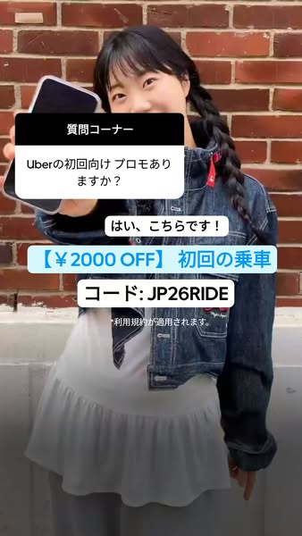
# Ad summary
An Uber ad with a person that asks a question from the audience, and the answer is a discount of ¥2000 for the first ride with the code JP26RIDE.
# Brand positioning
Uber is presented as a convenient and cost-effective ridesharing solution. The ad promotes accessibility and affordability by highlighting a discount for first-time users, implying that Uber is keen on attracting new customers and making their initial experience appealing. By offering a promo code for a discounted ride, Uber underscores its commitment to providing value and ease of use, positioning itself as a user-friendly and budget-conscious transportation option.
# Product
The advertised product is Uber's ridesharing service, specifically targeting first-time users. The ad highlights a promotion offering a discount of ¥2000 off the initial ride. This incentive aims to lower the barrier to entry for new customers, encouraging them to try the service. The inclusion of a promo code, JP26RIDE, simplifies the redemption process, making it easy for users to access the discount. The ad addresses the purchase barrier by offering a tangible cost saving, designed to make the service more attractive and accessible to those who may be hesitant to try it.
# Visual style
The ad features a casual, UGC-style production quality, likely shot on a phone. The visual motifs include overlaid text boxes with different colored backgrounds to highlight information. The image treatment is minimal, with natural lighting and no obvious filters. This platform-native style is designed to blend in with organic content in a social media feed, enhancing scannability.
# Hooks
Headline: 質問コーナー Uberの初回向けプロモありますか?
# Benefits
- [object Object]
# Features
- [object Object]
- [object Object]
- [object Object]
# Call to action
None used.
# Point of view
- [object Object]
# Storyline
- The ad opens with a question posed to the audience regarding a promotion for first-time Uber users. This message is intended to engage viewers by directly addressing a common query about potential discounts, creating a sense of relevance for those who haven't yet used the service. The framing is from the customer's perspective, presenting a question they might have.
- The ad provides a direct answer, confirming the availability of a promotion and highlighting the specific discount and promo code. This message aims to provide a clear and immediate solution to the initial question, offering a tangible incentive for new users to try Uber. The framing is from the brand's perspective, delivering a straightforward response and call to action.
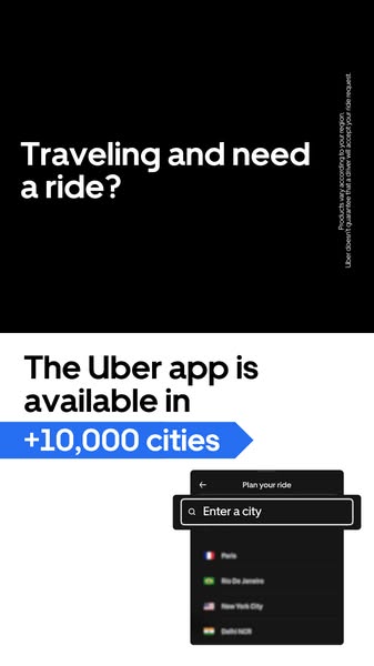
# Ad summary
This ad shows that Uber is available in many cities, solving the problem of the viewer needing a ride while traveling.
# Brand positioning
Uber is presented as a widely available and convenient transportation solution for travelers. The ad highlights its presence in over 10,000 cities, implying global reach and accessibility. The brand positions itself as a reliable option for individuals who need a ride while traveling, emphasizing convenience and widespread availability. It aims to occupy the space of a dependable and accessible transportation solution for travelers and locals alike.
# Product
The advertised product is the Uber app, which provides on-demand ride-hailing services. The ad emphasizes the app's availability in over 10,000 cities, highlighting its widespread accessibility. The app enables users to plan their ride by entering a city and selecting a destination. The ad addresses the barrier of finding transportation in unfamiliar locations by showcasing the app's extensive reach and ease of use. The Uber app provides the service of connecting riders and drivers to get riders to their desired destination.
# Visual style
The ad has a clean and minimalistic style with a focus on clarity and information. The use of black and white text on a black and white background, along with a blue arrow, creates a visually simple and easy-to-understand design. The app screen recording adds a practical element, showing the product in action. The overall style is straightforward and functional, emphasizing the app's accessibility and ease of use.
# Hooks
Headline: Traveling and need a ride?
# Benefits
- [object Object]
# Features
- [object Object]
# Call to action
None used.
# Point of view
- [object Object]
# Storyline
- The ad opens by posing the question, “Traveling and need a ride?” to grab the attention of viewers who are likely traveling. The question sets the stage for the problem that the product will address. The ad is speaking from the brand's perspective to identify a common scenario where their product would be beneficial.
- The next statement “The Uber app is available in +10,000 cities” demonstrates the widespread availability of the app. This positions the Uber app as a reliable solution for finding transportation in numerous locations, and speaks from the brand's perspective.
- Lastly, the ad shows a screen recording of the app. The viewer sees a prompt to "Enter a city." This emphasizes how simple it is to book a ride using Uber. The perspective comes from the customer as the screen recording shows how to book a ride.
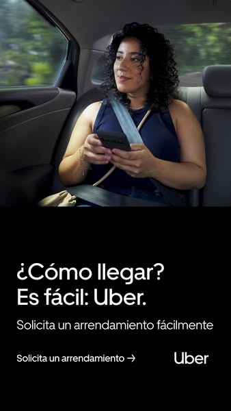
# Ad summary
This ad showcases Uber's easy and convenient ride-hailing service. It features a woman riding in the back of an Uber car, looking relaxed and content. The text highlights how easy it is to get to your destination with Uber.
# Brand positioning
Uber is presented as a convenient and accessible transportation solution. The brand focuses on ease of use, aiming to simplify the experience of getting from one place to another. By offering a straightforward way to book rides, Uber positions itself as a hassle-free alternative to traditional transportation methods. The brand highlights efficiency and user-friendliness.
# Product
The advertised product is the Uber ride-hailing service, which allows users to easily book transportation via a mobile app. The ad emphasizes the service's ease of use with the line, "Es fácil: Uber" (It's easy: Uber), and highlights the convenience of quickly arranging a ride. The service is presented as a solution for getting around easily. The ad focuses on booking a ride easily without mentioning specific vehicle types or other additional features.
# Visual style
The ad uses a simple and clean visual style, prioritizing clarity and ease of understanding. The production quality appears polished with a focus on natural lighting and realistic settings. The image treatment is minimal with subtle color grading that enhances the overall mood. Typography is integrated with large, legible fonts that stand out against the dark background, ensuring scannability. The style mimics a native in-feed format, making it easily digestible for users.
# Hooks
Headline: ¿Cómo llegar? Es fácil: Uber.
# Benefits
- [object Object]
- [object Object]
# Features
- [object Object]
# Call to action
Solicita un arrendamiento →
# Point of view
- [object Object]
# Storyline
- The ad opens with an image of a woman riding comfortably in the back of an Uber, looking out the window. This sets the scene and establishes the context of using the service from the customer's perspective. The aim is to visualize the comfortable and convenient experience of using Uber.
- The ad then presents the core message, "¿Cómo llegar? Es fácil: Uber" (How to get there? It's easy: Uber). This phrase is a clear statement about the brand's value proposition. The brand is clearly stating that Uber offers a simple solution to the problem of how to get from one place to another.
- The ad concludes with a call to action, “Solicita un arrendamiento fácilmente”, which translates to "Request a ride easily". This directs the audience on what to do next. From the company's perspective, Uber is prompting users to take immediate action and book a ride through the app, underscoring the service's ease of use.
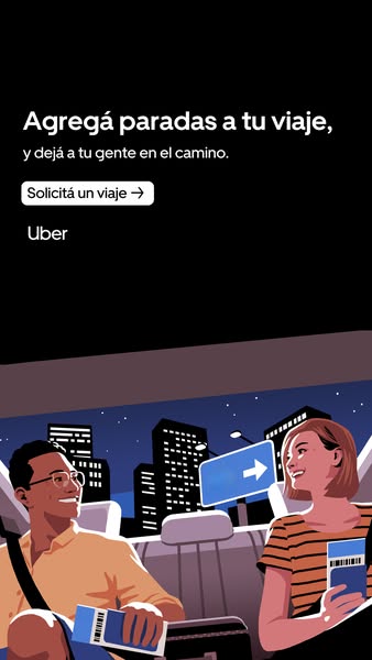
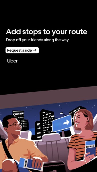
# Ad summary
This image ad showcases Uber's feature allowing riders to add multiple stops to their journey, emphasizing convenience for passengers sharing a ride. The illustration depicts two people in the back of an Uber, highlighting a city skyline at night. It encourages users to request a ride and utilize the multi-stop feature.
# Brand positioning
Uber is presented as a convenient and reliable transportation solution that simplifies travel logistics. The ad focuses on a functional benefit—adding multiple stops to a journey—positioning Uber as a user-friendly service that accommodates the needs of passengers sharing a ride. The brand aligns with a lifestyle of convenience and efficiency, implicitly contrasting with the complexities of coordinating multiple drop-offs without a ride-sharing service. The tone is straightforward and practical, emphasizing ease of use and direct functionality rather than emotional brand appeals.
# Product
The advertised product is Uber's ride-sharing service, highlighting the ability to add multiple stops during a single trip. This feature allows users to conveniently drop off multiple passengers along a route, simplifying transportation for groups. The ad targets riders who need to make several stops or share a ride with others, showcasing a use case where convenience and efficiency are paramount. The key selling point is the ease of coordinating multiple destinations within one Uber trip, addressing the potential hassle of separate rides or complex drop-off arrangements.
# Visual style
The ad utilizes a flat, vector-style illustration with strong lines and solid colors. The overall aesthetic is clean and modern, with a focus on simplicity and readability. The color palette is primarily dark, with pops of color in the characters' clothing and the cityscape. The production quality appears highly polished, with a digital feel that mimics a modern app interface.
# Hooks
Headline: Agregá paradas a tu viaje,
y dejá a tu gente en el camino.
# Benefits
- [object Object]
# Features
- [object Object]
# Call to action
Solicitá un viaje
# Point of view
- [object Object]
- [object Object]
# Storyline
- The ad opens with the core message about adding multiple stops to a journey. The brand conveys this directly, highlighting a key feature and its associated convenience.
- A call to action is presented, prompting users to request a ride. This is the brand's directive, encouraging immediate engagement with the service.
- The visual element shows two passengers enjoying a night ride in the city, emphasizing the ease and shared experience of using Uber. The customer's perspective is depicted, showcasing a pleasant and seamless transportation experience.
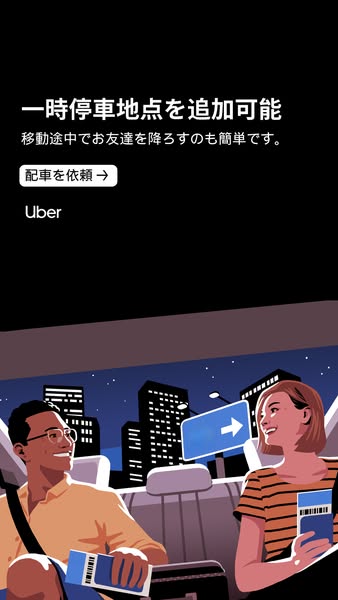
# Ad summary
This ad promotes Uber's feature of adding temporary stops for dropping off friends. The ad uses an illustration showing two people in the back of an Uber at night.
# Brand positioning
Uber is presented as a convenient and reliable transportation solution. The brand offers a service that simplifies urban commuting by providing on-demand rides, as well as adding temporary stops for convenience. By showcasing a scenario of friends sharing a ride and easily dropping one off, Uber emphasizes its role in facilitating social experiences and making transportation hassle-free. The brand positions itself as modern and user-friendly, focusing on enhancing the rider's overall experience with flexible options and easy accessibility.
# Product
The promoted product is Uber's ride-hailing service, specifically highlighting the feature that allows users to add temporary stops to their route to drop off friends. This feature is presented as a simple and convenient solution for riders who need to make multiple stops during a single trip. The illustration shows two passengers in the back of an Uber, reinforcing the idea that the service is for shared rides and social outings. The ad emphasizes the ease of using this feature, suggesting it removes the complexity of coordinating multiple destinations with friends.
# Visual style
The ad features a cartoon-like illustration style with a limited color palette, primarily using black, white, blue, and shades of orange and brown. The overall style is clean and modern, with a focus on simplicity and clarity. The illustration has bold outlines and minimal shading, creating a flat, graphic feel. The background is a stylized cityscape at night, adding context to the scene.
# Hooks
Headline: 一時停車地点を追加可能
# Benefits
- [object Object]
- [object Object]
# Features
- [object Object]
- [object Object]
# Call to action
配車を依頼→
# Point of view
- [object Object]
- [object Object]
- [object Object]
# Storyline
- The ad opens with text highlighting the ability to add temporary stops, immediately conveying the key feature being promoted. The brand is stating that the service offers a way to add convenience to your trip.
- The text follows by explaining that it's easy to drop off friends along the way, reinforcing the feature's simplicity and social benefit. The brand is emphasizing ease of use and appealing to the user's desire to easily travel with friends.
- A button with the words "Request a ride" and an arrow pointing to the right, presents a clear call to action. The brand is prompting the user to take immediate action and use the service.
- The illustration shows two friends inside an Uber at night, smiling and appearing relaxed. The customer is shown in a real-life scenario where the Uber service is in use.
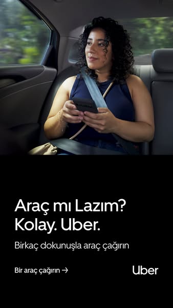
# Ad summary
An Uber ad shows a woman sitting in the backseat of a car, looking out the window, and using her phone. The ad promotes the ease of using Uber to call for a ride.
# Brand positioning
Uber is presented as a convenient and accessible solution for transportation needs. The ad emphasizes simplicity and ease of use, positioning Uber as a modern alternative to traditional transportation options. The brand aligns with a lifestyle of convenience and efficiency, appealing to customers who value quick and reliable solutions. It leans into functional positioning, offering a practical service that simplifies the process of getting a ride.
# Product
Uber is a ride-hailing service that connects users with drivers through a mobile app. The ad highlights the product's ease of use by stating, "Kolay. Uber." and "Birkaç dokunuşla araç çağırın" (Call a car with a few touches), emphasizing the convenience and speed of the service. It targets individuals who need transportation and are looking for a quick and easy way to get a ride. The ad addresses the purchase barrier of transportation accessibility by showcasing how Uber simplifies the process with just a few taps on a phone. It promotes Uber as a solution for those who need a ride quickly and efficiently.
# Visual style
The ad employs a clean and modern visual style. The production quality appears to be high, with a professionally shot image. The image treatment includes background blurring to emphasize the subject. Typography is clean and simple, placed against a solid black background for contrast. The visual style aims to be both informative and appealing, communicating the ease and convenience of the Uber service.
# Hooks
Headline: Araç mı Lazım?
Kolay. Uber.
# Benefits
- [object Object]
- [object Object]
# Features
- [object Object]
- [object Object]
# Call to action
Bir araç çağırın →
# Point of view
- [object Object]
# Storyline
- The ad opens with an image of a woman in the backseat of a car, using her phone, which conveys the message that Uber provides a convenient and accessible ride service. This visual introduces the context of using Uber and highlights the ease of using the app while on the go, from the customer's perspective.
- The text, "Araç mı Lazım? Kolay. Uber." (Need a car? Easy. Uber.) positions the app as a simple solution for finding transportation. Uber is establishing itself as the provider of this service, speaking directly to the potential user.
- The call to action, "Birkaç dokunuşla araç çağırın" (Call a car with a few touches) emphasizes the ease and speed of using the app to get a ride. This reinforces the message of convenience and accessibility, encouraging users to try the service. The brand provides this incentive, highlighting the ease of use.
- Finally, the Uber logo at the bottom of the ad reinforces the brand's identity and provides a clear visual cue to the user. This reinforces brand recognition and ties the message to the Uber service, from the brand's perspective.
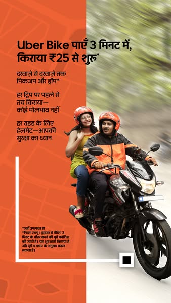
# Ad summary
This image ad for Uber Bike in India promotes affordable rides starting at ₹25. It highlights the convenience of door-to-door pickup and drop-off, transparent pricing without haggling, and the provision of helmets for safety. The ad is designed for a quick and economical transportation solution.
# Brand positioning
Uber Bike is presented as an accessible and reliable transportation option within the broader Uber ecosystem. The brand focuses on convenience, affordability, and safety, aiming to position itself as a practical choice for short-distance travel. It emphasizes transparent pricing to eliminate negotiation hassles. Uber Bike aligns with a lifestyle that values efficient and budget-friendly commuting. The brand competes against local transportation options, offering a standardized and trustworthy service.
# Product
Uber Bike is a motorcycle ride-sharing service offered through the Uber app. It provides a quick and economical transportation alternative, with fares starting at ₹25. The service includes door-to-door pickup and drop-off, ensuring convenience for users. One of the main USPs highlighted is the pre-determined fare for each trip, eliminating the need for haggling. The service also emphasizes safety by providing helmets for every ride. This product is designed for individuals seeking a fast and affordable way to navigate urban areas, particularly for short distances.
# Visual style
The ad features a mix of real-life imagery and graphic elements, creating a clean and informative visual style. The production quality appears to be moderately polished. The use of an orange background with white text provides contrast and ensures readability. The blurred background and close-up shot of the riders convey a sense of movement and immediacy. The visual style is likely intended to be scannable and engaging in a mobile feed.
# Hooks
Headline: Uber Bike पाएँ 3 मिनट में, किराया ₹25 से शुरू
# Benefits
- [object Object]
- [object Object]
- [object Object]
# Features
- [object Object]
- [object Object]
- [object Object]
# Call to action
None used.
# Point of view
- [object Object]
# Storyline
- The ad starts with the headline "Uber Bike पाएँ 3 मिनट में, किराया ₹25 से शुरू" (Get Uber Bike in 3 minutes, fares starting from ₹25), which immediately grabs attention by highlighting the speed and affordability of the service. The brand is telling the audience why they should consider using Uber Bike, focusing on quick availability and low cost.
- The next beat focuses on the convenience of the service, mentioning "दरवाज़े से दरवाज़े तक पिकअप और ड्रॉप *" (Door to door pickup and drop off *). This is the brand emphasizing the ease of use and direct transport to the desired location.
- The next line highlights the transparent pricing with "हर ट्रिप पर पहले से तय किराया—कोई मोलभाव नहीं" (Fixed fare in advance for every trip - no bargaining). Here the brand is aiming to remove potential customer concerns about hidden costs or price negotiations, emphasizing transparency.
- The ad concludes by stressing the safety measures with "हर राइड के लिए हेलमेट-आपकी सुरक्षा का ध्यान" (Helmet for every ride - your safety is important). The brand is trying to reassure potential riders that their well-being is a priority.
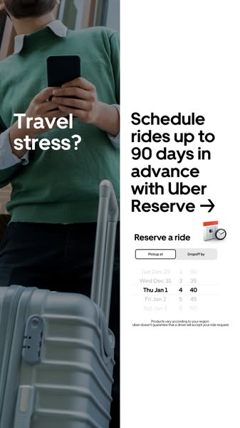
# Ad summary
This ad promotes Uber Reserve, highlighting the ability to schedule rides up to 90 days in advance to alleviate travel stress.
# Brand positioning
Uber is presented as a reliable and forward-thinking transportation solution, specifically through its Uber Reserve service. The brand aims to occupy the space of convenient and stress-free travel planning. The ad promotes a sense of control and preparedness, aligning with values of efficiency and ease. Uber is pushing against the norm of spontaneous, on-demand ride booking by offering the ability to schedule rides far in advance. The brand positioning is both functional (scheduling rides) and emotional (reducing travel stress).
# Product
Uber Reserve is a service that allows users to schedule rides up to 90 days in advance. This feature is designed for anyone who wants to plan their transportation ahead of time, reducing the stress associated with last-minute bookings. The ad highlights the ability to "Schedule rides up to 90 days in advance," addressing the purchase barrier of uncertainty and lack of control over travel arrangements. The product is presented as a way to alleviate "Travel stress?" by providing a reliable and pre-planned transportation option.
# Visual style
The ad features a clean and modern visual style with a split-screen layout. One side shows a person with luggage, while the other side displays text and a calendar interface. The production quality is highly polished, with professional lighting and crisp graphics. The image treatment includes background removal and color grading to create a cohesive look. The typography is large and bold, enhancing scannability. The style contrasts with platform-native content, aiming to stand out in the feed with its high-design aesthetic.
# Hooks
Headline: Travel stress?
# Benefits
- [object Object]
# Features
- [object Object]
# Call to action
None used.
# Point of view
- [object Object]
- [object Object]
- [object Object]
# Storyline
- The ad begins by posing the question "Travel stress?", immediately capturing the audience's attention by highlighting a common pain point. This is from the customer's perspective, drawing them in by acknowledging their potential frustration with travel planning.
- The ad then transitions to the brand's perspective, offering a solution: "Schedule rides up to 90 days in advance with Uber Reserve". This message introduces the product and its key benefit, positioning Uber Reserve as a way to alleviate travel stress through advance planning.
- The ad concludes by showing a calendar interface, visually demonstrating how users can reserve a ride. This is from the brand's perspective, providing a practical demonstration of the product's functionality and ease of use.
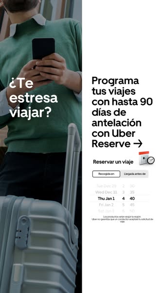
# Ad summary
This image ad promotes Uber Reserve, highlighting the ability to schedule trips up to 90 days in advance to alleviate travel stress.
# Brand positioning
Uber is presented as a convenient and reliable transportation solution, specifically highlighting its Uber Reserve feature. The brand aims to occupy the space of stress-free and pre-planned travel, positioning itself as a tool that allows users to schedule rides in advance, up to 90 days. This caters to individuals who value organization and peace of mind when it comes to transportation. The brand aligns with a lifestyle of planning and convenience, pushing against the norm of spontaneous or last-minute travel arrangements. The brand positioning is both functional (scheduling, reliability) and emotional (reducing travel stress).
# Product
The advertised product is Uber Reserve, a feature within the Uber app that allows users to schedule their rides up to 90 days in advance. This feature is designed for travelers and individuals who prefer to plan their transportation ahead of time. The ad highlights the ability to book rides in advance, addressing the potential purchase barrier of travel-related stress and uncertainty. The ad shows a calendar interface within the app, implying ease of use and clear scheduling options. The product is presented as a solution for those who want to ensure their transportation is secured well in advance of their travel dates.
# Visual style
The ad has a clean and modern visual style. It combines a real-life image of a traveler with a digital interface showcasing the Uber Reserve feature. The color palette is simple, with a focus on white, gray, and green. The typography is clean and legible. The overall production quality is high, suggesting a professional and polished brand image.
# Hooks
Headline: ¿Te estresa viajar?
# Benefits
- [object Object]
- [object Object]
# Features
- [object Object]
# Call to action
None used.
# Point of view
- [object Object]
- [object Object]
# Storyline
- The ad starts by asking, from the brand's perspective, if traveling stresses the viewer, immediately addressing a common pain point associated with travel.
- The ad then transitions to the brand's perspective, presenting Uber Reserve as a solution, highlighting the ability to schedule trips up to 90 days in advance, offering a sense of control and planning.
- The ad concludes by showing a calendar interface within the Uber app, from the customer's perspective, allowing users to select their pickup and arrival times, reinforcing the ease and convenience of scheduling rides in advance.
# Ad summary
This ad promotes Uber's feature that allows riders to add multiple stops to their route. The ad features an illustration of two people riding in the back of an Uber at night.
# Brand positioning
Uber is presented as a convenient and reliable transportation solution. The ad focuses on the functional benefit of adding multiple stops to a route, suggesting that Uber aims to simplify travel for groups and individuals with multiple destinations. The brand aligns with a lifestyle of convenience and efficiency, positioning itself as a modern solution to transportation needs. The ad ignores category norms of focusing on speed or luxury, instead highlighting practicality and user control.
# Product
The ad promotes the Uber ride-sharing service, specifically highlighting the feature that allows users to add multiple stops to their route. This feature is designed for individuals or groups who need to make several stops along the way to their final destination. The ad addresses the potential inconvenience of coordinating multiple drop-offs by offering a solution within the Uber app. The ad emphasizes the convenience and flexibility of the Uber service, suggesting that it can accommodate various travel needs.
# Visual style
The ad features a clean and modern illustration style. The color palette is limited, with a focus on black, white, and shades of blue and orange. The illustration is flat and graphic, with bold lines and minimal detail. The overall aesthetic is simple and user-friendly, aligning with the brand's focus on convenience and efficiency.
# Hooks
Headline: Add stops to your route
# Benefits
- [object Object]
- [object Object]
# Features
- [object Object]
# Call to action
Request a ride →
# Point of view
- [object Object]
# Storyline
- The ad starts by highlighting the ability to add multiple stops to your route, conveying the message that Uber offers a convenient solution for trips with multiple destinations. This is told from the brand's perspective to introduce the feature.
- The ad then shows an illustration of two people riding in the back of an Uber, implying that the feature is designed for friends traveling together. This is told from the brand's perspective to show the use case.
- The ad includes a call to action to request a ride, encouraging viewers to try the feature. This is told from the brand's perspective to drive conversions.
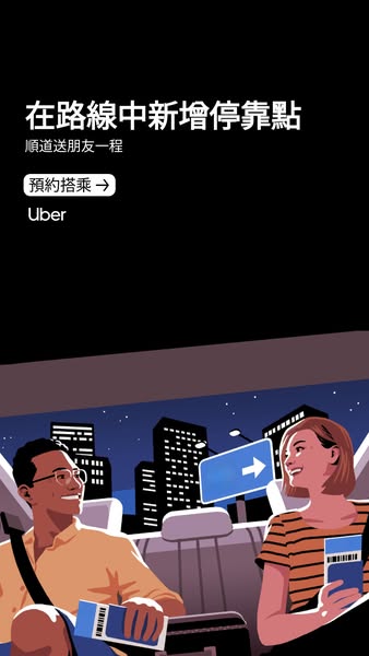
# Ad summary
This image ad for Uber features a cartoon illustration of two passengers in the back of a car in a city. It promotes the ability to add multiple stops along the way.
# Brand positioning
Uber is presented as a convenient and flexible transportation solution that simplifies urban travel. The brand aims to occupy a space in the consumer's mind as a reliable and accessible way to navigate cities, especially when needing to accommodate multiple destinations or sharing rides with friends. The ad promotes ease and convenience, aligning with a lifestyle of urban mobility. Uber differentiates itself by offering the ability to add multiple stops along a route, catering to the needs of users who may have to drop off friends or run errands. This positions the brand as a user-friendly option that values convenience and flexibility, contrasting with more rigid transportation services.
# Product
The Uber service allows users to book rides via a mobile app, providing a convenient way to get around cities. The advertisement emphasizes the ability to add extra stops along a route, making it easier to drop off friends or handle multiple errands in a single trip. This feature is presented as a key selling point, highlighting flexibility and convenience for users who need to make multiple stops. The product is designed for individuals who need reliable transportation within a city and who value the ability to customize their routes according to their needs. The image shows that this product is for those who travel with friends and need to make stops to drop them off, implying the product is useful for those who are social.
# Visual style
The ad features a cartoon illustration style with flat colors and strong outlines. The production quality is polished, giving the ad a clean and modern appearance. The visual motifs include a nighttime cityscape and cartoon figures, creating a friendly and relatable feel. The image treatment involves background removal and color blocking, simplifying the scene and drawing attention to the key elements. The ad's visual style is platform-native in that it has high scannability and quick information delivery.
# Hooks
Headline: 在路線中新增停靠點
# Benefits
- [object Object]
- [object Object]
# Features
- [object Object]
# Call to action
預約搭乘→
# Point of view
- [object Object]
- [object Object]
# Storyline
- The ad begins by highlighting the capability to add stops to a route using Uber, conveying the message that Uber can accommodate multiple destinations in a single trip. This opening emphasizes convenience and flexibility from the brand's perspective.
- It continues by illustrating two friends riding in the back of an Uber in front of a cityscape at night. This visual reinforces the social aspect of the service, showing how Uber can be used when traveling with others, from the customer's perspective.
How Other Transportation Brands Advertise on Meta
Peer brands in Motion's library — click any brand to see their creative strategy, live ads, and AI breakdowns.