
# Ad summary
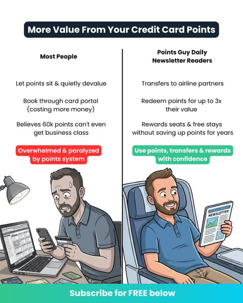
The ad compares the myth and the fact about travel rewards points redemptions. It implies that waiting for the ‘perfect’ redemption is a waste of time, and that the Points Guy Daily Newsletter is the right solution because it keeps consumers up to date and informs them on which redemptions are worth making.
# Brand positioning
The Points Guy is presented as an expert, modern source for travel rewards guidance. It aims to occupy a space in the consumer’s mind as the go-to resource for navigating the complexities of travel points and maximizing their value. The brand aligns with the values of savvy travelers who seek to make informed decisions and stay ahead of the curve in the ever-changing landscape of airline transfer rates and rewards programs. This brand directly addresses the notion that consumers should hold their points for the 'perfect redemption,' which is shown to be a myth. The positioning is functional, focusing on keeping customers informed, and helping them make the most of their points.
# Product
The Points Guy Daily Newsletter keeps you up to date with every change, so you always know which redemptions are worth making. It is for people who use travel rewards points. It addresses the purchase barrier that redemption availability changes all the time and can make it difficult to know when to redeem your points. The product is presented as completely free.
# Visual style
The ad's visual style is clean, simple, and informative. It features a clear layout with bold typography to highlight key points. The use of a plain white background and minimal visual elements contributes to a modern and uncluttered aesthetic. The design mimics a listicle article style, aiming for easy scannability and quick comprehension.
# Hooks
Headline: Hold your points for the perfect redemption
# Benefits
- [object Object]
- [object Object]
- [object Object]
# Features
- [object Object]
# Call to action
Sign up - It's completely free
# Point of view
- [object Object]
# Storyline
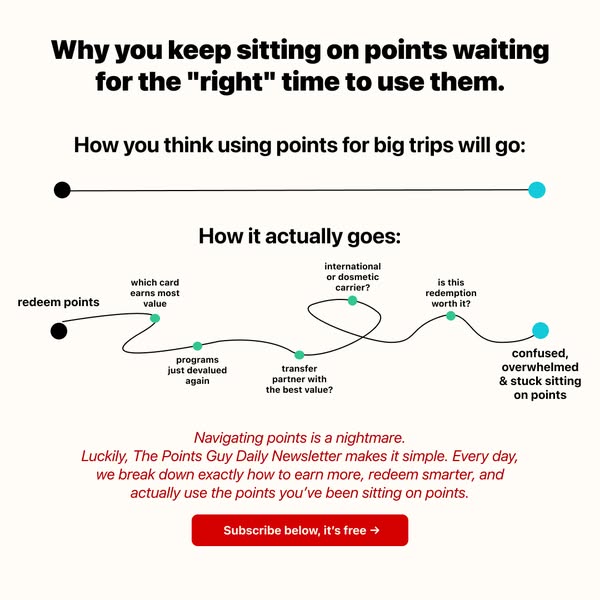
- The ad starts by calling out the ‘myth’ of holding your points for the perfect redemption, conveying that there is a common belief that waiting for the optimal time to use your points is a good strategy. The brand is setting up the problem they intend to solve.
- Next, the ad presents the ‘fact’ that ‘perfect’ redemptions don’t exist, clarifying that airlines change transfer rates and the best redemptions disappear overnight. The brand is explaining the reality of the situation.
- Finally, the ad introduces The Points Guy Daily Newsletter as a solution, explaining that it keeps you up to date with every change, so you always know which redemptions are worth making. The brand is offering their product as a means to solve the problem they presented.