

# Ad summary
The ad showcases Swatch watches with face designs that feature landscape paintings by famous artists. The hands of the watch function as animated additions to the art.
# Brand positioning
Swatch is presented as a brand that brings art and design to everyday life through its watches. By featuring famous works of art on its watches, Swatch aligns itself with culture, creativity, and accessibility. The brand's positioning appears to be at the intersection of art and fashion, offering a wearable art piece that is both functional and expressive, allowing consumers to carry a piece of art with them. The brand tone is playful and artistic, aiming to appeal to individuals who appreciate art and design as part of their personal style, pushing against the norm of conventional watch designs that are more focused on utility or luxury.
# Product
The product being advertised is a Swatch watch featuring famous landscape paintings on the watch face and strap. The watch has a transparent, light-pink case, and the design of the watch face is based on Impressionist-style landscape art. The key USP lies in its unique design, seamlessly integrating fine art into a functional accessory. The watch offers a way for art lovers to wear and display their appreciation for art, making it a conversation starter and a unique fashion statement. There are no purchase barriers addressed in the ad.
# Visual style
The ad has a polished, clean aesthetic. The lighting is soft and even, highlighting the watch's design. The background color is a peach tone. The production quality is high-end commercial, intended to showcase the watch as an artful object. The pacing is slow, allowing the viewer to appreciate the details. There are no cuts.
# Benefits
- [object Object]
- [object Object]
# Features
- [object Object]
- [object Object]
- [object Object]
# Call to action
None used.
# Point of view
- [object Object]
# Storyline
- 00:00–00:05 00:00–00:05 The Swatch watch is presented with the minute and hour hands rotating around the watch face.

How Swatch Advertises on Meta
Refreshed 4 months ago · Weekly refresh cadence
Swatch runs 31 active ads on Meta, shipping ~5 new creatives per week. Their library leans on Cinematic B-Roll30%, Branded Asset17%, and Montage17%. Recently, swatch is leaning hard into the Scuba Aqua collection with an overwhelming underwater aesthetic (jellyfish, translucent materials, bright colorways) that positions these as fashionable dive watches for the style-conscious rather than serious water sports enthusiasts. They're also pushing limited artist collaborations and cultural moments like the Monet-inspired piece and Chinese New Year horse design, framing the brand as accessible art you wear on your wrist. The through-line is democratized design maximalism: bold, playful, collectible watches that merge pop culture, art, and functionality without taking themselves too seriously.
Indexed by Motion's Inspo Library.
The 20 Most Recent Swatch Ads on Meta
# Ad summary
The ad features a new Swatch watch design for the year of the horse, featuring an intricate horse illustration and white and red colors.
# Brand positioning
Swatch is presented as a maker of artistic and colorful watches. The brand uses this limited edition watch to celebrate a new year, and leans into the cultural significance of the animal representing that year. The brand's values appear to align with artistic expression, cultural awareness, and fun.
# Product
The product is a Swatch watch made to celebrate the year of the horse. The watch has a mostly transparent band and encasement. The dial features a horse illustration in white and red. The art style is detailed and decorative, in keeping with the imagery often associated with the Chinese new year.
# Visual style
The ad features simple and elegant visuals. The video relies heavily on the color red and uses minimal effects or transitions. The video feels polished and commercial.
# Benefits
- [object Object]
# Features
- [object Object]
- [object Object]
# Call to action
None used.
# Point of view
- [object Object]
# Storyline
- 00:00–00:01 The Swatch logo appears on a red background.
- 00:01–00:04 00:01–00:04 The new watch spins on a red background, and the viewer can see that it has a mostly clear encasement and watchband, and a decorative horse illustration on its face.
- 00:04–00:06 00:04–00:06 An animated paper cutout of a horse is shown in white, against a white background. The animation is simple and only serves to reveal the horse image.
- 00:06–00:09 00:06–00:09 The watchband is shown in more detail. The design features horses in red, set against a parchment-colored background.
- 00:09–00:14 00:09–00:14 The full watch spins in the center of the frame, surrounded by decorative illustrations of horses and clouds.
# Ad summary
This ad showcases a Swatch watch with a unique design inspired by Claude Monet's 'Impression, soleil levant' painting. The ad focuses on the watch's aesthetic appeal and its connection to art.
# Brand positioning
Swatch is presented as a brand that merges art and functionality, offering timepieces that are both practical and visually striking. The brand aligns with a lifestyle that appreciates art and self-expression, positioning itself as a creator of wearable art. Swatch pushes against the norm of purely functional watches, instead emphasizing the emotional and aesthetic value of its products. The brand aims to occupy a space in the consumer's mind as a provider of unique, artistic, and expressive timepieces.
# Product
The featured product is a Swatch watch with a design inspired by Claude Monet's 'Impression, soleil levant' painting. The watch features a transparent case, a dial showcasing the painting, and a color-coordinated strap. The watch is for individuals who appreciate art and want to express their style through unique accessories. The USP is its artistic design, which transforms a functional item into a piece of wearable art. The ad highlights the watch's aesthetic appeal and its ability to make a statement.
# Visual style
The ad has a clean and polished aesthetic, with a focus on showcasing the product in a simple and elegant manner. The editing style is static, with no cuts or transitions. The production quality is high, giving the ad a professional and sophisticated feel. The visual motif is the focus on the watch's design, inspired by Claude Monet's painting. The pacing is slow and deliberate, allowing the viewer to fully appreciate the watch's aesthetic. The audio-visual sync is minimal, as the ad relies primarily on visual appeal.
# Benefits
- [object Object]
- [object Object]
- [object Object]
# Features
- [object Object]
- [object Object]
- [object Object]
# Call to action
None used.
# Point of view
- [object Object]
# Storyline
- 00:00–00:06 00:00–00:06: The ad begins with a static shot of the Swatch watch against a peach background. The focus is on showcasing the watch's design, inspired by Claude Monet's 'Impression, soleil levant' painting. The intention is to immediately capture the viewer's attention with the watch's unique aesthetic. The perspective is from the brand, presenting the product in a clean, artful manner. The tone is calm and sophisticated, emphasizing the artistic value of the watch. This moment sets the stage for the rest of the ad, highlighting the watch's design as its primary selling point.
# Ad summary
The Swatch Scuba Aqua collection ad showcases various colorful Swatch watches. The watches are displayed in an underwater setting with accompanying jellyfish, emphasizing the 'Aqua' aspect of the collection.
# Brand positioning
Swatch is presented as a brand that embraces bold colors and playful designs. The 'Scuba Aqua' collection is showcased as a fun and vibrant take on traditional dive watches, moving away from the serious, utilitarian image often associated with such timepieces. Swatch aims to occupy a space in the consumer's mind as a youthful and fashionable brand, offering affordable and expressive accessories.
# Product
The advertised product is the 'Scuba Aqua' collection of Swatch watches. These watches are distinguished by their colorful, transparent cases and two-tone straps. Each watch features a unidirectional rotating bezel, luminous hands and indices, and a water resistance suitable for swimming and snorkeling. The watches come in various translucent color options including blue, green, orange, and purple. They are targeted towards individuals seeking a fashionable and functional accessory that is suitable for water-related activities.
# Visual style
The ad features a polished and vibrant aesthetic with a focus on showcasing the colorful and transparent designs of the Swatch watches. The editing style incorporates smooth transitions and dynamic camera movements to highlight the watches from various angles. The underwater setting, combined with the jellyfish, adds a touch of whimsy and reinforces the 'Aqua' theme. The pacing is consistent, allowing viewers to fully appreciate the details of each watch.
# Benefits
- [object Object]
- [object Object]
# Features
- [object Object]
- [object Object]
- [object Object]
- [object Object]
# Call to action
None used.
# Point of view
- [object Object]
# Storyline
- 00:00–00:04 The advertisement begins with the brand's name, 'SCUBAQUA', as the shot transitions into a macro shot of the inside of a watch underwater.
- 00:04–00:08 The perspective then pulls out to show a blue and white watch sitting on a rock underwater. The water creates the effect of a watch being unveiled. This moment is intended to make the viewer think of water related activities and the brand's association with them.
- 00:08–00:14 The ad presents the second watch as an addition to the unveiling from the initial shot. The product is being shown with its functionality and how its target customers would use the product.
- 00:14–00:19 The ad presents a third watch as an addition to the unveiling from the initial shot. The product is being shown with its functionality and how its target customers would use the product.
- 00:19–00:23 The ad presents a fourth watch as an addition to the unveiling from the initial shot. The product is being shown with its functionality and how its target customers would use the product.
- 00:23–00:28 The ad then groups all of the watches together. This is meant to show the variety of color options offered in the Scuba Aqua Collection.
# Ad summary
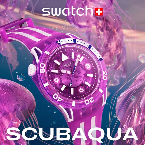
This image ad showcases a purple Swatch SCUBA AQUA watch surrounded by jellyfish.
# Brand positioning
Swatch is presented as a brand that creates playful and expressive timepieces. The design of the featured watch, combined with the brand's clear logo placement, reinforces Swatch's position as a maker of functional fashion accessories that can align with individual style and expression. The brand embraces a playful and expressive design, offering a wide array of colors and patterns that defy the norms of traditional watchmaking.
# Product
The featured product is the Swatch SCUBA AQUA watch. The watch has a translucent purple case and band with white stripe accents. The face of the watch has a transparent design that reveals the inner mechanics and the watch hands are visible in the face. The product's design and name suggest a water-friendly, durable construction ideal for those who enjoy water activities or a casual, active lifestyle. Its unique selling point is its translucent design, allowing the user to see the inner mechanisms of the watch, combined with its vibrant color and sporty style. The SCUBA AQUA collection pushes back against basic watch design and invites customers to showcase a vibrant sense of style.
# Visual style
The ad has a highly polished, studio-shot aesthetic with a surreal underwater theme. The image treatment includes soft lighting, background blur, and color grading to create a cohesive visual experience. The overall feel is modern, clean, and eye-catching, designed to grab attention in a social media feed.
# Hooks
Headline: None used
# Call to action
None used.
# Point of view
- [object Object]
# Storyline
- The image focuses on a purple Swatch SCUBA AQUA watch, positioning it as the focal point. This invites the audience to admire its unique design and aesthetic appeal from the brand's perspective.
- The background features soft, blurred images of jellyfish, reinforcing the "SCUBA AQUA" theme and suggesting a connection to the underwater world. This part of the story is told from the brand's perspective to enhance the watch's association with water and adventure.
- The title "SCUBA AQUA" in a large, bold font anchors the product name in the viewer's mind, reinforcing the association with diving and water-related activities. The brand uses the product name as an anchor to connect the watch to the underwater world.

# Ad summary
This ad showcases the SCUBAQUA watch from Swatch, emphasizing its underwater theme through visuals of jellyfish and a water-like background.
# Brand positioning
Swatch is presented as a brand that embraces aquatic themes with its SCUBAQUA watch line. The brand aims to occupy a space of playful, youthful, and fashionable accessorizing, aligning with a lifestyle that values self-expression through bright and bold design. By creating a visual world around its product, Swatch leans into emotional brand positioning, connecting with consumers who want to express themselves through their accessories. There is no clear category norm or competitor behavior that the brand either pushes against or follows.
# Product
The advertised product is the SCUBAQUA watch by Swatch, featuring a vibrant orange, transparent case with white and orange striped bands. The watch has a visible inner mechanism with blue watch hands. The bezel displays numbers at 10-minute intervals (10, 20, 30, 40, 50). The watch is designed for everyday use with an underwater theme.
# Visual style
The ad features a highly polished, studio-shot visual style with a focus on vibrant colors and underwater elements. The image treatment includes background blur to enhance depth and focus on the product. The typography is clean and modern, integrated seamlessly into the underwater theme. The style is disruptive, designed to grab attention in-feed with its vibrant colors and thematic consistency.
# Hooks
Headline: SCUBAQUA
# Benefits
- [object Object]
# Features
- [object Object]
- [object Object]
- [object Object]
# Call to action
None used.
# Point of view
- [object Object]
# Storyline
- The ad opens with an underwater scene, visually establishing the watch's theme. This is from the brand’s perspective, to show the product in its thematic environment.
- The SCUBAQUA watch is presented front and center, emphasizing its design and color. The perspective is from the brand, showcasing the product's features.
- Jellyfish are shown surrounding the watch, reinforcing the connection to aquatic life and diving. This is from the brand’s perspective, to create an immersive experience.
- The ad culminates in a complete image of the watch within its thematic environment, inviting the viewer to explore the product further. This is from the brand, to capture the lifestyle that is connected to its product.
# Ad summary
This ad features the Swatch Scuba Aqua watch shown floating in an underwater scene with jellyfish. The ad showcases the design and highlights that it is a Swiss-made dive watch.
# Brand positioning
Swatch is presented as a Swiss-made watch brand known for its innovative designs. The brand targets consumers looking for a fashionable, high-quality timepiece, positioning itself as a vibrant and playful alternative to more traditional watch brands. Swatch promotes a lifestyle of self-expression and adventure, with watches that combine function and design.
# Product
The Swatch Scuba Aqua watch is a Swiss-made dive watch with a purple and white striped band. The watch case and bezel are also purple, with white numbering on the bezel. The watch face features white hour markers and hands, as well as the Swatch logo. The watch is designed to be durable and water-resistant, suitable for diving and other water activities. The transparent case allows a view of the watch mechanism. The watch is presented as stylish and functional, ideal for individuals who enjoy both fashion and aquatic adventures.
# Visual style
The ad features a polished, high-end production quality with vibrant colors and smooth transitions. The underwater setting and purple jellyfish create a surreal and playful aesthetic. The editing rhythm is slow and deliberate, allowing the viewer to focus on the watch's details. The visuals are synced with the ambient, underwater-themed music, creating a cohesive and immersive experience.
# Benefits
- [object Object]
# Features
- [object Object]
# Call to action
None used.
# Point of view
- [object Object]
# Storyline
- 00:00–00:04 The ad begins by introducing the Swatch Scuba Aqua watch in an underwater setting.
- 00:04–00:10 The watch is shown alongside purple jellyfish, highlighting its water resistance and playful design.
- 00:10–00:14 The camera zooms in to showcase the watch details, including its transparent case and white numbering, emphasizing its quality and Swiss-made craftsmanship.
# Ad summary
The Swatch Scubaqua collection is showcased in this ad that features a green watch that embodies the essence of deep-sea exploration through vibrant visuals and underwater aesthetics. Set in an animated deep-sea environment with floating jellyfish, the advertisement emphasizes the watch's durability and aquatic inspiration, appealing to adventurous and fashion-conscious individuals.
# Brand positioning
Swatch is presented as a fun, accessible, and innovative brand that merges functionality with self-expression. The brand is positioned as one that creates eye-catching, expressive accessories with high quality and durability for adventurous, style-conscious consumers. Swatch is positioned as a brand that is accessible to all, offering a wide range of designs that allow individuals to express their personalities through their accessories and their love for active lifestyles. The brand stays away from positioning itself as a traditional luxury watchmaker, but instead presents itself as a trendy and accessible option that enhances personal style and functionality, reinforcing the message that its watches are not just time-telling devices but fashion-forward lifestyle accessories. The brand identity is about embracing color and designs that break the status quo.
# Product
The featured product is a Swatch watch from the Scubaqua collection, which is designed as a durable and stylish accessory. The watch features a transparent green case with white and blue accents, paired with a striped green and white silicone strap. It has a unidirectional rotating bezel with numbered time markers, enhancing its functionality for timing underwater activities. The watch has a transparent skeleton dial that showcases the intricate mechanical movement. Its clear, playful design targets adventurous consumers who value both aesthetics and performance in their accessories. It is waterproof and durable for everyday wear.
# Visual style
The ad's aesthetic is polished and digitally rendered, with a focus on vibrant colors and smooth animations. The color palette is dominated by greens and blues, which evokes an underwater theme, creating a playful and immersive experience. The editing rhythm is smooth with static shots and gentle transitions. The production quality is high-end commercial. The pacing is consistent at around 20 BPM.
# Benefits
- [object Object]
- [object Object]
- [object Object]
- [object Object]
# Features
- [object Object]
- [object Object]
- [object Object]
- [object Object]
- [object Object]
# Call to action
None used.
# Point of view
- [object Object]
# Storyline
- 00:00–00:02 The Swatch logo is displayed in white text, which transitions to a vibrant underwater scene filled with animated jellyfish.
- 00:02–00:08 00:02–00:08: The watch is introduced, floating gently in the water among the jellyfish, highlighting its design details and aquatic inspiration.
- 00:08–00:14 00:08–00:14: The watch is shown at different angles, offering a detailed view of its features and the animated jellyfish move around it. The Swatch logo reappears, reinforcing the brand’s identity and product line.
# Ad summary
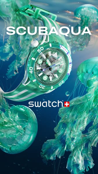
A visually-driven ad showcasing a green and white Swatch SCUBA AQUA watch surrounded by translucent jellyfish in an aquatic setting, emphasizing the watch's design and connection to water.
# Brand positioning
Swatch is presented as a design-centric watch brand that embraces bold colors, playful aesthetics, and aquatic inspiration. The brand aims to occupy a space in the consumer's mind as a maker of fun, stylish, and accessible watches that aren't afraid to make a statement. The brand's values appear to align with self-expression, youthful energy, and a connection to nature, positioning it as a brand for individuals who appreciate both fashion and functionality. Swatch defies category norms by offering expressive, design-driven timepieces at an accessible price point. The brand positioning is both functional, highlighting durability and water resistance, and emotional, tapping into a sense of adventure and self-expression through design.
# Product
The featured product is the Swatch SCUBA AQUA watch, a timepiece with a green and white color scheme and a design inspired by the ocean. The watch is analog with visible gears in the watch face and has a rotating bezel with numerical markers. It is intended for individuals who appreciate bold design and have an active, water-friendly lifestyle. The watch has a transparent green case, a green dial with white markings, and a matching green and white striped strap. Key features include a rotating bezel, visible gears, and water resistance. The watch is displayed within an aquatic environment with jellyfish to emphasize its connection to water and diving. The ad presents the watch as a stylish, functional, and durable accessory suitable for everyday wear and underwater activities.
# Visual style
The ad uses a highly polished, studio-shot aesthetic. The composition features a vibrant color palette and a motif of aquatic elements, such as translucent jellyfish and a gradient background that resembles water. The image treatment includes background removal and soft, diffused lighting to enhance transparency and create a dreamy underwater atmosphere. The typography integration is clean and legible, ensuring that the brand name is easily readable. The visual style contrasts with typical platform norms, offering a high-design aesthetic that is likely to capture attention in-feed.
# Hooks
Headline: SCUBAQUA
# Benefits
- [object Object]
# Features
- [object Object]
# Call to action
None used.
# Point of view
- [object Object]
# Storyline
- The Swatch brand, the storyteller, presents the SCUBA AQUA watch in a visually engaging setting with an aquatic theme. The intent is to immediately capture attention and create a link between the watch and the essence of water, implying adventure and a connection to nature.
- The product is showcased amid jellyfish, which the brand is using to emphasize its water-resistance and design inspired by the ocean. This elevates the watch beyond a mere time-telling device into a fashion statement and a symbol of a lifestyle connected to water.
- The close-up shot of the watch itself, presented by the brand, focuses on its unique design elements such as the see-through face and rotating bezel. This aims to emphasize the watch's unique qualities and visual appeal, highlighting why it is worth considering for purchase.
# Ad summary
This ad showcases a collection of colorful, transparent Swatch watches, set against an underwater-themed backdrop.
# Brand positioning
Swatch is presented as a fun, modern, and vibrant watch brand that pushes against traditional luxury watch norms. The brand is playful and colorful. The use of bright, transparent materials suggests that Swatch aims to occupy a space in the consumer's mind as an accessible, expressive, and design-forward brand. This ad promotes an emotional connection, focusing on the aesthetic appeal and fun associated with owning a Swatch watch.
# Product
The ad features a collection of Swatch watches called 'SCUBAQUA.' These are transparent watches with colorful designs, and white accents on the bands. The collection includes models in orange, green, blue, and purple. The watches are promoted for their bright colors and being visually appealing, with the product details and design taking center stage. The ad focuses on the watches' aesthetic and trendy design, highlighting them as desirable fashion accessories. The ad does not address any purchase barriers.
# Visual style
The ad has a polished, high-end commercial aesthetic with vibrant colors and a focus on product presentation. The editing style involves quick cuts and smooth transitions, creating a dynamic rhythm. The pacing is consistent throughout, with cuts timed to the music. The visual motif is the use of vibrant, transparent colors and an underwater setting. The production quality is high, with glossy surfaces and reflections that enhance the product's appeal.
# Benefits
- [object Object]
# Features
- [object Object]
- [object Object]
# Call to action
None used.
# Point of view
- [object Object]
# Storyline
- 00:00–00:01 Water is shown flowing over an unseen object.
- 00:01–00:02 00:01–00:02 Close up of orange Swatch watch rotating on the screen.
- 00:02–00:04 00:02–00:04 Close up of green Swatch watch rotating on the screen. Green jellyfish float in the background.
- 00:04–00:07 00:04–00:07 Close up of a blue Swatch watch rotating on the screen with an iceberg in the background.
- 00:07–00:09 00:07–00:09 Close up of orange Swatch watch rotating on the screen. Orange jellyfish float in the background.
- 00:09–00:11 00:09–00:11 Close up of a purple Swatch watch rotating on the screen.
- 00:11–00:14 00:11–00:14 Four of the SCUBAQUA watches rotating on the screen.
# Ad summary
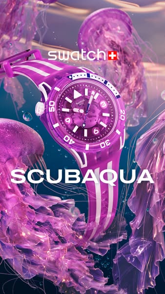
This ad showcases a pink Swatch watch with jellyfish swimming in the background.
# Brand positioning
Swatch positions itself as a playful, colorful, and accessible watch brand. The brand stands out through its trendy and vibrant designs, and the brand's identity revolves around fun and self-expression. Swatch products appeal to younger demographics and those seeking a non-conformist way to accessorize. The brand follows category norms of style and design but pushes against the traditional watch industry's focus on luxury and exclusivity.
# Product
The featured product is a Swatch Scuba Aqua watch. The watch is pink with white accents. It has a rotating bezel with minute markers and a transparent case. The watch is designed for diving and everyday wear. The USP of the watch is its unique combination of style, durability, and water resistance.
# Visual style
The ad has a highly polished, studio-shot production quality. The visual motifs include a monochromatic color scheme (primarily pink and purple), with a focus on creating an immersive underwater environment. The image treatment involves color grading and lighting effects to enhance the vibrancy and translucency of the jellyfish and watch. The typography is large and bold. The style mimics high-design imagery. This style impacts scannability by creating an eye-catching and immersive visual experience, making the ad stand out in a feed.
# Hooks
Headline: None used
# Call to action
None used.
# Point of view
- [object Object]
# Storyline
- The ad opens with a vibrant visual of a Swatch watch in a stylized underwater setting, immediately capturing attention and establishing the product's playful and aquatic theme. The intention is to highlight the product's unique design and connect it with a sense of adventure and fun, from the brand's perspective.
- The brand reinforces the watch's identity by showcasing it within a dreamy, underwater environment filled with jellyfish, enhancing the watch’s connection to water and diving activities. This setting aims to emphasize the watch’s suitability for water-related activities, enriching the product narrative.
- The ad concludes by highlighting the watch's name, 'SCUBAQUA,' which directly communicates its primary function and intended use. The name is displayed prominently, reinforcing the watch's purpose and brand identity from the brand's perspective.
# Ad summary
This ad showcases Swatch's SCUBAQUA watch in vibrant orange and white. It immerses the viewer in an underwater world complete with jellyfish and light refractions, with extreme closeups of the watch's mechanics and design, highlighting its durability and stylish design for underwater exploration or everyday wear.
# Brand positioning
Swatch is presented as a brand that embraces vibrancy, innovation, and durability, particularly with its SCUBAQUA line, designed for underwater exploration but stylish enough for everyday wear. The brand aligns with a lifestyle of adventure and self-expression, pushing against the norms of traditional, staid watch designs. Swatch is positioned as both functional and emotionally appealing, blending practicality with a sense of fun and exploration.
# Product
The SCUBAQUA watch by Swatch is a diver-style watch designed for both underwater use and everyday wear. The ad focuses on an orange and white model, featuring a transparent face that displays the intricate inner mechanisms. It is highlighted for its durability, designed to withstand underwater conditions, and its unique, eye-catching design with an emphasis on the watch's design, allowing the wearer to express their individuality while enjoying a functional and reliable timepiece.
# Visual style
The ad has a polished and high-end commercial aesthetic, featuring smooth transitions, slow-motion shots, and extreme close-ups to highlight the watch's design and durability. The editing style incorporates quick cuts and static shots, syncing product actions with the music's rhythm. The production quality is high, which supports the brand's positioning as innovative and stylish. The recurring visual motif is the presence of jellyfish and underwater settings, which reinforces the SCUBAQUA line's association with aquatic exploration.
# Benefits
- [object Object]
- [object Object]
- [object Object]
# Features
- [object Object]
- [object Object]
# Call to action
None used.
# Point of view
- [object Object]
# Storyline
- 00:00–00:02 The ad begins with an abstract, blurred visual of flowing liquid, followed by a quick transition to a clear view of the SCUBAQUA watch brand and product model, introducing the watch in a dynamic and engaging way. The intention is to immediately capture attention and associate the watch with fluidity and motion.
- 00:02–00:06 A series of close-up shots showcase the watch underwater, surrounded by jellyfish, displaying its water resistance and design. The use of an underwater environment reinforces the 'SCUBA' aspect of the product name, emphasizing its functionality and durability in aquatic settings.
- 00:06–00:09 The ad then transitions to an extreme close-up of the watch’s internal mechanisms, highlighting the detailed craftsmanship and engineering. This conveys the message that the watch is not only stylish but also technically sophisticated and reliable.
- 00:09–00:13 The watch is shown again amidst jellyfish and water droplets, reinforcing its aquatic theme and water-resistant capabilities. The close-up view emphasizes its aesthetic appeal, suggesting that the watch is a stylish accessory for any occasion.
- 00:13–00:14 The ad concludes with the Swatch logo on a solid background, providing a clear brand reinforcement and a straightforward end to the visual journey.
# Ad summary
This Swatch ad highlights the Scuba Aqua watch underwater, emphasizing its design and durability.
# Brand positioning
Swatch is presented as a bold and innovative brand that embraces both style and functionality. The brand aligns with a lifestyle that values adventure, durability, and unique design. The ad focuses on the Swatch's durability, with a rugged aesthetic that deviates from more conventional, luxury watch marketing. The brand is positioning itself as both functional and stylish, offering timepieces suitable for both everyday wear and more adventurous activities.
# Product
The Swatch Scuba Aqua is a durable wristwatch designed for underwater use. It features a transparent case, a unidirectional rotating bezel, and luminous hands. It includes a crown with an 'n' symbol and a striped watch band. The watch is shown submerged in water to demonstrate its waterproof capabilities. The design details, such as the transparent case and bold numerals, add to its distinct aesthetic.
# Visual style
The ad has a polished, high-end production quality with a focus on crisp visuals and smooth transitions. The editing style is simple with static shots and slow camera movements, which creates a calm and immersive viewing experience. The color palette is dominated by blues and whites, reinforcing the underwater theme and lending a clean, modern aesthetic. The audio-visual sync is subtle, with sound effects timed to match the movements of the watch in water.
# Benefits
- [object Object]
- [object Object]
- [object Object]
# Features
- [object Object]
- [object Object]
- [object Object]
- [object Object]
# Call to action
None used.
# Point of view
- [object Object]
# Storyline
- 00:00–00:01 The ad begins by displaying the product line name, SCUBA AQUA.
- 00:01–00:04 00:01–00:04: A close-up of the watch face underwater emphasizes its functionality with the watch’s mechanics. This shows the product’s underwater capabilities while highlighting its technical design.
- 00:04–00:07 00:04–00:07: A shot of the crown underwater emphasizes its function to withstand underwater depths.
- 00:07–00:12 00:07–00:12: The watch is displayed fully underwater, highlighting its aesthetic appeal. This visually reinforces its water resistance and positions it as a stylish accessory for underwater adventures.
- 00:12–00:14 00:12–00:14: The brand name is displayed, reinforcing brand awareness and association with the featured product.
# Ad summary
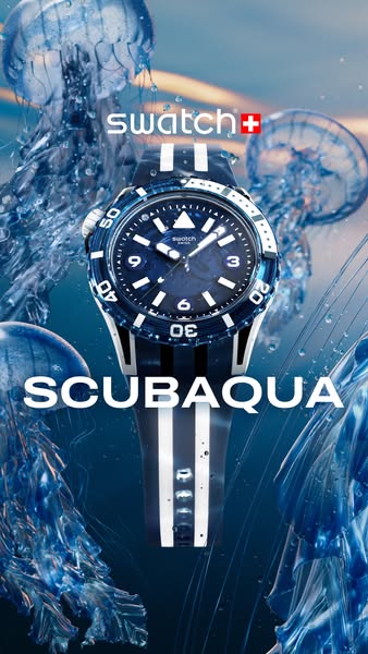
This ad showcases a Swatch Scuba Aqua watch in an underwater setting, highlighting its functional design and affiliation with water activities.
# Brand positioning
Swatch is presented as a brand that specializes in creating durable, water-resistant watches, as implied by the 'Scuba Aqua' product line. The brand aims to position itself as youthful, adventurous, and closely connected to water sports. The values the brand aligns with are durability and aquatic adventure. Swatch seems to be following category norms by emphasizing the functionality of its dive watches, but it differentiates itself through design and branding by creating eye-catching designs rather than purely functional designs.
# Product
The advertised product is a Swatch 'Scuba Aqua' wristwatch. It features a blue watch face with white number markers (3, 6, 9) and indices around the chapter ring, as well as an arrow at the 12 o'clock position. The watch has a rotating bezel with numbers and indices to measure elapsed time underwater, a striped band, and a transparent case. The product is designed for use in aquatic environments, as the 'Scuba Aqua' name implies. The watch is for anyone interested in water sports or those who want a durable and stylish timepiece that fits their aquatic lifestyle. The product's key selling points are its functionality, durability, and eye-catching design.
# Visual style
The ad has a highly polished, studio-shot production quality. The visual motif is an underwater theme with jellyfish. The image treatment involves color grading to enhance the blue tones and create a sense of depth. The typography integration is large and bold, emphasizing the product name. The style aims to be native to a modern, high-design aesthetic, increasing its stop power in-feed.
# Hooks
Headline: None used
# Benefits
- [object Object]
# Features
- [object Object]
# Call to action
None used.
# Point of view
- [object Object]
# Storyline
- The ad opens with a visual of the watch set against a blue underwater environment with jellyfish. This establishes the watch's theme and hints at its water-resistant properties from the brand's perspective.
- The camera angle focuses on the face and band of the watch to showcase its design and features. It's a presentation of the product as a stylish and functional item, appealing to potential customers from the brand's perspective.
- The text "SCUBAQUA" appears prominently beneath the watch, reinforcing the product's name and suggesting its suitability for scuba diving or other water activities from the brand's perspective.
No preview available
# Ad summary
This ad showcases different colors of Swatch's SCUBAQUA water resistant watches, which are displayed underwater with colorful sea creatures.
# Brand positioning
Swatch is presented as a colorful and exciting brand that aligns with an active lifestyle. The ad uses the color palettes and underwater visuals to position Swatch as a fun and playful brand, moving away from traditional watch category norms that favor premium and luxury. Swatch's brand positioning is emotional, centered around exploration, playfulness, and vibrant self-expression.
# Product
The featured product is Swatch's SCUBAQUA watch, which is shown in different colors. The watches are waterproof and designed with a sporty look, featuring a unidirectional rotating bezel, luminous hands, and a clear dial. The ad highlights the durability and reliability of the watch, showing them underwater. The watches feature vibrant color schemes, including orange, green, purple, and black.
# Visual style
The ad has a polished and vibrant aesthetic, using bright colors and underwater visuals to showcase Swatch watches. The editing style includes smooth transitions and slow motion shots, highlighting the watches in a visually appealing way. The underwater setting and macro shots create a sense of depth and clarity, contributing to the high-end production quality.
# Benefits
- [object Object]
- [object Object]
- [object Object]
# Features
- [object Object]
- [object Object]
- [object Object]
- [object Object]
# Call to action
None used.
# Point of view
- [object Object]
# Storyline
- 00:00–00:02 The Swatch SCUBAQUA watch is revealed underwater.
- 00:02–00:07 00:02–00:07 The ad transitions to a green-colored Swatch watch moving along with green jellyfish, then a black and white version follows along with a blue background.
- 00:07–00:11 00:07–00:11 A rotating orange Swatch watch moves along with orange jellyfish, followed by a purple watch moving along with purple jellyfish.
- 00:11–00:13 00:11–00:13 The different-colored Swatch watches cluster together.
- 00:13–00:15 00:13–00:15 The Swatch logo appears.
# Ad summary
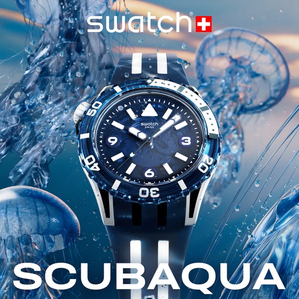
This image ad showcases the Swatch SCUBAQUA watch surrounded by water and jellyfish.
# Brand positioning
Swatch is presented as a Swiss watchmaker that makes high quality but affordable timepieces. The brand is positioned as accessible luxury, as evidenced by its clear embrace of modern design and its focus on materials that deliver exceptional durability and performance. The SCUBAQUA line projects a sporty, adventurous spirit, suggesting the brand seeks to align itself with an active lifestyle.
# Product
The Swatch SCUBAQUA is a Swiss-made diving watch designed for underwater use. The watch features a blue face with white index markers and hands, encased in a blue bezel with numerical markings from 10 to 50. It has a durable blue and white striped silicone strap. The face features the 'swatch swiss' branding. The image emphasizes its water resistance through the surrounding water droplet effects and jellyfish visuals. The product is presented as both functional and stylish, suitable for diving and everyday wear.
# Visual style
The ad has a high-production quality, with studio-style lighting. The visual motifs center around a stylized underwater scene using a product-in-environment shot. There is a subtle blue color grading which is in line with the visual motifs. The typography integration is large and bold, for maximum impact. The ad's style contrasts with platform norms by using a highly produced style.
# Hooks
Headline: None used
# Call to action
None used.
# Point of view
- [object Object]
# Storyline
- The ad opens with a full, eye-level product shot, immediately displaying the product and it's key features. This orients the viewer by immediately conveying what's being sold from the brand's perspective.
- The product is shown immersed in a stylized underwater environment to give the viewer an idea of a scenario in which the watch can be used. The jellyfish add to the visual interest in the ad from an external source.
- The ad concludes with the product name, which reinforces the scuba diving theme, and gives the viewer an idea of the product line the watch is a part of from the brand's perspective.
# Ad summary
The ad features the Omega x Swatch watch, showcasing its design and details through close-up shots.
# Brand positioning
Omega x Swatch represents a collaboration between luxury watchmaker Omega and accessible brand Swatch. This partnership aims to democratize high-end watch design by offering a version of the iconic Omega Speedmaster at a more affordable price point. The collaboration combines Omega's precision and heritage with Swatch's playful designs and accessible materials. The brand positioning balances functional reliability with emotional appeal, making a piece of luxury accessible to a broader audience.
# Product
The featured product is the Omega x Swatch watch. It is a collaborative design that reimagines the classic Omega Speedmaster Moonwatch. It maintains the core design elements of the Speedmaster, including the chronograph layout, tachymeter scale, and distinctive hands, while incorporating Swatch's innovative materials and color palettes. The case is made from bioceramic, a Swatch-developed material that combines ceramic and bio-sourced plastic, offering both durability and a unique tactile experience. The watch is water-resistant and features a Swiss-made quartz movement. It is intended for everyday wear.
# Visual style
The ad has a polished and high-end aesthetic. The editing style consists of static shots and smooth transitions. The production quality is very high, creating a commercial feel. The video uses extreme close-ups to emphasize the details of the watch. The pacing is slow and deliberate, with approximately 4 cuts per minute.
# Benefits
- [object Object]
- [object Object]
# Features
- [object Object]
- [object Object]
- [object Object]
- [object Object]
# Call to action
None used.
# Point of view
- [object Object]
# Storyline
- 00:00–00:02 The ad begins with a full shot of the Omega x Swatch watch against a textured gray background.
- 00:03–00:05 The camera zooms in closer to highlight the watch face, showing the Omega x Swatch logo and the watch hands.
- 00:06–00:08 The focus shifts to the side of the watch, showcasing the crown and its detailing.
- 00:09–00:11 The camera moves to the edge of the watch face, emphasizing the numbers and scale.
- 00:12–00:14 The camera shows the back of the watch case, where the words "Mission to the Moon" are engraved, along with other product details.
# Ad summary
This is a Swatch ad that highlights a Chinese New Year-themed watch featuring horse imagery. It showcases the watch's design details and festive theme through detailed shots and a vibrant, celebratory visual style.
# Brand positioning
Swatch is presented as a brand that embraces art and culture, blending it into its watch designs. The brand aligns with a lifestyle that values self-expression through unique accessories, using functional designs to convey art. Swatch ignores conventional norms by using their watches as a canvas for cultural expression and seasonal relevance. The brand positioning has functional and emotional appeal; providing quality timekeeping while letting the customer wear a piece of art.
# Product
The featured product is a Swatch watch designed for the Chinese New Year, with a horse motif. The watch features a transparent case and a band that incorporates artwork of horses in a style reminiscent of traditional Chinese paintings. The watch face includes gold-tone hands, with the designs appearing to be integrated into the watch. The watch celebrates the Year of the Horse. The visuals also address the visual aesthetic to promote the brand.
# Visual style
The ad has a vibrant and polished aesthetic, using bright colors and smooth transitions to highlight the watch's design. The editing style is quick, with dynamic shots that keep the viewer engaged. The production quality is high-end, reflecting the brand's attention to detail and quality. The pacing is consistent, with cuts timed to the music, enhancing the ad's rhythm and visual appeal.
# Call to action
None used.
# Point of view
- [object Object]
# Storyline
- 00:00–00:01 The ad begins with the Swatch logo on a red background with cloud imagery.
- 00:01–00:04 00:01–00:04: The ad transitions to show a close-up of the watch, with red and gold cloud designs swirling around it to emphasize the watch's unique design and cultural relevance.
- 00:04–00:06 00:04–00:06: A paper cutout of a horse is shown to highlight the imagery that makes up the design of the watch.
- 00:06–00:13 00:06–00:13: The ad showcases the watch in full view, set against a red backdrop with paper cutout horses and clouds. This shot displays the watch's complete design, linking it back to the original Chinese New Year theme.

# Ad summary
This image ad presents the Swatch brand through an artistic lens, showcasing a person standing at the entrance of the Swatch Ai Dada Lab in Milan. The visual elements combine to create a unique and engaging promotion that aligns with the brand's image as innovative and artistically playful.
# Brand positioning
Swatch is presented as a brand deeply intertwined with art, innovation, and culture. The presence of the "Ai Dada Lab" suggests a dedication to experimental design and a break from conventional norms. The location in Milan implies a connection to high fashion and artistic heritage. Swatch is positioned as a brand that values creativity and aims to resonate with consumers who appreciate cutting-edge art and innovative design.
# Product
There are no specific products shown in this ad. Instead, the brand is promoting the Swatch Ai Dada Lab, which is the company's art and design space in Milan. This lab appears to be a hub for creative experimentation and aligns with the brand’s image as innovative. The use of the location as the sole focus of the ad implies that the space itself is an expression of the brand's values and serves as a tangible representation of Swatch’s artistic identity.
# Visual style
The ad has a clean and modern visual style with an emphasis on the juxtaposition of industrial elements and artistic details. The lighting highlights the entrance, while the bold graphics on the window and the figure in the jumpsuit provide visual interest. The overall effect is polished, suggesting a blend of high art and commercial appeal.
# Hooks
Headline: None used
# Benefits
- [object Object]
# Features
- [object Object]
- [object Object]
# Call to action
None used.
# Point of view
- [object Object]
- [object Object]
# Storyline
- The ad shows a person standing at the entrance of the Swatch Ai Dada Lab in Milan. This invites the viewer to imagine themselves as a patron of the arts, exploring the space and its creative atmosphere from the perspective of an art enthusiast.
- The presence of artistic elements on the exterior of the building, such as the mustache and abstract line drawings, aims to enhance the artistic and playful feel of the brand. These elements offer a glimpse into the type of creativity housed within the lab. This part of the story is told from the brand's perspective.
- The Swatch logo and the name of the lab are prominently displayed above the entrance. This reinforces the brand’s identity and its commitment to art and innovation. The brand is inviting the viewer to explore and associate with its artistic endeavors.

# Ad summary
This ad for Swatch features an arm painted to look like a flamingo holding its wrist up to showcase a pink Swatch watch.
# Brand positioning
Swatch is presented as a vibrant and design-forward brand, known for its Swiss-made watches that push the boundaries of style and self-expression. By showcasing a watch in a whimsical, flamingo-themed setting, the brand is positioning itself as fun, unconventional, and accessible to those who want to make a statement with their accessories. The brand's products offer a way to express individuality and connect with joyful, standout designs.
# Product
The product featured is a Swatch watch, characterized by its transparent pink band and matching pink watch face. The watch has the standard Swatch design including a round face and simple time-telling mechanism. The watch is presented as a functional and fashionable accessory that is both fun and accessible. The focus of the ad is aesthetic pleasure and personal expression, highlighting the product as a playful addition to any outfit. The watch is presented as something that can add color and excitement to the wearer's life.
# Visual style
The ad has a highly polished, studio-shot quality. The flamingo arm is meticulously painted and the lighting is even and bright. The overall effect is playful and surreal, with the unexpected image of a flamingo-arm wearing a watch against a solid blue backdrop.
# Hooks
Headline: PAINTED PARADISE
# Call to action
None used.
# Point of view
- [object Object]
# Storyline
- The ad shows an arm painted to look like a flamingo’s neck and head holding its wrist up, with a Swatch watch prominently displayed on the wrist. This presents the product in a creative and eye-catching way that is also very colorful.
How Other Accessories Brands Advertise on Meta
Peer brands in Motion's library — click any brand to see their creative strategy, live ads, and AI breakdowns.