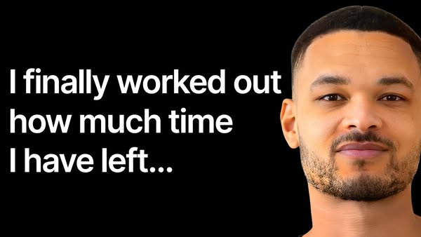
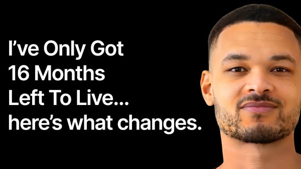
Steven Bartlett runs 37 active ads on Meta, shipping ~87 new creatives per week. Their library leans on Headline28%, Demo17%, and Founder15%. Recently, Steven Bartlett is running a dual-pronged push centering on his Behind the Diary newsletter and productivity/time scarcity content, with some product spots for the One Percent Diary and conversation cards. The newsletter ads lean heavily on vulnerability and honest community building ("scared to say," "100% honest," "nobody else thinks the way you do"), while the productivity angle uses mortality salience hooks like "I've only got 16 months left to live" and "never waste an evening again" to drive urgency around time optimization. There's a clear through-line of introspection and personal transformation, whether it's joining an intimate written community or confronting how you spend your finite time, all framed around Bartlett as the relatable guide who's figured something out that he's ready to share.
# Ad summary
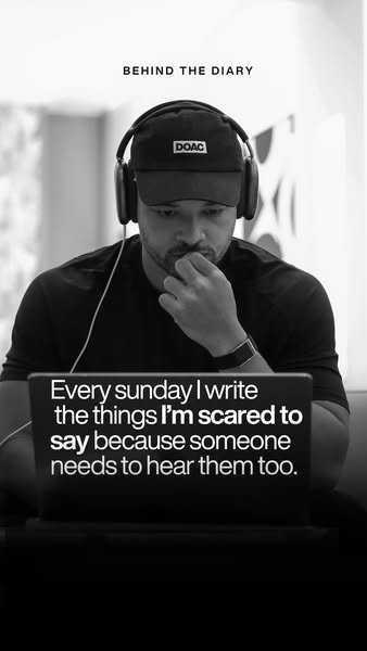
This ad features a testimonial from a man describing how writing in his diary helps him to express the things he is scared to say. The black and white image creates a contemplative mood.
# Brand positioning
The brand is not explicitly mentioned or shown in the image. The focus is on the individual sharing his personal thoughts and experiences. The brand aims to align with values of vulnerability, authenticity, and self-expression, and may appeal to those who are looking for a safe space or outlet for their thoughts and feelings. The brand pushes against the norm of suppressing emotions by promoting the idea that it is important to express one's true feelings.
# Product
The product is a diary, implied by the caption text "BEHIND THE DIARY" at the top of the image. The ad does not visually showcase a physical diary, but instead focuses on the emotional and psychological benefits of diary writing. It emphasizes the idea of expressing thoughts and feelings that one might be scared to say, suggesting the diary provides a safe space for personal reflection and emotional exploration. The ad is targeting individuals who may be struggling to express themselves or seeking a way to process their emotions and the ad addresses the purchase barrier of fear of judgement.
# Visual style
The ad has a black and white aesthetic that conveys a sense of intimacy and authenticity. The black and white color palette creates a contrast between the dark background and the white text. The focus is on the person and the text, without distractions from other visual elements.
# Hooks
Headline: Every sunday I write the things I'm scared to say because someone needs to hear them too.
# Benefits
- [object Object]
- [object Object]
# Features
- [object Object]
- [object Object]
# Call to action
None used.
# Point of view
- [object Object]
- [object Object]
# Storyline
- The ad opens with the title "BEHIND THE DIARY," immediately establishing the theme of personal reflection and introspection. The brand uses this title to set the stage for an intimate glimpse into someone's private thoughts, inviting the audience to consider the value of journaling and self-expression.
- Next, the perspective shifts to a man sitting in front of a laptop, with text overlaid on the screen that reads, "Every sunday I write the things I'm scared to say because someone needs to hear them too." This conveys a sense of vulnerability and honesty. The brand shares his perspective on the importance of expressing difficult emotions, suggesting that sharing one's fears can be both cathartic and beneficial for others.
# Ad summary
The ad promotes the 'Behind the Diary' newsletter, which offers unfiltered insights into the creator's life. The goal is to build an honest community where members share their experiences.
# Brand positioning
The brand, 'Behind the Diary' positions itself as a source of unfiltered, honest content. It is presented as raw and real, aligning with values of transparency and authenticity, aiming to build a community based on genuine experiences. It is positioned as a counterpoint to the curated and polished content typically found online. The brand focuses on personal connection and promises 100% honesty, emphasizing a community where members share the ups and downs of their lives.
# Product
The featured product is the 'Behind the Diary' newsletter, described as a platform where individuals can get to know the creator on a deeper level. The newsletter promises unfiltered access to the creator's thoughts, experiences, troubles, ups, and downs. It aims to create a community based on honesty and realness, with a commitment to 100% transparency from its members. It addresses the barrier of filtered or curated content by offering a raw, authentic perspective.
# Visual style
The ad has a polished UGC style with a clean, modern aesthetic. The editing is simple with static shots and smooth transitions. The production quality is high, which supports the tone of authority and authenticity. The pacing is consistent and moderate, with clear audio-visual sync between speech and text overlays.
# Benefits
- [object Object]
- [object Object]
- [object Object]
- [object Object]
# Features
- [object Object]
- [object Object]
- [object Object]
- [object Object]
# Call to action
Put your email address in
# Point of view
- [object Object]
# Storyline
- 00:00–00:02 The creator introduces a change in his usual response.
- 00:02–00:05 He announces the launch of the 'Behind the Diary' newsletter.
- 00:05–00:11 He describes the newsletter's content as his unfiltered thoughts and life experiences.
- 00:11–00:18 He invites viewers to join the community, emphasizing its raw and real nature.
- 00:18–00:24 He ends with a CTA to subscribe to the newsletter, promising to see viewers in their inbox.
# Ad summary
The ad promotes the Behind the Diary newsletter by Steven Bartlett.
# Brand positioning
The Steven Bartlett brand is positioned as a source of raw, real, and unfiltered insights into his life and thoughts. The brand aims to occupy the space of authentic connection and honest communication, offering a glimpse into the 'troubles, the ups, the downs' of his experiences. It aligns with values of transparency and community, pushing against the curated and filtered norms often seen in public figures. The brand positioning is both functional, providing access to exclusive content, and emotional, fostering a sense of belonging and genuine connection.
# Product
The 'Behind the Diary' newsletter is a platform created by Steven Bartlett where he shares unfiltered insights into his life. It is for individuals seeking an authentic connection with him. The newsletter is positioned as a space to explore the 'troubles, the ups, the downs' of Steven's life, providing a raw and real perspective. Its USP is its commitment to 100% honesty, creating a community based on transparency. By signing up with their email address, subscribers gain access to Steven's thoughts and experiences, promising an unfiltered view of what he is going through.
# Visual style
The ad has a polished and professional aesthetic. The editing is static with smooth transitions, with the production quality of a polished commercial. The pacing is consistent, offering a conversational tone. The visuals support the audio by keeping the focus on Steven Bartlett as he explains the newsletter.
# Benefits
- [object Object]
- [object Object]
- [object Object]
# Features
- [object Object]
# Call to action
Put your email address in and I'll see you in your inbox
# Point of view
- [object Object]
# Storyline
- 00:00–00:02 Steven speaks directly to the viewer, acknowledging that they have been requesting this product for about five years.
- 00:02–00:08 He introduces the 'Behind the Diary' newsletter, highlighting that it offers a genuine glimpse into his thoughts and experiences.
- 00:08–00:11 He specifies that the newsletter covers the 'troubles, the ups, the downs' of his life in an unfiltered manner.
- 00:12–00:16 Steven invites the viewer to join the community, emphasizing its raw and real nature.
- 00:16–00:20 He states the community's promise of 100% honesty about what they are going through.
- 00:20–00:22 Steven gives a call to action, urging viewers to put their email address in to join.
# Ad summary
This ad promotes the Behind the Diary Newsletter. The speaker discusses topics of family, relationships, marriage, and mental health. He encourages you to join his community as a promise to each other to be 100% honest about what you are going through. He asks the user to put in their email address to see them in their inbox.
# Brand positioning
This ad presents Behind the Diary Newsletter as a resource for individuals seeking a raw and unfiltered community where they can openly discuss their personal challenges and triumphs. The brand emphasizes the importance of honesty and authenticity, promising a space where members can truly connect and support one another through life's ups and downs. It positions itself as a community that values vulnerability and genuine connection, offering a space for individuals to share their experiences without fear of judgment. This emotional and personal approach aims to resonate with those seeking genuine connection.
# Product
The promoted product is the "Behind the Diary Newsletter," presented as a source of raw and unfiltered content where subscribers can get to know the creator on a deeper level. The newsletter focuses on sharing the ups, downs, and troubles of the creator's life, providing insights into his thoughts and experiences. It's intended for individuals seeking a community where honesty and authenticity are valued, promising a safe space for members to openly share what they're going through. The ad addresses potential barriers by emphasizing the rawness and reality of the content, promising a community built on genuine connection and mutual support. The key selling point is the promise of 100% honesty and a supportive community environment.
# Visual style
The ad has a clean and straightforward aesthetic with a focus on the speaker. The editing style consists of quick cuts to maintain engagement. The production quality is polished, lending a professional feel. The pacing is consistent, maintaining a steady rhythm. There is audio-visual sync as the cuts align with the music beats and voiceover lines.
# Benefits
- [object Object]
- [object Object]
# Features
- [object Object]
- [object Object]
# Call to action
Put your email address in and I'll see you in your inbox.
# Point of view
- [object Object]
# Storyline
- 00:00–00:02 The speaker mentions the troubles he is facing regarding family, relationships, marriage, and mental health. The intent is to establish a relatable problem or challenge that the audience might be experiencing.
- 00:02–00:06 The speaker introduces the Behind the Diary Newsletter as a solution for people who are dealing with issues, as mentioned in the previous beat.
- 00:06–00:12 He invites the viewer to join his community to discuss their troubles, ups, and downs, unfiltered. This builds on the introduction of the newsletter by expanding the reach and target group.
- 00:12–00:21 He presents the community as raw and real and promises that they will be 100% honest with each other about what they are going through. This beat further expands on why someone should join the community.
- 00:21–00:23 He provides a CTA by asking viewers to put their email address in and that he will see them in their inbox.
# Ad summary
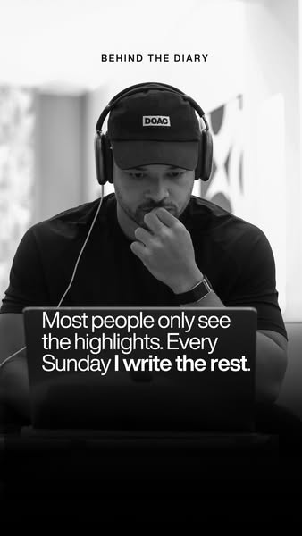
This black and white ad features a man working on his laptop and reveals that his work involves writing about the highlights he is experiencing. The ad is designed to appeal to those interested in the behind-the-scenes aspects of the man's diary.
# Brand positioning
The brand 'DOAC' is presented as an aspirational, high-end brand. It is not explicitly clear what this brand sells; however, through the man's presentation, which includes wearing a hat with the brand name and a watch, it suggests it is a luxury item. The brand is positioned as exclusive, focusing on what goes into what is eventually presented to the public.
# Product
The primary product in this ad is the man's diary. The ad focuses on the behind-the-scenes process of writing about his experiences. The ad highlights the dedication and effort that goes into creating the polished 'highlights' that the public sees. The use occasion is every Sunday, which is when he dedicates time to writing.
# Visual style
The ad has a minimalist and sophisticated visual style with a focus on the subject. The black and white color scheme gives the ad a classic and timeless feel. The soft, natural lighting and shallow depth of field draw attention to the man and his laptop, creating a sense of intimacy and authenticity. This visual style enhances scannability.
# Hooks
Headline: BEHIND THE DIARY
# Benefits
- [object Object]
- [object Object]
# Features
- [object Object]
- [object Object]
# Call to action
None used.
# Point of view
- [object Object]
# Storyline
- The ad opens with the caption "BEHIND THE DIARY", immediately setting the scene and informing viewers that they are about to see something beyond the public eye. The brand is telling the viewer to get them interested in learning more about what goes into the product.
- The image of the man working on his laptop with the text overlay "Most people only see the highlights. Every Sunday I write the rest" presents the brand's message. The man's perspective gives the viewer a glimpse into his process of writing about his experiences.
# Ad summary
The ad promotes access to exclusive content from an individual's diary by encouraging users to sign up.
# Brand positioning
Based on the image, the brand aims to cultivate an image of exclusivity and intimacy. The brand leverages personal insights and content that is not available elsewhere to create a sense of privilege for its audience. By positioning itself as a source of unfiltered, private information, the brand seeks to foster a deeper connection with its audience, suggesting a lifestyle of trust, authenticity, and premium access.
# Product
The ad promotes access to exclusive content from the creator's diary that they don't share anywhere else. This offers an opportunity to gain insights and information unavailable on other platforms, enticing users to sign up for unique, behind-the-scenes content. The creator is not explicitly revealed, but the visuals imply access to insights from a person who likely maintains a public persona that this "diary" will explore.
# Visual style
The ad has a behind-the-scenes, documentary style. The setting is upscale, indicating luxury and exclusivity. The image has a slight filter, with muted colors and a soft focus, enhancing the intimate, personal feel. The layout is simple, with text overlayed at the bottom for a clean, modern aesthetic. This blend of luxury and candid visuals creates a sense of exclusive access.
# Hooks
Headline: BEHIND THE DIARY
# Benefits
- [object Object]
- [object Object]
# Call to action
Sign up
# Point of view
- [object Object]
- [object Object]
- [object Object]
# Storyline
- The ad opens with the phrase "BEHIND THE DIARY" to set the stage for something exclusive and intimate. The audience experiences this from the brand's perspective, hinting at unique content that goes beyond the surface.
- The image shows a person working on a laptop inside a luxurious car. This is included to visually reinforce the idea of exclusive behind the scenes insight, implying a lifestyle of high value or importance. The audience observes from a removed brand perspective.
- The ad concludes with the prompt to "Sign up to read all the stuff I don't share anywhere else." This direct call to action is positioned from the creator's perspective, offering a peek into their private thoughts and experiences.
# Ad summary
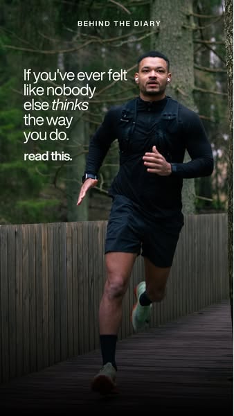
An image ad with the headline: "If you've ever felt like nobody else thinks the way you do. read this." The ad shows a person jogging on a wooden path in a forest.
# Brand positioning
This ad doesn't explicitly mention a brand. However, the implied message is aligned with a brand that supports individuality, uniqueness, and challenging conventional thinking. The ad speaks to those who feel like outsiders or non-conformists, positioning the brand as an ally for people who think differently and are not afraid to stand out. The brand promotes a lifestyle of self-expression and empowerment.
# Product
There is no specific product mentioned in the ad. Instead, the ad focuses on a feeling of relatability that the brand provides to people who feel like they are different. The ad is centered around the idea of connecting with people who think differently.
# Visual style
The visual style of the ad is a mix of a real-life setting and a narrative approach. The production quality appears to be high, with good lighting and a clear focus on the subject. The image treatment includes subtle color grading to create a muted tone. The typography integration is simple and clean, using a sans-serif font for easy readability. The style seems designed to be scannable in-feed, using an emotional connection to attract the viewer's attention.
# Hooks
Headline: If you've ever felt like nobody else thinks the way you do. read this.
# Benefits
- [object Object]
# Features
- [object Object]
# Call to action
None used.
# Point of view
- [object Object]
# Storyline
- The ad opens with a statement, "If you've ever felt like nobody else thinks the way you do." The brand makes this statement to reach out to people who feel like they are different and isolated.
- The ad continues with, "read this." The brand uses this as a direct call to action, encouraging the viewer to engage with the ad, with the implication that the brand has something relevant to offer to those who feel misunderstood.
# Ad summary
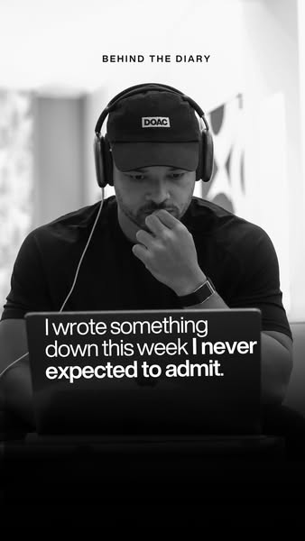
An image ad featuring a person in front of a laptop with an emotional caption intended to grab the viewer's attention. The person looks to be caught up in his own thoughts, while the caption suggests that he has written something that he never expected to admit.
# Brand positioning
Based on the visual of a man in front of a computer, the brand appears to position itself as a producer of personal diary content. The brand may be focused on sharing intimate thoughts or personal content. The brand promotes an emotional tone, suggesting that the audience should care about the content. It positions itself away from more lighthearted or "surface-level" content to bring value to its consumer.
# Product
The product being shown in this ad is a diary or some other form of personal reflection that is available on a computer. The product appears to encourage the individual to write down thoughts that they never expected to admit. The product intends to provide a space for honest reflection.
# Visual style
The ad has a simple visual aesthetic. It is a black-and-white image with a focus on the person and the laptop. The image is slightly blurred in the background, which helps to draw attention to the person and the laptop. The typography is clean and legible.
# Hooks
Headline: I wrote something down this week I never expected to admit.
# Call to action
None used.
# Point of view
- [object Object]
- [object Object]
# Storyline
- The image displays a person sitting in front of a computer. The message being conveyed is that the person has something on their mind. The audience experiences the ad from the perspective of a brand showcasing an individual using their product.
- The caption is shown directly on the computer's screen. The message being conveyed is that the person has written something down this week that he never expected to admit. The audience experiences the ad from the perspective of the person in the ad.
# Ad summary
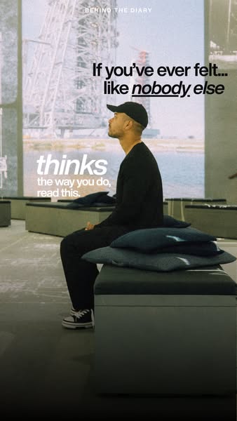
This ad speaks to people who feel like they think differently and offers them a community and resource to help them feel seen and understood.
# Brand positioning
The brand is presented as a resource and community for people who feel like they don't fit into mainstream society or who feel like their way of thinking is different from the norm. The brand values uniqueness and individuality. The ad pushes against the idea that everyone needs to think the same way to be successful or accepted.
# Product
The product is not directly shown but implied to be a diary or resource where people who feel like they think differently can find community and content to support their journey. It is positioned as a place to feel understood and to connect with others who share similar perspectives. The ad addresses the purchase barrier of feeling alone or misunderstood in one's thinking.
# Visual style
The ad has a muted, almost film-like aesthetic with a slightly desaturated color palette. The shot is framed and lit in a way that evokes a sense of introspection and quiet contemplation. The integration of typography is clean and modern.
# Hooks
Headline: If you've ever felt... like ~~nobody~~ else
# Call to action
read this.
# Point of view
- [object Object]
# Storyline
- The ad opens by speaking directly to the viewer if they have ever felt like nobody else thinks the way they do. The intention is to create a moment of recognition and connection with the viewer, immediately drawing them in if they relate to this feeling. The perspective is that of the brand, extending an empathetic hand.
- The ad prompts the viewer to read on if they identify with the initial statement. This serves as a call to action, inviting the viewer to engage further and learn more about what the brand has to offer. This continues the brand's perspective.
# Ad summary
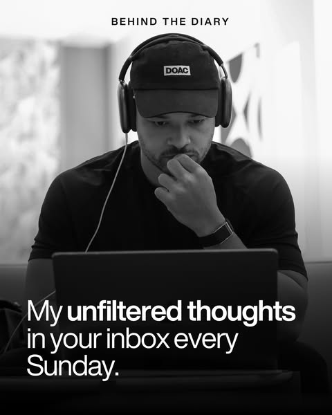
This black and white image ad promotes a behind-the-scenes diary that's delivered to your inbox every Sunday.
# Brand positioning
Based on the visuals, this brand appears to be lifestyle content creator centered around productivity. It seems this brand aims to occupy the space of thought leadership, likely by creating accessible content delivered directly to consumers inboxes. The visuals showcase a individual working at a laptop with noise-canceling headphones on, suggesting the brand values focus and productivity.
# Product
The product is a "behind the diary" newsletter delivered to the user's inbox every Sunday. The value proposition is that it contains the creator's "unfiltered thoughts," offering a peek into their creative process and life.
# Visual style
The visual style is black and white, which creates a sense of sophistication and simplicity. The photo appears to be taken with a shallow depth of field, blurring the background and focusing attention on the man and his laptop. The typography is clean and modern, layered on top of the image to create a visually appealing and easily scannable ad.
# Hooks
Headline: BEHIND THE DIARY
# Benefits
- [object Object]
# Call to action
None used.
# Point of view
- [object Object]
- [object Object]
# Storyline
- The ad opens with the phrase "Behind The Diary," setting up a sense of exclusivity and insider access from the brand's POV.
- The ad then follows with the line, "My unfiltered thoughts in your inbox every Sunday" telling the audience how often they would be getting the product from the brand's POV.
# Ad summary
An image ad for an unspecified product or service. The ad features a headshot of a person with the headline, "Never Waste An Evening Again After Watching This Video."
# Brand positioning
The brand is not explicitly named or displayed in the ad. However, the ad uses a conversational tone, suggesting it is approachable and casual. By promising viewers they will "Never Waste An Evening Again After Watching This Video," the brand implies its products or services will enhance the user's leisure time and overall lifestyle.
# Product
The ad does not specify a product or service. It simply encourages viewers to watch a video that promises to improve their evenings.
# Visual style
The ad features a clean and minimalist visual style. The color palette is limited to black and white/neutral tones. The production quality appears to be high, with well-lit and clear imagery. This style allows the headline to stand out.
# Hooks
Headline: Never Waste An Evening Again After Watching This Video
# Benefits
- [object Object]
# Features
- [object Object]
# Call to action
None used.
# Point of view
- [object Object]
# Storyline
- The ad copy states, "Never Waste An Evening Again After Watching This Video." This message is intended to capture the viewer's attention by suggesting they can significantly improve their leisure time. The perspective is from the brand.
# Ad summary
The ad is trying to shock the viewer into contemplating the limited amount of time they have left to live in order to make them reflect on how they are currently spending their time.
# Brand positioning
There is no brand explicitly presented in the ad. Therefore, it is difficult to pinpoint what space the brand aims to occupy or what values they align with. The brand seems to go against the grain by using a shocking and fear-based message to grab attention. Without more information, it's difficult to determine if the brand positioning leans more functional or emotional.
# Product
There is no product presented in the ad. The ad focuses solely on the concept of time and urging viewers to consider how they are spending their remaining hours.
# Visual style
The ad features a minimalistic and direct style with a high-contrast black and white color scheme. The production quality appears polished, using a studio-shot image of a man against a stark black background. The typography is bold and clear, designed to be easily scannable. The overall aesthetic aims to be attention-grabbing and disruptive, deviating from typical norms by employing a shocking message.
# Hooks
Headline: You Only Have 500,000 Hours Left... Stop Wasting Them
# Benefits
- [object Object]
# Features
- [object Object]
# Call to action
None used.
# Point of view
- [object Object]
# Storyline
- The ad opens with a stark statement: 'You Only Have 500,000 Hours Left...' to create a sense of urgency and shock. The perspective is from an outside narrator attempting to grab the viewer's attention immediately.
- The ad then transitions to an instruction: 'Stop Wasting Them.' This is to pivot from the shocking statement to a call for action, suggesting the viewer should reconsider their current behavior and make better use of their time. The perspective is that of an authority aiming to influence the viewer's choices.
# Ad summary
The ad features a man on the right side of the screen, with text on the left reading "The Scariest Productivity Exercise I've Ever Done Made Me Less". The ad is meant to intrigue the viewer and get them to click to learn more.
# Brand positioning
There is no clear indication of what brand this ad is for, but the ad's content implies the brand exists within the self-help or productivity space. It attempts to promote a modern, efficient lifestyle by offering exercise that aims to cut out wasted time in the user's day.
# Product
The ad promotes an exercise that helps the user save time. The ad refers to this product as "The Scariest Productivity Exercise". The purpose of the product is to make the user "less," though it's unclear what that means. The product is for anyone looking to improve their productivity.
# Visual style
The ad has a simple, clean style. The text is large and easy to read, and the man's face is well-lit. The overall effect is one of professionalism and trustworthiness.
# Hooks
Headline: The Scariest Productivity Exercise I've Ever Done Made Me Less
# Benefits
- [object Object]
# Features
- [object Object]
# Call to action
None used.
# Point of view
- [object Object]
# Storyline
- The ad begins with text on the left-hand side of the screen reading "The Scariest Productivity Exercise I've Ever Done Made Me Less". This opening grabs the attention of the audience and draws them in. The audience is experiencing this opening from the brand's perspective.
- The second beat features a man looking directly at the camera, hinting that the exercise will save the user time. The audience is experiencing this opening from the brand's perspective.
# Ad summary
An image ad states, "Give me 32 Minutes And You'll Never Waste An Evening Again..." with a photo of a man with short hair and a beard on the right side of the image.
# Brand positioning
This ad does not focus on a product so it does not promote a brand. Instead, the ad focuses on a specific problem that the person shown in the image can solve for the audience. The brand sells time-saving, easy-to-implement solutions that quickly allow customers to improve their lifestyle. The brand positions itself as an expert, offering a shortcut to increased personal satisfaction by directly addressing the audience and promising a tangible improvement in their daily lives.
# Product
This ad does not describe a tangible product. The service being advertised requires a 32 minute time commitment. The ad promises that if you invest those 32 minutes, "You'll Never Waste An Evening Again..."
# Visual style
The ad has a modern, direct, and minimalistic style. The image is cleanly divided, with bold text on one side and a portrait on the other. The use of a black background gives it a stark, attention-grabbing feel, while the direct gaze of the man creates a personal connection. The overall effect is designed to be easily scannable and engaging in a fast-moving feed.
# Hooks
Headline: Give me 32 Minutes And You'll Never Waste An Evening Again...
# Benefits
- [object Object]
# Features
- [object Object]
# Call to action
None used.
# Point of view
- [object Object]
# Storyline
- The ad opens by directly addressing the viewer, immediately commanding their attention by asking for a specific amount of their time. This is included to hook the viewer by creating an air of intrigue and highlighting the investment required. The story is being told from the perspective of the brand representative.
- The story then transitions to promising a profound change if the viewer complies, implying that the time commitment is worth it. The brand representative is offering a powerful solution to the problem of wasting evenings, suggesting that their product or service is the key to unlocking more fulfilling leisure time.
# Ad summary
This ad features a man next to a black background with white text claiming to share the 16 Month Rule To Stop Wasting Your Evenings.
# Brand positioning
There is no brand explicitly promoted or mentioned in this ad. The ad is implicitly promoting a product that aims to improve time management and reduce wasted time in the evenings, suggesting a focus on productivity and efficiency.
# Product
The product being advertised is not explicitly shown but is strongly implied to be a productivity or time management system, method, or program designed to help individuals optimize their evening hours. The ad presents the "16 Month Rule" as a key element of this product, suggesting that following this rule will lead to more effective use of evenings. The ad aims to address the problem of wasting evenings and offers a solution through the "16 Month Rule."
# Visual style
The ad has a straightforward, direct visual style. The production quality is clean, with clear text against a dark background. The image treatment appears to be minimal, with natural lighting and no obvious filters or effects. The typography is large and bold, ensuring high scannability. The style is intended to be attention-grabbing and to convey a sense of authority and directness.
# Hooks
Headline: The 16 Month Rule To Stop Wasting Your Evenings.
# Benefits
- [object Object]
# Features
- [object Object]
# Call to action
None used.
# Point of view
- [object Object]
# Storyline
- The ad begins with a bold claim that promises to share "The 16 Month Rule To Stop Wasting Your Evenings." This is designed to grab the viewer's attention by presenting a solution to a common problem. The message is being conveyed by the brand, and is intended to spark the viewer's curiosity.
- The ad features a man looking confidently at the viewer. This is intended to build trust and credibility by associating a person with the solution being presented. The individual is acting as a brand ambassador, and is intended to create a personal connection with the audience.
# Ad summary
This Meta image ad features a person speaking to the camera with the caption "I finally worked out how much time I have left...", to create curiosity about the solution they've discovered.
# Brand positioning
There is no brand explicitly presented in the ad. Therefore, it is not possible to discern the brand's space in the consumer's mind, values, tone, lifestyle, or competitive positioning.
# Product
No specific product is featured in the ad. The ad aims to intrigue viewers with a problem and the suggestion of a solution, but the product offering remains undisclosed in this creative.
# Visual style
The ad has a high-production quality, likely studio-shot, with a clean and simple design. The black background creates a stark contrast with the white text and the person's face. There are no filters, background removal, or lighting effects used.
# Hooks
Headline: I finally worked out how much time I have left...
# Benefits
- [object Object]
# Features
- [object Object]
# Call to action
None used
# Point of view
- [object Object]
# Storyline
- A person speaks to the camera stating, "I finally worked out how much time I have left...", to pique the audience's curiosity about a method or tool they discovered.
# Ad summary
An image of a man with text beside him that says, "I've Only Got 16 Months Left To Live... here's what changes."
# Brand positioning
There is no brand mentioned in this advertisement, and thus the brand's positioning within the market cannot be determined. Without any brand references, values, or specific product information, it's impossible to ascertain the brand's objectives or target audience.
# Product
There is no product mentioned in this advertisement. Without any brand references, values, or specific product information, it's impossible to ascertain the product’s functionality, target audience, features, or any potential purchase considerations.
# Visual style
The ad employs a minimalist visual style with stark contrast, featuring a brightly lit man's portrait against a solid black background. The layout is simple and direct, split into two distinct blocks: a dark block of text on the left and an eye-level headshot on the right. This high-contrast, text-driven approach is designed for maximum scannability and immediate attention-grabbing on the feed.
# Hooks
Headline: I've Only Got 16 Months Left To Live... here's what changes.
# Benefits
- [object Object]
# Features
- [object Object]
# Call to action
None used
# Point of view
- [object Object]
# Storyline
- The ad opens with a stark announcement, 'I've Only Got 16 Months Left To Live...' immediately grabbing attention and creating a sense of urgency. This is presented from the perspective of someone facing a limited timeframe.
- It then pivots to '...here's what changes', creating anticipation and hinting at transformative actions or reflections. This second part of the ad storyline presents the promise of something about to be revealed.
# Ad summary
This ad features a man promoting the One Percent Diary, a tool designed to help users improve 1% every day by teaching daily habits that lead to a better life. He emphasizes the diary's role in fostering these habits and encourages viewers to act quickly due to a limited run.
# Brand positioning
The One Percent Diary brand positions itself as a catalyst for personal growth through daily habit formation. The brand aligns with values of self-improvement and consistent progress, pushing against the norm of instant transformation. Its functional positioning centers on simplicity and performance, offering a practical tool to achieve incremental daily improvements. The brand caters to individuals seeking a structured approach to self-improvement by focusing on the power of daily habits.
# Product
The One Percent Diary is a physical tool designed to help users improve 1% every day by establishing and tracking daily habits. It is for anyone seeking structured self-improvement. The diary helps to form habits that lead to personal growth. The diary aims to address the purchase barrier of expecting instant results, instead focusing on consistent, incremental progress. The One Percent Diary positions itself as a tool to teach daily habits to improve your life.
# Visual style
The ad features a polished and professional aesthetic, characterized by clean lighting and static shots. The editing style is straightforward with smooth transitions, maintaining a consistent pacing throughout the video. The overall production quality feels like a hybrid between UGC and commercial, striking a balance between authenticity and professionalism.
# Benefits
- [object Object]
# Features
- [object Object]
# Call to action
Then please act now.
# Point of view
- [object Object]
# Storyline
- 00:00–00:04 The ad begins with the presenter holding up a black diary and explaining that this diary won't change your life, but the habit it teaches will. This is intended to grab attention by presenting a counterintuitive statement.
- 00:05–00:12 The presenter flips through the diary and states that they are only doing a limited run of these diaries, so if you want one for yourself, a friend, a colleague, or your team, then please act now. This message conveys urgency and scarcity, encouraging immediate purchase.
# Ad summary
This ad promotes the One Percent Diary, emphasizing its potential to help users identify and focus on the one percent of habits that will ultimately change their lives. The ad features a presenter who explains the diary's purpose and encourages viewers to act now due to a limited run.
# Brand positioning
The One Percent brand is presented as a catalyst for self-improvement, focusing on developing consistency and focusing on the critical few habits that drive change. The brand positions itself away from fleeting trends, instead aligning with the pursuit of meaningful, long-term progress. The brand is functional, focused on performance and habit formation with the ultimate purpose of self-improvement.
# Product
The product is the One Percent Diary, a physical journal designed to help users identify, stay focused on, and develop consistency in the 1% of habits that will ultimately change their lives. The diary includes pages for weekly reflection and content geared towards improving focus. This is a limited run, highlighting its exclusivity. The diary aims to help customers improve focus and consistency, encouraging them to prioritize the habits with the highest potential impact.
# Visual style
The ad has a clean and polished aesthetic, with well-lit shots and smooth transitions. The production quality appears high, giving it a professional feel. The editing rhythm is moderate, with cuts timed to emphasize key points. The ad uses a mix of direct address and overhead shots to showcase the diary in use.
# Benefits
- [object Object]
# Features
- [object Object]
# Call to action
Please act now.
# Point of view
- [object Object]
# Storyline
- 00:00–00:02 The presenter holds a black diary and asserts that the diary itself won't change the viewer's life.
- 00:03–00:05 Building on the previous point, he pivots to explain that the habits the diary teaches will definitely change their life.
- 00:06–00:12 The presenter holds the diary again, explaining that its purpose is to help viewers identify, stay focused on, and develop consistency.
- 00:12–00:14 Continuing from the previous point, he explains that the diary helps the user focus on the 1% that will ultimately change their life.
- 00:15–00:17 The presenter then states that there will only be a limited run of these diaries.
- 00:17–00:21 Concluding the ad, the presenter urges viewers to act now if they want one for themselves, a friend, a colleague, or their team.
# Ad summary
The ad features the creator of The Diary of a CEO conversation cards. He opens the ad by explaining that the cards previously sold out twice. The ad then shows clips of celebrities reviewing the conversation cards and the creator explains how powerful the cards are.
# Brand positioning
The Diary of a CEO conversation cards positions itself as a tool to facilitate deeper connections and self-discovery. The ad emphasizes vulnerability and open communication to improve relationships and self-awareness. The brand aims to occupy a unique space by aligning with emotional intelligence and personal development. By inviting vulnerability, the brand distinguishes itself from superficial or generic conversation starters and traditional self-help products by framing connection and introspection as tools for self-improvement.
# Product
The Diary of a CEO conversation cards are a card game to spark conversation with friends, partners, family, or yourself. The cards include prompts to encourage players to discuss their feelings, thoughts, and opinions. The creator of the cards explains that they can be used to help couples, families, and even oneself to save their marriages, get to know each other, and help with personal growth. The cards can be played at home, with your partner, with friends on the weekend, or even with colleagues at work.
# Visual style
The ad combines a polished commercial feel with UGC. The creator is sitting in front of a microphone and a bookshelf, but the lighting is natural and the camera is static. The editing style is simple, using quick cuts and minimal transitions. This approach attempts to blend professional quality with a relatable, user-generated aesthetic, enhancing the ad's credibility while maintaining an approachable tone. The ad appears to have a pace of around 25 cuts per minute.
# Benefits
- [object Object]
- [object Object]
- [object Object]
# Features
- [object Object]
# Call to action
Send me a DM
# Point of view
- [object Object]
- [object Object]
# Storyline
- 00:00–00:07 The creator of the cards explains that the cards have sold out twice.
- 00:07–00:14 The ad cuts to Jada Pinkett Smith and Seth Rogan talking about the cards, while the creator explains that the stories he has heard about the cards have been very powerful.
- 00:11–00:22 The creator then provides three scenarios: a grandfather playing the cards with his grandson to get to know him, a husband pulling the cards out with his wife in the midst of a divorce, and people using the cards in their own diary to get to know themselves.
- 00:24–00:27 The creator reiterates that these cards have blown his mind.
- 00:27–00:33 The creator explains the different places the cards can be played: with your partner at home, with colleagues at work, or with your best friend on the weekend.
- 00:33–00:41 The creator then asks the viewer to send him a DM after they get the cards to let him know how powerful they were for you and your relationships.