
# Ad summary
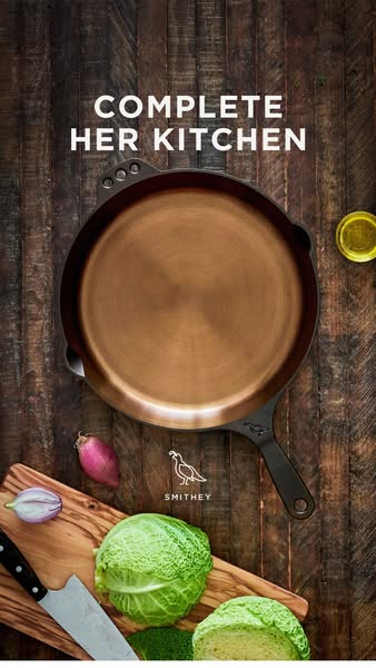
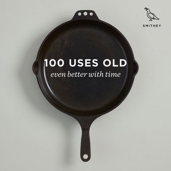
The image ad features a well-used Smithey cast iron skillet with the text overlayed '100 Uses Old, even better with time'. The ad promotes the quality and longevity of the cast iron skillet, suggesting that the more it is used, the better it becomes.
# Brand positioning
Smithey is presented as a premium heritage brand that values craftsmanship, quality, and longevity. The brand occupies the space of a provider of high-end, durable cookware that improves with age and use. The brand aligns with a lifestyle of cooking quality meals and appreciates the value of well-made tools that can last for generations. Smithey seems to push against disposable or mass-produced kitchenware, promoting an emotional connection to cooking and the tools used in the process.
# Product
The product featured is a cast iron skillet from Smithey. It is shown as well-used, implying its durability and long-lasting nature. The ad copy states the skillet is 'even better with time,' highlighting a unique selling proposition that the skillet improves with use. The product is likely intended for home cooks who value quality, durability, and the experience of cooking with traditional tools. The product is presented not just as a cooking tool but as an investment that grows better with each use.
# Visual style
The ad has a clean, minimalist aesthetic with a focus on product quality and longevity. The lighting is soft and natural, emphasizing the texture and details of the cast iron skillet. The image treatment is minimal, with a focus on accurate color representation. The overall style feels timeless and classic, which aligns with the brand's heritage and craftsmanship values. The visual composition is simple and balanced, creating a sense of harmony and visual appeal.
# Hooks
Headline: 100 USES OLD even better with time
# Benefits
- [object Object]
# Features
- [object Object]
# Call to action
None used.
# Point of view
- [object Object]
- [object Object]
# Storyline
- The ad opens with a visual of a well-used Smithey cast iron skillet, conveying a sense of quality and durability. The brand is showing the audience a pan that has stood the test of time, and one that is still in great condition.
- The ad highlights the tagline, '100 Uses Old even better with time', the brand is conveying that their product has longevity and value and is something that gets better with use.