
# Ad summary
This ad showcases the current sale on Reserva's website. In the ad, a male model is wearing the brand's clothing while text on the screen highlights the sale promotion.
# Brand positioning
Reserva is presented as a contemporary, stylish brand for men. The brand appears to position itself as offering accessible yet high-quality fashion. The tone of the ad is straightforward and promotional, focusing on the value proposition of the current sale event. The ad is clearly targeting fashion-conscious men who are looking for contemporary, wearable pieces at discounted prices. Reserva seems to ignore the trend-driven nature of fast fashion by providing a promotion.
# Product
The ad features Reserva brand apparel for men. The main item showcased is a lightweight, beige hooded jacket with a collared, button-up beige polo shirt underneath, paired with beige pants, creating a monochrome outfit. The ad highlights a tiered discount system: customers can save up to 60% on outlet items or get 20% off when buying three items or 25% off when purchasing four or more items. The ad emphasizes the ongoing sale, indicating that the products are offered at a reduced price for a limited time. The clothing is simple and neutral, which broadens the appeal to be more widely used.
# Visual style
The ad features a clean and modern aesthetic with a focus on showcasing the product. The editing style is simple with a single cut. The production quality appears polished, reflecting a commercial feel. The pacing is slow, given there is one shot with the ad lasting for a total of 11 seconds.
# Benefits
- [object Object]
- [object Object]
- [object Object]
# Features
- [object Object]
- [object Object]
- [object Object]
- [object Object]
# Call to action
None used.
# Point of view
- [object Object]
# Storyline
- 00:00–00:09 A male model stands in front of a gray background wearing a beige jacket with matching shirt and pants.
- 00:09–00:11 The shot cuts to a white screen with the company's logo and call to action for users to shop online.
How Reserva Advertises on Meta
Refreshed 4 months ago · Weekly refresh cadence
Reserva runs 84 active ads on Meta, shipping ~20 new creatives per week. Their library leans on Headline51%, Feature Benefit Pointout14%, and Slideshow9%. Recently, reserva is going all in on soccer club collaborations, flooding the feed with partnership collections across multiple Brazilian teams (São Paulo, Goiás, Grêmio, Sport, Galo, Bahia, Coritiba) and positioning them around multigenerational fandom with consistent father/son imagery that frames the clothing as legacy pieces for lifelong supporters. They're wrapping this club merchandise push with ongoing outlet sale messaging (up to 60% off with volume discounts) and some functional product spots highlighting their core tees with anti-odor, breathable, no-iron benefits. The through-line is tapping into deep emotional loyalty around regional soccer culture while clearing inventory and anchoring their basics as wardrobe essentials.
Indexed by Motion's Inspo Library.
The 20 Most Recent Reserva Ads on Meta
# Ad summary
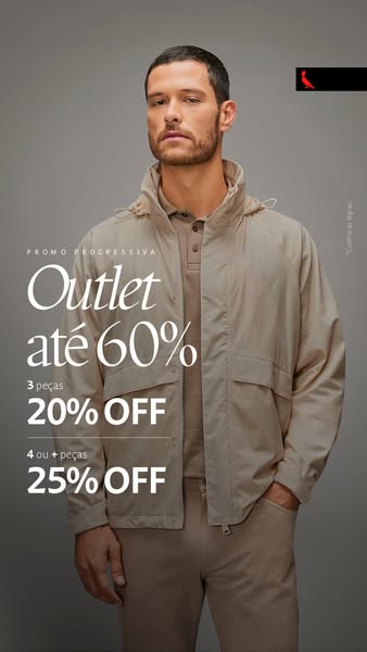
An image ad promotes the outlet sale event, advertising up to 60% off. When the customer purchases 3 items they will receive 20% off and if they purchase 4 or more items they will receive 25% off.
# Brand positioning
The brand is positioned as a purveyor of modern, minimalist apparel for men. Their offerings are versatile enough to be styled for any smart-casual occasion. The brand seems to ignore the fast fashion cycle, focusing instead on a classic, understated aesthetic.
# Product
The featured product is a beige jacket paired with matching pants and a polo shirt. The jacket is a lightweight, hooded windbreaker style with a relaxed fit and large front pockets. It is versatile enough to be dressed up or down for a variety of occasions. The ad focuses on the brand's outlet sale event, advertising up to 60% off. It also incentivizes customers to purchase multiple items by offering tiered discounts: 20% off for 3 items and 25% off for 4 or more items.
# Visual style
The ad has a minimalist and modern visual style, with a focus on clean lines and muted tones. The production quality appears to be high, with professional lighting and styling. The image treatment is subtle, with minimal filtering or color grading. The typography is clean and legible, with a focus on readability. The overall effect is sophisticated and understated, conveying a sense of luxury and exclusivity.
# Hooks
Headline: Outlet até 60%
# Benefits
- [object Object]
- [object Object]
# Features
- [object Object]
- [object Object]
# Call to action
None used.
# Point of view
- [object Object]
# Storyline
- The ad starts by showcasing a sophisticated man wearing a beige jacket, polo, and pants, presenting a polished and put-together image. This establishes the brand's aesthetic and target audience.
- The focal point shifts to the text overlay, which reveals the outlet sale event and tiered discount offers. This is intended to create excitement and urgency by highlighting the opportunity to purchase the brand's products at a discounted price. This part of the story is being told from the brand's perspective.
- By pairing the sale announcement with the image of a stylishly dressed man, the ad aims to associate the brand's products with a desirable lifestyle and aesthetic, encouraging viewers to take advantage of the offer and elevate their own style.

# Ad summary
This ad promotes a brand's new clothing collection. It features a man sitting in a library and wearing clothing from the brand.
# Brand positioning
This brand presents itself as a sophisticated and classic clothing provider. It offers timeless styles that fit into refined environments, such as libraries. The brand aims to occupy a space in the consumer's mind that values elegance, heritage, and intellectual pursuits. The brand aligns with a lifestyle of understated luxury and cultural appreciation. By choosing a library setting and a classic aesthetic, the brand positions itself apart from fast-fashion trends and emphasizes enduring style.
# Product
The ad showcases clothing from the brand's latest collection. The outfit includes a light-colored button-down jacket with large pockets and black button accents, paired with a knit sweater that has a subtle pattern. The jacket appears to be made of a soft, textured material suitable for cooler weather, aligning with the 'INVERNO 26' (Winter 26) collection theme. The clothing is marketed toward individuals who appreciate quality and style. The setting suggests the collection is appropriate for relaxed yet refined occasions.
# Visual style
The visual style is polished and sophisticated, with a clear focus on conveying a sense of timeless elegance. The ad appears to be studio-shot with careful attention to lighting, color grading, and overall composition. The visual motif revolves around a classic setting and a refined appearance, combined to create a sense of heritage and sophistication. The color palette is muted and warm, which enhances the vintage, library-like setting. The typography is clean and legible, positioned to stand out without disrupting the image. The brand aims for a native in-feed style that catches the eye with its calm elegance, yet maintains a design quality that sets it apart.
# Hooks
Headline: nova coleção
# Benefits
- [object Object]
# Features
- [object Object]
# Call to action
None used.
# Point of view
- [object Object]
# Storyline
- The ad opens with a man positioned in a library, giving the impression of sophistication and intellectualism. This establishes the setting and introduces the type of lifestyle the brand aligns with, as seen from the brand's perspective.
- The focus shifts to the clothing the man is wearing, specifically pieces from the 'INVERNO 26' collection. This is a product showcase from the brand, illustrating the style and fit of their new line.
- The text 'nova coleção' (new collection) is displayed, directly telling the audience from the brand's perspective that the clothing is part of the brand's latest offering and is intended to encourage the consumer to explore the new arrivals.
# Ad summary
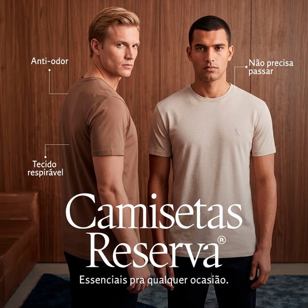
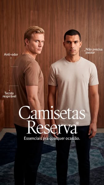
The image promotes Reserva t-shirts by highlighting their anti-odor and breathable fabric features in Portuguese. The ad uses a clean, minimalistic visual style with two male models wearing the t-shirts to emphasize their everyday usability and essential qualities.
# Brand positioning
Reserva is presented as a brand offering essential, high-quality t-shirts suitable for any occasion. The brand focuses on functional benefits such as anti-odor and breathable fabric, which suggests a positioning that values comfort and practicality. This brand likely appeals to consumers seeking versatile, reliable clothing items that simplify their wardrobe choices. The brand deviates from the need of ironing shirts, reinforcing an everyday lifestyle for any occasion.
# Product
The advertised product is a line of basic t-shirts offered by Reserva. The t-shirts are available in multiple neutral colors, as shown by the brown and beige shirts worn by the models. Key features highlighted include anti-odor technology and breathable fabric, catering to comfort and practicality. The t-shirts are also presented as requiring no ironing ('Não precisa passar'), emphasizing convenience and ease of maintenance. Overall, the product is positioned as an essential item that simplifies daily wear while providing functional benefits.
# Visual style
The ad utilizes a clean, minimalist aesthetic with a focus on neutral colors and simple backgrounds. The image features studio-style lighting to highlight the product features, while the use of thin white lines to connect text to the product creates a modern, informative visual. The overall impression is polished and professional, aiming for a high-end but accessible appeal. The ad breaks from the platform norm by being less colorful and energetic than much of the content found in the feed.
# Hooks
Headline: Camisetas Reserva
# Benefits
- [object Object]
- [object Object]
- [object Object]
# Features
- [object Object]
- [object Object]
- [object Object]
# Call to action
None used.
# Point of view
- [object Object]
- [object Object]
# Storyline
- The ad opens by showcasing two men each wearing a different colored Reserva t-shirt. The intention is to visually introduce the product and its availability in multiple color options from a brand perspective.
- Next, feature callouts highlight 'Anti-odor' and 'Tecido respirável' (breathable fabric) on one model and 'Não precisa passar' (no ironing needed) on the other. This communicates key product benefits to the audience, speaking from the brand perspective.
- The ad concludes with the brand name, 'Camisetas Reserva,' and a tagline, 'Essenciais pra qualquer ocasião' (essentials for any occasion). This reinforces the brand's identity and the product's core value proposition, presented from the brand perspective.
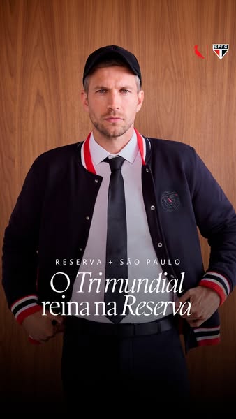
# Ad summary
This ad promotes the RESERVA brand's collaboration with the São Paulo soccer team to celebrate their historical achievement. A male model is shown wearing a shirt, tie, jacket, and baseball cap from the collection.
# Brand positioning
The RESERVA brand is presented as a stylish and sophisticated clothing brand that aligns with sports culture and success. This is demonstrated through its collaboration with the São Paulo soccer team, a reference to the team's historical 'Tri mundial' (three-time world champion) title. The brand aims to occupy a space in the consumer's mind that associates it with both fashion and athletic achievements, promoting a lifestyle of success and style.
# Product
The ad features clothing from the RESERVA brand's collaboration with the São Paulo soccer team. The featured items include a dark-colored jacket with white stripes and a red stripe along the collar and wrist cuffs, a white collared shirt, a slim black tie, and a dark baseball cap. The jacket includes a circular logo patch on the left breast. The ad is designed for fans of both fashion and the São Paulo team, suggesting that wearing these items allows them to celebrate the team's historical achievement while maintaining a sense of style. The clothing is presented as a way to express pride and association with the team's success.
# Visual style
The ad has a polished, studio-shot aesthetic with a focus on the featured clothing items and the male model wearing them. The visual motifs include a clean and classic fashion presentation. The image treatment involves background removal or selective focus to emphasize the subject. The typography is large and bold, integrated seamlessly into the image. The visual style is upscale and sophisticated.
# Hooks
Headline: O Trimundial reina na Reserva
# Call to action
None used.
# Point of view
- [object Object]
# Storyline
- The ad highlights the RESERVA brand's collaboration with the São Paulo soccer team, conveyed by text overlaying the image of a man wearing clothing from the collaboration line. The message intends to communicate that the RESERVA brand is associated with the soccer team. This is told from the brand's perspective, showcasing a notable collaboration.
- The ad emphasizes the soccer team's historic 'Tri mundial' (three-time world champion) title and highlights the brand's relevance to the soccer world, displayed as large text that overlays the man and clothing. The message conveys the brand's historical reference. This is told from the brand's perspective, emphasizing the historical importance of the team.
- The ad features a male model wearing clothing from the collaboration, presented from a chest-up angle in formal wear, creating a sense of aspiration and style. The message conveyed is that the collaboration's clothing is stylish and sophisticated. This is told from the brand's perspective, showcasing the appeal of their clothing line.

# Ad summary
This ad for Reserva + Goiás clothing features two men wearing the brand's apparel in front of a wood-paneled background, with a headline that translates to 'To wear the love for the green of the mountains.'
# Brand positioning
Reserva + Goiás is presented as a brand that blends modern style with a love for nature. The brand associates itself with the "verdão da serra," or the green of the mountains, suggesting a connection to environmental appreciation and a lifestyle of enjoying natural beauty. The image features simple and elegant clothing designs with the brand logo, positioning it as a modern and refined option for consumers who value both style and a connection to nature.
# Product
The ad showcases apparel from Reserva + Goiás, featuring a white long-sleeve button-down shirt and a dark sweater. The white shirt is worn by a man with long wavy hair. Both the shirt and sweater have the brand's "LG" logo embroidered on the front. The ad aims to highlight the clothing's stylishness and how it reflects a love for the environment.
# Visual style
The ad has a polished and modern visual style, with a focus on natural textures (wood paneling). The lighting is soft and warm, creating a relaxed and inviting atmosphere. The typography is clean and elegant, reinforcing the brand's sophisticated image. The visual elements come together to present a cohesive and high-end aesthetic.
# Hooks
Headline: Pra vestir o amor pelo verdão da serra
# Benefits
- [object Object]
# Features
- [object Object]
# Call to action
None used.
# Point of view
- [object Object]
# Storyline
- The ad opens with a sophisticated image of two men wearing Reserva + Goiás clothing. The perspective is from the brand, as it introduces the clothing line and its brand alignment.
- The headline "Pra vestir o amor pelo verdão da serra" sets the tone by conveying the emotional connection to nature and the brand's intention to capture that essence in its clothing line. The brand tells this part of the story, indicating the ad is meant to be evocative and aspirational.
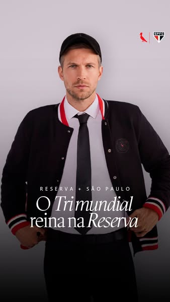
# Ad summary
This ad promotes the Reserva + Sao Paulo clothing line. It features a man wearing the collaboration's letterman jacket.
# Brand positioning
Reserva is presented as a clothing brand that values partnerships with cultural symbols, as evidenced by its collaboration with Sao Paulo, a major soccer team. The brand aims to create a sense of pride and belonging for fans by offering them apparel that represents their team. The brand positions itself in the market by connecting itself with sports culture and team loyalty, making it appealing to fans who want to show their support through fashion. The brand ignores the norms of typical sports merchandise and aims to bring a more stylish look to sports clothing.
# Product
The product being advertised is a black letterman-style jacket with red and white striped cuffs, collar, and waist. The jacket features the Reserva brand logo in a shield-shaped emblem on the left breast. The collaboration is further emphasized by the presence of the Sao Paulo soccer team logo, suggesting that it is part of a limited-edition collection that resonates with fans of the team. The jacket blends sports fan apparel with a fashion forward aesthetic, indicating it can be worn casually and as a form of expressing pride and allegiance.
# Visual style
The ad features a clean, studio-shot aesthetic with a neutral color palette dominated by black, white, and red accents. The image treatment includes a gradient background. The typography is clean and modern. The ad's visual style is designed to be high-design.
# Hooks
Headline: O Trimundial reina na Reserva
# Call to action
None used.
# Point of view
- [object Object]
- [object Object]
- [object Object]
# Storyline
- The ad opens with a man wearing the jacket, which immediately highlights the product and its design. The intention is to capture the viewer's attention with the stylish letterman jacket. The viewer is experiencing the ad from the perspective of a potential customer who is being introduced to the product.
- The text overlay "Reserva + Sao Paulo" is presented, visually emphasizing the partnership between the clothing brand and the soccer team. This collaboration is intended to add appeal to fans of the team, as well as position the brand to a wider audience who may not know the brand, but recognize the Sao Paulo soccer team. The viewer is experiencing this moment from the brand's perspective, highlighting an important collaboration.
- The headline "O Trimundial reina na Reserva" introduces the name of the partnership's name and the idea that fans can wear it. The audience is meant to feel a sense of pride in supporting the team by purchasing the clothing. The viewer is experiencing this moment from the customer's perspective, invited to purchase the brand.
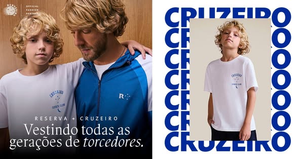
# Ad summary
This split screen ad shows two photographs side by side. The left side features two males, one who appears to be a child, wearing the brand and sport club affiliation. The right side of the ad shows a single child wearing a t-shirt with the same logo.
# Brand positioning
This ad shows Reserva partnering with Cruzeiro Esporte Clube to appeal to sport fans across multiple generations. Both entities are leveraging the other's following to broaden their reach and create a co-branded line of clothing. The brands are leveraging feelings of nostalgia and community that are often created within sports fan bases.
# Product
The ad features a co-branded t-shirt that is being offered by Reserva and Cruzeiro Esporte Clube. The white t-shirt features the Cruzeiro Esporte Clube logo. The t-shirts are being marketed to appeal to fans of all generations.
# Visual style
This ad has a side-by-side split image. The left side shows lifestyle branding, and the right side has a product focus with a logo reveal. The colors are light and natural.
# Hooks
Headline: Vestindo todas as gerações de torcedores.
# Benefits
- [object Object]
- [object Object]
# Features
- [object Object]
- [object Object]
# Call to action
None used.
# Point of view
- [object Object]
# Storyline
- The brand is showing a picture of two males wearing its product, one appears to be a father and one a son. This is meant to convey a family connection and feeling of nostalgia for the brand's partnership.
- The second image is of the child wearing the t-shirt. The background has blue letters to act as a logo reveal and tie the two brands together.
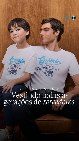
# Ad summary
This ad is for Reserva clothing in partnership with Grêmio football club. It features a father and son wearing matching t-shirts with the team's logo and mascot. The ad highlights the brand's ability to resonate across generations of fans.
# Brand positioning
Reserva is presented as a brand that embraces intergenerational connections and shared passions, particularly through its collaboration with Grêmio, a well-known football club. The brand positions itself as a provider of clothing that can be enjoyed by fans of all ages, emphasizing a sense of community and tradition. The visuals and tagline suggest a brand that values family bonds and the unifying power of sports, appealing to customers who appreciate both style and their connection to a beloved team. Reserva presents itself as a lifestyle brand deeply intertwined with the emotional and cultural fabric of its customers' lives.
# Product
The featured product is a white t-shirt adorned with the Grêmio football club's logo and a vintage-style cartoon mascot holding a soccer ball. The t-shirt is made of a soft-looking fabric. The design includes the word "Grêmio" in a stylized font above the image of the mascot, with the years "1911" and "1903" flanking the mascot. This T-shirt is part of a collaboration between Reserva and Grêmio. The shirt is intended for fans of all ages, and its design evokes a sense of nostalgia and team spirit. The ad aims to convey that the shirt is a way for fans to connect with their team and share their passion across generations.
# Visual style
The ad has a clean, classic aesthetic with warm, inviting lighting. The composition is simple and focuses on the subjects, creating a sense of intimacy and connection. The color palette is muted, with neutral tones and soft blues, lending a timeless quality to the image. The production quality is high, suggesting a professional photoshoot rather than user-generated content.
# Hooks
Headline: Vestindo todas as gerações de torcedores.
# Benefits
- [object Object]
- [object Object]
# Features
- [object Object]
- [object Object]
# Call to action
None used.
# Point of view
- [object Object]
# Storyline
- The ad opens with a visual of a father and son seated closely together, both wearing matching Grêmio t-shirts. This image is designed to immediately convey a sense of intergenerational connection and shared fandom, framing the products in the context of family and tradition, from the brand's perspective.
- The ad then focuses on the tagline, "Vestindo todas as gerações de torcedores" (Dressing all generations of fans). This reinforces the message that the clothing is suitable for fans of all ages, highlighting the brand's ability to create products that resonate across different generations, from the brand's perspective.
# Ad summary
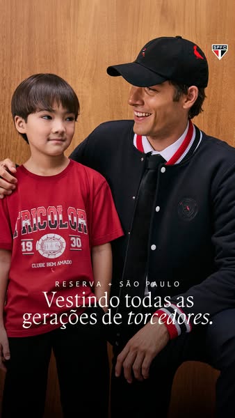
This image ad shows a man and a boy, likely a father and son, wearing Sao Paulo Football Club apparel from Reserva. The ad celebrates the tradition of supporting the team across generations.
# Brand positioning
Reserva is presented as a brand that values family traditions and intergenerational connections, specifically in the context of sports fandom. The collaboration with São Paulo reinforces its association with local culture and heritage. The brand seeks to occupy a space that combines fashion with cultural pride, creating apparel that resonates with fans of all ages. Reserva aligns with values of community, support, and shared experiences, offering a way for families to bond over their love for their team. The brand ignores the norm of focusing solely on current trends, instead emphasizing timeless connections.
# Product
The ad features apparel from the Reserva + São Paulo collaboration. The boy is wearing a red t-shirt with the word "TRICOLOR" and the numbers "19" and "30" surrounding a team emblem along with the phrase "CLUBE BEM AMADO" (on-package label text). The man is wearing a black bomber jacket with white and red trim, a white collared shirt, and a black tie. He is also wearing a black baseball cap with a red logo. The apparel is designed for fans of the São Paulo Football Club and emphasizes the generational appeal of supporting the team. The ad promotes these items as a way to express team loyalty.
# Visual style
The ad has a polished, studio-shot production quality with soft, diffused lighting that creates a warm and inviting atmosphere. The color palette is limited to red, black, and white, which reinforces the team's colors and provides a cohesive visual identity. The typography is clean and modern. The image treatment includes subtle color grading to enhance the tones. The layout is simple, focusing on the subjects and the text overlay. The ad mimics a lifestyle portrait, aiming for a timeless feel that would stand out against trend-driven content.
# Hooks
Headline: Vestindo todas as gerações de torcedores.
# Benefits
- [object Object]
- [object Object]
# Features
- [object Object]
- [object Object]
- [object Object]
- [object Object]
# Call to action
None used.
# Point of view
- [object Object]
# Storyline
- The image opens by displaying a man and a boy, likely father and son, standing together, suggesting a close relationship and shared interest in the featured team. The purpose is to immediately engage viewers with a relatable scene of family connection and to highlight the target audience, told from a brand perspective to emphasize their product's multi-generational appeal.
- The image then focuses on the apparel worn by both figures. The intent is to showcase the brand's products, highlighting the design and the connection to the São Paulo Football Club. This is delivered from a brand perspective to showcase the product and reinforce the theme of generational team spirit.
- The final message is delivered via a text overlay at the bottom of the image. The intent is to reinforce the theme of intergenerational support for the team. This is presented from a brand perspective to promote the idea that their clothing can foster a bond between family members through shared team pride.
# Ad summary
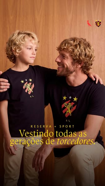
This image ad features a father and son wearing matching Reserva + Sport t-shirts with the logo of the Sport Club do Recife. The ad highlights the idea of passing down team loyalty through generations.
# Brand positioning
Reserva is presented as a brand associated with family values, particularly the tradition of fathers passing down team loyalty to their sons. The collaboration with "Sport" (likely a sports team or brand) implies a focus on sports apparel and fan merchandise. The brand aims to occupy a space in the consumer's mind that values tradition, family bonding through shared interests, and high-quality apparel suitable for multiple generations of fans. This positioning ignores the norm of focusing solely on individual athletic performance and instead highlights the social and emotional aspects of sports fandom.
# Product
The featured product is a dark navy t-shirt with a graphic logo on the chest. The logo includes three yellow stars above a graphic of a lion over red and black stripes. The shirts are part of the Reserva + Sport collection, which appears to be a collaboration between the Reserva brand and a sports team or organization, as the t-shirts feature a sports team logo. The shirts are intended for fans of all ages, creating a sense of shared identity and tradition. This ad addresses the purchase barrier of clothing being only for specific age groups, promoting the idea that these shirts can be worn by anyone who supports the team.
# Visual style
The ad has a clean and polished studio shot aesthetic. The lighting is soft and even, creating a warm atmosphere. The image uses a shallow depth of field, keeping the father and son in sharp focus while the background remains slightly blurred. The overall style is simple and classic, aiming to convey a sense of timelessness and family values.
# Hooks
Headline: Vestindo todas as gerações de torcedores.
# Benefits
- [object Object]
# Features
- [object Object]
# Call to action
None used.
# Point of view
- [object Object]
# Storyline
- The ad opens with a father and son wearing matching t-shirts. This conveys a sense of unity and shared identity. The audience is experiencing the scene from an outside observer's perspective, capturing a heartwarming moment of familial bonding. The moment progresses the overall narrative by establishing the theme of intergenerational connection through shared team support.
- The logo of the Sport Club do Recife is prominently displayed on the shirts, reinforcing the brand's association with sports and team loyalty. The audience experiences this visual from the brand's perspective, highlighting their partnership and product offerings. The moment progresses the overall narrative by showcasing the specific team and merchandise being advertised.
- The tagline "Vestindo todas as gerações de torcedores" reinforces the message of clothing all generations of fans. This is told from the brand's perspective, emphasizing their inclusive and timeless appeal. The narrative is advanced, solidifying the message of passing down team spirit and traditions through clothing.
# Ad summary
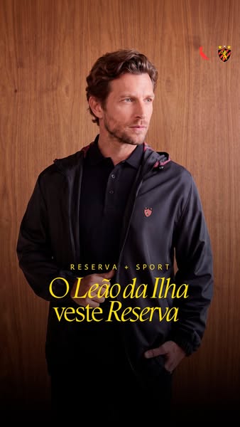
This ad features a man wearing a Reserva Sport jacket over a Reserva polo shirt. The ad promotes the collaboration between Reserva and the Sport Club of Recife.
# Brand positioning
Reserva Sport appears to be a brand that promotes a sporty yet refined style for men. The collaboration with the Sport Club of Recife enhances its local relevance, while its overall style remains sophisticated and athletic, targeting consumers who appreciate quality and a subtle nod to team spirit.
# Product
The ad features a Reserva Sport jacket and a polo shirt. The jacket is a dark color with a hood, and the polo shirt is also a dark color. Both items feature a small logo on the chest, subtly indicating the brand. The jacket appears lightweight and suitable for sports or casual wear, while the polo shirt suggests a smart-casual aesthetic. The combination suggests a versatile look that balances athletic functionality with everyday style.
# Visual style
The ad has a clean and polished aesthetic, resembling a studio shot with careful lighting and color grading. The use of a shallow depth of field and focus on the subject creates a sense of depth and draws the viewer's eye to the model and clothing. The image treatment includes subtle color adjustments that enhance the richness of the colors, particularly the wood background and the clothing. The typography is integrated seamlessly into the design, with the brand name and promotional text presented in a clear and legible font. The overall impression is sophisticated and modern, fitting for a fashion or lifestyle brand targeting a discerning audience. The visual style aims to present the brand as elevated and stylish, encouraging viewers to associate Reserva Sport with quality and fashion.
# Hooks
Headline: O Leão da Ilha veste Reserva
# Benefits
- [object Object]
# Features
- [object Object]
- [object Object]
# Call to action
None used.
# Point of view
- [object Object]
# Storyline
- The image presents a well-dressed man in Reserva Sport clothing. The man is looking off camera to the left. This conveys an image of aspirational style that also suggests the casual comfort of the clothing. The viewer is experiencing the ad from the brand's perspective.
- The brand is presented prominently via text overlaid on the image, reinforcing the collaboration. This reinforces brand recognition and association with the team and the brand. The viewer is experiencing the ad from the brand's perspective.
# Ad summary
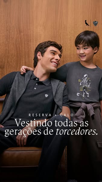
An ad featuring an adult male and a child wearing clothing from Reserva + Galo, with the message of 'dressing all generations of fans'.
# Brand positioning
Reserva + Galo represents a fusion of style and tradition, catering to fans across different generations who seek to express their loyalty through their clothing choices. The brand creates an emotional connection by associating itself with multigenerational support of a team. It offers fans a way to visibly demonstrate their commitment and belonging. The brand leans into an emotional connection and lifestyle affiliation, rather than just focusing on functional product features.
# Product
Reserva + Galo offers a range of clothing for both adults and children, as seen in the image. The adult is wearing a gray collared shirt with white buttons and a small shield logo. He also has on a dark gray hooded vest. The child wears a dark gray t-shirt with an illustration of a soccer player in the team's colors. Both are wearing dark-colored pants. The clothing is designed to allow fans of all ages to display their support and pride for their favorite team in a fashionable and relatable way.
# Visual style
The ad has a clean, lifestyle-focused visual style with high production quality. The image features a natural color palette with a focus on muted tones and natural lighting. The typography is clean and legible, and the overall composition is balanced and visually appealing. The visual style has a timeless feel.
# Hooks
Headline: Vestindo todas as gerações de torcedores.
# Benefits
- [object Object]
# Features
- [object Object]
- [object Object]
# Call to action
None used.
# Point of view
- [object Object]
- [object Object]
# Storyline
- The image presents an adult and a child standing side by side, both wearing clothing from the featured brand. This sets the stage to highlight the brand's appeal across different age groups. The intention is to showcase the products on real people in order to make the product relatable.
- The adult is looking down at the child with a smile, while his arm is around the child's shoulders. The child is looking straight ahead. This is intended to convey a moment of connection or bond between two generations. This also serves to reinforce the idea of shared passion and team spirit.
- The text overlay reads, 'Vestindo todas as gerações de torcedores', which translates to 'Dressing all generations of fans'. This message is designed to communicate the brand's commitment to uniting fans of all ages. It reinforces the idea of brand loyalty being passed down from one generation to the next.
# Ad summary
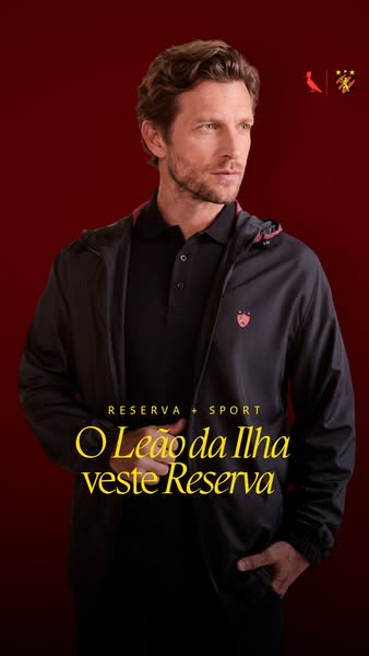
This ad showcases a Reserva Sport jacket worn over a collared shirt. The ad emphasizes the brand's connection to the "Leão da Ilha," suggesting a partnership or endorsement.
# Brand positioning
Reserva is presented as a brand that bridges high-end fashion with athletic wear through its Reserva Sport line. The brand associates itself with a sense of regional pride and affiliation by featuring "Leão da Ilha," suggesting a collaboration or endorsement from a local sports team or organization. This positions Reserva as a brand that values both style and community connection.
# Product
The featured product is a dark-colored, lightweight jacket from the Reserva Sport line, designed for men. The jacket is worn over a dark polo shirt, suggesting a sporty yet refined style. It features a hood with a red accent lining. The garment includes the Reserva logo on the left breast, indicating brand recognition and quality. This combination of sportswear and casual wear implies versatility for different occasions, enhancing its appeal to consumers looking for stylish and functional attire.
# Visual style
The ad features a clean and polished studio shot with a focus on the model and the clothing. The lighting is soft, with the dark background creating a sense of depth. The composition is simple and direct, with the model centered and the text placed to complement the visual elements.
# Hooks
Headline: O Leão da Ilha veste Reserva
# Benefits
- [object Object]
# Features
- [object Object]
- [object Object]
- [object Object]
# Call to action
None used.
# Point of view
- [object Object]
- [object Object]
# Storyline
- The ad presents a male model looking off to the side wearing the Reserva Sport jacket. This captures the viewer's attention and establishes the visual focus on the featured product from a brand perspective.
- The text "RESERVA + SPORT" and "O Leão da Ilha veste Reserva" highlights a partnership between the brand and a sports team, establishing credibility from a brand perspective.
# Ad summary
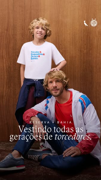
This image ad shows an adult and child, both wearing apparel from the Reserva + Bahia collection. The ad promotes the idea of the collection being for all generations of fans.
# Brand positioning
The ad features Reserva in partnership with Bahia, suggesting a collaboration that leverages the strengths of both brands. Reserva appears to be a fashion brand that aligns with a sense of style that is multigenerational and appeals to a wide audience. The brand is presented as one that values tradition and community. Its positioning appears to be more emotional, as it focuses on connecting with consumers through their shared love for a sports team.
# Product
The ad showcases apparel from the Reserva + Bahia collection. The adult is wearing a red t-shirt under a white, blue, and red jacket, paired with blue jeans and grey sneakers. The child wears a white t-shirt with the text "Tricolor & Esquadrão & De aco & Bahea.", suggesting the apparel is branded to represent a specific sports team. The clothing appears to be casual and everyday wear. The ad addresses the purchase barrier of generational appeal by showing both an adult and child wearing the clothing, implying that the collection is suitable for fans of all ages.
# Visual style
The ad has a clean and polished production quality, with natural lighting and warm color grading. The image treatment gives the ad a lifestyle feel. The typography is integrated with a clean san-serif font. The overall style is native to the platform, designed to be easily scannable in-feed.
# Hooks
Headline: Vestindo todas as gerações de torcedores.
# Benefits
- [object Object]
- [object Object]
# Features
- [object Object]
# Call to action
None used.
# Point of view
- [object Object]
# Storyline
- The ad opens with an adult and child looking at the camera. This establishes a connection with the viewer and introduces the concept of a multigenerational appeal, from a neutral observer perspective.
- The focus shifts to the clothing worn by the adult and child, emphasizing that it comes from the Reserva + Bahia collection. This shows the product and its branding, from the brand's perspective.
- The message "Vestindo todas as gerações de torcedores." is presented, reinforcing the theme of inclusivity and generational appeal, which is from the brand's perspective and designed to resonate with fans of all ages.
# Ad summary
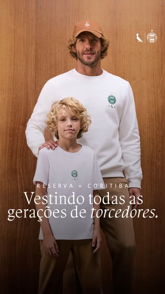
This image ad promotes Reserva + Coritiba apparel, featuring a father and son dressed in matching apparel. The ad's headline reads, "Vestindo todas as gerações de torcedores," suggesting that the brand aims to unite fans of all ages through their clothing.
# Brand positioning
Reserva is presented as a brand focused on uniting generations through clothing. The ad features a father and son, both wearing Reserva + Coritiba apparel, emphasizing the brand's appeal to different age groups. This suggests that Reserva aims to occupy a space in the consumer's mind as a brand that values family connections and shared experiences, specifically in the context of sports fandom. The brand aligns with a lifestyle that celebrates tradition and unity, potentially pushing against the norm of sports apparel being solely for younger demographics. The brand positioning appears to be both emotional, by fostering a sense of belonging and shared identity, and functional, by providing apparel that caters to a range of ages.
# Product
The featured product is apparel from the Reserva + Coritiba collaboration, including a white sweatshirt and a white t-shirt, both adorned with the Coritiba team logo. The sweatshirt is worn by a man, and the t-shirt is worn by a boy, suggesting the product line is for all generations. The ad shows a use occasion of fans wearing the apparel together. The products are designed to showcase team pride and connect fans across different age groups. The ad addresses the potential purchase barrier of age exclusivity by featuring both a man and a boy, implying that the apparel is suitable for everyone.
# Visual style
The ad has a clean and modern aesthetic with a focus on natural tones. The production quality is high, suggesting a professional photoshoot. The image treatment includes soft lighting and color grading to create a warm, inviting atmosphere. The typography is integrated subtly, complementing the overall design without being overly intrusive. The style aligns with platform norms for fashion and lifestyle brands, aiming for scannability and stop power in-feed by presenting an appealing visual of a stylishly dressed father and son.
# Hooks
Headline: Vestindo todas as gerações de torcedores.
# Benefits
- [object Object]
- [object Object]
# Features
- [object Object]
- [object Object]
# Call to action
None used.
# Point of view
- [object Object]
# Storyline
- The ad opens with a visual of a man and a boy wearing Reserva + Coritiba apparel. The message conveyed is that the brand aims to connect generations of fans, from the brand's perspective. This is included to visually showcase the generational appeal of the clothing line.
- The headline states "Vestindo todas as gerações de torcedores," (dressing all generations of fans) reinforcing the theme of unity across generations, from the brand's perspective. This emphasizes the brand's mission to connect fans of all ages through their apparel.
# Ad summary
This vertical video ad for usereserva.com showcases a man in various athletic-style outfits. The text 'SPORT' is repeated in the background.
# Brand positioning
Usereserva.com is presented as a retailer specializing in sporty and athletic-style apparel. The brand offers fashionable and comfortable attire suitable for an active lifestyle or casual wear. The brand's apparel seems to be associated with a sporty lifestyle and is geared towards men who appreciate style, comfort, and team spirit.
# Product
The ad showcases a range of athletic-style apparel, including a black T-shirt with a yellow lion graphic with three stars above it, a polo shirt, and a lightweight, hooded jacket. Each item features the brand's logo, emphasizing the brand's athletic identity. The clothing is presented as suitable for both active pursuits and casual wear. These products are worth trying or buying because they provide stylish and comfortable options for a sporty lifestyle.
# Visual style
The ad has a clean and polished aesthetic with evenly lit static shots. The editing style is simple, relying on direct cuts between shots. The overall production quality is high, resembling a professional commercial. The pacing is moderate, with cuts timed to the music beats. The text overlays in the background create a visual motif.
# Benefits
- [object Object]
- [object Object]
- [object Object]
# Features
- [object Object]
- [object Object]
- [object Object]
- [object Object]
# Call to action
Compre agora pelo site ou app.
# Point of view
- [object Object]
# Storyline
- 00:00–00:02 00:00–00:02 A man is shown wearing a black hooded jacket and polo shirt. The brand logo is visible on the jacket. The text 'SPORT' is repeated in the background.
- 00:02–00:05 00:02–00:05 A man is shown wearing a black t-shirt with a lion graphic with three stars above it. The text 'SPORT' is repeated in the background.
- 00:05–00:07 00:05–00:07 The man from the beginning of the video reappears wearing a black hooded jacket and polo shirt. The brand logo is visible on the jacket. The text 'SPORT' is repeated in the background.
- 00:07–00:10 00:07–00:10 The man wearing a black t-shirt reappears. The text 'SPORT' is repeated in the background.
- 00:10–00:12 00:10–00:12 A white screen with the brand logo and text 'Compre agora pelo site ou app. usereserva.com' and the apple and google play logos are shown.
# Ad summary
This ad displays a series of promotional images featuring different men's clothing items. The ad concludes with a call to action to purchase the clothing via the brand's website or mobile app.
# Brand positioning
Reserva is presented as a modern and stylish brand. The clothing appeals to a youthful audience with a blend of casual and semi-formal looks. The brand is presented as trend-setting and fashion forward.
# Product
The ad showcases a range of men's apparel from Reserva. Featured items include collared shirts, t-shirts, and varsity jackets, all of which feature a bird logo in the upper left. The clothing has a minimalist aesthetic with a focus on neutral colors and simple patterns. The ad promotes the clothing as accessible through their website and mobile app.
# Visual style
The ad has a clean and modern aesthetic with a focus on showcasing the apparel. The backgrounds are minimalist and the camera framing is steady. The overall impression is polished and professional, which aligns with the brand's image.
# Benefits
- [object Object]
- [object Object]
- [object Object]
# Features
- [object Object]
- [object Object]
- [object Object]
# Call to action
Compre agora pelo site ou app.
# Point of view
- [object Object]
# Storyline
- 00:00–00:09 The ad opens with a rapid sequence of images of models wearing clothes from Reserva's collection.
- 00:09–00:11 The ad concludes with a simple screen of text promoting where the clothing can be purchased.
# Ad summary
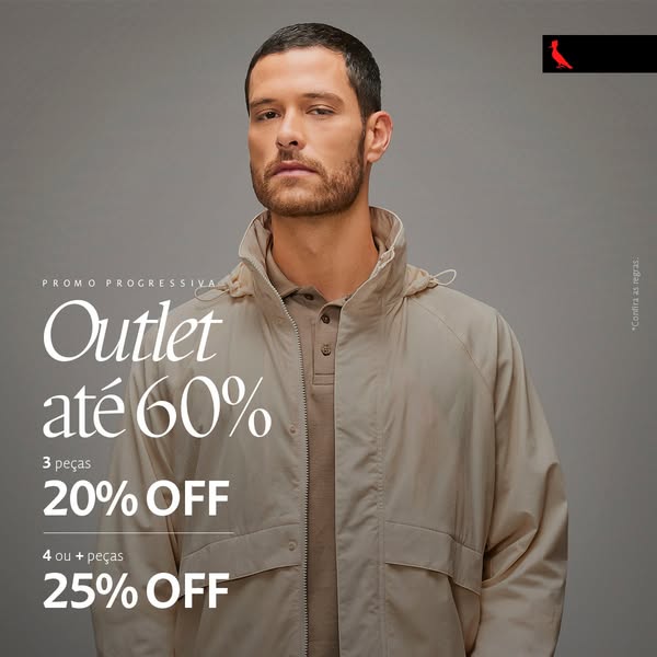
This is an advertisement for a clothing outlet sale. It features a man wearing clothing from the brand. The sale offers increasing discounts depending on the number of items purchased.
# Brand positioning
The brand appears to be positioned in the market as a provider of stylish and high-quality clothing. The brand uses a modern, neutral color palette which conveys a sense of sophistication and versatility. The brand caters to individuals who value both fashion and quality in their clothing choices. The overall aesthetic suggests a brand that focuses on timeless style and elegance, appealing to consumers who appreciate classic fashion with a contemporary edge. The brand logo is a red bird, possibly a cardinal.
# Product
The ad features a hooded lightweight jacket or windbreaker in a neutral beige color. It appears to be made of a lightweight, possibly water-resistant material, suitable for transitional weather. The jacket features a standard collar with a button-down shirt collar underneath, suggesting a layered look. The overall impression is a versatile, practical garment suitable for casual or semi-formal occasions. The ad promotes an outlet sale with tiered discounts: 20% off for 3 items and 25% off for 4 or more items, incentivizing bulk purchases.
# Visual style
The ad has a clean, modern aesthetic with a focus on the product. The production quality appears to be high, with professional lighting and a well-groomed model. The image treatment is minimal, with soft color grading and subtle shadows. The typography is clean and legible, and the overall style feels designed for in-feed placement.
# Hooks
Headline: Outlet até 60%
# Call to action
None used.
# Point of view
- [object Object]
# Storyline
- The ad opens with a man modeling the brand's clothing. The intention is to showcase the style and fit of the brand's apparel on a real person. The viewer is experiencing it from the brand's perspective.
- Next, the ad highlights the 'Outlet até 60%' deal to attract customers with a sale announcement. This is intended to create a sense of urgency and value, enticing viewers to consider shopping at the outlet. The viewer is experiencing it from the brand's perspective.
- Finally, the ad breaks down the discount tiers, showing the specific discounts for purchasing three items ('20% OFF') and four or more items ('25% OFF'). This is to clarify the offer and further incentivize larger purchases. The viewer is experiencing it from the brand's perspective.
# Ad summary
This ad features two men modeling solid-color t-shirts from Reserva. The focus is on the t-shirts' anti-odor and breathable fabric features, as well as the fact that they don't need to be ironed, making them essential for any occasion.
# Brand positioning
Reserva is presented as a provider of essential clothing items that are designed for everyday use and versatility. The brand aims to occupy a space in the consumer's mind as a reliable source for comfortable and practical wardrobe staples suitable for various occasions. The Reserva brand promotes values of simplicity and functionality, focusing on delivering quality clothing items that simplify the customer's life. Positioning itself as a brand that prioritizes convenience and ease of wear, as demonstrated by features like anti-odor, breathable fabric, and non-iron properties, Reserva is trying to appeal to consumers who value practicality in their clothing choices.
# Product
The featured product is a line of men's t-shirts designed by Reserva. They are presented as essential items suitable for any occasion. The t-shirts are made from a breathable fabric that helps to keep the wearer cool and comfortable. They also have anti-odor properties, making them ideal for all-day wear and minimizing the need for frequent washing. A key selling point of these t-shirts is that they do not need to be ironed, offering a convenient solution for individuals looking to save time and effort on garment care. The t-shirts are available in neutral colors like brown and beige.
# Visual style
The ad has a clean and polished aesthetic with studio-quality photography. The visual motifs include clear product placement and concise text annotations that call out specific features. The image treatment appears to use subtle color grading to enhance the natural tones and provide a modern feel. Typography is integrated using a large, legible font for the main headline, ensuring high scannability in-feed. The overall visual style is professional and straightforward, aiming for a native yet refined look that contrasts with more disruptive ad formats.
# Hooks
Headline: Camisetas Reserva
# Benefits
- [object Object]
# Features
- [object Object]
- [object Object]
- [object Object]
# Call to action
None used.
# Point of view
- [object Object]
# Storyline
- The ad showcases two men wearing the Reserva t-shirts, presenting them as stylish and versatile wardrobe staples. This is intended to visually demonstrate the product and highlight its suitability for everyday wear from the brand's perspective.
- The ad highlights the features of the t-shirts, such as being anti-odor, made from breathable fabric, and not requiring ironing. This aims to inform the audience about the functional benefits of the product from the brand's perspective.
- The text "Camisetas Reserva. Essenciais pra qualquer ocasião" reinforces the message that these t-shirts are essential items for any occasion, emphasizing their versatility and practicality from the brand's perspective.
How Other Apparel Brands Advertise on Meta
Peer brands in Motion's library — click any brand to see their creative strategy, live ads, and AI breakdowns.