PureWow runs 44 active ads on Meta, shipping ~13 new creatives per week. Their library leans on Collage17%, Expert Explainer10%, and Before and After7%. Recently, purewow is leaning hard into wellness and life optimization content, pushing gut health advice, mental wellness frameworks, and products that solve everyday friction points like sleep issues, headaches, and disorganization. The creative strategy is less about polished aspiration and more about relatable pain points (sticky notes, cluttered drawers, festival survival) paired with accessible solutions, often through sponsored integrations with brands like IKEA, Yahoo Mail, and Lume. There's a clear through-line of "make your life smoother" whether that's through meal timing for gut health, organization hacks, or grab-and-go systems, all delivered in a practical, influencer-driven format that feels native and immediately actionable.
# Ad summary
A tired woman is shown in bed. The image is overlaid with a transparent clock to indicate the time spent in bed. The ad is likely highlighting a product that can aid in a better night's sleep.
# Brand positioning
There is no brand visible or explicitly stated in the ad. However, the visual focuses on a rest and sleep aid. The ad implies that this brand aims to help consumers achieve a better night's sleep, positioning itself within the health and wellness sector. The lack of overt branding suggests a focus on the product's functional benefits rather than an emotional connection to a specific brand identity. The ad positions the brand around the importance of restful sleep.
# Product
There is no product explicitly shown in the ad. The ad implies that there is a product available, which can improve sleep. The ad focuses on the concept of achieving a full night of restful sleep, implying that the product is designed to address sleep-related issues or enhance the quality of sleep. The ad centers on the importance of sleep as a key component of overall health and well-being, positioning the product as a solution to ensure a full night of rest.
# Visual style
The ad utilizes a clean, studio-shot image with soft lighting. The overall color palette is muted, dominated by light blue and peach tones, which conveys a sense of calm and tranquility. The addition of the clock graphic layered over the image adds a conceptual element, visually linking the concept of sleep and time. The photo is high-quality and well-lit.
# Hooks
Headline: None used
# Benefits
- [object Object]
# Features
- [object Object]
# Call to action
None used.
# Point of view
- [object Object]
# Storyline
- The image features a woman in bed, overlaid with a clock graphic. This creates a visual of time and sleep being intertwined, which is from the perspective of the viewer. The intention of the moment is to convey the importance of restful sleep and the amount of time spent in bed.
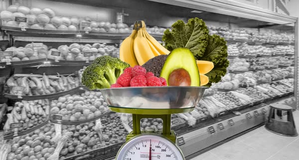
# Ad summary
This ad features fresh produce weighed on a scale against the backdrop of a grayscale supermarket. The intent of the ad is not clearly indicated.
# Brand positioning
Based on the content of the ad, the brand's goal is to promote health and nutrition by emphasizing fresh produce and healthy eating habits. The brand appears to cater to health-conscious consumers.
# Product
This ad features a variety of fresh produce, including broccoli, raspberries, bananas, kale, avocado and oranges. The produce is placed in a metal bowl on top of a green-colored scale. The scale is a mechanical spring scale with a round dial that indicates weight. All of the produce in the metal bowl is in color. The bananas are shown as yellow and the raspberries are shown as red, indicating freshness. The avocados are cut in half to show the seed inside. The oranges are shown as orange wedges. The broccoli and kale appear fresh and in season.
# Visual style
The ad has a vibrant, health-conscious visual style. The use of color for the produce against the black-and-white backdrop of the supermarket aisle emphasizes the freshness and appeal of the natural ingredients. The choice of a traditional mechanical scale suggests a focus on simplicity and fundamental health principles, while the supermarket backdrop subtly implies accessibility and everyday relevance.
# Hooks
Headline: None used
# Benefits
- [object Object]
# Features
- [object Object]
- [object Object]
# Call to action
None used.
# Point of view
- [object Object]
# Storyline
- A colorful bowl of fresh produce sits on a scale to promote healthy eating by weighing out fresh ingredients. The supermarket scene is in black and white, while the bowl of produce is in color, indicating that it's possible to prioritize fresh ingredients and healthy eating in the context of a grocery store. The brand presents the image to show its commitment to nutrition.
# Ad summary
The ad is for a product that helps relieve tension headaches and migraines. The ad visually and conceptually suggests that the product alleviates a number of overwhelming feelings and thoughts that are causing tension.
# Brand positioning
This ad is not explicitly pushing any particular brand values beyond effective relief from tension and migraines. It’s implied that the brand understands and cares about helping its customers cope with overwhelming stress and the symptoms it causes. The visual presentation is somewhat clinical and muted, suggesting a no-nonsense and purely functional approach to wellness.
# Product
The ad is for a product that can relieve tension headaches and migraines. It is implied through the ad's visuals that the product has a calming, stress-relieving effect on the user. The specific ingredients and format of the product are not shown.
# Visual style
The ad uses a stark contrast between a black and white photo and a layer of bright red scribbles, which draws the eye. The effect is somewhat jarring, with the red feeling like a visual representation of pain and discomfort. The overall tone is clinical and direct, without soft edges or subtle cues.
# Hooks
Headline: None used
# Benefits
- [object Object]
# Features
- [object Object]
# Call to action
None used
# Point of view
- [object Object]
# Storyline
- The image opens on a woman touching her temples. The artist is conveying that she is struggling with tension or a migraine.
- The artist conveys that the woman's head is full of swirling thoughts, questions, and stressors, as suggested by the red scribbles, question marks, and lightning bolts over her head. The artist is using these visuals to represent the overwhelming thoughts and questions that cause headaches and migraines.
# Ad summary
An overhead shot of an appetizer served in tortilla shell bowls on a white plate.
# Brand positioning
The brand, PureWow, is positioned as a culinary curator. It offers users recipes for meals that are easy to prepare.
# Product
The image features an appetizer consisting of an edible bowl, tortilla shell cups. They are filled with a creamy, cheesy filling and topped with cilantro. This meal is easy to eat and can be prepared in advance. It is shown plated on a white plate over a wooden surface.
# Visual style
The ad has a clean and bright visual style. The image is an overhead shot with natural lighting and a shallow depth of field. The colors are muted and natural, with the focus on the food itself. The brand logo in the upper left has a white circle background, which is offset from the image and gives the ad a clean feel.
# Hooks
Headline: the UNINTERRUPTED PLATE
# Call to action
None used.
# Point of view
- [object Object]
# Storyline
- The audience sees a white plate over a wood surface from an overhead view. The intention is to show the product is being served during a gathering.
- The audience sees an assortment of tortilla shell cups filled with a creamy, cheesy filling and topped with cilantro. The intention is to display the end result of the featured recipe.
- The brand presents its name and slogan as an endorsement.
# Ad summary
This image ad showcases Purewow's recipe for Green Chili Chicken Enchilada Cups. The ad's creative features a close-up shot of the finished dish, aiming to entice viewers with its appealing presentation and promise of gut-friendly indulgence.
# Brand positioning
Purewow is presented as a curator of accessible and health-conscious culinary content. The focus on a 'gut-friendly fiesta' suggests that Purewow aims to occupy a space in the consumer's mind as a provider of recipes that are both enjoyable and considerate of dietary health. The brand values seem to align with promoting a lifestyle that balances indulgence with wellness, possibly pushing against the notion that flavorful food must be unhealthy. This brand positioning is both functional and emotional, offering recipes that are practical to make and enjoyable to eat.
# Product
The product featured is a recipe for Green Chili Chicken Enchilada Cups, which appear to be miniature, individually portioned enchiladas baked in tortilla chip cups. The dish includes a filling of chicken and green chilies, topped with melted cheese and fresh cilantro. The use occasion implied is a casual gathering or a personal snack. A key selling point is the 'gut-friendly' aspect, suggesting that this recipe is easier to digest or contains ingredients that promote gut health. The ad appeals to viewers by showcasing an appealing and appetizing dish.
# Visual style
The ad features a highly polished, studio-shot image. The visual motif is a flatlay, with a focus on showcasing the food in an appetizing and accessible manner. The image treatment includes bright lighting and a shallow depth of field to emphasize the enchilada cups and blur the background. The overall style is clean and modern.
# Hooks
Headline: Green Chili Chicken Enchilada Cups
# Benefits
- [object Object]
# Features
- [object Object]
# Call to action
None used.
# Point of view
- [object Object]
# Storyline
- The ad opens with an overhead shot of several Green Chili Chicken Enchilada Cups, plated together and arranged to fill the frame. This visual aims to immediately capture attention with a highly appetizing dish. The audience experiences this beat from the brand's perspective, which is attempting to establish its credibility as a source of tasty recipes.
- Next, the brand name appears in a semi-transparent box overlayed on the enchilada cups, along with a description of the recipe and a tagline. The intention here is to communicate what the viewer is looking at. The audience experiences this beat from the brand's perspective, which is highlighting the recipe's appeal and positioning it as a solution for gut-friendly eating.
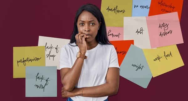
# Ad summary
An ad showing a woman surrounded by sticky notes to show the user's pain points.
# Brand positioning
There is no brand explicitly present in the ad, but the brand is positioned as a solution to the problems shown. The consumer should care because the brand aims to offer a solution to manage the stresses of daily life.
# Product
There are no products displayed in this ad. The focus is on the problems that can be solved, not the product that solves them. The ad shows a woman surrounded by sticky notes that read: deadlines, no excuses, relationship issues, dirty dishes, weight, work load, burnout, debt, illness, lack of perfectionism, lack of sleep, lack of control.
# Visual style
The ad has a studio-shot look. The image treatment has clean lighting. There is integration of handwritten-style typography. The style might impact stop power in feed due to the relatability.
# Hooks
Headline: None used
# Benefits
- [object Object]
# Features
- [object Object]
- [object Object]
- [object Object]
- [object Object]
- [object Object]
- [object Object]
- [object Object]
- [object Object]
- [object Object]
- [object Object]
- [object Object]
- [object Object]
# Call to action
None used.
# Point of view
- [object Object]
- [object Object]
# Storyline
- The ad starts with the woman in the center expressing stress. This highlights the problem that a person feels when they have stress. This is from the customer's POV.
- Then, the ad lists all of the different things that can stress someone out. This is to show how many things someone might be stressed about. This is from the brand POV.
# Ad summary
The image is an ad for Mind Talks, a company or organization focused on mental wellness and discussions. The ad features a collage-style design with images of people in various settings, each set against different colored backgrounds. The composition aims to create a sense of energy and inspiration, suggesting that Mind Talks offers a platform for diverse perspectives and engaging discussions related to mental wellness.
# Brand positioning
The brand, Mind Talks, positions itself as a platform for mental wellness discussions and engagement, with a focus on diverse perspectives and thought-provoking conversations. The use of vibrant colors and collage-style visuals suggests a modern, approachable, and creative approach to mental health. The brand emphasizes inclusivity and encourages audiences to explore and understand their minds through open dialogue and diverse experiences, moving away from traditional, clinical approaches and embracing a more dynamic and accessible approach to mental health discussions. This is done through featuring a variety of different people in vibrant settings, suggesting a sense of community.
# Product
The ad promotes Mind Talks, which is a platform that promotes mental wellness through discussion. The ad shows a montage of various individuals, presumably representative of the audience or people who are part of the Mind Talks community. Each of the individuals are separated by colorful backgrounds with white string-like doodles connecting all the images. The ad conveys that Mind Talks is a place for diverse voices and perspectives to come together and engage in meaningful conversations.
# Visual style
The visual style of the ad combines bold, flat colors and a collage layout for a modern, eye-catching design. Each image is individually framed with a specific color background and is linked together with a white scribble design. The photo subjects appear to be of high quality, and are well-lit, with their outfits matching the background color scheme. The ad seems to be designed for a Gen Z or millennial audience, with the collage layout being reminiscent of digital scrapbooking and social media aesthetics.
# Hooks
Headline: None used
# Benefits
- [object Object]
# Features
- [object Object]
# Call to action
None used.
# Point of view
- [object Object]
# Storyline
- The ad begins with a collage-like layout featuring different individuals set against colored backgrounds, meant to represent the diversity of perspectives at Mind Talks. The brand is telling the story of inclusivity and representing the range of voices that are part of the Mind Talks platform.
- Next, the focus is brought to the central image of a woman holding a microphone with an uncertain expression. This reinforces the idea that Mind Talks is a place to express yourself and face your fears. This section highlights the theme of Mind Talks as a space for open discussion and expression.
- Finally, the layout is balanced with a photo on the right side of women playfully lying on a couch. This reinforces the theme of community. The brand presents the idea that Mind Talks offers engaging, thought-provoking conversations on mental wellness.
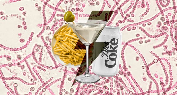
# Ad summary
A side-by-side comparison showing that a Diet Coke is a replacement for a martini and fries.
# Brand positioning
Diet Coke is presented as a zero-sugar alternative to high-calorie alcoholic beverages and greasy foods. The brand positions itself for consumers who want to indulge in familiar treats but are health-conscious.
# Product
A can of Diet Coke, a zero-calorie soda, is presented as an alternative to a high-calorie alcoholic beverage (martini) and greasy foods (french fries).
# Visual style
The ad has a split-screen comparison style, with the two sides divided by a diagonal line. The image is a digital composite.
# Hooks
Headline: None used
# Benefits
- [object Object]
# Features
- [object Object]
# Call to action
None used.
# Point of view
- [object Object]
# Storyline
- The image presents two contrasting scenarios separated by a diagonal line. On one side, there's a martini with an olive and a plate of french fries, representing a high-calorie indulgence. This is to show viewers the more indulgent option.
- On the other side, there's a can of Diet Coke, a zero-calorie soda. This is intended to present a healthier alternative to the martini and fries.
- The comparison is intended to suggest that Diet Coke can satisfy cravings without the caloric cost. The brand implies that you can still have a treat and enjoy it without the guilt.
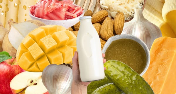
# Ad summary
This image ad is designed to promote the idea that consuming a diet rich in histamine can be healthy. The ad features a diverse array of foods that contain histamine. A hand holds a bottle of milk in the center of the frame.
# Brand positioning
There is no brand explicitly promoted in this ad. The ad promotes the general idea of a diet full of histamine, and may be targeting viewers who already consume a high histamine diet, or viewers who are interested in the potential benefits of a histamine rich diet. The brand, if any, positions itself as a source of information or validation for viewers already familiar with the topic of histamine in food.
# Product
The ad doesn't feature a specific product, but rather, showcases a variety of foods that contain histamine, such as pickles, kimchi, cheese, mango, almonds, and milk. A bottle of milk is prominently featured, held by a hand in the center of the image. These foods may be presented to encourage viewers to consider the benefits of a histamine-rich diet, and the ad seems to target individuals who may already be familiar with such a diet, seeking validation, or those curious about exploring the concept.
# Visual style
The ad uses a food collage style, with bright lighting and focus on textures. The composition features a hand prominently holding the product in front of the other ingredients.
# Hooks
Headline: None used
# Benefits
- [object Object]
# Features
- [object Object]
# Call to action
None used.
# Point of view
- [object Object]
# Storyline
- The ad showcases different foods that contain histamine, such as cheese, pickles, and kimchi. This is to highlight the diversity of foods with histamine and to suggest that a histamine-rich diet can be varied and appealing, presented from the brand's perspective.
- A hand holds a bottle of milk. This is a central visual element that may serve to anchor the composition and draw the viewer's eye, presented from an outside perspective.
- The ad features fruits, vegetables, dairy, and fermented products. This is to provide an overview of various sources of histamine from the brand's perspective.
# Ad summary
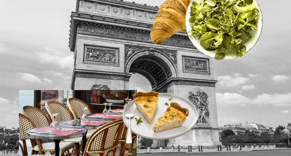
This ad features a composite image of french food items such as a croissant, a bowl of salad, slices of quiche, and a French-style restaurant in front of the Arc de Triomphe. The food items and the restaurant are in color while the Arc de Triomphe is in grayscale.
# Brand positioning
This ad does not explicitly mention a brand or the brand's position in the market. However, it uses visual elements and a Parisian theme to imply a connection to French cuisine and culture. The combination of iconic imagery and classic dishes suggests the brand aligns with sophistication, tradition, and culinary excellence, possibly targeting consumers with an appreciation for fine dining or those seeking an authentic French experience.
# Product
The ad showcases a variety of French food items. A croissant, known for its flaky and buttery layers, sits prominently near the top. A bowl of fresh green salad adds a touch of lightness and health. Two slices of quiche, likely savory custard tarts, sit on a plate with a fork. Each item represents a part of French cuisine and suggests a diverse culinary experience. These products are targeted towards customers seeking a taste of France or those who appreciate the traditional flavors and meals found in French culture.
# Visual style
The ad features a collage-style arrangement with a mix of colored and grayscale elements. The production quality appears to be of medium quality, combining stock photography with basic compositing. The typography is clean and minimalist. The visual style aims to evoke a sense of French sophistication and culinary appeal, while maintaining a modern, Instagram-friendly aesthetic.
# Hooks
Headline: None used
# Benefits
- [object Object]
- [object Object]
# Features
- [object Object]
- [object Object]
- [object Object]
# Call to action
None used.
# Point of view
- [object Object]
# Storyline
- The ad opens with a scenic, albeit grayscale, view of the Arc de Triomphe, immediately setting a Parisian backdrop. This establishes an atmosphere of French culture and elegance, creating a sense of place from the perspective of the viewer experiencing the imagery.
- The story transitions to a closer view of French cuisine with colorful images of a croissant, a salad, and a plate of quiche. By layering these items, the ad shifts the focus to the food itself, giving the brand the role of curator.
- Lastly, the restaurant table in the foreground implies an invitation to dine, furthering the brand's message.
# Ad summary
This ad promotes Yahoo Mail's Planner feature, with a male creator explaining how it helps him organize his festival plans.
# Brand positioning
The ad promotes Yahoo Mail, emphasizing its Planner feature as a tool for organization and event management. The brand is positioned as a practical solution for staying on top of schedules and enjoying moments that matter. It aims to occupy a space in the consumer's mind as a reliable assistant for managing events and personal commitments, offering a functional approach to planning and organization.
# Product
The product is Planner by Yahoo Mail, a feature within the Yahoo Mail app designed to help users stay organized and manage their schedules. It allows users to integrate events and appointments directly from their email into a centralized planner, ensuring they don't miss important moments. The product aims to address the pain point of feeling disorganized and overwhelmed, especially when managing multiple events or commitments. It is for anyone who wants to streamline their schedule and have everything in one place, such as festival-goers. The ad highlights how Planner by Yahoo Mail can help users stay on top of everything and actually enjoy all the moments that matter, like a surprise guest or a huge moment.
# Visual style
The ad has a UGC feel, with a clean and bright aesthetic. The editing style includes direct cuts and a mix of static shots and close-ups on the smartphone screen. The production quality is polished enough for social media but maintains a casual, relatable tone.
# Benefits
- [object Object]
- [object Object]
- [object Object]
- [object Object]
# Features
- [object Object]
# Call to action
Check out Planner by Yahoo Mail
# Point of view
- [object Object]
# Storyline
- 00:00–00:08 00:00–00:08 The creator introduces himself and mentions how much he loves festivals, but this year wants to be more organized because last year, he felt he wasn't fully on top of everything and didn't enjoy it as much as he wanted. This moment is told from the creator's point of view, setting the stage for the solution he's about to present.
- 00:08–00:16 00:08–00:16 The creator states that this year he feels much more prepared because Planner by Yahoo Mail has him ready to go, so he can stay on top of everything and enjoy all the moments that matter. This moment shifts perspective to the benefits of using the Yahoo Mail Planner, highlighting how it provides a sense of preparedness and enables users to fully enjoy important moments. The tone is enthusiastic and persuasive.
- 00:16–00:25 00:16–00:25 The creator urges viewers to check out Planner by Yahoo Mail so everything stays in one place and you don't miss what matters. This moment conveys a sense of urgency and directness, prompting the audience to explore the Planner and experience its organizational benefits themselves. The creator's tone is encouraging, inviting viewers to take action and try out the product.
# Ad summary
This ad promotes Yahoo Mail Planner, which is an app that can integrate all of your scheduled events from your email into one place.
# Brand positioning
Yahoo Mail Planner is presented as a solution for people who experience stress from having many events and scheduling conflicts. The brand aims to position itself as an efficient and convenient way to organize your schedule, allowing users to live in the present moment. Yahoo Mail Planner aligns with the values of simplicity and organization. Rather than a completely new app or software, Yahoo Mail Planner is a feature inside of an already popular email platform that many people already use, creating convenience for those who don't want to learn how to use a new platform.
# Product
Yahoo Mail Planner is an app that can take the events and tasks directly from your email and put them all in one place. The product is for anyone with events, tasks, and appointments in their email that they need to organize. Yahoo Mail Planner puts all your schedules, times, and itineraries in one place. It addresses the pain point of being stressed out by one's schedule and the difficulty of keeping track of one's various events. It helps users live in the present moment rather than worrying about what they have to do.
# Visual style
The ad has an informal and UGC aesthetic, with selfie-style shots from a low angle. The editing is quick and has many cuts. The production quality has a UGC feel. The pacing is fast, with many quick cuts.
# Benefits
- [object Object]
- [object Object]
# Features
- [object Object]
# Call to action
None used.
# Point of view
- [object Object]
# Storyline
- 00:00–00:02 The ad starts with a man running and talking about FOMO, but then also says he experiences FOMSI.
- 00:02–00:04 The man then defines FOMSI as the fear of missing something important. This is from the perspective of the man in the video, and the tone is casual and conversational.
- 00:04–00:10 The man says that he read an article about how Yahoo Mail Planner can literally take the events in your email and put it all in one place. The tone is informational and is again from the perspective of the man.
- 00:10–00:11 The man expresses his gratitude for Yahoo Mail Planner. The tone is light and friendly.
- 00:11–00:14 The man states that he finds that what he is stressed about with his schedule is that he can't live in the present. The perspective is from the man who is expressing a pain point.
- 00:14–00:19 The man says that Yahoo Mail Planner makes things much easier and that all of his schedules, times, and itinerary are all in one place. The man is expressing how the product solves his previously stated pain point. The tone is informational and from the man's perspective.
- 00:19–00:22 The man states that instead of stressing, he can now look at the birds and enjoy the trees. This is a continuation of the previous moment.
- 00:22–00:24 The man says that now he can do that without the back of his mind screaming that he is unorganized. This is a continuation of the previous moment and emphasizes how much of a pain point this product solves.
- 00:24–00:26 The man states that he is organized now. The tone is excited and relieved.
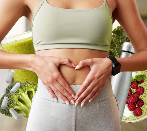
# Ad summary
This image ad showcases a woman standing with her hands forming a heart shape around her stomach. The image is surrounded by various healthy food items and dietary supplements, emphasizing a focus on health and wellness.
# Brand positioning
This ad does not feature any overt branding. The brand positioning is heavily focused on health, wellness, and nutrition. The ad promotes a lifestyle centered around healthy eating and potentially dietary supplementation. The brand appears to be targeting consumers who are health-conscious and interested in maintaining a balanced diet and lifestyle.
# Product
The ad features a variety of products associated with a healthy lifestyle. These include a green smoothie in a glass, fresh broccoli, chia seed pudding topped with raspberries, a stainless steel thermos, and dietary supplement capsules. The smoothie and chia seed pudding suggest a focus on nutritious and wholesome foods. The capsules indicate the potential use of dietary supplements to support health and wellness. The stainless steel thermos implies a lifestyle of on-the-go health maintenance. These products are collectively presented as aids for achieving and maintaining a healthy lifestyle.
# Visual style
The ad features a clean, bright, and health-focused visual style. The image is well-lit, and the colors are vibrant, emphasizing freshness and vitality. The composition is balanced, with the woman at the center and healthy food items arranged around her. The overall aesthetic is modern and appealing, designed to resonate with a health-conscious audience.
# Hooks
Headline: None used
# Benefits
- [object Object]
- [object Object]
- [object Object]
# Features
- [object Object]
- [object Object]
- [object Object]
- [object Object]
- [object Object]
# Call to action
None used.
# Point of view
- [object Object]
- [object Object]
# Storyline
- The image centers on a woman making a heart shape over her stomach, which conveys a message of self-love and body positivity from the customer's point of view. The heart shape is meant to symbolize caring for one's health and well-being.
- Surrounding the woman are various health-focused items: a green smoothie, broccoli, a chia seed pudding with raspberries, a thermos, and supplement capsules. This is from the brand's perspective, promoting a holistic approach to health, incorporating nutritious foods and supplements.
- The ad as a whole conveys a message about prioritizing health and wellness through a combination of diet and supplementation from the brand's perspective. The overall intent is to associate these products with a healthy and caring lifestyle.
# Ad summary
A woman shows the Ikea products she bought to make an outdoor grab-and-go station.
# Brand positioning
Ikea is presented as the ideal brand to purchase essential items to create an ideal home environment for any season of the year. Ikea is presented as the solution to take a home from chaos to control, providing everything needed for a family to enjoy life.
# Product
Ikea offers a range of products to create a grab-and-go station to make summer outings easier. The featured products include a large tote with backpack straps, a small polka dot print cooler bag, bento boxes, and an insulated tumbler. The goal is to have everything in one spot so you can walk out the door without thinking. The grab-and-go station is designed to be accessible to children so they can independently get their own things, so parents stop getting asked for things.
# Visual style
The ad has a polished, clean aesthetic with warm lighting. The video features a combination of static and smoothly transitioned shots, with a moderate editing rhythm. The production quality gives off a commercial feel, and the cuts and product actions are timed to the music.
# Benefits
- [object Object]
- [object Object]
- [object Object]
# Features
- [object Object]
- [object Object]
- [object Object]
- [object Object]
- [object Object]
# Call to action
None used.
# Point of view
- [object Object]
# Storyline
- 00:00–00:03 A woman walks out the door onto her porch, conveying the beginning of summertime and outdoor activities.
- 00:03–00:08 The voiceover states that life moves outside, showing images of children swimming in a pool and a picnic setup, conveying common summer activities.
- 00:08–00:11 The voiceover states that the goal is to grab and go, showing the woman taking out a large tote, implying preparation to go somewhere.
- 00:11–00:12 She heads to Ikea to purchase items for the grab-and-go station.
- 00:12–00:17 The voiceover states that this time the shopping trip is focused entirely on what they need when they leave the house, showing the woman preparing food in bento boxes.
- 00:17–00:19 She packs a cooler bag.
- 00:19–00:24 The voiceover continues by showing different items such as bento boxes, tumblers, and silicone bags.
- 00:24–00:27 Everything lives in one spot so they can walk out the door without thinking.
- 00:27–00:31 The voiceover says that when it's all set up and accessible the kids stop asking me for things, showing a child getting a drink from a water dispenser.
- 00:31–00:35 Ikea took us from chaos to a kitchen that keeps up with every season.
- 00:35–00:37 This summer, we're ready.
# Ad summary
This social media ad is for Lume deodorant and features a compilation of photos of a woman who carries the product with her in multiple places, implying it can be taken anywhere.
# Brand positioning
Lume positions itself as a whole-body deodorant brand that offers innovative solutions to common body odor concerns. The brand's products go beyond traditional deodorants and are formulated to work on various parts of the body, providing long-lasting odor control. This positioning directly challenges traditional deodorant brands that primarily focus on underarm odor, setting Lume apart by offering a broader, more comprehensive solution for odor management. The brand's focus on a more holistic approach to body odor suggests a commitment to addressing the underlying causes of odor, rather than just masking the symptoms.
# Product
Lume is a deodorant that claims to be effective for the entire body. It can be used on underarms, private parts, and feet, offering a comprehensive solution to body odor. The product is designed for anyone who experiences body odor and wants a long-lasting solution. Lume aims to address the purchase barrier of embarrassment or discomfort associated with body odor by offering a product that can be used discreetly and effectively on any external part of the body. The packaging is a small, portable tube.
# Visual style
The ad has a collage-like aesthetic with multiple photos of the same woman in different places using the product. The photos appear to be high-quality and shot on a professional camera. The lighting is good and the colors are vibrant. The background is a solid, pale pink color.
# Hooks
Headline: None used
# Benefits
- [object Object]
# Features
- [object Object]
- [object Object]
# Call to action
None used.
# Point of view
- [object Object]
# Storyline
- The ad opens with a woman posing, showing off her outfit to set a friendly and relatable tone. This is presented from her perspective as someone who values personal style and is also introducing the ad to the viewer.
- The ad then shows the woman with the product in multiple locations. The ad tells the story of how the product can be taken anywhere and is easy to use. This is from the woman's perspective, as the product user.
- Finally, the ad concludes with the product in the woman's pocket, showcasing its portability and convenience. This is from the woman's perspective as someone who needs a product that can be easily carried around.
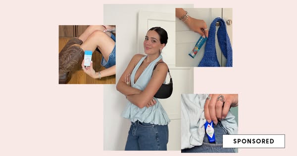
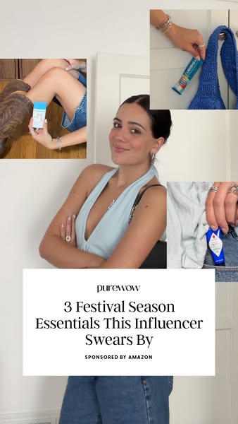
# Ad summary
This ad features an influencer that is sponsored by Amazon to showcase three essentials for festival season, including: deodorant, Liquid I.V., and lip balm. The influencer is pictured in the middle of the frame and in the background there are pictures of the influencer using the product.
# Brand positioning
PureWow is presented as a lifestyle brand that creates content around a variety of categories, including food, travel, fashion, beauty, and home. The brand's content strategy revolves around finding what's new, now, and next in a way that is both informative and entertaining. PureWow uses influencers to promote a variety of brands and products. The brand aligns with the values of people who love lifestyle content and value the opinion of influencers.
# Product
This ad features three products that are positioned as festival season essentials. The first product featured is a deodorant, presumably to reduce sweat and odor. The second product is Liquid I.V., which claims to hydrate faster and more efficiently than water alone. The final product is a lip balm, presumably to hydrate lips and protect them from the elements.
# Visual style
The ad has a casual, lifestyle feel. The influencer is wearing casual clothing and the photos have not been heavily edited, which gives the ad a more authentic feel.
# Hooks
Headline: 3 Festival Season Essentials This Influencer Swears By
# Benefits
- [object Object]
# Features
- [object Object]
- [object Object]
- [object Object]
# Call to action
None used.
# Point of view
- [object Object]
# Storyline
- The ad starts by showcasing three products an influencer swears by. The ad does this to grab the viewer's attention by showcasing relevant products.
- The ad features the influencer to build trust and credibility with the audience.
- The ad also includes the 'Sponsored by Amazon' tag, which tells the audience that the ad is paid for by Amazon and that the influencer may have a financial relationship with the company.
# Ad summary
This ad by PureWow in partnership with IKEA promotes their products that help make a grab-and-go station. The ad features different products like storage containers, drink tumblers, cooler bags, and a tiered shelf all from IKEA.
# Brand positioning
IKEA is presented as a brand that aims to occupy the space of providing affordable and practical solutions for home organization. They are positioned as a one-stop-shop for individuals and families looking to create efficient and stylish spaces, emphasizing convenience and accessibility. IKEA aligns with values of practicality, affordability, and functionality, promoting a lifestyle of organized simplicity. The brand offers functional home solutions for all aspects of daily life.
# Product
The featured products are from IKEA, that are used to create a grab-and-go station, including containers, cooler bags, drink tumblers, and a tiered shelf. The containers include metal bento boxes with dividers for snacks, and other containers for dry goods storage. The cooler bag is a blue floral pattern with a zipper closure. The drink tumblers and plastic reusable cups are stored on a tiered shelf, displayed next to a clear beverage dispenser. The ad is promoting all of these products as worth trying and buying for their practicality, convenience, and organization.
# Visual style
The ad has a polished commercial aesthetic, which supports the intended tone and audience. The production quality is high-end. There is a mix of static shots and some quick cuts. The pacing stays consistent throughout the ad.
# Benefits
- [object Object]
- [object Object]
# Features
- [object Object]
- [object Object]
- [object Object]
- [object Object]
# Call to action
None used.
# Point of view
- [object Object]
# Storyline
- 00:00–00:03 The ad begins with a woman walking out onto her porch, conveying the idea that summer is approaching and life is moving outdoors.
- 00:03–00:11 00:03–00:11 The woman gathers her bag and items, showing her setting up and preparing her grab-and-go station. This is from the perspective of someone that is using the IKEA items to set up a grab-and-go station.
- 00:11–00:13 00:11–00:13 The woman heads to IKEA for a haul. This is from the perspective of the woman setting up her grab-and-go station.
- 00:13–00:17 00:13–00:17 The woman packs the containers from IKEA with snacks. This is from the perspective of the woman setting up her grab-and-go station.
- 00:17–00:27 00:17–00:27 The woman finishes filling up her bag from the grab-and-go station. This is from the perspective of the woman setting up her grab-and-go station.
- 00:27–00:31 00:27–00:31 The little girl gets a drink from the beverage dispenser. This shows that the grab-and-go station is accessible to kids, and makes life easier.
- 00:31–00:35 00:31–00:35 Back in the IKEA store, with an array of kitchen products on display.
# Ad summary
This ad shows a before and after transformation of the kitchen. The left side shows the kitchen before being organized with drawers full of mixed and disorganized items. The right side of the ad showcases the kitchen after it was organized with drawer dividers, with kitchen items neatly organized within them.
# Brand positioning
The brand appears to be targeting people who value organization and order in their homes, especially in areas prone to clutter like the kitchen. The transformation shown in the ad suggests that the brand offers solutions that not only organize items but also enhance the aesthetic appeal of spaces. It positions itself as a functional and visually satisfying solution to everyday organizational challenges.
# Product
The product being advertised is a drawer divider designed to organize kitchen items. It features multiple compartments that neatly hold utensils, packaged goods, and other kitchen essentials. The dividers are made of light-colored wood and are designed to fit inside drawers, creating a structured and visually appealing storage solution. The ad highlights how the product effectively transforms cluttered drawers into organized spaces, making it easier to find items and maximizing drawer space. The use case shows how the product is designed for anyone looking to declutter and organize their kitchen drawers, making it a must-have for those seeking a tidy and efficient kitchen environment.
# Visual style
The visual style of the ad is clean and straightforward. The split-screen style with before-and-after shots makes it easy to quickly see the transformation. The photography appears to be taken with natural lighting. Overall, the style is designed to clearly communicate the product's value and impact.
# Hooks
Headline: None used
# Benefits
- [object Object]
- [object Object]
- [object Object]
# Features
- [object Object]
# Call to action
None used.
# Point of view
- [object Object]
- [object Object]
# Storyline
- The ad starts by showing cluttered kitchen drawers and countertops filled with disorganized items. This is to portray the problem that many people face with kitchen storage and organization. The perspective is from someone struggling with the disarray, which is implied.
- The ad then switches to the organized kitchen drawers after the drawer dividers were installed. It is intended to showcase the effectiveness and the aesthetic appeal of the organization solution and emphasize how it transforms the cluttered drawers into neat and orderly spaces. The perspective is from the brand showcasing the effectiveness of the solution.
# Ad summary
This ad, titled “The Check-In: Gut Health Edition,” features Claire Rifkin, a registered dietician, who offers insights on gut health. She emphasizes the importance of consistent meal timings to help the gut anticipate food, and discusses how irregular eating patterns can lead to digestive issues like reflux, bloating, and abdominal pain. The ad aims to educate viewers on maintaining a healthy gut by establishing predictable meal times throughout the day.
# Brand positioning
The ad is presented by PureWow, although the specific brand positioning isn't thoroughly detailed in the ad. The brand aligns itself with providing expert-driven content, and they are positioning themselves as an information source on topics related to health and wellness. The tone is educational and supportive, which suggests a focus on providing value and guidance. The brand is operating within category norms by tapping an expert to deliver health and wellness information.
# Product
There is no specific product being advertised within the video. The dietician discusses general information about gut health and offers tips to avoid negative side effects like reflux, bloating, and abdominal pain.
# Visual style
The ad has a polished and clean aesthetic with a focus on the speaker, who is well-lit and framed against a solid background. The editing is simple, with static shots and minimal transitions. The production quality appears to be a hybrid, combining elements of a professionally shot interview with a casual, accessible tone. The pacing is moderate, around 5 CPM, focusing on clear communication and expert delivery.
# Benefits
- [object Object]
# Features
- [object Object]
# Call to action
None used.
# Point of view
- [object Object]
# Storyline
- 00:00–00:04 Claire Rifkin, a registered dietician, introduces herself and the topic of gut health, establishing her expertise and setting the stage for informative content.
- 00:05–00:19 She explains that the gut is highly rhythmic and emphasizes the benefit of eating at predictable times to help the gut anticipate food intake. This establishes the core idea that the following examples will support.
- 00:19–00:33 Rifkin transitions to a scenario commonly seen in her practice, describing women who skip meals and then eat large dinners. This demonstrates a relatable problem.
- 00:33–00:47 Rifkin explains that compressing a huge digestive load into one sitting can lead to digestive issues, clearly linking the described behavior to negative health outcomes and raising the stakes.
- 00:47–00:52 She reiterates the importance of eating at consistent times to promote better gut health, reinforcing the central message and offering a takeaway solution to the previously described problem.
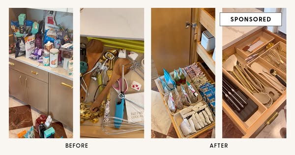
# Ad summary
The ad is a split screen of before and after shots of kitchen organization. The voice over focuses on what storage pieces are being used and where to buy them. It conveys organization and ease.
# Brand positioning
The brand, PureWow, is presented as a source for inspiration and practical solutions for home organization and lifestyle improvements. It is conveyed in the ad as a brand that understands the needs of families and aims to provide accessible and effective ways to create well-organized spaces. The brand's focus is on functional organization.
# Product
The ad showcases kitchen organizers. The first product is a shelf riser for holding bowls and plates. The second product is an in-drawer silverware organizer. The ad focuses on the practical aspects of each product, showcasing how they can maximize space and improve the functionality of kitchen drawers and shelves. Both products address the purchase barrier of clutter and disorganization by showing the ease of use and the resulting neatness they provide. The silverware organizer is for anyone who wants a more organized and efficient utensil drawer.
# Visual style
The ad has a polished commercial aesthetic with smooth transitions and clear visuals. The production quality is high-end, and the pacing is consistent throughout the ad with static shots and minimal camera movement. The audio-visual sync is timed to the voiceover.
# Benefits
- [object Object]
- [object Object]
# Features
- [object Object]
- [object Object]
# Call to action
Click below
# Point of view
- [object Object]
# Storyline
- 00:00–00:03 The ad shows the unorganized state of the kitchen before showcasing how organizers can improve the space.
- 00:03–00:15 A woman explains what the kitchen organizers are and the improvement they can make to the kitchen space.