Printfresh runs 191 active ads on Meta, shipping ~107 new creatives per week. Their library leans on Headline32%, Try-On17%, and Demo5%. Recently, printfresh is going hard on coastal and nautical prints (lighthouses, seashells, lobsters) with hyper-targeted messaging that speaks directly to specific lifestyle affinities like "lighthouse lovers" or "people from Maine," positioning their pajamas as identity statements rather than just sleepwear. They're mixing this print-specific targeting with UGC testimonials emphasizing product quality (softness, durability, color retention) and sprinkling in newer patterns like tennis and mah jongg to test additional niche audiences. The through-line is extreme specificity: matching prints to micro-communities and letting the patterns themselves become the personality-driven selling point.
# Ad summary
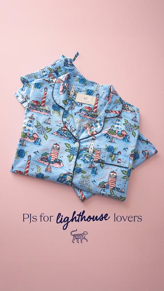
This image ad features a set of pajamas with a lighthouse and ocean themed print on a solid pink background. The headline indicates that the pajamas are for "lighthouse lovers."
# Brand positioning
The brand appears to focus on creating niche, high-quality products for people who have particular interests. The use of a jaguar-like animal as the brand's logo implies an association with luxury and style. This suggests a brand that is focused on creating unique and well-made products that cater to specific tastes and interests.
# Product
The product featured in this ad is a matching pajama set. The pajamas have a button-down shirt with a collar and chest pocket and come with matching bottoms. The pajamas are made from a light blue fabric with a detailed print of lighthouses, islands, boats, and hydrangea-like flowers, all in various shades of blue, pink, white, and green. The pajamas are designed for people who love lighthouses or nautical themes, offering a comfortable and stylish way to express their interest.
# Visual style
The ad has a clean, bright, and inviting visual style. The lighting is soft and even, highlighting the details of the pajamas and creating a sense of comfort. The color palette is soft and pastel, giving the ad a feminine and cozy feel. The product is flat-layed on a pink background.
# Hooks
Headline: PJs for lighthouse lovers
# Benefits
- [object Object]
- [object Object]
- [object Object]
# Features
- [object Object]
- [object Object]
- [object Object]
- [object Object]
- [object Object]
- [object Object]
- [object Object]
# Call to action
None used.
# Point of view
- [object Object]
- [object Object]
# Storyline
- The ad opens by showcasing the pajama set, immediately drawing attention to its unique design and print. This aims to capture the viewer's attention by highlighting the product's aesthetic appeal from the brand's POV.
- The ad copy, "PJs for lighthouse lovers", is used to speak directly to a specific audience, creating an immediate connection with those who have an interest in lighthouses. This is done in the brand's voice to clearly define who the product is intended for and to foster a sense of community among potential customers.
- The brand's logo, a stylized jaguar-like animal, is included to subtly reinforce brand recognition and associate the product with the brand's image of style and exclusivity. This serves as a visual reminder of the brand's identity and positions the pajamas as a product within their broader collection from the brand's POV.
# Ad summary
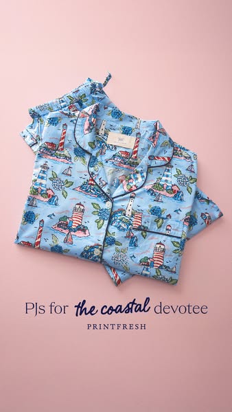
This image ad showcases pajamas with a coastal themed print. The pajamas are folded on a pink surface, and the ad is targeted to people who love the coast.
# Brand positioning
Printfresh is presented as a brand offering pajamas. The pajamas are presented in a visually appealing way, highlighting the quality of the fabric and the unique designs. Printfresh aims to occupy a space in the consumer's mind as a provider of high-quality, stylish, and comfortable sleepwear. The brand aligns with values of comfort, relaxation, and a love for unique prints.
# Product
The product being advertised is a set of pajamas. They feature a button-down top and coordinating bottoms. The pajamas are made from a soft-looking fabric and are decorated with a detailed coastal print featuring lighthouses, islands, sailboats and blue hydrangea flowers. The pajamas have black piping on the collar, sleeves, and button closure. The ad suggests that these pajamas are for anyone who loves the coast and appreciates quality sleepwear.
# Visual style
The ad has a clean, polished, and inviting aesthetic. The production quality looks high, and the image is well-lit and styled. The product is the primary focus, and the background is simple to avoid distractions. The overall visual style is consistent with a lifestyle or fashion brand, and it is designed to appeal to a target audience interested in comfort, quality, and unique design.
# Hooks
Headline: PJs for the coastal devotee
# Benefits
- [object Object]
- [object Object]
# Features
- [object Object]
- [object Object]
# Call to action
None used.
# Point of view
- [object Object]
# Storyline
- From the brand's perspective, the pajamas are presented in a visually appealing way to highlight the quality of the fabric and the unique design. This is intended to capture the viewer's attention and create an immediate desire for the product.
- The copy "PJs for the coastal devotee" reinforces the theme and is intended to resonate with the target audience. This copy is from the brand's perspective.
# Ad summary
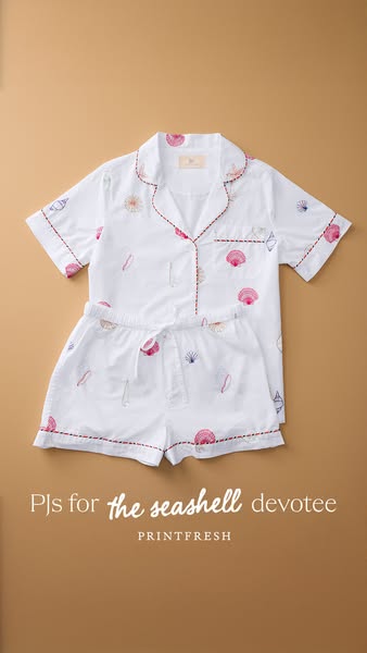
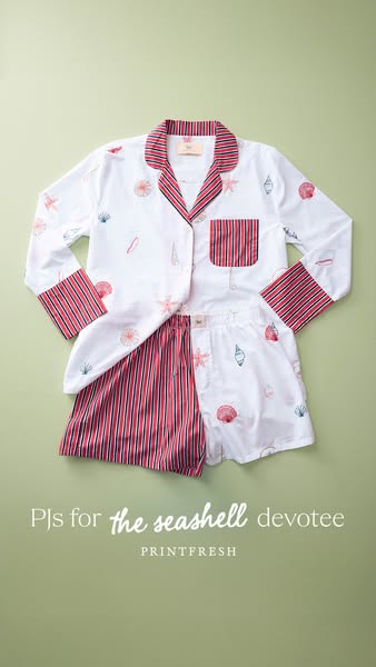
This image ad showcases a set of white pajamas with a seashell pattern. The ad targets individuals who love the beach and are seashell enthusiasts.
# Brand positioning
Printfresh is presented as a brand that focuses on creating unique and delightful sleepwear for individuals with specific interests, as highlighted by the phrase "the seashell devotee". The brand aims to occupy a space in the consumer's mind as a provider of high-quality, themed pajamas that allow customers to express their love for a particular hobby or aesthetic, making sleepwear more personal and enjoyable. Printfresh stands out from category norms by creating unique themed pajama sets.
# Product
The product featured is a set of white cotton pajamas adorned with seashell designs. The set includes a short-sleeved, button-down top and matching shorts. The edges of the sleeves, collar, placket, pocket, and hem of the shorts are trimmed with a dark pink stitching. Each piece is patterned with illustrations of various seashells in shades of pink, beige, and navy. The pajama set appears to be designed for comfortable sleepwear, while also allowing customers to express their interest in seashells. The focus is on the unique design of the pajamas, making them a standout choice for those who appreciate seashell-themed items.
# Visual style
The ad has a clean and simple visual style. The product is well-lit and centered on a neutral background. The shot is high quality, which suggests professional studio photography. The overall effect is calming and appealing.
# Hooks
Headline: PJs for the seashell devotee
# Call to action
None used.
# Point of view
- [object Object]
# Storyline
- The ad presents a set of seashell-themed pajamas. This aims to capture the attention of customers who are fond of the beach or seashell collecting. The image conveys this information from the brand's perspective.
# Ad summary
An image ad showcasing a set of Printfresh brand women's pajamas, styled as a flat lay and designed for people who are devotees of seashells.
# Brand positioning
Printfresh is presented as a brand that offers unique pajama designs that feature original prints. The ad highlights the brand’s ability to cater to specific interests with its seashell-themed PJs. The brand appeals to individuals who appreciate creativity, comfort, and a personalized touch in their sleepwear.
# Product
The product being advertised is a set of women's pajamas. The set includes a long-sleeve, button-down top and shorts. The top is white with red and navy vertical stripes on the collar, sleeve cuffs, and pocket, and is patterned with seashell images in red, pink, and navy. The shorts are partially visible and have a matching seashell and stripe pattern. The focus of the ad is to showcase the unique seashell pattern. The copy suggests that the product is for individuals who have a love or devotion for seashells. The product is presented as something special for seashell enthusiasts.
# Visual style
The ad features a clean and bright aesthetic with a product-focused flat lay and is likely studio-shot. The lighting is even and soft, emphasizing the pajama set's details and colors. The overall look is intended to be visually appealing and scannable for social media feeds.
# Hooks
Headline: PJs for the seashell devotee
# Call to action
None used.
# Point of view
- [object Object]
- [object Object]
# Storyline
- The ad showcases a neatly laid-out pajama set, including a button-down shirt and shorts. This is intended to visually present the product's design and overall aesthetic. The perspective is from a brand point of view, highlighting the key elements of the pajama set.
- The text indicates that the PJs are for the "seashell devotee." The brand is explicitly speaking to its potential customer.
# Ad summary
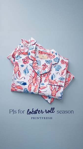
This Printfresh ad features a pair of pajamas with a lobster and seashell pattern laid against a solid background. The ad highlights the pajamas as being perfect for lobster roll season.
# Brand positioning
Printfresh is presented as a brand that embraces whimsy and seasonal themes within their product designs, suggesting a playful yet sophisticated aesthetic. The brand seems to offer a touch of luxury through its sleepwear, positioning itself as a provider of unique and high-quality items for those who appreciate comfort and style. It carves out a niche by associating its products with specific seasonal experiences, implying that customers can express their personality and celebrate special moments through their choice of apparel.
# Product
The featured product is a set of women's pajamas, adorned with a charming lobster and seashell print. These pajamas are designed with a classic button-down top and coordinating bottoms, creating a traditional yet stylish sleepwear ensemble. The choice of a lobster and seashell motif suggests a playful nod to summertime and coastal living. The pajamas appear to be made from a soft, comfortable fabric, implying a focus on relaxation and quality sleep. They are intended for women who appreciate unique designs and seek comfortable sleepwear that reflects their personal style and love for seasonal themes.
# Visual style
The ad has a clean and inviting visual style, using a flat lay shot against a solid-colored background to focus attention on the product. The lighting is soft and even, creating a gentle, appealing look. The overall aesthetic is simple and uncluttered, which allows the whimsical lobster and seashell print to stand out.
# Hooks
Headline: PJs for lobster roll season
# Call to action
None used.
# Point of view
- [object Object]
# Storyline
- The image begins with a neatly folded set of pajamas featuring a distinct lobster and seashell pattern. This immediately conveys the main product offering and its unique design, shown from the brand's perspective to highlight the aesthetic appeal of the pajamas and draw viewers in with its playful pattern.
- The ad then incorporates the text, “PJs for lobster roll season” along with the brand name "Printfresh". The brand is framing the pajamas as the perfect sleepwear for a particular time of year, inviting viewers to associate the product with a specific, enjoyable experience that is clearly coming from the brand itself.
# Ad summary
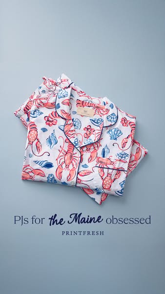
This image ad features a folded set of Printfresh pajamas with a lobster and seashell print. The ad is targeted to people from Maine or people who like Maine.
# Brand positioning
Printfresh is presented as a purveyor of high-end pajamas with unique prints. Their brand ethos seems to focus on comfort and personal expression through distinctive designs. The brand appears to cater to individuals who appreciate a blend of whimsy and luxury in their sleepwear, setting themselves apart from competitors by offering distinctive, artistic patterns that reflect personal interests and passions.
# Product
The featured product is a pajama set with a print pattern of lobsters, seashells, and other sea-themed imagery. The pajamas are white with the printed images in shades of coral and blue. The pajama set consists of a button-down, collared top with chest pocket and a pair of matching bottoms. The top and bottoms are both piped with navy blue along the edges. This sleepwear is designed for comfort and personal expression, targeting those who enjoy unique and playful patterns. The ad emphasizes the brand's ability to cater to specific interests.
# Visual style
The ad features a clean, minimalistic visual style, emphasizing the product against a solid backdrop. The high-quality, studio-shot image and soft lighting contribute to a polished aesthetic. The text is integrated seamlessly to enhance the visual appeal and communicate the ad's message clearly. The ad leverages a flatlay visual motif to give the viewer a clear, unobstructed look at the product.
# Hooks
Headline: PJs for the Maine obsessed
# Benefits
- [object Object]
# Features
- [object Object]
- [object Object]
# Call to action
None used.
# Point of view
- [object Object]
# Storyline
- The image shows a pajama set in a clear, direct visual of the product. The intention is to immediately showcase the sleepwear's unique design and quality from the brand's perspective.
- The text "PJs for the Maine obsessed" is designed to appeal to customers who are from Maine or who are passionate about Maine. The brand's perspective here is highlighting its ability to cater to niche interests, offering a product that resonates with a specific identity or passion.
- The Printfresh logo reinforces brand recognition. This is the brand's perspective and intends to ensure that the target audience knows exactly who is selling this product.
# Ad summary
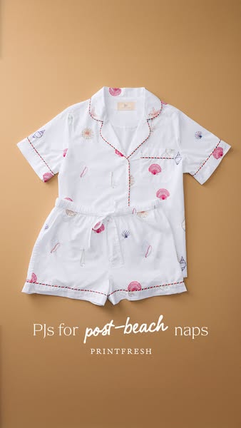
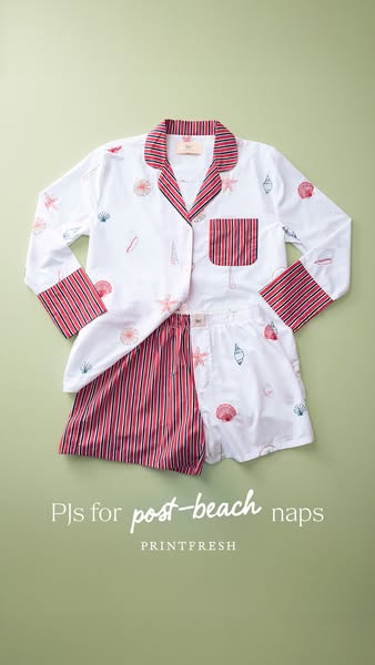
This image ad features a set of pajamas with a beach theme. It calls out that the pajamas are perfect for post-beach naps.
# Brand positioning
PRINTFRESH is presented as a brand that offers comfortable, high-quality sleepwear that fits seamlessly into a relaxed lifestyle. The brand is positioning itself as a provider of pajamas for leisure, rest, and comfort, particularly after engaging in activities like going to the beach. The brand distinguishes itself by focusing on specific use cases, such as 'post-beach naps,' which suggests a relaxed and leisurely lifestyle, contrary to the fast-paced nature of many competitor brands.
# Product
The product being advertised is a set of matching pajamas, featuring a short-sleeved top and shorts. The pajamas are white with a pattern of seashells and sailboats in shades of pink and blue. The seams of the pajamas have a red trim. The pajama set is designed for comfort and relaxation, explicitly intended for 'post-beach naps'. The implied selling point is that these pajamas are a comfortable and stylish choice for winding down after a day at the beach, suggesting a blend of leisure and thoughtful design.
# Visual style
The ad has a clean and polished aesthetic with a focus on showcasing the product in a straightforward manner. The production quality appears to be studio-shot. The image treatment includes even lighting and background removal to make the pajamas the focal point. The typography is simple and legible, complementing the product without being distracting. The style is designed to be scannable in-feed, using a clear and direct visual presentation to quickly convey the product and its purpose.
# Hooks
Headline: PJs for post-beach naps
# Benefits
- [object Object]
- [object Object]
# Features
- [object Object]
- [object Object]
# Call to action
None used.
# Point of view
- [object Object]
# Storyline
- The ad displays a neatly arranged pajama set to visually introduce the product to the viewer. The intent is to showcase the pajama set’s design and overall aesthetic. This is presented from the brand's perspective, aiming to immediately capture attention and convey the product's visual appeal.
- The ad includes the text 'PJs for post-beach naps,' which positions the product as a solution for relaxation after beach activities. The brand is telling the viewer when the pajamas are most useful, highlighting the specific use case and benefits. This message is designed to resonate with people who enjoy beach outings and value comfort.
- The ad also displays the brand name 'PRINTFRESH' below the text to identify the brand. The brand intends to clearly show what product they are selling. This is delivered from the brand’s perspective and functions to ensure brand recognition.
# Ad summary
Image ad for Printfresh PJs for "post-beach naps."
# Brand positioning
Printfresh is presented as a premium brand for sleepwear that emphasizes both style and comfort. The brand uses beach-themed designs that evoke a sense of relaxation and vacation. The brand positions itself as providing the perfect loungewear for leisurely moments, specifically tailored for post-beach relaxation.
# Product
The featured product is a set of PJs designed for relaxation after time at the beach. The set includes a long-sleeved, button-up top and boxer-style shorts. The pajamas are made from a lightweight, white fabric patterned with colorful seashell and starfish illustrations. The trim on the collar, cuffs, pocket, and partially exposed short is a red and white pinstripe, adding a nautical touch. The product is presented as ideal for comfortable and stylish lounging, perfectly suited for leisurely moments following a beach visit.
# Visual style
The ad has a clean and polished aesthetic, suggesting high production quality with well-balanced lighting and a simple background. The visual motif is a flat lay style, with the pajama set neatly arranged to showcase its design. The image treatment includes soft lighting and color grading to create a calming and inviting atmosphere. The overall style is designed to be easily scannable and attention-grabbing in a social media feed.
# Hooks
Headline: PJs for post-beach naps
# Benefits
- [object Object]
# Features
- [object Object]
# Call to action
None used.
# Point of view
- [object Object]
# Storyline
- The ad opens by presenting a stylish pajama set, showcasing its design and suitability for relaxed moments. The intention is to visually communicate the brand's focus on comfort and style. The audience is viewing the product through the brand's lens, emphasizing its aesthetic appeal.
- The ad uses the headline "PJs for post-beach naps" to specifically target a moment of relaxation after a beach visit. This line is intended to resonate with individuals who enjoy leisurely beach outings and appreciate comfortable loungewear. The viewer is experiencing the brand's message that positions the product as ideal for beach-related relaxation.
- The ad concludes by displaying the brand name PRINTFRESH, reinforcing brand recognition and trust. The intention is to leave a lasting impression of the brand. This element is presented from the brand's perspective, ensuring the audience remembers the source of the advertised product.
# Ad summary
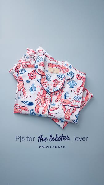
This ad features an overhead, flat lay shot of Printfresh pajamas, patterned with lobsters and seashells on a blue background. The ad is targeted toward people who love lobsters.
# Brand positioning
Printfresh is presented as a brand that values unique and playful designs, offering an escape from conventional sleepwear. The brand seemingly occupies a niche in the market for people who appreciate whimsical and personalized touches in their everyday lives. This is a brand that pushes against the generic offerings of the sleepwear category by providing artistic patterns. Printfresh offers emotionally-driven purchasing decisions through fun designs.
# Product
The featured product is a set of Printfresh pajamas. The pajamas consist of a collared, button-down top and coordinating bottoms, both made from a lightweight fabric. The sleepwear features a white base color adorned with a repeating pattern of illustrated lobsters and seashells. The design is executed in a hand-drawn style, with the lobsters rendered in a vibrant coral hue and the seashells in shades of blue. The overall impression is one of comfort, style, and a playful attention to detail. The USPs are the unique pattern and the high-quality construction. These pajamas are an invitation to indulge in moments of leisure and self-expression.
# Visual style
The ad features a clean and modern visual aesthetic, with a focus on showcasing the product in a visually appealing way. The image is well-lit and professionally shot, with attention to detail in the styling and composition. The flat lay arrangement and solid background create a sense of order and simplicity, allowing the product's unique design to take center stage.
# Hooks
Headline: PJs for the lobster lover
# Benefits
- [object Object]
# Features
- [object Object]
# Call to action
None used.
# Point of view
- [object Object]
# Storyline
- The ad opens with a visually appealing flat lay showcasing a set of Printfresh pajamas, emphasizing the brand's unique pattern and quality. The goal is to immediately capture the viewer's attention and communicate the product's aesthetic value from the brand's perspective. This sets the stage for highlighting the product's unique features and benefits, creating a sense of desire and aspiration in the viewer.
- The narrative progresses with a clear and concise headline, "PJs for the lobster lover," which communicates the product's key selling point and target audience. This message clarifies the product's appeal to people with a specific interest, emphasizing its niche value and creating a sense of connection from the brand's point of view. It helps viewers quickly understand the product's unique proposition and relevance to their personal taste.
- The storyline concludes with the presentation of the brand name, "PRINTFRESH," reinforcing brand recognition and establishing trust. This message aims to instill confidence and familiarity in the viewer, encouraging them to explore the brand's other offerings and build a long-term relationship from the brand's perspective. It creates a sense of credibility and legitimacy around the product, making it more appealing to potential customers.
# Ad summary
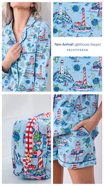
This image ad features a woman modeling light blue pajamas with a lighthouse print. The ad also highlights a matching travel bag with the same print.
# Brand positioning
PRINTFRESH is presented as a brand that prioritizes unique and whimsical designs within the sleepwear category. The brand's alignment with leisure and relaxation positions it as an advocate for comfortable and stylish downtime. By featuring eye-catching patterns and coordinating accessories, PRINTFRESH differentiates itself by offering a more curated and visually appealing sleepwear experience. The brand leverages an emotional approach by focusing on how its products can enhance personal comfort and enjoyment.
# Product
The advertised product is a matching pajama set and travel bag, both featuring a whimsical "Lighthouse Keeper" print on a light blue background. The pajama set consists of a button-down, collared top with black piping along the edges and matching shorts with an elastic waistband. The travel bag is a cube-shaped, quilted duffel with a red-and-white checkered zipper. The ad highlights the unique design and matching set concept as reasons to purchase.
# Visual style
The ad uses a clean, bright aesthetic with a focus on showcasing the product's design. The production quality appears to be studio-shot with soft, diffused lighting to highlight the fabric and pattern details. The image is arranged in a grid layout, creating a balanced and easily scannable composition. The styling and color palette evoke a sense of calm and leisure.
# Hooks
Headline: New Arrival Lighthouse Keeper
# Call to action
None used.
# Point of view
- [object Object]
# Storyline
- The ad opens with a shot of a woman wearing the lighthouse-print pajama top, subtly showcasing the design and fit. This piques interest by illustrating the garment on a real person.
- The creative cuts to a close-up of the fabric print, reinforcing the unique design and attention to detail. This serves to emphasize the visual appeal of the sleepwear.
- The brand showcases the coordinating travel bag. This expands the product line concept and suggests a cohesive, stylish travel set.
- The ad concludes with a full view of the pajama shorts being worn, demonstrating the entire set and highlighting its comfort and style. This encourages purchase by showing a complete, wearable look.
# Ad summary
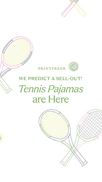
This image ad from Printfresh promotes their new tennis-themed pajamas. The ad features a white background with graphic tennis rackets and text encouraging customers to buy the pajamas quickly.
# Brand positioning
Printfresh is presented as a brand that specializes in pajamas with unique and eye-catching designs. The ad utilizes a fun, sporty tennis theme. The brand's positioning seems to lean towards playful and stylish sleepwear that sets it apart from more traditional or basic pajama options. The brand logo in the ad shows a tennis ball design, which reinforces this playful and unique brand identity.
# Product
The ad promotes Printfresh's new tennis-themed pajamas. These pajamas are presented as a limited-edition product, as suggested by the line “We predict a sell-out!”. The design features a tennis racket motif, indicating a playful and sporty theme. While the specific material and style details aren't explicitly stated, the ad focuses on the unique design as a key selling point, appealing to customers looking for something different and trendy in their sleepwear.
# Visual style
The ad has a clean and playful visual style. The white background and pastel-colored graphics give it a fresh, modern look. The design is simple and uncluttered, which makes it easily scannable. The tennis racket graphics add a fun, sporty touch that is likely to appeal to the target audience. The overall style feels designed to be eye-catching and engaging, which enhances its stop power in the feed.
# Hooks
Headline: WE PREDICT A SELL-OUT!
# Call to action
None used.
# Point of view
- [object Object]
# Storyline
- The ad opens by immediately grabbing attention with the line “WE PREDICT A SELL-OUT!”, which is conveyed from the brand's perspective, and aims to create a sense of urgency and exclusivity around the product.
- Next, the ad introduces the product by stating, “Tennis Pajamas are Here”, from the brand's perspective, informing customers that Printfresh is releasing new pajamas with a tennis theme, which is intended to pique the interest of people who love tennis.
# Ad summary
A blonde woman shows off three different sets of short pajama sets in different prints and colors.
# Brand positioning
This ad presents a brand that focuses on fun and unique prints for their pajama sets. The ad promotes a brand that has a light-hearted, whimsical lifestyle with a focus on comfort and individuality. The brand pushes against the norm of plain and generic sleepwear, offering pajama sets with unique prints and designs that appeal to those who want to express their personality, even when lounging at home.
# Product
The ad features pajama sets that consist of a button-down, short-sleeved top and matching shorts. The pajama sets come in a variety of colors and prints. One set has a white background with pink, blue, and green hydrangea flowers. The second pajama set has a light green background with a print of dogs and cats playing mahjong. These pajama sets are designed for comfort and are perfect for spring.
# Visual style
The ad has a bright and airy aesthetic. The production quality is polished, giving the ad a clean and professional feel. The editing style uses quick cuts to transition between different pajama sets. The pacing is consistent throughout the ad.
# Benefits
- [object Object]
- [object Object]
# Features
- [object Object]
- [object Object]
# Call to action
You've got to shop some of these
# Point of view
- [object Object]
# Storyline
- 00:00–00:06 A woman is showing off her hydrangea pajama set.
- 00:06–00:14 She shows off another pajama set, this one with dogs playing mahjong. She thinks they are perfect and she is obsessed.
# Ad summary
The ad features a woman in her bedroom showcasing a pair of Printfresh brand pajamas. She shares her initial hesitations about needing them, but then affirms that she absolutely needed the pajamas, calling them her personality. She explains that they get softer each wash, hold up well, and the colors don't fade.
# Brand positioning
Printfresh is presented as a brand that offers unique, comfortable, and durable pajamas that become softer with each wash. The brand aligns with a lifestyle that values self-care and treating oneself to everyday luxuries. The brand differentiates itself by providing pajamas that are not only stylish but also maintain their quality and color over time, pushing against the norm of fast-fashion sleepwear that quickly fades or deteriorates. The brand positioning leans towards the emotional benefit of feeling good and expressing one's personality through what one wears to bed.
# Product
The featured product is a set of Printfresh brand pajamas, specifically a button-down top and pants, adorned with a unique design featuring hydrangeas and lovebirds on a white background. The pajamas are presented as a 'treat yourself' item, implying a sense of luxury and comfort. The pajama material is highlighted for its quality, becoming softer with each wash while maintaining color and overall integrity. The product is presented as being for someone who appreciates quality sleepwear that reflects their personality.
# Visual style
The ad has a natural, unfiltered aesthetic, resembling user-generated content (UGC). The editing style includes straightforward cuts between shots, maintaining a casual and personal feel. The production quality is simple and unpolished, which aligns with the authentic tone of the ad. The pacing is consistent and conversational, with cuts timed to emphasize key points in the dialogue.
# Benefits
- [object Object]
- [object Object]
- [object Object]
- [object Object]
- [object Object]
# Features
- [object Object]
- [object Object]
- [object Object]
- [object Object]
# Call to action
None used.
# Point of view
- [object Object]
# Storyline
- 00:00–00:02 The woman starts by sharing her initial doubts about needing the pajamas.
- 00:02–00:11 She reveals that after receiving them, she realized she absolutely needed them.
- 00:11–00:15 She calls the pajamas her personality and describes them as a 'treat yourself' item, suggesting a purchase based on self-care and indulgence.
- 00:15–00:19 She shows a close-up of the pajama pattern, highlighting the hydrangeas and lovebirds design.
- 00:20–00:28 The woman shares that the pajamas get softer with each wash and maintain their color and quality.
- 00:28–00:31 She reiterates that they are worth the investment and encourages viewers to treat themselves.
# Ad summary
A woman sitting in her home is excited to receive pajama sets and expresses that they are the cutest things she's ever seen.
# Brand positioning
Printfresh is presented as a brand that focuses on making cute, soft pajama sets. The brand seems to focus on emotional positioning by having a unique focus on being a pajama set that makes the customer feel cute.
# Product
Printfresh pajama sets are marketed as being very soft and cute. The ad showcases two sets in particular: One set has a tan background, short sleeves, button-up top, pants, and a pattern that includes leopards and various floral elements. The second set is a bright pink color with a pattern of roses and floral elements.
# Visual style
The ad uses a natural aesthetic, featuring natural lighting and a static camera.
# Benefits
- [object Object]
# Features
- [object Object]
- [object Object]
# Call to action
None used.
# Point of view
- [object Object]
# Storyline
- 00:00–00:09 A woman shows a pajama set she has recently received.
- 00:09–00:17 She continues to describe the pajama sets, stating that they are softer than she thought, and that she is going to put them on tonight.
- 00:17–00:21 She shows the second pajama set.
- 00:21–00:24 She shows both sets in the box and describes them as the cutest things she's ever seen.
# Ad summary
A blonde-haired woman showcases two sets of pajamas from the brand Dondolo. She wears each set while standing in front of a mirror, exclaiming how obsessed she is with them. She recommends the pajamas for spring.
# Brand positioning
Dondolo is a brand that provides pajama sets. Based on the imagery shown in the ad, the brand has a fun and unique brand identity with multiple patterns and styles. The brand's visual style is traditional and the fabrics are high-quality. The brand follows category norms of offering pajamas but pushes against the norm of solid patterns by creating pajamas with unique patterns.
# Product
Dondolo provides colorful pajama sets. The pajama sets are made for women based on the size and fit. The sets shown are a matching top and bottom. The first set of pajamas feature a hydrangea pattern, matching the creator's phone case. The second set of pajamas features a mint-green mahjong pattern that includes the creator's golden-retriever puppy.
# Visual style
The ad's aesthetic is polished and vibrant, with a focus on showcasing the product in a bright, home environment. The editing is quick and snappy. The overall tone is enthusiastic and cheerful, reflecting the presenter's excitement about the pajamas. There is an amateur aesthetic given the casual presentation and location.
# Benefits
- [object Object]
- [object Object]
# Features
- [object Object]
- [object Object]
# Call to action
You've got to shop some of these.
# Point of view
- [object Object]
# Storyline
- 00:00–00:03 The video begins with the creator standing in front of a mirror, modeling a pajama set.
- 00:03–00:08 The creator tells the audience that she has been waiting for a package to arrive that includes two pajama sets that are so her.
- 00:08–00:12 The creator is now wearing the hydrangea pajama set in front of a mirror. She points to her phone case and tells the audience how much she loves hydrangeas.
- 00:12–00:22 The creator is now wearing the mahjong pajama set in front of the mirror. She says she is obsessed with these, and points out how her dog, Sunny, is on the shirt, playing mahjong.
- 00:22–00:27 The creator then tells the audience that they have to shop the pajamas for spring and says she is obsessed.
# Ad summary
This ad showcases a woman wearing a floral pajama set, highlighting its design for those who love hydrangeas. The ad uses upbeat music and a simple visual presentation to appeal to people who enjoy comfortable and stylish sleepwear.
# Brand positioning
The brand is positioned as creating clothing for individuals with specific interests and passions, as demonstrated by the pajama set designed for those who love hydrangeas. The brand seems to focus on niche interests to create a sense of exclusivity and personalization. It aligns with a lifestyle that values comfort, style, and expressing individual interests through clothing. The brand appears to ignore the standard industry focus on broad appeal, instead catering to specific aesthetic preferences. The brand's positioning is emotional, focusing on personal interests and aesthetic preferences.
# Product
The product is a pajama set featuring a floral design, specifically hydrangeas, catering to people who are obsessed with this particular flower. The set includes a collared, short-sleeved button-down top and matching shorts. The fabric appears lightweight and comfortable. The pajamas are designed for anyone who wants to showcase their love for hydrangeas through their sleepwear.
# Visual style
The ad has a simple, natural aesthetic, resembling user-generated content. It uses natural lighting and a handheld camera style. The editing is minimal, with static shots and smooth transitions. The production quality is consistent with content found on social media. The pacing is slow and relaxed, which aligns with the theme of comfort and sleepwear.
# Benefits
- [object Object]
- [object Object]
# Features
- [object Object]
- [object Object]
# Call to action
None used.
# Point of view
- [object Object]
# Storyline
- 00:00–00:05 The ad opens with a woman showing off a pajama set with a hydrangea floral pattern.
# Ad summary
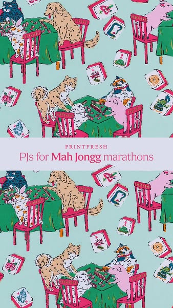
This image ad features a repeating print design of cats, dogs, and pigs playing Mah Jongg on a light blue background. The ad promotes Printfresh PJs.
# Brand positioning
Printfresh is presented as a brand that values playful and unique designs, especially in the realm of sleepwear. Their brand ethos seems to center on injecting fun and personality into everyday items, suggesting they aim to occupy a space in the consumer's mind as a source of creatively designed, comfortable pajamas. Printfresh stands out by using whimsical, detailed patterns that diverge from typical sleepwear designs. This positioning is likely an emotional one, appealing to customers who want to express themselves through their clothing, even in the comfort of their homes.
# Product
The advertised product is a set of Printfresh pajamas, implied to be comfortable enough to wear during long Mah Jongg playing sessions. While the specific cut or style of the PJs isn't visible, the focus is on the unique and playful print design. The ad copy and visuals suggest these pajamas are for individuals who enjoy Mah Jongg or other similar activities. The ad implies a connection between the pajamas and leisurely, extended periods of play, suggesting that they are designed for comfort and relaxation during downtime. The unique selling proposition (USP) is clearly the custom print design. The print is the main draw, suggesting that the product is intended for people who appreciate originality and humor in their sleepwear.
# Visual style
The ad has a whimsical and playful aesthetic. The illustration style gives it a hand-drawn feel. The flat, repeating pattern resembles wallpaper. There are bright colors used for the animals, chairs, and tables against a light blue background.
# Hooks
Headline: PJs for Mah Jongg marathons
# Benefits
- [object Object]
- [object Object]
# Features
- [object Object]
# Call to action
None used.
# Point of view
- [object Object]
# Storyline
- The image presents a repeating pattern featuring various animals—cats, dogs, and pigs—seated at Mah Jongg tables with tiles scattered about. This is intended to showcase the unique and playful design that the brand offers. The audience experiences this from the brand's perspective, highlighting the distinct aesthetic of Printfresh's products.
- The design includes Mah Jongg tiles scattered around the animals and tables. This is meant to suggest the playful and leisurely activity the PJs are designed for. The brand is setting a scene that captures the essence of relaxation and entertainment, which is visually communicated through the design.
- The words "PRINTFRESH PJs for Mah Jongg marathons" overlay the image. This serves to explicitly state what the product is and the activity it complements. The brand is directly addressing the viewer, making it clear that the PJs are suitable for long hours of Mah Jongg. This furthers the overall theme and ties the product to a specific, niche activity.
# Ad summary
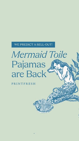
This image advertises the return of Printfresh's Mermaid Toile Pajamas and uses a mermaid illustration to support the product.
# Brand positioning
Printfresh is presented as a brand that offers unique and whimsical pajama designs. The brand is positioned as one that leans into artistic and eye-catching designs, as demonstrated by the mention of the "Mermaid Toile" pattern, suggesting that the brand values creativity and aims to provide customers with sleepwear that stands out from the ordinary.
# Product
The product being advertised is Printfresh's "Mermaid Toile Pajamas". These are pajamas featuring a unique mermaid-themed design, implying a whimsical and artistic aesthetic. The ad highlights that they are "Back", which means these pajamas are a returning product. This suggests a popular and well-loved design, increasing their appeal and urgency to purchase, implying high demand and potential sell-out.
# Visual style
The ad has a vintage and artistic visual style, using a toile-inspired design with a mermaid illustration on a light green background. The use of the illustration suggests a handcrafted and artisanal feel, while the minimalist layout gives it a clean, modern look.
# Hooks
Headline: Mermaid Toile Pajamas are Back
# Call to action
None used.
# Point of view
- [object Object]
# Storyline
- The ad starts by announcing, "WE PREDICT A SELL-OUT!", creating a sense of urgency and scarcity around the product. This is from the brand's perspective, trying to generate excitement and encourage immediate purchase.
- Then it introduces the main subject: "Mermaid Toile Pajamas are Back". The brand is announcing the return of a popular product. The brand uses the return as a draw.
- The illustration of a mermaid and sea shell is included next to the text to visually represent the "Mermaid Toile" design and add an artistic touch. This design element is being presented from the brand, adding a playful and thematic visual element to the ad.
# Ad summary
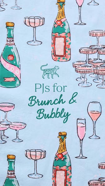
This image ad evokes a luxurious lifestyle by pairing pajamas with brunch and bubbly. The ad features a whimsical design with champagne bottles, champagne coupes, and an animal print, suggesting a playful yet elegant brand.
# Brand positioning
The brand is positioned as aligning with moments of leisure and celebration, specifically brunch and enjoying bubbly. The brand promotes a lifestyle that appreciates playful luxury, suggested by the combination of pajama comfort with champagne elegance. It seems to ignore the norms of overtly serious or formal luxury brands, opting instead for a more relaxed and whimsical approach.
# Product
The featured product appears to be pajamas, implied by the text "PJs for Brunch & Bubbly." These are likely designed for comfortable and stylish lounging, suitable for casual at-home gatherings or relaxed mornings. The fabric is patterned with champagne bottles and coupes, suggesting a fun and celebratory theme. The pajamas are positioned as an essential part of a luxurious yet relaxed brunch experience.
# Visual style
The ad has a whimsical, hand-drawn aesthetic that combines playful illustrations with a light, pastel color palette. The visual motifs include repeating patterns of champagne bottles, coupe glasses, and animal prints, creating a lighthearted yet luxurious feel. The typography is integrated seamlessly into the design, complementing the hand-drawn aesthetic. The style mimics an upscale fabric design.
# Hooks
Headline: PJs for Brunch & Bubbly
# Benefits
- [object Object]
# Features
- [object Object]
# Call to action
None used.
# Point of view
- [object Object]
# Storyline
- The ad invites the audience to consider the brand's pajamas as part of a leisurely lifestyle. The brand is telling this part of the story, aiming to associate its product with luxurious relaxation.
- The ad presents the idea of pairing pajamas with brunch and bubbly, a concept intended to evoke a sense of casual elegance and enjoyment. The brand is communicating this association, showing how its product fits into the audience's lifestyle.
# Ad summary
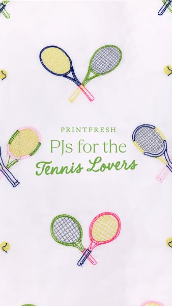
This ad features an image of an embroidered fabric. The image shows embroidered tennis rackets and tennis balls scattered across a white background. The brand name 'Printfresh' appears at the top center of the image, followed by the text 'PJs for the Tennis Lovers' in a green script font.
# Brand positioning
Printfresh is presented as a brand that offers unique, design-forward products that cater to specific interests and hobbies. The brand aims to occupy a space in the consumer's mind as a provider of niche-themed pajamas. By focusing on 'Tennis Lovers,' the brand aligns with a specific lifestyle and hobby. The brand promotes a playful and comfortable lifestyle, stepping away from the more generic or mass-market sleepwear options. The brand positioning is emotional, evoking a sense of belonging and connection to one's hobby through its product.
# Product
The featured product is a set of pajamas designed for tennis enthusiasts. These PJs are made from a white fabric with an embroidered pattern of tennis rackets and tennis balls. The design caters specifically to people who love tennis, creating a unique and themed sleepwear option. The product emphasizes comfort and personal expression through its hobby-related design. The ad directly addresses the desire for niche and personalized products, suggesting that these PJs are worth buying for their unique theme and comfort.
# Visual style
The ad has a clean, minimalist visual style with a focus on the product's embroidered design. The production quality appears high, with a focus on showcasing the fabric and its unique pattern. The visual motif is an all-over print, creating a cohesive and eye-catching design. The image treatment is simple, with a bright and even lighting that highlights the colors and details of the embroidery. The typography is clean and legible, with a script font adding a touch of personality.
# Hooks
Headline: PJs for the Tennis Lovers
# Benefits
- [object Object]
- [object Object]
# Features
- [object Object]
- [object Object]
# Call to action
None used.
# Point of view
- [object Object]
# Storyline
- The ad starts with a visual of an all-over print fabric that contains embroidered tennis rackets and tennis balls, which immediately grabs the attention of tennis enthusiasts and conveys the theme of the product. This is from the brand's perspective, showcasing their unique design.
- Next, the brand name 'Printfresh' is displayed above the text 'PJs for the Tennis Lovers' to identify the brand and the specific product offering, informing the audience what the ad is about. This is told from the brand's point of view, specifying who makes the product and what the product is.
How Other Apparel Brands Advertise on Meta
Peer brands in Motion's library — click any brand to see their creative strategy, live ads, and AI breakdowns.