
# Ad summary
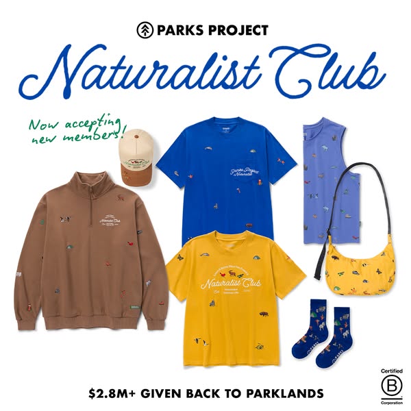
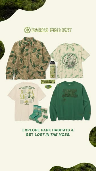
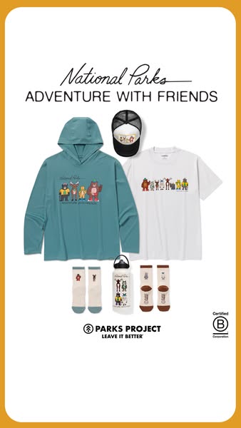
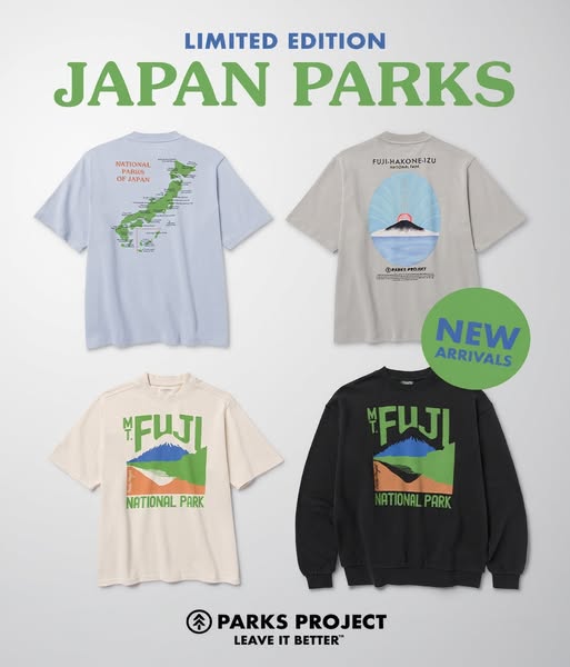
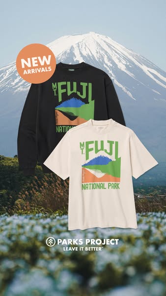
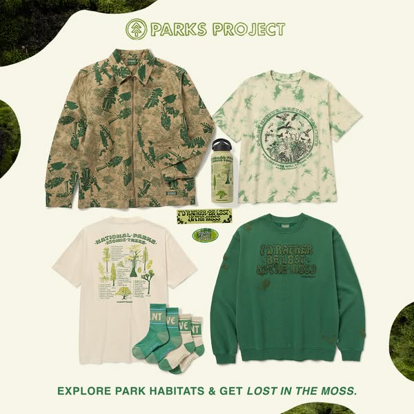
This image ad showcases a collection of clothing and accessories from Parks Project featuring designs that express an appreciation for nature. The displayed items include a jacket, a t-shirt with tie-dye effect, a t-shirt with illustrations of different kinds of trees, a sweatshirt, a water bottle and a pair of socks. The ad emphasizes a connection with nature.
# Brand positioning
Parks Project is presented as a brand that celebrates and promotes the appreciation of nature, particularly national parks. The brand seems to focus on consumers who love outdoor activities and are environmentally aware. By offering nature-inspired apparel and accessories, Parks Project likely aims to align with a lifestyle centered around environmental consciousness, exploration, and conservation. The brand appears to push against norms that disregard environmental responsibility and instead fosters a connection between consumerism and environmental care.
# Product
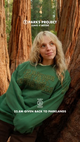
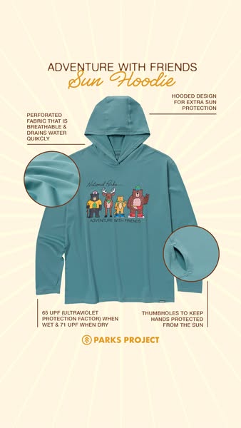
The ad features a variety of clothing and accessories: a zip-up jacket with a printed pattern of greenery, a tie-dye t-shirt with graphic print, a graphic t-shirt with an illustration of trees, a green sweatshirt with the phrase "I'D RATHER BE LOST IN THE MOSS," a metal water bottle with a greenery graphic, and a pair of socks. These products are targeted towards people who appreciate nature, the outdoors, and casual wear. The prints and designs on the clothing items, along with the water bottle, suggest a lifestyle of adventure and exploration.
# Visual style
The ad features a collage-style layout with a flatlay of clothing and accessories from Parks Project. The overall production quality is polished and well-lit, giving it a clean and professional look. The image treatment uses natural, muted colors, enhancing the earthy feel of the products. The typography is bold and modern, and the visual style is likely intended to be scannable and eye-catching, fitting well within an in-feed environment.
# Hooks
Headline: EXPLORE PARK HABITATS & GET LOST IN THE MOSS.
# Benefits
- [object Object]
- [object Object]
# Features
- [object Object]
# Call to action
None used.
# Point of view
- [object Object]
# Storyline
- The ad opens with a display of several Parks Project apparel items, aiming to capture the viewer's attention. From a brand perspective, it displays their nature-inspired merchandise.
- The collection of products is laid out against a neutral background with mossy accents on the sides, aiming to create an environment that relates to outdoor exploration. This comes from the brand perspective to reinforce the theme of nature and adventure.
- The ad ends with the tagline “EXPLORE PARK HABITATS & GET LOST IN THE MOSS,” summarizing the ad's theme. The tagline is from the brand's perspective, encouraging consumers to explore nature and connect with the brand.