Lonely Planet runs 40 active ads on Meta, shipping ~12 new creatives per week. Their library leans on Collage28%, Headline22%, and Post It9%. Recently, lonely planet is flooding their feed with hyper-specific travel planning books (hiking guides, bike rides, train journeys, beaches, birdwatching, family travel) positioned as tactical tools for niche trip types rather than destination guides. They're framing themselves as the solution for "how to travel" versus "where to go," with book products dominating over destination content, and they're leaning into lifestyle verticals and activity-based segmentation. The through-line is building lonely planet as a multi-format travel utility brand with a book for every possible trip intention, plus scattered partnerships (Tecno, Hurtigruten) that feel more opportunistic than strategic.
# Ad summary
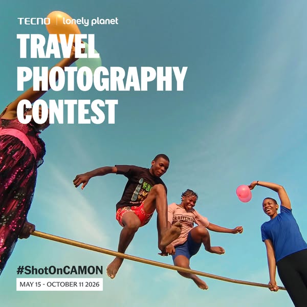
An ad for Tecno and Lonely Planet's Travel Photography Contest. It features four people leaping over a horizontal pole. The image is credited to Tecno's Camon phone. The ad invites submissions of travel photos taken with the phone.
# Brand positioning
Tecno is presented as a modern, global brand focused on mobile photography, particularly for travel and adventure. Tecno partners with Lonely Planet, suggesting a commitment to quality photography and travel experiences. By featuring the hashtag #ShotOnCAMON, Tecno encourages user-generated content and positions its Camon phone as a tool for capturing high-quality travel photos.
# Product
The advertised product is Tecno's Camon phone, emphasized through the hashtag #ShotOnCAMON. The phone is implicitly presented as having a high-quality camera capable of capturing dynamic travel moments. The ad doesn't explicitly state any features or specifications of the Camon phone, but it suggests that the camera is easy to use and produces shareable photos, as it invites people to submit their own photos taken with the phone. The implied USP is the ability to capture high-quality travel photos, positioning the phone as a must-have for travel enthusiasts. The ad is targeted to those who wish to capture travel photos, addressing the desire of travel photographers for high-quality cameras.
# Visual style
The ad has a vibrant and energetic visual style, with bright colors and an action shot to convey a sense of fun and adventure. The image is taken from a low angle, making the subjects appear dynamic against the bright blue sky. The composition is casual, giving it a user-generated content (UGC) feel, enhanced by the #ShotOnCAMON hashtag. The overall effect is meant to be eye-catching and inviting, with a platform-native look suitable for in-feed display.
# Hooks
Headline: TRAVEL PHOTOGRAPHY CONTEST
# Call to action
None used.
# Point of view
- [object Object]
- [object Object]
- [object Object]
# Storyline
- The image begins with the Tecno and Lonely Planet logos at the top, immediately establishing a partnership and lending credibility to the contest. This is being told from the brand's perspective, building trust and signaling a professional collaboration to viewers right from the start.
- The headline "TRAVEL PHOTOGRAPHY CONTEST" is displayed prominently. The brand is using a bold, clear announcement to directly inform the audience about the event, grabbing their attention with an opportunity to participate and win.
- The focus shifts to the action shot of four people jumping over a pole, emphasizing the dynamic capabilities of the Camon phone's camera. This moment gives the viewer the customer's perspective, highlighting the phone's ability to capture exciting, real-life travel moments and experiences.
- The hashtag #ShotOnCAMON is placed at the bottom, inviting users to associate the image quality with the Tecno Camon phone and share their own similar photos. This is from the brand's view, promoting the user-generated content and positioning the phone as the go-to device for travel photography.
- The date range 'MAY 15 - OCTOBER 11 2026' provides the timeline for the contest, adding a sense of urgency and giving people a clear deadline to participate. The brand is giving logistical details, framing it as an opportunity to engage and participate, thereby extending reach and user involvement.
# Ad summary
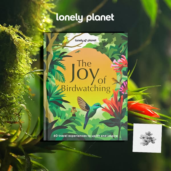
This ad promotes Lonely Planet's "The Joy of Birdwatching" book, highlighting its ability to inspire travel experiences. The visual setting is outdoors, surrounded by greenery.
# Brand positioning
Lonely Planet is positioned as a guide and source of inspiration for travel experiences. The brand aims to occupy the space of a trusted resource for both seasoned and novice travelers, offering curated experiences and insights to uplift and inspire. The brand promotes a lifestyle of adventure, exploration, and connection with nature. Positioning is functional, focusing on simplicity and accessibility, making travel planning easy and inspiring.
# Product
The advertised product is Lonely Planet's "The Joy of Birdwatching," a travel book designed to uplift and inspire travel experiences. It is targeted toward individuals interested in nature, birdwatching, and travel. The book appears to highlight 60 travel experiences. The ad conveys that the book is worth trying or buying to gain inspiration for travel, specifically related to birdwatching and nature exploration.
# Visual style
The ad has a natural and inviting visual style, with a focus on showcasing the book in an outdoor environment. The production quality appears to be high, with carefully arranged elements. The visual motif relies on a lush, green setting to emphasize the theme of nature and birdwatching. The image treatment uses natural lighting and colors to create an appealing image. The visual style appears to be native to in-feed, with a focus on visual appeal to capture attention.
# Hooks
Headline: None used
# Benefits
- [object Object]
# Features
- [object Object]
# Call to action
None used.
# Point of view
- [object Object]
- [object Object]
# Storyline
- The Lonely Planet brand is shown at the top, intending to present the source of the product. The brand is telling the audience who is providing the book.
- The book cover is displayed, intending to show the product's title and theme. The brand is telling the audience what kind of content the book contains.
- A line of text describing the book's content is shown at the bottom of the book cover, intending to further clarify what the book is about. The brand is further clarifying to the audience the benefit of purchasing the book.
# Ad summary
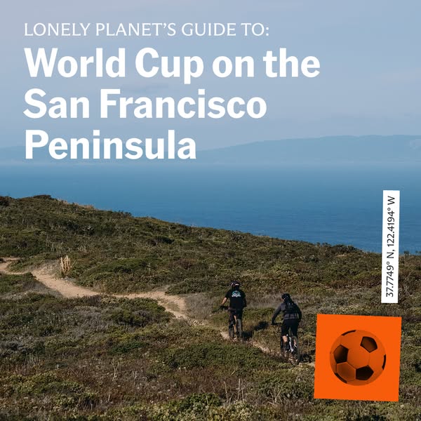
This ad for Lonely Planet promotes their guide to the World Cup on the San Francisco Peninsula. The image features mountain bikers on a trail overlooking the ocean.
# Brand positioning
Lonely Planet is presented as a trusted source for travel information, offering expert guidance to both well-known and niche destinations and events. The brand positions itself as a provider of informative guides for travelers looking to explore specific interests and events, such as the World Cup, within a particular region.
# Product
The advertised product is a Lonely Planet travel guide that focuses on the World Cup on the San Francisco Peninsula. The guide is intended for travelers interested in attending or learning about the World Cup events taking place in the San Francisco Peninsula area. It provides information tailored to this specific event and location, suggesting that it may include details on venues, schedules, local attractions, and travel tips relevant to the area and the World Cup.
# Visual style
The ad has a travel-focused aesthetic with a scenic outdoor shot and integrated text. It combines a natural landscape with simple graphic elements. The production quality appears to be professionally shot, possibly with a stock photo. The image treatment is minimal. The typography is clean and legible. The style is informative.
# Hooks
Headline: World Cup on the San Francisco Peninsula
# Call to action
None used.
# Point of view
- [object Object]
# Storyline
- Lonely Planet introduces a guide to the World Cup on the San Francisco Peninsula, aiming to draw attention to a specific event and location. The brand is telling the story to highlight their expertise in providing detailed travel information to those interested in this event.
- The image showcases mountain bikers on a trail overlooking the ocean, visually emphasizing the location and suggesting outdoor activities available in the San Francisco Peninsula. This is the brand's way of illustrating the setting and attracting viewers with a sense of adventure and place.
- The coordinates provided on the right side along with the soccer ball in the bottom right corner create a visual connection between the location and the event, emphasizing the guide's specific focus. The brand uses this to create a sense of place and occasion for the guide.
# Ad summary
This Lonely Planet ad showcases their 'Where To Go When Hiking' guide, set against a trail backdrop to appeal to outdoor enthusiasts.
# Brand positioning
Lonely Planet is presented as a comprehensive travel guide publisher, specializing in providing detailed and informative resources for travelers and outdoor enthusiasts. The brand's positioning centers around offering expert advice and inspiration for discovering unique destinations and experiences, particularly in the realm of hiking. It aligns with values of exploration, adventure, and informed travel, aiming to equip customers with the knowledge needed to plan and execute memorable trips. By focusing on specific activities like hiking, Lonely Planet carves a niche for itself within the broader travel market, appealing to those seeking detailed, curated experiences rather than generic travel advice. The brand's functional and aspirational approach appeals to those planning trips and is a dependable source of information.
# Product
The advertised product is the Lonely Planet's 'Where To Go When Hiking' guide, designed to be the ultimate month-by-month trip planner for hikers, walkers, and trekkers. It serves as a comprehensive resource for planning hiking trips throughout the year. The guide offers curated recommendations of locations, providing details on when and where to hike based on seasonal conditions and regional highlights. It addresses the common barrier of uncertainty in trip planning by offering structured, timely advice that helps outdoor enthusiasts make informed decisions about their hiking destinations. By focusing on the 'when' and 'where,' the guide aims to simplify the planning process and ensure a more enjoyable and fulfilling hiking experience.
# Visual style
The ad features a blend of product showcase and natural imagery, aiming for a balanced and informative presentation. The production quality is high, with the book and background appearing professionally shot and edited. A nature-focused visual motif is achieved through the blurred background and natural lighting. The image treatment includes background blur to keep the focus on the main product. Clean typography integrates the Lonely Planet logo. The style is both native and high-design, enhancing its appeal and scannability in-feed.
# Hooks
Headline: None used
# Benefits
- [object Object]
# Features
- [object Object]
# Call to action
None used.
# Point of view
- [object Object]
# Storyline
- The ad opens with the Lonely Planet logo, establishing brand recognition and credibility as a trusted source of travel information. This is told from the brand's perspective.
- The focus shifts to the 'Where To Go When Hiking' guide, showcasing its cover and promising an ultimate month-by-month trip planner for hikers, walkers, and trekkers. This is from the brand's perspective.
- The guide is visually integrated into a natural setting to enhance the appeal to outdoor enthusiasts. This is from the brand's perspective, as they are highlighting their product.
# Ad summary
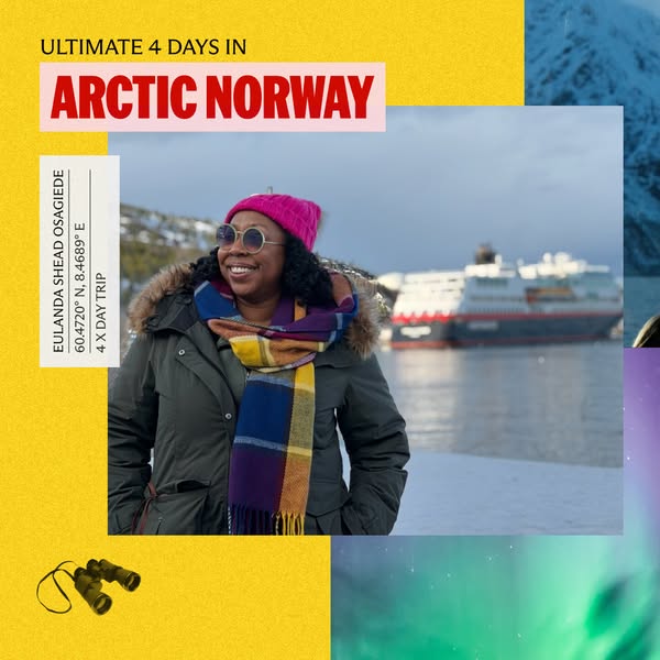
This ad highlights an Arctic Norway vacation taken by a woman, likely a travel influencer, and promotes an ultimate 4 day experience.
# Brand positioning
This ad showcases a travel agency specializing in curated experiences. The ad implicitly promotes the brand as offering unique travel opportunities, moving beyond standard vacation packages by highlighting specialized tours to destinations like Arctic Norway. The brand's positioning leans towards adventure and exploration, aligning with a lifestyle of discovery and cultural immersion. The brand distinguishes itself by offering in-depth, location-specific itineraries, catering to travelers who seek a deeper connection with the places they visit, as seen through the lens of personal experiences.
# Product
The product being advertised is an ultimate 4-day tour package in Arctic Norway. This package is designed for travelers who are interested in unique experiences and immersive travel. The ad features Eulanda Shead Osagiede's Arctic Norway vacation, implying the tour includes scenic views, possible cruise ship travel, and an exploration of the Arctic region. A key feature of the advertised package is the curated itinerary that allows for a comprehensive experience within a short timeframe.
# Visual style
The ad has a collage-style layout, combining different images and background colors. The color scheme is vibrant with yellows, pinks, and greens contrasting with the snowy Arctic landscape. The image treatment includes background removal and layering of elements. The typography is bold and clear. The overall visual style appears modern and eye-catching.
# Hooks
Headline: ARCTIC NORWAY
# Benefits
- [object Object]
# Features
- [object Object]
# Call to action
None used.
# Point of view
- [object Object]
# Storyline
- The ad opens with the text “ULTIMATE 4 DAYS IN ARCTIC NORWAY”, immediately conveying that the ad is about a travel experience in the Arctic Norway region. It intends to capture the viewer's attention and highlight the advertised location and duration of the tour, from a brand perspective.
- The ad presents a woman standing outside near a body of water with a ship in the background. The intention is to show the viewer a glimpse of what the Arctic Norway experience could look like, from a personal perspective.
- The ad includes a description of the traveler including name, coordinates, and experience duration to highlight that she has had the 'ULTIMATE' experience traveling with the brand, from the brand perspective.
# Ad summary
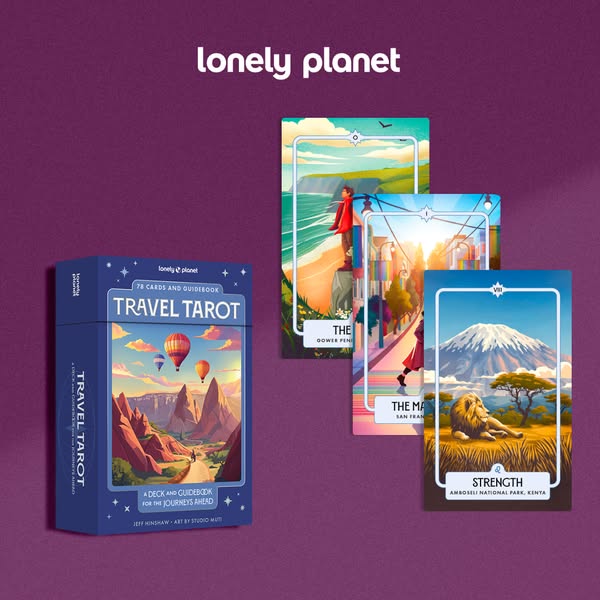
This is an advertisement for Lonely Planet's Travel Tarot deck. It includes 78 cards and a guidebook for the journeys ahead.
# Brand positioning
Lonely Planet is presented as a travel brand that combines travel with self-discovery through the use of tarot. The brand positions itself as a guide for journeys, both literal and metaphorical, appealing to consumers interested in travel and personal insight. The brand stands apart by integrating tarot with travel, suggesting a unique approach to exploring destinations and personal growth. With their Travel Tarot deck, Lonely Planet encourages travelers to explore destinations with a sense of wonder and self-reflection, enriching their experiences beyond typical sightseeing.
# Product
The featured product is the "Travel Tarot" deck by Lonely Planet, which consists of 78 cards and a guidebook. The tarot deck is designed to offer guidance and inspiration for journeys, both literal and metaphorical. Each card features unique artwork by Studio Mutti, depicting landscapes and destinations. The deck aims to provide insights and perspectives for travelers, encouraging self-reflection and discovery. The packaging highlights the deck as a tool for enhancing travel experiences and navigating life's adventures.
# Visual style
The ad has a clean and polished visual style, with a focus on product presentation and design. The use of a solid background and soft lighting gives it a professional look. The layout is simple and organized, with the product box in the foreground and the tarot cards arranged behind it. The overall style is modern and visually appealing, drawing attention to the Travel Tarot deck and its artwork.
# Hooks
Headline: lonely planet
# Benefits
- [object Object]
- [object Object]
- [object Object]
# Features
- [object Object]
- [object Object]
# Call to action
None used.
# Point of view
- [object Object]
# Storyline
- The image opens with a shot of the Lonely Planet Travel Tarot deck. This is included to introduce the product and visually set the stage for the overall advertisement. The story is told from the brand's perspective, showcasing their product offering.
- The camera then pans up to show three cards from the deck standing upright. The purpose is to visually represent some of the cards and their unique travel-themed artwork. The story is being told from a brand perspective, aiming to entice viewers with the visual appeal of the product.
# Ad summary
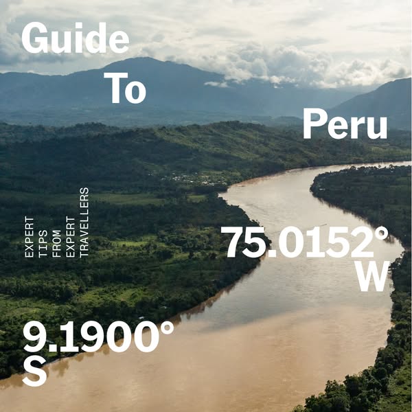
This ad promotes a travel guide to Peru, highlighting expert tips from experienced travelers. The visual features a scenic landscape of Peru, with overlaid text providing a guide title and geographical coordinates.
# Brand positioning
This ad does not explicitly promote a brand. Instead, it focuses on providing a travel guide to Peru, positioning itself as a source of expert travel tips. The ad aims to occupy the space of a helpful and informative resource for travelers interested in exploring Peru. The values promoted are exploration, expertise, and authentic travel experiences. The ad ignores typical brand positioning by focusing solely on the destination and travel tips, without highlighting any specific travel company or service. The positioning is functional, offering practical information for planning a trip to Peru.
# Product
The product being advertised is a travel guide to Peru, offering expert tips from experienced travelers. The guide is intended for individuals interested in exploring Peru and seeking reliable information for their trip. The ad highlights the expertise of the tips provided, suggesting that the guide offers valuable insights for travelers. The guide addresses the purchase barrier of uncertainty and lack of information by providing a reliable resource for planning a trip to Peru. The ad aims to convince viewers that the guide is worth trying or buying by emphasizing the expertise and value of the travel tips it contains.
# Visual style
The ad features a natural and scenic visual aesthetic, with a focus on showcasing the landscape of Peru. The production quality appears to be high, with a professionally shot image. The visual motifs include the use of overlaid text to convey information and the integration of geographical coordinates to add authenticity. The image treatment includes soft and diffused lighting, enhancing the natural colors of the landscape. The typography integration is large and bold, ensuring readability and prominence of the text elements. The visual style aims to be informative and visually appealing, capturing the essence of Peru's natural beauty.
# Hooks
Headline: Guide To Peru
# Benefits
- [object Object]
- [object Object]
- [object Object]
# Features
- [object Object]
- [object Object]
# Call to action
None used.
# Point of view
- [object Object]
- [object Object]
# Storyline
- The ad opens with the title "Guide To Peru," immediately establishing the purpose of the ad as an informational resource for travel to Peru. This is told from the brand's perspective, setting the stage for providing expert travel tips.
- The ad includes the text "EXPERT TIPS FROM EXPERT TRAVELLERS," reinforcing the value proposition of the guide as a source of reliable and experienced advice. This is told from the brand's perspective, emphasizing the credibility and expertise behind the travel tips.
- The ad features geographical coordinates "9.1900° S" and "75.0152° W," providing specific location information and adding a sense of authenticity and precision to the guide. This is told from an external source perspective, offering factual details about Peru's location.
# Ad summary
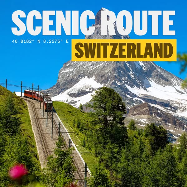
This image ad showcases a scenic view of a train traveling in Switzerland. The Matterhorn mountain is also displayed.
# Brand positioning
This ad is designed to evoke a sense of wonder and adventure, showcasing the beauty of Switzerland as a must-see destination. The brand positions itself as a gateway to extraordinary experiences, inviting customers to explore iconic landscapes and create unforgettable memories. The brand's tone is inspirational and aspirational, emphasizing the allure of travel and the promise of breathtaking sights. It aligns with a lifestyle of exploration and appreciation for natural beauty, positioning itself for those who seek enriching and visually stunning travel experiences.
# Product
The focal point is the scenic route in Switzerland, exemplified by the train journey and the breathtaking view of the Matterhorn. It presents the opportunity to experience Switzerland's iconic landscapes in a unique and memorable way. The ad conveys the message that this travel experience is worth trying or buying by showcasing the beauty and grandeur of the scenery, creating a sense of awe and wanderlust.
# Visual style
The ad employs a highly polished, studio-shot aesthetic to capture the beauty of the Swiss landscape, aiming to create a sense of wonder and wanderlust. The image is vibrant and crisp, with natural lighting that highlights the lush greenery and snow-capped mountains. The typography is clean and bold, integrated seamlessly into the landscape to draw the viewer's eye. This visual style enhances scannability by making key information easily readable and appealing, ensuring the ad stands out in a feed.
# Hooks
Headline: SCENIC ROUTE
# Benefits
- [object Object]
# Features
- [object Object]
- [object Object]
# Call to action
None used.
# Point of view
- [object Object]
# Storyline
- The image captures a high-angle, wide shot of a Swiss landscape, with a small train visible on the tracks leading up to the Matterhorn. This moment is included to draw viewers in with the promise of scenic travel, shown from the perspective of an observer taking in the full grandeur of the view.
# Ad summary
This ad is presented as a travel guide with recommendations for what to do, where to stay, what to eat, where to drink, and where to shop in New Hampshire.
# Brand positioning
This ad features a travel guide by Lonely Planet. The brand curates travel experiences for its audience by providing information on popular destinations and travel tips.
# Product
The ad showcases a digital guide to New Hampshire from Lonely Planet. The guide is presented as a list of recommendations including what to see, where to stay, where to eat, where to drink, and where to shop. Each category lists multiple specific establishments.
# Visual style
The ad uses a clean, informative style with a static, listicle format. The initial forest scene provides a visually appealing introduction, while the travel guide graphic delivers specific recommendations. The production quality is high, with sharp text and vibrant colors.
# Call to action
None used.
# Point of view
- [object Object]
# Storyline
- 00:00–00:02 The ad opens with a landscape shot of a forest path.
- 00:02–00:05 00:02–00:05: The ad switches to the Lonely Planet travel guide, displayed on the background of a lake scene. The guide recommends where to see, stay, eat, drink, and shop in New Hampshire.
# Ad summary
This ad showcases a trip to Norway with Hurtigruten, featuring a range of activities and experiences from dog sledding to exploring the fjords.
# Brand positioning
Hurtigruten is presented as a premier travel company specializing in Arctic Norway adventures. The brand promotes a unique, immersive experience that combines luxury travel with authentic cultural and natural encounters. They position themselves as offering exclusive access to some of the world's most remote and scenic locations, suggesting a premium offering for discerning travelers who seek adventure and relaxation.
# Product
The ad features a 4-day Arctic Norway tour package with Hurtigruten, highlighting several different aspects of the experience. These include accommodation aboard the Hurtigruten MS Trollfjord, gourmet dining with scenic views of the fjords, and unique excursions such as dog sledding in Alta at Holmen Husky Lodge. The package caters to travelers seeking adventure and comfort, combining luxury travel with cultural and natural experiences. It emphasizes the ease of exploring Norway’s Arctic region through a pre-planned, comprehensive tour that eliminates the typical planning hassles associated with such trips.
# Visual style
The ad uses a vibrant and dynamic visual style, combining user-generated content with animated text overlays. The editing is quick, with each scene transitioning rapidly to maintain a fast pace. The color palette is diverse, incorporating bright yellows, blues, and greens, contributing to an energetic and adventurous tone. The overall production quality suggests a hybrid approach, blending authentic, on-location footage with polished graphic elements.
# Benefits
- [object Object]
- [object Object]
- [object Object]
# Features
- [object Object]
- [object Object]
- [object Object]
# Call to action
None used.
# Point of view
- [object Object]
# Storyline
- 00:00–00:02 00:00–00:02 The ad opens with a square frame of a woman in Norway. Text overlays the frame indicating this is the "ULTIMATE 4 DAYS IN ARCTIC NORWAY". The frame is surrounded by a yellow background on the left and a blue-tinted mountain range on the top right. At the bottom right, there is a visual of the Northern Lights.
- 00:02–00:05 00:02–00:05 The ad transitions to a shot of the interior of the Hurtigruten MS Trollfjord, showcasing people dining near large windows with a mountain view. A text overlay indicates the creator "stayed on board the Hurtigruten MS Trollfjord".
- 00:05–00:08 00:05–00:08 The scene changes to the traveler dog sledding in Alta at Holmen Husky Lodge.
# Ad summary
This ad showcases the Lonely Planet "Where To Go When Hiking" book, emphasizing its usefulness in planning hiking trips by providing a guide to help users find the hike that's right for them.
# Brand positioning
Lonely Planet is presented as an expert source of information and inspiration for travelers, particularly those interested in hiking. The brand is positioned as a guide that simplifies the planning process, offering curated recommendations that cater to different preferences and skill levels. It promotes a lifestyle of adventure, exploration, and connection with nature, aligning with values of discovery and accessibility in travel. The brand does not push against or follow category norms, but rather occupies a functional space as a source of organized information, presented in an accessible format.
# Product
The Lonely Planet "Where To Go When Hiking" book is a guidebook designed to help both experienced and novice hikers plan their trips. It is structured to assist users in determining the type of hiking experience they desire, offering categorized hike suggestions based on preferences like micro-adventure, week-ish wander, or epic trek, and further broken down by interests such as wilderness, coast, community, or history. The book provides information on various trails and destinations, catering to those seeking guidance on where to hike and what to expect. Its USP is the ability to quickly narrow down hike choices based on individual interests. The product addresses the purchase barrier of uncertainty in planning a hike, making it accessible to everyone regardless of experience. The ad encourages viewers to explore and discover new hiking locations.
# Visual style
The ad features a polished commercial aesthetic with quick cuts and smooth transitions, creating a sense of dynamic movement. The production quality is high-end, with clear visuals and professional graphics. The ad maintains a consistent pace, syncing visuals and text to create a seamless viewing experience.
# Benefits
- [object Object]
- [object Object]
- [object Object]
# Features
- [object Object]
- [object Object]
- [object Object]
# Call to action
Shop Now
# Point of view
- [object Object]
# Storyline
- 00:00–00:01 The ad opens with scenic views of a mountain range, immediately establishing a connection to nature and outdoor adventures. This sets the stage for the book's focus on hiking destinations.
- 00:01–00:02 A person hikes through a forest, providing a close-up view of someone actively engaged in a hiking experience. The perspective is from behind the hiker, allowing viewers to imagine themselves in the scene. This visually connects with the book's purpose of guiding hikers.
- 00:02–00:03 The ad transitions to a hand pointing at a map in the Lonely Planet book, highlighting a specific hiking trail. This illustrates the practical utility of the book in identifying hiking locations.
- 00:03–00:04 The page flips through October and the book displays a flow chart, categorized by hike type. This demonstrates how the book guides users to hikes that align with their preferences.
- 00:04–00:05 The ad concludes with a full view of the Lonely Planet "Where To Go When Hiking" book, positioned centrally on a green background. The "Shop Now" CTA encourages viewers to purchase the product.
# Ad summary
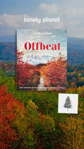
This image ad for Lonely Planet's 'Offbeat' travel guide uses a background image of colorful fall foliage, creating an immersive visual experience. The book cover is displayed prominently, showcasing the title and hinting at the content inside. The visual style, combined with the clean, sans-serif font, positions the guide as a modern resource for adventurous travelers looking for unique and less-traveled destinations.
# Brand positioning
Lonely Planet is presented as a purveyor of unique travel experiences, offering curated guidance for those seeking adventures beyond the typical tourist traps. The brand aligns with a sense of exploration, independence, and a desire for authentic cultural engagement. This positioning stands against the norm of mainstream, heavily-marketed travel destinations, instead promoting a more personalized and off-the-beaten-path approach. Lonely Planet occupies a space in the consumer's mind as a trusted resource for discovering hidden gems and creating memorable journeys with functional ease.
# Product
The featured product is Lonely Planet's 'Offbeat', a travel guide showcasing '100 Amazing Places Away From The Tourist Trail'. It appears to be a physical book, and is aimed at travelers who desire unique, less-crowded experiences and destinations. The title 'Offbeat' and descriptive text emphasize the book's USP: a collection of destinations that deviate from standard tourist attractions, promising a sense of adventure and discovery. The guide offers practical information for planning trips to unusual locations.
# Visual style
The ad has a highly polished, studio-shot aesthetic with a nature-focused motif. The image treatment involves background blurring to highlight the book cover, and a clean, modern font is used for the text elements. The visual style aims to be scannable and eye-catching, using natural imagery to draw the viewer in.
# Hooks
Headline: None used
# Benefits
- [object Object]
# Features
- [object Object]
# Call to action
None used.
# Point of view
- [object Object]
- [object Object]
# Storyline
- The brand logo is displayed at the top of the image, immediately identifying the publisher of the book. This is included to establish brand recognition and credibility. The POV is from the brand.
- The book cover is centrally placed, highlighting the title 'Offbeat' and the subtitle '100 Amazing Places Away From The Tourist Trail'. The cover photo of a scenic, less-traveled path creates visual interest and reinforces the theme of the guide. The POV is from a potential customer.
- A small, square image of a pine tree is featured in the bottom right of the image, acting as a visual marker and reinforcing the theme of nature and off-the-beaten-path destinations. This provides a secondary visual element to draw the eye. The POV is from the brand, using a visual icon to further brand identity.
# Ad summary
A UGC-style testimonial promotes Hurtigruten cruise line as the best way to see the Northern Lights. A woman shares her experience on board the MS Trollfjord cruise ship, highlighting the comfortable suites, gourmet dining, and stunning views. She also enjoys a dog sledding excursion.
# Brand positioning
Hurtigruten is presented as a luxury cruise line specializing in immersive experiences in cold regions. The ad emphasizes the brand's ability to provide unique access to the Northern Lights and Arctic adventures, contrasting with conventional land-based tourism. Hurtigruten aims to occupy a premium space in the travel market, targeting discerning travelers who value comfort, adventure, and authentic cultural experiences. The ad suggests that Hurtigruten defies the typical cruise experience, focusing instead on intimate exploration and sophisticated onboard amenities.
# Product
The Hurtigruten cruise line offers curated travel experiences that include comfortable suites, gourmet dining, and scenic views. The advertised cruise specifically travels from Tromsø to Oslo on the North Cape Line, with the MS Trollfjord as the vessel. The ship features cozy suites with breathtaking views of the Arctic landscape, three dining rooms with diverse food options, and amenities such as a ladies' sauna. It facilitates excursions such as dog sledding in Alta. The cruise addresses potential barriers such as discomfort in cold climates by providing luxurious onboard facilities. This product is designed for travelers seeking both adventure and relaxation in a high-end setting, emphasizing the cruise as an all-inclusive experience with unique opportunities for exploration and sightseeing.
# Visual style
The ad combines UGC-style footage with polished commercial shots to convey authenticity while highlighting luxury. Editing includes a mix of quick cuts and static shots, creating a dynamic yet relaxed feel. Production quality appears to be a hybrid of both UGC and professional quality. Visual motifs such as snowy landscapes, close-ups of food, and luxury interiors recur throughout the ad. The pacing is consistent, but picks up during the dog sledding.
# Benefits
- [object Object]
- [object Object]
- [object Object]
- [object Object]
- [object Object]
# Features
- [object Object]
- [object Object]
- [object Object]
- [object Object]
- [object Object]
# Call to action
None used.
# Point of view
- [object Object]
# Storyline
- 00:00–00:04 The ad opens with a view of the northern lights.
- 00:05–00:10 00:05–00:10 A woman, Host Eulanda Shead Osagiede, stands in front of a cruise ship and asks if the viewer wants to know the best way to see the Northern Lights, then answers her own question: from a cruise ship.
- 00:10–00:16 00:10–00:16 The cruise ship MS Trollfjord is shown, with text indicating the route goes from Tromsø to Oslo on the North Cape Line. The ad then cuts to a dining room interior with a view of the water.
- 00:16–00:22 00:16–00:22 The ad continues to show interiors of the cruise ship, emphasizing the suites and bathrooms.
- 00:22–00:25 00:22–00:25 The host is shown on the deck of the ship marveling at the views.
- 00:25–00:35 00:25–00:35 The host is shown dog sledding in Norway. She says the dog's endurance is incredible.
- 00:35–00:41 00:35–00:41 The host returns to the cruise ship and uses the ship's sauna.
- 00:41–00:48 00:41–00:48 The host is shown dining and says that the ship offers plenty of delicious offerings.
- 00:48–00:58 00:48–00:58 The host says that the Northern Lights are in appearance, and the ad cuts to views of the Northern Lights.
# Ad summary
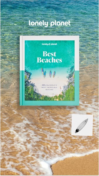
This ad for Lonely Planet features a copy of their "Best Beaches" book laying on the sand at a beach. A small graphic of a surfboard is visible near the book.
# Brand positioning
Lonely Planet is presented as a reputable travel brand that specializes in curating comprehensive travel guides, with a focus on detailed information and insider knowledge. The brand is positioned as an authority in travel, directing consumers towards unique destinations with credibility and expertise, for those looking to go beyond the typical tourist experience and venture into the world's most remarkable and desirable locales.
# Product
The featured product is Lonely Planet's "Best Beaches", a curated guide showcasing "100 of the world's most incredible beaches." The book is for travel enthusiasts seeking unparalleled beach destinations. The ad emphasizes the detailed nature of the book, suggesting it is an ideal resource for planning trips to remarkable beach locations, from well-known to more obscure destinations. It promotes the book as a resource for planning beach travel.
# Visual style
The ad has a bright, summery aesthetic. It is set on a beach, which is directly relevant to the product that is being advertised.
# Hooks
Headline: lonely planet
# Call to action
None used.
# Point of view
- [object Object]
# Storyline
- The ad features a Lonely Planet "Best Beaches" book and implies to the viewer that they should purchase it if they are interested in traveling to the world's best beaches. The brand is using the ad to increase book sales.
# Ad summary
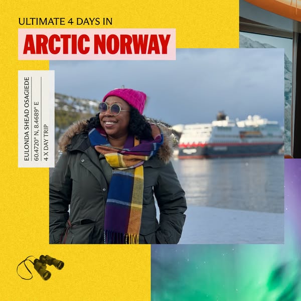
This travel ad promotes 4-day trips in arctic Norway and features a woman wearing a winter coat with a ship and arctic skies in the background.
# Brand positioning
This ad creates the impression that the company behind the trip on offer curates or offers unique travel experiences in arctic Norway. By showing a traveler smiling in the foreground and a cruise ship in the background, the company communicates that it provides high-value travel experiences in hard-to-reach destinations. The brand promotes the values of wanderlust and exploration.
# Product
This ad promotes arctic Norway travel experiences that involve 4-day-long trips. The woman in the image is wearing a winter coat, hat, and scarf, suggesting that this experience takes place in cold conditions. The presence of the ship in the background suggests that this trip may involve maritime travel. The aurora borealis in the corner of the image implies that a benefit of this trip is witnessing this natural phenomenon.
# Visual style
The ad has a simple and modern visual style. It uses bright colors and clear photography to create a sense of excitement and adventure. The ad also has a platform-native feel, as it looks like it could be easily created using the features of a social media app.
# Hooks
Headline: ULTIMATE 4 DAYS IN ARCTIC NORWAY
# Benefits
- [object Object]
# Call to action
None used.
# Point of view
- [object Object]
- [object Object]
# Storyline
- The ad opens with a headline declaring an "ULTIMATE 4 DAYS IN ARCTIC NORWAY", which communicates the experience that's being offered, as seen from the brand's perspective. This is likely the most important element of the ad, as it contains the core value proposition.
- Next, the ad displays an image of a woman posing in front of a boat and arctic scenery. From the perspective of the customer, this communicates the kind of experience they might have if they take this 4-day trip.
- Finally, the ad includes the words "EULONDA SHEAD OSAGIEDE" with GPS coordinates and the text "4 X DAY TRIP". This provides the implied perspective of the brand and more information about the trip's exact location and timing.
# Ad summary
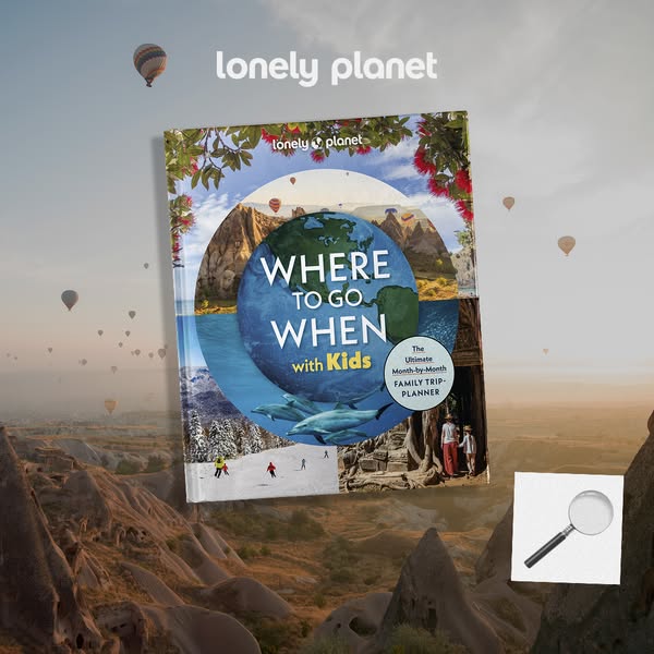
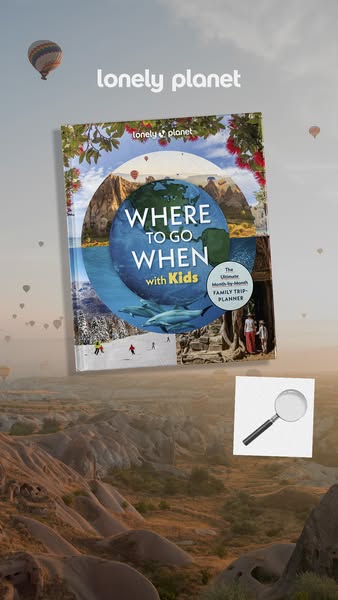
This ad promotes the "Where To Go When With Kids" family travel planner from Lonely Planet. The ad features an appealing product shot of the book layered over a blurred background of Cappadocia, Turkey with hot air balloons.
# Brand positioning
Lonely Planet is presented as a resource for planning travel, particularly for families. The brand name is featured prominently on the book cover, establishing it as a trusted authority in travel guidance and advice. Lonely Planet positions itself as the ultimate source for planning a family trip.
# Product
The featured product is the "Where To Go When with Kids" travel planner by Lonely Planet. It is designed to help families decide on the best destinations based on the time of year. The planner is a physical book, and the cover displays a collage of destinations, including mountains, beaches with dolphins, and historical sites. The book is described as “The Ultimate Month-by-Month FAMILY TRIP-PLANNER,” suggesting it is an organized resource for year-round travel ideas. The ad seeks to overcome the barrier of indecision and planning overwhelm that families face when trying to arrange trips.
# Visual style
The ad has a polished, studio-shot feel with a focus on showcasing the product in an appealing environment. The background is soft and dreamlike, which contrasts with the solid presence of the book. The style is designed to be eye-catching and informative, with a clear emphasis on the brand's travel expertise.
# Hooks
Headline: WHERE TO GO WHEN with Kids
# Benefits
- [object Object]
- [object Object]
# Features
- [object Object]
# Call to action
None used.
# Point of view
- [object Object]
# Storyline
- The ad opens by presenting the Lonely Planet "Where To Go When with Kids" book as the main focus. This aims to immediately introduce the product and highlight its purpose as a travel planner for families from the brand's perspective.
- The background of Cappadocia with hot air balloons provides context, suggesting the kind of travel experiences the book can help plan. This conveys a sense of adventure and wonder from the brand's perspective.
- The inclusion of a magnifying glass suggests a closer look at the details within the book, encouraging viewers to explore its contents. This hints at the depth of information the book offers from the brand's perspective.
# Ad summary
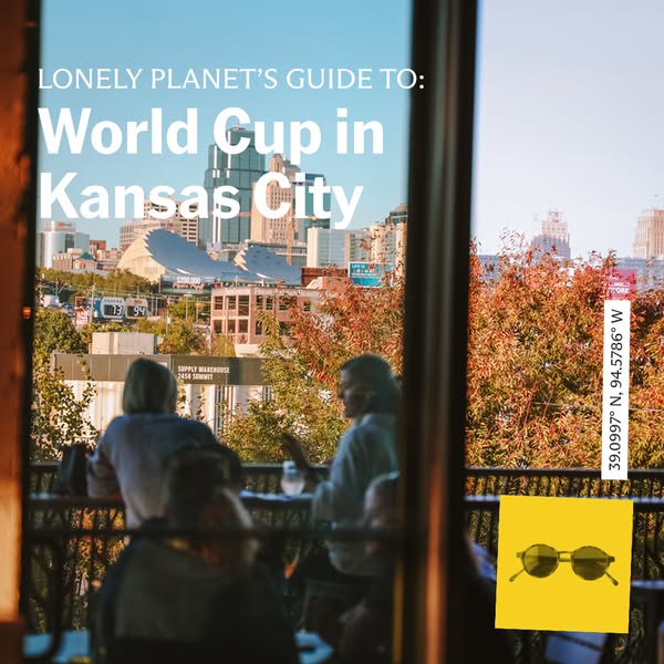
This ad promotes Lonely Planet's guide to the World Cup in Kansas City. It features an outdoor urban scene viewed through a window and includes a bright yellow sticky note with sunglasses. The sticky note is placed on the window, presumably to remind the viewer of items needed for the World Cup.
# Brand positioning
The ad features Lonely Planet, a well-known travel guide brand. The ad implies that Lonely Planet provides comprehensive guides for various locations and events, positioning the brand as an authority on travel information. The brand's presence indicates a focus on providing reliable and detailed information to help travelers plan their trips effectively. By associating with a major event like the World Cup, Lonely Planet aims to be seen as relevant and up-to-date for contemporary travel needs.
# Product
The product being advertised is Lonely Planet's guide to the World Cup in Kansas City. Although the physical guide itself is not visually represented, the ad promotes the idea of using Lonely Planet's expertise to explore and enjoy the World Cup event in Kansas City. The guide aims to provide travelers with the information they need to navigate the event and the city effectively, addressing potential purchase barriers by offering comprehensive insights and recommendations. The ad emphasizes the product’s relevance to a specific event and location, suggesting that the guide is tailored to enhance the viewer’s experience of the World Cup in Kansas City.
# Visual style
The ad has a casual, lifestyle-oriented visual style, resembling a snapshot taken indoors looking through a window. The production quality appears to be high, but the framing and composition give it a more authentic feel, possibly mimicking a photo taken from a restaurant or cafe. The image treatment includes natural lighting and soft color grading, enhancing the scene's realism. The typography is clean and modern, integrated smoothly with the image to ensure scannability. The presence of the yellow sticky note adds a layer of visual interest and a touch of personal planning, contrasting with the more polished elements of the cityscape and brand text.
# Hooks
Headline: World Cup in Kansas City
# Call to action
None used.
# Point of view
- [object Object]
# Storyline
- The ad starts with the title "Lonely Planet's Guide to: World Cup in Kansas City" to grab the viewer's attention and clearly establish what is being advertised. This is told from the brand's perspective to clarify what the product is and its purpose. This part of the story is intended to draw in people who are interested in the World Cup and planning to attend events in Kansas City, highlighting the relevance of Lonely Planet's guide for their travel needs.
- The ad includes a visual of an urban scene through a window, where people are enjoying time on a patio, along with a yellow sticky note with a drawing of sunglasses attached to the window. The scene acts as a visual metaphor of a local experience with people enjoying a day out, with the brand suggesting that the viewer could experience this by using their guide. This part of the story is told from the brand's perspective as a way to immerse people in the scene and create a sense of anticipation of the experience of being in Kansas City for the World Cup, emphasizing the potential for enjoyable moments with the brand's guide.
# Ad summary
This image ad promotes the Lonely Planet "Where To Go When With Kids" travel book, featuring the book cover floating over a Cappadocia landscape with hot air balloons.
# Brand positioning
Lonely Planet positions itself as a trusted resource for travel information and inspiration. The brand targets travelers seeking authentic and enriching experiences. By focusing on a specific audience with 'Where To Go When With Kids', Lonely Planet is showcasing its expert travel guidance tailored for families. The brand’s positioning is both functional and emotional, providing practical travel advice alongside inspiring images that evoke the excitement and joy of discovery.
# Product
The product being advertised is the Lonely Planet "Where To Go When With Kids" book, described (on-package label text) as 'The Ultimate Month-By-Month FAMILY TRIP-PLANNER'. The book is for parents and families who want to plan travel, and provides information on destinations and timing. Its unique selling proposition is providing recommendations tailored to specific months, helping families optimize their vacation planning. The book addresses the barrier of uncertainty and overwhelm that families often face when planning travel.
# Visual style
The ad features a clean and aspirational visual style with professional-quality photography. The image treatment is bright and inviting, with a focus on clear presentation of the product. The floating book and subtle background blur create a sense of depth. The design contrasts a realistic travel scene with a product shot, mimicking an in-feed environment and increasing scannability.
# Hooks
Headline: lonely planet
# Benefits
- [object Object]
- [object Object]
# Features
- [object Object]
# Call to action
None used.
# Point of view
- [object Object]
- [object Object]
- [object Object]
# Storyline
- The ad features the Lonely Planet logo, immediately establishing the brand's identity and credibility. This is from the brand's perspective, aiming to build instant recognition with their target audience and communicate authority in the travel sector.
- The book cover is prominently displayed, titled "WHERE TO GO WHEN with Kids", immediately clarifying the product's focus on family travel planning. This is shown from the customer's perspective, as it directly communicates the book's core offering and value.
- A magnifying glass placed next to the book suggests exploration and discovery. This is from the brand's perspective, emphasizing the idea that the book can help customers uncover new and exciting travel destinations.
- The backdrop of Cappadocia with hot air balloons evokes a sense of adventure and wanderlust. This is intended for the customer, inspiring them to envision the exciting travel possibilities the book can unlock.
# Ad summary
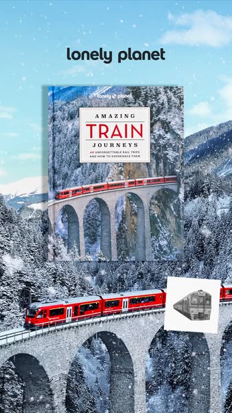
This image promotes the Lonely Planet's book "Amazing Train Journeys". The image features a book cover on the background of a snow-covered mountain landscape, which mirrors the book's cover image. An illustration of a train is placed to the right of the book.
# Brand positioning
Lonely Planet is portrayed as a curator of travel experiences, offering expert guidance for those seeking unique and unforgettable journeys. The brand positions itself as a provider of detailed information and inspiration for travelers looking to explore the world by train, emphasizing discovery and immersive experiences. By focusing on 'unforgettable rail trips,' Lonely Planet suggests a commitment to quality and the extraordinary, catering to an audience that values in-depth travel knowledge and adventure.
# Product
The product featured is the Lonely Planet book titled "Amazing Train Journeys." This book, as implied by its title and cover image, serves as a guide to 40 unforgettable rail trips. The book offers insights on how to experience these journeys, suggesting it includes practical tips and inspiration for planning and enjoying train travel. The focus on rail trips suggests a unique selling proposition of combining scenic travel with cultural exploration, appealing to travel enthusiasts interested in a slower, more immersive travel experience. The book aims to lower the barrier to entry for such travel, providing all the necessary information in one place.
# Visual style
The ad features a blend of photographic realism and digital enhancements, creating a visually appealing and immersive travel-themed scene. The production quality appears highly polished, combining a studio-shot book cover with a digitally enhanced background and added visual effects (snowflakes). The image treatment includes background removal and layering. The integration of the 'Lonely Planet' logo is clean and legible, and the overall style aims for a balance between informative and aspirational to capture attention in-feed.
# Hooks
Headline: None used
# Benefits
- [object Object]
# Features
- [object Object]
# Call to action
None used.
# Point of view
- [object Object]
- [object Object]
# Storyline
- The image showcases the Lonely Planet brand and its book, "Amazing Train Journeys," to attract potential buyers interested in unique travel experiences. The brand's perspective is highlighted as it seeks to position itself as a trusted resource for exceptional travel guidance.
- The book cover and the background imagery both feature a picturesque, snow-covered mountain landscape with a train traveling across a viaduct. This conveys a sense of adventure and invites the viewer to imagine themselves on such a journey, as experienced through the eyes of the travel destination itself.
- An illustration of a train is placed next to the book, providing an additional visual cue related to the book's theme, as seen from a brand perspective. This reinforces the idea of train travel and the book's focus on amazing train journeys.
# Ad summary
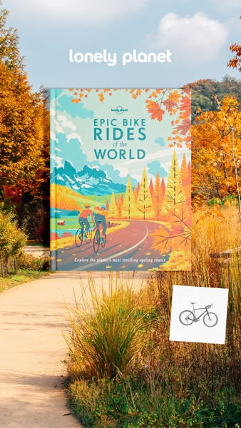
This ad for Lonely Planet's Epic Bike Rides of the World book features the book standing upright on a walking path surrounded by autumnal trees. A small graphic of a bicycle appears to the right of the path, suggesting the book’s content.
# Brand positioning
Lonely Planet is presented as a curator of world travel experiences. The brand promises adventure and discovery, focusing on thrilling, scenic, and culturally rich destinations that appeal to the adventurous traveler. It positions itself as a gateway to exploring the planet's most exciting and unique locations.
# Product
The product featured is the book "Epic Bike Rides of the World" by Lonely Planet. This book is a guide for cyclists looking for thrilling and scenic cycling routes around the world. It offers readers the opportunity to explore the planet's most exciting destinations on two wheels, promising adventure, cultural immersion, and a deep connection with the landscapes they traverse. The product is designed for those who seek both physical activity and enriching travel experiences.
# Visual style
The ad employs a natural, inviting visual style that emphasizes the book's theme of outdoor adventure. The shot is taken outdoors, utilizing natural lighting and seasonal colors to evoke a sense of wanderlust. The book is presented as the central focal point, supported by environmental elements that reinforce the cycling and travel theme.
# Hooks
Headline: None used
# Benefits
- [object Object]
# Features
- [object Object]
# Call to action
None used.
# Point of view
- [object Object]
- [object Object]
# Storyline
- The image focuses on the Lonely Planet "Epic Bike Rides of the World" book in a natural setting. This is included to highlight the book’s content and suggest the theme of outdoor adventure and travel from the brand's POV.
- The image showcases a pathway and autumnal trees, creating a visual association with the book's theme of exploration and cycling in various landscapes. This is intended to evoke a sense of wanderlust and excitement for cycling adventures from the brand's POV.
- The presence of a bicycle graphic further emphasizes the book's focus on cycling routes, enticing potential customers to explore and discover new destinations from the customer's POV.
How Other Travel Brands Advertise on Meta
Peer brands in Motion's library — click any brand to see their creative strategy, live ads, and AI breakdowns.