

# Ad summary
This ad uses a split-screen to compare inDrive with a traditional taxi service, highlighting the differences in pricing and convenience through animated visuals and sound effects. The ad aims to position inDrive as a more affordable and modern alternative to traditional taxi services.
# Brand positioning
inDrive is presented as a modern, cost-effective alternative to traditional taxi services. The brand positions itself as a ride-hailing app that offers lower prices compared to traditional taxis. The brand aligns with values of affordability and convenience, pushing against the higher prices and perceived inconveniences often associated with traditional taxi services. The brand positioning is functional, emphasizing the practical benefits of cost savings.
# Product
inDrive is featured as a ride-hailing application designed to provide a more affordable alternative to traditional taxis. The ad conveys that the app allows users to request rides and presumably negotiate fares, resulting in lower costs compared to standard taxi services. The app functions by connecting riders with drivers, similar to other ride-hailing apps. The key selling point is the cost savings, visually represented by comparing dollar signs on the app interfaces. The ad is geared toward anyone looking for cheaper transportation options, addressing the pain point of high taxi fares. The ad encourages viewers to try inDrive as a solution to expensive rides.
# Visual style
The ad has a clean, minimalist aesthetic with a focus on bold color contrast (black/white vs. bright green). The editing style uses simple transitions and static shots, creating a clear and straightforward visual message. The production quality feels polished and modern, suitable for a tech-focused brand.
# Benefits
- [object Object]
# Features
- [object Object]
# Call to action
None used.
# Point of view
- [object Object]
# Storyline
- 00:00–00:01 The screen splits vertically, with the left side representing traditional taxis and the right side representing inDrive, creating a visual comparison setup.
- 00:01–00:02 On the left, a traditional taxi symbol appears over a greyed-out map with a driving path. On the right, the inDrive logo appears above a brightly colored map with a driving path, visually contrasting the two services.
- 00:02–00:05 Smartphones appear beneath each map. The phone on the left (taxi service) displays a car with three dollar signs over it, symbolizing higher cost. The phone on the right (inDrive) displays a car with only one dollar sign, indicating lower cost. This directly addresses and attempts to solve the problem that taxis are expensive.
- 00:05–00:08 The scene transitions to a bright green screen with the inDrive logo in the center, reinforcing the brand identity and highlighting its unique color scheme.

How inDrive Advertises on Meta
Refreshed 4 months ago · Weekly refresh cadence
inDrive runs 298 active ads on Meta, shipping ~11 new creatives per week. Their library leans on Screen Recording15%, Split Screen12%, and Headline9%. Recently, inDrive is hammering home its core value prop of user control and negotiated pricing, positioning itself as the anti-algorithm alternative to traditional taxis and other rideshare apps that gouge during peak times. The creative leans heavily on split-screen comparisons, animated map demos, and explicit price negotiation UI showcases to make affordability and transparency tangible. There's a secondary push on convenient in-app payment methods (PIX, bank integration) and driver selection features (ratings, arrival time), but it all ladders up to one message: you set the terms, not surge pricing.
Indexed by Motion's Inspo Library.
The 20 Most Recent inDrive Ads on Meta

# Ad summary
This animated ad for inDrive, an application for booking rides, shows a cartoon family in a car and ride offers popping up on the screen.
# Brand positioning
inDrive is presented as a ride-booking app. It positions itself as a service that allows users to request rides with specific prices, times, and distances, and it also provides a way for people to get around town.
# Product
The product being advertised is the inDrive application, which allows users to book rides from local drivers. The app interface features names and star ratings of potential drivers, the distance and time of their rides, and a dollar amount associated with each offer. The user can then 'Accept' the offer.
# Visual style
The ad uses a cartoon-style illustration, likely inspired by anime. It employs soft color grading, smooth shading, and distinct character outlines to create a friendly and accessible aesthetic. The visual style aims to capture attention and clearly communicate the ride-sharing concept. The ad is designed in a vertical format, suitable for mobile viewing, with a layout that prioritizes scannability.
# Hooks
Headline: None used
# Benefits
- [object Object]
- [object Object]
# Features
- [object Object]
- [object Object]
- [object Object]
- [object Object]
- [object Object]
# Call to action
None used.
# Point of view
- [object Object]
# Storyline
- The ad begins with a cartoon family of five sitting inside a car, creating an environment that the brand hopes customers will relate to. This sets the stage for the inDrive's product showcase.
- The ad shows two ride offers popping up on the screen, which allows the brand to showcase the app’s features and benefits. The offers feature the names and star ratings of potential drivers, the distance and time of their rides, and a dollar amount associated with each offer. This shows potential drivers how they can use inDrive to book rides from local drivers.
# Ad summary
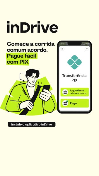
Ad for inDrive, an app for requesting rides. The ad shows a person holding their phone. On the phone screen is the inDrive app with the options to pay directly from your bank, or pay using PIX.
# Brand positioning
The inDrive brand aims to position itself as a modern and convenient solution for ride-sharing. The brand promotes a lifestyle of ease and accessibility. By emphasizing the ability to easily pay with PIX, inDrive positions itself as adaptable to local payment preferences, offering a functional and user-friendly experience.
# Product
The ad promotes the inDrive app, a platform designed to connect riders with drivers for transportation services. The ad highlights the convenience of in-app payment options, specifically featuring PIX, a Brazilian instant payment system. It emphasizes ease of use, suggesting that users can "Pague fácil com PIX" (Pay easily with PIX). The app facilitates direct payment from the user's bank account. The ad addresses potential payment barriers by showcasing multiple payment methods within the app.
# Visual style
The ad has a modern, clean visual style with a limited color palette. The image features flat, cartoon-style illustrations with solid colors and minimal shading. The overall aesthetic is simple and uncluttered, focusing on clear communication of the app's features.
# Hooks
Headline: Pague fácil com PIX
# Benefits
- [object Object]
# Features
- [object Object]
- [object Object]
# Call to action
Instale o aplicativo inDrive
# Point of view
- [object Object]
- [object Object]
- [object Object]
- [object Object]
# Storyline
- The ad starts by introducing the inDrive brand and its slogan, "Comece a corrida comum acordo" (Start the ride together), setting the stage for a user-friendly experience, told from the brand's perspective.
- The ad highlights the feature of easy payment with PIX, emphasizing convenience and accessibility for users in Brazil, told from the brand's perspective.
- The ad displays a smartphone screen showing the inDrive app interface, illustrating the payment options available to the user, including paying directly from their bank, told from the customer's perspective.
- The ad includes a call to action to install the inDrive app, encouraging viewers to take the next step and start using the service, told from the brand's perspective.
# Ad summary
This ad promotes the inDrive app. It is designed to appeal to users looking for affordable rides. The ad uses motion graphics to show how inDrive allows users to negotiate the price of their rides.
# Brand positioning
inDrive is presented as a ride-hailing service that distinguishes itself by giving riders more control over pricing. The ad emphasizes the cost-effectiveness of the app, suggesting it offers more affordable options compared to competitors. The brand aims to occupy a space in the consumer's mind as a practical, budget-friendly solution for transportation needs, aligning with values of empowerment and control over expenses. inDrive seemingly pushes against the norm of fixed pricing set by other ride-hailing services, emphasizing the app's user-driven negotiation model.
# Product
inDrive is a mobile ride-hailing app that allows users to negotiate the price of their rides with drivers. The ad shows how users can set their desired fare, which drivers can then accept or counter. The product is for anyone who wants to save money on transportation and have more control over costs. Key features include the ability to set your own fare, counteroffers from drivers, and potentially lower prices than other ride-hailing services. The ad addresses the common purchase barrier of high ride costs by emphasizing affordability through negotiation. It positions inDrive as a way to get around without breaking the bank.
# Visual style
The ad has a clean, minimalist aesthetic with bright, solid colors. The editing features quick cuts and simple motion graphics. The production quality appears polished, giving it a modern and professional feel. The pacing is fast, with cuts timed to the music beat, creating a dynamic and engaging rhythm.
# Benefits
- [object Object]
- [object Object]
# Features
- [object Object]
- [object Object]
- [object Object]
# Call to action
Baixe o app
# Point of view
- [object Object]
# Storyline
- 00:00–00:02 The ad opens with a generic map graphic, showing a vehicle driving on the map from point A to point B. This image functions to put the viewer in the shoes of someone looking for a ride, while implying that the inDrive app is a great way to get around.
- 00:02–00:05 The map is animated to show competing cars on the map and dollar signs that are meant to convey how much each ride costs. The dollar signs on the competing cars on the map are triple the size of the dollar signs on the vehicle driven by inDrive, implying that the price is much lower with inDrive. This functions to show viewers that they can save money by using the inDrive app.
- 00:05–00:07 The scene cuts to the inDrive logo on a lime-green background, solidifying the brand identity in the viewer's mind.
# Ad summary
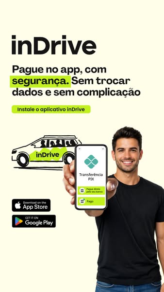
This image ad for inDrive promotes paying through the app for safety, ease, and simplicity. It features a man holding a phone displaying the in-app payment screen. The ad emphasizes the convenience and security of using the app's payment feature.
# Brand positioning
inDrive is presented as a modern and convenient ride-hailing app that prioritizes ease of use and safety for its users. The app aims to occupy a space in the consumer's mind as a hassle-free alternative to traditional payment methods, focusing on simplicity and security. By highlighting features like in-app payments, it positions itself as a forward-thinking service that values the user's time and peace of mind. The brand promotes a lifestyle of convenience and security, aligning with values of trust and efficiency in transportation services.
# Product
The featured product is the in-app payment feature of the inDrive ride-hailing application. It allows users to pay for rides directly through the app, providing a secure and straightforward transaction method. The feature is designed for users who value convenience and security in their payment processes. Key details include the ability to pay directly through the app without exchanging data or experiencing complications. The app uses a PIX transfer system. The ad highlights the ease of paying directly from the user's bank account and the simplicity of the payment process, addressing potential barriers related to payment security and complexity.
# Visual style
The ad has a clean and modern visual style, with a focus on simplicity and clarity. The production quality is highly polished, with studio-shot elements. The visual motifs include a minimalist color palette (pale yellow, black, white, and green), line art, and clear typography. The image treatment includes background removal and balanced lighting effects. The ad mimics a platform-native style, similar to an Instagram post, which enhances scannability and stop power in the feed.
# Hooks
Headline: Pague no app, com segurança. Sem trocar dados e sem complicação
# Benefits
- [object Object]
# Features
- [object Object]
- [object Object]
- [object Object]
# Call to action
Instale o aplicativo inDrive
# Point of view
- [object Object]
- [object Object]
# Storyline
- The ad opens by highlighting the core benefit of paying within the inDrive app: enhanced security, simplicity, and convenience. The message conveyed is that inDrive prioritizes user safety and ease of use. The brand voice aims to assure the customer that using inDrive's payment system is the best option.
- A visual of a man holding a smartphone displaying the inDrive payment interface serves as a practical demo. This shows the user interface, reinforcing the ease and straightforward nature of the payment process. This is from the brand's perspective, emphasizing the app's functionality.
- The presence of app store download badges for both the Apple App Store and Google Play Store serves as a direct prompt to action. The brand is telling the audience that they should install the inDrive app for themselves.
# Ad summary
This mobile ad uses a map to show how inDrive's app works. It follows an animated icon that represents a person and shows the various prices offered by inDrive and other ride-share services. The woman chooses inDrive because it is the cheapest option.
# Brand positioning
inDrive is presented as a ride-share app that is more affordable than other options. The brand aims to occupy a space in the consumer's mind as a cost-effective solution for transportation. In the ad, inDrive goes against the norm of fixed pricing by offering a platform where users can find rides at lower rates, which promotes the idea that the customer should care about saving money on transportation.
# Product
inDrive is a ride-sharing app designed to offer users more affordable transportation options. The app allows users to view various prices from available drivers in their area. The key selling point highlighted in the ad is the app's ability to provide rides at a lower cost compared to other services, addressing the common purchase barrier of high transportation expenses.
# Visual style
The ad has a polished commercial aesthetic with a bright, eye-catching color scheme. It is edited with quick cuts and smooth transitions. The pacing is consistent with the background music. The visuals are clean and modern, and it feels like it was made for Reels or TikTok.
# Benefits
- [object Object]
- [object Object]
# Features
- [object Object]
- [object Object]
# Call to action
Baixe o app.
# Point of view
- [object Object]
# Storyline
- 00:00–00:01 A woman needs a ride and opens a map interface on a mobile device.
- 00:01–00:04 The map begins showing multiple car icons representing rideshare services.
- 00:01–00:04 Each icon has a price tag associated with it, and the woman icon appears upset at the high prices from other rideshare apps.
- 00:04–00:05 The green inDrive car icon shows a lower price.
- 00:05–00:06 The woman smiles and chooses the inDrive ride.
- 00:07–00:09 The inDrive ride then heads to the woman's home.
- 00:09–00:11 The ad transitions to a bright green screen with a photo of a car with the inDrive logo on the hood.
- 00:11–00:13 The ad shows a download prompt.
# Ad summary
The ad promotes inDrive, a ride-hailing app that gives users more control over pricing and driver selection. The ad highlights the frustration of algorithm-driven pricing in other ride-sharing apps and positions inDrive as an alternative where users can suggest their fare and choose their driver.
# Brand positioning
inDrive is presented as a consumer-centric ride-hailing alternative to traditional, algorithm-based apps. The brand champions the user's right to control pricing and choice of driver, pushing against the norm of fixed rates and assigned drivers in the ride-hailing industry. The brand aligns with values of empowerment and fairness, offering a functional solution that prioritizes user choice over algorithm-driven convenience.
# Product
The ad features inDrive, a ride-hailing application, that allows users to suggest their own fares and select their preferred driver. Users can accept a recommended price or define their own, giving them more control over the cost of the ride. The app also presents a list of drivers with their ratings, allowing riders to choose their preferred driver based on reviews and other criteria. The ad positions inDrive as a tool to avoid algorithm-defined pricing and enables the user to choose their own driver, emphasizing control and choice.
# Visual style
The ad features a clean, modern aesthetic with bright colors. The video uses a combination of direct address and screen recordings to deliver its message. The editing is quick and snappy. The overall production quality suggests a hybrid approach, blending a UGC-style presenter with polished app interface visuals.
# Benefits
- [object Object]
# Features
- [object Object]
- [object Object]
# Call to action
Baixe já inDrive
# Point of view
- [object Object]
# Storyline
- 00:00–00:03 A woman directly addresses the audience, questioning whether they are tired of algorithm-determined pricing from ride-sharing apps. This sets up the central problem the ad intends to solve.
- 00:03–00:06 The ad transitions to a screen recording of the inDrive app interface, demonstrating how users can suggest their fare.
- 00:06–00:08 The interface shows the ability to accept a recommended price or set a custom fare.
- 00:08–00:11 The app interface shows a list of available drivers with prices, ratings, and profiles, emphasizing the user's ability to select their preferred driver.
- 00:11–00:13 The ad concludes with a call to action to download the inDrive app, presented against a bright yellow background.
# Ad summary
This ad demonstrates how InDrive empowers users to set their own price for rides, select their driver based on bids, and enjoy the ride. The ad is in Portuguese.
# Brand positioning
InDrive positions itself as a modern and user-centric ride-sharing app that breaks away from traditional pricing models, by allowing riders to set their own fares. It emphasizes user empowerment and transparency, allowing riders to choose their preferred driver based on customized bids. InDrive aims to occupy a space in the consumer's mind as an accessible and flexible ride service that challenges the conventional norms of fixed pricing and limited driver selection. The brand aligns with a lifestyle that values convenience, control, and fair pricing in transportation.
# Product
InDrive is a ride-sharing app that allows users to negotiate their fares directly with drivers. Users enter their desired fare for a ride, and drivers can then accept, decline, or counter with a different offer. The app displays a list of available drivers, along with their proposed fares, ratings, and estimated arrival times. The user can then select a driver based on their preferences and budget. The app provides standard ride-tracking and contact features. The ad emphasizes that users can “Escolha seu preço” (choose your price) and “Defina o motorista” (define the driver).
# Visual style
The ad has a natural, candid aesthetic with real-world settings. The editing style uses static shots and smooth transitions. The production quality is polished, suggesting a commercial feel while maintaining a relatable tone. The pacing is consistent. The visual cuts sync with the music.
# Benefits
- [object Object]
- [object Object]
- [object Object]
# Features
- [object Object]
- [object Object]
# Call to action
Baixe o app agora!
# Point of view
- [object Object]
# Storyline
- 00:00–00:02 00:00–00:02 The scene opens with a woman on a city street looking at her phone and smiling. Text overlays indicate the ability to adjust the fare, conveying the message that the user gets to choose their price.
- 00:03–00:06 00:03–00:06 A screen overlay shows a list of drivers with their corresponding prices. The message conveyed is that the user can define the driver they want.
- 00:06–00:08 00:06–00:08 A map screen shows the route and arrival time. The message conveyed is that the user can enjoy the ride.
- 00:08–00:10 00:08–00:10 The woman is now shown inside a car, smiling and looking at her phone. This reinforces the idea that after choosing their price and driver, the user can sit back and enjoy the ride.
- 00:10–00:14 00:10–00:14 A bright green screen appears with the InDrive logo and a call to action to download the app now. This concludes the ad with a direct prompt for the viewer to take the next step.
# Ad summary
This ad promotes inDrive, a ride-sharing app that emphasizes safety and freedom to choose prices for rides. The ad shows a family comfortably enjoying a ride, highlighting the app's ease of use and convenience. It targets families and individuals seeking control over their ride costs while ensuring safe travel.
# Brand positioning
inDrive is presented as a modern and family-friendly ride-sharing app that prioritizes user control over pricing and safety. The brand aims to occupy a space in the consumer's mind as a reliable and comfortable travel solution, particularly for families. It promotes values of safety, freedom, and convenience, differentiating itself by allowing users to choose their price, which sets it apart from competitors with fixed pricing models. The brand positioning is both functional, offering control and convenience, and emotional, providing a sense of security and comfort during travel.
# Product
The inDrive app is a ride-sharing service that emphasizes safety and freedom in pricing. It allows users to book rides with a focus on family comfort. The ad highlights features such as setting your own price, ensuring secure and reliable transportation. It also addresses potential purchase barriers by emphasizing the ease of using the app for family travel, promoting the app's convenience and affordability. The product is depicted as being ideal for family trips, ensuring everyone enjoys a comfortable and safe ride. The ad promotes the value of having control over ride costs while enjoying the convenience of modern ride-sharing services.
# Visual style
The ad has a clean and modern aesthetic with a focus on bright, vibrant colors and clear text overlays. The editing style is straightforward with static shots and smooth transitions, creating a polished commercial feel. The pacing is consistent and supports the intended tone of reliability and user empowerment.
# Benefits
- [object Object]
- [object Object]
# Features
- [object Object]
- [object Object]
# Call to action
Baixe o app
# Point of view
- [object Object]
- [object Object]
# Storyline
- 00:00–00:04 The ad opens with a shot inside a car showing three family members enjoying a ride, smiling, and looking at a tablet. This sets the tone for a comfortable family travel experience.
- 00:00–00:04 The text overlay appears, emphasizing the tagline "Viaje em familia com conforto" or "Travel with family in comfort," which reinforces the ad's focus on family travel.
- 00:04–00:11 The visuals switch to showcasing text overlays that highlight the key benefits of using inDrive, such as choosing your own price and feeling secure during the ride. This presents inDrive as a superior ride-sharing option focused on user empowerment and safety.
- 00:12–00:14 The ad ends with the inDrive logo and tagline, reinforcing the brand identity and message that travel is done your way.
# Ad summary
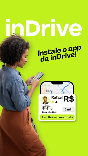
This image ad for inDrive features a woman using the app on her phone. The ad promotes the ease of choosing your driver and installing the app.
# Brand positioning
inDrive is presented as a convenient ride-hailing app that empowers users to choose their driver, differentiating itself from traditional ride-hailing services. The brand focuses on user choice and ease of use, positioning itself as a modern solution for transportation needs. inDrive caters to tech-savvy individuals seeking control and transparency in their ride arrangements, with a focus on simplicity and accessibility.
# Product
The featured product is the inDrive mobile app, a ride-hailing service that allows users to choose their driver. The ad showcases the app's interface, displaying potential drivers with their names, ratings, estimated fare (R$), car model (Chevrolet Onix), and estimated arrival time (7 min). The app is designed for individuals seeking a convenient and customizable transportation solution, as evidenced by the call to action, "Escolha seu motorista" (Choose your driver). The ad addresses the need for a user-friendly ride-hailing experience, highlighting the control and choice offered to the user in selecting their preferred driver.
# Visual style
The ad employs a clean and modern visual style, characterized by a minimalist design and bright color palette. The use of a solid lime green background creates a sense of energy and vibrancy, while the white text and app interface contribute to a clean and uncluttered aesthetic. The image features a shallow depth of field, blurring the background and drawing attention to the woman and the app interface. The use of a realistic smartphone mockup and a real person conveys a sense of authenticity and relatability. The overall visual style is intended to be eye-catching and easily scannable, making it suitable for use in fast-paced social media feeds.
# Hooks
Headline: Instale o app da inDrive!
# Benefits
- [object Object]
# Features
- [object Object]
# Call to action
Escolha seu motorista
# Point of view
- [object Object]
- [object Object]
# Storyline
- The ad opens with the inDrive logo and a woman using the app on her phone. The brand is telling the consumer to download the app and begin use.
- The image then transitions to a mockup of the inDrive app interface, showcasing a driver profile and key details like name, rating, car model, and estimated arrival time. This shows the consumer a preview of the easy user-interface of the inDrive application.
- The ad concludes with a clear call to action, encouraging viewers to choose their driver. The brand uses this final message to reinforce user agency and highlights the key feature of the app: the power to select the driver that best meets their needs.
# Ad summary
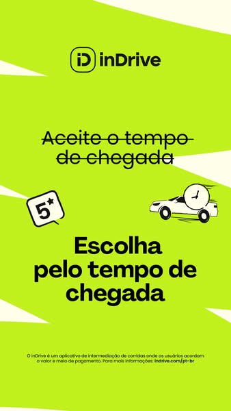
This inDrive ad highlights the app's unique feature: allowing users to choose rides based on arrival time. The ad features a 5-star rating badge and an illustration of a car to represent inDrive as a ride-sharing app.
# Brand positioning
The brand inDrive is presented as a modern and user-centric ride-sharing app. It emphasizes empowering users to make choices based on their specific needs, particularly arrival time. The brand appears to push against the norm of prioritizing price or driver ratings alone, suggesting that time is a critical factor for riders. The positioning is functional, highlighting the app's unique feature of allowing users to choose rides based on the time of arrival.
# Product
inDrive is presented as a ride-sharing application that allows users to coordinate the value and means of payment. The ad emphasizes the unique selling proposition (USP) of the app, which is the ability for users to choose rides based on arrival time. This feature is for those who prioritize punctuality and efficiency in their transportation choices. The product addresses the purchase barrier of uncertainty around arrival times by giving users more control and transparency over the ride selection process. There is one product mentioned which is the ride-sharing app.
# Visual style
The ad has a clean and modern visual style, using flat vector graphics and a bold color palette. The production quality appears to be highly polished, with a focus on simplicity and clarity. The image treatment includes background removal for the logo and text, with a focus on high contrast and legibility. The typography is large and bold, making it easy to scan and read quickly. The overall style feels native to a mobile platform, designed to capture attention in a fast-scrolling feed.
# Hooks
Headline: Aceite o tempo de chegada
# Benefits
- [object Object]
# Features
- [object Object]
# Call to action
None used.
# Point of view
- [object Object]
# Storyline
- The ad starts by stating, "Aceite o tempo de chegada" (Accept the arrival time), this is the brand inviting the user to be open to choosing their ride by arrival time.
- Next, the ad shows a 5-star rating, which communicates positive ratings for the ride-sharing service, from the perspective of inDrive.
- The ad concludes with "Escolha pelo tempo de chegada" (Choose by arrival time). This is the brand showing their USP, which is that riders can pick their driver by the time it will take for them to arrive.
# Ad summary
This ad for inDrive, a ride-share app, shows an animated map with cars and dollar signs. The ad encourages the user to download the app.
# Brand positioning
inDrive is a ride-sharing app. The ad showcases the app interface on a map and encourages users to download the app. The brand aims to be a quick and easy transportation solution, and appears to position itself within the category norm for the ride-sharing app market. The brand positioning appears functional.
# Product
The inDrive app is presented as a ride-sharing platform that lets users book rides from point A to point B. The app is promoted by highlighting the ability to select rides on a map, view nearby cars, and seemingly make money by driving.
# Visual style
The ad has a bright and animated style using cartoonish graphics and a simple color palette. It has a polished commercial feel due to the clean graphics and consistent branding. The pacing is quick, with cuts timed to the music.
# Benefits
- [object Object]
- [object Object]
# Features
- [object Object]
- [object Object]
- [object Object]
- [object Object]
- [object Object]
# Call to action
Baixe o app
# Point of view
- [object Object]
# Storyline
- 00:00–00:01 The ad opens with a map screen showing a grid of roads.
- 00:01–00:05 00:01–00:05 An animated graphic of a car appears on the map, traveling a dotted path from point A to point B. The car passes animated dollar sign icons, implying the ability to earn money.
- 00:05–00:08 00:05–00:08 The screen transitions to a bright green screen with the inDrive logo displayed.
# Ad summary
This is an ad for inDrive, a ride-sharing app, that presents a map of a city. InDrive's logo appears along with a display of cars that are using the app. InDrive is presented as the app that puts you in control of the ride's pricing.
# Brand positioning
InDrive positions itself as a modern and dynamic ride-sharing app that puts the power of pricing into the consumer's hands. The brand is presented with a youthful and energetic tone, aligning with a lifestyle of convenience and cost-effectiveness. The brand does not explicitly push against category norms or competitor behaviors in this ad, however, the focus on map, cars, and pricing cues suggests the brand might position itself as a more affordable solution for ride-sharing. The brand positioning is functional, focusing on performance and simplicity.
# Product
InDrive is a ride-sharing application designed to connect passengers with drivers. It allows users to set their own prices for rides, putting them in control of the transaction. The product is for anyone who needs transportation within a city and seeks a potentially more affordable option. The ad showcases the app's interface on a city map with cars, destinations, and price indications. It highlights the USP of user-controlled pricing, addressing the potential purchase barrier of high or fluctuating fares by allowing riders to propose their own prices.
# Visual style
The ad has a clean and modern aesthetic, with a focus on showcasing the app's interface and branding. The editing style is simple and direct, with smooth transitions and static shots. The production quality appears to be polished. The pacing is consistent, with a focus on clearly communicating the app's key features and benefits. The colors used are neon green and bright white.
# Benefits
- [object Object]
- [object Object]
# Features
- [object Object]
- [object Object]
- [object Object]
# Call to action
Baixe o app
# Point of view
- [object Object]
# Storyline
- 00:00–00:03 A map of a city is displayed with the logo for the inDrive app on top.
- 00:03–00:05 The perspective shifts to a view of the map that shows a route drawn from one point to another. Two cars appear on the map with dollar signs above them.
- 00:05–00:08 The screen transitions to a solid neon green background with the app logo.
# Ad summary
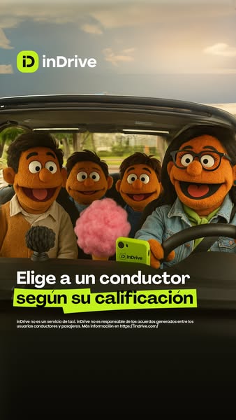
The ad features muppet-style characters in a car to promote InDrive. The ad's focus is on the ability to choose a driver based on their rating, emphasizing user control and safety. Legal disclaimer information is also included in the bottom of the ad.
# Brand positioning
InDrive is presented as a modern ride-sharing service that puts the user in control, particularly in regard to driver selection. The brand aims to be seen as a safe and reliable alternative to traditional taxis, as clarified in the disclaimer that reads: "InDrive is not a taxi service." The use of muppet-like characters gives the brand a friendly and approachable vibe, distinguishing it from more corporate competitors. The focus is on the functional benefit of choosing a driver based on their rating, suggesting a customer-centric approach that values transparency and user choice.
# Product
InDrive is presented as a ride-sharing service, where users can "elige a un conductor según su calificación" (choose a driver based on their rating). The product works through a mobile app, as implied by the image of a smartphone with the InDrive interface, allowing users to have greater control over their choice of driver. The service is not a taxi service. This product is for users who are seeking convenient, safe, and user-controlled transportation options, emphasizing the ability to select a driver based on their rating, enhancing the sense of security and control.
# Visual style
The ad features a bright and playful visual style, with a focus on the muppet-like characters to create an approachable feel. The production quality is high, with clear, well-lit visuals. The use of bright colors and clean typography against the car's dark interior contribute to its scannability. The overall effect is designed to stand out in a social feed and convey a friendly, trustworthy brand image.
# Hooks
Headline: Elige a un conductor según su calificación
# Benefits
- [object Object]
# Features
- [object Object]
# Call to action
None used.
# Point of view
- [object Object]
- [object Object]
# Storyline
- The ad starts with a view inside a car where muppet-like characters are seated as passengers, with one character in the driver's seat. This establishes the scene and introduces the characters who will be 'experiencing' the InDrive service, from the brand's POV.
- The main message appears: "Elige a un conductor según su calificación" (Choose a driver based on their rating). This key message from the brand highlights the unique selling proposition of the InDrive service. This is designed to appeal to the user by promising more control over their ride.
- The ad concludes with a legal disclaimer stating that InDrive is not a taxi service and disclaims responsibility for agreements between drivers and passengers. This is from an external source and provides important legal information and context about the nature of the service.
# Ad summary
The ad showcases the inDrive ride-hailing app as a cost-effective alternative to traditional taxi services. It uses a split-screen to illustrate the price differences and highlight the app's logo and branding.
# Brand positioning
inDrive is presented as a modern ride-hailing app that prioritizes affordability and user control over pricing. The brand identity is conveyed through a clean, minimalist design and a bright, vibrant color palette (lime green). inDrive's positioning pushes against the traditional taxi model, emphasizing transparent pricing and potentially lower costs, suggesting a functional benefit centered around value for money. The brand aims to occupy the space of a budget-friendly and tech-savvy option in the transportation market.
# Product
inDrive is a ride-hailing application designed to connect passengers with drivers, positioning itself as a more affordable option than traditional taxi services. The ad highlights its ability to provide lower prices compared to standard taxis. The user interface is showcased on a smartphone screen, illustrating the ease of requesting and viewing ride options. The clear USP is cost-effectiveness, directly addressing the pain point of expensive transportation. The ad shows the inDrive app's interface on a mobile phone.
# Visual style
The ad has a clean and modern aesthetic with a minimalist design. The split-screen comparison is straightforward and visually direct. The use of bright, contrasting colors (lime green and white) is attention-grabbing. Editing is simple and direct, with static shots and clear transitions.
# Benefits
- [object Object]
# Call to action
None used.
# Point of view
- [object Object]
# Storyline
- 00:00–00:02 The screen is split into two sides, with the left side representing taxis and the right side representing inDrive.
- 00:02–00:04 A route is drawn on a map on both sides, indicating a journey from one point to another.
- 00:04–00:05 On the taxi side, a phone displays a white car with three dollar signs above it ($$$), while on the inDrive side, a similar car is shown with two dollar signs ($$).
- 00:06–00:08 The screen transitions to a full-screen view with the inDrive logo on a bright green background.
# Ad summary
This ad promotes inDrive, a ride-sharing app, by highlighting its key features: choosing arrival time, selecting a driver based on rating, and negotiating the fare. The ad uses a bright, minimalist design with animated text and graphics to communicate these benefits quickly and effectively.
# Brand positioning
inDrive is presented as a modern, user-centric ride-sharing app that puts the passenger in control. The brand emphasizes flexibility and choice, allowing users to accept arrival times, choose drivers based on ratings, and negotiate the fare. This positioning sets inDrive apart from traditional ride-sharing services by promoting a more collaborative and personalized experience. The brand uses a playful, casual tone and bright visuals to appeal to a younger, tech-savvy audience.
# Product
inDrive is a ride-sharing application that allows users to book rides and negotiate the fare directly with drivers. The app enables users to 'Aceite o tempo de chegada' (accept the arrival time) and 'Escolha pelo tempo de chegada' (choose by arrival time), giving them control over their schedule. Users can also select drivers based on their ratings. inDrive positions itself as a flexible and user-friendly alternative to traditional ride-sharing services.
# Visual style
The ad features a clean, minimalist aesthetic with bright colors and simple animated graphics. The editing style is quick and dynamic, with text and visuals appearing in sync with the upbeat music. The production quality is polished, giving the ad a modern and professional feel. The visual motifs include animated brush strokes and simple cartoon drawings. The pacing is fast, with cuts synchronized to the music's rhythm.
# Benefits
- [object Object]
- [object Object]
- [object Object]
# Features
- [object Object]
- [object Object]
- [object Object]
# Call to action
None used.
# Point of view
- [object Object]
# Storyline
- 00:00–00:01 The inDrive logo appears on a green background with animated brush strokes.
- 00:01–00:03 00:01–00:03: The text 'Aceite o tempo de chegada' (Accept the arrival time) appears above a cartoon car with a clock on top.
- 00:03–00:05 00:03–00:05: A 5-star rating icon appears in a speech bubble, followed by the text 'Escolha pelo tempo de chegada' (Choose by arrival time).
# Ad summary
The ad promotes inDrive, a ride-sharing app, featuring a woman explaining how to use it. The ad highlights the app's flexibility, allowing users to suggest their fare and choose their preferred driver. It features a screen recording of the app interface showing how easy it is to use.
# Brand positioning
The inDrive brand is presented as a customer-centric and flexible ride-sharing app, differentiating itself by allowing users to suggest their own fares rather than being dictated a set price. The brand aims to occupy the space of an empowering, affordable and convenient option in the ride-hailing market. The values align with user control and transparency, pushing against the norms of fixed-price models and emphasizing the ability to choose a preferred driver. The brand positioning is both functional (price control, choice) and emotional (empowerment, control).
# Product
The inDrive app is a ride-sharing platform that offers users the ability to suggest their own fare for a ride. It allows customers to choose from a list of verified drivers, viewing prices, ratings, and profiles before making a selection. The app presents various ride options, including “Viagem,” “Comfort,” and “Cidade a cidade.” Users can input their origin and destination points, and propose a fare. The platform addresses purchase barriers by giving users control over pricing and driver selection. The ad emphasizes the app's user-friendly interface and the ability to choose your “motorista parceiro,” appealing to customers seeking control and transparency in their ride-hailing experience.
# Visual style
The ad has a UGC feel, with a woman sitting in front of a couch. The addition of the animated graphics adds a playful look, appealing to a younger generation, while the app screen recording makes sure the audience knows the unique features of the app. The cuts are quick, around 4 seconds per cut.
# Benefits
- [object Object]
- [object Object]
# Features
- [object Object]
- [object Object]
# Call to action
Baixe já
# Point of view
- [object Object]
# Storyline
- 00:00–00:06 A woman poses a question about ride-hailing, setting the stage for the advertisement.
- 00:06–00:12 This shows the inDrive app interface, showing its unique features.
- 00:12–00:15 The woman returns, telling the audience to download the app.
# Ad summary
This ad uses relatable emojis and animation to depict how users feel when using other ride-sharing apps. It communicates that inDrive is an alternative to paying too much during rush hour or not being able to get a ride because there are no cars available. By showing the alternative (downloanding inDrive), the ad concludes with the value proposition that inDrive offers trips at fair prices.
# Brand positioning
inDrive is presented as a ride-sharing app that prioritizes fairness and accessibility for its users. The brand pushes against the norms of traditional ride-sharing services by offering a solution to common frustrations such as high surge pricing and limited availability. InDrive positions itself as an advocate for the rider, allowing them to negotiate prices directly, which promotes a sense of empowerment and control. This positioning suggests that inDrive aims to occupy a space in the consumer's mind as the go-to option for affordable and reliable transportation.
# Product
The inDrive app is portrayed as a ride-sharing platform designed to address common pain points associated with conventional ride-sharing services. It allows users to negotiate fares with drivers, ensuring fair pricing and preventing surge costs during peak hours. The app is positioned as a solution for users who frequently encounter issues with ride availability or inflated prices on other platforms. The ad showcases the ease of booking rides and the empowerment the app provides by allowing users to set their own prices. The ad also highlights that the app is readily available for download on multiple platforms, therefore reducing barriers to trying the product.
# Visual style
The ad is a digitally rendered motion graphic, with emojis and text laid over a map. The visual style is simplistic, using bright, contrasting colors against a lime green background to draw the viewer's attention. The editing style consists of quick cuts and animations, keeping a fast pace to reflect social media trends. The use of emoji expressions makes the ad feel casual and relatable, consistent with UGC and meme-style content.
# Benefits
- [object Object]
- [object Object]
- [object Object]
# Features
- [object Object]
# Call to action
None used.
# Point of view
- [object Object]
# Storyline
- 00:00–00:07 00:00–00:07 The ad opens with a red-faced emoji on a map, surrounded by car emojis, conveying the frustration of not finding a ride when needed. The use of an angry emoji and aggressive music sets a negative tone to depict the common experience of ride unavailability.
- 00:07–00:16 00:07–00:16 Continuing directly from the previous scene, the map now shows a sad emoji surrounded by cars with taxi symbols, symbolizing the pain of surge pricing. The change in emoji and the addition of sound effects create a sympathetic tone, highlighting another frustration with conventional ride-sharing apps.
- 00:16–00:23 00:16–00:23 In response to the problems shown in the first half, a happy emoji appears, representing the positive experience of downloading inDrive and setting your own price. The visual transition to a smiling emoji and the upbeat music shift the tone from frustration to satisfaction, presenting inDrive as the solution.
- 00:23–00:29 00:23–00:29 The ad closes with a sleek car on a green background and on-screen text to highlight that inDrive offers 'viajes a precios justos!' ('trips at fair prices!'), the solution to the problems presented earlier. The positive and upbeat music continues to create an uplifting mood, and concludes the ad with a call to action to download the app.
# Ad summary
This ad uses a cartoonish, animated map to demonstrate how the inDrive app works. Cars appear on the map, with dollar sign icons above them. The ad shows users the inDrive app lets them negotiate a better price for rides.
# Brand positioning
inDrive is presented as a rideshare app that gives riders more control over pricing. Unlike standard ride-hailing apps, inDrive appears to allow riders to negotiate fares directly with drivers. This positions the brand as a champion for riders, offering transparency and potential cost savings. The brand's tone is functional, highlighting convenience and value.
# Product
The inDrive app is a ride-hailing service that allows users to negotiate fares with drivers. The ad features an animated map interface. Cars appear as potential matches, each marked with a dollar sign icon indicating its price. The app seems geared toward budget-conscious riders seeking better deals on transportation.
# Visual style
The ad uses a bright, cartoonish, and animated visual style. The color palette is dominated by neon yellow and bright green. Editing is minimal. The visuals are clean and simple, designed to quickly convey the app's functionality.
# Benefits
- [object Object]
- [object Object]
# Features
- [object Object]
- [object Object]
# Call to action
Baixe o app
# Point of view
- [object Object]
# Storyline
- 00:00–00:02 The ad begins with an animated map interface.
- 00:02–00:05 A route is drawn on the map from point A to point B, indicating a potential ride.
- 00:05–00:07 The logo appears against a bright yellow background to reinforce brand recognition.
# Ad summary
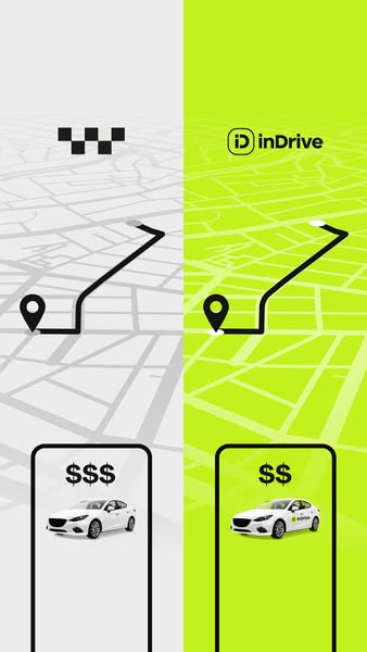
This is a split-screen ad comparing the pricing and ride experience between taxi services and inDrive. The left side represents traditional taxis, showing higher prices and a less modern interface, while the right side highlights inDrive's lower prices and modern interface.
# Brand positioning
InDrive positions itself as a modern, affordable alternative to traditional taxi services. The brand is portrayed as innovative and consumer-friendly, offering a more cost-effective transportation solution. It aligns with a lifestyle that values convenience and transparency in pricing, pushing against the norms of traditional taxi services with potentially hidden or surge pricing. The brand positioning is functional, emphasizing simplicity and affordability.
# Product
InDrive is a ride-hailing service that allows users to book rides at competitive prices. It functions through a mobile app interface, highlighted by a user-friendly design and transparent pricing. The service aims to address the high-cost pain point often associated with traditional taxis, offering a more budget-friendly option for the same service. The ad underscores the product's cost-effectiveness by visually representing lower fares ($$) compared to higher taxi fares ($$$).
# Visual style
The ad features a clean, minimalist design with a split-screen comparison. The use of contrasting colors (gray vs. green) and simple graphics gives it a modern, straightforward feel. The production quality is high, with polished smartphone and car renderings. The typography is clean and legible, reinforcing the message of simplicity and affordability.
# Hooks
Headline: None used
# Call to action
None used.
# Point of view
- [object Object]
# Storyline
- The ad opens with a split screen comparing ride-hailing services. The left side shows a taxi service with a traditional checkered logo on a gray map background, representing higher fares ($$$). The right side features the inDrive logo on a green background, signaling lower prices ($$). This contrast immediately highlights the price difference between the two options from the brand's perspective.
- The visual then focuses on the route to a destination, with a black line tracing a path on both sides of the split screen. This is intended to show that both taxi and inDrive can get riders to the same destination. The brand's intention is to reinforce that inDrive is just as convenient as a regular taxi.
- The ad concludes with a smartphone visual on each side, displaying a car. The taxi side shows a basic, less appealing interface and the higher price point. The inDrive side features the app with the brand logo, a modern-looking interface, and a lower price point, reinforcing its value proposition in the user's mind.