

# Ad summary
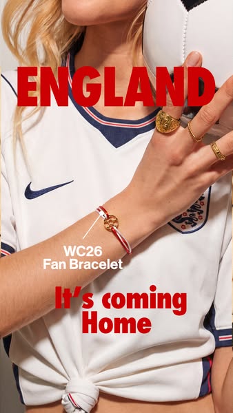
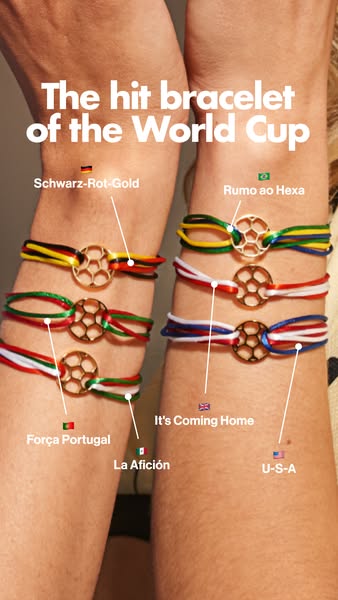
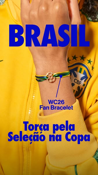
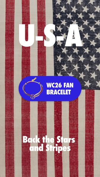
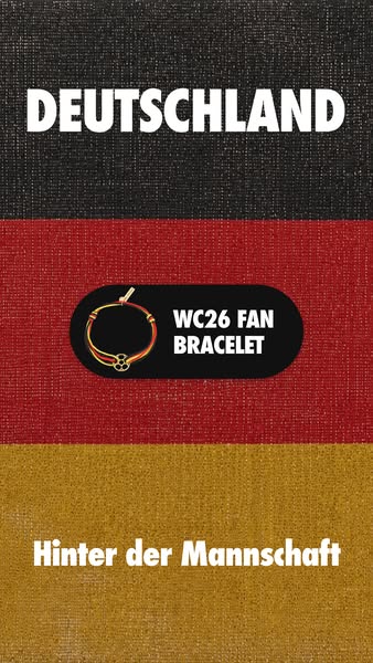
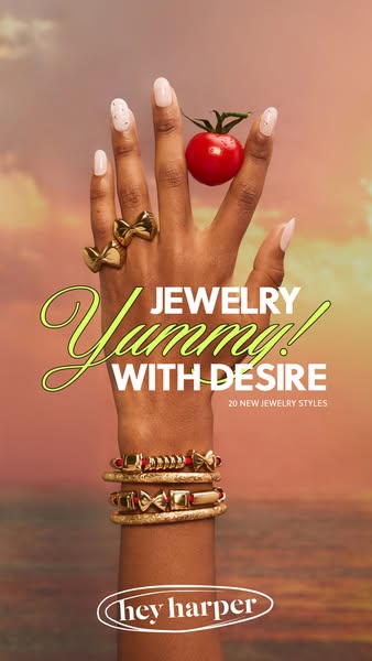
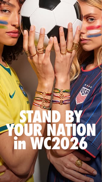
This ad encourages viewers to support their national team in the WC2026 with jewelry that represents their team's colors.
# Brand positioning
The brand is presented as one that fosters connection to people's heritage and national pride. By offering bracelets, rings, and other accessories that showcase national colors and symbols, the brand positions itself as a way for customers to express their identity and support their favorite team. The ad does not overtly push against category norms, but instead focuses on leveraging a major global event to connect with consumers on an emotional level, aligning with values of community and cultural pride.
# Product
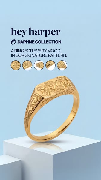
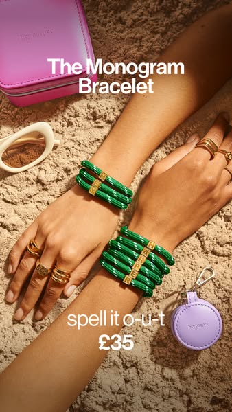
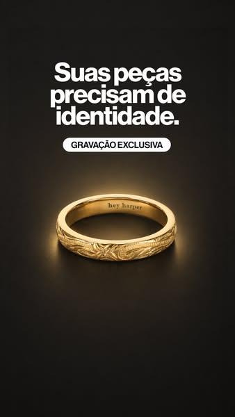
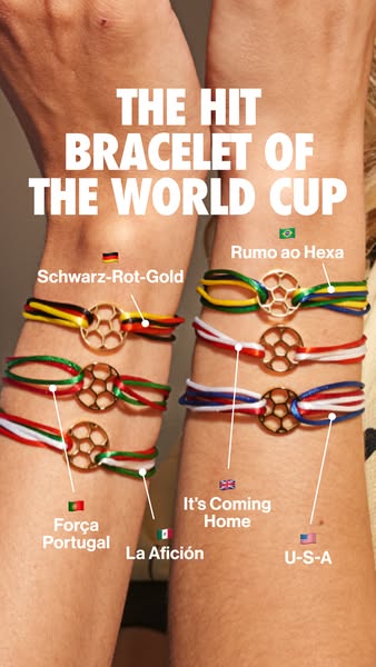
The ad features rings and bracelets that are designed to represent different nations participating in the WC2026 (World Cup 2026). The rings appear to be made of a gold-tone metal and are worn stacked on the fingers of the models. The bracelets are thin, corded designs featuring a round charm that is also gold in color and has a soccer ball design in the center. The bracelets come in a variety of color combinations, each seemingly corresponding to the colors of different national teams. The ad focuses on the idea of national pride, encouraging viewers to "stand by your nation" by wearing jewelry that showcases their allegiance. The jewelry is presented as a way to visibly support one's team during the World Cup.
# Visual style
The ad features a clean, brightly lit studio shot with a focus on the jewelry and the models wearing national team colors. The image is well-composed, with the models positioned closely together holding a soccer ball, creating a sense of unity and connection. The overall visual aesthetic is polished and professional, aiming to capture the excitement and spirit of the WC2026 tournament.
# Hooks
Headline: STAND BY YOUR NATION in WC2026
# Call to action
None used.
# Point of view
- [object Object]
# Storyline
- The image presents two people wearing jewelry with national team colors holding a soccer ball. This conveys a message of unity and support for their respective countries during WC2026 from the brand's perspective.