Front runs 5 active ads on Meta, shipping ~3 new creatives per week. Their library leans on Headline60%, Review20%, and Collage20%. Recently, Front is positioning itself as the antidote to B2B operational chaos, hammering on the idea that legacy CX systems can't handle modern complexity and critical handoffs. The creative leans heavy on visual metaphors (construction workers in freefall, classical art representing order vs chaos) to dramatize the anxiety and stakes of missed workflows. It's a consistent problem/solution beat: your current tools are failing you, Front brings structure and control to messy B2B customer operations.
# Ad summary
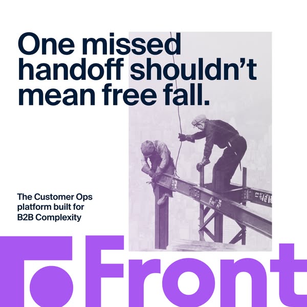
This ad promotes Front, a Customer Ops platform designed for B2B complexity. It uses a visual metaphor of construction workers to illustrate the importance of seamless handoffs and avoiding "free fall" situations.
# Brand positioning
Front is presented as a Customer Operations platform designed for businesses operating in complex B2B environments. The brand positions itself as a solution to prevent critical failures, emphasizing reliability and stability in business operations. The imagery of construction workers on a high steel beam implicitly promotes safety, precision, and dependability. The brand's name is prominently displayed, conveying a sense of being at the forefront of customer operations solutions.
# Product
The advertised product is Front, a Customer Ops platform tailored for B2B complexity. It is not a physical product, but a software solution that aims to streamline and improve customer operations. The ad suggests that Front prevents critical failures resulting from missed handoffs, offering a reliable way to manage customer interactions and operations effectively. The primary benefit is preventing the metaphorical 'free fall' associated with operational errors in complex B2B environments.
# Visual style
The ad has a vintage aesthetic, employing a washed-out color palette and a somewhat grainy, desaturated filter over the construction worker image. The typography is clean and modern, contrasting with the vintage image. The large, bold logo and straightforward text are designed for easy readability.
# Hooks
Headline: One missed handoff shouldn't mean free fall.
# Call to action
None used.
# Point of view
- [object Object]
- [object Object]
# Storyline
- The ad begins by stating a problem: "One missed handoff shouldn't mean free fall." This is framed from the brand's perspective, highlighting the potential consequences of operational errors and establishing the need for a solution.
- The visual then shows construction workers working on a steel beam, creating a visual metaphor for high-stakes operations. This imagery, shown from an external perspective, reinforces the message of risk and the need for stability.
- The ad concludes by introducing Front as "The Customer Ops platform built for B2B Complexity." This is from the brand's perspective, positioning Front as the solution to the problem introduced earlier.
# Ad summary
This ad for Front uses a series of images to illustrate the growing complexity of the world over time. The ad then positions Front as a solution for the need for CX tools that can keep up with modern problems.
# Brand positioning
Front is presented as a cutting-edge provider of customer experience (CX) tools designed to address the increasing complexity of customer interactions. The brand positions itself as essential for businesses needing to keep up with the demands of modern communication, implying that traditional or outdated CX solutions are insufficient. Front aligns itself with progress, innovation, and forward-thinking business strategies, suggesting that customers should choose Front to stay competitive and efficient in a fast-evolving market.
# Product
The product advertised is Front's customer experience (CX) tools, designed to help businesses manage and streamline their customer interactions. The ad implies that Front's tools are modern, up-to-date, and capable of handling the increasing complexity of customer service. It is for businesses that recognize the need for advanced solutions to keep pace with evolving customer needs. The ad doesn't explicitly detail the tools' features or ingredients, but the implied USP is Front's ability to manage complex customer interactions effectively. The ad aims to address the purchase barrier related to outdated or insufficient CX tools by offering a solution that keeps up with the times.
# Visual style
The ad features a minimalist and modern visual style. The use of grayscale with a purple undertone across the historical images creates a cohesive look and emphasizes the theme of evolution over time. The images are presented as if they are projected or displayed on screens. The typography is clean and bold, enhancing readability and conveying a sense of clarity and confidence. The overall aesthetic is professional and sleek, designed to appeal to a business-oriented audience.
# Hooks
Headline: Complexity is forever.
# Benefits
- [object Object]
# Call to action
None used.
# Point of view
- [object Object]
# Storyline
- The ad opens with the phrase "Complexity is forever," establishing the central theme of ever-increasing difficulty. The brand is establishing this idea as an objective truth about the nature of progress and change.
- A series of images are presented, each depicting a moment in history from ancient to modern times, showing how problems and challenges have evolved. This part of the story is told from an external source, providing an historical perspective on increasing complexity over time.
- The ad then pivots to the present day, suggesting that modern CX tools "should keep up" with this increasing complexity. The brand is telling the viewer that the complexity of the world requires more modern tools.
- The ad concludes with the brand's logo, "Front," positioned as the solution that enables businesses to manage complexity effectively. The brand is reinforcing its role as the provider of CX tools that address the issue of complexity.
# Ad summary
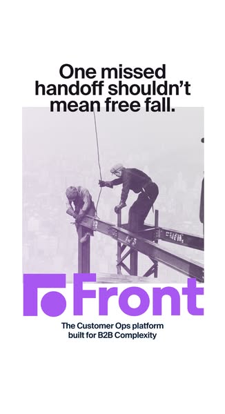
This ad for Front uses a black and white photograph of construction workers at a high altitude to visually represent the anxiety around missed handoffs and the resulting "free fall" for a B2B company. Front offers a Customer Ops platform as a solution.
# Brand positioning
Front aims to occupy the space in the consumer's mind as a solution for B2B complexity. It positions itself as a Customer Ops platform, implying that it is designed to streamline and optimize customer operations for businesses. It offers a functional, performance-oriented solution. It directly addresses the challenge of B2B complexity, suggesting that it is a solution for businesses struggling with intricate customer operations processes.
# Product
Front is promoted as The Customer Ops platform built for B2B Complexity. It addresses the challenges that businesses face in managing complex customer operations by streamlining their processes. The core purpose of Front is to prevent negative outcomes resulting from missed handoffs.
# Visual style
The ad uses a vintage black and white photograph overlaid with a modern, minimalist logo. The image treatment includes a purple color overlay to create a cohesive visual connection between the photo and the brand. Typography is integrated cleanly, with a balance of serious messaging. The ad's visual style feels disruptive due to its use of older imagery combined with modern branding, designed to catch the eye while still maintaining a sense of professional reliability.
# Hooks
Headline: One missed handoff shouldn't mean free fall.
# Benefits
- [object Object]
# Features
- [object Object]
# Call to action
None used.
# Point of view
- [object Object]
# Storyline
- The ad opens with the statement that a missed handoff shouldn't result in a 'free fall', framing the potential negative impact of mishandled operational tasks in the complex B2B world. This comes from the brand, suggesting that it understands the high stakes involved in business operations and the need to avoid disastrous outcomes.
- The ad uses a black and white photo of construction workers high on a building frame, emphasizing the precarity of the work. It positions Front as a safety net. This comes from the brand, communicating its role as a safety net in complex and risky B2B operational environments.
- The ad concludes by identifying Front as the Customer Ops platform that is built for B2B complexity, indicating the product's purpose and target audience. The brand highlights Front as the solution to ensure customer operations run smoothly, reducing the risk of errors or mishaps.
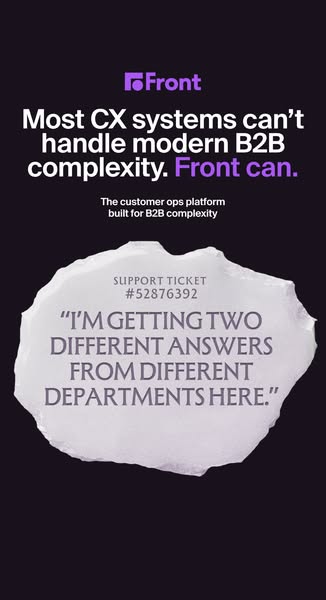
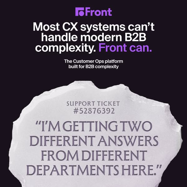
# Ad summary
This ad is for Front, a customer operations platform for B2B companies. The ad highlights the problem of CX systems failing to handle modern B2B complexity and the solution is Front.
# Brand positioning
Front is presented as a solution for businesses struggling with complex B2B customer operations. The brand positions itself as a modern solution, contrasting with existing CX systems that supposedly can't handle the intricacies of B2B. This implies that Front aims to occupy a space in the consumer's mind as an innovative and capable platform for managing customer interactions, especially in the complex B2B environment. Front aligns with a tone that promotes efficiency and problem-solving. The brand is functionally positioned, emphasizing its performance and ability to simplify complex operations.
# Product
Front is a customer operations platform designed to handle the complexities of modern B2B interactions. It addresses the problem of existing CX systems failing to manage the intricate needs of B2B customer operations. Its primary USP is its ability to handle modern B2B complexity. The ad implies that Front is worth trying or buying because it solves the pain point of inconsistent information from different departments, as indicated by the customer quote in the ad.
# Visual style
The ad has a clean and modern aesthetic with a minimalist design. The use of a solid dark background, combined with the Front logo's vibrant purple, creates a sense of sophistication. The visual of a stone tablet with a customer quote provides contrast and emphasizes the real-world problem that Front is designed to solve. The design aims for a balance between simplicity and impactful communication.
# Hooks
Headline: Most CX systems can't handle modern B2B complexity. Front can.
# Benefits
- [object Object]
# Features
- [object Object]
- [object Object]
# Call to action
None used.
# Point of view
- [object Object]
- [object Object]
# Storyline
- The ad starts by stating that most CX systems can't handle modern B2B complexity. This message is presented from the brand's perspective, immediately establishing the problem that Front aims to solve.
- The ad then pivots to state that Front can handle the complexity. This is presented by the brand in order to position itself as the solution.
- The ad transitions to a customer's perspective in the form of a quote displayed on what appears to be a stone tablet, highlighting a specific pain point: getting two different answers from different departments. This is included to connect the brand's solution to a tangible customer problem.
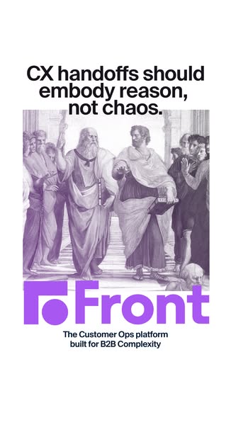
# Ad summary
This image ad for Front uses a classical art style to convey the message that their Customer Ops platform brings reason, not chaos, to B2B complexity.
# Brand positioning
Front is presented as a solution to complex Customer Operations in the B2B world. The brand positions itself as a source of order and reason. By contrasting the chaos of typical B2B environments with the classical allusion of philosophical debate, Front suggests a calm and structured approach. This juxtaposition implies that the brand values clarity and efficiency, aiming to occupy a space in the consumer's mind as a provider of sophisticated and streamlined solutions for B2B customer operations, prioritizing functional benefits.
# Product
The advertised product is Front, a Customer Ops platform designed for B2B complexity. It is not a physical product but rather a software solution that aims to bring order and reason to what is described as the chaotic nature of business-to-business customer operations. The ad is targeted toward businesses that face challenges in managing customer interactions and data. The unique selling proposition (USP) is its ability to streamline complex customer operations, implying features such as efficient handoffs and a centralized platform. The ad addresses the barrier of chaotic and unorganized systems, positioning Front as a tool that resolves this issue.
# Visual style
The ad features a blend of classical art and modern branding elements. The production quality leans towards a polished design with a strategic use of color and typography. The visual motifs include the juxtaposition of historical artwork with contemporary brand presentation, suggesting both tradition and innovation. The image treatment involves a monochromatic purple tint and background removal, adding a modern twist to the classical artwork. The typography integration is clean and legible, reinforcing the theme of clarity and simplicity. The style contrasts with typical in-feed content by using high-design elements, potentially increasing stop power and scannability.
# Hooks
Headline: CX handoffs should embody reason, not chaos.
# Benefits
- [object Object]
# Features
- [object Object]
- [object Object]
# Call to action
None used.
# Point of view
- [object Object]
- [object Object]
- [object Object]
# Storyline
- The ad starts by highlighting the issue of chaotic CX handoffs, emphasizing the need for reason instead. This sets the stage by pinpointing a common frustration in customer experience, as told from the brand's point of view.
- Next, the ad visually reinforces the idea of bringing order to chaos using a classical painting that depicts philosophical discussions. This element aims to juxtapose the current operational disarray with a vision of structured thinking, providing a brand perspective.
- Finally, the ad introduces Front as the solution, stating that it's a platform built for B2B complexity. This completes the narrative by presenting Front as the tool to achieve the earlier mentioned reason and order, again from the brand’s perspective.
# Ad summary
This image ad showcases Front as a solution for modern B2B complexity that most CX systems can't handle. It uses a direct comparison to highlight Front's capabilities and includes a customer quote to emphasize the frustrations that Front aims to solve.
# Brand positioning
Front positions itself as the solution for B2B customer operations in a complex environment. By contrasting itself with other CX systems that can't handle modern B2B complexity, Front aims to occupy the space of being a sophisticated, capable, and necessary tool for businesses. The brand promotes a sense of clarity and efficiency, aligning with values of simplification and problem-solving in the operational space. This positioning rejects the norm of complicated, inadequate customer service systems, opting instead for a functional approach that prioritizes performance and ease of use.
# Product
Front is a customer operations platform designed to manage B2B complexity, contrasting itself with CX systems that can't handle the modern business environment. The ad highlights its ability to resolve issues such as inconsistent departmental responses. It addresses the pain point of inefficient customer support, offering itself as a streamlined solution that ensures clarity and consistency in customer interactions. The product is for B2B companies who want an operation platform built for B2B complexity.
# Visual style
The ad features a clean and straightforward visual style, contrasting a modern logo and text with a rough stone slab that simulates a customer support ticket. The ad has high production quality. The image treatment includes subtle color grading. Typography is integrated to mimic a real support ticket on the stone slab, which contrasts with the modern font used for the brand messaging. This contrast aims to create stop power in the feed.
# Hooks
Headline: Most CX systems can't handle modern B2B complexity. Front can.
# Benefits
- [object Object]
# Features
- [object Object]
# Call to action
None used.
# Point of view
- [object Object]
- [object Object]
# Storyline
- The ad starts by highlighting that most CX systems cannot handle modern B2B complexity, which aims to introduce the primary problem or pain point the ad is designed to address. The perspective is from the brand who is pointing out the shortcomings of the current industry solutions.
- The copy then states that Front can handle modern B2B complexity, which is intended to position Front as the solution to the problem introduced earlier. The perspective is from the brand, offering its platform as the solution.
- The ad includes a customer's quote from a support ticket, which states: "I'M GETTING TWO DIFFERENT ANSWERS FROM DIFFERENT DEPARTMENTS HERE." This is intended to illustrate a common frustration or pain point that customers experience with current CX systems, which Front aims to solve. The perspective is from the customer, sharing a real-life issue.