Foreverfrenchbaby runs 262 active ads on Meta, shipping ~20 new creatives per week. Their library leans on Collage16%, Product Image16%, and UGC Overlay14%. Recently, foreverfrenchbaby is pushing their "ff exclusives" collection hard, flooding the feed with matching mommy-and-me pajama and lounge sets in cozy prints like gingham, stripes, hearts, and quirky motifs (motorcycles, cacti, milk cartons). The framing is all about aspirational comfort and coordinated cuteness, leaning into that "match your mini" positioning to drive urgency around limited drops and bestsellers. There's a clear throughline of lifestyle relatability mixed with product hero shots, selling not just clothes but a whole aesthetic of effortless, Instagram-ready family moments.
# Ad summary
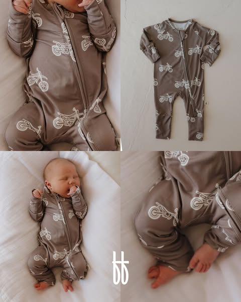
This ad features a collage of a baby wearing a brown onesie covered in white motorcycle images, as well as a solo product shot of the same onesie.
# Brand positioning
This brand is presented as a provider of comfortable and stylish baby clothing. The use of a motorcycle print on the onesie may suggest a playful or adventurous aesthetic, appealing to parents who want their children to stand out with unique designs. The brand appears to follow category norms by focusing on baby apparel but attempts to differentiate itself by using less conventional patterns and prints.
# Product
The advertised product is a long-sleeved baby onesie in a soft brown color, covered with a pattern of white motorcycle illustrations. It features a zipper that runs diagonally from the neck down to one of the legs, presumably for easy dressing and diaper changes. The onesie is made from a soft-looking fabric and appears to be designed for comfort, which addresses the purchase barrier of ensuring the baby's comfort. The pattern is a USP as it is distinct and not typically found in baby clothing.
# Visual style
The ad utilizes a soft, natural visual aesthetic. The production quality is high, with professionally shot images that highlight the product's details and the baby's comfort. The lighting is soft and diffused, which contributes to the overall gentle and inviting tone of the ad. The muted color palette and the use of natural light further enhance the ad's visual appeal, making it scannable and appealing in a social media feed.
# Hooks
Headline: None used
# Benefits
- [object Object]
# Features
- [object Object]
- [object Object]
# Call to action
None used.
# Point of view
- [object Object]
# Storyline
- The ad begins by showing the full onesie in the top right, isolated against an off-white background. The brand is using a product shot to show off the design of the onesie.
- In the top left, the image shows a baby wearing the onesie. The brand wants to show off the fit of the onesie and how it looks when worn.
- The bottom left image shows a sleeping baby wearing the onesie. The brand is showcasing how comfortable the onesie is, as the baby looks peaceful.
- The bottom right image provides a close-up of the onesie, with the baby's feet and hands partially visible. The brand is using this image to provide a detailed view of the fabric and the fit around the baby's limbs.
# Ad summary
This ad features a mom holding her baby to show off matching pajamas, conveying a relatable and cute moment.
# Brand positioning
The brand promotes cozy, stylish matching pajamas for mothers and their children. It aligns with a lifestyle of coordinated family moments and seeks to occupy the space of creating opportunities for connection and visual appeal through matching outfits. The brand's tone is casual and relatable, positioning itself as a provider of cute and fashionable items for both mothers and children, emphasizing shared experiences.
# Product
The featured product is a set of matching pajamas for a mother and child, adorned with a gray and beige checkered pattern. The mother's set includes a long-sleeved, zip-up top and flared pants, while the baby's set is a one-piece jumpsuit. These pajamas are presented as a way to create coordinated, cute moments, aimed at mothers who enjoy matching outfits with their children and appreciate comfortable, stylish sleepwear. The pajamas address the purchase barrier of hesitating to buy them by presenting the ad as a 'sign' to make the purchase.
# Visual style
The ad has a polished UGC feel with soft, natural lighting. The editing style is simple with static shots and smooth transitions. The production quality is high, aiming for a relatable yet aesthetically pleasing look, suitable for a social media audience.
# Benefits
- [object Object]
- [object Object]
- [object Object]
- [object Object]
# Features
- [object Object]
- [object Object]
- [object Object]
- [object Object]
# Call to action
None used.
# Point of view
- [object Object]
# Storyline
- 00:00–00:05 A mom holds her baby in matching pajamas, presenting a visual of coordinated outfits.
# Ad summary
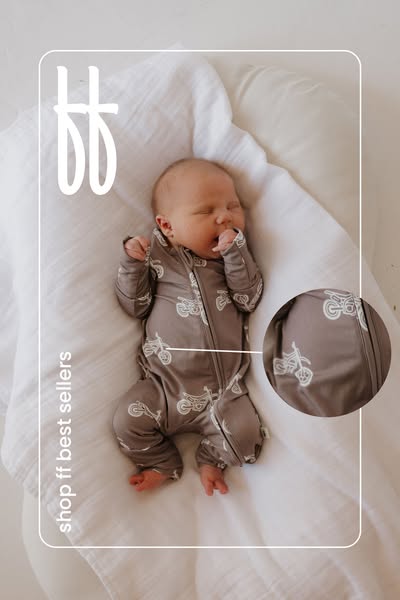
This ad features an image of a baby wearing a Footies brand onesie that is patterned with a white motorcycle design. There is text vertically on the left side of the image that states: shop ff best sellers. The image is taken in a soft natural light.
# Brand positioning
The Footies brand is presented as a provider of comfortable and stylish baby clothing. The brand is focusing on a specific product line of their "best sellers," suggesting popularity and quality. The visuals used in the ad, which includes a comfortable looking baby and simple text/design, suggest a brand that values a peaceful and stylish parenthood experience.
# Product
The product being advertised is a baby onesie, referred to as a "footie", made by the brand Footies. The onesie is light brown and features a white motorcycle pattern. It is made of a soft, flexible material and includes a zipper down the front. The baby pictured is wearing the onesie, which covers the entirety of the baby's body, hands, and feet. The ad conveys that this product is a popular item within the Footies brand.
# Visual style
The ad uses a clean and simple visual style. It features soft, natural lighting and a neutral color palette. The product is the main focus of the image. The brand's logo is subtly placed in the corner. The minimalist design conveys a sense of calm and sophistication.
# Hooks
Headline: shop ff best sellers
# Benefits
- [object Object]
# Features
- [object Object]
# Call to action
None used.
# Point of view
- [object Object]
# Storyline
- The ad shows a baby wearing a motorcycle-patterned onesie and tells the viewer to shop ff best sellers. The intention is to showcase a popular product and drive sales by appealing to parents interested in comfortable and stylish baby clothing. The perspective is that of the brand Footies.
# Ad summary
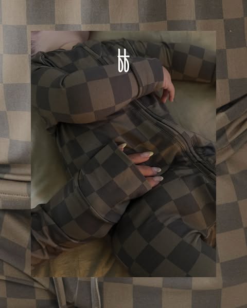
This ad features a close-up of a person wearing a brown and grey checkered, full body pajama onesie.
# Brand positioning
This ad is for a brand that is not explicitly named. Based on the checkered pattern and overall aesthetic of the ad, the brand appears to be a modern lifestyle brand that values comfort and style. They aim to occupy a space in the consumer's mind as a provider of aesthetically pleasing and comfortable clothing. The brand promotes a cozy lifestyle, emphasizing relaxation and ease. They seem to ignore the fast-paced fashion trends, focusing instead on timeless designs and comfort-driven products. The brand positioning is more emotional, aligning with feelings of comfort and relaxation.
# Product
The advertised product is a full-body pajama onesie, featuring a brown and grey checkered pattern. The onesie has long sleeves with attached mitten cuffs and a zipper running down the front. The fabric appears soft and flexible, designed for comfort. It seems to be for anyone who prioritizes relaxation and values cozy loungewear. The main selling point is its comfortable design and visually appealing pattern, making it an item worth trying for those seeking stylish comfort.
# Visual style
The ad has a soft, cozy, and aesthetically pleasing visual style. The production quality appears to be professionally shot, with attention to lighting and composition. The checkerboard motif creates a visually consistent and branded feel. Image treatment includes soft lighting and a muted color palette, enhancing the sense of comfort. The typography integration, if any, is subtle, maintaining a minimalist feel. This style aims to provide high scannability, as well as stop power in a social media feed, with the relaxing aesthetic and focus on comfort.
# Hooks
Headline: None used
# Benefits
- [object Object]
- [object Object]
- [object Object]
# Features
- [object Object]
- [object Object]
- [object Object]
- [object Object]
# Call to action
None used.
# Point of view
- [object Object]
# Storyline
- The ad shows a person wearing a brown and grey checkered onesie, conveying a message of comfort and style. The brand is showcasing its product in a relaxed setting, aiming to promote a sense of coziness and encourage viewers to consider the garment for their own loungewear needs.
# Ad summary
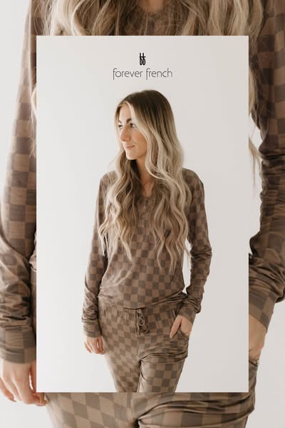
This ad features a woman wearing a brown and tan checkered lounge set from Forever French. The ad's framing and warm color palette evoke a sense of simple comfort.
# Brand positioning
Forever French is presented as a provider of comfortable, stylish loungewear. The brand logo is simple and understated, suggesting a focus on quality and timelessness. The brand aligns with a lifestyle of relaxation and effortless style, promoting a sense of casual elegance and comfort.
# Product
The product featured is a lounge set with a brown and tan checkered print. The set includes a long-sleeved V-neck top and drawstring pants, suggesting it is designed for comfort and relaxation. The soft fabric and relaxed fit contribute to the overall impression of easygoing style. The lounge set is aimed at individuals who value comfort and style, offering a cozy yet fashionable option for leisurewear.
# Visual style
The ad has a clean and minimalist visual style with a focus on natural lighting and soft colors. The framing and simple background create a sense of effortless elegance. The overall effect is approachable and inviting, suggesting that the brand is accessible and easy to incorporate into everyday life.
# Hooks
Headline: None used
# Benefits
- [object Object]
- [object Object]
- [object Object]
# Features
- [object Object]
- [object Object]
- [object Object]
# Call to action
None used.
# Point of view
- [object Object]
# Storyline
- The ad opens with a woman modeling a lounge set against a plain white background. This establishes the product as the primary focus, presenting it in a clean and simple setting. The POV is from the brand, showcasing its design aesthetic.
- The woman is shown from the waist up, allowing the viewer to get a clear look at the cut and style of the lounge set. The POV is from the brand, highlighting the set's design and fit.
- The woman is looking off to the side with a relaxed expression, creating a sense of ease and comfort. The POV is from the brand, evoking the set's lifestyle appeal.
# Ad summary
The ad shows different babies and toddlers in various colored and patterned clothing, blankets, and play spaces.
# Brand positioning
The brand is presented as catering to babies and young children by offering comfort and style. The brand aesthetic leans towards on-trend colors, patterns, and designs that are visually appealing and playful. By showcasing babies in trendy and aesthetically pleasing outfits, the brand positions itself as a go-to for parents who seek both functionality and modern design in their children's wear.
# Product
The product is a line of baby and toddler clothing and accessories featuring a variety of items. The line includes zip-up onesies in various colors and patterns, blankets with checkered patterns in neutral colors, and matching headbands. The clothing comes in different patterns, including lightning bolts, smiley faces, and barbells. The ad emphasizes the line's aesthetic appeal and comfort, making it clear that these products are designed to be both stylish and cozy for young children.
# Visual style
The ad's visual style is clean and bright, with a focus on showcasing the products in a visually appealing manner. The shots are well-lit, and the babies and toddlers are styled in trendy outfits. The editing is simple and straightforward, with quick cuts to transition between scenes. The overall aesthetic is polished and modern, appealing to parents who value both style and quality.
# Benefits
- [object Object]
- [object Object]
- [object Object]
- [object Object]
# Features
- [object Object]
- [object Object]
- [object Object]
- [object Object]
# Call to action
None used.
# Point of view
- [object Object]
# Storyline
- 00:00–00:00 The ad opens with a shot of a baby lying in a cushioned lounger.
- 00:00–00:01 The scene transitions to a baby wrapped in a blanket, looking up.
- 00:01–00:02 The scene changes to show a baby lying on a white sheet, wearing a white and black onesie.
- 00:03–00:03 Next, a toddler in a black and white checkered outfit is lying on a black blanket.
- 00:03–00:04 The ad concludes with a toddler kneeling and smiling by a wall, wearing a gray patterned outfit.
# Ad summary
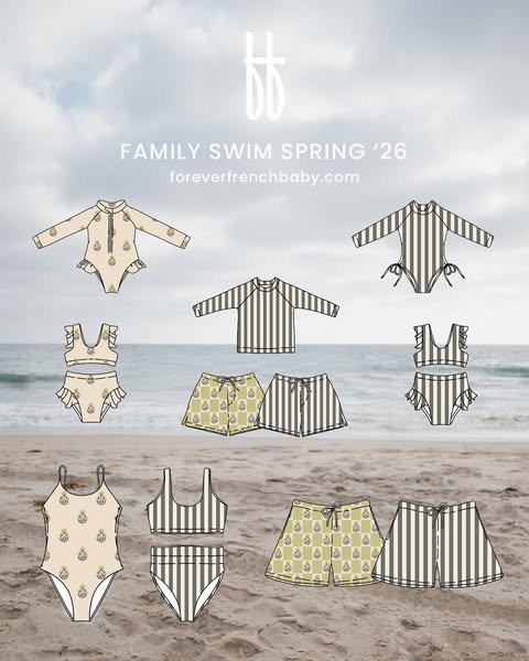
This ad for Forever French Baby displays a variety of swimsuits and swimwear for family swim in Spring of 2026.
# Brand positioning
Forever French Baby is presented as a brand that offers stylish and coordinated swimwear options for the whole family. The brand's name implies a French-inspired aesthetic and positions it as a provider of trendy and fashionable swimwear. The collection is designed to cater to families who want to express their style and coordinate their looks while enjoying time at the beach or pool. The brand focuses on creating matching or complementary swimwear sets for parents and children, emphasizing a sense of unity and togetherness. The brand leans towards a functional positioning that offers a variety of options.
# Product
The ad features a collection of family swimwear for the Spring '26 season. The collection includes a variety of styles and designs for different age groups and preferences. For babies and toddlers, there are one-piece swimsuits with long sleeves and front zippers, as well as two-piece sets with ruffle details. For older children and adults, there are bikini tops and bottoms, rash guards, and swim shorts. The swimsuits come in two patterns: one is a light tan color with a repeating motif of a pineapple or similar fruit and the other pattern features neutral vertical stripes. The collection emphasizes coordination, allowing families to mix and match different pieces to create cohesive looks.
# Visual style
The ad has a clean and minimalist visual style. The layout is simple, with the swimsuits arranged against a blurry beach background. The image treatment is clean and bright, with a slight desaturation of the beach to make the swimwear pop. The typography is simple and modern, with a focus on readability. The visual style is consistent with a modern and sophisticated brand aesthetic.
# Hooks
Headline: FAMILY SWIM SPRING '26
# Call to action
None used.
# Point of view
- [object Object]
- [object Object]
# Storyline
- The ad opens with an array of different swimsuit styles and patterns. This is included to showcase the variety of options available in the brand's family swimwear collection and create a visually appealing presentation. This part of the story is told from the brand's perspective, highlighting the range of products they offer.
- The ad then focuses on the coordination within the collection. This is included to show how families can mix and match different pieces to create cohesive looks. The perspective switches to the customer, emphasizing the benefits of coordinated family swimwear.
- The ad concludes with a call to visit the website. This is included to drive traffic and encourage purchases. The story returns to the brand's perspective, directing the audience to take action.
# Ad summary
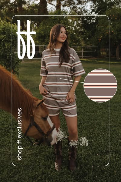
An image ad featuring a woman in a matching striped lounge set posing next to a horse. The ad promotes the brand FF Exclusives and their striped short set.
# Brand positioning
FF Exclusives appears to position itself as a fashion brand that offers on-trend, exclusive clothing options. The brand aims to appeal to individuals who seek unique and stylish pieces that are not widely available, suggesting exclusivity. The visuals, featuring a matching striped lounge set in a neutral color palette, evoke a relaxed yet fashionable tone. The brand aligns itself with a lifestyle that values comfort and style, possibly targeting those who want to look put-together effortlessly. The choice of a setting with natural elements and a horse suggests an outdoorsy, down-to-earth aesthetic.
# Product
The featured product is a matching striped lounge set consisting of a short-sleeved t-shirt and shorts. The set features horizontal stripes in shades of gray, brown, and white. The top has a relaxed, loose fit, while the shorts appear to have an elastic waistband for comfort. This set is designed for casual wear, likely targeting individuals who value comfort and style in their everyday clothing choices. The product is presented as a coordinated outfit, simplifying the process of choosing what to wear. The image shows the set being worn in an outdoor setting, suggesting it is suitable for relaxed activities or lounging. The USPs conveyed are comfort, style, and exclusivity.
# Visual style
The ad features a lifestyle shot with a soft, natural aesthetic. The production quality appears high, with attention to detail in the styling and setting. The image treatment includes a warm filter that enhances the natural tones. The typography is clean and modern. The overall style aligns with a casual, approachable vibe, making it scannable and appealing in-feed.
# Hooks
Headline: None used
# Call to action
None used.
# Point of view
- [object Object]
# Storyline
- The ad opens with a full shot of a woman in a matching striped lounge set posing in a yard next to a horse. This sets the scene and introduces the product in a lifestyle setting, highlighting the style and fit of the set from a distance, told from an external perspective.
- The focal point shifts to the model's outfit, and the ad includes a circular cutout of the fabric pattern. This is included to show the quality and color scheme of the fabric, giving a closer look at the style and detail. The viewer experiences the product through the brand's perspective.
- The eye is drawn downward to the lower left corner of the frame, where the text 'shop ff exclusives' is displayed vertically. This is to direct the audience to the brand and encourage a purchase, as told by the brand itself.
# Ad summary
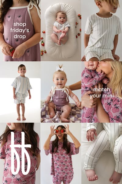
This ad showcases a variety of children's clothing sets, including a strawberry-themed set. It highlights the brand's new Friday drop and encourages matching outfits for mothers and children.
# Brand positioning
This brand appears to be a children's clothing brand. The company produces sets and individual pieces for both young kids and babies. There are matching sets that cater to mothers who may want to dress like their child. The brand's tone is playful and focused on comfortable, coordinated looks for families.
# Product
The ad showcases various children's clothing items including matching sets, dresses, and baby rompers. The clothing is designed for comfort and coordination, featuring soft fabrics and playful designs. One prominent design is a strawberry print, featured on multiple items for both babies and adults. These pieces include dresses, tops, and bottoms. The ad highlights the ability to 'match your mini,' suggesting that the brand offers coordinated outfits for mothers and their children. The variety of items and the focus on sets is intended to address the need for effortless, stylish looks for children and families.
# Visual style
The ad features a soft and bright aesthetic with a focus on natural lighting and muted color tones. The production quality is high, indicating a professional photoshoot. The visual motif is a grid layout showcasing various products and lifestyle moments. There are no obvious filters or image treatments, lending a clean and modern feel. The typography is simple and legible, likely chosen to blend seamlessly with the soft and playful aesthetic. The visual style is designed to be scannable and appealing in a social media feed.
# Hooks
Headline: match your mini
# Benefits
- [object Object]
# Features
- [object Object]
# Call to action
None used.
# Point of view
- [object Object]
# Storyline
- The ad opens by showcasing the brand's product range in the form of a grid which gives a glimpse into the variety of children's clothing the brand offers. This is presented from the brand's perspective to highlight the breadth of their collection and cater to different preferences and age groups.
- The ad highlights a specific strawberry print set, which is intended to spotlight a key design element and draw attention to one of the brand's unique product offerings. This is presented from the brand's perspective and progresses the narrative by focusing on a specific theme within the broader collection.
- The narrative is highlighting 'match your mini,' a brand message, which is intended to inspire viewers to purchase coordinated outfits for mothers and children. This comes from the brand's perspective and adds a unique selling point to the product showcase.
- The final narrative beat showcases various children wearing the brand's clothing and intends to demonstrate the practical use of the brand's various products. This narrative is presented from the customer's perspective and further demonstrates the brand's intent of offering a large selection of clothing products for children and families.
# Ad summary
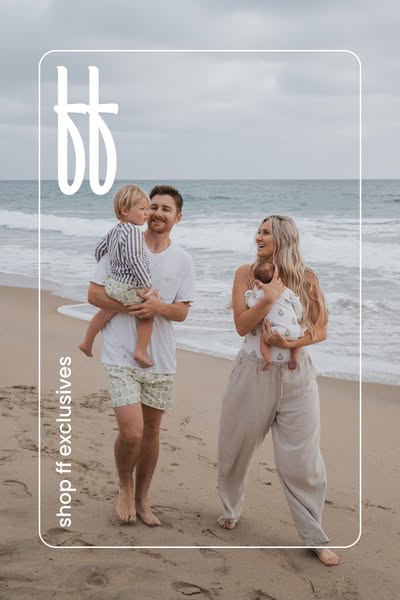
This ad features a family standing on a beach to promote exclusives. The image is framed by a white border with rounded edges, with brand logos in the upper left and the text "shop ff exclusives" rotated 90 degrees on the left side.
# Brand positioning
The brand appears to cater to families and prioritize comfort and quality, promoting a lifestyle of effortless style and relaxed sophistication. By showing a family with young children enjoying a day at the beach, the brand aligns itself with values of family, leisure, and natural beauty. The brand aims to occupy a space in the consumer's mind as a provider of stylish, comfortable, and high-quality clothing for the whole family, fitting into the broader market of premium family lifestyle brands.
# Product
The ad features a variety of apparel pieces worn by a family at the beach. The father is wearing patterned khaki shorts and a plain white t-shirt. The young boy is wearing matching shorts and a striped, long-sleeved shirt. The mother is wearing loose fitting neutral color linen pants and is holding a baby who is wearing a baby one-piece with a pattern. The product line appears to focus on providing comfortable, stylish clothing suitable for everyday family activities.
# Visual style
The ad has a warm, lifestyle-focused visual style, appearing to be shot outdoors in natural lighting. The image quality is high, but not overly polished, giving it an authentic and approachable feel. The color palette is neutral, with soft earth tones dominating the scene, aligning with the brand's aesthetic. The image has a slight vintage feel.
# Hooks
Headline: None used
# Benefits
- [object Object]
- [object Object]
- [object Object]
# Features
- [object Object]
- [object Object]
# Call to action
None used.
# Point of view
- [object Object]
# Storyline
- The ad opens with a family portrait of a man, woman, and two young children on the beach. This establishes a scene of familial leisure and emphasizes the brand's connection with family values, experienced from the perspective of an observer.
- The family members are all shown wearing products from the brand, and they face the camera. The ad is telling the user how the products look on real people.
- The brand logo and tagline "shop ff exclusives" are prominently displayed. This aims to promote the brand and encourage the viewer to explore the exclusive products, told from the brand's perspective.
# Ad summary
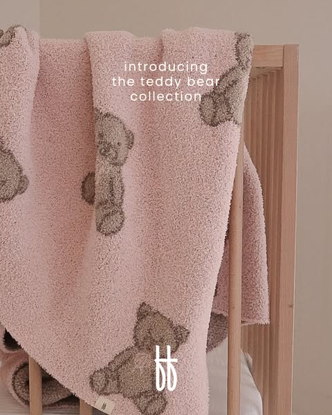
This ad showcases a pink teddy bear blanket, introducing the new teddy bear collection.
# Brand positioning
This brand positions itself within the baby and children's products sector, specifically specializing in items designed for comfort and security. The brand appears to be targeting parents who prioritize creating a cozy and nurturing environment for their children. The brand aligns with a lifestyle that values high-quality, soft, and comforting products, emphasizing gentle and soothing experiences for children, especially during sleep or rest. The brand aims to offer a comforting and familiar presence, evoking feelings of safety and warmth associated with a classic teddy bear, suggesting a gentle and loving approach to childcare.
# Product
The featured product is a soft, plush baby blanket with a pink base color and embossed teddy bear patterns. The blanket is made from a material that appears to be similar to sherpa or fleece. The blanket is intended for infants and young children, aimed at providing warmth and comfort. The defining feature is the repeating pattern of teddy bears embossed into the fabric, adding a tactile and visual element. The blanket addresses parental needs for providing a safe, warm, and comforting environment for their children, specifically during sleep or rest.
# Visual style
The ad employs a soft, comforting, and minimalist aesthetic. The production quality appears to be studio-shot, with careful attention to lighting and composition. The image treatment features a soft color grade, enhancing the warmth and plushness of the blanket. The typography is clean and simple, integrated to complement the serene and inviting tone. This style is designed to be easily scannable and visually appealing, encouraging the viewer to pause and appreciate the details of the product.
# Hooks
Headline: introducing the teddy bear collection
# Benefits
- [object Object]
- [object Object]
# Features
- [object Object]
- [object Object]
# Call to action
None used.
# Point of view
- [object Object]
# Storyline
- The ad introduces a new collection featuring a teddy bear blanket, conveying excitement about a new product line. The brand is telling the audience about the new collection.
- The ad then showcases a close-up view of the product, emphasizing the plush texture and teddy bear design, which highlights the blanket's key features and appeals to parents seeking cozy and comforting items for their children. The brand is showing off the details of their product.
# Ad summary
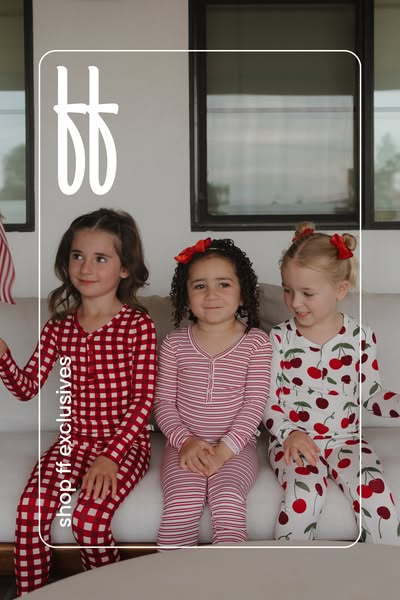
This ad features three young girls wearing pajamas and sitting on a couch. The ad promotes the brand's 'ff exclusives' collection and encourages viewers to shop.
# Brand positioning
The brand is positioned as an exclusive provider of children's pajamas, emphasizing style and comfort. By using real children in their ad, the brand aligns itself with authentic, everyday family life. The product's focus on unique patterns and styles pushes against generic children's sleepwear options, offering a more fashionable and personalized choice.
# Product
The product featured is a set of long-sleeved pajamas for children, which includes a top and pants. The pajamas are made of a soft, stretchy material and come in various patterns. The pajamas include a button-down top. The brand emphasizes their 'ff exclusives' line, suggesting unique and limited-edition designs not found elsewhere. The ad showcases the pajamas being worn in a casual, relaxed setting, suggesting they are comfortable for everyday use.
# Visual style
The ad has a bright and clean aesthetic, with natural lighting and soft color palettes. The production quality appears professional, suggesting a studio-shot image. The overall visual motif is simple and straightforward, focusing on the product and the children wearing them. The image is framed within a white border, contributing to a polished and cohesive look.
# Hooks
Headline: None used
# Benefits
- [object Object]
- [object Object]
# Features
- [object Object]
- [object Object]
# Call to action
None used.
# Point of view
- [object Object]
# Storyline
- The image shows three girls wearing different pajama sets. This establishes the product being advertised. The viewer experiences this from the brand's perspective.
- The text 'shop ff exclusives' encourages viewers to explore and purchase the exclusive pajama collection. This drives the narrative toward conversion. The brand is telling the story.
# Ad summary
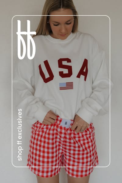
This image ad features a woman wearing a sweatshirt and shorts. The ad promotes a pair of red and white gingham shorts.
# Brand positioning
Based on the visual presentation, the brand aims to occupy a space in the consumer's mind that values comfort and a relaxed lifestyle. The brand also appears to align itself with American themes and culture. The brand positioning seems to lean towards emotional connection, focusing on feelings of patriotism and a comfortable, laid-back style.
# Product
The featured product is a pair of red and white gingham shorts. They appear to be made of a soft, possibly cotton, fabric. The shorts have an elastic waistband with a white tag attached at the front. The tag features the brand's logo. They are presented as comfortable loungewear. The ad suggests these shorts are suitable for casual, at-home wear.
# Visual style
The ad has a casual and lifestyle-oriented visual style. The production quality appears to be standard, with natural lighting and minimal editing. The image treatment uses a soft color palette, contributing to a relaxed feel. The typography is simple, with clear text placement. The overall style feels native to social media feeds, promoting easy scannability.
# Hooks
Headline: None used
# Benefits
- [object Object]
# Features
- [object Object]
- [object Object]
# Call to action
None used.
# Point of view
- [object Object]
- [object Object]
# Storyline
- The image showcases a person wearing the brand's shorts. This intends to highlight the fit and style of the shorts from the customer's point of view.
- The person is wearing a USA-themed sweatshirt along with the shorts. This may be included to create a specific aesthetic, promoting a relaxed and patriotic look from the brand's point of view.
- The words "shop ff exclusives" are featured, guiding the viewer to take a specific action, and this is presented from the brand's perspective.
# Ad summary
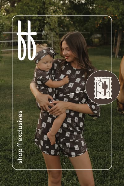
An image ad featuring a mother and baby wearing matching brown loungewear with a cactus and horseshoe print is showcased against a natural outdoor backdrop. The ad promotes the brand's exclusive collection.
# Brand positioning
This brand appears to focus on providing matching loungewear sets for mothers and their children. The ad aligns the brand with a lifestyle of comfort, family bonding, and coordinating fashion. The brand positions itself in the market by offering an exclusive collection, suggesting a limited availability or unique designs. With its matching sets and playful patterns, the brand differentiates itself from competitors by promoting a sense of fun and connection between family members.
# Product
The featured product is a matching loungewear set for a mother and baby. The set is brown and patterned with graphics of a horseshoe and a cactus in a square frame that appears like a postage stamp. The adult set consists of a t-shirt and shorts, while the baby set includes a t-shirt, shorts, and a matching headband. These loungewear sets are designed for comfort and style, perfect for casual wear at home or outdoors. The USPs lie in the matching design that allows for coordinated looks between mother and child, fostering a sense of connection and style unity.
# Visual style
The ad has a natural and soft aesthetic, with a focus on showcasing the matching loungewear in a comfortable, outdoor setting. The production quality appears to be high, with attention to detail in the styling and setting. The visual motifs include a cohesive color palette and a focus on patterns to create a unified look. The image treatment gives the ad a warm, inviting feel, enhancing the appeal of the product. The platform-native style suggests the ad is suitable for in-feed placement, with a clean and visually appealing design that is easy to scan.
# Hooks
Headline: None used
# Benefits
- [object Object]
- [object Object]
- [object Object]
# Features
- [object Object]
- [object Object]
- [object Object]
- [object Object]
# Call to action
None used.
# Point of view
- [object Object]
# Storyline
- The ad opens with a mother holding her baby in a natural outdoor setting, both wearing matching loungewear. This is intended to showcase the matching loungewear sets in a real-life context, as experienced from the brand's perspective, emphasizing the connection between mother and child through coordinated outfits.
- A stamp-like graphic with a cactus is placed next to the subjects, signaling a potential regional influence or design inspiration. This is from the brand's perspective and aims to create a connection with a specific geographical location or cultural aesthetic that resonates with the audience.
- The ad concludes with a vertically aligned call-to-action to shop the brand's exclusives, from the brand's perspective. This prompts viewers to explore and purchase the advertised product, guiding them toward a conversion.
# Ad summary
An image ad featuring a baby wearing an exclusive striped pajama set, promoting a baby clothing brand.
# Brand positioning
The brand being promoted in the ad positions itself as a provider of high-quality, exclusive baby clothing. The use of a cute baby as the main focus, combined with soft lighting and a gentle color palette, suggests a brand that values comfort and safety for babies. The brand stands out with its emphasis on exclusive products, suggesting a focus on unique designs not widely available. The brand's subtle logo and refined aesthetic indicates a commitment to quality and style.
# Product
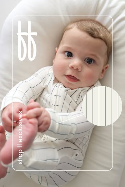
The ad showcases a striped pajama set for babies. The garment is a one-piece design with long sleeves and a full-length zipper down the front, allowing for easy dressing and diaper changes. The pajamas are made from a soft, white fabric with thin, dark stripes. The material appears to be lightweight and breathable, suitable for comfortable sleep or lounging. The baby is shown wearing the pajamas in a relaxed setting, emphasizing the comfort and fit of the product. The pajamas are being promoted as an 'exclusive' item.
# Visual style
The ad has a clean, minimalistic visual style. It uses soft lighting, a neutral color palette, and a shallow depth of field to keep the focus on the baby and the product. The overall aesthetic is gentle and inviting, with a focus on comfort and quality.
# Hooks
Headline: None used
# Benefits
- [object Object]
- [object Object]
- [object Object]
# Features
- [object Object]
- [object Object]
- [object Object]
# Call to action
None used.
# Point of view
- [object Object]
# Storyline
- From the brand's perspective, the image presents a baby in the brand's exclusive striped pajamas. This is included to showcase the product's design and fit on a real baby.
# Ad summary
This ad showcases a baby wearing a striped shirt and lying on a white cushion. The ad aims to draw attention to the product’s design and promote the brand's exclusive line.
# Brand positioning
The brand featured in the ad, implied to be 'ff' based on the large logo, positions itself in the children's apparel market with a focus on exclusive designs. The brand aims to occupy a space in the consumer's mind as a provider of unique and stylish clothing for babies, suggesting a blend of comfort and fashion. The brand promotes exclusivity through its 'ff exclusives' line, suggesting limited availability and specialized designs. The positioning appears to be both emotional and functional, offering aesthetically pleasing designs while also providing comfortable clothing for babies.
# Product
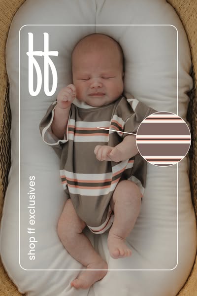
The featured product is a baby shirt or onesie, likely made of a soft, flexible fabric to ensure comfort for infants. The garment is a light brown color with horizontal stripes in white, light brown, and light orange. The design incorporates short sleeves and a simple, relaxed fit, prioritizing ease of movement and comfort for the baby. The ad emphasizes the product's availability as part of the brand's "ff exclusives" line, suggesting a limited or special collection. The ad aims to encourage viewers to purchase the shirt by showcasing its appealing design and highlighting its exclusivity.
# Visual style
The ad features a soft, natural aesthetic with muted tones and a focus on showcasing a baby in a comfortable setting. The production quality appears to be high, with attention to lighting and composition. The visual motifs include a focus on the baby and clothing, and clean text overlays. The image treatment includes soft lighting and color grading to create a warm and inviting feel. The typography is integrated seamlessly, with white text that complements the overall design. The visual style aims to be appealing and calming, intended to attract parents looking for comfortable and stylish clothing for their babies.
# Hooks
Headline: None used
# Benefits
- [object Object]
# Features
- [object Object]
# Call to action
None used.
# Point of view
- [object Object]
# Storyline
- The ad opens with a top-down shot of a baby wearing the featured shirt, lying comfortably in a cushioned basket. This is intended to capture the viewer's attention and showcase the product in a real-life context. The view is that of the brand, setting up the overall presentation of the product.
- A circular inset highlights the shirt's striped pattern in more detail. This emphasizes the design elements and allows potential customers to better appreciate the aesthetics of the clothing. This is also the brand's perspective as they call out the product's features.
- The lower left corner features the text 'shop ff exclusives,' prompting viewers to take immediate action and explore the brand's exclusive product line. The brand's call-to-action encourages a direct connection between the product shown and the brand's offerings.
# Ad summary
Ad shows a mother holding a baby, both wearing matching pajamas. The ad focuses on the brand's exclusive designs and is likely targeting new mothers.
# Brand positioning
The brand is presented as offering exclusive and matching clothing sets for mothers and their children. The design featuring a milk carton pattern suggests a playful and nostalgic aesthetic. The focus on matching sets implies a desire to create special moments and photo opportunities. The brand aims to occupy a space of stylish comfort and coordinated family fashion.
# Product
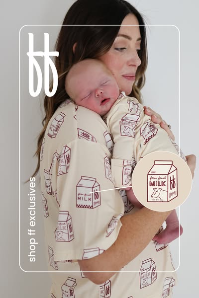
The featured product is a matching pajama set for a mother and child, adorned with a milk carton design. The set includes a button-down top and bottoms for the mother, and a onesie for the baby. The pattern features a cartoon-style milk carton with the brand's logo subtly integrated into the design. The product is for mothers who enjoy coordinated fashion with their children, particularly newborns. The ad emphasizes the exclusivity of the design, suggesting a unique and special offering.
# Visual style
The ad has a clean and soft aesthetic, with a focus on showcasing the product in a lifestyle setting. The lighting is soft and natural, creating a gentle and inviting mood. The color palette is muted and earthy, with a beige and brown color scheme. The overall style is modern and minimalist, with a touch of whimsy from the milk carton design. The production quality appears high, suggesting a professionally shot image.
# Hooks
Headline: None used
# Benefits
- [object Object]
- [object Object]
# Features
- [object Object]
- [object Object]
# Call to action
None used.
# Point of view
- [object Object]
# Storyline
- The ad showcases a mother holding her baby, both dressed in matching pajamas. This establishes the product and its intended use. This is shown from a brand perspective to highlight the visual appeal of the product.
- A close-up of the milk carton pattern on the pajamas is subtly presented. This highlights the unique design. This is shown from a brand perspective to showcase the specific details and aesthetic of the product.
- A call to action, 'shop ff exclusives', is displayed, prompting viewers to explore the brand's exclusive offerings. This is from a brand perspective and encourages immediate engagement and potential purchase.
# Ad summary
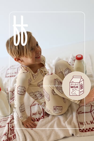
This ad features a toddler wearing pajamas with a milk carton print. A milk carton logo with the brand's initials is in the corner. The ad is for pajamas sold by shop ff exclusives.
# Brand positioning
The brand, shop ff exclusives, is presented as offering exclusive pajama designs. The brand's products aim to align with a fun and playful lifestyle. This is conveyed through the imagery of a smiling child in playful pajamas, suggesting that the brand values comfort, imagination, and a lighthearted approach to children's fashion.
# Product
The product is a pajama set designed for toddlers. The pajamas feature a long-sleeve top and pants, made of a soft, presumably comfortable material, as pajamas are typically designed for sleepwear. The defining characteristic of the pajama set is the all-over print of milk carton graphics. These milk cartons have the brand's initials 'ff' on them, which is a unique selling point for the brand's exclusive designs. The pajamas are presented as part of a lifestyle that is cute and comfortable.
# Visual style
The visual style is soft and inviting, with a focus on showcasing the product in a lifestyle setting. The production quality is high, with attention to detail in the product display and overall composition. The image treatment includes soft lighting and a muted color palette, contributing to a gentle and comforting aesthetic. The rounded frame adds a playful touch and helps draw attention to the main subject. The style appears to be designed for in-feed placement, with a clean and easily scannable layout.
# Hooks
Headline: None used
# Benefits
- [object Object]
# Features
- [object Object]
# Call to action
None used.
# Point of view
- [object Object]
- [object Object]
# Storyline
- The ad features a toddler wearing pajamas with a milk carton pattern. The brand is showing their product in use, demonstrating the comfort and style of the pajamas. From the brand's perspective, this is a way to visually represent their product's appeal and intended audience.
- The toddler smiles, reinforcing the idea that the pajamas are comfortable and enjoyable to wear. The customer's positive experience is emphasized to highlight the product's benefits. This shows the brand's perspective on how the product enhances a child's comfort and happiness.
- A milk carton logo with the brand's initials in the corner highlights the brand's unique product design and identity. The brand's perspective is showcased through its logo which is to create a unique and memorable design.
# Ad summary
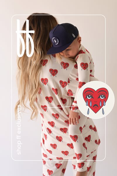
This image ad features a mom holding her child, both dressed in pajamas with a red heart design. The ad showcases "ff exclusives" and appears to target families seeking unique and exclusive clothing options.
# Brand positioning
The brand is presented as offering exclusive, family-oriented apparel, specifically pajamas. The brand aligns with a playful and somewhat unconventional aesthetic, as evidenced by the sad heart design. This positions the brand against typical norms of mainstream children's wear by embracing a more unique, emotionally expressive, and potentially edgy style. The brand aims to occupy a space in the consumer's mind as a provider of distinctive and exclusive clothing that stands out from conventional options.
# Product
The featured product is a set of matching pajamas for a mother and child. The pajamas are light-colored and patterned with a repeating design of a red heart with sad, crying eyes. The design appears across both the adult and child sizes, promoting a coordinated family look. The product aims to offer a unique and visually striking aesthetic, differentiating itself through its unconventional design. This offers a playful and emotive element to traditional sleepwear, targeting those who appreciate clothing with character and a modern, quirky appeal.
# Visual style
The ad features a clean, bright, and modern aesthetic with a focus on product display. The production quality appears to be professional, with clear lighting and a well-composed shot. The visual motif includes a rounded rectangular frame with rounded corners and circular inset, giving it a polished feel. There are no apparent image treatments or filters. The typography is simple and clean. The style is approachable and designed to be scannable in-feed.
# Hooks
Headline: None used
# Benefits
- [object Object]
- [object Object]
# Features
- [object Object]
- [object Object]
# Call to action
None used.
# Point of view
- [object Object]
# Storyline
- The image shows a mother holding her child, both wearing matching pajamas with sad heart prints. This is intended to showcase the coordinated family look and highlight the pajama's unique design from the brand's perspective.
- A close-up visual of the heart pattern is shown in a circular shape, emphasizing the unusual design and promoting a unique aesthetic of the brand. This is shown from the brand's perspective to highlight a key visual element of the product.
- The text "shop ff exclusives" is shown, indicating an exclusive product offering and encouraging viewers to explore more. This is displayed from the brand's perspective, encouraging viewers to make a purchase from the exclusive collection.
# Ad summary
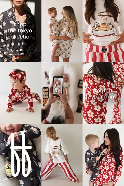
This ad uses a grid layout to show off the brand's pajama sets and promotes 'matching your mini'.
# Brand positioning
This brand is positioned as a provider of fun, family-oriented sleepwear. The brand aims to capture the playful side of parenthood, offering an opportunity for parents and children to bond through matching outfits. It stands apart by offering pajamas with playful and unique designs, like sushi and ramen, appealing to those who want to move beyond traditional sleepwear. The brand promotes a lifestyle where comfort meets fun and emphasizes creating memorable moments with your kids.
# Product
This ad features matching pajama sets for adults and children. The sleepwear comes in two main designs: one with a Japanese ramen pattern and the other featuring a red and white floral pattern. These sets are marketed toward parents and their children with an emphasis on 'matching your mini'. The ad features pajama sets, onesies, pants, and t-shirts made from soft and comfortable materials, catering to both adults and children. The overall appeal is about creating fun and unique family moments through coordinating sleepwear.
# Visual style
The ad uses a bright and clean aesthetic with a focus on lifestyle imagery. The production quality is high, with well-lit and styled shots. The grid layout allows for multiple images to be displayed at once, increasing the visual impact. The images have a cohesive color palette, and the typography is simple and legible. The overall style feels native to social media platforms, aiming to be eye-catching and easily scannable in a user's feed.
# Hooks
Headline: shop the tokyo collection
# Call to action
None used.
# Point of view
- [object Object]
# Storyline
- The ad starts with an image of a woman in a pajama set featuring a ramen pattern, paired with the text 'shop the tokyo collection'. The brand is introducing the specific collection of pajamas they offer, framing the start of the story around a focused theme.
- Next, the ad shows various images of children and parents wearing matching pajama sets. The brand is emphasizing the theme of matching outfits for parents and kids, which is a central aspect of their product line and branding.
- The ad ends with the text 'match your mini', placed over an image of a woman and child wearing matching floral pajama sets. The brand ends with a clear message, reinforcing the idea of family coordination and emphasizing the emotional connection through matching outfits.