

# Ad summary
A creator shares their top three favorite mobile games that can be played in the Fetch app and earn points to redeem for gift cards.
# Brand positioning
Fetch is presented as a rewards platform that incentivizes users to discover and play a variety of mobile games. The brand positions itself as a win-win solution, allowing users to turn their gaming hobby into tangible rewards, such as gift cards to popular retailers like GameStop, Nintendo eShop, and Amazon. This aligns with an emotional positioning of making leisure time more valuable and rewarding, while also offering a functional benefit of earning money towards purchases.
# Product
Fetch Play is a feature within the Fetch app that allows users to earn points by playing mobile games. Users can pick a game from Fetch's catalog, play as they normally would, and earn Fetch points. These points can then be redeemed for gift cards to places like GameStop, Nintendo eShop, and Amazon. The product addresses the potential barrier of wasted time spent gaming by turning that time into redeemable rewards.
# Visual style
The ad's visual style is casual and UGC-like, with a creator speaking directly to the camera in a seemingly authentic setting. The editing includes quick cuts and animated transitions to maintain viewer engagement. The overall production quality has a polished feel, suggesting a professional touch while retaining the relatable quality of user-generated content. The pacing is quick with the various transitions, product demos, and text placements syncing up with the music.
# Benefits
- [object Object]
- [object Object]
- [object Object]
# Features
- [object Object]
- [object Object]
# Call to action
None used.
# Point of view
- [object Object]
# Storyline
- 00:00–00:07 A creator shares their top three mobile games that they can't go a day without and notes that playing these games earns them rewards every time.
- 00:07–00:12 The creator proceeds to list Coin Chef, Monopoly Go, and Car Match as their top three mobile games.
- 00:12–00:15 The creator says that they have found all of these games through Fetch Play in the Fetch app.
- 00:15–00:18 The creator explains that the user can pick a game from the catalog and earn Fetch points by playing the game.
- 00:18–00:26 The creator says that the user can redeem these points for gift cards to places like GameStop, Nintendo eShop, and Amazon. The creator notes that a user's gaming habit can pay for the next purchase.

How Fetch Advertises on Meta
Refreshed 4 months ago · Weekly refresh cadence
Fetch runs 34 active ads on Meta, shipping ~7 new creatives per week. Their library leans on Screen Recording19%, Yapper15%, and Skit10%. Recently, fetch is going all in on fetch play, hammering home that mobile gaming can earn real rewards like gift cards to Sephora, Ulta, and Amazon, with heavy emphasis on limited time 2x point bonuses to drive urgency. The framing is decidedly lifestyle oriented, positioning game time as a guilt-free self care ritual or unwind routine rather than just passive scrolling. There's a clear shift from the original receipt scanning utility (barely present except one ad) to gaming as the hero product and emotional payoff.
Indexed by Motion's Inspo Library.
The 20 Most Recent Fetch Ads on Meta
# Ad summary
This ad showcases the presenter's favorite part of her routine of playing cozy games through Fetch Play. Fetch Play gives points for playing games, and then she can turn those points into gift cards for Sephora, Ulta, and Amazon.
# Brand positioning
The Fetch app, and specifically Fetch Play, is presented as a simple, easy way to earn rewards while playing games. It's positioned as a fun, almost guilt-free way to treat yourself using gift cards earned through the app. By offering rewards for playing games, the brand aligns itself with leisure and self-care while offering a practical incentive. The brand seemingly pushes against the idea that rewards and self-care must come at a high cost or effort. The brand's positioning is functional, focusing on the simplicity and ease of use, and emotional, by associating the app with feelings of enjoyment and guilt-free indulgence.
# Product
Fetch Play is a feature within the Fetch app that allows users to earn points by playing mobile games. These points can then be redeemed for gift cards to various retailers such as Sephora, Ulta, and Amazon. The featured product is described as an “emotional support beverage,” highlighting the element of coziness and relaxation associated with the product's usage. It addresses the problem of rewarding yourself without experiencing guilt, which is framed as the biggest purchase barrier. This is a “guilt free way for me to treat myself at the end of the day” by earning rewards for doing things she already enjoys.
# Visual style
The ad has a polished UGC feel, with bright lighting and a clean, uncluttered background. The editing style is primarily static shots with smooth transitions. The production quality is more polished than typical UGC, suggesting a deliberate effort to create a professional yet authentic feel. The pacing is moderate, with a conversational tone and deliberate cuts that highlight key moments. Audio and visual elements are synced, with the text overlays and product actions timed to the presenter's voiceover.
# Benefits
- [object Object]
- [object Object]
# Features
- [object Object]
- [object Object]
# Call to action
None used.
# Point of view
- [object Object]
# Storyline
- 00:00–00:06 The creator, in her home, shares that the best part of her unwind routine is playing cozy games on her iPad with her emotional support beverage. This emphasizes that the product is something she already integrates into her daily life.
- 00:07–00:17 The creator explains that she picks her favorite games through Fetch Play because they give you points, which she then turns into gift cards for Sephora, Ulta, and Amazon. This highlights the utility of the app and its potential benefits.
- 00:17–00:24 The creator describes Fetch Play as “such an easy, guilt-free way for me to treat myself at the end of the day”. This emphasizes that the product is a simple and convenient solution to reward oneself. This is a response to the previous point of how she earns rewards through the app and continues to build on the value proposition.
- 00:24–00:25 She encourages viewers who haven’t tried it before with a tone of familiarity and approval. This serves as a casual call to action, inviting the audience to try the product and see for themselves.
# Ad summary
This ad features a woman discussing how playing games on the Fetch app earns her points, which she can then redeem for gift cards. She highlights that Fetch Play is a guilt-free way for her to treat herself.
# Brand positioning
The ad presents Fetch as a user-friendly rewards app that provides a fun and guilt-free way for consumers to earn gift cards for playing their favorite games. The brand positions itself in the mobile gaming market, focusing on the emotional satisfaction of rewarding oneself. Fetch does not follow typical competitor behavior, but pushes against the consumer concern of spending money on reward apps, which can make it hard to redeem points. Its positioning is predominantly emotional, emphasizing the joy of earning rewards and self-care.
# Product
The product is the Fetch app, which allows users to earn points for playing various games. The app is designed for users who enjoy playing mobile games and appreciate the chance to redeem their gameplay for gift cards to stores like Sephora, Ulta, and Amazon. The user picks their favorite games and earns points just for playing. These points can then be exchanged for gift cards. The ad highlights the guilt-free way the app allows users to treat themselves, turning screen time into redeemable rewards.
# Visual style
The ad has a casual, UGC feel, with natural lighting and a simple background. The editing is quick and snappy, with cuts timed to match the speaker's energy and emphasis. The overall tone is friendly and accessible, enhanced by the presenter's upbeat demeanor. This style supports the ad's intent to showcase the product as an easy, rewarding, and guilt-free experience.
# Benefits
- [object Object]
# Features
- [object Object]
# Call to action
None used.
# Point of view
- [object Object]
# Storyline
- 00:00–00:06 The presenter introduces her 'unwind routine'.
- 00:06–00:11 She notes that her favorite part of her 'unwind routine' is playing cozy games on her iPad with her 'emotional support beverage'. The presenter positions herself as a typical user relaxing in her free time.
- 00:11–00:15 The presenter says that she picks her favorite games through Fetch Play because they give you points just for playing, showing a game being played on an iPad.
- 00:15–00:22 The presenter informs the audience that she turns those points into gift cards for retailers like Sephora, Ulta, and Amazon, displaying a rewards page on an iPad.
- 00:22–00:25 The presenter claims that Fetch Play is an easy, guilt-free way to treat herself at the end of the day.
- 00:26–00:28 She encourages viewers to try it and that if they haven't tried Fetch Play before, 'you're welcome'.
- 00:28–00:29 The Fetch logo with links to app stores appear.
# Ad summary
This ad promotes the Fetch app. With Fetch, users can earn rewards by playing mobile games. The ad shows how to download a game through the app, earn points, and then cash out those points for free gift cards. There is currently a 2X bonus live.
# Brand positioning
The Fetch app is presented as a fun and easy way to earn rewards while doing something people already enjoy: playing mobile games. The brand positions itself as a user-friendly platform that bridges the gap between gaming and real-world rewards, making it appealing to casual gamers looking to maximize their leisure time. The brand values convenience and accessibility, offering a seamless way to accumulate points and redeem them for gift cards to popular retailers. Fetch aims to occupy a space in the consumer's mind as a go-to app for earning rewards effortlessly, diverging from traditional loyalty programs by integrating rewards directly into the gaming experience.
# Product
The Fetch app is a mobile platform that allows users to earn rewards by playing various mobile games. It is designed for individuals who enjoy playing games on their phones and are looking for a way to monetize their gaming time. Users can download games through the Fetch app, earn points by completing in-game tasks, and then redeem those points for free gift cards to a variety of retailers. The app addresses the purchase barrier of not wanting to spend extra time or money to earn rewards, as it integrates seamlessly into existing gaming habits. The unique selling proposition (USP) is the ability to earn real-world rewards (gift cards) simply by playing games on a mobile device.
# Visual style
The ad has a bright, colorful, and playful aesthetic. The editing style features quick cuts and dynamic transitions to maintain viewer engagement. The production quality is polished, giving off a modern and professional vibe suitable for a tech app. The pacing is fast-paced, and product actions are timed to the voiceover.
# Benefits
- [object Object]
- [object Object]
- [object Object]
# Features
- [object Object]
- [object Object]
- [object Object]
- [object Object]
# Call to action
Download fetch and start earning today.
# Point of view
- [object Object]
# Storyline
- 00:00–00:01 A sound of success plays as a mobile game screen fills the frame.
- 00:01–00:04 00:01–00:04 The narrator asks if you know you can earn real rewards for playing free games. This serves as a hook, inviting the audience into the concept of earning rewards through gaming.
- 00:05–00:07 00:05–00:07 The narrator follows up to confirm. This is told from the brand perspective to affirm the ad's hook.
- 00:08–00:11 00:08–00:11 The ad announces a limited-time offer of double points for playing popular mobile games. This uses a brand perspective to build urgency.
- 00:12–00:13 00:12–00:13 The ad prompts viewers to choose a game. This conveys an intention of guiding the user.
- 00:14–00:16 00:14–00:16 The ad instructs viewers to download games through the Fetch app. This reinforces the user journey.
- 00:17–00:20 00:17–00:20 The ad states that users earn while they play. This emphasizes the ongoing reward system and aligns with the brand.
- 00:21–00:23 00:21–00:23 The ad highlights that users can cash out for gift cards. This completes the loop of the reward system and is told from a brand perspective to show a payoff.
- 00:24–00:29 00:24–00:29 The ad concludes by asking if the viewer is ready to play and prompts them to download Fetch and start earning today. This serves as a call to action and the ad’s intention is to drive app downloads.
# Ad summary
A woman presents her favorite part of her unwind routine, which includes cozy games on her iPad through Fetch Play that give her points. She turns those points into gift cards for Sephora, Ulta, and Amazon. She ends the video by stating Fetch Play is an easy, guilt free way to treat herself.
# Brand positioning
The Fetch brand aims to position itself as a convenient and guilt-free way to earn rewards while doing things that people enjoy, such as playing games. The brand aligns with the values of treating oneself and the desire for an easy way to earn rewards. It pushes against the norm of having to spend money to earn rewards by allowing users to earn them through playing games. The brand positioning is functional, focusing on the simplicity and ease of use of the platform, while also tapping into the emotional aspect of self-care and treating oneself.
# Product
Fetch Play is presented as a platform within the Fetch app that rewards users with points for playing games on their iPad. These points can then be redeemed for gift cards to retailers like Sephora, Ulta, and Amazon. The product aims to provide an easy and guilt-free way for users to treat themselves by turning leisure activity (playing cozy games) into tangible rewards. It addresses the purchase barrier of traditional reward programs that require spending money by offering a way to earn rewards through gameplay. The ad emphasizes that Fetch Play makes it easy to treat yourself.
# Visual style
The ad has a casual, UGC-feel with a brightly lit, static shot of a woman speaking directly to the camera. The editing style consists of static shots with smooth transitions. The production quality has a UGC feel to it, making it appear authentic and relatable to the audience. The pacing remains consistent throughout the ad.
# Benefits
- [object Object]
- [object Object]
# Features
- [object Object]
- [object Object]
- [object Object]
# Call to action
None used.
# Point of view
- [object Object]
# Storyline
- 00:00–00:06 The video begins with the presenter holding an iPad and a pink water bottle, telling the audience that playing cozy games on her iPad is her favorite part of her unwind routine, accompanied by her emotional support beverage.
- 00:06–00:13 She begins to discuss how she picks her favorite games through Fetch Play because they give you points for playing. The visual shows the games she plays on her iPad through the Fetch Play app.
- 00:13–00:23 She explains how she turns those points into gift cards for Sephora, Ulta, and Amazon as an easy, guilt free way for her to treat herself at the end of the day.
- 00:23–00:25 She ends the video by saying if you haven’t tried Fetch Play before, you’re welcome.
# Ad summary
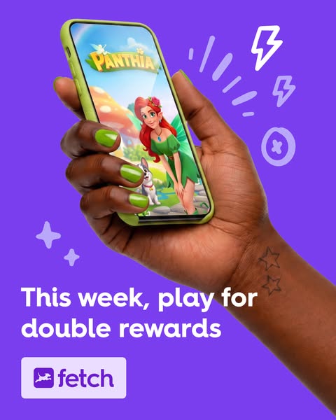
This Fetch ad promotes double rewards for playing the game Panthia.
# Brand positioning
Fetch is presented as a rewards platform that partners with various games to offer users incentives for playing. By associating with a visually appealing game like 'Panthia,' Fetch is subtly positioning itself as a modern, user-friendly app that enhances the gaming experience. The focus on 'double rewards' suggests that Fetch aims to add extra value and excitement to the user's existing gaming habits.
# Product
The Fetch app is shown on a smartphone screen, implying it's a mobile platform designed to reward users for playing games. The ad highlights a promotion of "double rewards" for playing the game Panthia, suggesting that users can accumulate points or other in-app currencies at twice the normal rate. This incentive is aimed at encouraging users to engage more with both the Fetch app and the featured game. The ad aims to make trying or buying Fetch worthwhile by showcasing it as a mutually beneficial partnership that enhances the user's gaming experience with extra rewards.
# Visual style
The ad uses a clean, modern visual style with a bright purple background that provides a high contrast to the smartphone and text. The image is well-lit and professionally shot, giving it a polished and inviting appearance. The graphic elements like the lightning bolts and stars add a playful touch, while the focus on the smartphone screen with the game showcases the product's value proposition. The ad employs a minimalist design approach, ensuring that the key message of 'double rewards' and the Fetch logo are easily scannable.
# Hooks
Headline: This week, play for double rewards
# Benefits
- [object Object]
# Features
- [object Object]
# Call to action
None used.
# Point of view
- [object Object]
# Storyline
- The ad opens by showcasing a smartphone displaying the game 'Panthia', immediately drawing the viewer's attention to the visually engaging content. This functions as a hook, piquing curiosity about the game and the platform offering it. The perspective is from the brand, introducing the product in an enticing way.
- Next, the ad highlights the incentive of 'double rewards', creating a sense of value and urgency. This is a promotional message from the brand aimed at motivating the viewer to take action and engage with the game through their platform. The perspective remains with the brand, emphasizing the benefits of using the app.
- Finally, the ad presents the Fetch logo, reinforcing brand recognition and recall. This solidifies the connection between the game and the rewards platform, encouraging viewers to associate the positive experience of 'double rewards' with the Fetch brand. This is the brand perspective, driving home its identity and value proposition.
# Ad summary
The ad showcases Fetch as a platform where users can earn double points this week by playing popular mobile games.
# Brand positioning
Fetch is presented as a rewarding mobile platform that allows users to earn points by playing popular mobile games. The brand aims to occupy a space in the consumer's mind as a fun and engaging way to earn rewards while enjoying mobile gaming. The brand promotes convenience and accessibility by rewarding its users. It positions itself as a functional and easy-to-use platform to earn rewards.
# Product
Fetch is a mobile platform that allows users to earn rewards by playing popular mobile games. The ad highlights a limited-time promotion offering double points for playing select mobile games. Fetch users can redeem points for gift cards. The ad is aimed at mobile gamers looking for rewards for playing games.
# Visual style
The ad has a clean, modern aesthetic with a vibrant color palette. The use of bright colors and clear graphics enhances the platform's appeal.
# Benefits
- [object Object]
- [object Object]
# Features
- [object Object]
- [object Object]
# Call to action
None used.
# Point of view
- [object Object]
# Storyline
- 00:00–00:02 The ad opens by highlighting the double points offer with the Fetch app open on a tablet.
- 00:00–00:03 The voiceover begins to narrate, mentioning the Fetch app and its double points offer for playing mobile games.
- 00:03–00:04 The ad then shows the Fetch logo and encourages users to play games and earn gift cards.
# Ad summary
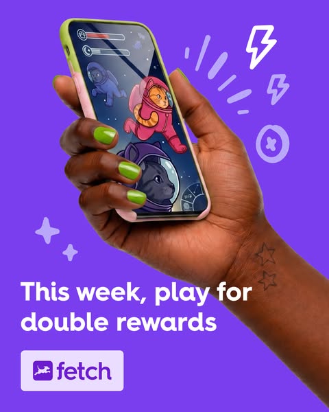
This image ad for Fetch highlights a limited-time promotion, encouraging users to play the app this week for double rewards. The ad uses a vibrant color scheme, cartoon-style graphics, and playful imagery to appeal to a younger, tech-savvy audience.
# Brand positioning
Fetch is presented as a fun, engaging, and rewarding platform that partners with many popular brands. The brand is positioned as a modern, app-based rewards program that incentivizes users to scan receipts for points, which can then be redeemed for gift cards and other rewards. This app aims to occupy a space in the user's mind as being an amusing way to earn gift cards by doing something they already do regularly: grocery shopping. Fetch distinguishes itself with its accessible, game-like interface and a focus on user-friendly technology, contrasting traditional, more cumbersome loyalty programs. The brand leans into an emotional positioning, promising to make everyday activities more enjoyable and rewarding, rather than focusing solely on functional savings.
# Product
The product being advertised is the Fetch app, a mobile platform that rewards users for scanning receipts. The app is designed for everyday consumers looking to earn points on their regular purchases, which they can then redeem for gift cards and other rewards. The ad highlights a time-sensitive promotion offering 'double rewards' for playing the app this week, implying that the app includes game-like features or activities that users can engage with to earn additional points. Fetch addresses the common purchase barrier of perceived effort by making the receipt-scanning process quick and easy and makes it more appealing by gamifying the user experience.
# Visual style
The ad features a high-production-quality, studio-shot image with bright, saturated colors and cartoon-style graphics, creating a playful and modern visual aesthetic. The focus is on the smartphone screen displaying a game interface, which is held by a hand with neatly manicured nails and a subtle tattoo, adding a touch of personality. The composition is clean, with the central element being the phone and the surrounding space filled with simple graphic elements like stars and lightning bolts. This style breaks from platform norms by utilizing a carefully styled, attention-grabbing image rather than a more casual or UGC look.
# Hooks
Headline: This week, play for double rewards
# Benefits
- [object Object]
# Call to action
None used.
# Point of view
- [object Object]
# Storyline
- The ad opens with a hand holding a smartphone displaying a cartoonish game interface featuring cats in astronaut suits, conveying a playful and engaging experience that deviates from traditional reward programs. This element aims to capture the viewer's attention by showcasing the entertainment value and quirky design of the app, as presented from a user's perspective within the app environment.
- The ad highlights the promise of 'double rewards' for playing the app this week, enticing users to engage with the app promptly. This is a time-sensitive offer, framed from the brand's perspective, designed to incentivize immediate action and drive user engagement.
- The ad concludes with the Fetch logo, reinforcing brand recognition and driving home the app's identity as the key to earning rewards. This element serves to solidify the brand's presence and encourage users to download or use the app, seen from the brand's promotional angle.

# Ad summary
A mobile app ad showing how users can play games for IRL rewards.
# Brand positioning
Fetch is presented as a rewarding app that connects digital gaming with real-world benefits. The brand is positioning itself to occupy the space in the consumer's mind as a bridge between digital and physical rewards, offering a unique value proposition for gamers seeking tangible incentives. It aligns with values of fun, gamification, and tangible rewards. Fetch innovates by linking the digital gaming experience to real-world perks, potentially disrupting the norm of purely virtual gaming rewards. The brand positioning is a mix of functional and emotional, providing performance-based rewards with an element of fun and surprise, as indicated by the 'IRL rewards'.
# Product
Fetch is presented as a mobile app that allows users to "Play games for IRL rewards." It is designed for gamers who want to earn real-world rewards through their gameplay. The app's unique selling proposition is its ability to convert digital gaming achievements into tangible benefits. The ad addresses potential purchase barriers by emphasizing that the app is free to download, as shown in the call to action "Get the free app". The product is designed to enhance the gaming experience by adding a layer of real-world incentives, making it more appealing for gamers looking for added value.
# Visual style
The ad has a clean, modern aesthetic with a focus on simplicity and approachability. It uses bright, solid colors and straightforward imagery to convey its message quickly. The production quality appears to be high, with well-lit and professionally shot imagery. The visual motifs include flat design elements and a focus on the product (the app) and its user. The image treatment involves background blurring, which creates depth and a sense of focus on the subject. The typography is large and bold, and the ad integrates platform-native elements like a simple button and brand logo. The style is designed to be scannable and eye-catching in the feed, using bright colors and clear messaging to grab attention.
# Hooks
Headline: Play games for IRL rewards
# Benefits
- [object Object]
# Features
- [object Object]
# Call to action
Get the free app
# Point of view
- [object Object]
# Storyline
- The ad opens by stating its value proposition: "Play games for IRL rewards." This is meant to catch the viewer's eye with the value of real-life rewards, and is told from the brand's perspective, which communicates the main value of the app. The intention of this beat is to immediately present the benefit to the viewer.
- A smiling person is looking at their phone, implying that they are actively playing a game. The person is also holding a coffee cup, implying they may be out and about during their daily routine. The perspective here is that of a consumer who is using the app as part of their lifestyle. The intention is to show the consumer that they can use the app while multitasking.
- The ad closes with a call to action: "Get the free app". The brand tells the audience this is a free way to start getting rewards. The intention is to promote app downloads.

# Ad summary
This ad promotes Fetch, a rewards app, by showing a man relaxing and playing mobile games while earning rewards.
# Brand positioning
Fetch is presented as a rewards app that integrates seamlessly into everyday activities, such as playing mobile games. The brand aims to occupy a space in the consumer's mind as a fun and easy way to earn rewards without significant effort. The brand aligns with a lifestyle of convenience and enjoyment, suggesting that users can passively accumulate value while engaging in leisure activities. Fetch pushes against the norm of traditional rewards programs that often require dedicated effort or specific purchases, instead offering rewards for activities users already enjoy. The brand positioning is both functional, providing a straightforward way to earn rewards, and emotional, associating the app with relaxation and enjoyment.
# Product
Fetch is a rewards app that allows users to earn rewards while playing mobile games. The ad shows a man relaxing on a couch, playing a game on his phone, and earning $3 in rewards after defeating a boss. The product is for mobile gamers who want to earn rewards for their gameplay. The ad highlights the ease of earning rewards while doing something enjoyable, addressing the purchase barrier of time investment by showing that rewards can be earned passively during leisure activities. The ad conveys that Fetch makes gaming more rewarding and worthwhile.
# Visual style
The ad has a relaxed and inviting visual style, with a focus on showcasing the ease of use and integration of the Fetch app into everyday life. The production quality appears to be high, with a well-lit and composed shot. The visual motifs include a focus on comfort and leisure, with the man relaxing on a couch. The image treatment includes soft lighting and natural colors, creating a warm and inviting atmosphere. The typography is clean and legible, with a focus on clear messaging. The style is designed to be scannable and attention-grabbing in a social media feed.
# Hooks
Headline: Play mobile games like a pro.
# Benefits
- [object Object]
# Features
- [object Object]
# Call to action
None used.
# Point of view
- [object Object]
- [object Object]
# Storyline
- The ad opens with the message "Play mobile games like a pro," which is intended to grab the viewer's attention by suggesting they can enhance their gaming experience. This is told from the brand's perspective, setting the stage for how Fetch can make mobile gaming more rewarding.
- The scene shows a man relaxing on a couch while playing a game on his phone, which is meant to illustrate the ease and comfort of earning rewards with Fetch. This is shown from the customer's perspective, demonstrating how the app integrates into everyday leisure activities.
- The text "boss defeated: $3 in rewards" appears next to the man, which is intended to highlight the tangible benefits of using Fetch while gaming. This is told from the brand's perspective, reinforcing the value proposition of earning rewards effortlessly.
- The Fetch logo and tagline "Live rewarded." are displayed at the bottom, which is meant to reinforce brand recognition and communicate the overall benefit of using the app. This is told from the brand's perspective, summarizing the core message of earning rewards in everyday life.
# Ad summary
This ad promotes Fetch, a mobile gaming app where users can earn rewards for playing free games. The ad demonstrates how to download games through the app, earn points by completing in-game tasks, and then cash out those points for gift cards. The ad also mentions a limited-time offer for double points.
# Brand positioning
Fetch is presented as a rewards platform that incentivizes users to engage with mobile games. Positioned in the gaming and rewards space, it offers a way to earn real-world value (gift cards) through casual mobile gameplay. Fetch aims to occupy a space in the consumer's mind as a fun and rewarding way to spend time on their phone, aligning with a lifestyle of convenience and potential financial gain. The brand appears to push against the norm of purely time-wasting mobile games by attaching a tangible reward system. The brand positioning appears to be both functional (offering rewards) and emotional (providing entertainment and satisfaction).
# Product
Fetch is a mobile app where users can earn points by downloading and playing other mobile games. Users download the featured games through the Fetch app. After this, users accumulate points by completing in-game tasks. These points can then be redeemed for free gift cards, providing a monetary incentive to use the app. The ad emphasizes the USP that users can earn rewards simply by playing games they enjoy. It addresses the potential purchase barrier of investing time in mobile games by promising tangible benefits in the form of gift cards.
# Visual style
The ad has a colorful and playful aesthetic, using a bright purple background and cartoonish graphics. The editing style is a mix of static shots and quick cuts. The production quality has a polished commercial feel, making it appear professional and trustworthy. The pacing is quick, likely around 60 BPM, to maintain viewer engagement.
# Benefits
- [object Object]
- [object Object]
# Features
- [object Object]
- [object Object]
- [object Object]
# Call to action
Download Fetch and start earning today.
# Point of view
- [object Object]
# Storyline
- 00:00–00:04 00:00–00:04 A question is posed to the audience asking if they knew they could earn real rewards just from playing games on their phone. This begins the ad in a conversational and engaging tone, directly addressing the viewer to pique their interest.
- 00:04–00:07 00:04–00:07 The response is affirmative. The 'Fetch' app logo appears inside a phone to identify the product being promoted.
- 00:07–00:11 00:07–00:11 It's revealed that Fetch is currently offering 2x points all week playing mobile games. This introduces a time-sensitive promotion to incentivize immediate action.
- 00:11–00:16 00:11–00:16 The ad instructs the viewer to choose a game. It is visually demonstrated how to download it through the Fetch app.
- 00:16–00:20 00:16–00:20 The ad then indicates the viewer can earn while they play, showing a screen recording of points being earned within a game.
- 00:20–00:23 00:20–00:23 The ad shows how the user can cash out points for gift cards, displaying a variety of gift card options.
- 00:23–00:29 00:23–00:29 The ad prompts the viewer to download Fetch and start earning today. A graphic shows a 2X bonus expiring May 17th.
# Ad summary
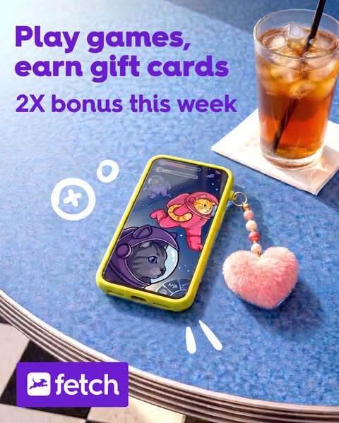
This ad promotes the Fetch app, which allows users to play games and earn gift cards. The ad highlights a 2X bonus available during the current week.
# Brand positioning
Fetch is presented as a user-friendly, rewarding platform that incentivizes user engagement by offering gift cards in exchange for playing games. The brand occupies a space of accessible entertainment and financial benefit, targeting users who enjoy gaming and appreciate earning rewards for their time and attention. Fetch aligns with the values of convenience, fun, and tangible benefits, seemingly pushing against the notion that gaming is solely a leisure activity, and instead positions it as a productive way to earn rewards. The brand positioning is functional, focusing on performance, simplicity, and direct financial benefits.
# Product
The advertised product is the Fetch app, a platform where users can play games and earn gift cards. The app is designed for individuals who enjoy playing games and are motivated by the opportunity to earn rewards. The ad explicitly mentions a "2X bonus this week," suggesting limited-time incentives to encourage immediate engagement. It works by allowing users to engage in gaming activities within the app, and then rewards users with gift cards, which creates a positive feedback loop. The primary benefit of the app is the ability to turn leisure time into tangible rewards, addressing the potential barrier of time investment by making it financially worthwhile.
# Visual style
The ad utilizes a clean, playful visual style, featuring bright colors and cartoon-like imagery to appeal to a younger audience. The production quality appears to be high, with studio-style lighting and crisp details that add to the image's scannability. The placement of the objects in the shot creates a sense of casualness, contrasting with the polished visuals.
# Hooks
Headline: Play games, earn gift cards
# Benefits
- [object Object]
- [object Object]
# Features
- [object Object]
- [object Object]
- [object Object]
# Call to action
None used.
# Point of view
- [object Object]
- [object Object]
# Storyline
- The ad opens by immediately highlighting the core benefit: playing games and earning gift cards. This top billing grabs the viewer's attention and invites them into the Fetch world. The ad is speaking directly as the brand, Fetch, telling the user what is in it for them.
- Next, the offer is enhanced with a time-sensitive bonus (2X) to create a sense of urgency and further incentivize the viewer to act now. The brand is clearly communicating the special promotion available to the viewer.
- Finally, the image of a phone displaying the Fetch app's interface provides a visual anchor and confirms that this offer is delivered via a mobile app. The user is experiencing the ad from the POV of someone considering the Fetch app.
# Ad summary
An advertisement for Fetch shows a man sitting in front of a Christmas tree who describes how Fetch allows you to get gift cards for playing games on your phone.
# Brand positioning
Fetch is a rewards app that incentivizes user engagement by offering gift cards in exchange for activities such as playing mobile games. The ad presents Fetch as a legitimate and worthwhile platform, asserting that users really can earn tangible rewards for their time spent on the app. The brand positions itself as a user-friendly way to monetize leisure time, differentiating from traditional gaming models that often require financial investment to advance.
# Product
Fetch is presented as a mobile app that rewards users with gift cards for playing games on their phones. The app interface, as shown in the ad, includes a points-based system that can be redeemed for various gift cards such as GameStop. The core USP of Fetch, as highlighted in the ad, is the accessibility of earning rewards for an activity people already engage in for leisure. The ad addresses potential skepticism by stating, "Actually, though," implying that the rewards are real and attainable. The product aims to convert casual mobile gaming into a source of real-world benefits.
# Visual style
The ad has a casual, UGC-style aesthetic, with a clear emphasis on accessibility and user-friendliness. The quick cuts and text overlays contribute to an upbeat pace, aligning with the rhythm of social media content. The split-screen format helps convey both the speaker’s message and the product interface simultaneously. The purple background with the Fetch logo gives the ad a consistent, branded feel.
# Benefits
- [object Object]
# Features
- [object Object]
# Call to action
None used.
# Point of view
- [object Object]
# Storyline
- 00:00–00:02 A man appears on the top half of the screen, stating, "You get gift cards for playing games on your phone."
- 00:00–00:02 The bottom half of the screen shows a mobile phone interface that is running a game.
- 00:02–00:03 The man then says, "Actually, though."
- 00:02–00:03 The screen displays a screenshot from the Fetch app that confirms a reward is on the way.
- 00:03–00:05 The Fetch logo appears on a purple background.
# Ad summary
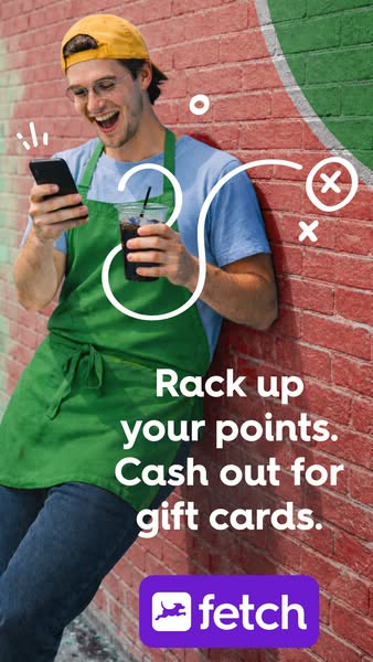
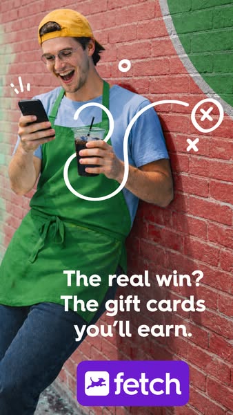
The Fetch ad depicts a man in a green apron happily looking at his phone and holding an iced coffee against a brick wall. The ad promotes the Fetch app, suggesting that users can earn points and redeem them for gift cards. The image also includes a white squiggly line.
# Brand positioning
Fetch is presented as a rewards app that allows users to accumulate points and redeem them for gift cards. This positions Fetch as a convenient and accessible way for consumers to earn rewards on their everyday purchases. The brand's playful logo and approachable language implies a fun and engaging user experience, setting it apart from more traditional or complex rewards programs.
# Product
Fetch is a mobile app that allows users to earn points and redeem them for gift cards. It is designed for anyone who wants to get rewards on their everyday purchases. The ad showcases the core value proposition: "Rack up your points. Cash out for gift cards." This emphasizes the ease and tangible benefits of using the app. The ad addresses a common purchase barrier by positioning rewards as accessible and readily redeemable, making it more appealing to potential users.
# Visual style
The ad features a casual, lifestyle-focused aesthetic, with a UGC production quality. The image uses natural lighting and includes realistic textures like the peeling paint on the brick wall. The bright colors, combined with the squiggly line, create a playful, approachable vibe that is well-suited for social media platforms.
# Hooks
Headline: Rack up your points. Cash out for gift cards.
# Benefits
- [object Object]
- [object Object]
# Features
- [object Object]
- [object Object]
# Call to action
None used.
# Point of view
- [object Object]
- [object Object]
# Storyline
- The ad begins with an image of a man using his phone and holding a cup of iced coffee, indicating a user who is casually engaged with the Fetch app while enjoying a beverage. This visually communicates the ease of use and integration of Fetch into everyday life from the customer's perspective.
- The text overlay states, "Rack up your points. Cash out for gift cards," emphasizing the straightforward value proposition of the app. This message, delivered from the brand's perspective, highlights the core benefit of using Fetch.
- The Fetch logo is displayed at the bottom, reinforcing brand recognition and association with the reward system. This final element from the brand reinforces the call to action, directing the audience to engage with the Fetch app.
# Ad summary
A photo ad for Fetch rewards. The ad features a man in a green apron holding a phone and a coffee drink with copy highlighting the rewards program.
# Brand positioning
Fetch is presented as a rewards program that provides users with gift cards by scanning receipts. The brand appeals to users looking to earn rewards on everyday purchases, positioning itself as a convenient and accessible way to gain value from their spending. By presenting the idea of earning gift cards as "the real win," Fetch is attempting to place itself in the consumers mind as a program that offers better rewards than other reward programs. The visual style is modern and approachable, making the app seem easy to use and integrate into daily life.
# Product
The advertised product is the Fetch rewards program, which allows users to scan their receipts and earn gift cards. The image shows someone using their smartphone, implying that the app is mobile-based and user-friendly. The central selling point is the chance to earn gift cards from everyday purchases, an incentive that addresses the financial barrier of spending money. The ad suggests that Fetch offers a tangible benefit in the form of gift cards. This is designed for users looking for an easy way to monetize their spending. The ad emphasizes that the value comes in the form of "gift cards you'll earn."
# Visual style
The ad has a modern, casual visual style with a focus on highlighting the product in a real-life setting. The image has a semi-candid feel, as if captured spontaneously. The bright colors and animated graphics enhance the ad’s scannability and ensure it catches the viewer's eye. The text is bold and clear, making it easy to read quickly. The brick wall and casual attire of the person in the ad suggest an urban, approachable vibe.
# Hooks
Headline: The real win? The gift cards you'll earn.
# Benefits
- [object Object]
# Call to action
None used.
# Point of view
- [object Object]
- [object Object]
# Storyline
- The ad opens by showing a man standing against a brick wall, casually holding a phone in one hand and a drink in the other, suggesting a real-life setting. This sets the stage to promote Fetch as a seamless addition to everyday routines.
- The storyline emphasizes the benefit of earning gift cards by showcasing the brand's logo and linking it to the act of using a mobile app. This is intended to make the value proposition of Fetch immediately clear to the viewer.
# Ad summary
This ad shows the Fetch app, where people can play games and earn gift cards.
# Brand positioning
Fetch is presented as a simple app that gives users rewards. The ad is colorful and emphasizes mobile gameplay and ease of use, with the primary call to action being to download the app. This positions Fetch as a fun, accessible tool for earning rewards without significant effort. The brand aligns with the values of convenience and entertainment.
# Product
Fetch is presented as an app where you can play games to earn gift cards to places like Ulta Beauty. It is designed for consumers who want to earn rewards for their time spent gaming on their mobile devices. The product's main feature is its ability to convert gameplay into tangible rewards like gift cards. The app is available on both the Apple App Store and Google Play, catering to a wide range of mobile users. The ad promotes the app as a fun and easy way to get free money.
# Visual style
The ad has a casual, UGC-style aesthetic with a split-screen format. The editing is simple and straightforward with direct cuts between shots. The production quality is relatively polished, aimed at making the app look appealing and user-friendly. The visuals are bright and colorful, particularly in the game footage, to capture attention and convey a sense of fun.
# Benefits
- [object Object]
- [object Object]
# Features
- [object Object]
- [object Object]
# Call to action
None used.
# Point of view
- [object Object]
# Storyline
- 00:00–00:01 A split-screen shows a woman looking at an app on her phone, while the bottom screen displays gameplay. This highlights the ease of playing games and earning rewards.
- 00:01–00:02 The screen shows the app interface with an Ulta Beauty gift card notification. The text says, "Your reward is on the way!" The reward notification builds excitement and emphasizes the reward aspect of the app.
- 00:02–00:03 The woman says, "I'm into it," expressing her satisfaction with the app, reinforcing the app's appeal and value.
- 00:03–00:04 The Fetch app logo and branding are displayed with the text to download on the Apple App Store and Google Play.

# Ad summary
This ad promotes the Fetch app, which allows users to turn game time into gift cards. The ad features a woman smiling and looking at her phone, with a call to action to download the free app.
# Brand positioning
Fetch is presented as a user-friendly app that rewards everyday activities like game time by converting them into gift cards. The brand aims to occupy a space in the consumer's mind as a convenient and fun way to earn rewards effortlessly. The brand aligns with a lifestyle of convenience and maximizing value from daily routines. Fetch positions itself as a modern, tech-savvy solution that integrates seamlessly into users' digital habits, offering a functional benefit of earning rewards without significant effort.
# Product
The Fetch app is a rewards platform that allows users to earn gift cards by scanning receipts and participating in various activities, such as playing games. The app is designed for anyone who wants to earn rewards from their everyday purchases and activities. The ad highlights the USP of turning game time into gift cards, making it appealing to gamers. The ad addresses the purchase barrier of cost by emphasizing that the app is free to download and use. The ad encourages users to download the app and start earning rewards effortlessly.
# Visual style
The ad has a clean and modern visual style with a gradient purple background and a focus on the product in use. The production quality appears to be high, with well-lit and professionally shot imagery. The visual motifs include rounded shapes and bright colors, creating a friendly and approachable feel. The image treatment includes background removal and color grading to enhance the overall aesthetic. The typography is large and bold, making it easy to read and scannable in-feed.
# Hooks
Headline: Turn game time into gift cards
# Benefits
- [object Object]
# Features
- [object Object]
# Call to action
Get the free app
# Point of view
- [object Object]
- [object Object]
# Storyline
- The ad starts by highlighting the core value proposition: turning game time into gift cards. This is intended to immediately grab the viewer's attention by presenting an appealing and straightforward benefit. The brand is telling the audience about the app's primary function and its potential to add value to their leisure activities.
- The ad then shows a woman smiling and looking at her phone, implying she is using the Fetch app. This is included to create a relatable and positive image of someone enjoying the app's benefits. The audience is experiencing this moment from the perspective of a satisfied customer, seeing the app in action and associating it with happiness and ease.
- The ad concludes with a clear call to action to download the free app. This is intended to prompt immediate action and remove any perceived barriers to entry. The brand is directly encouraging the viewer to take the next step and start using the app.
# Ad summary
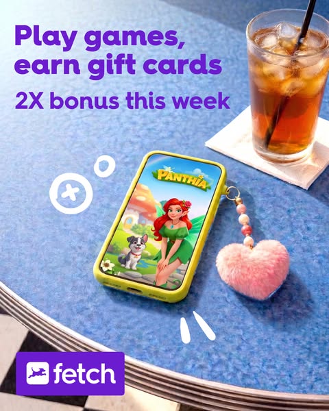
This ad promotes the Fetch app by highlighting the ability to earn gift cards through playing games on the app, also mentioning a bonus this week.
# Brand positioning
Fetch is presented as a fun and rewarding mobile application that allows users to earn gift cards by playing games. It positions itself in the app market by offering users rewards for their time and engagement with the platform. Fetch aligns with values of convenience and entertainment, allowing users to earn rewards while enjoying mobile games. The ad steers clear of directly comparing itself to other similar rewards apps and instead focuses on the tangible benefits of using the app.
# Product
The product being advertised is the Fetch app, a mobile application that rewards users with gift cards for playing games. The ad indicates that users can earn gift cards, and get a 2X bonus this week. The product's main selling point is the combination of entertainment and tangible rewards, addressing the barrier of time investment in mobile gaming by providing an incentive in the form of gift cards.
# Visual style
The ad uses a vibrant, lifestyle-oriented visual style, combining a product shot with everyday elements. The bright colors and clean layout aim to attract attention and convey a sense of fun and reward.
# Hooks
Headline: Play games, earn gift cards
# Benefits
- [object Object]
- [object Object]
# Features
- [object Object]
- [object Object]
- [object Object]
# Call to action
None used.
# Point of view
- [object Object]
# Storyline
- The ad starts by conveying a message that Fetch offers users the opportunity to play games and earn gift cards, which it's telling from the perspective of the brand. This sets the tone and intention for the advertisement, enticing viewers to engage with Fetch's platform by highlighting the combination of entertainment and rewards.
- The ad adds further incentive by promoting a "2X bonus this week," communicated from the brand's perspective. This creates a sense of urgency and encourages users to take immediate action, reinforcing the overall objective of attracting new users and increasing app engagement.
# Ad summary
A woman uses the joke of ignoring her boyfriend to promote a skincare product.
# Brand positioning
The brand is not explicitly mentioned in the ad. However, the product appears to be for people who want to take care of their skin.
# Product
The product is a skincare item. It is for people looking for a skincare item.
# Visual style
The ad's aesthetic is simple and casual, reminiscent of UGC content. It uses natural lighting and has a relaxed, unfiltered look. The editing is minimal, with static shots and smooth transitions, fitting a low-key vibe. The pacing is steady, mirroring the calm tone of the video.
# Benefits
- [object Object]
# Features
- [object Object]
# Call to action
None used.
# Point of view
- [object Object]
# Storyline
- 00:00–00:03 A woman is sitting inside.
- 00:03–00:08 She ignores her phone and applies a skincare product on her face.
- 00:08–00:10 The product is revealed.
- 00:10–00:14 The woman laughs and is happy with the product.
# Ad summary
This UGC-style ad showcases a young woman shopping in a clothing store. She uses the Fetch app to scan receipts and earn points for the purchases she is already making.
# Brand positioning
Fetch is presented as a user-friendly mobile app designed to reward consumers for their everyday purchases by awarding points for scanning receipts. Positioned as a convenient way to accumulate savings effortlessly, Fetch aims to integrate into the routine shopping habits of its users, incentivizing them to maximize their rewards from various retailers and brands. The app suggests a lifestyle of smart, resourceful spending, making users feel savvy and in control of their finances. It subtly pushes against the norm of passively accepting expenses without leveraging potential savings, instead advocating for an active approach to earning rewards. The brand's positioning is functional, emphasizing the simplicity and performance of its reward system.
# Product
Fetch is a mobile app that rewards users with points for scanning their receipts from various retailers and brands. The app is designed for anyone who shops regularly, aiming to make earning rewards effortless and part of the user's routine. The ad explicitly states that users can earn points on every purchase, highlighting the app's universal applicability. The key selling point of Fetch is its ability to turn everyday spending into savings through a simple receipt scanning process, addressing the barrier of complicated or time-consuming reward programs. By showing a shopper easily scanning receipts while shopping, the ad conveys the ease and convenience of using the app.
# Visual style
The ad uses a casual, UGC-style visual aesthetic. The editing is simple and the camera work appears to be handheld, adding to the authenticity of the content. The lighting is natural, likely from the store's overhead lights. The pacing is slow, reflecting the everyday activity of shopping.
# Benefits
- [object Object]
- [object Object]
- [object Object]
# Features
- [object Object]
- [object Object]
- [object Object]
# Call to action
None used.
# Point of view
- [object Object]
# Storyline
- 00:00–00:03 The ad begins with a woman shopping for clothes in a store. She is pulling out her phone with a somewhat annoyed facial expression, suggesting a problem.
- 00:03–00:07 The woman then scans the receipt using the Fetch app, and the tone shifts to a more positive one, indicating a solution to the initial problem. This shows how Fetch can turn a potentially negative shopping experience into a rewarding one.
- 00:07–00:10 The ad concludes with the woman happily pushing her shopping cart, showing the positive outcome of using Fetch. The change in her demeanor emphasizes the value and satisfaction that the app provides, reinforcing the message that Fetch can improve your shopping experience.
How Other Finance Brands Advertise on Meta
Peer brands in Motion's library — click any brand to see their creative strategy, live ads, and AI breakdowns.