Proper Cloth runs 299 active ads on Meta, shipping ~27 new creatives per week. Their library leans on Headline72%, Cinematic B-Roll8%, and Montage7%. Recently, proper cloth is going all in on summer tailoring with a fabric-first lens, hammering specific product names like The Bedford, The Stanton, The Versa Pant, and The Amalfi Pant while leaning heavily on material callouts (seersucker, Irish linen, hopsack, gauze, stretch linen, Loro Piana, Drago). The strategy feels like a seasonal wardrobe buildout play, positioning each piece as a named, considered essential rather than generic MTM, with wide-leg trousers and lightweight suiting dominating the mix. There's a clear push to elevate perception through fabric provenance and SKU branding, treating custom like a curated collection drop.
# Ad summary
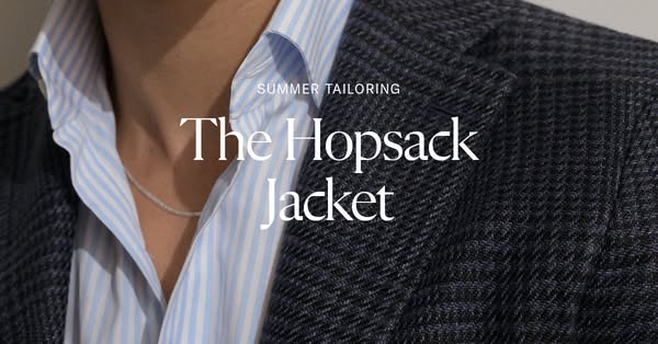
An image ad that showcases a man wearing a hopsack jacket. The ad emphasizes the jacket's suitability for summer tailoring.
# Brand positioning
The brand positions itself in the tailored clothing market, specifically focusing on summer-appropriate options. It offers stylish and comfortable solutions for warmer weather. The brand emphasizes tailoring, suggesting attention to detail, quality, and a sophisticated aesthetic. The customer should care because the brand provides fashionable, high-quality clothing that suits the summer season, potentially differentiating itself from heavier, more traditional tailoring.
# Product
The product being advertised is a hopsack jacket, explicitly named 'The Hopsack Jacket'. Its design and promotion cater to summer tailoring, suggesting a lightweight and breathable construction suitable for warmer weather. The jacket appears to be a dark color, featuring a textured weave that is characteristic of hopsack fabric. Its primary USP is its suitability for summer, implying comfort and style in a seasonal context. The ad emphasizes the jacket's texture and tailored fit, inviting the viewer to appreciate its detail and construction. The absence of specific details about materials or additional features maintains a focus on the jacket's design and seasonal applicability.
# Visual style
The ad has a polished, studio-shot look. The image features a close-up shot of a man wearing the advertised jacket, emphasizing texture and fit. The lighting is soft and diffused, highlighting fabric details and creating a high-end feel. The overall style is clean and modern, with minimalist text integration.
# Hooks
Headline: The Hopsack Jacket
# Benefits
- [object Object]
# Features
- [object Object]
# Call to action
None used.
# Point of view
- [object Object]
# Storyline
- The ad starts by introducing the concept of 'SUMMER TAILORING', setting the seasonal context and purpose of the product. The brand is framing the story, highlighting the intended use case for its tailored garments.
- Next, the ad features 'The Hopsack Jacket', emphasizing the specific product being showcased. The brand is telling the viewer what is being offered.
# Ad summary
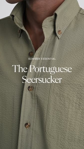
This ad features a close-up of a Portuguese Seersucker shirt on a light-skinned male torso. The shirt is presented as a summer essential.
# Brand positioning
The brand is presented as a provider of high-quality, essential menswear. The focus on "Portuguese Seersucker" implies a commitment to sourcing fine materials and craftsmanship. The brand aims to occupy a space in the consumer's mind as a provider of classic, refined menswear with a focus on quality and timeless style.
# Product
The product is a button-down shirt made from Portuguese Seersucker fabric. The shirt is a solid, light olive-green color and features a textured, puckered surface. The shirt has brown buttons and a pocket on the right side. It is portrayed as a "summer essential," implying it is lightweight, breathable, and suitable for warm weather. The ad highlights the origin of the fabric, suggesting a unique selling proposition of high-quality materials and craftsmanship.
# Visual style
The ad has a minimalist, clean aesthetic. The production quality appears high, with professional lighting and focus on detail. The image treatment includes subtle color grading to enhance the shirt's color. The typography is clean and legible, positioned to be easily scannable. The visual style conveys a sense of understated luxury and quality.
# Hooks
Headline: The Portuguese Seersucker
# Benefits
- [object Object]
# Features
- [object Object]
# Call to action
None used.
# Point of view
- [object Object]
# Storyline
- The ad opens with a close-up of the shirt, immediately drawing attention to the fabric's texture and color. This aims to highlight the unique material and visual appeal of the shirt from the brand's perspective.
- The text overlay designates the shirt as a "summer essential," framing it as a necessary item for the season. This message is conveyed from the brand's perspective.
- The focus on the "Portuguese Seersucker" aims to highlight the shirt's high-quality materials and craftsmanship, building trust with the audience from the brand's perspective.
# Ad summary
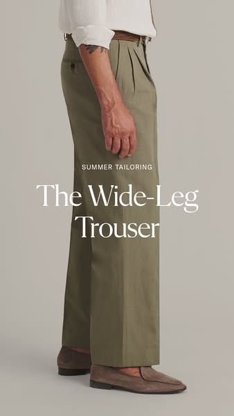
This ad showcases wide-leg trousers, likely targeting individuals interested in summer fashion and tailored clothing.
# Brand positioning
This brand is positioned as a purveyor of high-quality, tailored menswear, specifically targeting a sophisticated and style-conscious consumer. The emphasis on 'summer tailoring' suggests the brand focuses on seasonal collections that blend classic tailoring with contemporary trends and fabrics suitable for warmer weather. The brand aims to occupy a space in the consumer's mind as providing timeless style with a modern twist, while likely pushing against the norms of fast fashion by offering durable and well-crafted pieces.
# Product
The product being advertised is a pair of 'Wide-Leg Trousers' designed for summer wear. They are shown in an earthy, olive green color and appear to be made from a lightweight, breathable fabric ideal for warmer weather. The trousers feature a pleated front, side pockets, and a traditional waistband with belt loops, showcasing tailored design elements. The wide-leg cut offers a relaxed fit, suggesting comfort and contemporary style. The ad highlights the brand's tailoring and the modern yet classic design of the trousers, making them worth considering for anyone looking to update their summer wardrobe with stylish and comfortable options.
# Visual style
The ad features a clean and minimalist aesthetic. The production quality is high, with a studio-shot image that focuses on the garment's details. The image treatment includes soft lighting and natural color grading, enhancing the subtle tones of the trousers and loafers. The typography is elegant and understated, contributing to the overall sophisticated style. The ad mimics a high-fashion editorial style, likely intended to capture attention and convey a sense of timeless elegance.
# Hooks
Headline: The Wide-Leg Trouser
# Benefits
- [object Object]
# Features
- [object Object]
- [object Object]
# Call to action
None used.
# Point of view
- [object Object]
- [object Object]
# Storyline
- The image opens by showcasing a man wearing the wide-leg trousers and brown loafers, presenting a full side shot of the garment. This aims to highlight the product and its specific tailoring and drape, drawing the viewer's eye to its shape and fit. The perspective is from a direct observer, emphasizing the aesthetic of the trousers.
- The frame then moves its focus to the product and text overlay, focusing on the defining feature and a seasonal association, 'The Wide-Leg Trouser' and 'Summer Tailoring'. This is designed to inform the viewer about the style and intended use of the product, clarifying its place in the brand's seasonal collection. This segment is told from the brand's perspective, communicating the product's attributes directly.
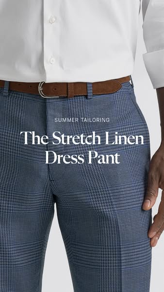
# Ad summary
This ad showcases a close-up of a man wearing blue plaid dress pants, emphasizing their stretch linen material and suitability for summer tailoring.
# Brand positioning
The brand is presented as a provider of high-quality, tailored clothing suitable for warm weather. The focus on "summer tailoring" suggests a brand that is both stylish and practical, catering to individuals who want to maintain a professional appearance while staying comfortable in the summer heat. The brand positions itself as a source for sophisticated, seasonal wardrobe solutions, emphasizing comfort and style.
# Product
The featured product is a pair of dress pants made from stretch linen. The pants have a blue plaid pattern and are designed for summer tailoring. They are worn with a brown suede belt with a silver buckle and a white dress shirt. The stretch linen material suggests comfort and breathability, making them suitable for warm weather. The pants are presented as a stylish and practical option for maintaining a professional appearance during the summer.
# Visual style
The ad features a clean, close-up shot with a focus on the product. The lighting is bright and even, highlighting the texture and pattern of the pants. The composition is simple and direct, with minimal distractions. The overall aesthetic is polished and professional, suggesting a high-quality product.
# Hooks
Headline: The Stretch Linen Dress Pant
# Benefits
- [object Object]
# Features
- [object Object]
# Call to action
None used.
# Point of view
- [object Object]
# Storyline
- The ad begins by showcasing the lower torso of a person wearing the dress pants, immediately drawing attention to the product. This is from the brand's perspective, highlighting the visual appeal and design of the pants.
- The text overlay emphasizes the key features of the pants: "The Stretch Linen Dress Pant." This is from the brand's perspective, informing the viewer about the product's material and style.
- The phrase "SUMMER TAILORING" is placed above the product name, setting the context and suggesting the pants are ideal for warm weather. This is from the brand's perspective, positioning the pants as a seasonal wardrobe solution.
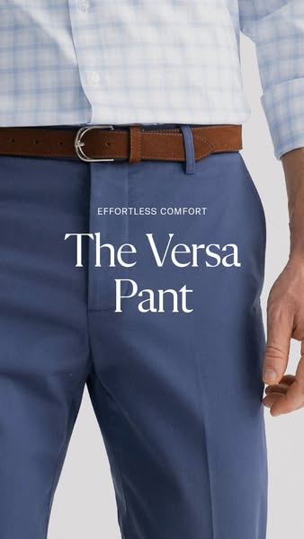
# Ad summary
This ad features a close up image of a man wearing the Versa Pant. White text overlaid on the image reads, "The Versa Pant" and "Effortless comfort."
# Brand positioning
The brand aims to occupy the space in the consumer's mind as a brand that values effortless comfort. This brand offers professional looking attire without sacrificing all day comfort.
# Product
The featured product is the Versa Pant. These pants are designed for effortless comfort. These pants appear to be for a consumer that values both a professional look and comfort.
# Visual style
The ad has high production quality with clean lighting. The photo is cropped at the waist so the pants fill most of the frame. White sans serif text is overlaid on the image. The background is a plain white.
# Hooks
Headline: The Versa Pant
# Benefits
- [object Object]
# Features
- [object Object]
# Call to action
None used.
# Point of view
- [object Object]
# Storyline
- From the brand's perspective, the ad shows a close up of someone wearing the product. The intention is to highlight the product's material and appearance in real life.
- From the brand's perspective, the ad uses white text overlaid on the product image. The text reads "The Versa Pant" and "Effortless comfort." The intention is to label the product and call out its most valuable benefit.
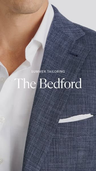
# Ad summary
This image ad showcases The Bedford suit jacket, highlighting its summer tailoring.
# Brand positioning
The brand is positioned as a purveyor of sophisticated summer tailoring. The brand aligns with a lifestyle of refined elegance and suggests a blend of classic style with modern needs, emphasizing tailored clothing for warmer weather. The brand seems to ignore the trend of casual wear by maintaining a focus on formal attire.
# Product
The advertised product is "The Bedford" suit jacket, tailored for the summer season. The jacket appears to be a navy blue hue with a subtle textured pattern. It is designed with a classic cut, featuring a notched lapel and a white pocket square detail. The primary reason to buy this product is for its suitability as formal wear during summer.
# Visual style
The ad features a clean, sophisticated aesthetic with high production quality. The visual motif includes a focus on texture and subtle details, rendered in a studio-shot environment with soft, diffused lighting. The typography is integrated subtly, lending an air of understated elegance that aims to be both native and high-design, enhancing scannability while maintaining a luxury feel.
# Hooks
Headline: The Bedford
# Call to action
None used.
# Point of view
- [object Object]
- [object Object]
# Storyline
- The image starts with a close-up view of a man wearing the suit jacket, subtly indicating the personal experience of wearing the garment. This sets the stage for showcasing the brand's summer tailoring through a direct visual connection with the product and its wearer.
- The focal point shifts to "The Bedford" jacket itself, highlighting its design and texture. This brings the product to the forefront, allowing the brand to communicate its commitment to tailoring excellence. This part of the narrative is told from the brand's perspective.
- The pocket square accentuates the fine tailoring, contributing to a refined aesthetic. It emphasizes the brand’s commitment to sophistication in tailoring. This element is presented from an observational perspective, allowing viewers to admire the craftsmanship.
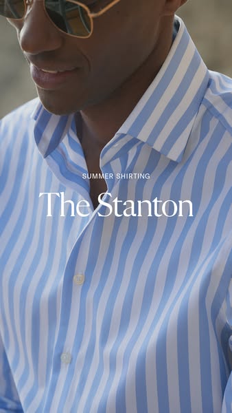
# Ad summary
This ad features a close-up shot of a man wearing a blue and white striped shirt, focusing on the shirt's fabric and fit. The text overlay emphasizes the shirt's name, 'The Stanton', and seasonal suitability with 'Summer Shirting'.
# Brand positioning
The brand is positioned as offering premium shirting options, specifically highlighting seasonal collections suitable for warm weather. The brand is focused on classic menswear staples, refined for contemporary consumers who appreciate quality fabrics and attention to detail in their wardrobe. The brand aims to embody an understated elegance, focusing on fit and construction for a timeless style. The ad focuses on functional aspects such as seasonal suitability and fabric quality, the brand also conveys a sense of refined taste and effortless style.
# Product
The product is a button-down shirt called 'The Stanton' designed for summer wear. It features a blue and white vertical striped pattern with a classic collar and button closure. The shirt is presented as a warm weather-appropriate garment, implying a lightweight and breathable fabric suitable for summer. The main selling point appears to be its design which balances classic style with modern seasonal needs, making it an ideal choice for maintaining a polished look during warmer months. The shirt offers a way to stay stylish and comfortable during the summer season.
# Visual style
The ad features a clean and refined aesthetic with a focus on showcasing the product in a flattering light. The image appears to be a high-quality photograph, possibly taken in a studio or controlled outdoor environment. Soft, natural lighting is used to highlight the fabric texture and color of the shirt. The visual style is minimalistic, with only the product and minimal text included.
# Hooks
Headline: The Stanton
# Benefits
- [object Object]
# Features
- [object Object]
# Call to action
None used.
# Point of view
- [object Object]
# Storyline
- The ad opens with a medium shot of a blue and white striped button-down shirt, presented to highlight its texture and design. The intention is to immediately capture attention with the visual appeal of the garment, which is the focal point of the ad. This part of the story is being told by the brand, showcasing the product in a visually appealing manner.
- Next, text overlays appear, first noting 'Summer Shirting' followed by 'The Stanton'. The purpose is to inform the viewer about the product's name and its suitability for the summer season. This section provides explicit information about the shirt being featured, and is told from the brand's perspective.
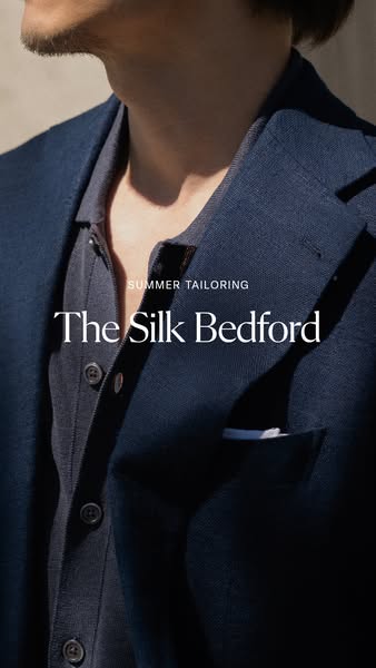
# Ad summary
A close-up shot of a man wearing a navy blazer and matching shirt, accompanied by the text "Summer Tailoring" and the product name "The Silk Bedford."
# Brand positioning
This brand positions itself in the high-end tailoring market with a focus on luxury materials like silk. It aims to appeal to customers who appreciate quality, craftsmanship, and a refined aesthetic. The brand emphasizes timeless elegance and understated style, suggesting that its target audience values sophistication over fleeting trends. By featuring a silk blazer, the brand highlights its commitment to using premium fabrics to create comfortable and stylish garments.
# Product
The product being advertised is "The Silk Bedford," a tailored navy blazer made from silk. The blazer is shown worn over a matching navy button-down shirt, suggesting a coordinated and stylish ensemble. The silk material implies a lightweight and breathable quality, making it suitable for summer wear. The blazer features a classic cut with a pocket square peeking out, contributing to an image of refined elegance and attention to detail. The ad is designed to showcase the blazer as a versatile piece that can elevate a man's wardrobe during the warmer months.
# Visual style
The ad features a sophisticated and minimalist visual style, emphasizing the quality and elegance of the blazer. The production quality is high, with a studio-shot feel and attention to detail in the lighting and composition. The image treatment includes subtle color grading to enhance the navy tones and create a cohesive aesthetic. The typography is clean and legible, complementing the overall design. This style aims to create a sense of exclusivity and appeal to a discerning audience.
# Hooks
Headline: The Silk Bedford
# Benefits
- [object Object]
# Features
- [object Object]
- [object Object]
# Call to action
None used.
# Point of view
- [object Object]
# Storyline
- The ad opens with a close-up shot of a man wearing a navy blazer and matching shirt. This is intended to immediately capture the viewer's attention with a visually appealing and sophisticated image, showing how the product is worn. The perspective is from the brand, showcasing the quality and style of their product.
- Text overlayed on the image reads "Summer Tailoring" and "The Silk Bedford." This informs the viewer that the ad is promoting a specific product line (summer tailoring) and identifies the featured item (the silk Bedford blazer). This is the brand's perspective, explicitly naming the product and associating it with a seasonal theme.
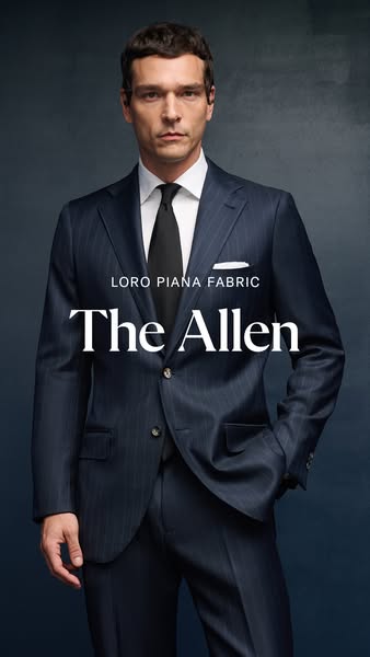
# Ad summary
This ad showcases a man wearing a suit made of Loro Piana fabric. The ad highlights the suit's fabric and design.
# Brand positioning
This brand is positioned as a provider of high-end, luxury suits. The brand emphasizes quality and sophistication, aligning with a lifestyle of success and elegance. The brand pushes against the trend of casual wear by promoting formal attire. The brand positioning is emotional, appealing to the consumer's desire for status and refinement.
# Product
The product is a men's suit, specifically "The Allen" model, made from Loro Piana fabric. The suit appears to be a navy blue pinstripe design, tailored for a sophisticated and professional look. The suit is for men who appreciate high-quality materials and classic tailoring. The ad highlights the luxurious fabric as a key selling point, suggesting the suit is worth trying or buying due to its superior material and design.
# Visual style
The ad has a highly polished, studio-shot production quality. The visual motif is a straightforward product showcase. The image treatment includes color grading to enhance the suit's color and texture, with soft lighting effects. The typography is large and bold, integrated to highlight the product name and fabric. The style contrasts with platform-native content, aiming for a high-design, attention-grabbing effect in the feed.
# Hooks
Headline: The Allen
# Benefits
- [object Object]
# Features
- [object Object]
# Call to action
None used.
# Point of view
- [object Object]
# Storyline
- The ad opens with a full shot of a man wearing a suit, immediately establishing the product being advertised. This is from the brand's perspective, aiming to capture attention and showcase the suit's overall appearance and fit.
- The focus then shifts to the suit's fabric and model name, emphasizing the quality and specific design of the product. This is from the brand's perspective, highlighting key features and branding the suit as "The Allen" made with Loro Piana fabric.
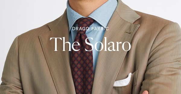
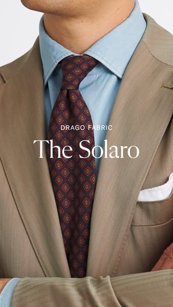
# Ad summary
The ad showcases a Drago fabric suit and tie ensemble. It is a simple product shot with messaging intended to highlight the quality of the fabric.
# Brand positioning
The brand's positioning is high-end, luxurious and focused on quality and craftsmanship. The focus is on the material of the product (Drago fabric) rather than the design or fit of the suit, suggesting that the brand values premium materials above all else. This attention to quality is likely designed to appeal to customers seeking investment pieces who appreciate the finer details.
# Product
The product featured is a suit made from Drago fabric, paired with a complementary tie. The suit is a light brown or tan color. It is worn over a light blue button-down shirt, and includes a white pocket square. The suit’s defining feature is its Drago fabric, which is highlighted in the ad's messaging, though no further information about the fabric is given. The tie is a dark red or burgundy color with a repeating pattern of small geometric shapes in shades of red and gold.
# Visual style
The visual style is clean and minimalist, with a focus on showcasing the product in a straightforward manner. The production quality appears high, suggesting a professional studio shoot. The image treatment is natural and unedited, with subtle color grading to enhance the colors of the suit and tie. The typography is elegant and understated, complementing the overall aesthetic. This approach aims to convey a sense of sophistication and luxury, targeting a discerning audience who appreciates quality and craftsmanship.
# Hooks
Headline: The Solaro
# Benefits
- [object Object]
# Features
- [object Object]
# Call to action
None used.
# Point of view
- [object Object]
# Storyline
- The ad opens with a close-up of a man's suit and tie. The focus is on presenting a luxurious, well-made ensemble. The perspective is that of the brand or designer, showcasing their product in the best possible light.
- The image zooms in on the fabric and design, allowing viewers to appreciate its quality. The brand's goal is to emphasize craftsmanship and elevate the material above all else.
- The main message is simple: the suit is made from Drago fabric and is named 'The Solaro.' The ad uses minimal copy, instead emphasizing the visual appeal of the garment. This is the brand communicating the name of the fabric being used to the viewer.
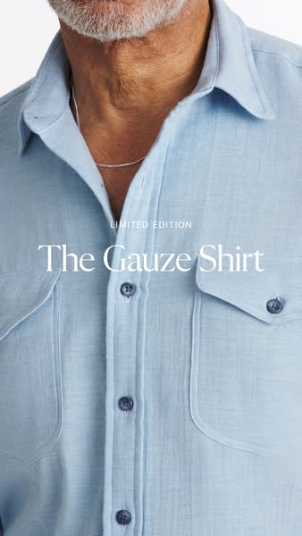
# Ad summary
This ad showcases a close up of a man wearing the brand's gauze shirt.
# Brand positioning
The brand appears to be positioned in the premium casual menswear market, focusing on high-quality materials like gauze. The "Limited Edition" tagline suggests exclusivity and appeals to customers who value unique and well-crafted clothing. The brand aligns with a relaxed yet refined lifestyle, where comfort and style are equally important. The focus on the material and design pushes against fast fashion and trends, emphasizing timeless appeal and craftsmanship. The brand positioning is both functional (high-quality material) and emotional (exclusivity, relaxed style).
# Product
The product featured is a gauze shirt, presented in a light blue color. It's a button-down shirt with two chest pockets, each fastened with a button. The shirt has a relaxed and comfortable look, achieved through the use of the gauze material and a classic design. The shirt appears to be a limited edition item. The ad shows the shirt being worn, highlighting how it looks on the body and suggesting it's suitable for casual wear. The ad does not explicitly address purchase barriers but implies that the quality and design are worth the investment.
# Visual style
The ad has a clean and minimalist visual style, with a focus on showcasing the material and fit of the shirt. The production quality appears to be high, with careful attention to lighting and detail. The image treatment is subtle, with a soft color palette and a focus on natural textures. The typography is clean and legible, enhancing the overall sense of sophistication. The style appears to be suited for in-feed browsing due to the direct product showcase.
# Hooks
Headline: The Gauze Shirt
# Benefits
- [object Object]
# Features
- [object Object]
# Call to action
None used.
# Point of view
- [object Object]
# Storyline
- The ad begins with a close-up of a man wearing a light blue gauze shirt. This is intended to draw the viewer's attention to the product's texture and fit, from the brand's perspective.
- The ad then displays the text "Limited Edition The Gauze Shirt." This communicates the product name and highlights its exclusivity, from the brand's perspective.
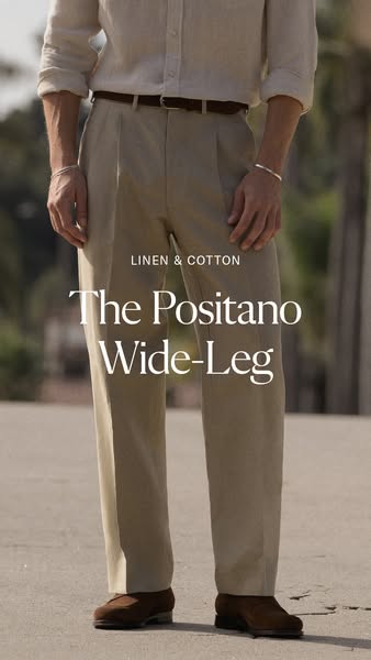
# Ad summary
This ad showcases a pair of wide-leg linen and cotton pants, highlighting their fabric and style.
# Brand positioning
This brand is positioned as an arbiter of everyday luxury, specializing in classic, timeless pieces made from high-quality materials like linen and cotton. The brand aligns with a relaxed yet refined lifestyle, promoting understated elegance and comfort. The brand's positioning is functional, emphasizing the fabric and fit of the featured pants.
# Product
The advertised product is a pair of wide-leg pants made from a linen and cotton blend. These pants are likely designed for individuals who appreciate comfort and style. The pants are presented as versatile, suitable for various occasions where a relaxed yet refined look is desired. The visible features include a pleated front, wide-leg cut, and a light, breathable fabric. The ad implies that these pants are a stylish alternative to more traditional styles, offering comfort and a modern silhouette.
# Visual style
The ad features a clean and minimalist visual style, focusing on the product and its material. The color palette is neutral and earthy, creating a sophisticated and relaxed aesthetic. The production quality is high, with attention to detail in the styling and lighting. The typography is elegant and understated. The visual style is designed to convey a sense of timelessness and quality.
# Hooks
Headline: The Positano Wide-Leg
# Benefits
- [object Object]
# Features
- [object Object]
# Call to action
None used.
# Point of view
- [object Object]
# Storyline
- The ad begins with a close-up shot of a person wearing the brand's linen and cotton wide-leg pants. This sets the stage and immediately introduces the product as the central focus. The brand is telling the story and highlighting the product's design and fabric.
- The camera focuses on the details of the pants, such as the pleats, the wide-leg cut, and the way they drape. This emphasizes the quality and design of the garment, showcasing the brand's attention to detail from the brand's perspective.
- The ad concludes with a full view of the pants, styled with a casual shirt and brown shoes. This provides context and suggests how the pants can be incorporated into a complete outfit, giving the audience a visual cue from the brand about the pants' versatility.
# Ad summary
This ad showcases Proper Cloth shirts on a model in a bright outdoor setting. The focus is on the brand and product visuals.
# Brand positioning
Proper Cloth is presented as a modern men's clothing brand specializing in high-quality shirts. The brand emphasizes timeless style and attention to detail, offering a range of classic designs and fabrics. Proper Cloth positions itself as a purveyor of elevated essentials, aligning with a sophisticated lifestyle. The brand avoids overt trends, focusing instead on core wardrobe pieces that withstand fleeting fads. The brand positioning is primarily functional, emphasizing quality materials and craftsmanship, while also incorporating an emotional element of classic style and confidence.
# Product
The featured product is a button-down shirt from Proper Cloth. The shirt is light yellow with thin stripes, has long sleeves, a front pocket, and a buttoned placket. It is made of fabric that appears textured. The shirt is designed for men and worn in a casual setting, partially unbuttoned at the collar. The shirt appears to be versatile for various occasions. The ad highlights the shirt's design, fit, and material, emphasizing its quality and style. There are no purchase barriers explicitly mentioned.
# Visual style
The ad has a clean and bright aesthetic with a polished commercial feel. The editing style is simple with static shots and smooth transitions. The visual motifs include bright, natural lighting and clear product focus. The pacing is slow, emphasizing a relaxed and sophisticated tone. There is no evident audio-visual synchronization.
# Benefits
- [object Object]
- [object Object]
- [object Object]
# Features
- [object Object]
- [object Object]
- [object Object]
- [object Object]
- [object Object]
# Call to action
None used.
# Point of view
- [object Object]
# Storyline
- 00:00–00:01 The camera focuses on the collar of the shirt, showcasing the material and stripe pattern. The text overlay displays the brand name.
- 00:01–00:03 00:01–00:03: The shot transitions to a wide angle of palm trees on a bright sunny day. The brand name remains on the screen.
- 00:03–00:07 00:03–00:07: A model is shown wearing the shirt, paired with khaki pants and a brown belt, walking outdoors. The camera focuses on the fit and overall style of the shirt. The brand name remains on the screen.
# Ad summary
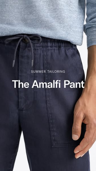
An ad featuring a pair of "The Amalfi Pant".
# Brand positioning
The brand presents a modern, upscale aesthetic with a focus on tailoring. The emphasis on "Summer Tailoring" suggests a blend of formal and casual styles, perfect for warm weather. The product's name, "The Amalfi Pant", evokes a sense of European luxury and relaxation, positioning the brand as offering sophisticated yet comfortable clothing.
# Product
The featured product is "The Amalfi Pant", a tailored pant designed for summer wear. The pants appear to be made of a lightweight, possibly linen-blend fabric, and are navy blue. They feature a drawstring waist with a button, and a pocket on the right leg. The ad highlights the pants as a versatile and stylish option for warm-weather tailoring. The overall presentation suggests that these pants offer both comfort and a polished look, making them suitable for various occasions.
# Visual style
The ad has a clean, minimalist visual style with a focus on showcasing the product's texture and fit. The lighting is soft and even, creating a natural and inviting look. The composition is tightly framed, drawing the viewer's attention to the details of the pants and the overall aesthetic of summer tailoring. The image has a high production quality, with attention to detail in fabric texture and color accuracy. The style aims to create a sense of sophisticated simplicity, emphasizing the product's quality and style without overwhelming the viewer.
# Hooks
Headline: The Amalfi Pant
# Benefits
- [object Object]
# Features
- [object Object]
- [object Object]
# Call to action
None used.
# Point of view
- [object Object]
# Storyline
- The ad focuses on showcasing the "The Amalfi Pant" in a close-up shot, highlighting its fabric, fit, and design details. This is from the brand's perspective to draw attention to the product's quality and style.
- The copy "SUMMER TAILORING" and "The Amalfi Pant" is overlaid on the image to clearly communicate the product's name and seasonal relevance. This is from the brand's perspective.
# Ad summary
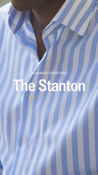
This ad showcases a light blue and white striped shirt, named "The Stanton", as part of a summer shirting collection.
# Brand positioning
This brand is presented as a provider of high-quality, stylish shirting options, particularly for the summer season. The focus on a specific product name, "The Stanton," suggests a curated collection with distinct offerings. The brand aims to occupy a space in the consumer's mind as a go-to for seasonal, fashionable shirts. The brand aligns with a lifestyle of effortless style and seasonal appropriateness, pushing against the norm of generic, all-season clothing. The brand positioning is both functional (providing shirts) and emotional (offering style and seasonal relevance).
# Product
The product featured is a button-down shirt called "The Stanton," designed as part of a summer shirting collection. The shirt has a light blue and white vertical striped pattern. It is a collared shirt with visible buttons down the front. The shirt appears to be made of a lightweight fabric suitable for warm weather. The ad emphasizes the shirt's style and seasonal appropriateness, suggesting it is a fashionable choice for summer. The ad aims to overcome the purchase barrier of not having suitable clothing for the summer season by presenting a stylish and seasonally relevant option.
# Visual style
The ad has a clean and minimalist visual style, focusing on the product with a shallow depth of field and soft lighting. The image treatment appears to have subtle color grading to enhance the blue tones. The typography is simple and modern, integrated seamlessly into the image. The style is high-design and aims to be scannable and attention-grabbing in a feed.
# Hooks
Headline: The Stanton
# Benefits
- [object Object]
# Features
- [object Object]
# Call to action
None used.
# Point of view
- [object Object]
# Storyline
- The ad opens with a close-up shot of the shirt, immediately drawing attention to its design and texture. This is from the brand's perspective, aiming to highlight the shirt's aesthetic appeal and quality.
- The text overlay introduces the shirt as "The Stanton" and positions it within the context of "Summer Shirting." This is from the brand's perspective, providing a name and category for the product to help the audience understand what is being offered.
# Ad summary
This image ad showcases a tie with a patterned design worn by a model in a light-colored suit and light blue shirt. The text overlay highlights the fabric of the tie.
# Brand positioning
The ad promotes Drago Fabric as a producer of high-quality fabrics. The brand positions itself in the luxury market through the use of refined fabrics and the showcasing of the tie. The brand promotes sophistication and elegance.
# Product
The product is a tie, made from Drago Fabric, featuring a navy blue base with a symmetrical diamond pattern of red and light brown hues. It is shown being worn as part of a business-formal outfit consisting of a light blue shirt and a light brown suit. The tie is tied in a classic knot, and the angle of the image showcases the material and design of the fabric. The ad presents this tie as a sophisticated and stylish accessory for formal occasions.
# Visual style
The ad has a professional and refined aesthetic. The production quality is high, with a focus on showcasing the texture and details of the tie and suit. The image treatment appears to involve soft, diffused lighting and subtle color grading to enhance the elegant and sophisticated atmosphere. The typography is clean and legible. The overall style aims to convey a sense of quality and sophistication, fitting the brand's image.
# Hooks
Headline: The Solaro
# Benefits
- [object Object]
# Features
- [object Object]
# Call to action
None used.
# Point of view
- [object Object]
# Storyline
- The image displays a person wearing a tie with a specific fabric, aiming to showcase the tie's appearance and texture. The viewer is experiencing it from the brand's perspective.
- The ad then presents the name of the tie itself, reinforcing the product name and highlighting its association with the fabric's quality. This is being shown from the brand's perspective.
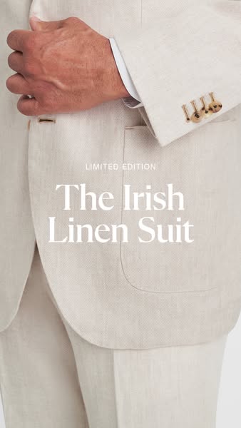
# Ad summary
This ad features a close-up of a man's Irish linen suit, highlighting its texture and design. The ad emphasizes the suit's limited edition status, positioning it as a premium and exclusive product.
# Brand positioning
The brand is presented as offering premium, limited-edition apparel. The focus on "The Irish Linen Suit" suggests a commitment to quality materials and craftsmanship. The brand aims to occupy a space in the consumer's mind as a provider of sophisticated, exclusive clothing items, aligning with a lifestyle of refined taste and appreciation for high-end fashion. The brand seems to ignore the fast-fashion trend, instead focusing on timeless elegance and limited availability.
# Product
The advertised product is "The Irish Linen Suit," presented as a limited edition item. The suit is made from linen fabric, as indicated by the product name. The suit consists of a jacket and trousers, tailored in a classic design. The suit is light in color, appearing to be off-white or beige. The ad emphasizes the suit's exclusivity through the "limited edition" label, suggesting a sense of urgency and scarcity. The suit is likely targeted towards individuals seeking sophisticated and high-quality apparel for formal or semi-formal occasions.
# Visual style
The ad features a highly polished, studio-shot image with a focus on texture and detail. The visual motif is clean and minimalist, with a neutral color palette. The image treatment includes soft lighting and subtle color grading to enhance the fabric's texture. The typography is large and bold, integrated seamlessly into the image. The overall style is sophisticated and high-design, aiming to capture attention and convey a sense of luxury.
# Hooks
Headline: The Irish Linen Suit
# Benefits
- [object Object]
- [object Object]
- [object Object]
# Features
- [object Object]
- [object Object]
- [object Object]
# Call to action
None used.
# Point of view
- [object Object]
# Storyline
- The ad opens with a close-up shot of the Irish Linen Suit, immediately drawing attention to the product's texture and design. This is intended to showcase the quality and craftsmanship of the suit from the brand's perspective.
- The text "LIMITED EDITION" is displayed above the product name, creating a sense of exclusivity and urgency. This is intended to persuade the audience that the product is a rare and valuable item from the brand's perspective.
- The product name, "The Irish Linen Suit," is prominently featured, clearly identifying the product being advertised. This is intended to inform the audience about the specific item being offered from the brand's perspective.
# Ad summary
This ad showcases Proper Cloth shirts, highlighting their style, fit, and versatility in a casual, outdoor setting. The ad uses a visual-focused approach, emphasizing the shirt's appearance and how it complements the wearer's lifestyle. A man is walking down the street wearing a Proper Cloth shirt with text overlays showing the brand name.
# Brand positioning
Proper Cloth positions itself as a provider of well-fitting, stylish, and versatile shirts, suitable for various occasions. The brand emphasizes classic and contemporary style, blending functional and emotional appeal. Proper Cloth aims to occupy a space in the consumer's mind as a brand that offers well-designed shirts that meet the demands of a modern lifestyle, with a focus on looking and feeling good while doing so.
# Product
The Proper Cloth shirt is a button-down shirt in a yellow and white striped pattern. The shirt has long sleeves and a classic collar. It is designed to be worn in casual settings. The shirt is shown being worn by a man in an outdoor environment. It appears to be lightweight and comfortable. The ad focuses on the aesthetic appeal and fit of the shirt, suggesting that it is a worthwhile purchase for those who value style and comfort.
# Visual style
The ad has a polished and clean aesthetic, using natural lighting and smooth transitions. The production quality is high-end, creating a sophisticated and stylish feel. The editing style uses static shots with some camera movement to keep the visuals engaging. The pacing is consistent and moderate, allowing the viewer to take in the details of the shirt and the setting.
# Benefits
- [object Object]
- [object Object]
- [object Object]
# Features
- [object Object]
- [object Object]
- [object Object]
- [object Object]
# Call to action
None used.
# Point of view
- [object Object]
# Storyline
- 00:00–00:02 The ad opens with a close-up of the Proper Cloth shirt.
- 00:02–00:03 The camera tilts upward to reveal palm trees in the background. This shot establishes a stylish and relaxed vibe.
- 00:03–00:07 The camera focuses on a man wearing the Proper Cloth shirt as he walks. This gives the audience perspective on how the shirt looks when worn and in motion.
# Ad summary
This ad promotes a men's stretch linen dress pant in a brown color. The ad showcases the texture and fit of the pants, while highlighting its comfort.
# Brand positioning
This ad presents the brand as focused on classic menswear. The brand emphasizes a timeless style, with a focus on tailoring and high-quality materials. The brand seems to ignore fleeting trends, instead focusing on core wardrobe staples. The brand's positioning seems functional, providing comfort and flexibility with a modern, understated style.
# Product
The product featured in this ad is a men's 'Stretch Linen Dress Pant'. It is shown in a brown color with a subtle texture. The pants are presented as comfortable and flexible, designed for summer tailoring. The ad showcases the fit, texture, and overall style of the pant, highlighting its ability to pair with smart casual outfits.
# Visual style
The ad has a clean and polished aesthetic. The editing is minimal. The visuals are well-lit and focus on detail. The pacing is relaxed. The production quality suggests a high-end commercial.
# Benefits
- [object Object]
- [object Object]
# Features
- [object Object]
# Call to action
None used.
# Point of view
- [object Object]
# Storyline
- 00:00–00:03 The ad opens with a close-up of the pants, immediately introducing the product. The goal is to present the product in detail, emphasizing the texture and style.
- 00:01–00:02 Next, the camera shows the pants on a person walking, showcasing the fit and how the pants move. This beat intends to give a sense of the garment in motion and shows how it looks when worn.
- 00:02–00:03 Finally, the ad shows a rear view of the pants. This moment aims to provide a full view of the garment's cut and fit.
# Ad summary
This ad for Proper Cloth showcases their custom menswear. It shows a variety of people in a number of stylish, fashionable outfits, highlighting how the clothing can be customized to fit the client's needs.
# Brand positioning
Proper Cloth is presented as a provider of custom menswear. The brand aims to occupy the space in the consumer's mind as a place where they can get custom-made clothing without the need to go to a tailor. The brand promotes values of high-quality clothing, with emphasis on custom fit, high attention to detail and timeless style. The brand positioning is both functional (custom fit, high-quality materials) and emotional (confidence in appearance).
# Product
The advertised product is custom menswear, including shirts, pants, sweaters, and jackets. The clothing is custom-made to the consumer's exact measurements. A variety of fabrics and design details are available to choose from. The clothing is presented as timeless, high-quality and fashionable, and can be worn in a variety of situations, from casual to professional.
# Visual style
The ad has a polished, high-end commercial aesthetic with natural lighting. The editing style includes quick cuts and static shots with smooth transitions. The pacing is consistent throughout the ad at approximately 24 BPM.
# Benefits
- [object Object]
- [object Object]
- [object Object]
- [object Object]
# Features
- [object Object]
# Call to action
None used.
# Point of view
- [object Object]
# Storyline
- 00:00–00:05 The Proper Cloth brand is introduced.
- 00:05–00:08 00:05–00:08 The versatility of the clothing line is shown with examples from casual settings.
- 00:08–00:12 00:08–00:12 Examples of work environments are shown, showcasing how the brand can be worn in those settings.
- 00:12–00:16 00:12–00:16 Different ways the clothing line can be customized are shown.
- 00:16–00:23 00:16–00:23 Different people are shown wearing and styling the brand.
- 00:23–00:27 00:23–00:27 Custom fit clothing is shown with various models.
How Other Apparel Brands Advertise on Meta
Peer brands in Motion's library — click any brand to see their creative strategy, live ads, and AI breakdowns.