# Ad summary
This ad shows a screen recording of someone googling how to focus while studying, then introduces The Focus Company app, which is available in the App Store and on Google Play.
# Brand positioning
The Focus Company app aims to help users struggling with focus and productivity by blocking distracting apps and limiting screen time. The brand presents itself as a functional tool for managing digital distractions.
# Product
The Focus Company app is designed to block distracting apps and limit screen time in order to help people focus. The app includes features like the ability to block social media and email apps, timers for focused work sessions, and customizable settings. It also features a snarky message that appears when you try to open blocked apps. The app is available for download on the App Store and Google Play.
# Visual style
The ad has a simple, clean aesthetic, mimicking a screen recording from a smartphone. The production quality is basic, with direct overhead shots and no elaborate editing. The pacing is relatively quick, with cuts timed to the background music.
# Benefits
- [object Object]
- [object Object]
- [object Object]
# Features
- [object Object]
- [object Object]
- [object Object]
# Call to action
None used.
# Point of view
- [object Object]
# Storyline
- 00:00–00:03 The ad starts with a search bar on a smartphone showing common searches including "How I Met Your Mother," "How to Get to Heaven From Belfast," "How to make a Killing," "How to get to Versailles from Paris," "How tall is the Eiffel Tower," "How to Train Your Dragon," "How many countries in the world," and "How are you in French."
- 00:00–00:03 Continuing from the previous shot, the search bar now shows more queries related to focusing, such as "How to focus," "How to focus on yourself," "How to focus with ADHD," "How to focus while studying," "How to focus better," "How to focus the oculory," and "How to focus on work."
- 00:00–00:03 Building off the previous shots, the smartphone is now showing a Google search page for “how to focus while studying.” The search results consist of a list of quick tips for increasing attention span, such as limiting distractions, taking breaks, getting enough sleep, eating healthy snacks, staying hydrated, exercising, meditating, and turning off your phone.
- 00:03–00:08 00:03–00:08 The scene transitions to a phone lying on a wooden surface. A finger taps on the phone screen, opening an app labeled “Timer.” A hand then navigates through different app options, including “Deep Study” and “Digital Detox.” They then click on “Blocked Apps” and a snarky message pops up: “Damn, Not You Again... I’m sick and tired of your BS anymore. Can’t deal with your BS anymore. Leave me alonseeee.” The user taps “Dismiss.”
- 00:08–00:11 00:08–00:11 The camera cuts to a black screen with the Focus Company logo. The screen also displays “Download on the App Store” and “Get it on Google Play” buttons.

How Opal・#1 Screen Time App Advertises on Meta
Refreshed 6 weeks ago · Weekly refresh cadence
Opal・#1 Screen Time App runs 79 active ads on Meta, shipping ~28 new creatives per week. Their library leans on Screen Recording38%, Montage10%, and POV8%. Recently, opal is pushing hard on the core app blocking functionality with a strong focus on ADHD audiences and productivity framing, using humor and relatable pain points around phone addiction to position the app as both a blocker and a gamified motivation tool. They're testing multiple angles including low-energy "calm" messaging, visual humor (brick phone cases, stuck-on-page-12 books), and aspirational "choose life over algorithms" travel content, but the through-line is consistently about reclaiming hours lost to scrolling and turning blocked screen time into real-world action. There's also subtle brand expansion happening with "The Focus Company" appearing as an alternate or umbrella name in a few creatives, suggesting possible repositioning or product suite broadening.
Indexed by Motion's Inspo Library.
The 20 Most Recent Opal・#1 Screen Time App Ads on Meta
# Ad summary
This ad for the Opal app takes an intentionally low-energy approach, suggesting that watching it will bring the viewer a sense of calm rather than more anxiety and stimulation.
# Brand positioning
Opal is presented as a tool to help people disconnect from their phones and reduce screen time. The brand positions itself as a solution to the constant stimulation and anxiety caused by excessive phone use, aiming to occupy a space in the consumer's mind as a calming influence in their digital lives. Opal aligns with values of mindfulness, focus, and intentionality, pushing against the norm of constant engagement promoted by many apps. The brand positioning is both functional (blocking apps, setting timers) and emotional (reducing stress, promoting calm).
# Product
Opal is a screen time control app designed to help users focus, block distracting apps, and set timers for app usage. It's intended for anyone who feels overwhelmed by constant notifications and wants to reduce their screen time. The app offers features like app blocking, time limits, and tools to help users feel calmer and less anxious about getting to the next video. It addresses the purchase barriers of feeling addicted to one's phone by offering a solution that promotes mindfulness and helps users regain control of their time and attention.
# Visual style
The ad has a deliberately low-key and unpolished aesthetic, creating a casual and approachable feel. The editing style is minimal, with static shots and no noticeable transitions or effects for the majority of the video. Production quality leans toward a UGC feel, enhanced by the natural setting and the speaker's relaxed delivery. The pacing is slow and steady, emphasizing the message of calm and intentionality.
# Benefits
- [object Object]
- [object Object]
- [object Object]
# Features
- [object Object]
- [object Object]
# Call to action
Download for free
# Point of view
- [object Object]
# Storyline
- 00:00–00:02 A man stands in a wooded area and tells the viewer that they have reached an "Instagram checkpoint."
- 00:02–00:08 He states that the video will not be interesting or stimulating, nor will it try to keep the viewer from scrolling.
- 00:08–00:14 He continues, saying he won't speak fast or make cuts to fight for the viewer's attention. This establishes a tone of intentional calm and a contrast to typical attention-grabbing content.
- 00:14–00:23 If the viewer is still watching, the man says that he just wants them to watch the video for themselves and focus on the feeling it gives them. This implies the video is meant to offer some sort of benefit beyond mere entertainment.
- 00:23–00:33 He suggests that the viewer might now be feeling calmer, less stressed, and less anxious to get to the next video. This highlights the positive emotional outcomes the video is aiming to provide.
# Ad summary
An individual shares an app called Opal, which blocks access to apps that are negatively impacting their daily life.
# Brand positioning
Opal is presented as an app to help users take control of their phone usage and digital wellbeing. The brand is positioned as a solution to the problem of excessive screen time and its negative impacts on mental and physical health. By providing tools to block distracting apps and monitor usage, Opal aims to empower users to reclaim their time and focus on what truly matters. The brand aligns with a lifestyle focused on mindfulness, productivity, and intentionality, pushing against the norms of constant connectivity and digital distraction. Its positioning is both functional (providing tools for time management) and emotional (promoting feelings of control, balance, and freedom).
# Product
Opal is an app designed to help users manage and reduce their screen time, promoting digital wellbeing. The app works by allowing users to block specific apps that they find distracting, such as social media or games, and monitor their overall phone usage. Its features include app blocking, screen time tracking, and focus assistance. Opal’s USPs include its ability to help users break free from toxic relationships with their phones, reclaim their time, and achieve a more balanced and fulfilling lifestyle. The ad showcases use occasions such as reducing screen time to achieve “healed, hydrated, unbothered.” By addressing purchase barriers such as the belief that phone usage cannot be controlled, Opal encourages viewers to try the app and experience its benefits firsthand.
# Visual style
The ad has a casual, UGC-style aesthetic, resembling content commonly found on platforms like TikTok or Instagram Reels. The editing style consists of quick cuts and jump cuts, creating a fast-paced rhythm. The production quality is a hybrid of polished commercial and UGC feel, balancing authenticity with professional presentation. The pacing is consistent, with cuts timed to the music beats. There are no recurring visual motifs.
# Benefits
- [object Object]
- [object Object]
- [object Object]
# Features
- [object Object]
- [object Object]
# Call to action
Download for free
# Point of view
- [object Object]
# Storyline
- 00:00–00:03 The video opens with the creator holding a mug, with text explaining that your phone can be your toxic situation and you're in denial. The intention is to call out how people may be unaware of the toxic role a phone plays in their life. It is from the creator's perspective, conveyed through the selfie style shot and relatable tone. It sets a humorous, relatable tone.
- 00:03–00:05 Building on this concept, the creator reveals that she is "breaking up" with her phone, which means using the Opal app. The goal is to show how easy it is to integrate Opal into daily life. It is from the creator's perspective, conveyed through the selfie style shot and informative tone.
- 00:05–00:06 Next, the creator explains how she used to spend over 7 hours on her phone daily, which she describes as "not normal." The goal is to highlight the common problem the app addresses. It is from the creator's perspective, using a selfie style shot and vulnerable tone.
- 00:07–00:09 The video displays the phone usage after using the app; it is much lower at just over 3 hours per day. The presenter describes herself as "healed, hydrated, unbothered". The goal is to show the tangible results of using the app, in the creator's perspective with an outdoor selfie shot and triumphant tone.
- 00:09–00:13 Building on that, the creator states she has "told my phone we're on a break" and shows how she has blocked apps using Opal. The intention is to provide a quick demonstration of the app's features. The viewer sees the perspective of the user, with an overhead shot of the phone screen and explanatory tone.
- 00:13–00:15 The video ends with a screen promoting the Opal app and stating "Stop losing hours to your phone," with a call to action to "Download for free." The purpose is to reinforce the brand message and encourage downloads. The perspective is that of the Brand, using a clean graphic and a direct marketing tone.
# Ad summary
This ad promotes The Focus Company, an app designed to help people with their digital habits. The ad uses visual humor and relatable pain points to connect with an audience struggling with phone overuse and feeling haunted by digital obligations.
# Brand positioning
The Focus Company is presented as a quirky, modern solution for digital overload. The ad emphasizes the relief of disconnecting from constant notifications and the pressure to stay online, positioning the app as a supportive tool for reclaiming focus and balance. The brand voice is lighthearted and self-aware, acknowledging the absurdities of digital life, and aligns with the lifestyle of someone seeking mindful tech habits rather than complete digital abandonment. It aims to occupy a space that pushes back against the norms of constant connectivity and the fear of missing out by offering a practical, humorous approach to digital wellness.
# Product
The Focus Company app is designed to help users manage their digital habits and disconnect from the constant distractions of smartphones. As shown in the ad, the app presents users with humorous reminders that reference the 'haunting of the FYP' and 'cognitive servers overheating.' These notifications serve as a lighthearted intervention, prompting users to initiate an 'emergency shutdown' and take a break from their digital devices. The app is available for download on both the App Store and Google Play, making it accessible to a wide range of smartphone users. The ad communicates that the app offers a fun, non-judgmental approach to reducing screen time and reclaiming focus from the overwhelming demands of digital life.
# Visual style
The ad features a blend of high-quality natural footage with a UGC feel, contrasted with polished interface elements. The editing style includes quick cuts between real-life scenery and phone screen recordings, creating a juxtaposition between the peacefulness of nature and the chaos of digital notifications. The production quality is hybrid, combining authentic, possibly user-generated content, with professionally designed graphics and text overlays. The pacing is moderately fast, with cuts timed to the rhythm of the background music. There is an intentional audio-visual sync, as the countdown and notification pop-ups draw attention to the brand.
# Benefits
- [object Object]
- [object Object]
- [object Object]
# Features
- [object Object]
- [object Object]
- [object Object]
# Call to action
None used.
# Point of view
- [object Object]
- [object Object]
# Storyline
- 00:00–00:04 The ad opens with a serene scene of someone relaxing in a hammock by a waterfall, immediately juxtaposed with an intrusive text overlay composed of random characters.
- 00:00–00:04 This jarring contrast sets the stage for the ad's message: even in a peaceful setting, digital distractions can intrude. The scene is from a customer perspective, experiencing peace until it is disrupted by the text, which acts as a visual metaphor for digital noise.
- 00:04–00:06 A countdown begins, transitioning to a picturesque mountain scene with the words "Digital Sabbath" overlaid.
- 00:06–00:11 This sets up the idea of a digital detox, implying a break from the constant connectivity. The view shifts to the screen of a phone, receiving notifications about the 'haunting of the FYP' and cognitive overload.
- 00:06–00:11 These notifications, presented in a humorous, self-aware tone, highlight the pain points of digital addiction.
- 00:12–00:14 Finally, the ad introduces The Focus Company logo, signaling a solution to the digital distractions highlighted earlier, and provides download links.
- 00:12–00:14 This offers the audience a clear path to address the problem presented.
# Ad summary
This ad promotes the Opal app, which blocks distracting apps to help users focus and limit screen time. The ad humorously presents the common struggle of avoiding chores, suggesting that the app can motivate users to be productive by locking distracting apps.
# Brand positioning
Opal is presented as a screen time control app that promotes focus and productivity by blocking distracting apps. The brand positions itself as a solution for individuals struggling with phone addiction and procrastination, specifically highlighting its ability to motivate users to complete tasks by limiting access to social media and other time-consuming applications. The brand aligns with the values of productivity, focus, and time management. It pushes against the norm of constant connectivity and excessive screen time, aiming to empower users to regain control over their digital habits and improve their real-life productivity. The brand positioning is functional, emphasizing the app's ability to block distractions and improve focus.
# Product
Opal is a screen time control app designed to block distracting apps on a user's phone, promoting focus and productivity. The app is for individuals who want to limit their screen time and improve their focus. The app blocks apps like TikTok, Instagram, and Messenger, displaying a message that the app is blocked by Opal. The user can manage blocking within the Opal app. The main USP is its ability to motivate users to complete tasks and chores by restricting access to distracting apps. The app addresses the purchase barrier of procrastination and lack of focus by providing a structured solution to limit digital distractions. The ad suggests that the app is worth trying because it transforms avoidance of chores into a motivation to complete them, rewarding users with access to their favorite apps once they've accomplished their tasks.
# Visual style
The ad uses a UGC style, with handheld camera shots. The production quality is basic, resembling a user-generated video. The pacing is quick, with cuts aligning to the music. The audio and visual elements sync to emphasize the app's functionality. The editing is characterized by jump cuts and quick transitions, contributing to a fast-paced rhythm.
# Benefits
- [object Object]
- [object Object]
- [object Object]
# Features
- [object Object]
- [object Object]
- [object Object]
- [object Object]
# Call to action
Download for free
# Point of view
- [object Object]
- [object Object]
# Storyline
- 00:00–00:04 The video starts with a series of close-up shots of someone doing chores, such as cleaning a sink, stovetop, and floor.
- 00:00–00:04 The intention is to show the viewer the brand's solution for overcoming procrastination with humor. The perspective is from the brand, showcasing real-life cleaning and suggesting their product’s motivating potential for those facing procrastination. The tone is humorous, acknowledging the relatability of chore avoidance.
- 00:04–00:05 Then, there is a shot of the Opal app screen on the app store. Text states that it is "not gatekeeping this one."
- 00:04–00:05 This builds credibility by showcasing an official app store listing with positive ratings and a design award, implying it’s a trusted and effective tool. The perspective shifts to an external source of validation, reinforcing the app’s reliability through official channels. The tone is informational, conveying the brand’s credibility through concrete data.
- 00:05–00:10 Following this, the user is shown repeatedly tapping to open apps like TikTok, Instagram and Messenger, only to find that they are blocked by Opal.
- 00:05–00:10 The user perspective of navigating the blocked apps is to demonstrate the app's core functionality and to show the user that their actions are blocked by the app. The tone is instructional, demonstrating the app’s practical use case.
- 00:10–00:12 Finally, the Opal app logo is shown, along with the taglines "Stop losing hours to your phone" and "Download for free."
- 00:10–00:12 The brand is speaking directly to the consumer, trying to grab their attention. The perspective is from the brand, directly pitching its value proposition and CTA. The tone is persuasive, emphasizing the app’s benefits and ease of access.
# Ad summary
This ad promotes the Opal app as a way to help people with ADHD focus and be productive by incentivizing real-world tasks with virtual gems. The ad uses humor and relatable situations to show how the app can turn everyday chores into a game, making it easier to stay on track and avoid phone addiction.
# Brand positioning
Opal is positioned as a tool to help people manage their phone usage and improve focus, especially for those with ADHD. The brand presents itself as a helpful and innovative solution that turns productivity into a game, incentivizing users to engage in real-world tasks by rewarding them with 'silly gems'. Opal aligns with values of self-improvement, productivity, and mindful technology use. It pushes against the norm of constant digital engagement, offering a way to break free from phone addiction and regain control over one's time.
# Product
The Opal app is a screen time control application designed to help users focus and manage distractions by blocking access to distracting apps. It features customizable schedules and time limits, allowing users to set specific periods for 'Laser Focus' and 'Rise & Shine'. The app rewards users with 'silly gems' for completing real-world tasks when their phones are locked, gamifying productivity and incentivizing users to stay off their phones. A premium option offers extended features, such as uninterrupted rest and sleep.
# Visual style
The ad features a blend of UGC-style footage and polished app interface shots. The editing style includes quick cuts to maintain a fast pace, combined with static shots of the app's UI. The production quality varies between casual home video and professional app displays, supporting the intended tone of relatability and functionality. The pacing is consistent, creating a sense of continuous action and information delivery.
# Benefits
- [object Object]
- [object Object]
- [object Object]
- [object Object]
# Features
- [object Object]
- [object Object]
- [object Object]
- [object Object]
# Call to action
None used.
# Point of view
- [object Object]
- [object Object]
# Storyline
- 00:00–00:05 The ad starts with a relatable scenario of being 'forced' to clean due to the Opal app's lock, which presents the user's perspective and introduces the product.
- 00:05–00:10 The screen shifts to the Opal app interface, showcasing its features such as time limits and schedules, explaining the functional aspects of the app from the brand's perspective.
- 00:10–00:14 A finger interacts with the Opal app on a phone, navigating through its features and setting time limits, which gives a demo of how the app works, narrated from a customer's perspective.
# Ad summary
This ad showcases the Opal app's app-blocking capabilities with humorous visuals. It uses a comedic juxtaposition of retro and modern tech—a phone case resembling an old Nokia brick phone—to capture attention and create a memorable contrast with the app's modern functionality. The ad humorously emphasizes productivity and mindful phone use.
# Brand positioning
Opal is presented as a productivity-focused app designed to empower users to take control of their screen time and focus better. The brand aligns with values of mindfulness and digital well-being. It positions itself against the norm of constant connectivity and the addictive nature of social media and other apps. Its positioning is primarily functional, offering simplicity and performance in managing app usage, but it also carries an emotional undercurrent of empowerment and improved well-being.
# Product
Opal is an app designed to block distracting apps and promote focused work sessions. It enables users to block specific apps like YouTube, Instagram, TikTok, and LinkedIn to reduce digital distractions. The app allows users to manage their blocking settings. A key USP is the app's ability to empower humans to focus better. It visually addresses the user's habit of checking blocked apps, providing a log of blocked attempts to highlight the app's effectiveness and reinforce the user's commitment to focused sessions. The app works by blocking apps during user-defined focus sessions.
# Visual style
The ad has a playful aesthetic, mixing high-tech with retro design elements. The editing style includes quick cuts to maintain a fast pace, alternating between live visuals and screen recordings. The production quality is a blend of polished commercial elements and UGC feel. The pacing is fast, approximately 30 cuts per minute, with cuts synchronized to the music's rhythm.
# Benefits
- [object Object]
- [object Object]
# Features
- [object Object]
- [object Object]
# Call to action
None used.
# Point of view
- [object Object]
- [object Object]
# Storyline
- 00:00–00:02 The ad begins by showcasing a hand holding an iPhone in a transparent case that mimics the appearance of a classic Nokia phone, complete with a faux keypad and screen displaying the message 'GET OFF YOUR PHONE'. The intention is to grab attention through a humorous contrast between retro and modern technology, immediately setting a playful and ironic tone regarding phone usage.
- 00:02–00:03 The visual shifts to different iterations of the 'GET OFF YOUR PHONE' message on the faux Nokia screen, each with slightly varied text and graphical elements. This reinforces the ad's opening message in a humorous and attention-grabbing way.
- 00:03–00:04 The scene transitions to an Opal app notification that reads 'YouTube was blocked by Opal' followed by supporting text. The goal is to introduce the app's core functionality and demonstrate its ability to block distracting apps during user sessions. The perspective shifts to that of a user who is encountering the app's blocking feature.
- 00:04–00:04 The display shows the message 'Instagram was blocked by Opal'. This expands on the previous message by illustrating the app's ability to block multiple social media apps, emphasizing its effectiveness.
- 00:04–00:05 The screen displays the message "Get off that phone." in white text on a black screen. This text repeats the key theme of reducing screen time, underscoring the app's purpose and reinforcing its message in a simple, direct way.
- 00:05–00:06 The ad transitions to a phone home screen displaying numerous app icons, most of which have notification badges. The 'APP BLOCKER' widget at the top shows an active session with remaining time. This provides a visual contrast between the user's digital distractions and Opal's control, highlighting the user’s need for the app.
- 00:06–00:07 The message 'Instagram was blocked by Opal' reappears. This reinforces the consistent blocking of distracting apps, further emphasizing Opal's capability to control app usage and prevent distractions.
- 00:07–00:08 The ad returns to the home screen view. This continues to highlight the availability of distracting apps, providing ongoing reinforcement of the need for Opal's services.
- 00:08–00:09 The ad displays a blocked message on Instagram. This shows a higher blocking count, suggesting repeated attempts to access the app, which reinforces the app’s effectiveness in preventing compulsive checking and further emphasizes the user's need for the app.
- 00:09–00:10 The Opal logo appears in white text on a black background. This ends the ad with a clear brand reinforcement, leaving the audience with a memorable image of the app being promoted.
# Ad summary
This ad promotes Opal, a screen time control app. It highlights the user's daily routine of waking up, scrolling, working, scrolling, and sleeping, emphasizing excessive screen time. The ad shows how Opal helps break this loop by blocking distracting apps like Instagram and Messenger, allowing the user to regain several hours per day.
# Brand positioning
Opal is presented as a solution for individuals seeking to reduce their screen time and break free from the addictive cycle of social media and constant connectivity. The brand positions itself as a tool for reclaiming time and attention by blocking distracting apps, promoting a more balanced and productive lifestyle. By emphasizing the negative aspects of excessive screen time, Opal offers a functional solution for those who feel trapped in this digital loop. The brand aims to occupy the space of a helpful and necessary tool for self-improvement and reclaiming control over one's digital habits.
# Product
Opal is an app designed to control screen time by blocking distracting applications and setting timers for usage. It is aimed at individuals who find themselves spending excessive amounts of time on their phones, particularly on social media and other addictive apps. The app blocks access to specified applications, allowing users to focus on other activities. A key feature is the ability to set up "breaks" from these apps, helping users to reclaim several hours per day. The app also provides data on screen time usage, allowing users to track their progress. By addressing the purchase barrier of potential distraction and addiction, Opal is presented as a tool to regain control and improve productivity.
# Visual style
The ad has a casual, UGC-style aesthetic, with a mix of selfie-style shots and screen recordings. The editing is simple with quick cuts and minimal transitions. The production quality feels natural and relatable. The pacing is brisk, approximately 25 cuts per minute, keeping the viewer engaged.
# Benefits
- [object Object]
- [object Object]
# Features
- [object Object]
- [object Object]
- [object Object]
# Call to action
None used.
# Point of view
- [object Object]
# Storyline
- 00:00–00:02 The ad starts by showing a person sipping a drink with on-screen text describing a typical daily routine: wake, scroll, work, scroll, sleep. This establishes a relatable scenario of excessive screen time.
- 00:02–00:03 The narrative shifts to breaking free from this loop by introducing Opal, a screen time control app. This is presented as a solution to the established problem of excessive screen time, implying the app can help break the cycle.
- 00:03–00:06 The ad shows the person using the app, reflecting on a feeling that their part-time job pays nothing, it’s TikTok. This line conveys the app user's perspective, highlighting how much time is spent on unproductive activities.
- 00:06–00:09 The app is shown blocking Instagram and Messenger, telling the phone “we’re on a break.” This showcases the app's blocking function and its role in limiting access to distracting apps, creating a sense of control.
- 00:09–00:13 The ad emphasizes the positive outcome of using Opal, “resigned from the algorithm.” A silly little 4 hours are gained back per day. This visualizes a significant reduction in screen time, presenting a tangible benefit of using the app.
# Ad summary
This ad for the Opal app uses a side-by-side comparison of two phone screens to highlight the app's ability to reduce screen time and increase focus. The ad showcases various features of the Opal app, such as setting time limits for apps, providing personality tests, and offering suggestions for mindful activities, all presented with a clean and modern aesthetic.
# Brand positioning
Opal is presented as a solution to the problem of excessive screen time and digital distraction. The brand positions itself as a tool for users seeking to regain control over their tech usage, promoting values of mindfulness, productivity, and intentionality. By offering features that limit app usage and suggest alternative activities, Opal aligns with a lifestyle that prioritizes balance and focus, pushing against the norms of constant connectivity. The brand positioning is both functional, through its screen time management tools, and emotional, by appealing to the user's desire for a more mindful and balanced lifestyle. The brand aims to occupy the consumer's mind as a tool for promoting digital well-being.
# Product
The Opal app is a screen time management tool designed to help users reduce their digital distractions and increase focus. It works by allowing users to set time limits for specific apps, providing personality tests to understand usage habits, and offering suggestions for mindful activities. Features include app usage tracking, customizable time limits, and prompts for alternative activities like making a brag list or naming five things to focus on. The app is intended for anyone who feels overwhelmed by their phone usage and wants to regain control over their time. It addresses the purchase barrier of uncertainty by offering the app for free to download. The ad emphasizes the app's ease of use and its ability to promote a more intentional and balanced lifestyle.
# Visual style
The ad has a clean and modern aesthetic, using a simple top-down perspective to showcase the app's features. Editing is minimal, with static shots and smooth transitions. The production quality is polished. The pacing is consistent, with one cut per second. The cuts are timed to the app's actions.
# Benefits
- [object Object]
- [object Object]
- [object Object]
- [object Object]
# Features
- [object Object]
- [object Object]
- [object Object]
- [object Object]
# Call to action
Download for free
# Point of view
- [object Object]
# Storyline
- 00:00–00:01 Two hands are shown on a table, each interacting with a smartphone. One hand is using an iPhone with a traditional setup, while the other hand is using an iPhone with the Opal app installed.
- 00:01–00:02 00:01–00:02: The hand using the Opal-enabled iPhone taps through the app. It opens several features of the Opal app, including personality tests and mindful activities suggestions. The intention is to show the user that the app has a variety of features.
- 00:02–00:03 00:02–00:03: The hand using the iPhone without Opal opens several social media and entertainment apps. It is setting time limits on those apps, but fails to actually click OK to start the timer.
- 00:03–00:04 00:03–00:04: The hand using the Opal-enabled iPhone taps through the app. It opens several features of the Opal app, including personality tests and mindful activities suggestions. The intention is to show the user that the app has a variety of features.
- 00:04–00:05 00:04–00:05: The hand using the iPhone without Opal opens several social media and entertainment apps, as well as Instagram.
- 00:05–00:06 00:05–00:06: The hand using the Opal-enabled iPhone taps through the app. It opens several features of the Opal app, including personality tests and mindful activities suggestions. The intention is to show the user that the app has a variety of features.
- 00:06–00:07 00:06–00:07: The hand using the iPhone without Opal opens several social media and entertainment apps, as well as Instagram.
- 00:07–00:08 00:07–00:08: The hand using the Opal-enabled iPhone taps through the app. It opens several features of the Opal app, including personality tests and mindful activities suggestions. The intention is to show the user that the app has a variety of features.
- 00:08–00:09 00:08–00:09: The hand using the iPhone without Opal opens several social media and entertainment apps, as well as TikTok.
- 00:09–00:10 00:09–00:10: The hand using the Opal-enabled iPhone taps through the app. It opens several features of the Opal app, including personality tests and mindful activities suggestions. The intention is to show the user that the app has a variety of features.
- 00:10–00:11 00:10–00:11: The hand using the iPhone without Opal opens several social media and entertainment apps, as well as TikTok.
- 00:11–00:12 00:11–00:12: The hand using the Opal-enabled iPhone taps through the app. It opens several features of the Opal app, including personality tests and mindful activities suggestions. The intention is to show the user that the app has a variety of features.
- 00:12–00:13 00:12–00:13: The hand using the iPhone without Opal opens several social media and entertainment apps, as well as Instagram.
- 00:13–00:14 00:13–00:14: The hand using the Opal-enabled iPhone taps through the app. It opens several features of the Opal app, including personality tests and mindful activities suggestions. The intention is to show the user that the app has a variety of features.
- 00:14–00:15 00:14–00:15: The hand using the iPhone without Opal opens several social media and entertainment apps, as well as TikTok.
- 00:15–00:16 00:15–00:16: The hand using the Opal-enabled iPhone taps through the app. It opens several features of the Opal app, including personality tests and mindful activities suggestions. The intention is to show the user that the app has a variety of features.
- 00:16–00:19 00:16–00:19: The screen switches to black. The Opal app is advertised and user is encouraged to download it.
# Ad summary
The ad for Opal, an app blocker, hooks viewers by saying their phone is the most potent drug known to man. It then features an iPhone with blocked access to social media apps, encouraging users to ‘look in the mirror’ because they’re ‘hooked’.
# Brand positioning
Opal is presented as a technology solution designed to combat excessive phone usage, positioning itself as a tool to empower individuals to focus better. The brand advocates for digital well-being by drawing a comparison between phone usage and drug addiction, framing itself as a necessary intervention. Opal aligns with values of productivity and intentionality, pushing against the norm of constant connectivity and the addictive nature of social media. The brand adopts a functional and slightly confrontational approach, urging users to recognize and address their dependency on their phones.
# Product
Opal is an app that blocks access to distracting applications like Instagram, TikTok, and Twitter. The app's user interface is displayed, showing alerts like 'Instagram is blocked by Opal' and statistics such as '100 Million Hours Saved'. It works by blocking the apps during set focus sessions, empowering humans to focus better. The app allows users to manage and customize their blocking settings and limit use of social media apps. It is designed for individuals who are hooked on their phones and struggle to put them down, as the ad states. By limiting access to specific apps, Opal aims to address the purchase barrier of time wasted on social media, positioning itself as a solution for increased productivity and improved focus.
# Visual style
The ad features a hybrid visual style, blending UGC-style footage with polished UI shots. The editing rhythm is quick, with fast cuts between the man speaking and the app interfaces. The production quality is decent, combining natural outdoor settings with clear, professional screen recordings. The pacing is brisk, ensuring the message is delivered succinctly and engagingly.
# Benefits
- [object Object]
- [object Object]
# Features
- [object Object]
- [object Object]
# Call to action
None used.
# Point of view
- [object Object]
# Storyline
- 00:00–00:04 A man in a winter setting points at the viewer, claiming they're high on the most potent drug known to man, which creates an immediate, attention-grabbing hook by using a surprising and provocative statement. The brand is attempting to surprise and shock the audience.
- 00:04–00:05 The speaker reveals that the drug is the viewer's phone, emphasizing the pervasive and addictive nature of smartphones. The brand is aiming to confront the audience with the reality of their dependence on technology, linking it to a serious issue like drug addiction.
- 00:05–00:06 A phone displays the Opal app blocking access to social media, demonstrating the app's core functionality. The brand is aiming to show the app in action, highlighting its ability to restrict access to distracting apps.
- 00:06–00:08 A person is urged to look in the mirror because they're hooked, reinforcing the severity of phone addiction and the need for intervention. The brand is trying to create a moment of self-reflection and realization in the viewer, driving home the message about addiction.
- 00:08–00:13 The phone continues to display blocked social media apps. The brand is trying to reinforce how the app prevents constant checking of social media apps.
- 00:13–00:14 The ad displays the Opal app blocking social media apps. The brand is aiming to show the app preventing constant checking of social media apps.
# Ad summary
This ad presents a problem that a woman with ADHD faces, which is being easily distracted, and advertises an app that can block distracting apps so that she can focus. It uses humor and social relatability to appeal to the target audience.
# Brand positioning
The Focus Company aims to position itself as a tool that helps people with ADHD focus and avoid distractions. The brand aims to align with the values of productivity, humor, and understanding of neurodivergence. It addresses the norm of constant accessibility and the compulsion to check social media, pushing against these behaviors by providing a way to block distracting apps. The brand positioning is both functional, offering a tool to increase focus, and emotional, providing relief and a sense of control for those struggling with attention.
# Product
The product is a focus app by The Focus Company designed to block distracting apps and help users with ADHD concentrate on tasks. It allows users to set a timer, during which distracting apps are blocked. The app includes unique and humorous screen prompts that appear when blocked apps are accessed, such as "The Sheep Are on Strike" or "Cosmic Dawn Signal Detected," making the experience more engaging. It directly addresses the purchase barrier of lack of focus and constant distractions by providing a tool to manage and mitigate these issues, particularly appealing to users who struggle with attention and productivity.
# Visual style
The ad has a UGC feel with a blend of casual and polished elements. The initial kitchen scene is shot in a raw, unedited style, while the app demonstration is cleaner and more produced. The editing rhythm is moderate, with cuts timed to the music and voiceover. The production quality is a hybrid, combining realistic home footage with clear app interface shots. Visual motifs include the juxtaposition of the chaotic kitchen with the structured app interface.
# Benefits
- [object Object]
- [object Object]
- [object Object]
# Features
- [object Object]
- [object Object]
# Call to action
Download on the App Store; GET IT ON Google Play
# Point of view
- [object Object]
- [object Object]
# Storyline
- 00:00–00:06 00:00–00:06: The ad opens with a man showing the state of his kitchen after his wife, who has ADHD, spent two hours 'cleaning' it. The kitchen is chaotic, with items strewn across the counter and drawers open. This is intended to humorously depict the problem of distraction and disorganization associated with ADHD, framing the wife's perspective from a place of struggle and the husband's perspective from a place of empathy and shared frustration. The tone is lighthearted and relatable, drawing the audience in with a familiar scenario.
- 00:06–00:11 00:06–00:11: The scene transitions to a phone screen, showing the Focus Company app being set with a two-hour timer. The narrator explains that the app blocks distracting apps. This introduces the product as a solution to the problem shown earlier, positioning it as a tool to help manage distractions. The perspective shifts to the brand's offering, delivered with a tone of helpfulness and problem-solving.
- 00:11–00:16 00:11–00:16: The ad shows various humorous prompts displayed when attempting to access blocked apps, such as "The Sheep Are on Strike" and "Cosmic Dawn Signal Detected." This highlights a unique and entertaining feature of the app, distinguishing it from typical productivity tools. The perspective is from the app's user, showcasing the playful and engaging way it handles distractions. The tone is humorous and quirky, aiming to make the experience of staying focused more enjoyable.
- 00:16–00:19 00:16–00:19: The ad concludes with the Focus Company logo and calls to action to download the app from the App Store or Google Play. This is the final brand message, urging viewers to take action and try the product. The perspective is from the brand, delivering a direct and clear call to action. The tone is direct and encouraging, reinforcing the app as an accessible solution.

# Ad summary
This image ad promotes the idea of having a designated 'phone basket' at the dinner table to encourage people to be present and engaged in the moment, rather than being distracted by their phones.
# Brand positioning
This ad positions the brand as one that values in-person connection and mindful presence. The brand is subtly advocating for a lifestyle that prioritizes real-life engagement over digital distractions, suggesting a more intentional and connected way of living. It's a functional positioning with an emotional appeal.
# Product
The primary product being advertised is a woven basket designed to hold cell phones at the dinner table. The basket is round and made of woven straw. It holds two smart phones, one black and one gold, stacked on top of each other. The smartphones are positioned face-down in the basket. The basket is intended to hold phones as a way to encourage being present during shared meals.
# Visual style
The visual style is warm and inviting with a focus on natural materials and soft lighting. The production quality appears to be high, with a focus on a lifestyle aesthetic. The image is well-lit, with a soft, diffused light that creates a cozy atmosphere. The color palette is muted and earthy, with cream, brown, and green tones dominating. The overall effect is designed to be calming and promote a sense of mindful presence.
# Hooks
Headline: Phone basket → Be here →
# Benefits
- [object Object]
- [object Object]
# Features
- [object Object]
# Call to action
None used.
# Point of view
- [object Object]
- [object Object]
# Storyline
- The image shows a carefully set dining table with plates, glasses, and candles, implying a special or intentional meal is about to take place. The intent is to set a scene of a pleasant, distraction-free dining experience from the customer's POV.
- A small card is placed on the table with the words "Phone basket → Be here →" suggesting the function of the basket is to collect phones and encourage presence. This is being communicated from the brand's POV, as a recommendation for the ideal dining experience.
- A woven basket filled with two cell phones sits on the table, indicating that people are putting away their phones for the meal. This continues the customer POV by illustrating how the brand's recommendation is being put into practice.
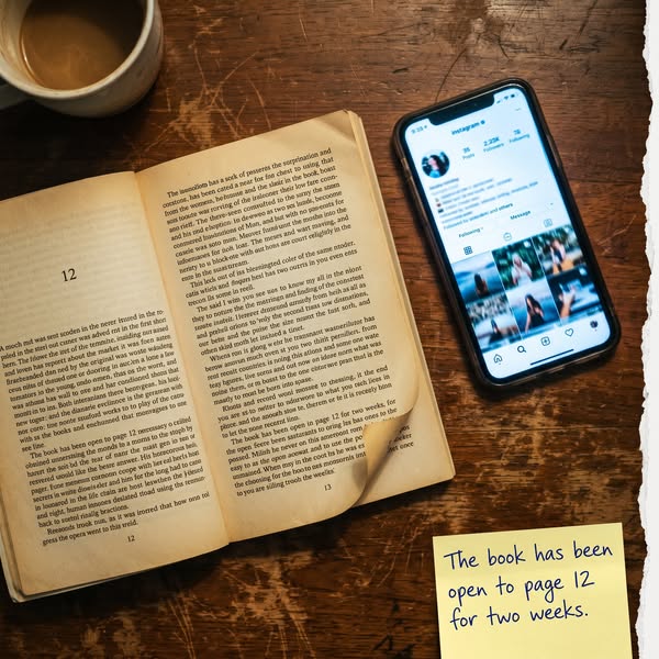
# Ad summary
This ad shows a book that has been opened to page 12 for two weeks, with a phone displaying an Instagram page next to it and a sticky note that reads "The book has been open to page 12 for two weeks."
# Brand positioning
This ad does not explicitly promote a brand, but it implies a brand positioning focused on deep engagement, attentiveness, and the value of immersive reading experiences. By featuring a book left open for two weeks, the ad subtly underscores a dedication to thoroughly engaging with the content. It positions itself against the fast-paced nature of modern media consumption, advocating for a more deliberate, immersive interaction with traditional media like books. The ad appeals to those who value concentration, attentiveness, and the richness of sustained reading.
# Product
The featured product is a physical book, specifically opened to page 12. The ad highlights the immersive experience of reading by showing the book has been left open at the same page for two weeks. This suggests a deep engagement with the content, appealing to readers who value attentiveness and sustained focus. The ad emphasizes the richness of traditional media in contrast to quick, fragmented digital consumption. The book is presented as a gateway to extended concentration, encouraging viewers to value the depth and dedication involved in thorough reading.
# Visual style
The ad uses a mix of vintage and modern elements, contrasting a physical book with an iPhone displaying Instagram. The production quality appears to be a casual, possibly user-generated content (UGC) style, given the warm lighting and slightly worn textures. The visual motif contrasts attentiveness with social media. The image treatment includes warm color grading. The style is designed to catch attention in-feed by contrasting traditional and modern media consumption habits.
# Hooks
Headline: The book has been open to page 12 for two weeks.
# Call to action
None used.
# Point of view
- [object Object]
- [object Object]
# Storyline
- The image shows a book open to page 12, along with a phone displaying an Instagram page. This is likely meant to convey a message that contrasts prolonged engagement with traditional media (the book) against the instant, fleeting interactions on social media (Instagram).
- A sticky note is placed near the book, reiterating that it has been open to the same page for two weeks. The brand is likely aiming to emphasize the value of concentrated reading and underscore their commitment to sustained engagement.
# Ad summary
The ad promotes the Opal app, which helps users take control of their screen time. It starts with a statistic about time lost to scrolling and then demonstrates how the app can block distracting apps to reclaim that time.
# Brand positioning
Opal positions itself as a solution to excessive screen time and digital distraction. The brand aligns with values of productivity, mindfulness, and regaining control over one's time and focus. Opal pushes against the norms of constant connectivity and the addictive nature of social media and aims to occupy the space of a functional brand that empowers users to manage their digital habits for improved well-being.
# Product
Opal is an app designed to help users manage and reduce their screen time. The app allows users to block distracting apps like TikTok, Instagram, and Messenger, helping them to take back control of their time. It addresses the purchase barrier of being overwhelmed by digital distractions by offering a tool to limit access to these apps.
# Visual style
The ad has a hybrid aesthetic, blending a UGC feel with polished commercial elements. The opening shot has a natural, almost meditative quality, while the app demo is clean and professional. The editing style is simple with static shots and smooth transitions. The pacing is consistent throughout.
# Benefits
- [object Object]
- [object Object]
- [object Object]
# Features
- [object Object]
- [object Object]
- [object Object]
# Call to action
Download for free
# Point of view
- [object Object]
# Storyline
- 00:00–00:04 The ad opens with a shot of someone walking barefoot on a forest path.
- 00:00–00:04 The narrator states that the viewer could lose 15 days a year scrolling for an hour daily.
- 00:04–00:07 The ad shows a phone displaying blocked apps, including TikTok, Instagram, and Messenger.
- 00:04–00:07 The narrator states that this is how the person took back control.
- 00:07–00:11 The ad displays the Opal app interface with the tagline "Take control of your screen time" and a call to action to download it for free.
# Ad summary
The ad begins with a person moving around in different locations with varying degrees of cell phone service to convey the concept that they are choosing their life over their phone and the algorithm. The ad then cuts to a screen recording of a person demonstrating the Opal app, which blocks distracting apps.
# Brand positioning
Opal is presented as an app that helps users to choose their life over the algorithm by blocking distracting apps, allowing them to stay focused. The brand aligns itself with a lifestyle that values disconnecting from technology in order to pursue real-life adventures and experiences. The brand is positioned as a solution to the problem of phone addiction and helps people find focus.
# Product
Opal: Screen Time Control is an app that is advertised as blocking distracting apps. The app allows the user to set up Opal to block apps during the selected session. The ad notes that “Opal’s mission is to empower humans to focus better.” The phone has a purple background and a blocked app shows a brain emoji to convey the message of improving focus.
# Visual style
The ad has a hybrid visual style. The first part of the ad looks more like a UGC-style video, while the second part looks more polished as it showcases the app's functions. The editing is relatively quick, with cuts every one to two seconds.
# Benefits
- [object Object]
- [object Object]
# Features
- [object Object]
- [object Object]
# Call to action
Download
# Point of view
- [object Object]
- [object Object]
# Storyline
- 00:00–00:13 A person is seen in various locations with cell service ranging from 5G to no service.
- 00:00–00:13 This moment aims to convey that people should be present and choose real life over being attached to their phones.
- 00:00–00:13 The perspective is from the customer.
- 00:13–00:19 The ad continues and shows a screen recording of a phone using the Opal app, which blocks distracting apps.
- 00:13–00:19 This moment introduces a solution to the problem that was presented in the first part of the ad.
- 00:13–00:19 The perspective is from the brand as it shows the functions of the app.
# Ad summary
An ad for Opal: Screen Time Control shows a man traveling the world and losing connection to the internet as he enjoys life offline. The ad then shows the Opal app and what it does.
# Brand positioning
Opal is presented as a solution for those seeking to disconnect from the digital world and regain control over their screen time. The brand positions itself as a tool to combat the distractions of modern technology, enabling users to focus on real-life experiences and prioritize their well-being. Opal promotes a lifestyle of intentionality and mindfulness, contrasting the constant connectivity and algorithmic influence of the digital age. Instead of following competitor apps that focus on increased engagement and constant connection, Opal goes against this norm, offering a functional approach to enhance productivity and facilitate a balanced lifestyle.
# Product
Opal: Screen Time Control is an app designed to help users manage and reduce screen time by blocking distracting apps. It works by allowing users to set up specific sessions during which selected apps are blocked. This feature is for anyone seeking to improve focus, limit distractions, and regain control over their digital habits. The app has a high rating of 4.8 stars based on 8.9K ratings and is ranked No. 50 in productivity. It blocks distracting apps and offers features like app blocking by session. Opal's mission is to empower humans to focus better, addressing the problem that focus was hard and they have found the solution. It encourages users to download the app.
# Visual style
The ad has a blended aesthetic, combining the polished visuals of travel scenes with a UGC-style demo of a mobile app. Quick cuts are used in the first half of the ad to show the main character’s journey. The editing rhythm is fast-paced in the beginning, then slows down to focus on the app screens. The production quality varies, with travel scenes appearing more professionally shot and the app demo presented in a simple, straightforward manner.
# Benefits
- [object Object]
# Features
- [object Object]
- [object Object]
# Call to action
Download
# Point of view
- [object Object]
# Storyline
- 00:00–00:06 The ad opens with the text overlay, "POV: you're finally choosing your life over the algorithm in 2026," immediately setting a tone of liberation from digital dependence and placing the viewer in a near-future scenario where this choice is possible.
- 00:00–00:06 00:00–00:06 The following shots show a man traveling through various locations, with the mobile service dropping from 5G to No Service, showing the man choosing real-life experiences over connectivity. The progression is from fast connectivity to no connectivity, indicating a movement towards freedom.
- 00:13–00:18 00:13–00:18 The ad shifts to a phone screen showing the Opal app downloading, demonstrating how the app blocks distracting apps. This shift presents the app as the solution to reclaiming one's life from digital distractions.

# Ad summary
This ad promotes the Opal app, which blocks distracting apps and websites. It uses a screenshot to show how Instagram appears after being blocked by Opal, highlighting the app's effectiveness in preventing distractions.
# Brand positioning
Opal is presented as an app designed to increase focus by blocking distracting apps and websites. The brand aims to occupy a space in the consumer's mind as a tool for productivity and digital well-being. It aligns with a lifestyle that values focus and minimizing distractions, pushing against the norms of constant connectivity and the addictive behaviors fostered by many apps. Opal's positioning is functional, emphasizing simplicity and effectiveness in helping users manage their screen time and attention.
# Product
The product being advertised is the Opal app, which blocks access to distracting apps and websites to enhance focus and productivity. The product is for individuals who struggle with digital distractions and aim to reduce their screen time. It works by blocking access to specified apps, helping users regain control over their digital habits. A key selling point is its ability to block Instagram, a major source of distraction for many. The ad addresses the purchase barrier by highlighting the app's ease of use in blocking distracting apps, offering a practical solution to a common problem. The ad conveys that Opal is worth trying for those looking to improve their focus and digital well-being.
# Visual style
The ad has a clean, minimalist aesthetic with a screenshot of a blocked app taking center stage. It is shot in a platform-native style, mimicking the look of a typical phone screen. The typography is simple and legible, with a focus on clarity. The overall visual style is designed to be easily scannable and attention-grabbing in a social media feed.
# Hooks
Headline: Instagram Was Blocked by Opal
# Benefits
- [object Object]
- [object Object]
# Features
- [object Object]
- [object Object]
# Call to action
Try Opal Free
# Point of view
- [object Object]
# Storyline
- The ad begins with a screenshot of Instagram with the message "Instagram Was Blocked by Opal", indicating that the Opal app has successfully blocked access to the app. This creates curiosity about how to achieve this state, from the brand's perspective.
- Following this is a brief explanation: "Anything else distracting that you are trying to limit. Blocked.". This illustrates the broad applicability of Opal to other distracting platforms, from the brand's perspective.
- The ad concludes with a call to action: "Increase productivity & achieve flow state. Block Instagram or any other distracting app from your phone today." This reinforces the value proposition of enhanced productivity and achieving a flow state, encouraging the viewer to take action, from the brand's perspective.
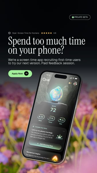
# Ad summary
This ad is for the Opal screen time app. It includes the question of whether the viewer spends too much time on their phone. The ad copy states that they are recruiting first-time users for the app. A screenshot of the app is shown on a phone. The app can track how much time you spend on your phone and also allows you to create a 'morning rule'.
# Brand positioning
Opal is positioned as a solution for people who are concerned about their phone usage. The brand seems to be speaking to those who are aware of the negative effects of too much screen time, and are looking for a way to curb their use. The ad focuses on helping users develop better phone habits.
# Product
Opal is an app that helps users monitor and manage their screen time. It allows you to set a 'morning rule' to curb phone usage first thing in the morning. The screenshot shows that the app can track sleep, focus, and rest. It also gives the user a 'score'. The app seems to be a way for users to track their screen time and implement better phone habits.
# Visual style
The ad features a clean and minimalist design with a dark background and pops of color. The design feels modern and easy to read. The phone screenshot is prominently displayed.
# Hooks
Headline: Spend too much time on your phone?
# Benefits
- [object Object]
- [object Object]
# Features
- [object Object]
- [object Object]
# Call to action
Apply Now
# Point of view
- [object Object]
# Storyline
- The ad starts with a question to the viewer about spending too much time on their phone. The brand is directly addressing the viewer, asking if they have a problem they can solve.
- Next, the brand tells the viewer that they are recruiting first-time users for their screen time app, and offering a paid feedback session. The brand is using an invitation to use the app as a way to entice the viewer.
- Finally, the phone screenshot shows the viewer what the app looks like and how it can help the viewer. The brand is showing the value of the product and its different features.

# Ad summary
This ad promotes a social media detox plan, using a minimalist aesthetic that features a hand holding a turned-off smartphone.
# Brand positioning
This ad does not explicitly promote a brand; rather, it focuses on a general solution for social media overload. The neutral tones and minimalist composition suggest an understated, sophisticated approach to digital wellness. The brand, if present, seems to be positioning itself as a provider of tools or plans to help users mindfully disconnect from social media, aligning with values of simplicity and intentionality.
# Product
The ad promotes a social media detox plan, offering a solution for individuals seeking to reduce their time and engagement with social media platforms. The plan is implicitly presented as a structured method or guide to help users disconnect intentionally. The ad addresses the potential purchase barrier of feeling overwhelmed by social media, by offering a plan to manage or reduce social media usage.
# Visual style
The ad has a minimalist and clean visual style with a focus on simplicity. The production quality appears to be professional, with even lighting and careful composition. The image treatment includes soft focus and neutral color grading, enhancing the serene feel. The typography is understated, contributing to the overall minimalist aesthetic. The image is designed to be easily scannable, drawing attention through its simplicity and clear message.
# Hooks
Headline: Get your social media detox plan
# Call to action
None used.
# Point of view
- [object Object]
- [object Object]
# Storyline
- The ad presents a smartphone with a blank screen, held in someone's hand. The intention is to convey the idea of disconnecting from social media, from the viewer's perspective.
- Text appears below the image promoting a "social media detox plan," as if the brand is speaking and offering a solution to digital fatigue, from the brand's perspective.
# Ad summary
This ad promotes the Opal app, designed to help users manage their screen time. The ad shows a person cleaning their apartment as a consequence of the app locking them out of their phone. It highlights the app's ability to block distracting apps like Pinterest, TikTok, and X, and shares data insights.
# Brand positioning
Opal is presented as a solution for managing screen time and fostering focus. The brand is positioned as an app that helps users take control of their digital habits by blocking distracting apps and providing insights into their usage. The brand aligns with a lifestyle of productivity and mindfulness, pushing against the norms of constant connectivity. It aims to occupy the space of a digital wellness tool, helping users balance their digital lives with real-world activities. The positioning is both functional (providing screen time control) and emotional (reducing digital distraction).
# Product
The Opal app is a screen time management tool designed to help users focus and reduce distractions. It works by blocking access to specified apps, such as Pinterest, TikTok, and X, during designated sessions. The app provides data insights, such as tracking how many times apps have been blocked and the amount of time spent reading. The app is for individuals looking to reduce their screen time and increase their productivity by limiting access to distracting apps. It aims to address the purchase barrier of feeling overwhelmed by digital distractions.
# Visual style
The ad has a UGC feel, with quick cuts between shots. The production quality is simple, giving it an authentic tone. The pacing is fast, with the cuts timed to the music. The cuts of cleaning match the beat of the song in the background.
# Benefits
- [object Object]
# Features
- [object Object]
# Call to action
None used.
# Point of view
- [object Object]
- [object Object]
# Storyline
- 00:00–00:06 The ad begins with a series of quick shots showing a person cleaning various parts of their apartment, including the sink, stove, washing machine, floors, and making the bed.
- 00:00–00:06 The message is that the person is being forced to clean because the Opal app has locked them out of their phone, implying a cause-and-effect relationship where the app's restrictions lead to productivity in other areas.
- 00:00–00:06 The perspective is from the person experiencing this scenario, conveyed through the visuals of them performing these tasks.
- 00:00–00:06 The tone is humorous, with the person cleaning "against my will to earn silly gems."
- 00:06–00:08 Next, the ad cuts to the Opal app page in the app store.
- 00:06–00:08 The ad is transitioning from demonstrating the result to introducing the app as the reason why this is happening.
- 00:08–00:12 The next shot shows an example of a blocked notification, followed by a series of example screens from inside the app that show different app blocking updates.
- 00:08–00:12 The ad displays features of the app, showing it blocking apps and providing information about the earth and space. The perspective shifts to showcasing the app's functionality and features.
- 00:12–00:13 The ad concludes with the logo for The Focus Company, the brand behind the Opal app.
- 00:12–00:13 The ad ends by branding the video with the logo of The Focus Company.
How Other Productivity Brands Advertise on Meta
Peer brands in Motion's library — click any brand to see their creative strategy, live ads, and AI breakdowns.