# Ad summary
This ad showcases a Made By Mary birth flower necklace. A woman talks about its meaningfulness, design and durability, emphasizing it's more than just jewelry—it’s a keepsake to be passed down.
# Brand positioning
Made by Mary aims to occupy a space in the consumer's mind as a provider of meaningful and lasting jewelry. The brand aligns with values of beauty, meaning, and sentimentality, offering pieces that are more than just accessories, but keepsakes. The brand pushes against the notion of disposable fashion jewelry, positioning itself as a provider of items designed to last. The brand positioning is emotional, emphasizing the stories and meaning behind each piece.
# Product
The featured product is the Made By Mary Birth Flower Necklace. It's designed for those who appreciate meaningful, lasting jewelry. The necklace features hand-drawn designs, is engraved, gold-filled, and made to last. A key selling point is that it's more than just jewelry; it's a keepsake that holds stories and can be passed down. The necklace is described as combining beauty and meaning, and is suitable for everyday wear.
# Visual style
The ad has a natural, UGC-style aesthetic with simple editing. The production quality is clean but not overly polished, giving it an authentic feel. The ad appears to be shot with natural lighting in an indoor environment. The pacing is moderate, with cuts timed to key voiceover moments. No visual motifs are apparent, except for the consistent focus on the necklace and the woman presenting it.
# Benefits
- [object Object]
- [object Object]
# Features
- [object Object]
- [object Object]
- [object Object]
- [object Object]
# Call to action
None used.
# Point of view
- [object Object]
# Storyline
- 00:00–00:02 The ad starts with a close-up of the necklace inside its packaging, before showing it being held.
- 00:02–00:04 The narrator states this necklace will not be taken off in 2026, promising its longevity.
- 00:04–00:09 The narrator states the necklace holds stories. The camera shows it being held up close.
- 00:09–00:18 The narrator introduces the Birth Flower Necklace, stating that it's inspired by hand-drawn designs, engraved, gold-filled, and made to last.
- 00:18–00:23 The narrator states the necklace is proof that beauty and meaning can exist in the same place.
- 00:23–00:27 The narrator says that it's something that you'll want to pass down.
How Made by Mary Advertises on Meta
Refreshed 6 weeks ago · Weekly refresh cadence
Made by Mary runs 687 active ads on Meta, shipping ~23 new creatives per week. Their library leans on Testimonial39%, Demo21%, and Unboxing14%. Recently, made by mary is leaning hard into personalization with deep emotional stakes, pushing birth flower necklaces and birthstone rings as heirloom-worthy pieces tied to kids, family milestones, and personal stories rather than just aesthetic purchases. The ocean and nautical jewelry gets a seasonal push but the through-line is sentimental permanence: creators and customers frame these as everyday wear that carries meaning, stacks well, and gets passed down. It's all about dainty, gold, meaningful jewelry that feels custom without the friction, positioning the brand as the go-to for low-key luxury keepsakes.
Indexed by Motion's Inspo Library.
The 20 Most Recent Made by Mary Ads on Meta
# Ad summary
This ad features a creator showcasing the Made By Mary Birth Flower Disc Necklace. The ad focuses on the necklace's hand-drawn design and the ability to stack multiple necklaces. The creator shares a personal connection to the November flower, revealing that both of her sons were born in November.
# Brand positioning
Made By Mary is presented as a brand that values intentionality and personal connection. The ad highlights the brand's dedication to hand-drawn designs, suggesting a focus on artistry and uniqueness. By offering customizable birth flower necklaces, the brand encourages customers to imbue their jewelry with personal meaning and significance. The brand avoids flashy trends and instead aims for timeless pieces that resonate with the wearer's life experiences, promoting an emotional connection with its products.
# Product
The featured product is the Birth Flower Disc Necklace by Made By Mary. Each necklace features a hand-drawn design of a specific flower associated with a particular birth month. The necklaces are delicate gold chains with a circular disc pendant. The pendant's floral design is intended to add a personal touch. The ad states that you can "stack up to three" flower discs, indicating a customizable layering option. The creator mentions choosing the November flower because both of her sons were born in that month, highlighting the necklace's potential for sentimental value.
# Visual style
The ad features a clean and simple aesthetic. The editing is smooth with static shots and minimal transitions. The production quality is polished. The use of close-up shots of the product and a direct-to-camera testimonial gives it a personal feel. The pacing is moderate, allowing viewers to focus on the product and the speaker's message.
# Benefits
- [object Object]
- [object Object]
- [object Object]
# Features
- [object Object]
- [object Object]
- [object Object]
# Call to action
None used.
# Point of view
- [object Object]
# Storyline
- 00:00–00:02 The ad opens by showcasing the Made By Mary Birth Flower Disc Necklace in its packaging.
- 00:02–00:04 The creator makes a direct claim about the necklace's lasting appeal, positioning it as a timeless piece that will remain stylish for years to come.
- 00:04–00:09 The creator explains the necklace's design origins, highlighting the hand-drawn nature of each birth flower and emphasizing the intentionality behind the product.
- 00:10–00:14 She introduces the option to stack multiple flower disc necklaces for a personalized layered look, holding up multiple necklaces to demonstrate.
- 00:16–00:31 The creator shares a personal connection to the November flower, chosen to represent the birth month of her sons, born on the same day two years apart, emphasizing the necklace's sentimental value.
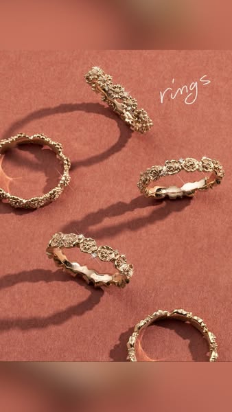
# Ad summary
This ad features five gold rings with floral accents arranged on a brown surface. The word 'rings' is written in a handwriting style.
# Brand positioning
The brand is positioning itself as a provider of elegant and timeless jewelry, specifically rings. The use of warm tones and a minimalist aesthetic suggests a focus on understated luxury and sophistication, appealing to customers who value classic style and craftsmanship. The brand aims to occupy a space in the consumer's mind that associates its products with refined taste and enduring beauty. It seems to ignore the mass market of cheap, trendy jewelry and targets customers who are willing to invest in high-quality pieces.
# Product
The product featured is a set of gold rings, each adorned with intricate floral accents. These rings appear to be designed for stacking or wearing individually. The rings appear to be made of a shiny gold material, possibly plated. The repeating floral design adds a touch of femininity and elegance. The product is aimed at individuals looking for sophisticated and timeless jewelry pieces. The rings could be worn for special occasions or as everyday accessories, adding a touch of refinement to any outfit. The ad emphasizes the beauty and design of the rings, highlighting why they are worth investing in.
# Visual style
The overall visual style is clean and elegant, with a focus on showcasing the jewelry's details in a simple yet sophisticated manner. The warm color palette and soft lighting contribute to a luxurious aesthetic. The use of a handwritten typeface adds a personal touch, enhancing the product's appeal.
# Hooks
Headline: rings
# Benefits
- [object Object]
- [object Object]
# Features
- [object Object]
- [object Object]
# Call to action
None used.
# Point of view
- [object Object]
# Storyline
- The ad presents an array of ornate, gold rings, intending to capture attention and showcase their aesthetic. This is conveyed from the brand's perspective, focusing on the rings' visual appeal and inviting viewers to admire their beauty.
- The rings are arranged on a brown surface, alongside a handwritten text that simply states 'rings,' serving to identify and emphasize the highlighted product. This is presented from the brand's point of view, reinforcing the product's identity in a straightforward and visually consistent manner.
# Ad summary
A young woman shows off her Made by Mary rings.
# Brand positioning
Made by Mary is presented as a jewelry brand offering dainty, stackable rings. The brand seems to position itself in the market as an accessible, everyday jewelry brand. The ad is presented as casual and fun, indicating the brand promotes self-expression through jewelry.
# Product
The advertised product is stackable rings. The rings are thin and encrusted with diamonds. The rings are meant to be worn together for a stacked effect, creating a unique and personalized look. The ad highlights the versatility of the rings, suggesting they can be worn every day. These stackable rings are for anyone who likes to wear dainty, diamond rings.
# Visual style
The ad has a casual, UGC aesthetic. The lighting is natural. The camera is handheld and shaky. The editing includes quick cuts and jump cuts. The production quality feels lo-fi, which supports the tone of a casual customer review.
# Benefits
- [object Object]
# Features
- [object Object]
- [object Object]
# Call to action
None used.
# Point of view
- [object Object]
# Storyline
- 00:00–00:03 00:00–00:03 The creator shows off a diamond ring, holding it in front of the camera. She is demonstrating how the ring will eventually be stacked with other rings.
- 00:03–00:07 00:03–00:07 The creator states that she has to take some of her other rings off, indicating she will be adding more rings to her finger.
- 00:07–00:16 00:07–00:16 The creator has added all of her Made by Mary rings to her finger. She displays the stack of rings, expressing excitement and satisfaction with the completed stack.
- 00:17–00:24 00:17–00:24 The creator shows appreciation for the rings, ending the video by referring to herself as, "Just a girl and her diamond rings."
# Ad summary
This ad showcases various pieces of jewelry including a necklace, earrings, a ring, and a bracelet. These items feature gold and pearl accents. The ad gives a close-up view of the jewelry worn and still shots.
# Brand positioning
The brand is presented as an elegant, refined jeweler. The use of gold and pearl conveys sophistication and class. The brand occupies a space for those seeking classic, timeless pieces with a touch of modern design. The brand aligns with values of elegance and attention to detail. By focusing on classic materials with understated design, the brand ignores trends and caters to customers who prioritize enduring style.
# Product
The ad features a collection of jewelry pieces including a gold chain necklace with a pearl accent, a gold ring with a pearl accent, gold hoop earrings with three pearl accents, and a gold cuff bracelet with two pearl accents. The jewelry features a gold base metal with pearl accents. The pieces are designed for women who appreciate timeless elegance and understated luxury. The pearls add a touch of classic beauty, while the gold provides a modern, sophisticated element. The pieces can be worn for various occasions, from everyday wear to special events.
# Visual style
The ad has a clean and polished aesthetic with a focus on showcasing the details of the jewelry. The lighting is soft and even, highlighting the textures and reflections of the gold and pearls. The editing is simple and straightforward, with static shots that allow the viewer to focus on the jewelry pieces.
# Benefits
- [object Object]
- [object Object]
- [object Object]
# Features
- [object Object]
- [object Object]
# Call to action
None used.
# Point of view
- [object Object]
# Storyline
- 00:00–00:05 The ad opens with a split screen showcasing different jewelry pieces.
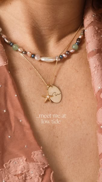
# Ad summary
A close up view of a woman wearing a pearl necklace, and gold pendant necklace with the text overlay of "meet me at low tide."
# Brand positioning
The brand appears to be in the jewelry space. From the image, it seems to be a high end brand that values simplicity while appreciating nature. The use of pearls and nautical imagery indicates that this brand likely pulls much of its inspiration from the sea. The brand uses simple, understated designs to evoke emotional connection over in-your-face branding.
# Product
The product advertised is a delicate gold pendant necklace featuring a small starfish charm and an oval pendant with a subtle wave design. The necklace is worn alongside a pearl necklace made up of iridescent pearls, green stones, and silver beads. The pendant is gold. It hangs from a delicate gold chain and the starfish charm is also gold with a pearl accent.
# Visual style
The ad has a natural, high-quality aesthetic with a soft, diffused lighting that highlights the jewelry. The close-up shot focuses on the product, while the neutral background keeps the focus on the jewelry. The overall impression is elegant and intimate, creating a sense of connection with the viewer.
# Hooks
Headline: ...meet me at low tide
# Call to action
None used.
# Point of view
- [object Object]
- [object Object]
# Storyline
- The ad opens with a close up shot of a model's neck, chest and upper torso to highlight the necklace and pendants that are being featured. The goal is to showcase how the product looks when worn. This part of the story is being told from the customer's perspective, showing how the product is worn and how it enhances the wearer's natural beauty and style.
- There is text overlaying the image, stating "...meet me at low tide" which is intended to evoke imagery of the sea and communicate the brand's name, which is being presented from the brand's perspective.
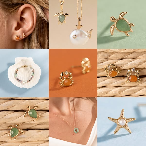
# Ad summary
This ad features a gallery of various ocean-themed jewelry, including necklaces, earrings, and a bracelet. Each piece features nautical designs like turtles, crabs, and starfishes.
# Brand positioning
The brand appears to be positioned in the affordable luxury sector, offering high-quality jewelry with a focus on nature-inspired designs. The consistent use of gold settings and natural-looking stones like jade and pearl suggests a commitment to elegance and natural beauty. The brand seems to be targeting consumers who appreciate understated luxury and unique, nature-themed pieces. The use of nautical motifs such as turtles, crabs, and starfishes implies a connection to the ocean, and is likely meant to appeal to consumers with an interest in conservation and oceanic wildlife.
# Product
The ad showcases a range of ocean-themed jewelry, including earrings, necklaces, and a bracelet. The earrings include stud styles featuring crabs, turtles, and starfishes. Each earring is made with a gold-colored metal and features a colored stone or pearl. The necklaces include turtle and whale pendants on gold chains. The turtle pendants feature jade-colored stones. The whale pendant features a large white pearl. The bracelet is displayed in a seashell and features small, multicolored beads and pearls. The common feature of all the jewelry is gold-colored metal and ocean-themed designs. These pieces are likely marketed toward people who enjoy the ocean or sea life.
# Visual style
The ad uses a clean, well-lit aesthetic with close-up shots to highlight the jewelry's details. The grid layout gives it a structured look, while the soft lighting and natural backgrounds create a sense of elegance. The color palette is consistent, using gold tones and muted backgrounds to keep the focus on the jewelry itself.
# Hooks
Headline: None used
# Benefits
- [object Object]
- [object Object]
- [object Object]
# Features
- [object Object]
- [object Object]
- [object Object]
- [object Object]
# Call to action
None used.
# Point of view
- [object Object]
# Storyline
- The ad presents a grid layout showcasing various pieces of ocean-themed jewelry. This is intended to give the viewer a quick overview of the brand's product range from the brand's perspective.
- The second story beat features close-up shots of individual pieces. This is intended to highlight the detail and quality of each piece from the brand's perspective.
- The ad concludes with a showcase of the full range. This is intended to reinforce brand identity and product diversity from the brand's perspective.
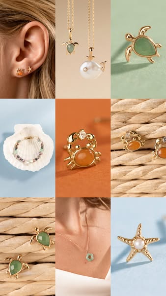
# Ad summary
This ad features nine different ocean-themed jewelry pieces in a three-by-three grid.
# Brand positioning
This ad presents a brand that specializes in delicate jewelry designs. The brand positions itself in the market as offering aesthetically pleasing and ocean-themed jewelry. The delicate jewelry pieces suggest a brand that values intricate design and feminine appeal. The brand presents its products in a clean and appealing way that enhances the perceived value of the pieces. This brand appears to be focused on customers who enjoy unique jewelry that reflects an appreciation for sea life.
# Product
The jewelry pieces in the ad include earrings, necklaces, and a bracelet, all featuring ocean-themed motifs. There are three sets of earrings, each gold-toned, with designs incorporating turtles, crabs, and starfish. The necklaces include a gold chain with a turtle pendant and another with a pearl accent. A bracelet made of small, colorful beads is displayed inside a shell. The items are presented with a focus on their delicate design and materials. Each piece emphasizes the ocean-inspired aesthetic, suggesting they are suitable for everyday wear and special occasions. The overall presentation aims to showcase the jewelry's aesthetic appeal and design quality, highlighting them as desirable accessories.
# Visual style
The ad has a clean and polished visual style with close-up shots of the jewelry pieces. It uses a grid layout to display multiple products and varying backgrounds. The lighting is soft and enhances the colors and textures of the jewelry. The overall aesthetic feels modern and sophisticated.
# Hooks
Headline: None used
# Benefits
- [object Object]
- [object Object]
- [object Object]
# Features
- [object Object]
- [object Object]
- [object Object]
- [object Object]
- [object Object]
- [object Object]
- [object Object]
# Call to action
None used.
# Point of view
- [object Object]
# Storyline
- The image opens with a three-by-three grid showcasing nine different jewelry pieces with an ocean theme. This layout immediately introduces the variety of items available, giving the audience a glimpse into the brand's product range. The perspective is from the brand.
- Each square within the grid displays a close-up of a different jewelry item. This highlights the craftsmanship and design details, emphasizing their visual appeal. This is from the brand's perspective.
- The individual products are presented against various backdrops to complement the jewelry's colors and textures. This enhances the overall aesthetic and creates an inviting view. The perspective is from the brand.
- The image ends with a complete view of the product range that is available. This creates an image to capture the attention of potential customers who are interested in purchasing ocean-themed jewelry. The perspective is from the brand.
# Ad summary
A close up of a woman's hand wearing 2 rings. She is sitting in casual clothes, jeans and a sweater. The camera zooms in so viewers can see all the intricate details of the rings.
# Brand positioning
The ad presents a brand that focuses on jewelry design. The brand values craftsmanship and aesthetic appeal, as evidenced by the intricate design and detail of the featured rings. The brand positioning is emotional, emphasizing the artistic design of the jewelry and the visual appeal. The ad promotes a sense of luxury and individuality, suggesting that the brand aims to connect with customers who appreciate distinctive and well-crafted pieces.
# Product
The ad features two distinct rings. The first ring has a gold vine-like structure with small gemstones evenly spaced throughout the ring. The second ring is a stacked gold band with alternating green, white, pink, and clear gemstones. The ad showcases intricate design and aesthetic appeal, emphasizing their unique and artistic design. The primary selling points are the detail and unique aesthetic that the rings bring. The rings are for people who enjoy detail, and one-of-a-kind pieces.
# Visual style
The ad has a polished and clean aesthetic. Editing is minimal, featuring slow zooms and static shots to let the jewelry take center stage. The production quality is high, lending a luxurious feel. Visual motifs are close-ups of jewelry, highlighting the fine details. The pacing is slow, with no music or fast cuts, allowing the viewer to focus on the product. Audio and visual elements are synchronized, with the silence emphasizing the visual details.
# Benefits
- [object Object]
- [object Object]
- [object Object]
# Features
- [object Object]
- [object Object]
- [object Object]
# Call to action
None used.
# Point of view
- [object Object]
# Storyline
- 00:00–00:07 00:00–00:07 The camera zooms in on a woman's hand wearing 2 rings. The ad highlights the design and detail of the rings.
# Ad summary
The ad showcases a gold necklace from Made By Mary, emphasizing its timelessness, durability, and sentimental value. The ad aims to highlight that the jewelry is something that you will want to pass down.
# Brand positioning
Made By Mary is presented as a brand that values the sentimental and lasting quality of jewelry. The brand aims to occupy a space in the consumer's mind where jewelry is more than just an accessory; it's a keepsake that holds stories and can be passed down through generations. The brand aligns with values of beauty, meaning, and enduring quality, positioning itself against the norms of fast fashion and disposable trends. It pushes against the idea of jewelry as simply a fleeting trend and emphasizes the emotional and sentimental value of its pieces. The brand positioning is a mix of functional durability (jewelry you won't take off) and emotional connection (jewelry that holds stories).
# Product
The featured product is a delicate gold necklace with a round pendant engraved with a floral design. The necklace is portrayed as a timeless piece that the wearer will not want to remove, indicating its durability and lasting appeal. The pendant is small and round, featuring a detailed engraving of flowers, suggesting a connection to nature and personalized meaning. The ad suggests the product is made for individuals who value sentimental items and are looking for jewelry that holds stories and memories. The necklace is presented as more than just an accessory; it's a keepsake meant to be passed down, signifying its enduring quality and emotional significance. The necklace is referred to as proof that beauty and meaning can exist in the same place.
# Visual style
The ad has a natural, polished feel with soft lighting and clear shots. The editing style includes quick cuts between the speaker and close-ups of the product, maintaining a consistent pace. The production quality leans towards a polished commercial look, with a clean aesthetic and focus on the product's details. The visual motifs include close-ups of the necklace and the speaker directly addressing the camera. The pacing is consistent.
# Benefits
- [object Object]
- [object Object]
- [object Object]
# Features
- [object Object]
- [object Object]
# Call to action
None used.
# Point of view
- [object Object]
# Storyline
- 00:00–00:02 The camera focuses on a Made By Mary necklace in its box.
- 00:02–00:04 The camera zooms in on the necklace as the voiceover introduces it.
- 00:04–00:09 The speaker transitions to a shot of her face, directly addressing the viewer.
- 00:10–00:14 The speaker holds the necklace up to the camera to showcase the pendant.
- 00:14–00:18 The speaker is seen again speaking to the viewer followed by an image of the necklace in its box.
# Ad summary
This ad showcases a birth flower disk necklace from Made By Mary. A creator shares her November birth flower necklace because both of her sons were born in November. She explains it feels like it was made for her with a lasting meaning.
# Brand positioning
Made By Mary is presented as a brand that offers personalized, meaningful jewelry. The brand seeks to occupy a space in the consumer's mind that emphasizes emotional connection and individuality, aligning with values of sentimentality and self-expression. Rather than focusing solely on aesthetics, the brand positions itself as creating pieces with deeper significance, pushing against the norm of mass-produced, generic jewelry. The brand positioning is largely emotional, focusing on the personal stories and memories that jewelry can represent, while still conveying functional attributes like hand-drawn designs and stackability.
# Product
Made By Mary is advertising its birth flower disk necklaces. These necklaces feature a hand-drawn design of the birth flower for each month. The necklaces are displayed in a gold finish, with a delicate chain and a circular pendant. These pieces can be stacked up to three at a time, so a person can wear the birth flowers of multiple loved ones. The brand is promoting the idea that these pieces carry significant personal meaning. The presenter states that the featured necklace means so much to her because it represents the birth month of her two sons. The product addresses the purchase barrier of jewelry being merely decorative by emphasizing its emotional value and connection to personal stories.
# Visual style
The ad has a polished UGC feel with natural lighting and simple editing. The editing style is characterized by quick cuts, keeping a consistent pace of approximately 15-20 cuts per minute. The visuals are synced with the voiceover. The production quality appears to be a blend of UGC and a polished commercial, which supports the intended tone of authenticity and relatability.
# Benefits
- [object Object]
- [object Object]
- [object Object]
# Features
- [object Object]
- [object Object]
- [object Object]
# Call to action
None used.
# Point of view
- [object Object]
# Storyline
- 00:00–00:03 The shot focuses on a hand holding a Made By Mary birth flower disk necklace in a gold finish. This is intended to capture the audience’s attention and highlight the product’s beauty. The tone is intimate, drawing the viewer in with a close-up view.
- 00:03–00:10 A creator is speaking directly to the camera about the product in her bathroom. She introduces the concept of birth flower disks and emphasizes the brand's value of intentionality by stating that each piece is based on a hand-drawn design. This conveys a sense of personal connection and uniqueness. The tone is enthusiastic and genuine, creating a sense of trust.
- 00:09–00:12 The creator explains that the birth flower disk necklaces can be stacked up to three at a time. This is intended to highlight the versatility and customization options of the product, allowing customers to create a personalized piece that represents multiple loved ones or meaningful moments. The tone is informative and encouraging.
- 00:12–00:16 The shot focuses on the necklace in a Made By Mary box and then on the necklace again in a hand. The creator states that she loves the birth flower disks, which continues the positive sentiment and personal endorsement, reinforcing the product's appeal. The tone is enthusiastic and appreciative.
- 00:16–00:25 The creator tells the audience that she chose the November flower because both of her sons were born in November, on the same day, two years apart. She explains that this necklace carries so much meaning for her. This personal story connects the product to meaningful life events, strengthening the emotional appeal and emphasizing the necklace’s sentimental value. The tone is heartfelt and sincere, fostering a deeper connection with the viewer.
- 00:25–00:30 The creator closes by reiterating how the necklace feels like it was made for her with a lasting meaning. This reinforces the idea that the product is a deeply personal and meaningful piece of jewelry. The tone is warm and genuine, leaving the viewer with a positive impression of the product and brand.
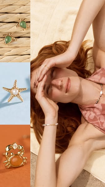
# Ad summary
This image ad showcases a collection of ocean-themed jewelry from a brand likely focused on summer-inspired designs. The ad juxtaposes close-up shots of the jewelry with a lifestyle image of a woman relaxing, suggesting the jewelry is ideal for leisure and a relaxed summer style.
# Brand positioning
This brand is positioned as a seller of playful, nature-inspired jewelry, specifically designs that evoke the ocean. The jewelry aesthetic appears lighthearted and whimsical, aiming to connect with customers who appreciate unique and fun accessories. The brand seems to be against the norms of traditional or serious jewelry brands, instead aligning with a lifestyle that values leisure, summer vibes, and a relaxed sense of personal style. The positioning is primarily emotional, tapping into feelings of joy and connection with nature rather than highlighting functional benefits.
# Product
The ad features a collection of gold-toned jewelry with ocean-themed designs. One item is a pair of turtle-shaped stud earrings with a green stone filling the turtle's shell. Another is a starfish-shaped stud earring with a central pearl. Lastly, there is a crab-shaped ring with an orange stone making up the crab's body and a small clear stone on top of the shell. These accessories are presented as playful and summery pieces, ideal for adding a whimsical touch to everyday outfits. The ad emphasizes the aesthetic appeal of the jewelry, suggesting they are worth buying for their unique designs and ability to evoke a sense of leisure and connection to the ocean.
# Visual style
The ad has a bright and summery aesthetic. The production quality is high, with professionally shot images. The ad employs a split-screen visual motif, dividing the frame into distinct product and lifestyle zones. The image treatment includes soft, diffused lighting that enhances the warmth and relaxation conveyed. The typography appears clean and legible, integrated seamlessly into the design without overshadowing the visuals. This style aims to be eye-catching, encouraging users to pause and engage with the ad.
# Hooks
Headline: None used
# Benefits
- [object Object]
- [object Object]
- [object Object]
# Features
- [object Object]
- [object Object]
- [object Object]
# Call to action
None used.
# Point of view
- [object Object]
- [object Object]
# Storyline
- The image opens with a split visual. The left side features close-up shots of ocean-themed jewelry against a textured backdrop, showcasing their intricate designs. This is intended to capture attention and introduce the product range from the brand's perspective.
- The right side shifts to a lifestyle image of a woman on a beach towel, relaxing in the sun, wearing jewelry. This aims to create an aspirational vision, suggesting how the jewelry enhances a relaxed summer lifestyle, from the customer's perspective.
- The two sides of the ad converge to show the jewelry as part of an overall summer aesthetic. This is to inspire and emotionally connect the product with the customer's desire for a summer lifestyle, from the brand's perspective.
# Ad summary
This ad features a woman endorsing a dainty little chain necklace from Made by Mary with a heart pendant engraved with her husband's initial. She highlights its cuteness, versatility for pairing, great quality, and personal significance.
# Brand positioning
Made by Mary is presented as a brand specializing in delicate and personalized jewelry. The brand's positioning is centered around creating meaningful and sentimental pieces that allow customers to carry loved ones with them. The emphasis on customization and quality suggests a brand that values emotional connection and craftsmanship, and the tone is personal and intimate, aligning with a lifestyle that prioritizes relationships and heartfelt gestures. Rather than adhering to fleeting trend cycles, Made by Mary focuses on timeless designs that resonate on a personal level, differentiating itself from mass-produced or impersonal jewelry brands.
# Product
The featured product is a dainty chain necklace from Made by Mary, adorned with a small heart pendant. The necklace is described as delicate and high-quality, making it versatile for pairing with various outfits. A key feature is the personalized engraving of the wearer's husband's initial on the heart pendant. This personalization allows the wearer to keep a reminder of their loved one close, making the necklace a sentimental and cherished accessory. The product is for anyone who values personal connection and wants to carry a meaningful keepsake with them.
# Visual style
The ad has a natural, unfiltered aesthetic with a casual, selfie-style framing that feels like a spontaneous recommendation from a friend. The lighting is soft and warm, adding to the approachable and authentic tone. The production quality is simple and straightforward.
# Benefits
- [object Object]
- [object Object]
- [object Object]
- [object Object]
- [object Object]
- [object Object]
# Features
- [object Object]
- [object Object]
- [object Object]
# Call to action
None used.
# Point of view
- [object Object]
# Storyline
- 00:00–00:01 A woman begins the video speaking directly to the camera.
- 00:01–00:08 00:01–00:08 She explains that her dainty Made by Mary chain with a heart pendant contains her husband's initials, so she can always wear it around with her.
- 00:09–00:14 00:09–00:14 She says it's cute, versatile for pairing, great quality, dainty, and one of her favorite things to wear.
# Ad summary
This ad promotes a weighted blanket and uses ASMR and sleep-inducing sounds to entice the viewer to learn more.
# Brand positioning
This ad promotes a brand that offers solutions for sleep. It is implied that the customer should care about their products because they are effective, calming, and help the customer get better sleep.
# Product
This ad features a weighted blanket, implied to promote better sleep. The ad shows the product up close and describes it as soft and fuzzy. The ad uses ASMR and sleep-inducing sounds to encourage viewers to learn more.
# Visual style
The ad is shot in a selfie style with natural lighting. The production quality is high, but still has a UGC feel.
# Benefits
- [object Object]
# Features
- [object Object]
- [object Object]
# Call to action
None used.
# Point of view
- [object Object]
# Storyline
- 00:00–00:02 The video opens with a woman holding the blanket up to the camera to show the product and its features.
- 00:02–00:07 The woman holds the blanket and makes soft, fuzzy sounds to imply the softness of the blanket.
- 00:07–00:15 The woman tilts her head and looks at the blanket with a soft smile, implying she enjoys this product.
# Ad summary
A woman describes how she loves to wear jewelry that is simple and delicate, and how it makes her outfit gorgeous and understated.
# Brand positioning
This brand seems to focus on providing simple, elegant jewelry for daily use. The brand promotes a lifestyle of effortless style. The brand pushes against ornate or over-the-top jewelry trends, opting for understated pieces that enhance rather than overwhelm an outfit. Its positioning is emotional, focusing on how the jewelry makes the wearer feel put-together without requiring excessive effort.
# Product
The product featured in the ad is a collection of delicate, understated bracelets. They are described as beautiful, simple, and delicate. These bracelets are designed to be worn easily and to adorn an outfit without being overwhelming. The bracelets are designed to make the outfit gorgeous and understated.
# Visual style
The ad has a natural and unfiltered aesthetic, with a clear UGC feel. It features static shots and smooth transitions. The overall impression is very casual, like a friend sharing a recommendation. The pacing is moderate, matching the speaker's conversational tone.
# Benefits
- [object Object]
- [object Object]
# Features
- [object Object]
- [object Object]
- [object Object]
- [object Object]
# Call to action
None used.
# Point of view
- [object Object]
# Storyline
- 00:00–00:05 A woman is speaking directly to the camera, and begins by stating the jewelry that she loves to choose is jewelry that is just beautiful and simple.
- 00:06–00:14 She continues by saying when she is getting dressed, she just wants a few pieces to choose from to make it really easy to adorn her outfit.
- 00:15–00:28 She then says that she loves these beautiful bracelets, they are just so delicate and simple, and it makes the outfit just gorgeous and understated.
# Ad summary
This ad features a woman showing off her Birth Flower March necklace. She explains that she wears it every day because it represents the birth of her son, and the wonderful surrogate that carried him.
# Brand positioning
This ad presents a sentimental and emotionally resonant connection to jewelry. The brand aligns with values of family, gratitude, and personal stories. It occupies a space in the market where jewelry serves as a daily reminder of important people and events. The brand pushes against the norm of jewelry being purely decorative or status-driven, instead positioning it as a deeply meaningful keepsake.
# Product
The ad features a Birth Flower March necklace. It is a delicate, fine chain necklace with small floral charms representing the birth flower for the month of March. The necklace is shown being worn daily as a meaningful reminder of important personal connections and life events. The ad addresses the barrier of jewelry being perceived as impersonal by emphasizing the emotional value and personal significance of the necklace.
# Visual style
The ad has a casual, UGC-style aesthetic with natural lighting and minimal editing. The production quality feels like a simple selfie-style video, which contributes to the authentic and personal tone. The ad features static shots with simple cuts. The ad has a slow pace, with an estimated 24 BPM (Beats per Minute). The audio-visual sync is simple, as the video consists mostly of the woman speaking directly to the camera.
# Benefits
- [object Object]
# Features
- [object Object]
# Call to action
None used.
# Point of view
- [object Object]
# Storyline
- 00:00–00:05 The ad opens with a woman directly addressing the viewer, stating she is going to show off her birth flower necklace.
- 00:05–00:06 She explains that she wears the necklace every day.
- 00:08–00:25 She continues to explain that it represents two things: the birth of her son, and the wonderful surrogate who carried him after medical issues prevented her from doing so herself.
- 00:25–00:30 She elaborates that she got a necklace for herself and a matching one for her surrogate.
- 00:30–00:41 The woman finishes the ad by stating that they both wear their necklaces every day to remind them of her son, each other, and the gift that the surrogate gave her, explaining that it is very special to her.
# Ad summary
This ad features a woman in a selfie-style video sharing MBM brand rings that her husband got her for Christmas. She identifies the rings as representing her three children's birthstones.
# Brand positioning
MBM is presented as a brand that creates personalized, meaningful jewelry, specifically rings. The rings in this ad contain birthstones representing children. The brand aligns with family values and emotional connection, positioning itself as a provider of sentimental and personalized keepsakes. The brand does not appear to push against any category norms, but rather to enhance personalization and family connection through sentimental gifts.
# Product
The featured product is a set of three MBM metal rings. Each ring contains different colored stones, which are birthstones representing the woman's three children. The green and orange stones represent her two sons, and the pink stone represents her new baby girl. The rings are presented as a sentimental gift, personalized with the birthstones of the wearer's children. The ad highlights the emotional value and personal connection associated with the rings, emphasizing their significance as a representation of family.
# Visual style
The ad has a casual, UGC-style aesthetic, with natural lighting and a simple background. The video appears to be filmed on a phone camera. The editing style is minimal. The pacing is relaxed.
# Benefits
- [object Object]
- [object Object]
- [object Object]
# Features
- [object Object]
- [object Object]
# Call to action
None used.
# Point of view
- [object Object]
# Storyline
- 00:00–00:01 A woman begins speaking to the camera in a selfie-style video.
- 00:01–00:08 00:01–00:08 The woman introduces herself and explains that she wanted to show the MBM pieces that her husband got her for Christmas. She is excited to share the rings and their personal significance.
- 00:08–00:15 00:08–00:15 The woman holds up her hand, displaying three rings on her fingers. She mentions that the rings are metal. She attempts to zoom in and focus on the rings to provide a better view.
- 00:15–00:24 00:15–00:24 The woman explains that the rings represent her three kids' birthstones. She clarifies that the green and orange stones are for her sons.
- 00:24–00:31 00:24–00:31 The woman shares that the pink stone is for her new baby girl, which she finds fitting. The tone is sentimental and joyful.
- 00:31–00:38 00:31–00:38 She expresses her love for the rings and mentions that she had her eye on them for a long time. She appreciates that her husband surprised her with all three for Christmas.
- 00:39–00:42 00:39–00:42 The woman concludes by expressing her love for the pieces and thanking the brand.
# Ad summary
A woman shares the Made by Mary Birthstone Eternity ring she purchased in honor of her daughter's birthstone. She shares that she loves to wear it alone or stack it with her other rings.
# Brand positioning
Made by Mary is presented as a brand for those who want simple, feminine jewelry with sentimental value. The brand's products are positioned as daily reminders of important people or events. The brand aligns with celebrating loved ones and personal connection through delicate, stackable jewelry.
# Product
The Made by Mary Birthstone Eternity Ring is a delicate ring featuring small birthstones set all the way around. It is designed to be worn on its own or stacked with other rings. The ring is for anyone looking to memorialize a loved one or important event. The ring is available in every birthstone.
# Visual style
The ad has a simple and authentic feel. It is a standard selfie shot. The lighting is natural. The editing style consists of basic cuts and static shots, with a consistent pace.
# Benefits
- [object Object]
- [object Object]
- [object Object]
# Features
- [object Object]
- [object Object]
- [object Object]
# Call to action
None used.
# Point of view
- [object Object]
# Storyline
- 00:00–00:07 00:00–00:07 The creator introduces herself as a mom of a baby girl born in June who is returning to work soon.
- 00:07–00:11 00:07–00:11 She says she wanted a piece of jewelry to remind her of her baby girl.
- 00:12–00:18 00:12–00:18 She says she discovered Made by Mary and found their Birthstone Eternity Ring.
- 00:18–00:25 00:18–00:25 She notes that she bought the ring for her daughter and that it's Alexandrite from June.
- 00:25–00:30 00:25–00:30 She shares that she loves to wear the ring alone or stack it with her wedding band.
- 00:31–00:40 00:31–00:40 She shares that she also loves to stack it with her engagement ring. She says the rings make a beautiful stack that she adores.
- 00:40–00:45 00:40–00:45 She concludes by saying she can't wait to have her daughter along with her through work.
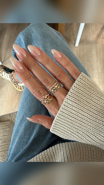
# Ad summary
Close-up of someone's hand with a fresh gel manicure. The person is wearing multiple gold rings, light wash jeans, and a tan sweater.
# Brand positioning
There is no brand explicitly mentioned in this ad, nor are there any competitors included. This ad focuses solely on the aesthetic of a fresh manicure. The overall tone suggests that having a well-maintained and visually appealing set of nails is a key part of looking and feeling put-together.
# Product
This ad focuses on a light pink gel manicure. The nail shape is long and almond-shaped. There are multiple gold rings on the pointer and middle fingers. The overall look is elegant and simple.
# Visual style
The overall visual aesthetic is simple and elevated. The image has been taken in a well-lit space with soft lighting and minimal editing. The layout is clean and focuses on a single point of interest.
# Hooks
Headline: None used
# Benefits
- [object Object]
# Features
- [object Object]
# Call to action
None used.
# Point of view
- [object Object]
# Storyline
- The ad shows a hand with a fresh manicure and stylish rings. The brand is showing the viewer that you can create an elegant look that can be achieved with the nail polish that they are selling.
# Ad summary
An influencer shares two different gold necklace products that she loves and wears every day. She talks about the quality of the necklaces and what makes them worth the purchase.
# Brand positioning
This ad positions the brand as one that offers valuable gold necklaces that are worth the purchase. It sells both an everyday wear necklace that will last for years, and an heirloom-quality 14 karat gold necklace that is truly forever. The brand focuses on providing real value for the price, enabling customers to invest in quality pieces that are long-lasting and versatile.
# Product
The ad features two distinct gold necklaces. The first is "Gold Vermeil", a necklace for "everyday normal life wear" that can last about ten years with regular wear and "makes it such a great value" for the price. The second is a 14 Karat Gold necklace that is favored because "it's truly forever". This product is positioned as an heirloom, something I'll have for decades."
# Visual style
The ad has a casual, UGC-style aesthetic with natural lighting. There are frequent jump cuts between similar-looking shots, which helps to keep the pacing quick.
# Benefits
- [object Object]
- [object Object]
- [object Object]
# Features
- [object Object]
- [object Object]
# Call to action
None used.
# Point of view
- [object Object]
# Storyline
- 00:00–00:02 The creator starts by saying that she has worn one of the brand's necklaces almost every day for months. This is intended to establish how much she likes the necklace and how often she wears it.
- 00:02–00:07 She mentions that the featured piece is Gold Vermeil, and then states that she wears it constantly. The creator then transitions to a shot of her wearing the necklace. This is intended to show a glimpse of how it looks when it's being worn and validate the previous statement.
- 00:07–00:14 The creator tells the audience that Gold Vermeil can last about ten years with regular wear. This fact provides value by suggesting the products are durable. She continues by stating that the necklaces makes it "such a great value" for the price and how much she uses it. This supports the idea that it makes sense to purchase the product.
- 00:15–00:18 She brings another necklace into the frame, and tells the audience that it is a 14 Karat Gold necklace that she favors because "it's truly forever". This provides another option for a customer looking for something longer lasting.
- 00:19–00:22 She then claims that it is an heirloom, and something she'll have for decades. This reinforces the longevity and value of the second necklace.
How Other Jewelry Brands Advertise on Meta
Peer brands in Motion's library — click any brand to see their creative strategy, live ads, and AI breakdowns.