Kill Crew runs 1K active ads on Meta, shipping ~59 new creatives per week. Their library leans on Headline16%, Try-On12%, and Demo11%. Recently, kill crew is flooding the zone with shorts in every format possible: bold colors, fruit and floral prints, and basic black, all hammered home through product stacks, flatlay shots, and UGC try-ons. They're leaning hard on functional benefits like chafe-proof performance and creating urgency with limited restock messaging, while weaving in their mental health mission as a values-based differentiator. The through-line is variety and accessibility,showing that no matter your style or size, they've got a short for you, and it stands for something beyond just activewear.
# Ad summary
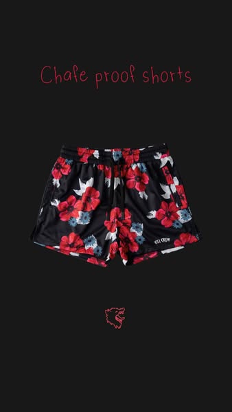
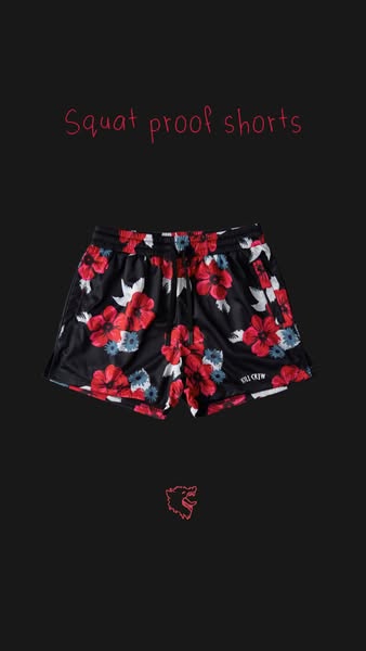
This ad features floral print shorts and positions them as chafe proof.
# Brand positioning
The Kill Crew brand is positioned as a brand that provides comfortable, stylish shorts that are chafe proof.
# Product
The product featured in this ad is a pair of black athletic shorts with a floral pattern consisting of red, white, and blue flowers. The shorts have an elastic waistband and the brand's name is printed on the lower right leg. The shorts are advertised as chafe proof.
# Visual style
The ad has a simple visual style, with a product shot on a solid background. The text is handwritten, which gives the ad a casual feel. Overall production quality is high.
# Hooks
Headline: Chafe proof shorts
# Benefits
- [object Object]
# Features
- [object Object]
# Call to action
None used.
# Point of view
- [object Object]
# Storyline
- The ad begins with a headline that states the shorts are chafe proof. This is to grab the audience's attention with the primary benefit of the product.
- The ad then presents an image of the floral shorts in order to provide a reference for the viewers. This gives the viewer a visual understanding of what the product looks like.
- Finally, the ad ends with the brand's logo. This tells the user who is making the chafe proof shorts.
# Ad summary
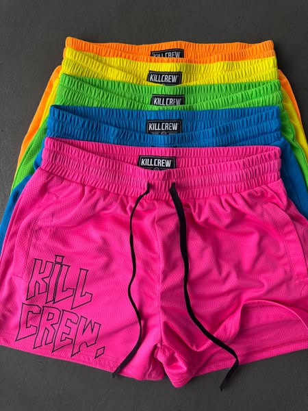
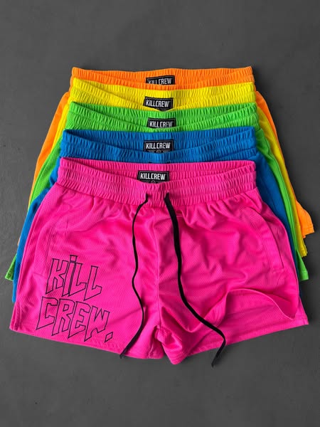
This image ad showcases a stack of mesh shorts from Kill Crew. The shorts are shown in a variety of colors.
# Brand positioning
Kill Crew is presented as an edgy athletic apparel brand. The brand name is repeated across the waistband of each pair of shorts, as well as more prominently on the front left side of the pink pair. The high contrast between colors suggests that the brand targets a youthful audience, seeking to stand out.
# Product
The advertised product is Kill Crew mesh shorts. The shorts are available in various colors, including orange, yellow, green, blue, and pink. Each pair of shorts features a black waistband with the brand name "KILLCREW" repeated in white text around the band. The brand name is also printed in stylized black letters on the lower left leg of the pink shorts. The shorts appear to be made from a breathable mesh material, as suggested by the visible netting texture.
# Visual style
The image is brightly colored and has a product-focused presentation. The composition is clean and straightforward, highlighting the product without additional distractions.
# Hooks
Headline: None used
# Benefits
- [object Object]
# Features
- [object Object]
- [object Object]
# Call to action
None used.
# Point of view
- [object Object]
# Storyline
- The ad displays a stack of the brand's mesh shorts in various colors, creating a visually appealing array. The arrangement highlights the variety of color options available, enticing viewers who value choice and style. This is told from the brand's POV.
- A close-up view of the pink shorts shows the brand name "KILL CREW" in a stylized font, reinforcing brand recognition. This emphasizes the brand's identity and aesthetic for the customer.
- The composition emphasizes a clear view of the shorts' mesh material and design details. This gives the customer information about the materials and shows them the quality of the product.
# Ad summary
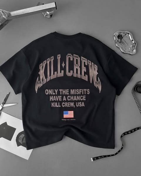
A flatlay product image ad for the clothing brand KILL CREW featuring one of their t-shirts. The t-shirt is black and has the brand name printed on the back.
# Brand positioning
KILL CREW presents itself as a brand for edgy, rebellious individuals who don't fit into mainstream society. They use the tagline "Only the misfits have a chance" to promote the values of individualism. KILL CREW is for those who see themselves as part of a crew or community of like-minded individuals. The brand emphasizes both style and identity, suggesting that KILL CREW clothing is a way for customers to express their unique personalities and values.
# Product
The advertised product is a black short-sleeved t-shirt by KILL CREW. It features a large graphic print on the back with the brand name "KILL CREW" in an arched, stylized font. Below the brand name is the text "ONLY THE MISFITS HAVE A CHANCE KILL CREW, USA". A small American flag is printed below the text. The graphic is designed to be eye-catching and to align with the brand's rebellious, misfit identity. The shirt appears to be made of a soft, comfortable material suitable for casual wear. The design is intended to appeal to customers who want to express their individuality and be part of the KILL CREW community.
# Visual style
The ad features a flatlay product shot with a muted color palette. The t-shirt is the main focus, positioned centrally on a gray surface. The surrounding elements are arranged to give a sense of curated authenticity, with neutral lighting to highlight the product details. The overall look is clean and modern, with a slightly edgy vibe.
# Hooks
Headline: None used
# Call to action
None used.
# Point of view
- [object Object]
# Storyline
- The ad features a black t-shirt on a grey surface. The intention is to showcase the product and its design in a visually appealing manner. The audience is viewing it from the brand's perspective, highlighting the shirt's key features, particularly the graphic on the back.
- The text "ONLY THE MISFITS HAVE A CHANCE KILL CREW, USA" and a small American flag are prominently displayed on the shirt. The message here is one of belonging and individuality, aligning with the brand's identity. The brand is presenting its message to appeal to a specific audience of people who want to express their individuality and be part of the KILL CREW community.
- Various tools and accessories are placed around the t-shirt, including a tape measure, scissors, and a metal tray. These elements are intended to create a sense of authenticity and 'behind-the-scenes' access. The brand aims to showcase itself as a company with a unique and creative process.
# Ad summary
A UGC-style ad promoting apparel company, Bullberry, as a great option for gym fits from a brand that supports mental health. The ad features a plus-size woman modeling a Bullberry gym fit while walking and running on a treadmill.
# Brand positioning
Bullberry is presented as a brand that offers gym apparel with a focus on supporting mental health initiatives. The brand positions itself as a caring and socially conscious alternative for consumers who want to align their purchasing decisions with values beyond just aesthetics or performance. By donating to support mental health, Bullberry attempts to occupy a space in the consumer's mind as an ethical and responsible company.
# Product
The ad showcases Bullberry's gym apparel, including a black sports bra with the brand's logo in pink and black and purple paisley-print shorts. The model is wearing a matching set, but the product can be mixed and matched. The ad's focus is less on specific product details and more on the brand's commitment to donating to mental health initiatives, implying that purchasing Bullberry apparel supports a good cause.
# Visual style
The ad has a casual, UGC-like feel. The shots are not perfectly framed and there is no high-end editing. The pacing is consistent and steady, matching the rhythm of the woman's movements on the treadmill.
# Benefits
- [object Object]
# Features
- [object Object]
- [object Object]
# Call to action
None used.
# Point of view
- [object Object]
# Storyline
- 00:00–00:02 The ad opens with a woman wearing a black sports bra and purple paisley-print shorts.
- 00:02–00:04 The woman is putting on headphones and begins to walk on a treadmill.
- 00:04–00:08 She begins to run on the treadmill.
- 00:08–00:15 The woman slows back to a walking pace.
# Ad summary
This ad utilizes humor and a relatable scenario to showcase Tide Oxi Boost as a solution for maintaining the freshness of frequently worn gym clothes. It targets women who regularly workout and want to keep their activewear clean and odor-free, even when re-wearing it between washes.
# Brand positioning
Tide is presented as a household name in laundry care, specifically with its Oxi Boost product line. The brand is positioned as a practical solution for active individuals who need effective cleaning for their frequently worn workout clothes. Tide's brand values are portrayed as functional and reliable, offering a straightforward solution without leaning into luxury or aspirational lifestyles. The brand appeals to consumers by providing a product that keeps their clothes fresh and clean, regardless of how often they wear them, thus addressing a common concern among fitness enthusiasts.
# Product
Tide Oxi Boost is presented as a laundry booster designed to keep frequently worn gym clothes fresh and clean. The product is for anyone who wears gym clothes often and wants to maintain their freshness, even when re-wearing them. The ad highlights that Tide Oxi Boost eliminates the need to wash gym clothes after every single wear, addressing the pain point of constant laundry and potential wear-and-tear on activewear. It is showcased as a practical and effective solution, allowing users to re-wear their favorite gym outfits without worrying about odors or cleanliness. The key USP is that it provides long-lasting freshness and cleanliness, making it a worthwhile addition to any laundry routine for active individuals.
# Visual style
The ad has a casual, UGC-feel with static shots and simple framing. The production quality is clean but not overly polished, which aligns with the relatable tone. There are no distinct visual motifs or shifts in pacing. The audio and visual elements are synced with the influencer's spoken lines and product demonstration.
# Benefits
- [object Object]
# Features
- [object Object]
# Call to action
None used.
# Point of view
- [object Object]
# Storyline
- 00:00–00:01 The ad opens with a question about the influencer wearing the same outfit again, implying judgment or observation from someone off-screen.
- 00:03–00:06 The influencer responds sarcastically, pointing out that a girl can have a favorite gym outfit.
- 00:06–00:07 The influencer holds up Tide Oxi Boost and explains that she doesn't need to wash the outfit after every wear because of the product, conveying the benefit of freshness without constant washing.
# Ad summary
This image ad showcases a stack of KILLCREW brand shorts in various neon colors on a grey background. The ad uses a product-focused visual approach.
# Brand positioning
KILLCREW is presented as an energetic and bold brand that focuses on athletic wear. The product's design and the brand's logo are prominently displayed, emphasizing a strong and identifiable brand presence. By offering vibrant, neon-colored shorts, the brand suggests a departure from traditional athletic wear, offering a unique and eye-catching alternative. The brand is positioned to appeal to individuals who are looking to make a statement through their clothing.
# Product
The product featured is a pair of KILLCREW athletic shorts. These shorts are made of a mesh material with a drawstring waist. The shorts are available in neon colors, including orange, yellow, green, blue, and pink. The brand logo, "KILLCREW", is printed on the front left thigh of the pink shorts and on a tag attached to the waistband of each pair. These shorts are marketed as a way to make a bold statement through their vibrant color palette and design.
# Visual style
The ad features a product-focused studio shot with the shorts stacked neatly to showcase the color range. The lighting is even and bright, highlighting the neon colors and mesh texture of the shorts. The overall visual style is clean and straightforward, emphasizing the product with minimal distractions.
# Hooks
Headline: None used
# Benefits
- [object Object]
- [object Object]
- [object Object]
# Features
- [object Object]
- [object Object]
- [object Object]
# Call to action
None used.
# Point of view
- [object Object]
# Storyline
- The image presents a neatly stacked collection of shorts in various neon colors, each pair featuring the "KILLCREW" branding. This visual arrangement primarily communicates the product's availability in a range of colors. The brand aims to promote an aesthetic that stands out through bright colors.
# Ad summary
A woman tries on clothing from Kill Crew.
# Brand positioning
Kill Crew is presented as a streetwear brand specializing in trendy, eye-catching apparel. The brand occupies a youthful, fashion-forward space in the consumer's mind. The brand promotes a fun, playful, and confident lifestyle. Kill Crew distinguishes itself through unique designs and bold patterns. The brand's positioning leans towards the emotional, focusing on self-expression and individuality.
# Product
The advertised product is a matching set of workout clothes. The set includes a sports bra style top and shorts, both featuring a strawberry print. The brand, Kill Crew, is printed on the left leg of the shorts. The set appears to be comfortable and fashionable, suitable for workouts or casual wear. The ad conveys that these sets are designed to make the wearer feel confident and stylish.
# Visual style
The ad has a polished UGC feel. The lighting is natural, and the production quality is high-end. The editing style is quick cuts and static shots. The estimated BPM is around 120, and the pacing stays consistent across the ad. Audio and visual elements are synced to create an engaging experience.
# Benefits
- [object Object]
- [object Object]
- [object Object]
# Features
- [object Object]
- [object Object]
- [object Object]
- [object Object]
- [object Object]
# Call to action
None used.
# Point of view
- [object Object]
# Storyline
- 00:00–00:05 00:00–00:05 The woman appears to be looking in a mirror and expresses excitement for the clothing set she is wearing. This creates a sense of anticipation and excitement in the viewer, as if they are getting a first look at something special. The video is from the customer's point of view, and the tone is enthusiastic.
# Ad summary
The ad features a woman in athletic wear dancing and showcasing the product's fit.
# Brand positioning
The brand is presented as fashionable and geared towards young women with an active lifestyle. The ad's visuals and music are trendy, aligning with current fashion and fitness trends. The brand promotes confidence, comfort, and style in its activewear, positioning itself in the market as a go-to choice for both workout sessions and casual wear. The focus is on demonstrating the apparel's stylish fit and how it can be worn throughout the day.
# Product
The ad features a matching set consisting of a sports bra and shorts. The set is light blue with a small floral pattern. The top has thin blue straps. The shorts are form-fitting with a thick waistband. The ad showcases the fit and design of the activewear. The model’s movements highlight how the product allows for ease of movement and comfort.
# Visual style
The ad features a clean and polished aesthetic with bright lighting and simple backgrounds. The editing is smooth, with transitions timed to the music. The production quality appears professional, aiming to create a visually appealing and trendy presentation.
# Benefits
- [object Object]
- [object Object]
- [object Object]
# Features
- [object Object]
- [object Object]
- [object Object]
- [object Object]
# Call to action
None used.
# Point of view
- [object Object]
# Storyline
- 00:00–00:02 The ad opens with a woman standing in an athletic clothing set covered by an oversized sweatshirt and sweatpants.
- 00:02–00:04 She removes the sweatshirt and sweatpants, revealing the matching activewear set.
- 00:04–00:14 The woman poses and turns, showing the clothing from multiple angles.
# Ad summary
The ad showcases a woman modeling a lemon-patterned workout set, suggesting it's designed for mid-size women.
# Brand positioning
Killcrew offers athletic wear for women that focuses on body positivity and inclusivity, particularly targeting mid-size women. The brand rejects unrealistic beauty standards, promoting confidence and comfort through its designs.
# Product
The ad showcases a lemon-patterned workout set from Killcrew's 'fruit drop' collection. The set includes a sports bra with a yellow trim and a triple-strap back, and high-waisted biker shorts. Both pieces feature a repeating pattern of lemons and white flowers on a pastel pink background. The shorts have a scrunch seam on the rear and a small yellow brand label at the front.
# Visual style
The ad has a casual, UGC-style aesthetic with static shots and minimal transitions. The lighting appears natural, and the production quality is simple, suggesting a focus on authenticity and relatability. The pacing is moderate.
# Benefits
- [object Object]
- [object Object]
- [object Object]
# Features
- [object Object]
- [object Object]
- [object Object]
- [object Object]
# Call to action
None used.
# Point of view
- [object Object]
# Storyline
- 00:00–00:12 The woman poses in the workout set, showing it from different angles.
- 00:12–00:21 The woman smiles and poses in the mirror, showing off the set.
# Ad summary
This ad shows a pair of patterned shorts against a black background, with a headline that speaks to its performance. The layout is simple and focuses on showing the product.
# Brand positioning
The brand is presented as edgy, fitness-focused, and bold. By creating apparel that is squat proof, the brand clearly caters to people looking for comfortable and practical athletic clothing. By including a logo and brand name, the brand attempts to position itself in the athletic apparel market.
# Product
The product being advertised is a pair of floral-patterned athletic shorts. The shorts are dark and have a pattern of red, white, and blue flowers scattered throughout. The shorts are "squat proof", meaning they are designed to be non-see-through and functional during intense workouts. These shorts address concerns about practicality and coverage during activities like squatting.
# Visual style
The ad has a minimalist visual style with a product-focused design. Production quality appears to be studio shot. The image treatment has a high contrast filter, making the colors pop against the black background. Typography is simple and clean, focusing on legibility.
# Hooks
Headline: Squat proof shorts
# Benefits
- [object Object]
# Features
- [object Object]
# Call to action
None used.
# Point of view
- [object Object]
# Storyline
- The ad opens by showcasing the promise of 'squat proof shorts,' immediately addressing a key concern for those who workout. This is being told from the brand's perspective.
- Next, the shorts are shown, highlighting the design and pattern, and reassuring the quality and style of the advertised product. This is from the brand's perspective.
# Ad summary
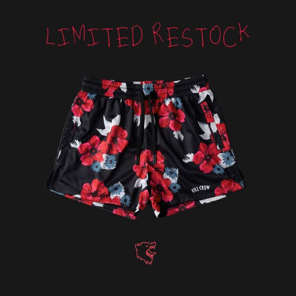
A striking image showcasing black floral shorts from Kill Crew against a dark backdrop. The ad emphasizes a limited restock with its bold headline.
# Brand positioning
Kill Crew presents itself as an edgy, streetwear-inspired brand that defies conventional fashion norms. Positioning itself in a niche market that appreciates bold and unconventional aesthetics, Kill Crew is designed for individuals who embrace individuality and self-expression through their clothing choices. The brand offers an alternative to mainstream fashion, focusing on unique designs and limited releases to enhance exclusivity.
# Product
The product is a pair of black floral shorts. The shorts feature a black base color with a bold pattern of red, white, and blue floral designs, giving them a striking and unique appearance. They have an elastic waistband with black and white detailing and a standard athletic shorts cut, suggesting they are made for both casual wear and active use. The shorts have the brand name, "KILLCREW," printed on the side near the hem.
# Visual style
The ad features a clean, product-focused visual aesthetic with a streetwear edge. The production quality is high, with well-lit product photography against a stark background. The limited color palette of black, red, and white enhances visual impact. The use of handwritten-style typography adds a casual, rebellious touch. Overall, the visual style aims to capture attention with a blend of high-quality presentation and urban flair.
# Hooks
Headline: LIMITED RESTOCK
# Benefits
- [object Object]
# Features
- [object Object]
- [object Object]
# Call to action
None used.
# Point of view
- [object Object]
# Storyline
- The ad opens by announcing a "LIMITED RESTOCK," which is conveyed by the brand to immediately grab the viewer's attention and create a sense of urgency.
- The brand showcases the black floral shorts, drawing attention to the unique design and pattern. This serves to highlight the product's aesthetic appeal and distinctive style.
- Finally, the brand displays its logo to reinforce brand recognition and association with the product.
# Ad summary
This ad features three girls modeling matching sports bra and short sets with different fruit patterns. They are interacting together as friends and showing off the flattering fit and functionality of the design.
# Brand positioning
This brand is presented as fun and youthful. The ads feature girls in their early twenties who are friends and appear to be at a brand photoshoot. The brand aligns with a playful lifestyle as the models discuss wearing fruit-themed matching sports bra and short sets. The brand seems to ignore category norms as it does not appear to be promoting any fitness or workout apparel. The brand positioning seems primarily emotional.
# Product
The featured product is a matching sports bra and shorts set. The sports bra has removable straps and can be worn as a halter top or strapless. The shorts feature a low waistband that is described as flattering. The sets come in a variety of colorful fruit patterns including strawberry, lemon, and cherry. The fabric is described as feeling 'so nice'. The ad seems to be telling the viewer the product is worth buying for the fashionable fit and feel.
# Visual style
The ad has a low-budget, unpolished aesthetic. The video has static shots with hard cuts. The production quality feels like UGC due to the shaky camera movement and natural lighting.
# Benefits
- [object Object]
- [object Object]
# Features
- [object Object]
- [object Object]
- [object Object]
# Call to action
None used.
# Point of view
- [object Object]
# Storyline
- 00:00–00:11 Three young women dance and interact in a photoshoot, while admiring the fit and feel of the product.
- 00:11–00:15 00:11–00:15: One of the women points out the removable straps on the sports bra, and turns it into a halter top. This is intended to convey the versatility of the sports bra
- 00:15–00:21 00:15–00:21: The women take off the halter top straps to demonstrate the versatility. This is intended to convey the versatility of the sports bra, and how flattering it looks as a halter top.
# Ad summary
This ad features a young woman showcasing various pieces of workout clothing from Kill Crew. She highlights the brand's commitment to donating proceeds towards suicide prevention and mental health initiatives.
# Brand positioning
Kill Crew is presented as an athletic apparel brand that stands for more than just performance wear. The brand is explicitly positioned as a company that donates proceeds toward suicide prevention and mental health. This cause-driven approach suggests the brand aims to occupy a space in the consumer's mind as socially conscious and values-driven. The brand aligns with a lifestyle that prioritizes both physical fitness and mental well-being, appealing to customers who want their purchases to contribute to a greater good. By tying its products to a significant social cause, Kill Crew differentiates itself from competitors who may focus solely on athletic performance or fashion trends.
# Product
The ad features a range of athletic apparel from Kill Crew, including sports bras, t-shirts, and shorts. The clothing is designed for workouts and physical activities, as implied by the term "gym clothes" and the model's active presentation. The shorts come in various patterns, including floral, flame, and paisley designs. The sports bras and t-shirts feature the Kill Crew logo. A key selling point is that proceeds from the sales go toward suicide prevention and mental health initiatives, making the purchase a contribution to a cause. The ad addresses the purchase barrier of justifying buying more gym clothes by framing it as a charitable act.
# Visual style
The ad has a casual, UGC-style aesthetic. The editing is simple with static shots and minimal transitions. The production quality is basic, giving it an authentic feel. The pacing is consistent, with each shot lasting a few seconds. The visuals are timed to the music beat.
# Benefits
- [object Object]
# Features
- [object Object]
- [object Object]
- [object Object]
- [object Object]
- [object Object]
# Call to action
None used.
# Point of view
- [object Object]
# Storyline
- 00:00–00:05 The ad opens with a young woman standing in front of a door, modeling a sports bra and floral shorts. She is centered in the frame and looks directly at the camera, showing off the clothing.
- 00:05–00:11 The woman models a white sports bra and white shorts with a flame design.
- 00:11–00:16 The woman models a black crop top and paisley shorts.
- 00:16–00:18 The woman models a yellow t-shirt and paisley shorts.
- 00:18–00:20 The woman models a black crop top and black shorts.
# Ad summary
This ad features a black t-shirt with a graphic image and white writing that says, “KILL CREW, EVERYONE’S GOT SOMETHING TO KILL”. Next to the t-shirt is a pair of red shorts that also say, “KILL CREW”. The ad shows multiple variations of shirts and shorts in different colors and designs.
# Brand positioning
KILL CREW is presented as a streetwear brand with an edgy and rebellious tone. The brand embraces themes of individuality and self-expression. KILL CREW stands apart from typical fashion brands, showcasing bold graphics and unconventional designs, appealing to those who want to make a statement and stand out from the crowd. The brand’s positioning appears emotional, geared toward empowering wearers to express their inner feelings.
# Product
The ad highlights a range of streetwear apparel, focusing on t-shirts and shorts. The t-shirts are black with graphic prints and the words “KILL CREW, EVERYONE’S GOT SOMETHING TO KILL” written in white. The shorts are athletic material with a drawstring. The shorts are shown in red and gray with the words “KILL CREW” printed on the left leg. The main selling point of the brand is the edgy and bold designs, designed to help people express themselves.
# Visual style
The ad features a polished commercial aesthetic. The editing style consists of slow camera movement and static shots. The production quality looks professional, which helps build a brand tone. The pacing of the ad is slow.
# Benefits
- [object Object]
# Features
- [object Object]
# Call to action
None used.
# Point of view
- [object Object]
# Storyline
- 00:00–00:09 The ad shows a t-shirt and shorts with “KILL CREW” written on them.
# Ad summary
This ad showcases a t-shirt and shorts from Killcrew. The ad is a simple product showcase with a song playing in the background.
# Brand positioning
Killcrew is presented as a brand focused on athletic wear with a fighter's club theme. The brand's apparel includes the brand name and the phrase "Killing inner demons through rigorous training," suggesting a focus on mental and physical strength. The brand aims to occupy a space in the consumer's mind that associates athletic wear with a lifestyle of discipline, self-improvement, and overcoming personal challenges. The brand aligns with values of determination, resilience, and the pursuit of personal growth through physical activity. The brand's positioning is both functional, providing athletic apparel, and emotional, promoting a lifestyle of empowerment and self-improvement.
# Product
The ad features a t-shirt and shorts from Killcrew. The t-shirt is a light beige color with the brand name "KILLCREW FIGHTER'S CLUB" printed in black across the chest, along with the tagline "Killing inner demons through rigorous training." The shorts are two-tone, with one side being light purple with the brand name "KILLCREW" in yellow, and the other side being light blue with the brand's logo in yellow. The shorts are designed for athletic activities, as implied by the brand's fighter's club theme and the tagline "Killing inner demons through rigorous training." The ad tells the viewer that these products are worth trying or buying because they represent a lifestyle of discipline, self-improvement, and overcoming personal challenges.
# Visual style
The ad has a simple and clean aesthetic, with a focus on showcasing the product. The editing style is static, with no quick cuts or transitions. The production quality is polished, with a focus on clear and well-lit shots. The pacing is slow and steady, with no sudden shifts in tempo. The audio-visual sync is minimal, with no specific timing of cuts or product actions to the music beats or voiceover lines.
# Benefits
- [object Object]
# Features
- [object Object]
- [object Object]
# Call to action
None used.
# Point of view
- [object Object]
# Storyline
- 00:00–00:02 The video begins with a close-up shot of the Killcrew t-shirt and shorts laid out on a concrete surface next to a wooden pallet.
- 00:02–00:16 The camera slowly zooms in on the t-shirt and shorts, showcasing the brand name and logo.
# Ad summary
This ad showcases a row of brightly-colored Kill Crew athletic shorts being touched and adjusted, highlighting the brand's bold and vibrant aesthetic. It aims to appeal to individuals who appreciate unique fashion and aren't afraid to stand out.
# Brand positioning
Kill Crew is presented as a bold, eye-catching athletic wear brand that emphasizes bright, neon colors. The brand aims to occupy a space in the consumer's mind as a fashion-forward, unique, and edgy choice for athletic apparel. The brand aligns with a vibrant and expressive lifestyle, encouraging individuals to stand out and make a statement through their clothing. The brand is positioning itself as an alternative to more subdued or traditional athletic wear, appealing to those who want to express their individuality. The brand positioning is more emotional than functional, focused on self-expression and confidence rather than solely performance or simplicity.
# Product
The product featured is a pair of athletic shorts by Kill Crew. The shorts come in a variety of bright, neon colors, including pink, orange, yellow, green, and blue. The shorts feature an elastic waistband, a black drawstring, and the Kill Crew logo prominently displayed on the front. They are made from a lightweight material and appear suitable for athletic activities or casual wear. The shorts seem to be designed for individuals who want to make a statement with their clothing and stand out from the crowd. The vibrant colors and bold branding suggest that these shorts are a fashion-forward choice.
# Visual style
The ad has a casual, UGC-style aesthetic. The editing style is simple, with a slow zoom out. The production quality feels accessible and unpolished, which aligns with the tone. The pacing is slow. The audio and visual elements are timed to the music.
# Benefits
- [object Object]
- [object Object]
- [object Object]
# Features
- [object Object]
- [object Object]
- [object Object]
- [object Object]
# Call to action
None used.
# Point of view
- [object Object]
# Storyline
- 00:00–00:04 The ad opens with a close-up of several pairs of brightly-colored Kill Crew athletic shorts lined up on a gray surface.
- 00:00–00:04 A hand with multiple rings and a gold watch adjusts the shorts, emphasizing the textures and colors.
- 00:05–00:09 The camera slowly zooms out to reveal a wider view of the shorts and the person wearing them.
# Ad summary
This ad features a t-shirt and shorts combination from Kill Crew. The ad features an up-close look at the apparel and highlights the cartoon graphics.
# Brand positioning
Kill Crew is presented as a streetwear brand with a bold and edgy aesthetic. The brand embraces dark humor and eye-catching graphics, appealing to those who want to stand out from the crowd. With cartoon skulls and smiley faces, Kill Crew defies traditional fashion norms. The brand offers casual apparel with a rebellious spirit.
# Product
The ad showcases a t-shirt and shorts set from Kill Crew. The white t-shirt features a green and yellow graphic of a smiley face lifting weights. Above the smiley face, the text "KILL CREW" appears in blue. Smaller smiley faces appear in the background of the graphic. Underneath the graphic, the text "PERHAPS THE WEIGHTS ACTUALLY LIFT US UP" appears. The black shorts feature a white flame design that travels up the left side. The brand name appears near the bottom of the right short leg in white lettering. The shorts include a neon green drawstring.
# Visual style
The ad has a clean and polished aesthetic, with a focus on showcasing the details of the clothing. The lighting is bright, and the camera movements are smooth. The ad maintains a consistent, slow pace.
# Benefits
- [object Object]
# Features
- [object Object]
- [object Object]
# Call to action
None used.
# Point of view
- [object Object]
# Storyline
- 00:00–00:09 The camera zooms in slowly on a t-shirt and shorts combination that are laying on the ground.
# Ad summary
This ad shows a sweatshirt and pair of shorts. The items are laid out to be viewed as a clothing option.
# Brand positioning
KILLCREW is a streetwear brand that produces graphic clothing and accessories. The brand has a playful, tongue-in-cheek tone that is meant to appeal to a younger generation. The brand embraces an edgy aesthetic.
# Product
The ad features a heather grey sweatshirt with a small, understated black KILLCREW logo embroidered on the chest. The ad also features shorts with a tree trunk and leaves pattern and a black hem. The KILLCREW logo is printed in the same style as on the sweatshirt on the lower left leg of the shorts.
# Visual style
The ad has a casual feel. The camera zooms in slightly which makes the brand seem familiar. The shot is filmed in front of a white surface in order to highlight the clothing.
# Benefits
- [object Object]
# Features
- [object Object]
- [object Object]
- [object Object]
# Call to action
None used.
# Point of view
- [object Object]
# Storyline
- 00:00–00:13 The video ad displays a heather grey sweatshirt with a black logo.
- 00:00–00:13 The video ad displays shorts with a camouflage tree trunk and leaves pattern and a black hem. The KILLCREW logo is printed in the same style as on the sweatshirt on the lower left leg of the shorts.
# Ad summary
A woman shows off an outfit she ordered online in a bathroom mirror. She dances to music and smiles at the camera.
# Brand positioning
This ad does not explicitly mention the brand name. However, the ad implies that the brand sells clothing online. The brand aims to provide clothing that fits as envisioned by the customer.
# Product
The product featured in this ad is an outfit consisting of a black crop top and blue and black shorts. The crop top has a graphic design on the front. The shorts are high-waisted and have a blue and black tie-dye pattern. The outfit is presented as fitting well and matching the customer's expectations when ordering online.
# Visual style
The ad has a casual, UGC feel, shot in a bathroom with natural lighting. The editing is simple, with static shots and no transitions. The pacing is consistent with the music's beat.
# Benefits
- [object Object]
# Features
- [object Object]
- [object Object]
# Call to action
None used.
# Point of view
- [object Object]
# Storyline
- 00:00–00:10 00:00–00:10 A woman stands in front of a bathroom mirror, posing and dancing to music while wearing a black crop top and blue and black shorts. She smiles and seems happy with the outfit.
# Ad summary
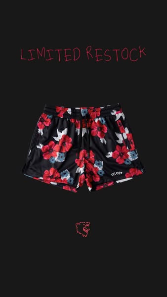
This ad showcases a pair of floral-print athletic shorts from the brand KILL CREW. The headline states that they are a limited restock.
# Brand positioning
KILL CREW is presented as a streetwear brand that caters to a young, active demographic. The brand embraces a casual, athletic style with a touch of boldness through its floral design. The brand is positioned to appeal to those who want to make a statement while staying comfortable and active.
# Product
The product being advertised is a pair of athletic shorts with a floral print. The shorts feature a black base with red, white, and blue floral patterns. They have an elastic waistband, which suggests comfort and flexibility for athletic activities. The 'KILL CREW' logo is visible on the shorts, reinforcing the brand identity. The focus is on a limited restock, highlighting scarcity and encouraging immediate purchase.
# Visual style
The ad has a clean, minimalist visual style with a focus on the product. The solid black background emphasizes the floral pattern on the shorts. The handwritten-style text adds a touch of informality.
# Hooks
Headline: LIMITED RESTOCK
# Benefits
- [object Object]
# Features
- [object Object]
# Call to action
None used.
# Point of view
- [object Object]
# Storyline
- The ad opens with the text 'LIMITED RESTOCK' in a handwritten-style font, drawing the viewer's attention to the exclusivity of the product. This is presented from the brand's perspective.
- The main focus of the ad is the product itself, a pair of floral-print athletic shorts. The brand is highlighting the visual appeal and availability of this specific item, from the brand's perspective.
- The brand's logo is displayed at the bottom, reinforcing brand recognition. The KILL CREW logo is used to reiterate the brand and style from the brand's perspective.
How Other Apparel Brands Advertise on Meta
Peer brands in Motion's library — click any brand to see their creative strategy, live ads, and AI breakdowns.