# Ad summary
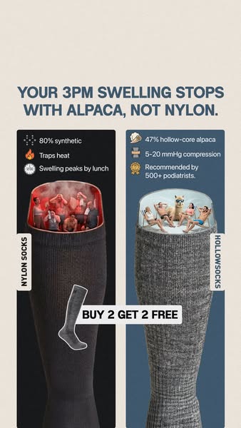
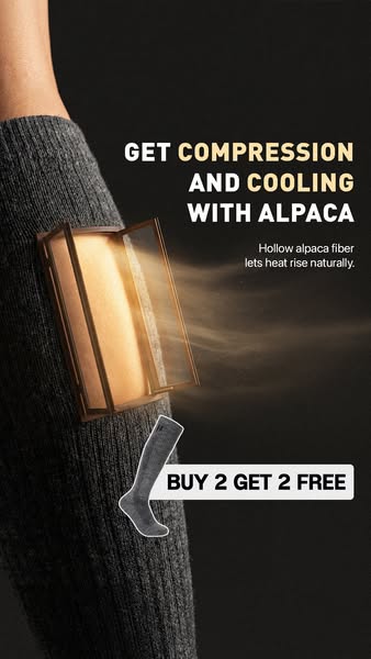
This ad promotes alpaca socks by highlighting the compression and cooling benefits of alpaca fiber. It uses a visual demonstration to show how the hollow alpaca fiber lets heat rise naturally, providing a cooling effect. It incentivizes customers to purchase the product with a "buy 2 get 2 free" offer.
# Brand positioning
This brand positions itself as a provider of apparel that uses alpaca fiber to create compression and cooling. The ad targets those seeking performance benefits such as compression and cooling in their activewear. By emphasizing the natural properties of alpaca fiber ("") the brand is positioning itself as a premium option that leverages natural materials for improved comfort and functionality.
# Product
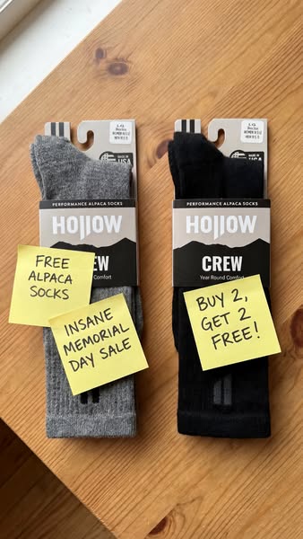
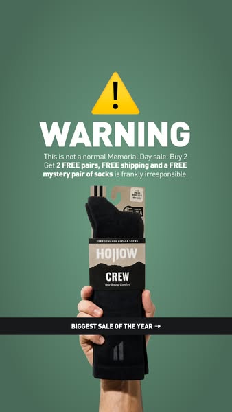
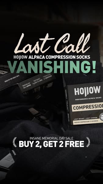
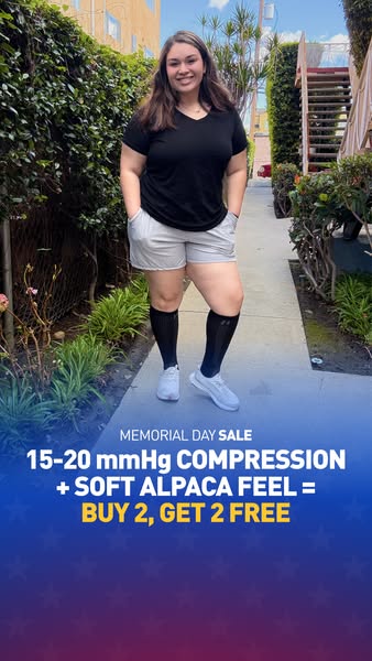
The product is an alpaca fiber compression sock designed to provide cooling and support. The socks are presented as leveraging hollow alpaca fiber to allow heat to rise naturally, suggesting enhanced breathability and temperature regulation. The ad focuses on the dual benefits of compression and cooling, making it appealing to individuals who want to improve their comfort during activities or daily wear. The ad incentivizes purchase by offering a "buy 2 get 2 free" promotion.
# Visual style
The ad has a minimalist and technical visual style. The color palette is neutral, featuring gray and brown tones. The use of a 3D rendering adds a modern touch, while the clean typography ensures readability. The overall effect is informative and sleek, designed to highlight the functionality of the product.
# Hooks
Headline: GET COMPRESSION AND COOLING WITH ALPACA
# Benefits
- [object Object]
# Features
- [object Object]
- [object Object]
- [object Object]
- [object Object]
# Call to action
None used.
# Point of view
- [object Object]
# Storyline
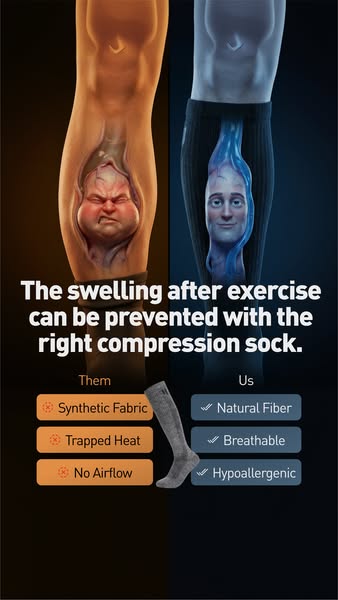
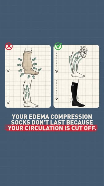
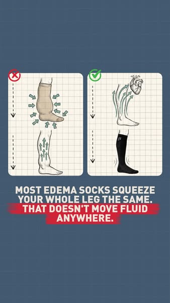
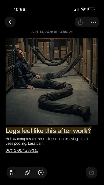
- The ad begins by immediately calling out the key benefits of the alpaca socks, compression and cooling, framing it as a solution for those seeking functional activewear. The brand is speaking and highlighting key features that appeal to the target audience.
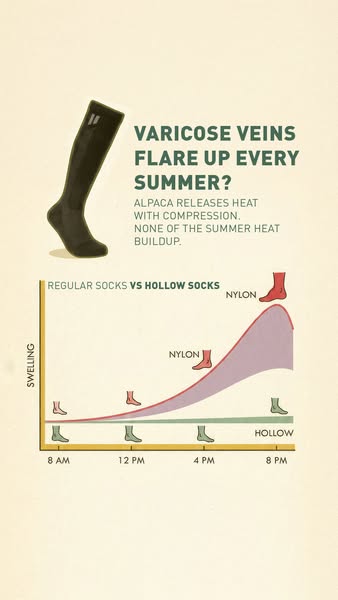
- Next, the ad showcases the science behind the cooling effect with a visual demonstration, explaining that hollow alpaca fiber allows heat to rise naturally. The brand is telling the audience how it works.
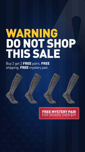
- Finally, the ad presents a direct purchase incentive with a "buy 2 get 2 free" offer, encouraging immediate action. The brand is telling the audience to buy the product.