Grunt Style runs 219 active ads on Meta, shipping ~24 new creatives per week. Their library leans on Headline33%, Split Screen14%, and Collage6%. Recently, grunt style is leaning hard into Father's Day gifting with a blue collar, working man positioning that celebrates practical masculinity through novelty tees like "Forklift Certified" and "Knower of Stuff, Fixer of Things." The "Girl Dad" push is notable as a softer counterbalance, framing traditional masculinity and nurturing fatherhood as compatible rather than contradictory. Underneath it all, they're still anchoring to patriotic/freedom messaging as brand DNA, but the immediate emphasis is selling dad humor and working class pride as the seasonal hook.
# Ad summary
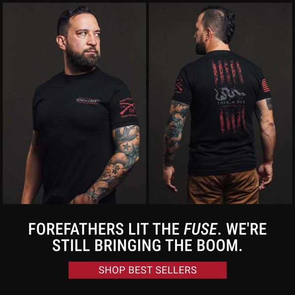
This ad features two men wearing black t-shirts, one with a design on the front and the other with a design on the back, along with the headline 'FOREFATHERS LIT THE FUSE. WE'RE STILL BRINGING THE BOOM.' The ad also includes a call to action button to 'SHOP BEST SELLERS.'
# Brand positioning
This brand aligns itself with American patriotism and a bold, unapologetic stance. The brand uses historical references and edgy slogans to connect with consumers who value freedom, self-reliance, and a strong sense of national pride. The brand seems to push against a trend of political correctness or muted expression, offering clothing and accessories that allow customers to express their values and beliefs assertively. It occupies a space for those who want to display their convictions through apparel, with an emphasis on historical and patriotic symbolism.
# Product
The product advertised is a black t-shirt featuring designs associated with American patriotism and historical symbolism. One shirt design includes the text "SONS of LIBERTY" and a crossed rifle graphic, while the other design features an image of a snake with the text "JOIN, or DIE" overlaid on a distressed American flag design. These shirts are intended for individuals who identify with values of freedom, self-reliance, and a strong sense of national pride. The t-shirts serve as a way to express these convictions through apparel. The designs on the shirts serve as a clear USP.
# Visual style
The visual style is clean and direct, focusing on clear product presentation against a dark background. The image appears to be studio-shot with professional lighting, giving it a polished look. The design incorporates a split layout to showcase both the front and back of the t-shirt, with bold typography and a strong call to action button to draw attention. The overall aesthetic is bold and patriotic, aiming to convey a sense of strength and conviction.
# Hooks
Headline: FOREFATHERS LIT THE FUSE. WE'RE STILL BRINGING THE BOOM.
# Call to action
SHOP BEST SELLERS
# Point of view
- [object Object]
- [object Object]
# Storyline
- The ad presents two men wearing different designs of the same black t-shirt. This helps to showcase both the front and back designs of the advertised shirts, giving a comprehensive view of the product to potential customers. The audience experiences it from the brand's perspective.
- The ad displays the slogan 'FOREFATHERS LIT THE FUSE. WE'RE STILL BRINGING THE BOOM,' reinforcing a theme of historical patriotism and bold action. The audience experiences it from the brand's perspective.
- The ad includes a 'SHOP BEST SELLERS' button, encouraging immediate purchase. The audience experiences it from the brand's perspective.
# Ad summary
This ad features a compilation of images showcasing men wearing shirts with a “Girl Dad” logo. The images feature the men doing activities with their daughters. The ad aims to market apparel celebrating fatherhood.
# Brand positioning
This brand seems to be promoting a message of empowered fatherhood. The "Girl Dad" logo suggests a celebration of men who are involved in their daughters' lives. The brand is positioned with a playful and rugged tone, with a slight patriotic nod, featuring t-shirts with the American flag on the sleeves. It's functional in the sense that it's apparel, but more emotional in how it promotes a positive identity for fathers.
# Product
The product being advertised is a t-shirt featuring the words “Girl Dad” in a distressed, block letter font. In some versions, the “I” in “Girl” is replaced with a bullet image, and the “A” in “Dad” is replaced with two crossed rifles. The phrase “Her First Line Of Defense” is printed below the main logo. The t-shirt is presented as a way for fathers to proudly display their involvement and dedication to their daughters.
# Visual style
The ad has a candid and authentic feel, with real-life scenarios. The editing is simple and straightforward. The production quality appears to be a mix of lifestyle photography. The pacing is slow with cuts at the start of each second. The visuals are timed to show each photo for only 1 second each.
# Benefits
- [object Object]
- [object Object]
- [object Object]
# Features
- [object Object]
- [object Object]
- [object Object]
# Call to action
SHOP COLLECTION
# Point of view
- [object Object]
# Storyline
- 00:00–00:02 The ad features various men wearing t-shirts with a "Girl Dad" design.
- 00:00–00:02 These men are shown in different settings, actively participating in activities with their daughters.
- 00:00–00:02 The visuals suggest that being a "Girl Dad" involves a mix of fun, protection, and nurturing.
- 00:03–00:04 The logo "Girl Dad" is shown against a black screen.
# Ad summary
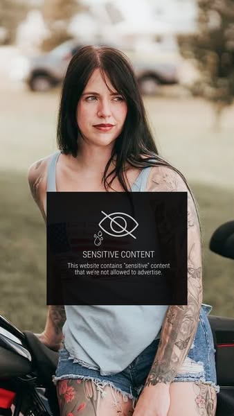
This image ad contains an image of a woman on a motorcycle. There is a dark transparent box in front of her with copy indicating the website has 'sensitive' content that cannot be advertised.
# Brand positioning
The brand in this ad is not explicitly identified. The brand appears to be associated with 'sensitive' content that prevents them from advertising directly. This may suggest the brand is edgy, exclusive, and direct in its market approach. It positions itself as outside the mainstream and not constrained by conventional advertising.
# Product
The product is not explicitly identified, but the ad implies that it is connected to the website being advertised. The website's content is described as 'sensitive' content that prevents them from advertising directly. There are no explicitly stated product details, USPs, or occasions for use.
# Visual style
The ad uses a natural, outdoor setting with a somewhat desaturated color palette. The image has a lifestyle photography feel, and is framed with a dark overlay to create an element of mystery.
# Hooks
Headline: SENSITIVE CONTENT
# Benefits
- [object Object]
# Features
- [object Object]
# Call to action
None used.
# Point of view
- [object Object]
# Storyline
- The ad begins by presenting an image of a woman on a motorcycle, which implies the website and product are connected to this scene. The intention is to create intrigue by showing the woman and motorcycle, inviting viewers to want to see more.
- The ad then introduces a block of text over the image indicating the website cannot be directly advertised due to its 'sensitive' content. This builds curiosity by hinting at the nature of the website's content while simultaneously creating a barrier to accessing it, making the viewer want to know what's on the other side.
# Ad summary
A woman holds up a Grunt Style t-shirt, describing its features and the brand's values.
# Brand positioning
Grunt Style is presented as a brand synonymous with true American patriotism and support for veterans and the military. The brand’s positioning is emotional, aligning with values of patriotism and national pride, and emphasizing quality. It stands for true American patriotism and cares about veterans and military.
# Product
The featured product is an America 250th anniversary t-shirt from Grunt Style. It is dark green with large graphics on the front and back, as well as on the left sleeve. The shirt's design and quality are touted as key features. The shirt is intended as a gift, suggesting it is suitable for gifting occasions to those who support the brand and its values.
# Visual style
The ad has a casual, UGC feel. The editing is minimal, with static shots and smooth transitions. The production quality is typical of a smartphone video. The pacing is moderate. The visual style supports a relatable tone, characteristic of user-generated content.
# Benefits
- [object Object]
# Features
- [object Object]
# Call to action
None used.
# Point of view
- [object Object]
# Storyline
- 00:00–00:04 A woman holds up a Grunt Style shirt, asking viewers to get a 250 shirt for America's birthday.
- 00:04–00:11 She presents the America 250th shirt and shares her strong feelings for it.
- 00:11–00:19 She states that the brand stands for American patriotism and cares about veterans and the military.
- 00:19–00:27 She expresses her obsession with the quality of the shirt and states it's a gift for her dad because his whole closet is Grunt Style.
- 00:27–00:34 She says she's excited to surprise him with it because it is the coolest shirt ever and that the viewers need it.
# Ad summary
This ad is for Girl Dad apparel and accessories. It features images of fathers in masculine and nurturing roles, meant to signal the brand's focus on challenging gender norms.
# Brand positioning
The brand aims to occupy a space of challenging traditional gender roles, particularly around fatherhood. It promotes values of strength, nurturing, and breaking stereotypes. The brand pushes against norms that confine men to purely masculine roles, instead showcasing and celebrating their ability to be both tough and caring. The brand's positioning is both emotional and functional, empowering fathers to express their multifaceted identities through apparel and accessories. The products all share a single brand identity around the 'Girl Dad' concept but differ in design.
# Product
The featured product is "Girl Dad" branded merchandise, specifically apparel. The products include t-shirts, stickers, and other accessories. The shirts feature a logo with the words “Girl Dad” in a stylized font, often incorporating imagery of firearms or bullets with the tagline, "Her first line of defense." The apparel is designed for fathers who want to express their love for their daughters while embracing traditionally masculine symbols. The product aims to address the barrier of men feeling confined by gender stereotypes, offering a way to express their identity as both protectors and nurturers. The merchandise serves as a statement, allowing dads to proudly display their role in their daughters' lives.
# Visual style
The ad's aesthetic is a blend of masculine and nurturing imagery, with a polished commercial feel. The video features quick cuts, transitioning between different scenarios that highlight the multifaceted role of a father. The editing style is straightforward, with static shots and simple transitions. The pacing is consistent. The audio is timed to match the visual elements, creating a cohesive and engaging viewing experience.
# Benefits
- [object Object]
- [object Object]
# Features
- [object Object]
- [object Object]
# Call to action
SHOP COLLECTION
# Point of view
- [object Object]
# Storyline
- 00:00–00:01 A man is crouched down with a child who is laying down and sighting a rifle.
- 00:01–00:02 A man with a beard is drinking tea with children.
- 00:03–00:04 The screen transitions to the Girl Dad logo.
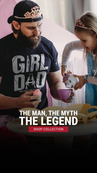
# Ad summary
An image ad featuring a father and daughter playing tea party, and promoting a t-shirt from the brand Nine Line Apparel, that reads "Girl Dad".
# Brand positioning
Nine Line Apparel is presented as a brand that celebrates American values, particularly those associated with military service and patriotism. The brand appears to offer apparel that allows customers to express their personal values and affiliations. The brand seems to target individuals who take pride in their country, family, and potentially their support for the armed forces. The company presents itself as more than just an apparel provider, but rather as a symbol of pride, family values, and unwavering support for the military community.
# Product
The product featured is a dark-colored t-shirt with a graphic design that reads "GIRL DAD" in distressed white lettering, with the word "GIRL" above "DAD". The "I" in GIRL is replaced by a rifle. The shirt appears to be made from a soft, comfortable fabric. The t-shirt aims to appeal to fathers of daughters who want to express their love and pride for their children while also displaying an appreciation for military themes. The phrase “HER FIRST LINE OF DEFENSE” is printed in smaller letters beneath “GIRL DAD”, reinforcing the theme of protection and familial love. It is presented as a way for dads to showcase their identity and role in a fun and stylish manner.
# Visual style
The ad has a lifestyle photography style with a focus on capturing an authentic moment between a father and daughter. The production quality appears to be high, with natural lighting and a shallow depth of field that keeps the focus on the subjects. The image treatment seems minimal, aiming for a realistic and relatable aesthetic. The typography integration is bold and clear, designed to quickly convey the message and call to action. The ad mimics a casual in-feed style, which can enhance its scannability and stop power by blending with organic content.
# Hooks
Headline: THE MAN, THE MYTH THE LEGEND
# Benefits
- [object Object]
- [object Object]
# Features
- [object Object]
# Call to action
SHOP COLLECTION
# Point of view
- [object Object]
# Storyline
- The ad opens with a father wearing a Girl Dad t-shirt and tiara while playing tea party with his daughter. This is meant to convey the message that the brand embraces a fun, loving, and playful relationship between fathers and their daughters. The story is being told from the brand's perspective.
- The scene highlights the father’s willingness to participate in activities typically associated with young girls. This is to convey a sense of inclusivity and breaking traditional gender roles. This moment progresses the overall narrative by showing a real-life scenario that reflects the brand’s theme. The story is being told from the brand's perspective.
- The ad concludes with a headline and call to action, encouraging viewers to shop the collection. This is the brand's direct invitation for viewers to explore and purchase products that reflect the depicted values and lifestyle. The story is being told from the brand's perspective.
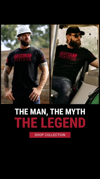
# Ad summary
This ad showcases the 'Forklift Certified' t-shirt with the phrase 'The man, the myth, the legend' and a 'Shop Collection' call to action.
# Brand positioning
This brand is positioning itself for those who work in industrial settings, specifically those who operate forklifts. The brand aims to connect with people who are proud of their work and appreciate quality apparel that reflects their profession. By using the phrase 'The man, the myth, the legend' the brand is attempting to connect with a rugged, tough, working class individual. The brand is taking the functional role of protective workwear while imbuing it with emotional attributes of respect, pride, and legacy.
# Product
The ad features a black t-shirt with the phrase 'Forklift Certified' printed in red on the chest. The shirt has a classic crew neck and short sleeves. It appears to be made from a durable cotton or cotton blend fabric, suitable for work environments. The shirt is designed for men who operate forklifts or work in related industries, and it aims to provide a comfortable and stylish way to show pride in their profession. The ad promotes the idea that wearing this shirt signifies expertise and certification in forklift operation, while also offering a sense of humor and camaraderie among wearers.
# Visual style
The ad has a split-screen layout with a focus on showcasing the product in different environments. The color scheme is primarily black, white, and red, giving it a bold and industrial feel. The overall production quality appears to be high, with professional photography and clean design elements. The image treatment includes balanced lighting and clear focus on the subjects and product. The typography is straightforward and legible, contributing to the ad's direct and no-nonsense approach.
# Hooks
Headline: THE MAN, THE MYTH
THE LEGEND
# Benefits
- [object Object]
- [object Object]
# Features
- [object Object]
- [object Object]
# Call to action
SHOP COLLECTION
# Point of view
- [object Object]
# Storyline
- The ad opens with split-screen visuals of two men wearing the featured 'Forklift Certified' t-shirt. This intends to showcase the product in different work environments and demonstrate its appeal to the target audience. The visual is intended to immediately grab the attention of potential customers who identify with the depicted professions. The audience experiences this beat from the brand's perspective.
- Below the images, the text 'The man, the myth, the legend' is displayed in white and red font. This is intended to create an aspirational and legendary status around the wearer. The brand is attempting to appeal to the target audience's sense of pride and humor, suggesting that wearing the shirt can elevate their image. The audience experiences this beat from the brand's perspective.
- At the bottom, a 'Shop Collection' button appears in red. This serves as a direct call to action, prompting viewers to explore and purchase the featured product. The brand is trying to drive immediate sales by making it easy for interested customers to buy the shirt. The audience experiences this beat from the brand's perspective.
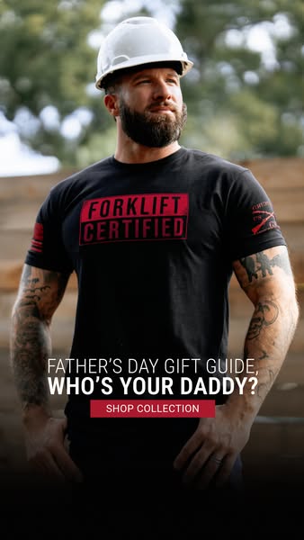
# Ad summary
This image ad promotes a Father's Day gift guide and features a man wearing a black t-shirt with the words 'Forklift Certified' printed on it.
# Brand positioning
The brand presents itself as rugged, masculine, and blue-collar. The emphasis on functional clothing like t-shirts with slogans related to skilled labor ('Forklift Certified') suggests a brand that values hard work, practicality, and a no-nonsense attitude. It aligns with values of strength, reliability, and a straightforward approach, pushing against more generic or fashion-focused apparel brands. The emotional positioning centers on pride in one's profession or skills, appealing to those who identify with these values.
# Product
The featured product is a black t-shirt with the phrase 'Forklift Certified' printed in a red outlined box on the chest. The t-shirt appears to be made of cotton or a cotton blend, with a standard crew neck and short sleeves. The shirt also features a logo on the left sleeve consisting of two crossing axes. The t-shirt is for men who take pride in their skilled labor or who appreciate clothing with a rugged, blue-collar aesthetic. The shirt presents itself as a practical, everyday item.
# Visual style
The ad has a rugged, masculine visual style. It features a medium shot of a man who appears to be a construction worker or in a similar trade, which communicates a sense of hard work and authenticity. The overall production quality seems high, with good lighting and a clear focus on the subject. The image treatment includes a slight darkening or vignette effect at the bottom, which highlights the call to action. The typography is clean and modern, making it easy to read against the image. The visual style aims to capture attention and convey a specific brand identity aligned with blue-collar values.
# Hooks
Headline: FATHER’S DAY GIFT GUIDE, WHO’S YOUR DADDY?
# Benefits
- [object Object]
# Features
- [object Object]
- [object Object]
# Call to action
SHOP COLLECTION
# Point of view
- [object Object]
# Storyline
- The ad features a man wearing a 'Forklift Certified' t-shirt and a white hard hat, implying he works in a field related to construction, manufacturing or warehouse operations. This is meant to convey the brand’s connection to the skilled trades and presents the man as someone who takes pride in his work. The audience experiences this moment through the brand's perspective.
- Below the man, the ad promotes a Father's Day gift guide with the question, 'Who's your daddy?' This communicates an intention to help viewers find a gift for Father's Day and playfully suggests the shirt or collection is the perfect gift for father figures who are associated with a rugged and blue-collar lifestyle. The audience experiences this message through the brand's perspective.
- At the bottom of the ad, the call to action 'Shop Collection' urges viewers to browse the brand’s full range of products. This encourages direct engagement and potential purchases. The viewer experiences this from the brand’s perspective.
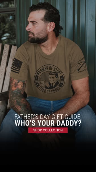
# Ad summary
This Father's Day gift guide ad features a man wearing a graphic tee with the phrase "Knower of Stuff, Fixer of Things." The ad prompts viewers to shop the collection.
# Brand positioning
The brand is implied to cater to a demographic that values practical skills, cleverness, and a slightly rugged or outdoorsy lifestyle. The brand's image suggests a celebration of the everyday hero—the resourceful, dependable, and knowledgeable father figure. The positioning appears to lean into a functional angle, highlighting qualities like handiness and problem-solving, but it also has an emotional component, honoring the role of a father.
# Product
The product featured is a tan-colored short-sleeve t-shirt with a graphic design. The design includes a circular emblem with the words "KNOWER OF STUFF" at the top and "FIXER OF THINGS" at the bottom. Inside the circle, there is a vintage-style illustration of a man in a suit drinking a cup of coffee that reads, "#1 DAD". The shirt also has an American flag patch on the left sleeve and another graphic on the right sleeve with the words "GRIM US THIS WES" alongside a rifle. The shirt is positioned as a Father's Day gift.
# Visual style
The visual style of the ad is casual and rugged, featuring a real-life model in an outdoor setting. The production quality appears to be a mix of studio shot with a slight outdoor aesthetic. The image has a slight color grading with a muted palette. The typography is integrated to be bold and readable. The ad also incorporates a clear call to action at the bottom, which ensures scannability in-feed.
# Hooks
Headline: FATHER'S DAY GIFT GUIDE, WHO'S YOUR DADDY?
# Benefits
- [object Object]
# Features
- [object Object]
# Call to action
SHOP COLLECTION
# Point of view
- [object Object]
# Storyline
- The image begins by showcasing a man wearing a t-shirt with a distinctive design, aiming to capture attention and pique the viewer's interest. The narrative starts from the brand's perspective, presenting their product in a relatable and eye-catching way.
- It then highlights the phrases "Father's Day Gift Guide, Who's Your Daddy?", to immediately contextualize the image and present it as a solution to the question of what to buy for fathers. This message comes from the brand, guiding the audience toward considering their collection as a relevant gift option.
- The final beat provides a clear call to action to "SHOP COLLECTION," directing viewers on how to proceed if interested. This explicit prompt is a direct suggestion from the brand.
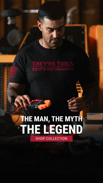
# Ad summary
A promotional image featuring a man wearing a branded t-shirt. The ad uses motivational text to highlight the brand.
# Brand positioning
This brand positions itself as the go-to choice for those who have a love of tools. The brand associates itself with hardworking individuals who take pride in their tools and see them as valuable assets rather than clutter. It conveys a sense of humor, and camaraderie among its customers, who likely share similar interests and values.
# Product
The advertised product is a black crewneck t-shirt. Printed on the chest are the words 'THEY'RE TOOLS SO IT'S NOT HOARDING' in red lettering. On the left sleeve of the shirt is a red, white, and black American flag patch. The shirt appears to be made of a soft, comfortable material suitable for everyday wear, emphasizing its functionality and appeal to those who value practicality in their wardrobe. The brand is promoting a broader collection of items.
# Visual style
The ad uses a natural, unedited aesthetic, reminiscent of a candid shot taken in a workshop. The color palette is dark and muted, with the focus on the man and the text overlaid on the image. The lighting is natural. The typography is large, bold, and straightforward. The image is designed to appear authentic and rugged.
# Hooks
Headline: THE MAN, THE MYTH THE LEGEND
# Benefits
- [object Object]
- [object Object]
# Features
- [object Object]
# Call to action
SHOP COLLECTION
# Point of view
- [object Object]
# Storyline
- The t-shirt communicates a lighthearted message about tool collection. The brand is sharing a sentiment that would resonate with its target audience: 'THEY'RE TOOLS SO IT'S NOT HOARDING'. The POV is from the brand.
- The words 'THE MAN, THE MYTH, THE LEGEND' are used to promote the brand. The brand is attempting to make an emotional connection with the audience, telling the audience they are a legend if they wear the shirt. The POV is from the brand.
- The 'SHOP COLLECTION' call to action encourages the viewer to explore the brand's offerings. The brand wants the viewer to purchase the shirt and/or other items. The POV is from the brand.
# Ad summary
This image ad promotes a collection of tools as a Father's Day gift guide. The ad features a man wearing a t-shirt that says 'They're Tools, So It's Not Hoarding.'
# Brand positioning
The brand is presented as catering to individuals who value tools and equipment, suggesting a no-nonsense, practical approach. The brand humorously acknowledges the stereotype of 'hoarding' tools by positioning it as a legitimate collection, appealing to those who take pride in their craftsmanship or DIY skills. The brand aligns with a lifestyle of functionality and preparedness, targeting customers who appreciate having the right tool for the job and pushing against the idea that owning many tools is excessive or unnecessary.
# Product
The ad promotes a collection of tools suitable for Father's Day gifts. A man holds a small device with an orange handle and attached red cords. The t-shirt shown in the image makes a statement that owning tools is not hoarding. The ad also promotes a Father's Day gift guide, highlighting an occasion and suggesting a solution for gift-giving.
# Visual style
The ad has a rugged, utilitarian visual style, suggesting a focus on practicality and durability. The lighting is subdued and warm, creating a sense of authenticity. The image treatment is simple, with minimal filters or effects, emphasizing the raw and unfiltered nature of the product and setting. The typography is bold and straightforward, ensuring readability and impact. This style is likely intended to resonate with a no-nonsense, hands-on audience, and the overall design aims to create a sense of trust and reliability.
# Hooks
Headline: FATHER'S DAY GIFT GUIDE, WHO'S YOUR DADDY?
# Benefits
- [object Object]
# Features
- [object Object]
- [object Object]
# Call to action
SHOP COLLECTION
# Point of view
- [object Object]
# Storyline
- The ad opens by showcasing a man wearing a t-shirt with the phrase, 'They're Tools, So It's Not Hoarding,' in order to humorously reframe the idea of owning tools. This is intended to appeal to the target audience and address a potential pain point by suggesting it is a valid hobby, as told from the brand's perspective.
- Next, the ad displays a man holding a tool, which helps to showcase the product category while implying the value of having the right equipment for the job. This is intended to resonate with the customer as they are presented with products they may need, shown from the brand's perspective.
- The ad concludes with a text overlay that reads 'Father's Day Gift Guide, Who's Your Daddy?' followed by a 'Shop Collection' call to action. This is intended to convert interest into a purchase as the customer is prompted to buy a Father's Day gift, from the brand's perspective.
# Ad summary
This Father's Day ad features two men wearing navy blue t-shirts with the same graphic print, advertising a "Shop Collection" CTA.
# Brand positioning
The brand presents itself as rugged, patriotic, and geared towards individuals who value hard work and a tough image. The brand utilizes a military-inspired aesthetic, indicated by the flag on the sleeves and the graphic of a wrench with the slogan 'Built Tough Like Father Like Son'. This imagery suggests a target audience that identifies with traditional masculine values, resilience, and a connection to family, particularly fatherhood.
# Product
The product featured is a navy blue short-sleeved t-shirt made of a soft material. The shirt features a white graphic print on the chest of a pipe wrench overlaid with a banner that reads "Built Tough Like Father Like Son." A small American flag with three white stripes is printed on the upper left sleeve. The t-shirt promotes a sense of durability and familial connection and is marketed towards people who appreciate high-quality apparel with a touch of patriotism and a rugged aesthetic.
# Visual style
The ad uses a split layout with two photos of the same product in different settings, connected by text and a button at the bottom. The production quality looks to be professionally shot. The color palette is dominated by navy blue, white, and silver tones, creating a cohesive and rugged aesthetic.
# Hooks
Headline: FATHER'S DAY GIFT GUIDE, WHO'S YOUR DADDY?
# Benefits
- [object Object]
- [object Object]
- [object Object]
# Features
- [object Object]
- [object Object]
- [object Object]
# Call to action
SHOP COLLECTION
# Point of view
- [object Object]
- [object Object]
# Storyline
- The ad opens with two different men in work settings wearing the same navy t-shirt. This is intended to showcase how the same t-shirt looks on different men in different locations and provides a customer POV on the product.
- The Father’s Day Gift Guide text at the bottom is used to suggest a gifting occasion, letting viewers know it is the brand's POV that this product can be a potential gift for fathers.
- The "Shop Collection" CTA closes the ad with the brand's intention to encourage the audience to explore and purchase the product.
# Ad summary
This image ad showcases a male model wearing a navy blue t-shirt with a wrench graphic. The ad intends to celebrate hard work, strength, and American values with a clear call to action to shop the collection.
# Brand positioning
This brand appears to focus on apparel for men who value hard work, patriotism, and perhaps a blue-collar lifestyle. The brand subtly aligns itself with American values through the inclusion of the American flag. The brand positions itself with strength, resilience, and a no-nonsense approach to life, appealing to men who take pride in their work and heritage.
# Product
The featured product is a navy blue short-sleeved t-shirt designed for men. The shirt features a stylized graphic of a wrench, symbolizing tools and manual labor. On the upper left sleeve, there is a small American flag, adding a patriotic element to the design. This product seems designed to be worn casually, appealing to those who take pride in their profession or hobbies involving tools and handiwork.
# Visual style
The visual style is clean and masculine, with a focus on showcasing the product on a model who embodies the brand's values. The photography is well-lit and professionally shot, with a shallow depth of field to keep the focus on the model and t-shirt. The overall aesthetic is rugged and straightforward, aligning with the brand's message of strength and reliability.
# Hooks
Headline: THE MAN, THE MYTH THE LEGEND
# Benefits
- [object Object]
# Features
- [object Object]
- [object Object]
# Call to action
SHOP COLLECTION
# Point of view
- [object Object]
# Storyline
- The ad introduces a male model wearing the brand's t-shirt, immediately associating the clothing with a masculine and perhaps rugged image. The perspective here is from the brand showcasing its product through a person who embodies the target demographic.
- The text overlay "THE MAN, THE MYTH, THE LEGEND" is displayed, suggesting that the wearer of the shirt possesses these admirable qualities. This part of the story is told from the brand's perspective, elevating the consumer to the level of a celebrated figure by wearing the brand.
- A red "SHOP COLLECTION" button appears, prompting the viewer to purchase the showcased t-shirt and more. This call to action is from the brand and directs the viewer towards making a purchase.
# Ad summary
Image ad for Grunt Style, featuring a man wearing a branded t-shirt, with the message that this is a Father's Day gift guide.
# Brand positioning
Grunt Style is presented as a brand that caters to individuals with a strong sense of patriotism and military pride. The brand's clothing features bold graphics and messages that celebrate American values and the military lifestyle. The brand positions itself as a way for customers to express their identity and affiliations.
# Product
The featured product is a short-sleeved, navy blue t-shirt with the text "I'LL BE IN THE GARAGE" printed in white across the chest. The shirt is made from a heathered material, giving it a textured appearance. The design suggests the wearer is a dad who enjoys spending time in the garage, likely working on projects or hobbies. The tee conveys the message that dads need their space, so the Grunt Style brand is a clever way to support his interests.
# Visual style
The ad has a clean and straightforward visual style. The production quality appears to be studio-shot, with professional lighting and a clear focus on the product and the model. The use of a dark grey background and white text creates a high-contrast look that is easily scannable. The layout is simple, with the main image at the top and the product carousel at the bottom.
# Hooks
Headline: FATHER'S DAY GIFT GUIDE, WHO'S YOUR DADDY?
# Benefits
- [object Object]
- [object Object]
# Features
- [object Object]
# Call to action
SHOP COLLECTION
# Point of view
- [object Object]
- [object Object]
# Storyline
- The image opens with a man wearing a t-shirt that reads, "I'LL BE IN THE GARAGE," conveying the message that dads need their space and enjoy working on projects in the garage. This is told from the customer's POV.
- The text "FATHER'S DAY GIFT GUIDE, WHO'S YOUR DADDY?" appears below, telling the audience the image is marketing towards finding the perfect gift for the father. This is told from the brand's POV.
- A "SHOP COLLECTION" button encourages the viewer to purchase the t-shirt or other similar items from the brand. This is told from the brand's POV.
- Finally, the image closes with a carousel of smaller images showcasing the same shirt worn by different men in various poses, reinforcing the main message and visual. This is told from the brand's POV.
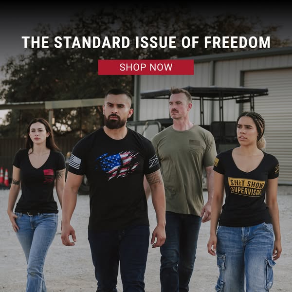
# Ad summary
This ad features four people wearing graphic t-shirts. The ad promotes a brand that celebrates freedom and patriotism through its apparel. The visual layout and copy focus on themes of freedom and American pride, suggesting the brand targets individuals who value these ideals.
# Brand positioning
The brand appears to be positioned around the ideals of freedom, patriotism, and American pride. This is conveyed through the prominent use of the American flag, both as a design element on the apparel and in the headline. The brand seems to target customers who identify with these values and want to express them through their clothing. The tone is assertive and confident, aligning with a lifestyle that values personal liberty and national pride. By incorporating patriotic symbols, the brand aims to foster a sense of belonging and shared identity among its customer base, pushing against trends that might overlook or downplay these values.
# Product
The ad features a variety of graphic t-shirts. These shirts are designed with patriotic themes. One shirt features a tattered American flag design, another has a small American flag on the sleeve, and one reads “SH*T SHOW SUPERVISOR” in yellow text. Each t-shirt is presented as a way to express personal values and identity, and they come in both men's and women's styles. The shirts appear to be made of comfortable, casual materials, suitable for everyday wear. The USPs revolve around the patriotic designs and the ability to showcase one's values and beliefs.
# Visual style
The ad utilizes a straightforward, authentic visual style. The production quality appears to be high, with clear and well-lit photography. The image treatment includes color grading that enhances the natural tones, giving it a slightly rugged feel. The typography is bold and easily readable, and the overall layout is simple and direct, ensuring the message is quickly scannable.
# Hooks
Headline: THE STANDARD ISSUE OF FREEDOM
# Benefits
- [object Object]
- [object Object]
# Features
- [object Object]
- [object Object]
# Call to action
SHOP NOW
# Point of view
- [object Object]
# Storyline
- The ad opens with a bold statement, "THE STANDARD ISSUE OF FREEDOM," which immediately conveys the brand's core message. This headline is intended to capture attention and set the tone for what the brand represents. This message is delivered from the brand's perspective, establishing its positioning around freedom and patriotism.
- Following the headline, a "SHOP NOW" button invites viewers to take immediate action. This is designed to drive direct sales and caters to those already aligned with the brand's message. The brand's perspective here is focused on converting interest into immediate purchases.
- The image showcases four individuals wearing different t-shirts, each with unique designs that reflect the brand's patriotic theme. This visual representation shows the diversity within the brand's customer base and highlights the various ways customers can express their values through apparel. The audience experiences this from the brand's perspective, showcasing its product range and customer appeal.
# Ad summary
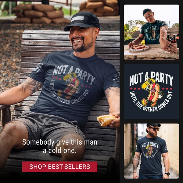
The ad features a man wearing a blue t-shirt with a graphic of a hotdog and the phrase "NOT A PARTY UNTIL THE WEINER COMES OUT". The ad also includes images of the t-shirt being worn by other men.
# Brand positioning
This brand caters to a demographic that appreciates humor, irony, and perhaps a more relaxed or 'bro' lifestyle. The t-shirt design, featuring a cartoon hotdog with the phrase "NOT A PARTY UNTIL THE WIENER COMES OUT," suggests a brand that doesn't take itself too seriously and aims to provide a bit of irreverent fun. The target audience likely values comfortable clothing with eye-catching designs that are conversation starters.
# Product
The featured product is a short-sleeve t-shirt in a dark blue color, with a graphic design centered on the chest. The design includes a cartoon hotdog character holding a bottle of mustard, surrounded by the text "NOT A PARTY UNTIL THE WIENER COMES OUT" in a semi-circular arrangement. The hotdog is depicted with a playful expression, suggesting the shirt is meant to be humorous and attention-grabbing. This t-shirt offers a comfortable fit and a unique design, perfect for casual wear.
# Visual style
The visual style is casual and relatable, appearing to be shot in a real-life setting with natural lighting. The production quality seems relatively high, with clear images. The ad uses a collage-style layout to showcase different angles and use cases for the t-shirt. The typography is simple and easy to read.
# Hooks
Headline: Somebody give this man a cold one.
# Benefits
- [object Object]
- [object Object]
- [object Object]
# Features
- [object Object]
- [object Object]
- [object Object]
# Call to action
SHOP BEST-SELLERS
# Point of view
- [object Object]
- [object Object]
# Storyline
- The initial image showcases a man sitting and smiling, wearing the advertised t-shirt, and holding a hotdog sandwich. This is intended to show the product being worn in a relaxed, real-life context, giving the audience a customer's POV.
- Additional inset images on the right side offer different perspectives: one features the man wearing the shirt while preparing hotdogs, another shows a close-up graphic of the t-shirt design, and a third features a man wearing the shirt in a street setting. This broadens the perceived appeal of the t-shirt, as seen from the brand's POV.
- The text overlay, "Somebody give this man a cold one," coupled with the call to action, "SHOP BEST-SELLERS," attempts to nudge the audience toward a purchase, creating a lighthearted sense of urgency. The customer's POV is invoked by suggesting a desire for a drink to complement the hotdog, thus associating the product with casual enjoyment.
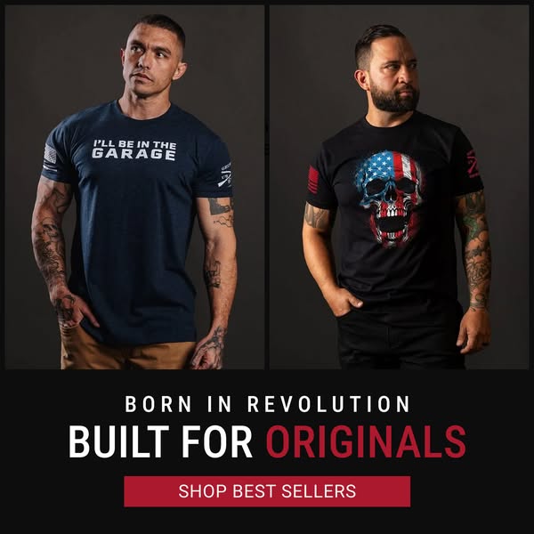
# Ad summary
The ad features two men wearing t-shirts from Grunt Style. The shirts each feature a different design. The ad encourages viewers to shop best sellers.
# Brand positioning
Grunt Style is presented as a brand for patriotic individuals. Their apparel is designed to represent American values, a rebellious spirit, and a military connection. The brand emphasizes originality and a strong sense of identity, appealing to those who want to express their unique perspective. The brand seems to push against the norm of conformity, offering a way for people to stand out and showcase their values and affiliations proudly.
# Product
The ad features two t-shirts by Grunt Style. The first is a navy blue shirt with the phrase "I'LL BE IN THE GARAGE" printed in white block letters across the chest. The second t-shirt is black and features a skull design with an American flag pattern. Both shirts feature the brand's logo on the sleeve. These shirts are for individuals who want to express their patriotism and affiliations through their clothing, and are designed for casual wear. The shirts offer a way to showcase personal values and stand out from the crowd.
# Visual style
The ad features a split-screen setup to showcase two different apparel styles, presenting a clear and direct product display. The models stand against a dark gray backdrop, providing a neutral contrast that highlights the clothing. Below, the ad utilizes bold text and a contrasting red button to draw attention to the brand's tagline and call to action. The overall style is clean and straightforward, focusing on the brand's message and products.
# Hooks
Headline: BORN IN REVOLUTION / BUILT FOR ORIGINALS
# Benefits
- [object Object]
- [object Object]
- [object Object]
# Features
- [object Object]
- [object Object]
- [object Object]
# Call to action
SHOP BEST SELLERS
# Point of view
- [object Object]
# Storyline
- The image showcases two men wearing different t-shirt designs from Grunt Style, aiming to present the variety and style of the brand's apparel. The brand is telling the story through the models by showing that they have options with the style of shirt they can purchase.
- Below the image of the two models, the brand presents the tagline "BORN IN REVOLUTION / BUILT FOR ORIGINALS" to highlight the values and target audience of the brand, reinforcing that the brand has a rebel spirit and its clothes are for those who want to be different. The brand is communicating why consumers should connect with the brand.
- At the bottom of the ad, a button prompts viewers to "SHOP BEST SELLERS," encouraging them to explore and purchase the brand's most popular items. The brand uses this statement to get the customer to the website and buy products.
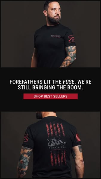
# Ad summary
This ad features the brand's apparel on two different images of a man wearing the shirt. The ad intends to convey American patriotism.
# Brand positioning
This brand is focused on patriotic American pride. The brand's tone is bold and somewhat rebellious, using imagery like snakes and crossed rifles on its clothing. This is aimed at an audience that feels strongly about American history and the values it represents.
# Product
The advertised product is a black t-shirt with red and gray graphics. The front of the shirt has the brand name (on-package label text). The right sleeve features two crossed rifles (on-package label text). The back of the shirt features red stripes like those on the American flag, and a snake with the phrase "JOIN OR DIE" (on-package label text).
# Visual style
The ad has a dark and serious tone, using high-quality studio shots of a rugged man in the brand's apparel. The layout is simple, featuring a basic product display ad format.
# Hooks
Headline: FOREFATHERS LIT THE FUSE. WE'RE STILL BRINGING THE BOOM.
# Benefits
- [object Object]
# Features
- [object Object]
- [object Object]
# Call to action
SHOP BEST SELLERS
# Point of view
- [object Object]
- [object Object]
- [object Object]
# Storyline
- The ad opens with a man wearing the product, establishing the brand's apparel. This grabs attention and showcases the product from a customer POV.
- Next, text appears in the middle of the ad. It implies that the brand is promoting American pride and is continuing the work of the Forefathers from the brand's POV.
- The ad concludes with another man wearing the apparel, showcasing the back of the shirt from a customer POV.
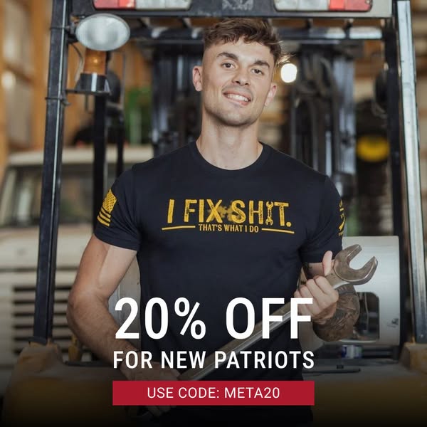
# Ad summary
Image ad promoting t-shirts with an offer of 20% off for new customers who use a specific discount code at purchase.
# Brand positioning
The brand is presented as catering to a patriotic, hard-working, and blue-collar demographic. It aligns with values of American pride, resilience, and a no-nonsense attitude, and targets individuals who are self-reliant and take pride in their ability to fix things themselves. The brand appears to push against the norms of corporate or office culture by associating with manual labor and self-sufficiency.
# Product
The product is a black short-sleeved t-shirt with a graphic print. The graphic features the phrase "I FIX SHIT." in gold font above the phrase "THAT'S WHAT I DO" also in gold font and located below the first phrase. The t-shirt is for people who take pride in being able to fix things and have a no-nonsense approach to problem-solving. The shirt is being advertised with a 20% discount for new customers with the use of a provided discount code, which addresses the purchase barrier of initial cost.
# Visual style
The ad has a gritty, industrial aesthetic with a focus on a strong, masculine figure. The production quality is high, with clear lighting and a shallow depth of field to emphasize the man and the t-shirt design. The color palette is dominated by black and gold, with a pop of red in the call to action button. The typography is large and bold to quickly convey the offer.
# Hooks
Headline: 20% OFF
# Benefits
- [object Object]
# Features
- [object Object]
# Call to action
USE CODE: META20
# Point of view
- [object Object]
- [object Object]
# Storyline
- The image immediately displays a man wearing the advertised t-shirt, confidently holding a large wrench, signaling self-reliance and a 'can-do' attitude to the audience. This intends to convey the brand's alignment with values of hard work and individual capability from the customer's POV.
- The offer text "20% OFF FOR NEW PATRIOTS" is positioned below the main image, presented from the brand's POV, intended to incentivize purchase for new customers.
- The brand shares the instruction to "USE CODE: META20" from the brand's POV, to give new customers a frictionless path to receiving the advertised discount.
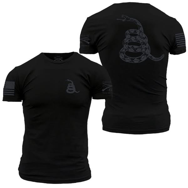
# Ad summary
Image featuring a black t-shirt with an American flag on the left sleeve and a coiled snake design with the words 'Don't Tread On Me' on the back. The ad targets individuals who value patriotism, freedom, and a strong, independent spirit.
# Brand positioning
This brand caters to individuals who identify with American patriotism, value freedom, and possess a strong, independent spirit. The brand aligns with a lifestyle that is rooted in traditional American values and self-reliance. The brand seems to position itself as a provider of apparel that reflects these values, appealing to those who want to express their beliefs through their clothing.
# Product
The featured product is a black t-shirt with a crew neck and short sleeves. On the left sleeve, there is an image of an American flag. On the back of the shirt is a coiled snake with the words "Don't Tread On Me." The design is shown in a matching dark-grey. On the front chest area, there is a smaller image of the coiled snake. The shirt is being advertised as a symbol of patriotism and freedom for those who want to express their beliefs through their clothing.
# Visual style
The visual style of the ad is clean and straightforward, with a focus on showcasing the product's design and patriotic symbolism. The image uses a neutral color palette and studio-style lighting to create a high-quality and professional look. The high-resolution image ensures that all details, such as the graphic and flag, are clearly visible, which helps to convey the brand's message effectively and appeal to the target audience.
# Hooks
Headline: None used
# Benefits
- [object Object]
- [object Object]
- [object Object]
# Features
- [object Object]
- [object Object]
- [object Object]
- [object Object]
# Call to action
None used.
# Point of view
- [object Object]
# Storyline
- The ad showcases a black t-shirt with patriotic imagery to immediately capture the attention of viewers who identify with American values and self-reliance. This is the brand's way of introducing the product and its core message.
- The image provides a detailed view of the shirt, highlighting its features, the prominent "Don't Tread On Me" graphic, and the American flag on the sleeve. This gives viewers a closer look at the product's design and quality.
- The ad aims to connect with the target audience by visually representing their values and beliefs, encouraging them to purchase the shirt as a way to express their identity and support the brand's message.
How Other Apparel Brands Advertise on Meta
Peer brands in Motion's library — click any brand to see their creative strategy, live ads, and AI breakdowns.