Buck Mason runs 95 active ads on Meta, shipping ~21 new creatives per week. Their library leans on Headline51%, Split Screen19%, and Cinematic B-Roll9%. Recently, buck mason is going all in on tee shirts as hero products, specifically pushing their Field-Spec line hard with repeated messaging around weight and density ("twice as dense," "twice as heavy") to position these as premium, substantial alternatives to standard tees. They're backing this up with fabric storytelling across multiple shirt categories (hemp blends, Supima cashmere, cotton slub, linen) and some lighter summer pieces like the Airlight Johnny Collar Polo, framing everything around craft, material quality, and that broken-in durability narrative. The through-line is elevating basics through technical fabric specs and manufacturing heritage, making everyday pieces feel considered and worth the investment.
# Ad summary
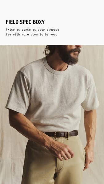
An advertisement for "FIELD SPEC BOXY" that focuses on the tee being twice as dense as your average tee with more room to be you.
# Brand positioning
The brand is positioned as providing higher-quality, denser t-shirts, as the ad states their tees are "twice as dense as your average tee.". The brand targets consumers who prioritize quality and comfort in their wardrobe basics. There is an emotional element of aligning with consumers who want room to be themselves.
# Product
The product is a men's t-shirt, called "FIELD SPEC BOXY". The primary selling point is that the shirt is twice as dense as the average tee, offering superior quality and durability. The shirt offers "more room to be you", implying a comfortable, relaxed fit and a brand that aligns with authenticity.
# Visual style
The ad features a minimalist aesthetic with natural lighting and a soft color palette. The overall tone is casual and authentic, which is emphasized by the model's relaxed posture and the simple background. The visual style suggests a focus on quality and comfort.
# Hooks
Headline: FIELD SPEC BOXY
# Benefits
- [object Object]
# Features
- [object Object]
# Call to action
None used.
# Point of view
- [object Object]
- [object Object]
# Storyline
- The ad begins by introducing the featured t-shirt and its name, "FIELD SPEC BOXY", aiming to grab attention and establish the product's identity. This is told from the brand's perspective to introduce its product line to the audience.
- The ad highlights the key feature of the t-shirt: being twice as dense as the average tee with more room to be you. This information is being conveyed from the brand to emphasize the superior quality and comfort. It is designed to create a sense of value for the customer.
- A full-body shot of the t-shirt being worn is shown to demonstrate fit and aesthetic, and give a use-case for the t-shirt. This is shown from an outside observer to showcase the product in action and provide a visual reference for the target audience.
# Ad summary
The ad showcases a variety of folded t-shirts on a wooden surface. The brand "FIELD-SPEC" is featured, and the t-shirts are described as being a "cult-classic tee cut from broken-in yet hard-wearing cotton."
# Brand positioning
FIELD-SPEC is positioned as a provider of classic, durable t-shirts. The brand values quality materials and construction, offering a timeless aesthetic with a focus on comfort and longevity. FIELD-SPEC appears to ignore fast fashion trends in favor of well-made, enduring garments.
# Product
The advertised product is a classic-cut t-shirt made from broken-in, hard-wearing cotton. It is presented in multiple colors and is designed to be both comfortable and durable. The shirts are folded neatly, highlighting their quality and attention to detail. The ad focuses on the timeless appeal and lasting construction of the t-shirt, making it a worthwhile investment for consumers seeking reliable everyday wear.
# Visual style
The ad has a clean, simple aesthetic with a focus on the product. The editing style is static with no transitions. The production quality is high, and the lighting is natural. The pacing is slow, with one cut per second.
# Benefits
- [object Object]
- [object Object]
- [object Object]
# Features
- [object Object]
- [object Object]
- [object Object]
# Call to action
None used.
# Point of view
- [object Object]
# Storyline
- 00:00–00:06 The ad showcases a variety of folded t-shirts on a wooden surface.
# Ad summary
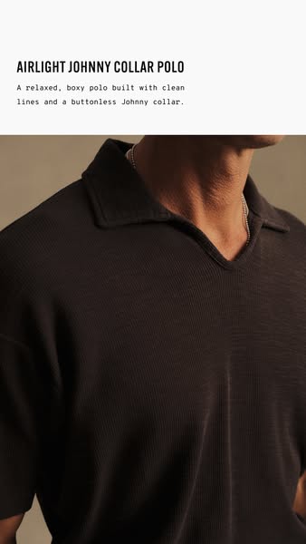
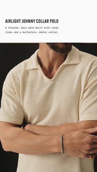
This ad showcases the Airlight Johnny Collar Polo shirt. The image focuses on the shirt's design and fit. The main message is that it's a relaxed, clean, and modern polo option.
# Brand positioning
Based on the ad, the brand presents itself as modern and focused on relaxed yet clean style. The brand aims to occupy a space in the consumer's mind that values comfort and simplicity, offering elevated basics with a focus on design details like the buttonless Johnny collar. It aligns with a lifestyle that values ease and style. It potentially pushes against traditional polo norms with its relaxed fit and buttonless design, opting for a more contemporary feel. The brand positioning is both functional (relaxed, clean lines) and emotional (modern style).
# Product
The featured product is the Airlight Johnny Collar Polo, described as a relaxed, boxy polo shirt. It is made with clean lines and a buttonless Johnny collar. The ad emphasizes its relaxed fit and modern design. The ad does not mention a specific target audience, but it could appeal to those looking for comfortable yet stylish clothing. The ad addresses the potential purchase barrier of traditional polo shirts by offering a modern and relaxed alternative.
# Visual style
The ad has a clean and modern aesthetic. The production quality is high, with professional studio lighting and a focus on texture. The image treatment includes subtle color grading to enhance the polo shirt's tone. The typography is integrated cleanly and legibly. The visual style is modern and aims for a minimalist aesthetic.
# Hooks
Headline: AIRLIGHT JOHNNY COLLAR POLO
# Benefits
- [object Object]
# Features
- [object Object]
- [object Object]
- [object Object]
# Call to action
None used.
# Point of view
- [object Object]
# Storyline
- The ad begins with a product name and description of the shirt. The brand is telling the audience about its Airlight Johnny Collar Polo shirt, highlighting its relaxed fit, clean lines, and unique buttonless Johnny collar to communicate the product's key features.
- The ad then shows the polo being worn by a person. The brand offers a visual representation of the shirt being worn in order to demonstrate how the product is worn and what it looks like when it is worn.
# Ad summary
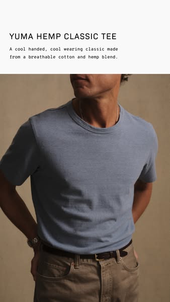
An ad displaying the Yuma Hemp Classic Tee, highlighting its comfortable and breathable material.
# Brand positioning
The brand is presented as a provider of classic, comfortable apparel with a focus on sustainability, as indicated by the use of hemp. The brand aims to position itself as an environmentally conscious choice that doesn't compromise on style or comfort. It promotes values of quality, comfort, and environmental responsibility, potentially pushing against fast fashion trends and brands that don't prioritize sustainable materials.
# Product
The product being advertised is the "YUMA HEMP CLASSIC TEE". It is described as "A cool handed, cool wearing classic made from a breathable cotton and hemp blend." The shirt is presented as a comfortable, stylish, and eco-friendly wardrobe staple. The use of cotton and hemp blend suggests a focus on breathability and comfort, making it suitable for everyday wear. The ad emphasizes the feel and wearability of the tee, highlighting that it is 'cool handed' and 'cool wearing', suggesting it is comfortable against the skin and keeps the wearer cool.
# Visual style
The ad has a clean and minimalist visual style, focusing on showcasing the product in a straightforward and appealing manner. The production quality appears to be professional, with well-lit studio shot and attention to detail. The image treatment includes soft lighting and natural color grading, creating a relaxed and inviting aesthetic. The typography is simple and legible, complementing the overall understated design. The style feels contemporary and accessible, aiming for a timeless appeal rather than a trendy or disruptive look. This promotes scannability by using a clear and uncluttered composition.
# Hooks
Headline: YUMA HEMP CLASSIC TEE
# Benefits
- [object Object]
# Features
- [object Object]
# Call to action
None used.
# Point of view
- [object Object]
- [object Object]
# Storyline
- The ad begins by showcasing the product name, "YUMA HEMP CLASSIC TEE". This immediately introduces the specific product being advertised and its branding. The intention is to inform the viewer of the product's name and category from the brand's perspective.
- Next, the ad highlights the key features and benefits of the shirt: "A cool handed, cool wearing classic made from a breathable cotton and hemp blend." This description aims to communicate the shirt's comfort, style, and material composition. This information is being provided from the brand's perspective, emphasizing the shirt's quality and desirability.
- The ad displays a person wearing the tee, allowing the viewer to see how it looks when worn. This provides a visual demonstration of the shirt's fit and style. The viewer is seeing the product from the perspective of a potential customer, imagining themselves wearing it.
# Ad summary
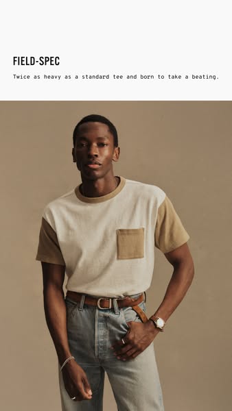
This ad showcases a brand of heavier t-shirts called FIELD-SPEC and implies its quality and durability.
# Brand positioning
The brand FIELD-SPEC is positioning itself as a provider of durable, high-quality t-shirts. By stating their shirts are twice as heavy as standard tees and built to take a beating, the brand is targeting consumers who value longevity and ruggedness in their clothing. The brand is pushing against the trend of fast fashion and promoting the opposite: slow fashion through increased quality and durability. The brand messaging is functional, focused on product performance and durability.
# Product
The ad promotes a two-tone, short-sleeved t-shirt with a chest pocket. The main body of the shirt is a cream or off-white color, while the sleeves and pocket are a complementary tan or beige. The shirt's key selling point is its durability, being "twice as heavy as a standard tee," suggesting a thicker, more robust fabric. This is for anyone looking for a durable t-shirt, that is "born to take a beating." The shirt's construction suggests a focus on quality and longevity, meant to withstand wear and tear, addressing the frustration of cheaply made, easily damaged clothing.
# Visual style
The ad has a clean and minimalist visual style. The production quality appears to be high, with a studio-shot image. The image is well-lit and features a model against a simple backdrop. The color palette is muted and natural, with earth tones dominating the visual. The typography is simple and legible, integrated into the design without being distracting. The overall aesthetic feels modern and understated, likely to appeal to an audience that appreciates quality and simplicity.
# Hooks
Headline: FIELD-SPEC
# Benefits
- [object Object]
# Features
- [object Object]
# Call to action
None used.
# Point of view
- [object Object]
# Storyline
- The ad opens with the brand introducing the FIELD-SPEC t-shirt and its key feature: being twice as heavy as a standard tee. This aims to immediately grab the viewer's attention by highlighting a unique selling point and establishing the product's quality, told from the brand's perspective to position itself as a provider of durable clothing.
- The ad then uses a visual of a model wearing the shirt to showcase its design and fit. This provides context for the product, allowing potential customers to imagine themselves wearing it, told from the brand's perspective to enhance the product's appeal and desirability.
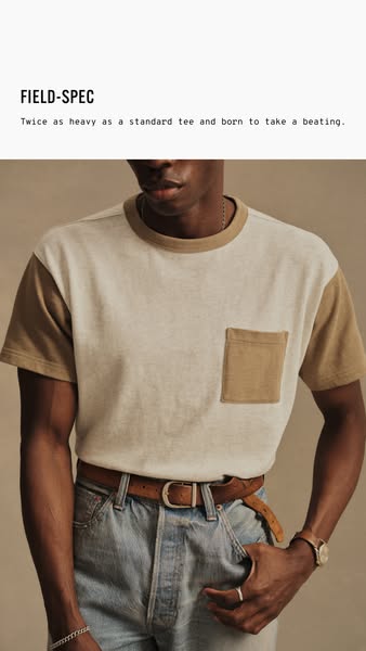
# Ad summary
This ad for a FIELD-SPEC t-shirt features a person wearing the product. The ad calls out the quality of the product by stating that it is twice as heavy as a standard t-shirt.
# Brand positioning
FIELD-SPEC is positioned as a brand that creates durable, high-quality clothing. The brand directly advertises this point by saying the featured t-shirt is 'twice as heavy as a standard tee and born to take a beating.' This positions the brand as prioritizing durability and resilience, appealing to customers who value long-lasting apparel.
# Product
The product featured is a FIELD-SPEC t-shirt, described as being 'twice as heavy as a standard tee and born to take a beating.' The t-shirt has a two-tone design with a lighter colored body and darker colored sleeves, neck, and pocket. The shirt appears to be made of a thick, durable material, emphasizing its high-quality construction. It is presented as a product for those who need clothing that can withstand wear and tear.
# Visual style
The ad has a clean, minimalist visual style. The lighting is soft and natural, highlighting the product's texture and details. The color palette is neutral, with a focus on earth tones, giving the ad a rugged and understated aesthetic.
# Hooks
Headline: FIELD-SPEC
# Benefits
- [object Object]
# Features
- [object Object]
# Call to action
None used.
# Point of view
- [object Object]
# Storyline
- The ad opens by introducing the FIELD-SPEC brand and its commitment to quality, establishing the product as durable and well-made from the brand's POV. This highlights the brand's value proposition, setting the stage for the product's key feature.
- The ad then highlights the key feature of the t-shirt, that it is twice as heavy as a standard tee, from the brand's POV. This description emphasizes the t-shirt's quality and durability, reinforcing the brand's positioning.
# Ad summary
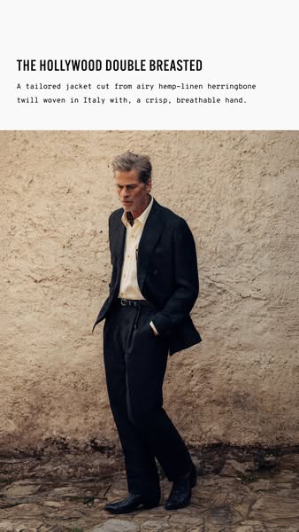
This image ad features a man modeling a Hollywood Double Breasted jacket.
# Brand positioning
The brand is subtly presented, focusing on high-quality materials and Italian craftsmanship. It suggests a sophisticated, tailored aesthetic without overt branding, positioning itself in the luxury or high-end menswear market. The emphasis on breathable materials and tailored cuts implies a blend of comfort and style, appealing to customers who value both.
# Product
The advertised product is "THE HOLLYWOOD DOUBLE BREASTED" jacket, described as a tailored jacket cut from airy hemp-linen herringbone twill woven in Italy, providing a crisp, breathable hand. It is presented as a garment that combines high-quality materials with tailored design. The garment appears to be a dark-colored, double-breasted jacket paired with matching dark-colored trousers. The jacket is worn over an unbuttoned light-colored button-down shirt. This implies it is suitable for both formal and casual settings.
# Visual style
The visual style is understated and sophisticated, with a focus on natural textures and muted tones. The high-quality image evokes a sense of timeless elegance and Italian craftsmanship. The layout is simple and clean, emphasizing the product without distractions.
# Hooks
Headline: THE HOLLYWOOD DOUBLE BREASTED
# Benefits
- [object Object]
# Features
- [object Object]
- [object Object]
- [object Object]
- [object Object]
# Call to action
None used.
# Point of view
- [object Object]
# Storyline
- The ad begins with an overhead text introducing the product by name and describing the high-quality material and construction of the jacket. This serves to immediately inform the audience about the product's features and origin from a brand perspective.
- The narrative transitions to a visual display of the jacket being worn by a man in an outdoor setting. This is from the viewer's perspective, showing the jacket in a real-world context to demonstrate its style and fit.
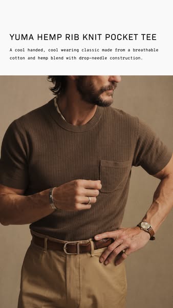
# Ad summary
This ad is for the Yuma Hemp Rib Knit Pocket Tee, showcasing its style and features.
# Brand positioning
The brand presents itself as a provider of classic, high-quality apparel made from breathable, natural materials. Positioning emphasizes comfort and style, aiming to appeal to consumers who appreciate timeless fashion crafted with care and attention to detail. The brand values a cool and comfortable wearing experience.
# Product
The advertised product is the Yuma Hemp Rib Knit Pocket Tee. It is a classic short sleeve shirt made from a breathable cotton and hemp blend. The shirt features a rib knit texture and a functional pocket. The tee is designed to be cool and comfortable for the wearer. It is constructed using a drop-needle technique.
# Visual style
The ad utilizes a clean, minimalist visual style with a focus on natural tones and textures. The production quality appears to be high, with attention to detail in lighting and composition. The image treatment is subtle, enhancing the product's color and texture without overwhelming the scene. The typography is integrated seamlessly, complementing the overall aesthetic. This ad feels native to a lifestyle brand with a clean design.
# Hooks
Headline: YUMA HEMP RIB KNIT POCKET TEE
# Benefits
- [object Object]
- [object Object]
# Features
- [object Object]
- [object Object]
# Call to action
None used.
# Point of view
- [object Object]
- [object Object]
# Storyline
- The ad introduces the Yuma Hemp Rib Knit Pocket Tee, setting the stage by highlighting its key features and construction. The brand is telling the story to emphasize the product's quality and design.
- The ad presents a visual of a man wearing the tee, showcasing its fit and style. This is intended to demonstrate the shirt's aesthetic appeal and how it looks when worn. The audience is experiencing it from a brand perspective.
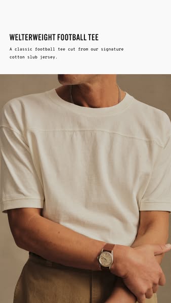
# Ad summary
A man models a "WELTERWEIGHT FOOTBALL TEE," described as "A classic football tee cut from our signature cotton slub jersey."
# Brand positioning
The brand is presented as a purveyor of high-quality, classic apparel staples, emphasizing the use of premium materials like "signature cotton slub jersey." By focusing on timeless designs such as a "classic football tee," the brand aims to occupy a space in the consumer's mind as a provider of enduring, well-crafted wardrobe essentials. The tone is understated and refined, aligning with a lifestyle that values simplicity, durability, and classic style over fleeting trends. The brand seems to ignore fast fashion and current trends in favor of a design that is more durable and more timeless.
# Product
The product is a "WELTERWEIGHT FOOTBALL TEE," a classic t-shirt design made from the brand's signature cotton slub jersey. This garment is explicitly defined as a modern version of a traditional football tee. It is intended for anyone who appreciates classic designs, quality materials, and understated style. The key selling point appears to be the combination of a timeless design with the comfort and feel of the brand's signature cotton slub jersey, which is described in the title as welterweight, which may imply that the shirt is light and comfortable, but still durable.
# Visual style
The ad has a clean and minimalist visual style, focusing on the product and its details. The color palette is muted and neutral, with soft lighting that gives the image a warm and inviting feel. The composition is simple and straightforward, with the product taking center stage and minimal distractions. The image has a high-quality, studio-shot look, with attention paid to details such as texture and fabric.
# Hooks
Headline: WELTERWEIGHT FOOTBALL TEE
# Benefits
- [object Object]
- [object Object]
# Features
- [object Object]
# Call to action
None used.
# Point of view
- [object Object]
# Storyline
- The ad opens with a product title and short description of the "WELTERWEIGHT FOOTBALL TEE", introducing the garment to the audience and highlighting its key features and materials. This sets the stage for what the advertisement is about. The brand is speaking directly to the audience.
- The product is shown being worn. This gives the audience an idea of how it fits and looks when worn. The customer is experiencing the product in its intended use case.
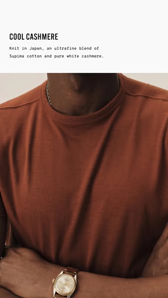
# Ad summary
This ad showcases the brand's commitment to luxury and comfort through its Supima cotton and cashmere blend shirt. It targets consumers who appreciate high-quality materials and sophisticated simplicity, emphasizing the refined design and craftsmanship that go into creating a premium garment.
# Brand positioning
This brand positions itself in the luxury apparel market by focusing on high-quality materials and minimalist design. It promotes values of comfort, sophistication, and understated elegance, aligning with a lifestyle that appreciates refined simplicity. The brand ignores fast-fashion trends, instead emphasizing timeless craftsmanship and luxurious materials. The brand positioning is both functional, highlighting the superior blend of Supima cotton and cashmere, and emotional, appealing to customers seeking a sense of comfort and effortless style.
# Product
The featured product is a premium t-shirt made from an ultrafine blend of Supima cotton and pure white cashmere. This combination results in a soft, luxurious feel and enhanced comfort. The shirt is designed for individuals who appreciate high-quality materials and a minimalist aesthetic in their wardrobe. The advertised features include the origin of the knit in Japan and the specific blend of fabrics used to create a soft and comfortable garment. It emphasizes the blend of cotton and cashmere for softness. This is a shirt for elevated everyday wear.
# Visual style
The ad features a minimalist, studio-shot aesthetic. The image is well-lit and professionally photographed, emphasizing the texture and quality of the fabric. There is a soft color grading used. The typography is clean and legible, integrated seamlessly into the overall design. The style conveys a sense of understated luxury and sophistication.
# Hooks
Headline: COOL CASHMERE
# Benefits
- [object Object]
- [object Object]
# Features
- [object Object]
- [object Object]
# Call to action
None used.
# Point of view
- [object Object]
# Storyline
- The ad opens with the brand introducing its 'COOL CASHMERE' t-shirt, setting the stage for a premium offering. The intention is to immediately capture attention and convey the luxury of the product. The brand is speaking directly to the viewer, establishing the ad's central theme.
- The ad specifies the shirt's key features, highlighting that it is 'Knit in Japan, an ultrafine blend of Supima cotton and pure white cashmere.' The goal is to emphasize the shirt's high-quality materials and craftsmanship. The brand is explaining the unique attributes of the product to build desire.
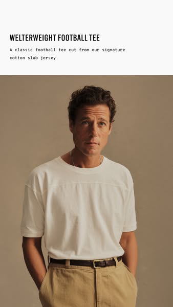
# Ad summary
This ad showcases a Welterweight Football Tee cut from signature cotton slub jersey. The ad features a male model wearing the t-shirt with a neutral backdrop.
# Brand positioning
The brand presents itself as a provider of classic, quality apparel made from signature cotton slub jersey. The emphasis is on timeless design and premium materials. The brand seems to target a customer who values quality and simplicity over trends, favoring a classic and understated style. This positions the brand as offering elevated basics with a focus on material quality and enduring design.
# Product
The advertised product is a Welterweight Football Tee, a classic football tee cut from the brand's signature cotton slub jersey. The t-shirt is presented as a high-quality basic, emphasizing the material's superior feel and construction. The tee is white, worn by a male model with tan pants and a brown belt. The product aims to appeal to customers seeking a durable, classic, and comfortable t-shirt option.
# Visual style
The ad has a minimalist and classic visual style. The production quality looks to be studio-shot with soft, diffused lighting. There is no background removal and the typography is simple and legible. The ad has a clean and elevated look, focusing on the quality of the product and model.
# Hooks
Headline: WELTERWEIGHT FOOTBALL TEE
# Benefits
- [object Object]
- [object Object]
# Features
- [object Object]
- [object Object]
# Call to action
None used.
# Point of view
- [object Object]
# Storyline
- The ad opens with a shot of the product name, Welterweight Football Tee, and a brief description of the product which is made from signature cotton slub jersey. The brand is telling the audience what they are advertising and what the specific material is for the tee shirt.
- Then, the ad transitions into an image of a model wearing the tee-shirt, shown from the chest up. The model is shot on a beige background to contrast with the white t-shirt. The brand is showing the customer what the t-shirt looks like on a person.
# Ad summary
This ad showcases the ToughKnit crew neck tubular t-shirts. The ad features a simple product shot of the t-shirts in white and black.
# Brand positioning
ToughKnit is presented as a brand focused on producing durable, high-quality crew neck t-shirts. The brand emphasizes its commitment to using American cotton and manufacturing its products in the USA, specifically at the Buck Mason Knitting Mills in Mohton, Pennsylvania. The brand positions itself as a provider of t-shirts that are 'Tougher Than the Rest,' suggesting a focus on longevity and resilience. This positioning appeals to consumers who value quality, durability, and American-made products, indicating a brand that stands for traditional values and reliable performance.
# Product
The featured product is the ToughKnit crew neck tubular t-shirt, available in both white and black. These t-shirts are made from 5 oz of American cotton and are constructed using 24 singles ring-spun cotton, ensuring a high-quality, durable fabric. The t-shirts are manufactured in the USA at the Buck Mason Knitting Mills in Mohton, Pennsylvania. Each pack contains two t-shirts. The primary selling point is their durability, as highlighted by the slogan 'Tougher Than the Rest.' This suggests that the t-shirts are designed to withstand regular wear and tear, making them a reliable choice for everyday use. The ad aims to convince viewers that these t-shirts are worth buying due to their superior quality and long-lasting construction.
# Visual style
The ad has a clean and simple aesthetic with static shots and smooth transitions. The production quality is polished, giving it a commercial feel. The pacing is slow and consistent, with each shot held for about one second. The cuts are timed to coincide with subtle shifts in the background music.
# Benefits
- [object Object]
# Features
- [object Object]
- [object Object]
- [object Object]
- [object Object]
# Call to action
None used.
# Point of view
- [object Object]
# Storyline
- 00:00–00:01 The ad opens with a shot of a package of white ToughKnit t-shirts.
- 00:01–00:02 The scene transitions to a single white ToughKnit t-shirt laid flat.
- 00:02–00:03 The ad then shows a package of black ToughKnit t-shirts.
- 00:03–00:04 The scene transitions to a single black ToughKnit t-shirt laid flat.
- 00:04–00:05 The ad returns to the package of white ToughKnit t-shirts.
- 00:05–00:06 The scene transitions back to the single white ToughKnit t-shirt laid flat.
- 00:06–00:07 The ad then shows the package of black ToughKnit t-shirts again.
- 00:07–00:08 The scene transitions back to the single black ToughKnit t-shirt laid flat, ending the ad.
# Ad summary
This ad tells the story of Buck Mason's Toughknit t-shirt, highlighting its heritage and manufacturing process.
# Brand positioning
Buck Mason is presented as a brand deeply rooted in American heritage, emphasizing quality craftsmanship and timeless style. The ad positions the brand as a provider of essential wardrobe pieces, particularly the t-shirt, that are made to last and endure through time. Buck Mason aligns with a lifestyle that values simplicity, durability, and a connection to the past. By showcasing the manufacturing process and the brand's knitting mills, the ad promotes a functional brand positioning rooted in tradition, contrasting against fast fashion and disposable trends.
# Product
The featured product is Buck Mason's Toughknit crew neck tubular t-shirt. The ad emphasizes that these t-shirts are made in the U.S. with a focus on quality and durability, described as “Tougher Than the Rest.” The t-shirts are presented as an essential piece of our wardrobe and our culture, suitable for various occasions and lifestyles. The ad showcases the manufacturing process, highlighting the knitting mills and the skilled workers who craft the t-shirts.
# Visual style
The ad has a vintage aesthetic, blending archival footage with modern shots of the manufacturing process. The editing rhythm is slow and deliberate, creating a sense of nostalgia and timelessness. The production quality is a hybrid of polished commercial and documentary feel, lending authenticity to the brand's story. Cuts are timed to the music beats and voiceover lines, enhancing the audio-visual sync.
# Benefits
- [object Object]
# Features
- [object Object]
- [object Object]
# Call to action
None used.
# Point of view
- [object Object]
# Storyline
- 00:00–00:01 The ad opens by highlighting the t-shirt as a wardrobe staple, connecting it to historical and cultural roots, setting the stage for showcasing the product's significance.
- 00:01–00:04 00:01–00:04 Images transition to vintage photographs and factory settings, creating a visual link to the brand's heritage and manufacturing process.
- 00:04–00:09 The ad transitions from images of boulevards to images of the manufacturing process as the narrator is telling us about the t-shirt, reinforcing the American heritage and the quality.
- 00:09–00:12 00:09-00:12 A shot of the packaging is shown, the narrator is highlighting the garment is “an essential piece of our wardrobe” solidifying the idea of quality that is built to last.
- 00:12–00:21 00:12–00:21 A montage of images appear that depict people engaging in different activities while wearing t-shirts. This is being shown to represent the importance of the t-shirt in “our culture”.
- 00:21–00:25 00:21–00:25 The ad transitions to the manufacturing process as the narrator says, “We’ll make them like they used to…”. It then pans to someone in a vest that has the words “Buck Mason Factory” printed on it. It then transitions to a man who looks directly at the camera and smiles, solidifying the trust and quality of the product.
- 00:25–00:31 00:25-00:31 As the narrator is saying “we do” in reference to making the products like they used to, an image of a worker with an industrial sewing machine is shown before the final images appear with the company slogan.
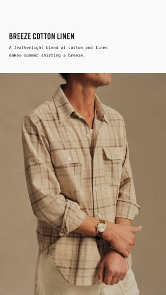
# Ad summary
An image ad promoting a Breeze Cotton Linen shirt featuring a blend of cotton and linen designed for summer shirting.
# Brand positioning
The brand is positioned as offering high-quality, breathable apparel ideal for warm weather. They use natural fibers like cotton and linen to provide comfort and style, suggesting a focus on classic designs with a modern approach to comfort. The brand appeals to consumers who value both quality and comfort, seeking out durable, breathable clothing.
# Product
The product featured is a Breeze Cotton Linen shirt, made from a featherlight blend of cotton and linen, explicitly designed for summer wear. The shirt is a light-tan color with a brown plaid pattern. It has long sleeves, a button-up front, and two breast pockets with button closures. The shirt promotes comfort and breathability, addressing the purchase barrier of discomfort in hot weather by offering a solution that is light and airy.
# Visual style
The ad features a clean and simple visual style with a focus on showcasing the product. The lighting is soft and natural, providing a casual and approachable feel. The color palette is neutral and earthy, reflecting the natural materials of the shirt. The overall effect is designed to highlight the shirt's comfort and style in a subtle and appealing manner.
# Hooks
Headline: BREEZE COTTON LINEN
# Benefits
- [object Object]
# Features
- [object Object]
# Call to action
None used.
# Point of view
- [object Object]
- [object Object]
# Storyline
- The ad begins by highlighting the product name "BREEZE COTTON LINEN" and emphasizing its suitability for summer shirting through the statement, "A featherlight blend of cotton and linen makes summer shirting a breeze." This message is presented from the brand's perspective, setting the stage by introducing the core features and benefits of the shirt.
- The storyline then transitions to a visual representation of the product. The photo showcases a person wearing the shirt, which allows the audience to see its style, fit, and overall aesthetic. This offers a customer’s perspective on the shirt, demonstrating its wearability and visual appeal in real-world use.
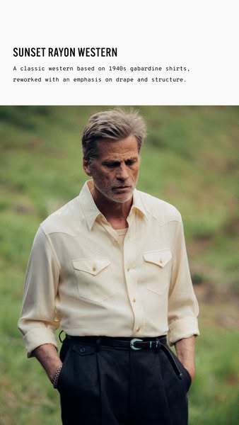
# Ad summary
The ad features a man wearing a Sunset Rayon Western shirt, emphasizing the shirt's drape and structure. The ad appeals to those interested in classic western wear with a modern emphasis on fit and style.
# Brand positioning
The brand positions itself as a modern interpreter of classic western wear, specifically referencing 1940s gabardine shirts. It appeals to consumers who value both historical authenticity and contemporary style. The brand emphasizes the 'drape and structure' of its garments, suggesting a focus on both the way the clothing hangs on the body and its underlying construction. This suggests a premium positioning, where attention to detail and quality are paramount. The brand aims to bridge the gap between vintage aesthetics and modern sensibilities, offering a sophisticated take on rugged western style.
# Product
The product featured is the 'Sunset Rayon Western' shirt, described as a classic western shirt based on 1940s gabardine shirts. The ad emphasizes that the shirt has been reworked with an emphasis on drape and structure. This suggests the shirt is made of rayon fabric, known for its fluid drape, and that the design and construction of the shirt have been carefully considered to enhance its fit and form. The color of the shirt is not explicitly stated, but it appears to be a light cream or off-white color, with long sleeves and western style pockets on the chest. The shirt seems geared towards men who appreciate classic western style with a modern touch.
# Visual style
The ad has a refined and classic visual style. The production quality appears to be high, with attention to detail in the lighting and composition. The image treatment has a slightly desaturated or muted color palette, giving it a vintage or timeless feel. The typography is clean and legible, and the overall layout is simple and uncluttered, putting the focus on the product. The visual style evokes a sense of understated elegance and authenticity.
# Hooks
Headline: SUNSET RAYON WESTERN
# Benefits
- [object Object]
- [object Object]
# Features
- [object Object]
- [object Object]
# Call to action
None used.
# Point of view
- [object Object]
# Storyline
- The ad opens with text introducing the 'SUNSET RAYON WESTERN' shirt and describes it as a classic western shirt based on 1940s gabardine shirts, reworked with an emphasis on drape and structure. This is the brand communicating the product's identity and key features to immediately set the context for what is being shown in the image and clarify its appeal.
- The camera focuses on a man wearing the shirt, showcasing how it looks when worn. This is the brand illustrating the product in use, allowing the audience to visualize the shirt's fit, drape, and style, reinforcing the earlier text description.
# Ad summary
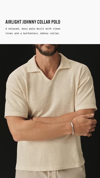
This image ad showcases a brand’s 'Airlight Johnny Collar Polo,' emphasizing its relaxed fit and clean, buttonless design.
# Brand positioning
The brand presents itself as offering elevated basics, focusing on comfort and minimalist design. They align with a lifestyle that values relaxed sophistication and understated style, eschewing traditional button-down shirts in favor of modern, clean lines. The brand prioritizes both functional comfort and emotional appeal by presenting classic pieces in a fresh and updated way.
# Product
The 'Airlight Johnny Collar Polo' is a relaxed, boxy-fit polo shirt. It is described as having clean lines and a buttonless Johnny collar. The shirt is made of a textured, off-white fabric that suggests lightweight and breathable material. It is designed for casual wear, emphasizing comfort and a modern style.
# Visual style
The ad has a minimalist and clean visual aesthetic. Production quality is high, with a studio-shot image focusing on detail and texture. The image treatment includes soft lighting and neutral tones, emphasizing the shirt's material and design. The typography is simple and legible, integrated to highlight the product's features. The style is meant to feel modern and sophisticated, aimed at capturing attention with its understated elegance.
# Hooks
Headline: AIRLIGHT JOHNNY COLLAR POLO
# Benefits
- [object Object]
- [object Object]
- [object Object]
# Features
- [object Object]
- [object Object]
- [object Object]
- [object Object]
# Call to action
None used.
# Point of view
- [object Object]
- [object Object]
# Storyline
- The ad opens by highlighting the brand's 'Airlight Johnny Collar Polo' as a new product. This is intended to immediately capture attention and introduce the key item, told from the brand's perspective to inform the audience of the shirt's existence and name, while establishing initial interest in a relaxed fit and design aesthetic.
- The ad continues by describing the product as 'A relaxed, boxy polo built with clean lines and a buttonless Johnny collar.' The purpose of this is to provide further detail on the shirt's design and features, offering a clear understanding of what makes it unique. This is told from the brand's perspective to highlight key selling points, such as its modern, minimalist design.
- The ad concludes with a visual representation of a person wearing the polo shirt. The image is designed to demonstrate how the polo looks when worn, providing a real-life perspective to enhance the appeal of the product. This is told from the customer's perspective, allowing viewers to see the garment's fit and style in action.
# Ad summary
This image promotes the Airlight Johnny Collar Polo. The polo is described as relaxed and boxy with clean lines and a buttonless Johnny collar. A bearded man is wearing the polo.
# Brand positioning
This brand is likely positioned as a retailer of higher-end, minimalist menswear. The polo shirt featured has a looser, relaxed fit, and the brand uses the description of “clean lines” to demonstrate an emphasis on simplicity and understated style. The brand appears to be ignoring traditional polo shirt construction by removing the buttons, which is a category norm.
# Product
The product is the Airlight Johnny Collar Polo. It's described as a relaxed, boxy polo built with clean lines and a buttonless Johnny collar. The product is for someone interested in a clean look and comfortable fit.
# Visual style
The ad has a minimalist visual style. It uses a neutral color palette and simple composition. The production quality is high, with clean lighting and sharp focus. The typography is clean and legible. The ad appears to be designed for an in-feed placement.
# Hooks
Headline: AIRLIGHT JOHNNY COLLAR POLO
# Benefits
- [object Object]
# Features
- [object Object]
- [object Object]
- [object Object]
- [object Object]
# Call to action
None used.
# Point of view
- [object Object]
# Storyline
- The ad begins by showcasing the Airlight Johnny Collar Polo and touting its features. This is intended to immediately inform the audience of the product being advertised and its key selling points, from the brand's perspective.
# Ad summary
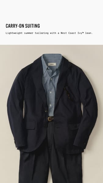
This ad showcases a lightweight summer suit, referred to as 'carry-on suiting', with a 'West Coast Ivy' lean. The ad features a suit, including a jacket, shirt, trousers, and belt.
# Brand positioning
The brand is positioned as offering lightweight summer tailoring that embodies a 'West Coast Ivy™' style. This suggests a blend of traditional Ivy League aesthetics with a relaxed, West Coast vibe, appealing to customers who value both classic style and modern comfort. The brand targets those seeking sophisticated yet easy-to-wear suiting options for warmer weather, differentiating itself by combining tailored elegance with lightweight materials and a contemporary design sensibility.
# Product
The product featured is a lightweight summer suit, referred to as 'carry-on suiting,' designed with a 'West Coast Ivy™' lean. It includes a navy blue suit jacket with two front pockets, a light blue button-down shirt, dark-colored trousers, and a brown leather belt with a metal buckle. The suit emphasizes lightweight tailoring, suggesting it is suitable for warmer weather and travel. The combination of classic suiting elements with lightweight materials aims to offer a comfortable and stylish option for various occasions, addressing the need for versatile and travel-friendly formal wear.
# Visual style
The ad presents a clean and classic aesthetic with high production quality. The lighting is soft and diffused, highlighting the texture and color of the suit without harsh shadows. The focus is sharp, emphasizing the details of the tailoring and fabric. The overall style is sophisticated and minimalist, aligning with the brand's positioning of understated elegance.
# Hooks
Headline: CARRY-ON SUITING
# Benefits
- [object Object]
- [object Object]
- [object Object]
# Features
- [object Object]
- [object Object]
# Call to action
None used.
# Point of view
- [object Object]
# Storyline
- The ad opens by showcasing the suit and its components, including the navy jacket, light blue shirt, dark trousers, and brown belt. This serves to highlight the individual elements of the ensemble and introduce the product from a brand perspective.
- The storyline highlights the suit's key attributes: its lightweight construction and 'West Coast Ivy™' style. This conveys the brand's intention to position the product as ideal for summer and as an interpretation of a classic style from the brand perspective.
- The image focuses on the suit as a whole, portraying a complete and coordinated outfit. This allows the audience to view the ensemble as a unified presentation of style from the brand's perspective.
# Ad summary
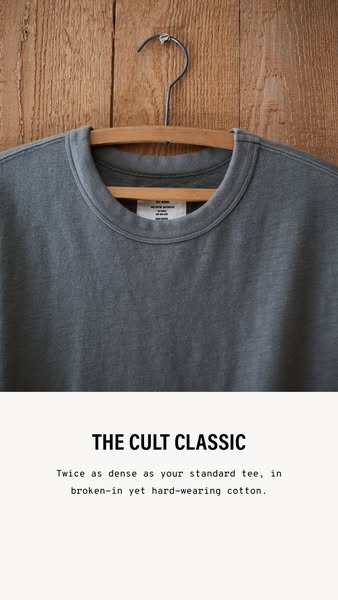
This ad features a close-up of a gray t-shirt on a hanger with text that reads, 'The Cult Classic. Twice as dense as your standard tee, in broken-in yet hard-wearing cotton.'
# Brand positioning
This brand is presented as a provider of high-quality, durable basics, specifically focusing on a t-shirt. The brand aims to occupy a space in the consumer's mind as a reliable source for classic, well-made wardrobe staples that stand the test of time. The brand aligns with values of durability, quality, and a classic aesthetic. It promotes a lifestyle of practicality and simplicity, focusing on the longevity and robustness of its clothing. By highlighting the density and hard-wearing nature of its cotton, the brand pushes against the trend of fast fashion and disposable clothing, emphasizing functional benefits like durability and longevity. The brand is positioned as providing products that are not only comfortable but also resilient, making it a practical choice for consumers seeking long-lasting garments.
# Product
The product featured is a gray t-shirt made from hard-wearing cotton. It is presented as 'Twice as dense as your standard tee,' highlighting its superior quality and durability. The t-shirt is described as being in 'broken-in' condition, suggesting immediate comfort and a worn-in feel. The product is for individuals seeking a durable and long-lasting wardrobe staple that combines comfort with resilience. The advertised features emphasize the t-shirt's unique selling points, such as its density and high-quality material. The ad addresses the purchase barrier of concerns about the longevity and quality of typical t-shirts by focusing on the product's robust construction and durable fabric.
# Visual style
The ad has a rustic and minimalist visual aesthetic. The production quality appears to be high, with a studio-shot image focusing on the product. The visual motif is clean and simple, with a focus on natural materials and textures. The image treatment includes soft lighting and a neutral color palette. The typography is integrated in a clean and legible font, complementing the overall understated design. This style conveys a sense of authenticity and quality, aiming to capture attention with its simplicity and subtle elegance.
# Hooks
Headline: THE CULT CLASSIC
# Benefits
- [object Object]
- [object Object]
# Features
- [object Object]
- [object Object]
- [object Object]
# Call to action
None used.
# Point of view
- [object Object]
# Storyline
- The ad begins by showcasing a gray t-shirt hanging on a wooden background. This is included to visually introduce the product and set a tone of rustic simplicity from the brand's perspective.
- Next, the ad highlights the key benefit of the product with the text 'Twice as dense as your standard tee, in broken-in yet hard-wearing cotton.' This is included to immediately communicate the superior quality and durability of the t-shirt from the brand's perspective.
# Ad summary
This ad showcases the cozy atmosphere and attention to detail at 'Fast Times,' blending the aesthetic of a bookstore with that of a coffee shop.
# Brand positioning
Fast Times is presented as a fusion between a bookstore and a coffee shop. The brand distinguishes itself by creating a cozy and intellectual environment where customers can enjoy handcrafted coffee while surrounded by curated literature and design. This brand aims to occupy a unique space in the consumer's mind by blending the warmth of a local bookstore with the sophistication of a specialty coffee shop. Fast Times appeals to those who appreciate both the comfort of a neighborhood bookstore and the quality of expertly crafted coffee.
# Product
The featured product is specialty coffee, highlighted through the meticulous preparation process. The product is for people who appreciate handcrafted beverages in a sophisticated yet comforting environment. Details include the use of an espresso machine to brew espresso, milk steaming and latte art creation, which emphasizes the care and skill involved in preparing each cup. The USPs are the quality of the coffee and the artisanal presentation, seen with the latte art. Moments of use are shown through the coffee preparation and finished cup. The ad showcases the careful construction of each coffee beverage, promising a premium and thoughtfully made product.
# Visual style
The ad has a polished and modern aesthetic, blending the charm of a local bookstore with the sophistication of a specialty coffee shop. The editing style uses smooth transitions and static shots, creating a calm and inviting viewing experience. The production quality is high, aiming for a commercial feel with attention to detail in lighting and composition. The pacing is moderate, with cuts timed to the music, giving the ad a rhythmic and engaging feel.
# Benefits
- [object Object]
- [object Object]
# Features
- [object Object]
- [object Object]
- [object Object]
# Call to action
None used.
# Point of view
- [object Object]
# Storyline
- 00:00–00:02 The camera peeks through the slats of a shelf, offering a fragmented view of a person standing behind a counter. This secretive framing creates a sense of curiosity and anticipation, drawing the viewer into the scene. The low angle and obstructed view enhance the intimate, behind-the-scenes feel.
- 00:02–00:05 00:02–00:05: The camera pans out to reveal a bustling coffee shop where two individuals are preparing coffee behind a counter. A neat stack of books sits in the foreground, blending the ambiance of a cafe with a library. This setup emphasizes the dual nature of the space—both a place for coffee and a place for books.
- 00:05–00:07 00:05–00:07: A close-up of bookshelves filled with a variety of books, including titles like "Raygun" and a book featuring Frida Kahlo. The shot highlights the literary and artistic influences present in the space, suggesting a sophisticated and creative atmosphere.
- 00:07–00:09 00:07–00:09: The process of brewing espresso into a white ceramic cup is shown, complete with the visual effect of vapor or steam. This shot focuses on the quality and care taken in crafting the coffee, emphasizing the attention to detail in the preparation.
- 00:09–00:14 00:09–00:14: The act of pouring steamed milk into the espresso is depicted, showcasing the creation of latte art. This highlights the artistry and skill of the barista, reinforcing the cafe's dedication to quality and presentation.
- 00:14–00:17 00:14–00:17: Four checker-patterned cups are seen stacked neatly on a windowsill, followed by a view of the cafe's exterior. These visuals emphasize the welcoming environment of the cafe and its integration into the neighborhood.
- 00:17–00:22 00:17–00:22: More close-ups of the café show an array of clean, stacked white ceramic cups on a tray and a table filled with books. These shots emphasize the dual atmosphere of cleanliness and intellectual stimulation.
- 00:22–00:26 00:22–00:26: A medium shot of the barista preparing a coffee with the ending showing a coffee with the art of hearts. The final close-up of the coffee focuses on the barista's attention to detail when preparing the beverage.
- 00:26–00:33 00:26–00:33: Bookshelves filled with books are displayed, and the camera highlights the book cover, "Last Day in Lagos."
- 00:33–00:35 00:33–00:35: Two women are standing outside the cafe and chatting, suggesting a vibrant social scene.
- 00:36–00:41 00:36–00:41: The words "FAST TIMES" appear on a black screen to end the ad. This clearly presents the brand's name.
How Other Apparel Brands Advertise on Meta
Peer brands in Motion's library — click any brand to see their creative strategy, live ads, and AI breakdowns.