# Ad summary
A diverse group of women stand in front of a white background and share how the brand's wireless bra is now available in a wider size range.
# Brand positioning
The brand seems to be positioned as inclusive and body-positive, offering a full-bust wireless bra and briefs in a wide range of sizes from extra small to 4XL. The brand caters to a variety of body types and appears to value customer feedback.
# Product
The ad features a full-bust wireless bra and high-cut full briefs. The bra is designed for support and comfort without the need for wires. The full briefs provide full coverage and are available in sizes XS to 4XL, catering to a diverse range of body types. The brand aims to address fit issues and ensure that more women can find comfortable and well-fitting lingerie.
# Visual style
The ad features a clean, minimalistic aesthetic with a white background. The editing is simple, focusing on clear product presentation. The overall feel is straightforward and informative, aiming for authenticity and inclusivity.
# Benefits
- [object Object]
- [object Object]
- [object Object]
# Features
- [object Object]
- [object Object]
- [object Object]
# Call to action
None used.
# Point of view
- [object Object]
- [object Object]
# Storyline
- 00:00–00:02 Three women stand against a white background, each holding a microphone, and announce new size offerings for their products.
- 00:02–00:06 A woman in a black jumpsuit rolls a mannequin toward the center of the screen, showcasing the new bra and brief on a plus-sized figure.
How Boody Advertises on Meta
Refreshed 6 weeks ago · Weekly refresh cadence
Boody runs 2K active ads on Meta, shipping ~120 new creatives per week. Their library leans on Headline14%, Split Screen11%, and Offer-First Banner10%. Recently, boody is pushing a complete bra wardrobe solution with hyper-targeted messaging around fit inclusivity, leading with their redesigned wireless bra across specific bust sizes (smaller bust bralettes, full bust support in DD+, and expanded size ranges). The framing is all about solving real pain points,no wires, no scratching, no marks, seamless comfort,with testimonial-style creative and close-up product shots that prove the fit and feel claims. There's a clear through-line of "we finally made bras that work for your actual body" paired with sustainable materials messaging, plus secondary pushes on versatile basics like briefs, loungewear, and that FreeMesh collection.
Indexed by Motion's Inspo Library.
The 20 Most Recent Boody Ads on Meta
# Ad summary
This ad for Boody Eco Wear features a woman modeling the brand's seamless bra. It emphasizes comfort and quality, highlighting that it is wireless, seamless, and sold out previously due to popularity. The ad uses simple visuals and text overlays to communicate the bra's features and availability.
# Brand positioning
Boody Eco Wear is presented as a brand focused on comfort and quality, offering essential items designed for everyday wear. The brand positions itself as a provider of seamless, wireless bras, which suggests a focus on simplicity and ease of wear. The brand promotes values centered around comfort and minimalism, aligning with a lifestyle that prioritizes uncomplicated, high-quality basics. The positioning is both functional (seamless and wire-free) and emotional (comfort and drama-free), indicating an appeal to customers seeking practical and comfortable clothing options.
# Product
The featured product is a seamless, wire-free bra designed for everyday comfort. The bra is available in white, beige, and black. Key features highlighted include its lack of wires and seams, which are emphasized to provide a 'no drama' wearing experience. The bra is described as so comfortable that you'll want to 'live in it,' implying it is suitable for all-day wear. The ad addresses potential purchase barriers by emphasizing the bra's comfort and seamless design, suggesting it avoids the common discomforts associated with traditional bras. The ad also notes 'You loved it. It sold out,' implying high demand and past success, building trust and enticing viewers to try it.
# Visual style
The ad has a clean, minimalist aesthetic with a focus on showcasing the product clearly. The production quality appears polished, with bright, even lighting and a simple background. The editing style features static shots. The pacing is slow and steady.
# Benefits
- [object Object]
# Features
- [object Object]
- [object Object]
# Call to action
None used.
# Point of view
- [object Object]
# Storyline
- 00:00–00:07 A woman models a dark green Boody bra while on-screen text states the brand's key selling points.
# Ad summary
This ad showcases the brand's briefs that they claim customers love and are designed for maximum comfort. The ad shows the briefs on a model, zooming in to show how it lays on the body without leaving marks. It mentions that the briefs are available in multiple colors and made without plastic.
# Brand positioning
The brand aims to occupy the space in the consumer's mind as a comfortable and sustainable underwear brand. The values are centered around comfort, simplicity, and eco-consciousness. The brand is positioning itself against traditional underwear brands that may use plastic or cause discomfort. The brand positioning is both functional (comfort and sustainability) and emotional (feeling good in your underwear).
# Product
The featured product is a pair of briefs designed for everyday wear. The ad emphasizes that they are 'the briefs you'll live in,' suggesting maximum comfort and wearability. The briefs are presented as being made without plastic, and designed to leave no marks on the skin. The ad shows that the briefs are available in multiple colors. It is implied that the briefs are worth trying because of their comfort, sustainable materials, and mark-free design. The briefs are being presented as a product that is simple, comfortable, and sustainable.
# Visual style
The ad has a clean and minimalist aesthetic. The production quality is polished, with soft natural lighting and simple backgrounds. The editing style is simple, with static shots and smooth transitions.
# Benefits
- [object Object]
# Features
- [object Object]
- [object Object]
- [object Object]
# Call to action
None used.
# Point of view
- [object Object]
# Storyline
- 00:00–00:05 The ad opens with a model wearing the brand's bra and briefs, with text overlay highlighting its popularity and comfort.
- 00:05–00:08 The model is shown adjusting the briefs to demonstrate how it lays on her skin without leaving any marks.
- 00:08–00:11 The ad ends with a zoom in to the product laying on the bed to reinforce the feel of the fabric and construction.
# Ad summary
An image ad showcasing Boody's 'Iconic Bra, Redesigned To Support', featuring four close-up shots of the bra in different sizes (AA-B, B-DD, DD-F cups), emphasizing the updated design and inclusive sizing.
# Brand positioning
Boody is presented as a brand that prioritizes comfort and support in its designs, specifically with its bras. The brand is positioned as having an 'iconic' bra, suggesting a pre-existing reputation for quality and design. The message focuses on a commitment to providing comfort and support, which are key functional benefits for undergarments. Boody seems to ignore the general market of other brands that focus less on comfort and more on appearance.
# Product
The product featured is Boody's 'Iconic Bra,' which has been redesigned to provide support. The ad showcases the bra in multiple sizes, AA-B cups, B-DD cups, and DD-F cups, to promote inclusivity. The bra itself appears to be a simple, wireless design, intended for everyday wear and comfort. The ad highlights that the bra is a redesigned version of an already popular product, potentially addressing any previous design flaws or incorporating new features to improve support and fit.
# Visual style
The ad features a clean, minimalist visual style. The use of solid color backgrounds and straightforward product shots creates a sense of simplicity. The overall effect is polished and aims to highlight the product's design and inclusive sizing in a clear, accessible manner.
# Hooks
Headline: Our Iconic Bra, Redesigned To Support
# Benefits
- [object Object]
# Features
- [object Object]
# Call to action
None used.
# Point of view
- [object Object]
# Storyline
- The ad opens by declaring that the 'Iconic Bra' has been redesigned, which aims to capture attention by leveraging the existing recognition of Boody's bra while highlighting improvements. The brand is informing the consumer of an updated product that they are already familiar with.
- The focus shifts to demonstrating the bra's expanded size range and the bra is shown in four different close-up shots and sizes (AA-B, B-DD, DD-F cups) to show the inclusivity. The brand seeks to highlight its dedication to catering to diverse body types and needs.
- The final section emphasizes the redesigned aspect of the bra, reinforced by the text. The brand wants to show that the new design of the bra is for more support and comfort.
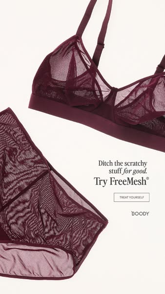
# Ad summary
This ad for Boody promotes their FreeMesh lingerie set as an alternative to scratchy materials. The ad features a minimal product shot.
# Brand positioning
Boody is presented as a brand focused on comfort and well-being, offering alternatives to traditional lingerie materials that may be uncomfortable. The brand positions itself as a provider of underwear that feels good, implied through the product name 'FreeMesh' and the promise of ditching scratchy materials. This functional yet still stylish lingerie suggests that Boody aligns with a lifestyle that values both comfort and style, challenging the norm of uncomfortable lingerie by prioritizing the wearer's comfort.
# Product
The featured product is a FreeMesh lingerie set by Boody, consisting of a bra and underwear, both made from a sheer mesh material in a dark wine color. The bra has a wire-free design and is constructed with triangular cups and an elasticized band. The matching underwear is a brief style. The ad emphasizes the comfort of the FreeMesh material as a USP, directly contrasting it with 'scratchy stuff'. This suggests the product is for those who value comfort in their undergarments and seeks to remove the barrier of discomfort associated with traditional lingerie materials.
# Visual style
The ad uses a minimalist and clean visual aesthetic. The production quality appears highly polished, with studio lighting on a seamless backdrop. The image treatment involves subtle color grading to enhance the product's color. The typography is clean and legible. The overall style is contemporary and visually appealing, designed for easy scannability in-feed.
# Hooks
Headline: Ditch the scratchy stuff for good.
# Benefits
- [object Object]
# Features
- [object Object]
# Call to action
None used.
# Point of view
- [object Object]
# Storyline
- The ad opens by directly addressing a common pain point with undergarments: the feeling of scratchy material. It is told from the brand's perspective, with the intention of immediately grabbing the viewer's attention by acknowledging their potential discomfort and setting up a problem that the brand can solve.
- Next, Boody offers a solution to the problem presented by inviting the customer to 'Try FreeMesh', a comfortable alternative to scratchy materials. This section serves to introduce the featured product as the solution and encourages the viewer to consider trying Boody's FreeMesh lingerie, told from the brand's perspective.
- Finally, the ad includes a subtle CTA in the form of a 'TREAT YOURSELF' prompt, delivered from Boody. This helps to encourage the viewer to make a purchase while also reinforcing the emotional benefit of self-care and indulgence associated with the product.
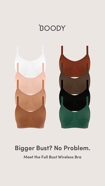
# Ad summary
This image ad presents Boody's Full Bust Wireless Bra as a solution for individuals with a bigger bust. The ad showcases the product in a variety of colors and aims to address the concern of finding comfortable and supportive bras for larger bust sizes.
# Brand positioning
Boody is presented as a brand that offers comfort and practicality, particularly through its intimate apparel. The focus on wireless bras suggests a commitment to comfort without sacrificing support, potentially appealing to those who prioritize ease and natural movement in their everyday wear. The variety of neutral color options shown across the product line may also imply a minimalist and versatile approach to wardrobe basics.
# Product
The advertised product is Boody's Full Bust Wireless Bra. The bra is designed to provide comfort and support without the use of wires, which is particularly beneficial for individuals with larger busts. The ad showcases the bra in a range of colors, including white, various shades of nude, brown, black, and green, indicating versatility and options to suit different preferences. The absence of wires addresses the common pain point of discomfort and restricted movement often associated with traditional wired bras. The product is likely intended for individuals who seek everyday comfort and support without compromising on style.
# Visual style
The ad features a clean and minimalist visual style. The production quality appears to be studio-shot, with soft lighting and a neutral color palette. The bras are neatly arranged and visually distinct, showcasing the range of color options. The typography is simple and legible, contributing to the overall sense of clarity and ease. The visual style is likely intended to communicate a sense of comfort, simplicity, and understated elegance, which may increase scannability in the feed.
# Hooks
Headline: Bigger Bust? No Problem.
# Benefits
- [object Object]
# Features
- [object Object]
# Call to action
None used.
# Point of view
- [object Object]
# Storyline
- The ad showcases a stack of the brand's wireless bras in a variety of colors. This is included to visually present the product and its availability in multiple color options. The audience experiences this from the brand's perspective, showcasing the range and variety of their product line.
- The ad highlights the bra's suitability for a "Bigger Bust" and assures the viewer that there is "No Problem." This is to directly address a common concern and offer a solution, conveying confidence in the product's ability to meet specific needs. The brand is speaking directly to a specific audience, offering a solution to their problem.
- The ad introduces the "Full Bust Wireless Bra." This is included to clearly define the product being advertised and emphasize its key features. The audience experiences this from the brand's perspective, providing product details.
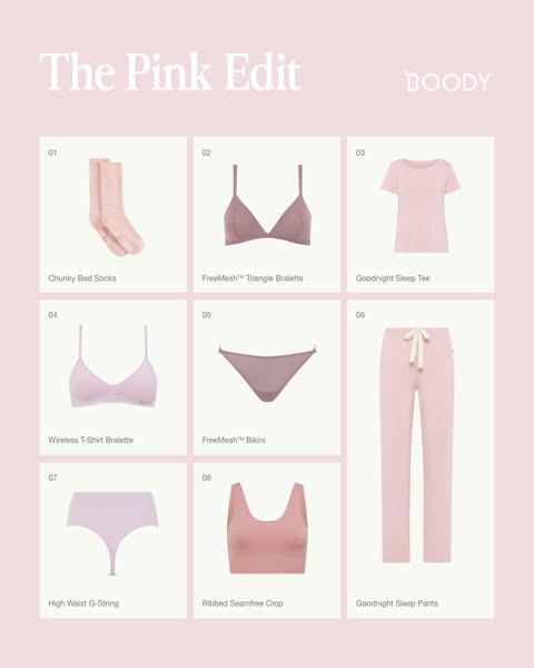
# Ad summary
This product grid ad showcases a collection of pink loungewear and intimates by Boody, highlighting various styles from socks to sleepwear.
# Brand positioning
Boody is presented as a brand offering comfortable and essential basics, focusing on loungewear and intimates. The brand seems to value simplicity and comfort, aligning with a relaxed lifestyle. The emphasis on essential items like socks, bralettes, and sleep tees suggests a focus on everyday wear. With a minimalist approach in design and presentation, Boody positions itself as a provider of easy, comfortable basics, possibly targeting consumers who value comfort and simplicity over high-fashion trends. The choice of the 'Pink Edit' theme implies a curated, fashionable approach to their core offerings, showing they are keeping up with trends while maintaining their core values of comfort and simplicity.
# Product
The ad features a selection of loungewear and intimate apparel from Boody, all in varying shades of pink. The products include: 'Chunky Bed Socks,' presented as cozy, oversized socks for relaxation; 'FreeMesh™ Triangle Bralette,' a lightweight bralette designed for comfort; 'Goodnight Sleep Tee,' a basic short-sleeved t-shirt intended for sleepwear; 'Wireless T-Shirt Bralette,' a seamless and supportive bralette for everyday wear; 'FreeMesh™ Bikini,' a bikini style underwear; 'Goodnight Sleep Pants,' comfortable drawstring pants for sleeping; 'High Waist G-String,' a high-waisted thong; and 'Ribbed Seamfree Crop,' a ribbed, seamless crop top. Each product is displayed individually, highlighting its design and fit. The emphasis is on comfort, indicated by terms like 'chunky,' 'seamless,' and 'wireless,' suggesting the products are designed for ease of wear. The use of the term 'FreeMesh™' for some items implies breathability and lightweight materials, addressing potential purchase barriers related to comfort and temperature regulation.
# Visual style
The ad has a clean, minimalist aesthetic with a consistent color scheme of light pinks and neutral tones. The production quality appears to be studio-shot, with clear and well-lit product photography. The grid layout organizes the products in a structured way, making it easy to scan. The typography is simple and legible, complementing the overall minimalist design. The style is clearly meant for an in-feed placement, with a simple layout that could easily catch the eye without being too disruptive.
# Hooks
Headline: The Pink Edit
# Benefits
- [object Object]
- [object Object]
- [object Object]
# Features
- [object Object]
- [object Object]
- [object Object]
- [object Object]
- [object Object]
- [object Object]
- [object Object]
- [object Object]
# Call to action
None used.
# Point of view
- [object Object]
# Storyline
- The ad opens with the title 'The Pink Edit' and the brand's logo, immediately signaling the theme and the brand being promoted. This intro serves to capture attention and introduce the product selection, presented from the brand's perspective.
- The main section of the ad is a grid displaying eight different products, each presented with its name. This section provides a comprehensive overview of the featured products, allowing the customer to view the range and diversity of the Boody's pink collection from a customer's perspective.
- Each product is displayed against a neutral background, emphasizing its features and design. This clear and straightforward presentation aims to simplify the decision-making process, helping the consumer to make an informed purchase and appreciate the details of each product from Boody's perspective.
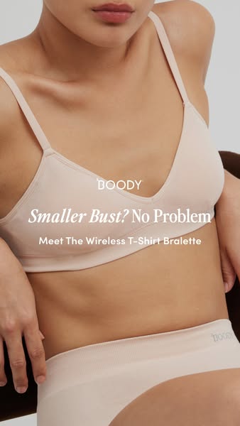
# Ad summary
This image ad promotes a wire-free bralette designed for smaller busts. The ad features a person wearing the product and text that calls out the 'Smaller Bust?' to assure the user that this bra is no problem.
# Brand positioning
Boody is presented as a brand that offers comfort-focused undergarments, particularly bralettes, designed for everyday wear. The brand addresses a specific concern, providing solutions for those with smaller busts. Boody positions itself as understanding and catering to a particular need in the market, offering products that are both functional and comfortable, and are a great solution for individuals with smaller busts who may struggle to find the right fit.
# Product
The advertised product is a wireless T-shirt bralette. The product appears to be made of a soft, stretchy fabric and is available in a neutral skin tone color. It is designed for individuals with smaller busts and is presented as a comfortable, wire-free option for everyday wear. The bralette's T-shirt design suggests that it is made to be invisible under clothing, providing a smooth and natural look. The name is "Wireless T-Shirt Bralette".
# Visual style
The ad features a clean and minimalist visual style. The neutral color palette and soft lighting create a sense of comfort and simplicity. The focus is on the product and the person wearing it, with minimal distractions. The image is well-lit and appears to be studio-shot, lending a polished and professional feel.
# Hooks
Headline: Smaller Bust? No Problem
# Benefits
- [object Object]
# Features
- [object Object]
# Call to action
None used.
# Point of view
- [object Object]
# Storyline
- The ad opens with the message "Smaller Bust? No Problem," to reassure the viewer that the brand has a solution for this specific concern, from the perspective of the brand.
- The ad then introduces the product as "Meet The Wireless T-Shirt Bralette", from the brand, highlighting the product features and benefits.
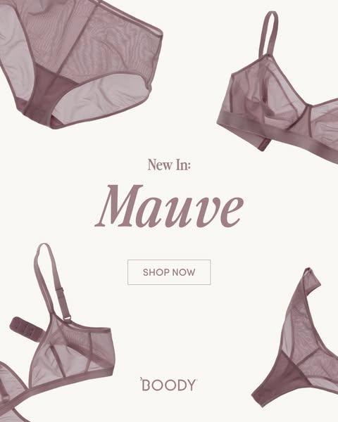
# Ad summary
An image ad showcasing Boody brand's lingerie set in Mauve color. The ad features two lingerie pieces: a bra and underwear. There is a SHOP NOW button that directs customers to purchase.
# Brand positioning
Boody is presented as a modern and minimalist brand. Their emphasis is on comfort, style, and sustainability. The brand is positioned as a purveyor of simple, high-quality essentials that consumers can feel good about wearing, both in terms of aesthetics and environmental impact.
# Product
The product being advertised is a set of women's lingerie that includes a bra and underwear. The lingerie is made from soft, breathable, and eco-friendly material, likely bamboo fabric, given Boody's brand ethos. The bra is a soft bra with thin straps. The underwear is a brief style, providing full coverage while maintaining a sleek silhouette. The pieces are in a new color called Mauve. The products aim to be comfortable, stylish, and sustainable, appealing to consumers who value ethical and eco-conscious fashion choices.
# Visual style
The ad features a clean and minimalist visual style with a focus on showcasing the product in an appealing way. The production quality is high, with well-lit, studio-shot images of the lingerie pieces against a neutral background. The visual motifs include a grid-like layout, with the products arranged in a symmetrical pattern around the central text and call to action. The image treatment involves subtle color grading to enhance the mauve tones and create a soft, inviting aesthetic. The typography integration is clean and legible, with a focus on readability. The overall style is designed to feel modern and sophisticated, aligning with the brand's identity and target audience.
# Hooks
Headline: Mauve
# Benefits
- [object Object]
- [object Object]
- [object Object]
# Features
- [object Object]
- [object Object]
- [object Object]
# Call to action
SHOP NOW
# Point of view
- [object Object]
# Storyline
- The ad opens by showcasing the brand's new product. The brand is highlighting its latest lingerie set in a trendy color, Mauve, aiming to capture the audience's attention and introduce the new addition to their collection. This beat serves to draw viewers in with the visual appeal of the product.
- The brand offers a direct call to action, inviting viewers to shop the new lingerie set. This beat is included to drive immediate conversions, making it easy for interested customers to purchase the featured product.
# Ad summary
This ad showcases a woman talking about the Boody bralette as the solution for women with smaller busts. The ad highlights key features of the product, like light padding and adjustable straps, which help the product fit the customer.
# Brand positioning
Boody is presented as an inclusive brand offering comfort, eco-friendly, and everyday essentials. The brand promotes a lifestyle of ease, simplicity, and conscious living, aligning with values of sustainability and inclusivity. Boody addresses the category norm of underrepresenting a wide variety of body sizes, and caters to a niche market with their products. The positioning balances functional attributes like comfort and fit with emotional benefits such as confidence and self-acceptance.
# Product
The Wireless T-Shirt Bralette is designed for AA-B cup fits, featuring light padding for a natural shape and support without the discomfort of underwires. The bralette is made with eco-friendly materials and offers convertible and adjustable straps for a custom fit. The product addresses the pain point of finding comfortable and well-fitting bras for smaller busts. The bralette is designed to be an 'iconic bra' to 'fit all busts.'
# Visual style
The ad has a polished commercial aesthetic with a clean, bright look. The editing style features static shots with smooth transitions. The production quality is high, lending a professional feel. The pacing is moderate.
# Benefits
- [object Object]
- [object Object]
# Features
- [object Object]
- [object Object]
# Call to action
None used.
# Point of view
- [object Object]
# Storyline
- 00:00–00:02 00:00–00:02 A woman in a black bralette and underwear smiles at the camera. The brand is introducing the subject of their product.
- 00:02–00:04 00:02–00:04 The woman is standing in front of a white curtain. The woman adjusts the bralette straps, introducing the product.
- 00:04–00:07 00:04–00:07 The woman touches the product to highlight the fit. The ad showcases how the product is made for smaller busts.
- 00:07–00:09 00:07–00:09 The woman touches the bottom of the bralette to highlight the light padding. This reinforces a functional element of the product.
- 00:09–00:10 00:09–00:10 The camera focuses on the back of the woman, showing that the straps are adjustable and convertible. This highlights a product feature.
- 00:11–00:13 00:11–00:13 The woman puts her hands behind her head and smiles, showing off the fit of the bra. This is positioned as a bra that can fit all busts.
# Ad summary
This ad for Boody Eco Wear is promoting their new FreeMesh bra. The advertisement uses a text overlay to catch the viewer's attention and then shows the bra being worn, emphasizing its comfort and shape.
# Brand positioning
Boody Eco Wear is presented as a brand focused on comfort, sustainability, and simple designs, primarily through the use of bamboo in their clothing. The brand offers eco-friendly alternatives to everyday basics. They focus on using sustainable materials and ethical production processes. Boody aims to occupy the space of providing high-quality, comfortable, and environmentally responsible clothing options, appealing to consumers who prioritize both style and sustainability.
# Product
The featured product is the FreeMesh bra by Boody. It is designed for a comfortable fit and all-day support. The bra is made from soft and breathable bamboo fabric, providing a smooth feel against the skin. Its standout feature is the FreeMesh design, which enhances breathability and reduces moisture, making it suitable for everyday wear. The bra aims to provide support without sacrificing comfort, offering a natural shape and a seamless look under clothing. The product is positioned as a comfortable and eco-friendly option for those seeking a supportive and breathable bra.
# Visual style
The ad has a polished and clean aesthetic with a focus on simplicity and comfort. The editing style is smooth with static shots and minimal transitions. The color palette is consistent, using a maroon background to emphasize the color of the bra. The production quality is high, giving the ad a commercial feel. The pacing is consistent throughout, maintaining a calm and inviting tone. The visual motifs include close-ups of the bra and the woman wearing it, highlighting the product's features and fit.
# Benefits
- [object Object]
- [object Object]
- [object Object]
- [object Object]
- [object Object]
# Features
- [object Object]
- [object Object]
- [object Object]
- [object Object]
# Call to action
Treat Yourself
# Point of view
- [object Object]
# Storyline
- 00:00–00:02 The ad starts with a close-up of a woman wearing the bra.
- 00:01–00:02 The text overlay emphasizes the feeling of love at first wear, highlighting the initial positive experience and comfort associated with the product.
- 00:02–00:03 The camera zooms out slightly to show the bra’s fit under a white t-shirt, emphasizing its seamless design and the natural shape it provides.
- 00:03–00:04 The text overlay mentions that the bra is buttery soft and supportive, reinforcing the comfort and functionality of the product.
- 00:04–00:05 The ad cuts to a close-up of the bra’s mesh detail and its ability to stretch.
- 00:05–00:06 The text explains that it is built for breathability and support, underscoring the key features of the bra.
- 00:06–00:08 The camera shows the woman from the shoulders up to highlight the bra’s shape and fit under the clothing.
- 00:08–00:09 The text claims it is light as air and supportive, emphasizing the weightless feel and the support provided.
- 00:09–00:10 The ad cuts to the Boody logo with a call to action to “Treat Yourself,” encouraging viewers to purchase the product.
# Ad summary
This ad showcases the Boody bra and its sizes and cup types. It uses a product focus format to provide a closer look at the product.
# Brand positioning
Boody is presented as a brand that focuses on comfortable and supportive bras. The brand is portrayed as one that caters to a wide range of body types and cup sizes. They aim to occupy a space in the consumer's mind as inclusive and body-positive, offering a redesigned iconic bra to meet diverse needs. There is a functional brand positioning that emphasizes support, indicating that the brand prioritizes the practical aspects of the product. The brand pushes against conventional norms by providing products for a range of sizes and body types.
# Product
The product featured in this ad is the Boody bra, specifically designed to provide support and comfort. The bra is wireless and available in multiple cup sizes, ranging from AA to F, ensuring an inclusive fit for various body types. The advertisement highlights that the bra is a redesigned, iconic item, suggesting it has been improved to meet customer needs. The bra aims to address the purchase barrier of finding a comfortable and supportive bra that fits well, by providing options for different cup sizes and being wireless for all-day wear.
# Visual style
The ad has a polished and clean aesthetic, with a focus on showcasing the product in detail. The editing style is simple, with static shots and smooth transitions. The production quality appears high-end, with clear lighting and focus on the product. The pacing is slow and consistent, with minimal camera movement, allowing viewers to focus on the product details.
# Benefits
- [object Object]
- [object Object]
# Features
- [object Object]
- [object Object]
# Call to action
SHOP WIRELESS T-SHIRT BRAS
# Point of view
- [object Object]
# Storyline
- 00:00–00:02 The ad showcases a close-up of a person wearing the Boody bra.
# Ad summary
This ad showcases the Boody Full Bust Wireless Bra, highlighting its ability to provide support and separation without the use of wires. It features close-up shots of models wearing the bra in various colors, along with text overlays emphasizing the product's benefits and a call to action to shop now.
# Brand positioning
Boody is presented as a brand focused on providing comfortable and supportive intimates, specifically addressing the needs of individuals with larger busts. The brand emphasizes solutions that enhance natural shape and comfort without compromising support. The ad's visuals and language suggest a commitment to simplicity and practicality, without leaning into overtly sexualized imagery. The brand positions itself against the norm of traditional bras with uncomfortable wires and seeks to occupy a space in the consumer's mind that values support and comfort.
# Product
The Boody Full Bust Wireless Bra is advertised as a solution for individuals seeking support and separation without the discomfort of traditional underwire bras. The product is made from a soft, seamless fabric, intended to provide all-day comfort and a natural shape. The ad highlights the bra's ability to prevent the "uniboob" effect, offering a more defined and lifted silhouette. It is shown in multiple neutral colors, emphasizing its versatility and suitability for everyday wear. The key selling points are comfort, support, and a natural-looking shape, addressing the common barriers of discomfort and unnatural appearance associated with traditional bras. The product is designed for those who want to feel comfortable and supported without compromising on aesthetics.
# Visual style
The ad features a clean and minimalist aesthetic, with a focus on showcasing the product in various colors. The lighting is soft and natural, creating a comfortable and inviting feel. The editing style consists of quick cuts between different models and colors, maintaining a consistent pace throughout the ad. The production quality appears polished, contributing to the overall professional and trustworthy image of the brand.
# Benefits
- [object Object]
- [object Object]
- [object Object]
# Features
- [object Object]
- [object Object]
- [object Object]
# Call to action
SHOP NOW
# Point of view
- [object Object]
# Storyline
- 00:00–00:02 The ad opens with a close-up shot of a person wearing the Boody Full Bust Wireless Bra.
- 00:02–00:19 The scene transitions to show models wearing the bra in various colors, emphasizing the product's versatility and range of options.
- 00:19–00:22 The ad concludes with a final shot of a model wearing the bra, reinforcing the brand's message of comfort and support.
# Ad summary
This ad showcases the Boody brand's full brief underwear collection. Three models of varying body types present two different cuts of the brand's full brief underwear line, highlighting the comfort, bum coverage, bamboo viscose material, seam-free construction, and sustainable.
# Brand positioning
Boody positions itself as a brand that prioritizes comfort, sustainability, and inclusivity in its basic apparel. The brand aligns with a lifestyle that values ethical and eco-friendly choices, emphasizing the use of sustainable materials like bamboo viscose. Boody focuses on providing comfortable and versatile basics that cater to a wide range of body types, offering a functional and emotional experience by creating everyday essentials that feel good to wear and align with conscious consumerism.
# Product
Boody's full brief underwear collection offers two cuts: the Full Coverage Brief and the High Cut Full Brief. Both are designed for all-day comfort. The Full Coverage Brief is designed to provide additional bum coverage. The High Cut Full Brief features a higher leg cut. Both styles are made from signature bamboo viscose, known for its softness, seam-free construction, and sustainable properties, engineered for all day comfort, ensuring nothing digs. The goal is to make the wearer so comfortable, you basically forget you have anything on.
# Visual style
The ad has a clean, minimalistic aesthetic with a focus on showcasing the product in a straightforward manner. It features static shots with simple transitions and a polished commercial look. The pacing is consistent, maintaining a steady rhythm, and the audio-visual sync aligns with the spoken lines.
# Benefits
- [object Object]
- [object Object]
- [object Object]
- [object Object]
- [object Object]
- [object Object]
- [object Object]
# Features
- [object Object]
- [object Object]
- [object Object]
- [object Object]
- [object Object]
- [object Object]
# Call to action
None used.
# Point of view
- [object Object]
# Storyline
- 00:00–00:05 Three models wearing black clothing stand in a line in front of a white backdrop and introduce the brand.
- 00:05–00:08 The first model presents the full brief. The intention is to introduce the two different cuts of the brand’s popular underwear.
- 00:08–00:17 The first model talks about the method to their madness and the fact that the briefs are now available in two different cuts.
- 00:18–00:21 The first model presents the full coverage briefs.
- 00:21–00:25 The first model describes the briefs, referring to its comfort and bum coverage. The intention is to show how comfortable the underwear is.
- 00:25–00:30 The first model claims this brief is perfect for anyone looking for that totally worry-free fit. The intention is to recommend the product.
- 00:30–00:36 The second model highlights the bamboo viscose material, seam free construction, and non-digging qualities.
- 00:36–00:39 The first model introduces the high-cut full briefs.
- 00:39–00:46 The first model explains that it's the same high-waist fit but with a higher leg. The intention is to explain why the brief is more flattering and provides a confident fit.
- 00:46–00:51 The second model recommends this version for those who want a higher leg but still want bum coverage. The intention is to recommend the product.
- 00:51–00:56 The third model summarizes the main aspects of the product. The intention is to summarize the product.
- 00:56–01:01 The second model highlights the material, seam free, and sustainability aspects of the product. The intention is to point out the high quality of the product.
- 01:01–01:05 The third model highlights the comfort of the underwear. The intention is to emphasize how comfortable the underwear is.
- 01:05–01:09 The first model finishes with a final recommendation. The intention is to finalize the ad with a product recommendation.
# Ad summary
The ad features a woman showcasing three different outfits styled with the same pair of high-waisted flare pants, highlighting their versatility for various occasions.
# Brand positioning
The brand presents itself as a provider of comfortable and versatile clothing suitable for everyday wear and various activities. The brand aligns with a casual, effortless lifestyle, promoting simplicity and ease of wear. It positions itself as offering wardrobe staples that can be styled in multiple ways, pushing against the norm of needing separate outfits for different occasions. The brand positioning is functional, focusing on comfort and versatility, while also tapping into an emotional desire for an effortless, stylish look.
# Product
The featured product is the 'Forme High Waist Flare Pants', presented as a versatile and comfortable wardrobe staple. The pants are shown in a 'carob' color. They are designed for everyday wear and various activities. The ad highlights the pants' ability to be styled in multiple ways, making them suitable for yoga, Pilates, coffee runs, or casual outings. The pants address the purchase barrier of needing multiple outfits for different occasions by offering a single, versatile piece that can be dressed up or down.
# Visual style
The ad has a polished, commercial aesthetic with bright, natural lighting and a clean, minimalist background. The editing style is quick-cut, with transitions timed to the music to match the outfit. The production quality is high-end, creating a friendly and persuasive tone. The pacing is fast, matching the upbeat music and the quick changes of outfits, which keeps the ad engaging and dynamic.
# Benefits
- [object Object]
- [object Object]
- [object Object]
- [object Object]
# Features
- [object Object]
- [object Object]
- [object Object]
- [object Object]
- [object Object]
# Call to action
None used.
# Point of view
- [object Object]
# Storyline
- 00:00–00:04 The woman is dancing around in different outfits.
- 00:04–00:05 00:04–00:05 The woman standing in front of the camera ready to show different outfits.
- 00:05–00:07 00:05–00:07 The woman introduces the segment by saying as we get into cooler months.
- 00:07–00:14 00:07–00:14 The woman talks about the pants she likes to wear and shows them in her current outfit.
- 00:14–00:19 00:14–00:19 The woman is introducing that they can be styled three different ways.
- 00:19–00:27 00:19–00:27 The woman is introducing outfit number 1.
- 00:27–00:36 00:27–00:36 The woman is introducing outfit number 2.
- 00:36–00:46 00:36–00:46 The woman is introducing outfit number 3.
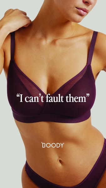
# Ad summary
This ad features a woman wearing a Boody bra and underwear set. The ad uses a customer testimonial to promote the comfort and quality of Boody products.
# Brand positioning
Boody is presented as a brand focused on comfort and quality, as highlighted by the customer testimonial. The brand is positioned as a provider of everyday essentials that are so well-made that they are faultless. The brand aligns with values of simplicity and satisfaction, suggesting a lifestyle of ease and contentment. Boody seems to ignore the fast-fashion trends, instead focusing on timeless pieces that customers can rely on.
# Product
The product featured is a matching bra and underwear set in a deep purple color. The bra is a soft bra with mesh detailing at the top of the cups. The underwear is a simple brief style. The ad emphasizes the comfort and quality of the product, suggesting that it is so well-made that it is faultless. The product is for anyone who values comfort and quality in their everyday essentials. The ad addresses the purchase barrier of uncertainty about quality by showcasing a positive customer testimonial.
# Visual style
The ad has a clean and minimalist visual style. The focus is on the product and the woman wearing it. The lighting is soft and natural, and the color palette is muted. The overall effect is one of simplicity and comfort.
# Hooks
Headline: "I can't fault them"
# Call to action
None used.
# Point of view
- [object Object]
# Storyline
- The ad opens with a close-up shot of a woman wearing a Boody bra and underwear set. This is intended to showcase the product in use and highlight its fit and style from the brand's perspective.
- A quote appears over the image of the woman wearing the bra and underwear set. This is intended to provide social proof and build trust in the product from the customer's perspective.
- The brand's logo is displayed on the woman's abdomen. This is intended to reinforce brand recognition and association with the product from the brand's perspective.
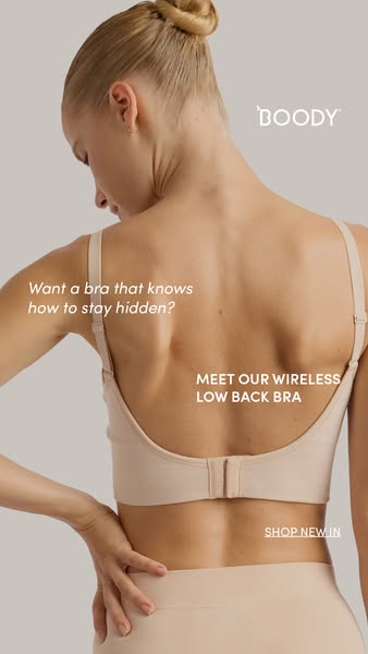
# Ad summary
This ad features a woman wearing a low-back bra from Boody. The ad highlights the bra's ability to stay hidden under clothing, making it a practical and discreet choice.
# Brand positioning
Boody is presented as a brand focused on providing comfortable and discreet undergarments. The brand emphasizes practicality and seamlessness, aiming to occupy a space in the consumer's mind as a provider of essential wardrobe solutions that prioritize comfort and invisibility. Boody aligns with values of simplicity and functionality, pushing against the norm of overtly visible or uncomfortable undergarments. The brand positioning is functional, focusing on the performance and simplicity of its products.
# Product
The featured product is a wireless low-back bra designed to stay hidden under clothing. It is presented as a practical solution for individuals seeking discreet undergarments. The bra is wireless, emphasizing comfort, and has a low-back design, making it suitable for outfits with lower backlines. The ad addresses the purchase barrier of visible bra straps by highlighting the bra's ability to remain unseen. The ad tells the viewer that this product is worth trying or buying because it offers both comfort and discretion, solving the problem of visible bra straps with low-backed clothing.
# Visual style
The ad has a clean and minimalist visual aesthetic. The production quality is high, with a studio-shot feel. The image treatment includes soft lighting and a neutral color palette. The typography is simple and legible, integrated seamlessly into the overall design. The style is platform-native, fitting well within the visual norms of social media feeds. The overall effect is calming and sophisticated, designed to be easily scannable and attention-grabbing.
# Hooks
Headline: Want a bra that knows how to stay hidden?
# Benefits
- [object Object]
# Features
- [object Object]
- [object Object]
# Call to action
SHOP NEW IN
# Point of view
- [object Object]
- [object Object]
# Storyline
- The ad opens with a question, "Want a bra that knows how to stay hidden?" This is intended to grab the viewer's attention by addressing a common frustration with visible bra straps. The brand is speaking directly to the customer, highlighting a problem they may be experiencing.
- The ad introduces the Boody wireless low back bra as the solution to the problem. The brand is presenting its product as the answer to the question posed earlier, positioning it as a practical and discreet undergarment.
- The ad concludes with a call to action, "SHOP NEW IN," encouraging the viewer to purchase the product. The brand is prompting the customer to take the next step and buy the featured bra.
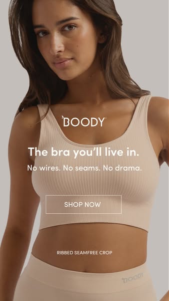
# Ad summary
An advertisement for Boody's Ribbed Seamfree Crop. The ad features a woman wearing the beige crop top with text that describes the comfort of the product.
# Brand positioning
Boody is presented as a brand focused on comfort and simplicity. The brand aligns with values of everyday ease and natural living, as suggested by the neutral color palette and focus on seamless design. Boody aims to occupy a space in the consumer's mind as a go-to for basic apparel that eliminates the common discomforts associated with undergarments like wires and seams. The brand positioning appears functional, emphasizing the practical benefits of their products, such as comfort and lack of drama.
# Product
The advertised product is the Ribbed Seamfree Crop from Boody. It's a bra top designed for women, featuring a ribbed texture and seamless construction. The product aims to provide comfort, eliminating the need for wires and seams. The advertised product details highlight a bra that can be lived in. The USPs emphasize the comfort and ease of wearing the bra, suggesting it is free from the usual discomforts of traditional bras. It addresses purchase barriers by promising a bra with "no wires, no seams, no drama."
# Visual style
The ad has a clean and minimalist visual style. The production quality is high, with soft lighting and a focus on natural tones. The image treatment includes subtle color grading that enhances the skin tones and gives the ad a cohesive, neutral aesthetic. The typography is clean and legible, integrated seamlessly with the overall design. The style feels native to in-feed, aiming for a seamless and scannable user experience.
# Hooks
Headline: The bra you'll live in.
# Benefits
- [object Object]
# Features
- [object Object]
- [object Object]
# Call to action
SHOP NOW
# Point of view
- [object Object]
- [object Object]
- [object Object]
# Storyline
- The ad starts with an image of a woman wearing the Boody Ribbed Seamfree Crop, framed to showcase the product in a real-life context. This is from the customer's perspective to visualize how the bra looks and fits.
- Next, the ad highlights the key selling points, "The bra you'll live in. No wires. No seams. No drama." This tells the customer the problem the bra solves, which is comfort. This is from the brand's perspective, communicating the benefits of the product.
- A "SHOP NOW" button is included. This is from the brand's perspective, inviting the customer to purchase the advertised product.
- The ad closes with a product identifier: "RIBBED SEAMFREE CROP." This is from the brand's perspective, clearly naming the specific product being advertised.
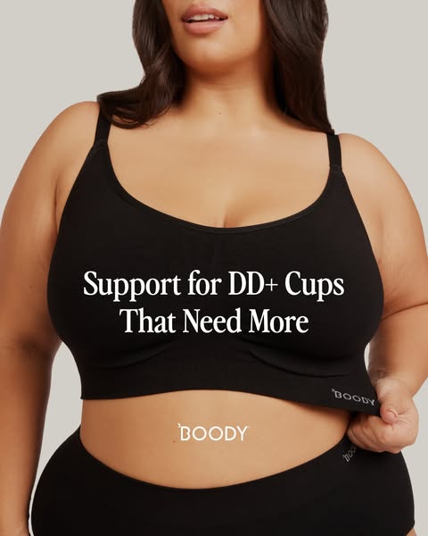
# Ad summary
This ad features a model wearing a Boody brand black bra and underwear set, emphasizing the support and comfort for DD+ cup sizes.
# Brand positioning
Boody is presented as a brand focused on providing comfortable and supportive essentials, particularly for women with larger cup sizes. The ad emphasizes inclusivity and caters to those who may struggle to find well-fitting and supportive undergarments. With a minimalist aesthetic and the focus on a single, well-fitted black bra, Boody positions itself as a provider of everyday basics that prioritize comfort and function without sacrificing style.
# Product
The product featured is a black bra designed to provide support for DD+ cup sizes. The bra has a wide band, wide straps, and full coverage cups. It appears to be made from a soft, stretchy material, suggesting comfort and flexibility. The ad focuses on the bra's ability to provide support for those who "need more," implying that the design is specifically tailored to meet the needs of larger busts. The black underwear matches the bra to create a coordinating set.
# Visual style
The ad has a clean, minimalist visual style. The production quality appears to be high, with professional lighting and a focus on showcasing the product's fit and comfort. The image is simple, with a solid background and no distracting elements, which draws attention to the product and the model.
# Hooks
Headline: Support for DD+ Cups That Need More
# Benefits
- [object Object]
# Features
- [object Object]
# Call to action
None used.
# Point of view
- [object Object]
- [object Object]
# Storyline
- The ad showcases a woman wearing the Boody bra and underwear set. The intention is to visually demonstrate the fit and support of the bra. The audience experiences the image from the perspective of a potential customer, seeing how the bra looks on a real person.
- The text overlay, "Support for DD+ Cups That Need More", emphasizes the specific benefit of the bra and immediately communicates who the target audience is. The brand is directly addressing a need within a specific customer segment.
- The Boody logo is displayed both on the bra band and subtly across the abdomen of the model. The brand is reinforcing brand recognition and associating the product with the Boody name.
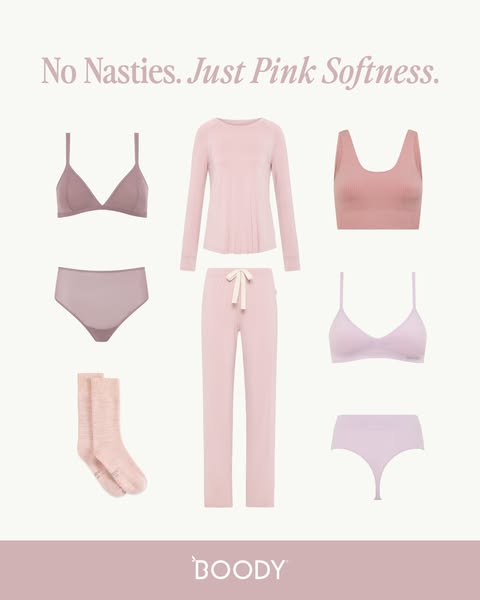
# Ad summary
This ad showcases a range of pink-toned loungewear items from Boody, emphasizing the brand's commitment to comfort and natural materials. The simple layout and soft color palette create a soothing and inviting feel, highlighting the brand's dedication to gentle, skin-friendly fabrics.
# Brand positioning
Boody is presented as a purveyor of comfortable and skin-friendly basics, particularly loungewear. The brand emphasizes natural materials and a gentle feel, positioning itself as a provider of everyday essentials without harmful substances. The brand aligns with a lifestyle of relaxation and self-care, offering products that promote a sense of well-being. Boody differentiates itself by focusing on what its products *don't* include – 'nasties' – while highlighting positive attributes like softness.
# Product
The ad features a selection of loungewear items in varying shades of pink, including a triangle bralette and matching brief, a long-sleeved top and pants pajama set with a drawstring, a ribbed tank top, and a thong. Also included is a pair of socks. These items are designed for comfort and relaxation, suitable for lounging or sleeping. The ad highlights the softness of the materials, suggesting a gentle feel against the skin. The absence of 'nasties' implies a focus on skin-friendly and natural materials, addressing concerns about irritation or harmful substances in clothing.
# Visual style
The ad features a clean and minimalist aesthetic with a soft color palette, primarily using various shades of pink. The production quality is high, with evenly lit, studio-shot product displays set against a neutral background. The ad uses a grid layout, showcasing individual items in a simple, organized manner. This visual style aims to convey a sense of calm, comfort, and simplicity, aligning with the brand's focus on natural and skin-friendly materials. The typography is clean and legible, integrated seamlessly into the overall design.
# Hooks
Headline: No Nasties. Just Pink Softness.
# Benefits
- [object Object]
# Features
- [object Object]
# Call to action
None used.
# Point of view
- [object Object]
- [object Object]
# Storyline
- The ad starts with a statement, 'No Nasties. Just Pink Softness,' which sets the tone and introduces the brand's focus on natural, gentle materials. This message is conveyed from the brand's perspective, aiming to immediately communicate its core value proposition of comfort without harmful substances, piquing the viewer's interest with a minimalist promise.
- Next, a product showcase is shown featuring various pink loungewear items, including underwear, tops, bottoms, and socks. This visually communicates the range of products available and their cohesive aesthetic, all from the brand's viewpoint. It demonstrates the variety and style of Boody's offerings, emphasizing the brand's commitment to creating a full collection of comfortable pink basics.
- The ad concludes with the Boody logo at the bottom, reinforcing brand recognition and trust. This final touch is a statement from the brand itself, solidifying its identity and promise of quality. It leaves the viewer with a clear impression of the brand's name and overall aesthetic.
How Other Apparel Brands Advertise on Meta
Peer brands in Motion's library — click any brand to see their creative strategy, live ads, and AI breakdowns.