
# Ad summary
The ad showcases apparel with a focus on the “Blacory” graphic t-shirts. The video presents the t-shirts with a bird graphic and brand name on the front, and the phrases “Flying Predator” and “Born to Live” on the back. A hand touches and holds up the t-shirts to showcase their quality.
# Brand positioning
Blacory is presented as an apparel brand specializing in t-shirts that feature unique, graphic designs. The brand targets customers looking for distinctive and stylish clothing that stands out from typical fashion norms. The brand emphasizes individuality and bold design choices, as seen through the striking bird graphics and edgy phrases on the shirts. The brand positioning leans towards emotional expression and lifestyle alignment rather than pure functional performance, appealing to those who value personal expression through their clothing.
# Product
The featured product is a graphic t-shirt by Blacory. The t-shirt has a crew neck and a regular fit. It features a detailed bird graphic on the front, along with the brand name “Blacory” in a stylized font. On the back, the shirt displays the phrases “Flying Predator” and “Born to Live” arranged artistically around the bird design. The design is printed on both dark green and black t-shirts. The t-shirts are made for individuals who want to express their unique style through bold and artistic graphics.
# Visual style
The ad features a simple, UGC-style aesthetic. The video appears to be shot outdoors, using natural lighting. The editing is minimal with static shots and direct cuts. The production quality suggests a casual, user-generated content feel, aligning with a personal recommendation tone. The pacing is slow and steady with a cut roughly every 3-4 seconds.
# Benefits
- [object Object]
- [object Object]
- [object Object]
# Features
- [object Object]
- [object Object]
- [object Object]
- [object Object]
# Call to action
None used.
# Point of view
- [object Object]
# Storyline
- 00:00–00:03 00:00–00:03: A hand holds up a dark green t-shirt, showcasing its front design, which includes a bird graphic and the brand name "Blacory." This action is intended to highlight the design of the shirt.
- 00:03–00:05 00:03–00:05: The hand holds up the t-shirt again, now displaying the back of the shirt with the phrases "Flying Predator" and "Born to Live" surrounding the bird design. This reveals the complete design concept of the t-shirt.
- 00:05–00:07 00:05–00:07: The hand holds up a black t-shirt, mirroring the initial presentation of the green t-shirt, focusing on the front design with the bird graphic and brand name. This showcases another color option for the same design.
- 00:07–00:10 00:07–00:10: The black t-shirt is turned around to display the back, again featuring the phrases "Flying Predator" and "Born to Live" around the bird design. This mirrors the earlier reveal of the green t-shirt’s back design.
- 00:10–00:11 00:10–00:11: A transition to the brand logo, a simple black icon on a white background, serves as the concluding brand identifier.

How Bluorng Advertises on Meta
Refreshed 4 months ago · Weekly refresh cadence
Bluorng runs 39 active ads on Meta, shipping ~12 new creatives per week. Their library leans on Split Screen27%, Product Image17%, and Headline15%. Recently, bluorng is flooding the zone with graphic tees and some hoodies, leaning hard into nature motifs (tigers, birds, ladybugs, florals) paired with edgy streetwear messaging like "Flying Predator" and "Money Over Your Feelings." The creative strategy is tactile and quality-focused, with gloved hands unfolding garments and close-ups on embroidery details to signal premium craftsmanship, while the product range spans bold animal graphics to more subdued floral embellishments. There's no single hero product, just a broad push across the catalog with a consistent through-line of streetwear attitude meets artisan presentation.
Indexed by Motion's Inspo Library.
The 20 Most Recent Bluorng Ads on Meta
# Ad summary
A gloved hand presents a printed sweatshirt from Believe in Me.
# Brand positioning
Believe in Me is presented as a brand focused on unique, artistic clothing designs. The brand uses detailed, high-quality prints of animals and positive messaging on its apparel, suggesting a focus on creativity and distinctive style. The presentation of the clothing with gloves implies a sense of care, exclusivity, and attention to detail.
# Product
The featured product is a yellow sweatshirt with a detailed graphic print. The design includes a lion, a lion cub, and stylized jungle foliage, along with the text "Believe." The sweatshirt also features a smaller, decorative brand logo embroidered on the upper left chest. The garment is presented and handled with white gloves, emphasizing its uniqueness and quality.
# Visual style
The ad has a clean, simple aesthetic. The focus is on showcasing the product with close-up shots and careful handling. The use of white gloves adds a touch of luxury and attention to detail. The editing is minimal with static shots and smooth transitions. The pacing is slow and deliberate to allow the viewer to appreciate the details of the product.
# Benefits
- [object Object]
- [object Object]
- [object Object]
# Features
- [object Object]
- [object Object]
- [object Object]
- [object Object]
# Call to action
None used.
# Point of view
- [object Object]
# Storyline
- 00:00–00:06 A gloved hand flattens and smooths the fabric of a yellow sweatshirt with a detailed lion graphic to showcase the design.
- 00:06–00:08 The sweatshirt is folded, displaying the small embroidered logo.
# Ad summary
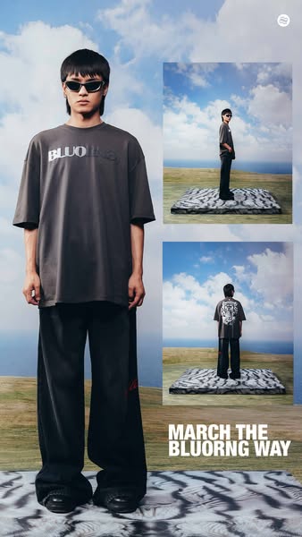
This ad promotes BLUORNG clothing, featuring a model wearing a t-shirt and pants. The ad showcases the clothing in a stylized outdoor setting, with a focus on a tiger print rug and background patterns that complement the brand's aesthetic.
# Brand positioning
BLUORNG presents itself as a contemporary fashion brand that leans into edgy and unconventional aesthetics. It positions itself in a space where streetwear meets high fashion, appealing to consumers who want to express individuality. The brand seems to defy traditional fashion norms by incorporating bold patterns and unique staging, targeting customers who want to stand out.
# Product
The ad features a dark gray, oversized t-shirt with the BLUORNG logo in a raised, tonal design. The t-shirt is paired with wide-leg black pants, with a red stripe on the side. The design is modern streetwear, with a focus on loose, comfortable fits. These pieces are showcased in an outdoor setting to highlight versatility and style.
# Visual style
The ad has a stylized and modern aesthetic with a blend of studio and outdoor elements. The image treatment includes color grading that enhances the earth tones and adds a slightly desaturated look. The composition utilizes a collage-like layout with inset images, and the typography is clean and bold. This creates a contemporary and eye-catching design.
# Hooks
Headline: MARCH THE BLUORNG WAY
# Benefits
- [object Object]
# Features
- [object Object]
- [object Object]
- [object Object]
# Call to action
None used.
# Point of view
- [object Object]
# Storyline
- The ad opens with a full-length shot of a model in BLUORNG apparel, immediately establishing the brand's aesthetic. This captures the viewer's attention and introduces them to the brand's fashion-forward vision from the brand's perspective.
- The ad features two smaller insets showing different angles of the model wearing the clothing. This reinforces the product's appeal by showing multiple views and details from the brand's perspective.
- The ad concludes with the text "MARCH THE BLUORNG WAY", which serves as an invitation to align with the brand's unique style and values, encouraging viewers to adopt the BLUORNG aesthetic as their own from the brand's perspective.
# Ad summary
This ad shows different color variations of a "Flying Predator" t-shirt from the brand Blvckout. The ad highlights the design of the shirt.
# Brand positioning
Blvckout presents itself as a luxury brand that produces streetwear apparel and accessories. The brand's target consumer values high-end design and exclusivity. The brand leans into the minimalist movement through monochromatic color schemes and edgy product designs.
# Product
Blvckout is advertising their "Flying Predator" t-shirt. The t-shirt is available in black and dark green. The main design of the shirt is an illustration of a bird of prey along with the brand's name on the front. The shirts appear to be made of a soft material.
# Visual style
The ad is a straightforward product demonstration. The shots are simple and focused on highlighting the design of the shirts. The production quality of the ad is polished. The editing style includes static shots and quick cuts. The ad has an outdoorsy aesthetic.
# Benefits
- [object Object]
# Features
- [object Object]
- [object Object]
# Call to action
None used.
# Point of view
- [object Object]
# Storyline
- 00:00–00:04 A person holds up a green version of the "Flying Predator" t-shirt, turning it to show off the design.
- 00:04–00:04 The person runs their hand across the design on the front of the shirt.
- 00:04–00:08 A person holds up a black version of the "Flying Predator" t-shirt, turning it to show off the design.
- 00:08–00:09 The person runs their hand across the design on the front of the shirt.
- 00:10–00:11 A white screen appears with the Blvckout logo in the center.
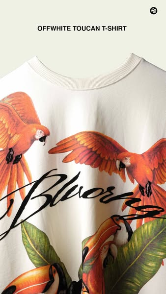
# Ad summary
This image ad showcases a white t-shirt with a toucan design from the brand OffWhite.
# Brand positioning
OffWhite is presented as a high-fashion brand, known for its edgy, contemporary designs. The brand creates aspirational products for consumers interested in luxury streetwear. The brand stands out with its unique and artistic prints.
# Product
The product featured is a white t-shirt made of lightweight fabric. It has a ribbed crew neck and short sleeves. The shirt features a colorful graphic print of toucans and tropical foliage. A black handwritten-style script is layered over the design. The t-shirt is presented as a stylish and unique garment.
# Visual style
The ad utilizes a product-focused and clean aesthetic with the graphic and colors used to highlight the design of the t-shirt.
# Hooks
Headline: OFFWHITE TOUCAN T-SHIRT
# Benefits
- [object Object]
# Features
- [object Object]
- [object Object]
# Call to action
None used.
# Point of view
- [object Object]
# Storyline
- The ad focuses on showcasing the design of the OffWhite t-shirt, inviting the audience to appreciate the shirt's unique graphic and overall aesthetic. The brand is telling the story of its product.
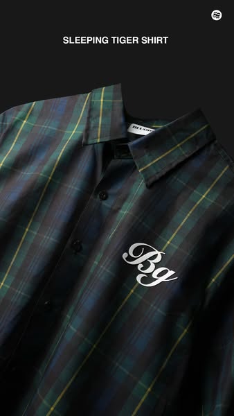
# Ad summary
An ad showcasing the Sleeping Tiger shirt.
# Brand positioning
The brand is presented as a modern clothing company selling quality products with a classic and comfortable style. The placement of the brand's logo in the top right corner suggests that the brand wants the customer to associate its logo with the product. By placing its logo in the ad, the brand is pushing itself as an important and relevant company.
# Product
The Sleeping Tiger shirt is a long-sleeved button-up shirt with a pointed collar. The shirt appears to be made of a soft flannel fabric and features a dark green, blue, and yellow plaid pattern. The shirt is seen with a white "Bg" script logo on the right side of the shirt.
# Visual style
The visual style is clean and modern, with a focus on highlighting the product's design and quality. The close-up shot of the shirt is well-lit and detailed, allowing viewers to appreciate the fabric and construction. The black background creates a sense of depth and contrast, while the placement of the brand's logo in the top right corner provides a subtle reminder of the brand. The overall effect is sophisticated and stylish, appealing to a discerning customer base.
# Hooks
Headline: SLEEPING TIGER SHIRT
# Benefits
- [object Object]
# Features
- [object Object]
# Call to action
None used.
# Point of view
- [object Object]
# Storyline
- The ad opens with a close-up shot of the buttoned Sleeping Tiger shirt, inviting the viewer to appreciate the shirt's design and fabric. The brand is showing off their product and hoping to entice the customer.
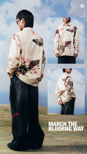
# Ad summary
This image ad features an individual wearing a shirt with graphic art on it. There are three separate image blocks layered on top of each other. The ad shows the same shirt from different angles.
# Brand positioning
This ad showcases Bluorng as a brand that values artistic expression and unique fashion. Bluorng positions itself as a brand for those who want to stand out from the crowd and embrace individuality. The brand does this by imprinting colorful and original graphic art on its clothing.
# Product
The product featured is a long-sleeved, button-up shirt with graphic art on it. The shirt has a cream or off-white base color. The shirt features elaborate graphics of eagles, wings, and stylized text. The graphic art incorporates black, white, brown, and red colors. The shirt is paired with dark-wash, wide-leg jeans that also have graphic art and stylized text in red near the left knee.
# Visual style
The ad uses a clean, modern aesthetic with a focus on showcasing the clothing. The image is well-lit and has a clear focus. The use of insets adds depth. The text is simple and easy to read. The overall style is polished and professional.
# Hooks
Headline: MARCH THE BLUORNG WAY
# Benefits
- [object Object]
- [object Object]
# Features
- [object Object]
- [object Object]
- [object Object]
# Call to action
None used.
# Point of view
- [object Object]
# Storyline
- The ad opens by showcasing a person wearing the graphic art shirt and jeans. This is to capture attention and introduce the product from the brand's POV.
- The shirt is shown in a second image block from another angle to demonstrate the fit and design of the shirt from the brand's POV.
- The brand encourages the viewer to "MARCH THE BLUORNG WAY" to prompt brand engagement.
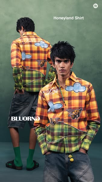
# Ad summary
This ad features two male models wearing the Honyland Shirt, showcasing its unique design and fit.
# Brand positioning
The brand, BLUORNO, aims to occupy a space of unique and artistic fashion, with a focus on original designs and bold visual statements. This positioning sets the brand apart from traditional fashion norms, appealing to individuals who want to express their individuality through clothing. The designs often incorporate playful and imaginative elements, indicating a brand that values creativity and self-expression. By creating visually striking pieces, BLUORNO encourages customers to embrace a more expressive and confident sense of style.
# Product
The advertised product is the Honyland Shirt, a long-sleeved, button-down shirt featuring a custom design. The upper portion of the shirt is a yellow and brown plaid pattern, while the lower portion transitions into a green and brown plaid separated by a horizontal line that mimics a landscape. The shirt features patches with graphics of stylized bees and fluffy blue clouds. The shirt is being presented as a statement piece that offers a fresh and imaginative take on traditional shirt designs. The overall aesthetic suggests a playful and artistic vibe, ideal for those looking to make a unique fashion statement.
# Visual style
The ad features a studio-shot image with a focus on highlighting the Honyland Shirt. The muted color palette, soft lighting, and attention to detail create a high-fashion editorial look. The composition balances showcasing the product and creating an aesthetically pleasing image.
# Hooks
Headline: Honeyland Shirt
# Benefits
- [object Object]
- [object Object]
# Features
- [object Object]
- [object Object]
- [object Object]
# Call to action
None used.
# Point of view
- [object Object]
# Storyline
- The image opens with two young male models wearing the BLUORNO Honyland shirt. This is intended to highlight the unique design and how it looks when worn, from the brand's perspective.
- The models are positioned in a way that allows the viewer to see both the front and back of the shirt, which allows the viewer to take in the full design. The brand wants to show all angles of the shirt to the customer.
- The overall composition and styling of the image emphasize the artistic and distinctive nature of the shirt. This is the brand's way of conveying the shirt's ability to stand out as a unique fashion statement.
# Ad summary
The ad showcases a clothing garment, highlighting its quality through visual inspection and tactile demonstration.
# Brand positioning
The brand is presented as a high-quality, detail-oriented brand that values craftsmanship and material quality. This is conveyed through the focus on the textured printing and the gloved hands inspecting the garment. The brand places emphasis on providing products that have unique design elements such as the tiger graphic, catering to individuals who are looking for clothing with character and a distinctive aesthetic. The brand stands out by focusing on detail and quality, rather than solely on trend-driven designs, positioning itself in a space that values artistic and tactile appreciation.
# Product
The product featured in the ad is a gray sweater or sweatshirt. The garment has unique design elements, including textured printing and a detailed tiger graphic. The printing features raised lettering, adding a tactile dimension to the design. The garment is presented as being of high quality, indicated by the gloved handling and close inspection of the material and print details. This suggests the product is intended for customers who value quality and unique design elements in their clothing.
# Visual style
The ad has a clean and detail-oriented aesthetic, emphasizing the quality of the garment through tactile demonstrations. The editing style is simple with static shots and smooth transitions, keeping the focus on the product. The production quality is high, which supports the intended tone of showcasing a premium product. The pacing is consistent, with each shot highlighting a specific detail of the garment.
# Benefits
- [object Object]
- [object Object]
# Features
- [object Object]
- [object Object]
# Call to action
None used.
# Point of view
- [object Object]
# Storyline
- 00:00–00:01 The person wearing white gloves begins by touching the garment.
- 00:01–00:02 The focus shifts to the garment's label and then the raised 'CALIFORNIA' text on the garment, the gloved hand inspects the material.
- 00:02–00:06 The gloved hand touches the printed graphic of a tiger.
- 00:06–00:07 The garment is folded and placed on top of another.
# Ad summary
This ad showcases a black hoodie with intricate floral and dragonfly embroidery, emphasizing the detail and artistry of the design. The presentation focuses on a careful, almost reverent handling of the garment to highlight its premium quality.
# Brand positioning
This brand is presented as a high-end fashion label that values intricate design and careful craftsmanship. By showcasing the product with white gloves and deliberate movements, the brand aligns with values of artistry, exclusivity, and a luxurious unboxing experience. The focus on fine embroidery and unique detailing pushes against norms of fast fashion and mass production, appealing to customers who seek sophisticated and visually rich apparel.
# Product
The advertised product is a black hoodie featuring detailed, multi-colored floral and dragonfly embroidery across the front, back, and sleeves. The embroidery includes pastel shades of green, purple, and peach. The product is presented as a garment of high craftsmanship. The visual presentation suggests this hoodie is targeted toward those who appreciate art and fashion. The hoodie's unique selling points are its detailed embroidery and distinctive design.
# Visual style
The ad features a polished, high-end aesthetic. The presentation is clean and deliberate, with static shots and smooth transitions. The focus is on showcasing the detail of the embroidery. The pacing is slow and steady, emphasizing the craftsmanship of the product. The audio is synced with the visual to create a calming and luxurious feel.
# Benefits
- [object Object]
- [object Object]
# Features
- [object Object]
- [object Object]
# Call to action
None used.
# Point of view
- [object Object]
# Storyline
- 00:00–00:07 00:00–00:07: A person wearing white gloves unfolds and presents a black hoodie. The hoodie features intricate embroidery of dragonflies and floral designs. The person carefully smooths out the material, emphasizing the detailed craftsmanship and artistic design of the garment.
- 00:07–00:09 00:07–00:09: The screen fades to white with a black circular logo in the center.
# Ad summary
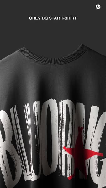
The ad features a close up shot of the 'GREY BG STAR T-SHIRT'.
# Brand positioning
The brand presents itself as modern, trendy, and high-fashion. The focus is on the brand's unique design aesthetic. The brand sets itself apart by emphasizing bold graphics, distinct typography, and unconventional visual elements. It aims to appeal to fashion-conscious consumers who are looking for statement pieces that reflect individuality and creativity, while maintaining an edgy and upscale feel.
# Product
The advertised product is the 'GREY BG STAR T-SHIRT.' It is shown in a close-up shot, highlighting the design and material. The T-shirt is grey and features a large graphic print in white and red. The graphic includes large, stylized letters filled with brushstroke-like textures. A red star is integrated into the graphic, adding a pop of color. The T-shirt is ribbed at the neck.
# Visual style
The visual style is clean and modern, focusing on a high-quality product showcase. The production quality appears highly polished, resembling a studio shot with controlled lighting. The image treatment includes subtle color grading to enhance the tones and contrast. The typography is bold and integrated into the design, contributing to the overall aesthetic. The style aims to capture attention quickly, offering a sleek and sophisticated presentation.
# Hooks
Headline: None used
# Benefits
- [object Object]
# Features
- [object Object]
# Call to action
None used.
# Point of view
- [object Object]
# Storyline
- The ad opens with a close-up of the grey t-shirt, focusing on the design and material. This is intended to immediately showcase the brand's aesthetic and capture the viewer's attention through its unique design. The brand is conveying its style and quality through visual presentation.
# Ad summary
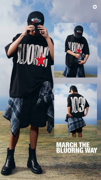
This ad features a person in an outdoor setting wearing a hat and t-shirt from BLUORNG. The image is stylized with floating, overlapping rectangles of the model in different poses.
# Brand positioning
BLUORNG is presented as a modern streetwear brand with a strong visual identity centered around its logo. The brand pushes against the norms of traditional fashion advertising by using unconventional styling and composition, creating a more artistic and youthful appeal. The brand's identity is focused on self-expression and individuality.
# Product
The featured products are a black t-shirt with the brand name "BLUORNG" printed in a stylized white font with a red star, and a black baseball cap with an embroidered graphic logo. The t-shirt is loose-fitting and is paired with black shorts and a blue and grey flannel tied around the waist. The baseball cap appears unstructured and features an embroidered graphic logo on the front. The ad promotes the brand's unique design elements and encourages viewers to adopt the brand's specific style.
# Visual style
The ad uses a streetwear aesthetic with a modern, edgy vibe. The production quality appears to be professional. The image treatment involves layering multiple shots of the same person to create a dynamic effect. The typography is bold and clean. The style of the ad might appeal to younger audiences who are interested in unique and fashionable clothing.
# Hooks
Headline: MARCH THE BLUORNG WAY
# Benefits
- [object Object]
- [object Object]
# Features
- [object Object]
- [object Object]
# Call to action
None used.
# Point of view
- [object Object]
- [object Object]
# Storyline
- The ad opens with a person standing on a hill or mound with a cloudy blue sky in the background. This provides a sense of openness and suggests the brand is about freedom and exploration.
- Multiple shots of the person in the same outfit are layered on the image to create a sense of movement and activity. This highlights the outfit's versatility.
- The brand's slogan, "MARCH THE BLUORNG WAY," appears at the bottom, explicitly connecting the brand with forward motion, individuality, and distinctiveness.
# Ad summary
A hand wearing a white glove unfolds a bright red sweatshirt. The sweatshirt has white text that reads 'Money Over Your Feelings', with a cursive logo reading 'Bluorna' revealed as the sweatshirt unfolds.
# Brand positioning
Bluorna is presented as a unique streetwear brand that encourages emotional awareness. The brand's aesthetic is bold, trendy, and slightly edgy, targeting a young audience interested in expressing themselves through fashion. The tagline 'Money Over Your Feelings' presented on the sweatshirt suggests the brand challenges conventional notions of consumerism and encourages a focus on emotional well-being. The presentation of the clothing is almost artful and the white glove styling implies elevated quality and uniqueness.
# Product
The advertised product is a bright red sweatshirt with the text 'Money Over Your Feelings' emblazoned in white on the front. The text is surrounded by whimsical green chameleon and vine illustrations. The brand name 'Bluorna' is also featured in a small, elegant cursive font, revealed as the shirt is unfolded. The sweatshirt appears to be made of a soft, comfortable material, and is shown being handled with care, suggesting a high-quality garment. The product appeals to individuals who want to make a statement through their clothing, expressing a sentiment that values emotional expression over traditional materialism.
# Visual style
The ad has a clean, crisp aesthetic. The lighting is bright and even, which allows the vibrant colors to pop. There are quick cuts to maintain a modern, energetic feel, keeping the viewer engaged. The production quality appears high, creating a polished commercial feel. The editing style uses quick cuts, helping to emphasize the brand. The ad has an upbeat pace.
# Benefits
- [object Object]
# Features
- [object Object]
- [object Object]
# Call to action
None used.
# Point of view
- [object Object]
# Storyline
- 00:00–00:05 A hand wearing a white glove unfolds a red sweatshirt with the words 'Money Over Your Feelings' written on it.
- 00:05–00:07 The brand name 'Bluorna' appears as the sweatshirt unfolds.
- 00:07–00:08 The sweatshirt is folded neatly.
# Ad summary
This ad shows the making of a baseball cap. It highlights the precision and the quality of work that is put into making it.
# Brand positioning
The brand being promoted is a company selling baseball caps. The brand emphasizes quality and craftsmanship, as demonstrated by the attention to detail during the construction of the hat. The ad implies that the brand prioritizes high quality and meticulous production.
# Product
The ad features a brown baseball cap with a curved brim. The hat has detailed stitching and features the brand name embroidered on the front in a cursive font using a thick, white thread. The back of the hat includes an adjustable strap with a metal clasp, which also features the brand's logo. The hat appears to be made for casual wear and is promoted as a high-quality product with an emphasis on craftsmanship.
# Visual style
The ad has a polished and clean aesthetic with a focus on close-up shots. The editing style uses quick cuts to showcase different stages of the cap's creation. The production quality is high, with clear lighting and sharp focus to emphasize the craftsmanship and detail. The visuals are timed with the music beats, creating a rhythmic effect that enhances the viewing experience.
# Benefits
- [object Object]
- [object Object]
- [object Object]
# Features
- [object Object]
- [object Object]
- [object Object]
# Call to action
None used.
# Point of view
- [object Object]
# Storyline
- 00:00–00:07 00:00–00:07 The video shows the making of the cap, starting with sewing the fabric. A white thread is used to embroider the logo on the cap. This emphasizes the precision that goes into crafting the hat.
- 00:07–00:08 00:07–00:08 A close-up of the hat's adjustable strap, highlighting the engraved logo on the metal clasp. This reinforces the brand's attention to detail.
- 00:08–00:09 00:08–00:09 The brand's logo is displayed on a white background. This is a quick brand reinforcement, ensuring the viewer recognizes the brand.
- 00:09–00:10 00:09–00:10 The person wearing the hat is riding in the passenger seat of the car and is vibing to the music. This shows someone wearing the product in a lifestyle setting.
# Ad summary
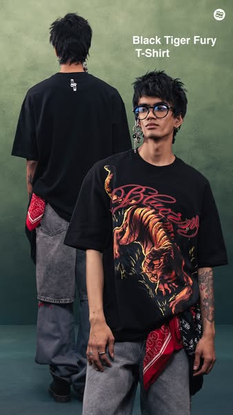
This ad features a model wearing a 'Black Tiger Fury' T-shirt by an apparel brand. The creative is designed to appeal to consumers interested in edgy, streetwear-style clothing.
# Brand positioning
This brand seems to occupy a streetwear fashion space. The brand aligns itself with edginess and an urban lifestyle through the graphic designs on their clothing and the styling choices in their ads. The brand ignores conventional fashion norms by utilizing bold graphics. The brand positioning is emotional, targeting consumers who want to express themselves through their clothing.
# Product
The featured product is the 'Black Tiger Fury T-Shirt'. It is a black, short-sleeved t-shirt with a graphic design on the front. The design features an orange tiger with red script above it. The t-shirt is made for those interested in streetwear and graphic tees. This shirt offers a unique design not commonly found.
# Visual style
The ad has a studio-shot feel with a focus on streetwear fashion. There's a muted color palette with a green background. The typography is integrated simply. The style contrasts with overly polished fashion ads and aims for a more raw, edgy aesthetic, potentially increasing stop power in feed by standing out.
# Hooks
Headline: Black Tiger Fury T-Shirt
# Benefits
- [object Object]
# Features
- [object Object]
- [object Object]
- [object Object]
# Call to action
None used.
# Point of view
- [object Object]
- [object Object]
# Storyline
- The ad shows a model wearing the 'Black Tiger Fury' T-shirt. This is intended to showcase the product and its design from a brand POV.
# Ad summary
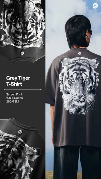
This ad showcases a gray t-shirt with a tiger print design. The ad emphasizes the quality of the materials used and provides technical specifications, appealing to consumers who value high-quality, detailed apparel.
# Brand positioning
The brand, identified by a circular logo with the letters 'SS', focuses on creating high-quality apparel with distinctive designs. It places a strong emphasis on the materials and manufacturing details, such as '100% Cotton' and '260 GSM,' appealing to consumers who value the specifics of apparel construction. The brand's positioning is functional, highlighting the tangible attributes of the product. The brand's tone is straightforward and detail-oriented, focusing on product specifications rather than emotional appeals.
# Product
The advertised product is a 'Grey Tiger T-Shirt'. The design features a black and white tiger print, with one image showing the full tiger head on the back, and another showing the tiger's face distorted and wrapping around the side of the shirt. The shirt is described as being made from '100% Cotton' and constructed with a 'Screen Print'. It is also specified to have a weight of '260 GSM', indicating a medium-weight fabric. This information is presented to highlight the product's quality and construction, appealing to consumers who value detailed product specifications.
# Visual style
The ad features a split-screen design with a studio shot on the left and an outdoor lifestyle shot on the right. The product is highlighted through clear, detailed imagery and a simple background. The overall style is clean and minimalist, with a focus on showcasing the product's design and quality. The visual aesthetic is modern and straightforward, providing essential information about the product in a visually appealing way.
# Hooks
Headline: Grey Tiger T-Shirt
# Benefits
- [object Object]
# Features
- [object Object]
- [object Object]
- [object Object]
# Call to action
None used.
# Point of view
- [object Object]
- [object Object]
# Storyline
- The ad begins with a side-by-side display of the 'Grey Tiger T-Shirt', presented by the brand. On the left, the shirt is shown in a close-up studio shot, emphasizing the texture and design details. On the right, the shirt is being worn outdoors, showing how it looks on a person in a natural setting. This is intended to give a clear and complete view of the product.
- The brand provides specific details about the shirt's construction, stating 'Screen Print', '100% Cotton', and '260 GSM'. The purpose is to communicate the quality and craftsmanship of the shirt. The ad is clearly communicating that the product is made with attention to detail.
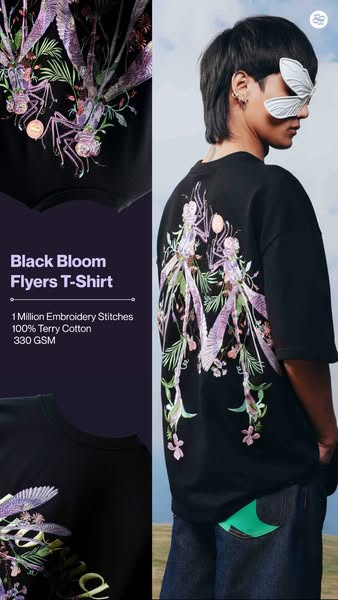
# Ad summary
An image ad showcasing the 'Black Bloom Flyers T-Shirt', highlighting its unique embroidery and material quality.
# Brand positioning
The brand is presented as a designer of unique and high-quality apparel. Its aesthetic merges streetwear with high fashion by focusing on elevated materials and distinctive design elements like elaborate embroidery. The brand aims to occupy a space in the market that values artistic expression and attention to detail, and caters to consumers who want to wear statement pieces.
# Product
The advertised product is the 'Black Bloom Flyers T-Shirt.' It is a black t-shirt featuring a detailed, colorful embroidered design on the back. The design is floral with insect-like creatures. According to the ad, the embroidery consists of '1 Million Embroidery Stitches' and the t-shirt is made of '100% Terry Cotton' with a weight of '330 GSM.' The design on the front features a partial rendering of the embroidery on the back.
# Visual style
The ad has a modern and fashionable visual style. The production quality is high, with well-lit and composed shots. The image treatment includes subtle color grading to enhance the colors. The layout is split, with product details on one side and a lifestyle shot on the other. The typography is clean and legible. The overall style is designed to feel current and appealing to a fashion-conscious audience.
# Hooks
Headline: Black Bloom Flyers T-Shirt
# Benefits
- [object Object]
# Features
- [object Object]
- [object Object]
- [object Object]
# Call to action
None used.
# Point of view
- [object Object]
- [object Object]
# Storyline
- The ad opens by displaying a partial rendering of the embroidered design on the front of the t-shirt on the left side of the frame. This serves to give an initial glimpse of the product's aesthetic and highlight the design elements. This portion of the story is being told from the brand's perspective.
- The camera zooms out on the right side of the frame to reveal a person wearing the t-shirt, showcasing the full design on the back and how it looks when worn. The camera focuses on the back of the shirt with the full embroidered design. This shows the full form of the garment and its unique design. This portion of the story is being told from an external perspective, presenting the product in a real-world context.
- On the left side of the frame, product details such as the shirt name ('Black Bloom Flyers T-Shirt'), the number of embroidery stitches ('1 Million Embroidery Stitches'), the material ('100% Terry Cotton'), and the fabric weight ('330 GSM') are listed. This provides key details about the product's craftsmanship and quality, meant to reassure the consumer of its value. This is the brand's perspective, directly stating the product's attributes.
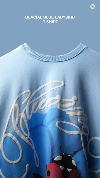
# Ad summary
This ad features the 'Glacial Blue Ladybird T-Shirt'. The ad emphasizes the shirt's design and color.
# Brand positioning
The brand presents itself as a creator of stylish, design-forward apparel, primarily graphic t-shirts with an emphasis on trendy color palettes. It targets consumers seeking unique and aesthetically pleasing clothing that stands out through its distinctive designs. The brand uses youthful color combinations and graphics.
# Product
The advertised product is a t-shirt identified as the "Glacial Blue Ladybird T-Shirt". The shirt is light blue and features a graphic design of a blue flower with a ladybug on one of the flower's petals. The graphic has a white, stylized script layered over it. The shirt has a ribbed crew neck and is made of a soft, breathable material.
# Visual style
The ad has a clean, minimalist aesthetic with a focus on the product. The lighting is soft and even, highlighting the texture of the t-shirt and the details of the graphic design. The color palette is monochromatic, enhancing the calming feel.
# Hooks
Headline: GLACIAL BLUE LADYBIRD
# Benefits
- [object Object]
# Features
- [object Object]
# Call to action
None used.
# Point of view
- [object Object]
# Storyline
- The ad begins with a focus on the upper portion of the t-shirt, showcasing its design and color. This is meant to highlight the aesthetic features of the product from the brand's perspective.
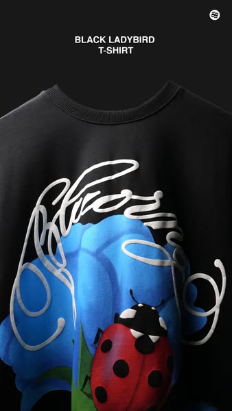
# Ad summary
This ad features a close up of a black t-shirt with a blue flower and ladybug design on the front. The product name is shown at the top.
# Brand positioning
The brand appears to offer t-shirts that are fashion-forward and feature bold graphic designs. They position themselves as a modern brand that isn't afraid to use bright colors in their designs. The brand exists to provide unique and fashionable clothing options.
# Product
The product is a black t-shirt featuring a distinctive design. The design includes a large blue flower with textured shading and a red ladybug with black spots. Overlapping the design is a cursive white script that adds a modern and artistic touch to the garment. The t-shirt itself appears to be made of a soft, comfortable material, suggesting it's designed for everyday wear with an emphasis on style and comfort.
# Visual style
The ad features a clean and minimalist style with a focus on the product. The lighting is soft, highlighting the textures and colors of the t-shirt design. The image is closely cropped to focus on the design of the shirt.
# Hooks
Headline: None used
# Benefits
- [object Object]
- [object Object]
# Features
- [object Object]
- [object Object]
# Call to action
None used.
# Point of view
- [object Object]
# Storyline
- The ad opens with a close-up view of the t-shirt, immediately drawing attention to its design and overall aesthetic. The intention here is to showcase the quality and visual appeal of the product. This is shown from the brand's perspective.
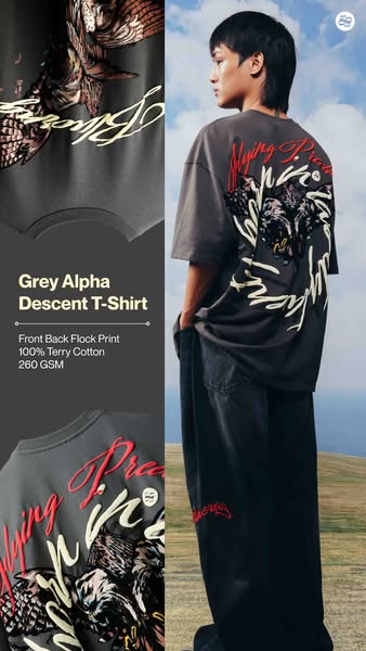
# Ad summary
This ad showcases a grey t-shirt with a graphic design on the front and back, emphasizing its material and design features.
# Brand positioning
The brand is presented as a contemporary clothing line that appeals to fashion-forward individuals. The designs are bold and artistic. The brand establishes itself in a niche that values distinctive graphic designs and premium materials. The brand is not explicitly positioned against any particular competitor, but it emphasizes the uniqueness and quality of its products.
# Product
The featured product is a 'Grey Alpha Descent T-Shirt'. It is made from '100% Terry Cotton' with a fabric weight of '260 GSM'. The t-shirt includes a 'Front Back Flock Print' design. The design features a graphic illustration of an animal, potentially a bird or a wildcat, along with stylized text, which is spread across the front and back of the shirt. The shirt is gray and seems to be designed for casual wear, highlighting the distinctive print as a key feature.
# Visual style
The ad features a clean and modern visual style with a focus on showcasing the product's design and material quality. The color palette is muted, with greys and blacks dominating, which helps to highlight the graphic print on the t-shirt. The outdoor setting provides a natural backdrop, and the focus is on the t-shirt and the person wearing it.
# Hooks
Headline: None used
# Benefits
- [object Object]
# Features
- [object Object]
- [object Object]
- [object Object]
# Call to action
None used.
# Point of view
- [object Object]
# Storyline
- The ad starts by presenting a close-up of the t-shirt's graphic design, showing the detailed artwork and texture of the print. This is intended to highlight the unique design and quality of the print, with the brand telling this part of the story to draw attention to the shirt's aesthetic appeal.
- Then, the ad transitions to a full shot of a person wearing the t-shirt, showing how it looks when worn and providing context for its fit and style. The brand is telling the story to display the shirt in a real-life setting, suggesting its wearability and overall style.
- Finally, the ad includes product details such as the material ('100% Terry Cotton') and print type ('Front Back Flock Print'), giving viewers concrete information about the shirt's construction and quality. This part of the story is again told by the brand, aiming to assure potential buyers of the shirt's value and material composition.
How Other Apparel Brands Advertise on Meta
Peer brands in Motion's library — click any brand to see their creative strategy, live ads, and AI breakdowns.