Afloral runs 28 active ads on Meta, shipping ~4 new creatives per week. Their library leans on Headline38%, Review19%, and Product Image13%. Recently, afloral is hammering home the realism of their artificial stems through heavy reliance on customer testimonials paired with styled in-home shots, making "looks real" the central proof point. They're pushing seasonal transitions hard (fall to spring) with kitchen and tabletop staging that screams effortless home refresh, while simultaneously laddering up to weddings with romantic bridal bouquet showcases that position them as upscale occasion-worthy. The through-line is credibility building around faux looking indistinguishable from fresh, whether it's for everyday elevated living or milestone moments.
# Ad summary
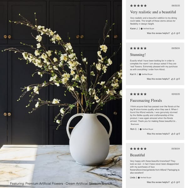
The ad showcases Afloral's Premium Artificial Cream Blossom Branch flowers, highlighting their realistic appearance and quality through customer testimonials.
# Brand positioning
Afloral is presented as a provider of high-quality artificial flowers that offer a realistic and beautiful alternative to natural flowers. The brand emphasizes the lifelike quality and craftsmanship of its products, suggesting that they are worth the investment for customers who appreciate aesthetics and long-lasting home decor. Afloral seems to cater to those who seek convenience and lasting beauty, providing faux flowers that are indistinguishable from real ones. The brand does not make any competitor comparisons, but caters to those who are discerning about the quality of artificial flower options, and positions its product as a premium option in the artificial flower space.
# Product
The product being advertised is Premium Artificial Flowers - Cream Artificial Blossom Branch from Afloral. It is presented as a very realistic and beautiful addition to any dining room table, offering flexibility in design height due to the length of its stems. Customer reviews praise the product's lifelike quality, often mistaking them for 'real' flowers, and express satisfaction with the product's quality and packaging. The ad addresses the potential barrier of skepticism toward faux florals by showcasing customer testimonials that vouch for the flowers' realistic appearance and value.
# Visual style
The ad has a clean and elegant visual aesthetic with a focus on showcasing the product in a realistic and appealing setting. The production quality is high, with a well-lit and styled product shot complemented by authentic-looking customer testimonials. The color palette is neutral, with cream, white, gray, and dark gray tones, conveying a sense of sophistication and understated luxury. The layout is simple, with the product image taking center stage and the testimonials arranged neatly to the right, providing social proof without overwhelming the visual. This style is likely designed to blend seamlessly into a user's feed while providing immediate product information and validation.
# Hooks
Headline: Very realistic and a beautiful
# Benefits
- [object Object]
- [object Object]
- [object Object]
# Features
- [object Object]
- [object Object]
# Call to action
None used.
# Point of view
- [object Object]
# Storyline
- The ad presents a beautifully styled floral arrangement using Afloral's cream artificial blossom branches. The intention is to visually showcase the product in a lifestyle setting, and the audience experiences the brand's visual of the product in a real-life context.
- The ad then transitions to showcasing customer testimonials praising the product's realism and aesthetic appeal. The intention is to build trust and credibility by demonstrating social proof, and the audience experiences the product through the perspective of satisfied customers who highlight the product's value and quality.
- The ad reinforces the product's value by highlighting its versatility and the positive experiences of other customers. The intention is to further persuade potential buyers by emphasizing the consensus of satisfaction, and the audience experiences a combined brand and customer message, solidifying the flowers' desirability and justifying the purchase.
# Ad summary
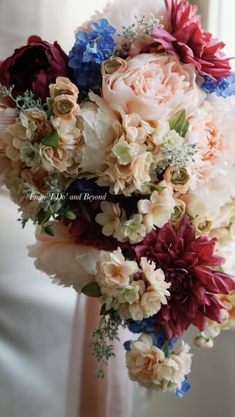
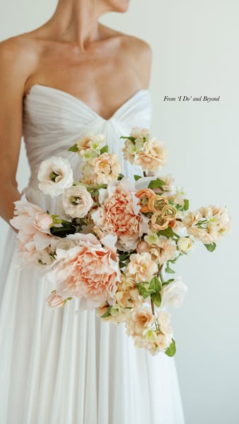
This image ad features a lush, colorful floral arrangement, likely promoting a floral design service for weddings or special events. The focus is on the beauty and elegance of the bouquet, aiming to attract customers seeking bespoke floral designs.
# Brand positioning
The brand, "I Do' and Beyond" positions itself within the wedding and event floral design space. The brand is implied to value artistry and detailed craftsmanship, with a focus on creating memorable, visually stunning floral arrangements. Their positioning seems emotional, aligning with the significance and beauty associated with wedding events, promising to go above and beyond typical floral services to create unforgettable moments.
# Product
The featured product is a custom-designed floral arrangement or bouquet. The arrangement includes various types of flowers in a range of colors including peach, white, burgundy, and blue. The arrangement contains peonies, and smaller ranunculus. The arrangement is large and lush, creating a visually rich display. The product is likely intended for weddings or high-end events, addressing the desire for bespoke, memorable floral designs. There are no specific product details or USPs listed, but the visual presentation emphasizes artistry and quality.
# Visual style
The ad uses a highly polished, studio-shot aesthetic to emphasize the beauty and quality of the floral arrangement. The visual motifs focus on a close-up view and soft lighting. The image treatment includes background blurring and subtle color grading. The typography integration is minimal. The style is high-design, aiming to create a visually appealing image that will stop the viewer in their feed.
# Hooks
Headline: From 'I Do' and Beyond
# Benefits
- [object Object]
- [object Object]
# Features
- [object Object]
# Call to action
None used.
# Point of view
- [object Object]
# Storyline
- The ad features a close-up shot of a large, elegant floral arrangement. This is included to showcase the brand's artistry and the visual appeal of their floral designs. The audience experiences this from a brand perspective, highlighting the beauty and craftsmanship they offer.
# Ad summary
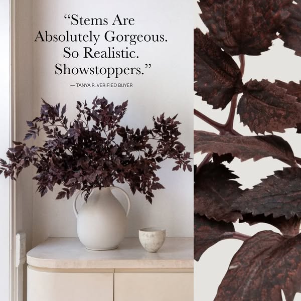
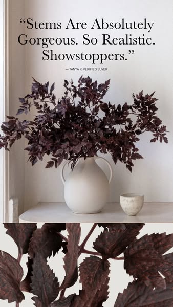
This image ad features a customer testimonial praising the lifelike appearance of the brand's stems, paired with a visual showcasing the product styled in a home setting.
# Brand positioning
The brand is positioned as offering high-quality artificial flowers that are so realistic, they can be considered 'showstoppers'. The ad presents the brand as a provider of elegant, long-lasting decor that rivals real flowers in appearance.
# Product
The featured product is artificial floral stems, specifically dark purple leafy stems. The stems are designed to mimic the appearance of real foliage, with the ad highlighting their realistic quality and beauty. The product is presented as a home decor item suitable for display in vases. The ad showcases the product's aesthetic value and its ability to enhance interior spaces.
# Visual style
The ad has a clean, minimalist visual style, using soft lighting and neutral colors to create an elegant and calming atmosphere. The image is well-lit, with natural light highlighting the details of the stems and the surrounding decor. The overall effect is polished and refined.
# Hooks
Headline: "Stems Are Absolutely Gorgeous. So Realistic. Showstoppers."
# Benefits
- [object Object]
- [object Object]
# Features
- [object Object]
# Call to action
None used.
# Point of view
- [object Object]
- [object Object]
# Storyline
- The ad opens with a customer's perspective, emphasizing the product's visual appeal and realism through a direct quote, establishing immediate credibility and highlighting the key selling points.
- The narrative then transitions to a visual display of the product, demonstrating how the stems look in a home setting, allowing potential customers to envision the product in their own spaces.
# Ad summary
This ad features a customer testimonial about the brand's realistic-looking faux floral stems.
# Brand positioning
The brand is presented as a provider of high-quality, realistic faux floral arrangements. The ad emphasizes the beauty and lifelike appearance of the stems, suggesting a focus on providing elegant and long-lasting alternatives to fresh flowers. The brand aims to occupy a space in the consumer's mind as a go-to for sophisticated, low-maintenance floral decor.
# Product
The product featured is a set of faux floral stems, specifically dark purple leafy stems. The stems are arranged in a white vase. The ad highlights the realistic appearance of the stems, with a customer testimonial emphasizing their beauty and lifelike quality. The stems are presented as a decorative item, suitable for adding a touch of elegance to any space. The ad addresses the purchase barrier of skepticism towards faux plants by showcasing a customer's positive experience and highlighting the stems' realistic look.
# Visual style
The ad has a clean and minimalist visual style. The color palette is muted, with soft whites and dark purples dominating the scene. The lighting is soft and diffused, creating a calming and elegant atmosphere. The composition is balanced and symmetrical, with the vase and stems positioned in the center of the frame. The overall effect is sophisticated and refined.
# Hooks
Headline: "Stems Are Absolutely Gorgeous. So Realistic. Showstoppers."
# Benefits
- [object Object]
- [object Object]
- [object Object]
# Features
- [object Object]
# Call to action
None used.
# Point of view
- [object Object]
- [object Object]
# Storyline
- The ad opens with a customer testimonial, "Stems Are Absolutely Gorgeous. So Realistic. Showstoppers." This is included to immediately establish the product's quality and appeal through the voice of a satisfied customer. The audience experiences this from the customer's perspective.
- The ad then shows a visual of the faux floral stems arranged in a vase. This is included to provide a visual representation of the product and its aesthetic appeal. The audience experiences this from the brand's perspective.
- The ad ends with a close-up shot of the stems. This is included to highlight the realistic details of the product. The audience experiences this from the brand's perspective.
# Ad summary
This ad showcases a variety of wedding bouquets, promoting perfect flowers for a perfect day.
# Brand positioning
The brand aims to position itself as the go-to provider for wedding flowers, emphasizing the importance of having perfect flowers for a special day. The brand aligns with values of elegance, beauty, and creating memorable moments. They push against the idea that wedding flowers are just an afterthought, presenting them as a crucial part of the perfect wedding. The brand positioning is emotional, focusing on the desire for a flawless and beautiful wedding experience. Multiple bouquets are showcased, each with its unique style, but all maintain the brand's identity of elegance and perfection.
# Product
The advertised product is wedding flower bouquets, presented as essential for creating a perfect wedding day. The bouquets come in various styles, colors, and arrangements, catering to different wedding themes and preferences. The ad highlights the bouquets' aesthetic appeal and how they enhance the overall wedding experience. There are no explicit product details or ingredients mentioned; instead, the focus is on the visual beauty and the emotional value the flowers bring to the occasion. The unique selling proposition (USP) is that the brand offers the 'perfect flowers' to ensure a memorable and aesthetically pleasing wedding. The use occasion is explicitly a wedding day. The ad addresses the potential purchase barrier of not prioritizing flowers by emphasizing their importance in creating a flawless wedding.
# Visual style
The ad has a polished and elegant aesthetic, with a focus on showcasing the beauty of the floral arrangements in high-quality images. The editing style consists of static shots with smooth transitions between them, creating a seamless flow. The production quality is high-end, resembling a professional commercial. The visual motif is the consistent presentation of bridal bouquets in various wedding settings. The pacing is slow and steady, with approximately 6 cuts per minute, maintaining a consistent rhythm throughout the ad. The cuts are timed to create a smooth visual experience.
# Benefits
- [object Object]
# Call to action
None used.
# Point of view
- [object Object]
# Storyline
- 00:00–00:02 00:00–00:02: A variety of bridal bouquets are shown in different settings, including outdoor wedding photos and indoor bridal portraits.
- 00:02–00:06 00:02–00:06: More examples of bridal bouquets are displayed, highlighting different colors and styles.
- 00:06–00:11 00:06–00:11: The ad concludes with final shots of bridal bouquets in various wedding contexts.
# Ad summary
This ad promotes fall decor that is suitable for any home aesthetic. It showcases the process of decorating a table runner with greenery and pinecones and then highlights how well-regarded the products are by customers and publications alike.
# Brand positioning
The brand is presented as offering high-quality, aesthetically versatile fall decor that can complement any home's style. The products are shown being lovingly placed in a dining setting, suggesting that the brand values elegance and attention to detail in home decor. The ad leverages social proof and editorial endorsements to build trust and demonstrate the widespread appeal and quality of its fall decor offerings.
# Product
The featured product is a collection of fall-themed decor, including greenery, pinecones, acorns, and gold-colored leaves. These items are designed to be arranged on a table runner. The greenery consists of faux evergreen branches, while the pinecones and acorns add natural textures and tones. The gold leaves provide a touch of elegance and warmth, complementing the overall autumnal theme. The ad shows how these decorations can be arranged to create a festive and visually appealing table setting, suitable for any home aesthetic.
# Visual style
The ad has a clean, polished aesthetic with a focus on showcasing the fall decor in a well-lit dining room. The editing style includes static shots and smooth transitions, maintaining a consistent and elegant visual flow. The production quality is high, giving the ad a professional commercial feel. The pacing is moderate, with cuts timed to the background music.
# Benefits
- [object Object]
- [object Object]
# Features
- [object Object]
- [object Object]
- [object Object]
# Call to action
Shop Now.
# Point of view
- [object Object]
# Storyline
- 00:00–00:01 00:00–00:01 The ad begins with a long shot of a dining room table with a beige table runner on it. This is meant to introduce the setting for the decor.
- 00:01–00:06 00:01–00:06 Hands are shown adding greenery, pinecones, and gold leaves to the table runner. The brand’s intention is to display the process of creating an autumnal table setting. The perspective is from someone watching the arrangement being made, emphasizing the creative process.
- 00:06–00:09 00:06–00:09 The hands continue to arrange the decor on the table runner. This is a continuation of the decorating process. The perspective remains the same, focusing on the arrangement.
- 00:09–00:12 00:09–00:12 The hands continue to add greenery to the table runner. The brand intends to show the full process of decorating. The perspective is still focused on the arrangement.
- 00:12–00:14 00:12–00:14 The ad ends with a long shot of the decorated dining room table with candles. The goal is to present the final, festive dining setting, creating a sense of warmth and elegance.
# Ad summary
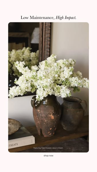
This ad features a serene photo of fake white lilacs in cream-colored pottery to promote the visual impact and low maintenance of the product.
# Brand positioning
The brand is positioned as offering high-end home decor that provides lasting beauty without the upkeep of real plants. It is implied that the brand appeals to customers who appreciate refined aesthetics and natural elements but value convenience and simplicity. The tone is elegant, understated, and accessible.
# Product
The product featured is a selection of fake flowers, specifically “Fake Flowers Lilacs in Cream.” They are presented as a high-impact, low-maintenance alternative to fresh flowers, implying they require no watering, sunlight, or pruning. The image emphasizes their realistic appearance and the way they enhance a room's decor. The flowers are placed in a rustic, earth-toned pottery vase, suggesting they are suitable for various interior styles. The ad subtly addresses the barrier of floral care by highlighting the convenience of faux botanicals.
# Visual style
The ad has a soft, natural, and slightly rustic visual style. The lighting is diffused, creating a gentle, inviting atmosphere. The color palette is muted, with earth tones and soft whites dominating. The overall effect is elegant and understated.
# Hooks
Headline: Low Maintenance, High Impact.
# Benefits
- [object Object]
- [object Object]
# Features
- [object Object]
# Call to action
shop now
# Point of view
- [object Object]
# Storyline
- The ad opens with the claim “Low Maintenance, High Impact.”, immediately conveying the key value proposition from the brand's perspective: offering elegant décor without the need for upkeep. The brand is positioning its offering as a solution to those seeking the beauty of flowers without the associated care requirements.
- The image then shows a close-up view of cream-colored lilacs arranged in a rustic, earthen vase. The brand is visually demonstrating the product's aesthetic appeal and how it can enhance home décor.
- The ad concludes with a call to action, 'shop now', directing the viewer to immediately purchase the product from the brand's perspective. This invites the viewer to experience the benefits of low-maintenance, high-impact décor for themselves.
# Ad summary
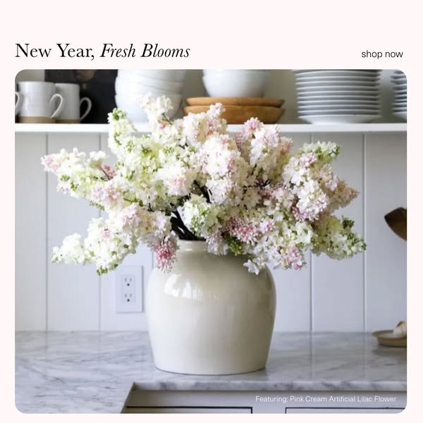
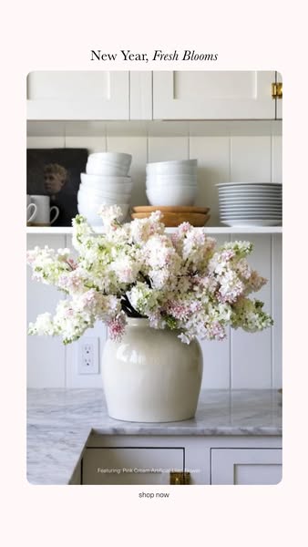
This ad showcases pink and white artificial lilac flowers in a neutral-colored vase set in a neutral kitchen setting. It aims to convey a feeling of freshness and renewal.
# Brand positioning
The brand is positioned as a provider of artificial flowers that bring the beauty of fresh blooms into the home without the upkeep. The focus is on providing realistic, high-quality alternatives to fresh flowers, allowing customers to enjoy the aesthetic appeal of floral arrangements year-round. The brand's tone aligns with a lifestyle of understated elegance and effortless style. Rather than competing with florists, the brand occupies a different niche by offering a practical, long-lasting solution for home decor.
# Product
The featured product is an artificial lilac flower, specifically the 'Pink Cream Artificial Lilac Flower.' It is a detailed replica of natural lilac, featuring a mix of light pink and white blossoms on a single stem. The product is designed to mimic the appearance and texture of fresh lilac, providing a realistic alternative. These artificial flowers are for anyone who wants to add floral decor to their space without having to replace them. The ad subtly addresses the purchase barrier of fresh flowers wilting quickly by offering a long-lasting solution.
# Visual style
The ad has a clean and minimalistic visual style, with a focus on natural light and neutral colors. The production quality is high, with a polished, studio-shot feel. The image treatment enhances the natural tones and textures, creating a soft and inviting atmosphere. The typography is simple and elegant, blending seamlessly into the overall design. The style creates a sense of understated luxury and sophistication.
# Hooks
Headline: New Year, Fresh Blooms
# Benefits
- [object Object]
# Features
- [object Object]
# Call to action
shop now
# Point of view
- [object Object]
- [object Object]
# Storyline
- The ad opens with the headline, "New Year, Fresh Blooms," setting a theme of renewal and freshness associated with the New Year. This is the brand's way of setting the tone for the ad and immediately positioning their product as part of that theme.
- The central image showcases a vase filled with the 'Pink Cream Artificial Lilac Flower.' The brand is highlighting the product in a natural, home-like setting, demonstrating how the flowers can enhance an interior space and offering a realistic view of their product in use.
- In the bottom right corner, the ad contains a caption that specifies, "Featuring: Pink Cream Artificial Lilac Flower." The brand wants to ensure the product featured is clear to the viewer, and this caption serves to reinforce the product's identity.
- In the upper right corner, there is a "shop now" button. This provides a clear and direct route for viewers to purchase the product, and it allows the brand to prompt the viewer to take action.
# Ad summary
This image ad showcases a bride holding a peach-colored flower bouquet. The overall feel of the image is soft and romantic, implying that the brand is for upscale weddings.
# Brand positioning
The brand is positioned as a wedding floral provider. Given the high-fashion nature of the shot, they are most likely targeting a higher end market. The brand sells floral arrangements for weddings.
# Product
The product is a wedding bouquet with peach-colored flowers. The flowers are full and plush with greenery. The bouquet is tied with what appears to be a white ribbon, but it is not visible as it is being held.
# Visual style
The image has a clean and modern aesthetic. The focus is on the flowers and the dress, so the background is kept simple. The overall impression is elegant and upscale. The image appears to be professionally shot.
# Hooks
Headline: None used
# Benefits
- [object Object]
- [object Object]
# Features
- [object Object]
- [object Object]
- [object Object]
- [object Object]
# Call to action
None used.
# Point of view
- [object Object]
# Storyline
- The narrative is from the brand's perspective, showing the audience the beauty of the product.
# Ad summary
This image ad features a vase of pink and white artificial flowers on a marble countertop in front of white cabinets. The ad promotes freshness and new beginnings for the new year and includes a 'shop now' CTA.
# Brand positioning
The brand is positioned as offering a simple way to elevate your space with a touch of elegance and freshness. The use of soft, natural light and a clean, minimalist aesthetic suggests a brand that values sophistication and tranquility. The brand aligns with a lifestyle that appreciates the beauty of nature and the comfort of home, offering products that seamlessly blend into a well-curated living space. Without explicitly pushing against category norms, the brand's focus on subtle beauty and understated luxury may appeal to customers seeking to refresh their homes with minimal effort and a keen eye for design.
# Product
The product featured is a bouquet of artificial flowers, specifically "Pink Cream Artificial Flower". These flowers are showcased in a cream-colored vase, implying they are intended for home decor. The ad highlights the aesthetic appeal of the flowers, suggesting they bring a fresh and vibrant touch to any interior setting. No specific features, ingredients, or design details are explicitly mentioned. The unique selling point is the ease with which one can introduce floral beauty without the upkeep of real flowers. This addresses the purchase barrier of maintenance and the time required to care for natural flowers. The ad conveys that these artificial flowers offer a hassle-free way to enhance living spaces.
# Visual style
The ad has a bright and airy visual aesthetic with a focus on clean lines and natural light. The production quality appears to be high, resembling a professionally styled interior shot. The visual motif is minimalist, with a simple arrangement of elements that highlight the product. The image treatment includes soft lighting and muted colors, creating a calm and inviting atmosphere. The typography is understated, allowing the visuals to take center stage. The overall style leans towards a blend of modern and classic, aiming to appeal to an audience that values refined and effortless beauty.
# Hooks
Headline: New Year, Fresh Blooms
# Benefits
- [object Object]
# Features
- [object Object]
# Call to action
shop now
# Point of view
- [object Object]
- [object Object]
- [object Object]
# Storyline
- The ad opens with the phrase, "New Year, Fresh Blooms," setting the tone for renewal and beauty. This message is from the brand's perspective, aiming to capture attention with a seasonal and aspirational theme.
- Next, a vase of artificial flowers is shown in a home setting. This visual intends to demonstrate the product’s aesthetic appeal and its suitability for interior decoration. The perspective here is from the viewer's, allowing them to envision the flowers in their own home.
- The ad concludes with the text "Featuring: Pink Cream Artificial Flower" followed by a "shop now" CTA, inviting immediate purchase. This is from the brand's perspective, transitioning from showcasing the product to driving sales.
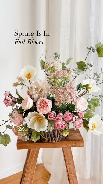
# Ad summary
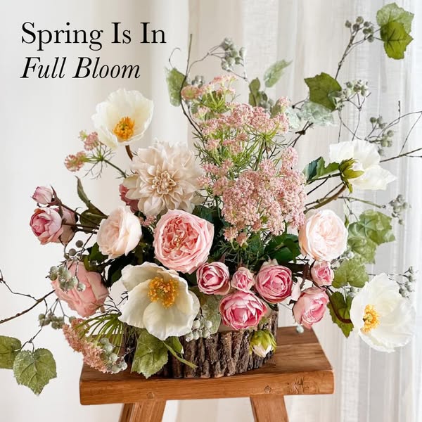
This image ad features a spring floral arrangement in a wood-look vase set on a small wooden table in front of white curtains. The ad is advertising spring.
# Brand positioning
This ad does not explicitly include any brand information. The overall aesthetic suggests a brand that values classic elegance, natural beauty, and a touch of rustic charm. The focus on a floral arrangement evokes a sense of freshness and seasonal renewal, appealing to consumers who appreciate home decor and are likely interested in creating a welcoming and aesthetically pleasing environment.
# Product
This ad features a meticulously arranged floral display, combining various flower types such as roses, dahlias, and what appear to be poppies in shades of pink, cream, and white. These blooms are interspersed with lush greenery and delicate sprigs of berries, creating a full and vibrant composition. The arrangement is housed in a cylindrical vase with a bark-like texture, adding a rustic touch. The overall presentation suggests a high-quality, artificial floral arrangement that mimics the beauty of fresh flowers with the added benefit of longevity and low maintenance. The arrangement is pre-made and ready to display, offering a convenient solution for adding a touch of spring to any space.
# Visual style
The ad features a bright and airy studio shot with a focus on natural light. The image is highly polished, emphasizing the textures and colors of the floral arrangement. The visual style mimics a lifestyle shot, creating an aspirational and inviting aesthetic that suggests the product fits seamlessly into an elegant home setting. The overall effect is clean and bright, designed to quickly capture attention and convey a sense of springtime freshness.
# Hooks
Headline: Spring Is In Full Bloom
# Benefits
- [object Object]
# Features
- [object Object]
# Call to action
None used.
# Point of view
- [object Object]
# Storyline
- The image presents a lush, carefully arranged floral display. This immediately sets the tone for spring and beauty. The viewer experiences the scene as a tranquil, aesthetically pleasing moment intended to evoke feelings of freshness and elegance.
# Ad summary
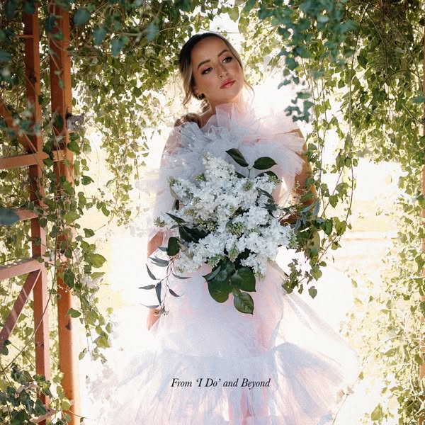
An image featuring a person in a white dress holding a bouquet of flowers in a natural setting, promoting 'I Do' and Beyond.
# Brand positioning
This ad showcases 'I Do' and Beyond as a service dedicated to creating memorable wedding experiences. The brand's positioning is centered around the emotional and aesthetic aspects of weddings, providing a service for people hoping to plan a wedding. The visual elements such as the flowers and sunlight create a bright, airy, and dreamlike atmosphere, highlighting the brand's focus on making your dream wedding a reality. They appear to be following wedding category norms.
# Product
The ad promotes the overall wedding services offered by the brand, 'I Do' and Beyond. These services aim to assist couples in planning and executing their weddings, ensuring memorable experiences. The services include wedding design, flowers, and potentially other elements necessary for a successful and beautiful wedding celebration. The ad is designed to appeal to those seeking a romantic, dreamlike wedding, and addresses potential purchase barriers by showing the beautiful results that can be achieved through their service.
# Visual style
The ad has a romantic and ethereal visual style, enhanced by soft lighting and a natural setting. The production quality looks professional, with attention to detail in the styling, floral arrangement, and composition. The image treatment includes a soft filter that adds to the dreamlike quality. The typography is subtle and elegant, complementing the overall aesthetic. The style is designed to capture attention and convey a sense of aspiration and beauty, aligning with the brand's focus on creating memorable wedding experiences.
# Hooks
Headline: From ‘I Do’ and Beyond
# Benefits
- [object Object]
- [object Object]
# Features
- [object Object]
# Call to action
None used.
# Point of view
- [object Object]
# Storyline
- The ad presents a bride-like figure standing outdoors in a dreamy, sun-lit scene. This visual aims to capture the imagination and evoke feelings associated with a perfect wedding day, allowing the viewer to imagine themselves in such a picturesque setting. This is from the brand's point of view.
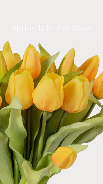
# Ad summary
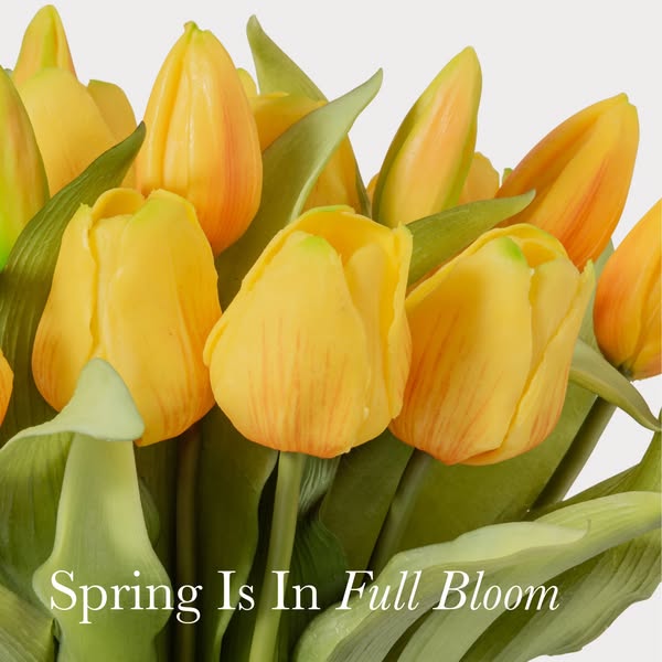
This image ad features a close-up shot of yellow tulips with a headline that reads: "Spring Is In Full Bloom."
# Brand positioning
The brand is not explicitly mentioned or visible in the ad. However, the ad evokes a sense of freshness, beauty, and renewal associated with spring. It positions the brand as one that appreciates and celebrates the beauty of nature and seasonal changes. The ad aligns with values of bringing natural beauty into the consumer's environment, promoting a lifestyle of enjoying simple pleasures, and offering a touch of elegance.
# Product
The product featured is a bouquet of yellow tulips. The tulips are in full bloom, showcasing their vibrant yellow color and intricate petal structure. Some tulips have hints of orange near the tips. The arrangement includes green leaves that provide a natural contrast to the yellow flowers. The ad emphasizes the aesthetic appeal of the tulips, suggesting they are ideal for bringing the beauty of spring indoors. The tulips are realistic enough to be perceived as real flowers, implying a fresh and natural aesthetic.
# Visual style
The ad has a clean and bright visual style with a focus on natural elements. The production quality appears to be highly polished, with careful attention to lighting and color grading. The image treatment enhances the natural colors and textures of the tulips, creating an inviting and visually appealing image. The typography is simple and elegant, integrated seamlessly into the image. The style is likely designed to be scannable and appealing in-feed, grabbing attention with its vibrant colors and clean composition.
# Hooks
Headline: Spring Is In Full Bloom
# Benefits
- [object Object]
# Features
- [object Object]
# Call to action
None used.
# Point of view
- [object Object]
# Storyline
- The ad opens with a close-up view of yellow tulips, creating a sense of immediacy and intimacy. This is done to immediately draw the viewer's attention to the beauty and vibrancy of the flowers, setting a positive and inviting tone. The audience experiences this from the perspective of someone admiring the flowers up close.
- The headline "Spring Is In Full Bloom" reinforces the seasonal theme and connects the flowers with the idea of renewal and beauty. This serves to convey the message that the product embodies the essence of spring and can bring its freshness into the viewer's life. The brand is using this to communicate that the product embodies the essence of spring.
# Ad summary
The ad showcases a handcrafted floral arrangement as the central product. The ad is styled for a spring theme and is likely intended to showcase the brand's aesthetic and craftsmanship.
# Brand positioning
The brand is presented as one that offers handcrafted and curated floral arrangements, suggesting a focus on artistry and attention to detail. It aims to occupy a space in the consumer's mind that associates with elegance, seasonal beauty, and high-quality design for home decor or gifting. The brand promotes values of sophistication and appreciation for natural beauty, ignoring category norms of mass-produced floral products.
# Product
The featured product is a handcrafted floral arrangement placed in a rustic-style wooden container. The arrangement includes a mix of white and pink flowers, featuring roses, peonies, and other delicate blooms, as well as stems with small berries or buds. The flowers are arranged in a way that appears natural and full, with a variety of textures and sizes creating visual interest. The wooden container has a bark-like exterior, adding to the organic aesthetic. The product is likely intended for home decor or as a gift, providing an elegant and seasonally-themed touch.
# Visual style
The overall visual style is elegant and soft, with a focus on natural light and delicate colors. The production quality appears to be studio-shot, with a high level of polish and attention to detail. The visual motif is a still life arrangement, set against a clean background to emphasize the product. The image treatment includes soft lighting and gentle color grading, creating a serene and inviting atmosphere. The typography is clean and legible, complementing the overall aesthetic. The style aims to contrast with typical, overly-saturated e-commerce ads and provide a high-end feel, enhancing stop power in feed.
# Hooks
Headline: Spring Is In Full Bloom
# Benefits
- [object Object]
- [object Object]
- [object Object]
# Features
- [object Object]
- [object Object]
- [object Object]
# Call to action
None used.
# Point of view
- [object Object]
# Storyline
- The ad presents the handcrafted floral arrangement as the primary subject, with a focus on its aesthetic appeal and seasonal theme. The intention is to showcase the brand's craftsmanship and design expertise, inviting the audience to appreciate the beauty and detail of the arrangement. The perspective is from the brand, highlighting its ability to create elegant and seasonally appropriate floral designs.
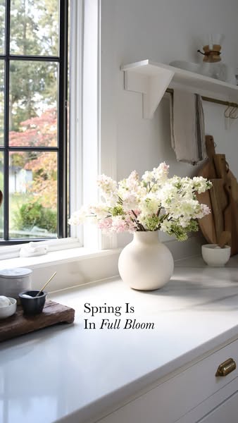
# Ad summary
This image ad features a vase of flowers on a kitchen counter next to a window, accompanied by the text: "Spring Is In Full Bloom."
# Brand positioning
There is no brand explicitly mentioned or visually represented in the ad. The ad focuses on creating a feeling of freshness and natural beauty, likely positioning the featured brand as one that values these qualities. The brand seems to align with a lifestyle that appreciates simple, elegant home decor and seasonal changes, without explicitly pushing against or following any specific competitor behaviors. The positioning appears more emotional than functional, aiming to evoke feelings of joy and renewal.
# Product
The featured product is a bouquet of flowers displayed in a white ceramic vase. The flowers include white and light pink blossoms with green accents. The vase has a simple, round design with a narrow neck. The bouquet is placed on a white marble countertop, positioned near a window that provides natural lighting. The product enhances a kitchen setting, suggesting it's worth trying or buying to bring seasonal beauty indoors.
# Visual style
The ad features a clean, bright, and modern aesthetic with a focus on natural lighting. The production quality appears to be high, possibly studio-shot, with careful attention to detail in the arrangement and staging. The visual motif is minimalist, emphasizing the beauty of the floral arrangement against a simple, elegant kitchen backdrop. The image treatment includes subtle color grading to enhance the natural tones and create a soft, inviting atmosphere. This style is designed to be scannable and visually appealing in a social media feed, likely aiming for a more elevated feel than platform native norms.
# Hooks
Headline: Spring Is In Full Bloom
# Benefits
- [object Object]
# Features
- [object Object]
- [object Object]
# Call to action
None used.
# Point of view
- [object Object]
# Storyline
- The ad opens with a vase of flowers in a kitchen setting, conveying a sense of natural beauty and home decor. The intention is to create an atmosphere of freshness and elegance. The audience is experiencing the scene from a general observer's perspective, taking in the overall aesthetic.
- The narrative progresses with the text overlay "Spring Is In Full Bloom," reinforcing the seasonal theme and highlighting the moment of renewal. This is the brand emphasizing the timeliness and relevance of the visual. The audience is now connecting the visual with a specific season and its associated feelings.
- The ad concludes with the implicit message that this type of floral arrangement can bring the beauty of spring into one's home. It's from the brand's perspective, presenting its products as a means to enhance the viewer's living space. The viewer is left to associate the promoted brand with the positive emotions evoked by the spring season.
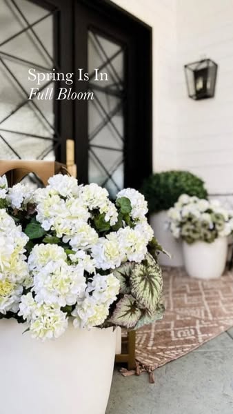
# Ad summary
Image ad depicting white flowers in planters.
# Brand positioning
Based on the image, the brand presents itself as one that focuses on the beauty and freshness of nature. The brand's decision to feature a bright, simple, and natural scene signals that it is aiming to align itself with values of naturalness, simplicity, and timeless appeal. The overall effect places the brand in the high-end market that values classic imagery.
# Product
The product is an arrangement of bright white flowers and green leaves, shown planted in a white planter. The product is being advertised as a way to bring the beauty of Spring into a home or outdoor area. The flower arrangement gives the home a refreshing outdoor accent.
# Visual style
The ad has a bright, clean visual style with a focus on natural elements. The production quality appears high, with attention to detail in the composition and lighting. The image is well-composed and feels aspirational, fitting for an in-feed ad where a user might pause to appreciate the scene.
# Hooks
Headline: Spring Is In Full Bloom
# Benefits
- [object Object]
# Features
- [object Object]
# Call to action
None used.
# Point of view
- [object Object]
# Storyline
- From the brand's POV, it is showcasing a lush, healthy arrangement of white flowers in planters. This presentation is meant to draw the viewer into the simple elegance of nature.
# Ad summary
The ad features a close-up view of yellow tulips with the text overlay “Spring is In Full Bloom”.
# Brand positioning
There is no brand presented in the ad. The ad is a product-focused piece showcasing an item during a particular season.
# Product
The product is a bouquet of yellow tulips with green leaves. The flower petals are solid yellow with faint vertical lines. The flowers are arranged in a bunch.
# Visual style
The ad features a clean, simple visual style with a focus on natural beauty. The close-up shot and soft lighting give the image a fresh, inviting feel, aligning with a minimalist aesthetic.
# Hooks
Headline: Spring Is In Full Bloom
# Benefits
- [object Object]
# Features
- [object Object]
# Call to action
None used.
# Point of view
- [object Object]
# Storyline
- The ad features a close-up shot of bright yellow tulips to convey a feeling of freshness and newness, appealing to the viewer's sense of appreciation for natural beauty.
# Ad summary
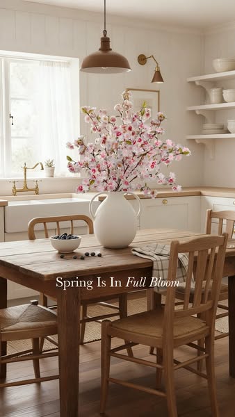
This image ad showcases a neutral-toned kitchen with spring blossoms in a white vase, advertising seasonal decor.
# Brand positioning
This ad promotes a brand that focuses on home decor items that evoke a sense of calm, simple sophistication and spring time freshness. The brand appeals to consumers who value a clean, bright, and minimalist aesthetic in their homes. The brand appears to ignore the trend of bold colors and maximalism, instead focusing on neutral tones and natural materials to create a serene living space.
# Product
The featured product in the ad is a white ceramic vase with two handles, holding artificial spring blossoms. The vase has a rounded body and a narrow neck, and the blossoms are a mix of white and pink, creating a soft and delicate appearance. The product is intended for individuals looking to add a touch of spring to their home decor, particularly those who prefer a minimalist and natural aesthetic. The vase can address the purchase barrier of floral arrangement maintenance, by offering a long lasting alternative to real flowers.
# Visual style
The ad uses a bright and airy visual style with a neutral color palette. The image has a high production quality, appearing to be professionally styled and photographed in a studio setting. The lighting is soft and natural, creating a warm and inviting atmosphere. The composition is well-balanced, with attention to detail in the placement of each element. The overall aesthetic is clean, minimalist, and sophisticated, aiming to capture a sense of calm and freshness.
# Hooks
Headline: Spring Is In Full Bloom
# Benefits
- [object Object]
- [object Object]
# Features
- [object Object]
- [object Object]
# Call to action
None used.
# Point of view
- [object Object]
# Storyline
- The ad begins with a wide shot of a neutral-toned kitchen, setting a serene and inviting scene. This introduces the overall aesthetic that the brand embodies, from the brand's perspective.
- The focus then shifts to a wooden table where a vase of artificial spring blossoms is prominently displayed. This highlights the featured product and its role in enhancing the home's ambiance, from the brand's perspective.
- The composition includes elements such as a bowl of blueberries and a draped cloth, adding to the visual appeal and suggesting a lived-in, comfortable space. The overall intention is to evoke a sense of spring and renewal in the home, from the brand's perspective.
# Ad summary
This ad showcases a series of bridal bouquets by 'From I Do' and Beyond'. It features elegant arrangements in various color palettes and styles to show off their expertise in creating stunning wedding florals.
# Brand positioning
From 'I Do' and Beyond is presented as a luxury floral design company specializing in weddings. The brand focuses exclusively on high-end floral arrangements for weddings, and is positioned as a provider of beautiful and elegant floral designs. The company’s arrangements appear modern and high-end.
# Product
The product being showcased is wedding floral arrangements, specifically bridal bouquets. The ad displays a variety of bouquets in different color schemes, floral types, and arrangement styles, indicating the company can accommodate a range of aesthetic preferences. These arrangements include a mix of traditional and modern styles to attract various customers. The ad does not include specific details about pricing or additional services, but the overall presentation implies a premium offering for discerning clients.
# Visual style
The ad has a polished and elegant aesthetic. The editing consists of quick cuts, showing a variety of different bridal bouquets. The production quality is high-end, giving off a premium feel. The video is well-lit, with a focus on showcasing the details of the bouquets.
# Call to action
None used.
# Point of view
- [object Object]
# Storyline
- 00:00–00:11 The ad showcases several bridal bouquets and a couple in wedding attire. All shots include a logo for From 'I Do' and Beyond.
# Ad summary
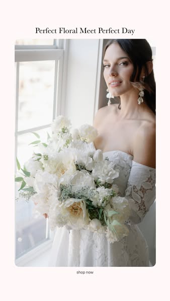
This ad features a woman in a white dress holding a large bouquet of white flowers. The ad is promoting floral arrangements, especially for weddings.
# Brand positioning
The brand is positioned as a high-end floral provider, specializing in creating perfect floral arrangements for special occasions, particularly weddings. The brand emphasizes elegance, beauty, and sophistication, aligning itself with values of perfection and refined taste. It seems to ignore norms around budget concerns, instead focusing on creating an aspirational aesthetic that promotes an emotional connection with the product.
# Product
The product is a large, luxurious bouquet of white flowers, which appears to be designed for a wedding or similar formal event. The arrangement includes a variety of white flowers, such as peonies, roses, and hydrangeas, combined with lush greenery. The bouquet is presented as a statement piece, emphasizing its visual impact and aesthetic appeal. It addresses the purchase barriers of visual appeal and quality by showcasing the intricate design and premium flowers used. The ad tells the viewer that this product is worth trying or buying because it represents a perfect floral arrangement for a perfect day.
# Visual style
The ad's visual aesthetic is highly polished and elegant. It resembles a studio-shot image, featuring soft, natural lighting and a focus on the product's details. The image treatment includes subtle color grading to enhance the whites and pastels, giving it a clean and romantic feel. Typography is integrated minimally, with a classic font that is legible. The style is clearly designed to be visually scannable and aims to capture attention in-feed through its serene and sophisticated imagery.
# Hooks
Headline: Perfect Floral Meet Perfect Day
# Call to action
shop now
# Point of view
- [object Object]
# Storyline
- The ad begins by showcasing an elegant bride holding an all-white floral arrangement. This is intended to convey a sense of sophisticated beauty, with the brand telling the story through its artful and aspirational presentation of the flowers.
- The ad then subtly nudges the viewer to purchase, by placing a 'shop now' CTA at the bottom. This shifts from an inspirational tone to a sales-oriented one, inviting the viewer to take the next step in their floral journey, with the brand clearly indicating how to purchase.
How Other Home Goods Brands Advertise on Meta
Peer brands in Motion's library — click any brand to see their creative strategy, live ads, and AI breakdowns.